green.

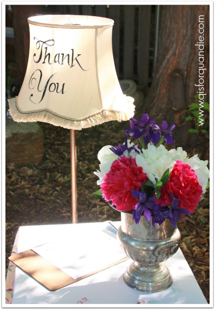
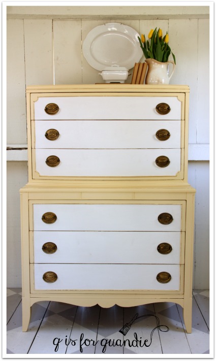
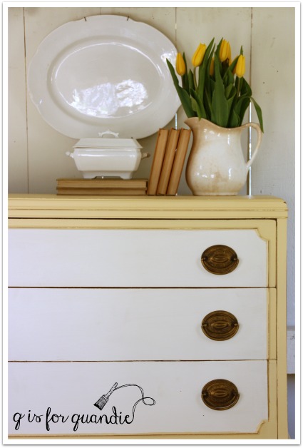
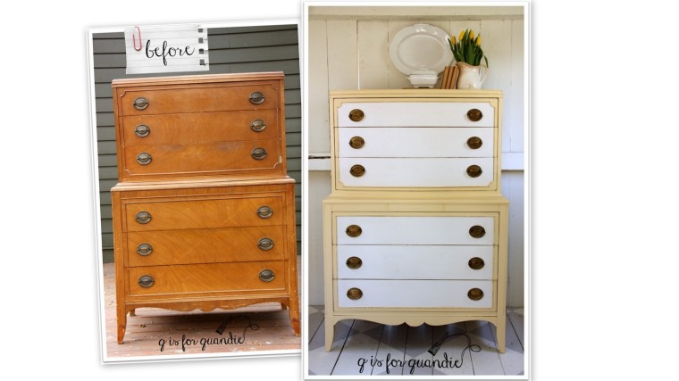
In my recent post about the dresser that I painted yellow and white, I mentioned that as soon as I saw that dresser I wanted to paint it yellow.  But I was a little nervous.  Yellow doesn’t always sell well.  To help convince myself that yellow was a good choice, I went to pinterest to seek out a little color pinspiration.  I just typed “yellow dresser” in the search field and my screen was flooded with beautiful yellow dressers.  That led to my creation of a pin board devoted to yellow.  And then one devoted to green.  Then aqua.

Seeing all of this color based pinning, one of my followers suggested I write a blog post about how to organize your pinterest boards.  Although your idea inspired me Victoria, I decided to go in a slightly different direction.  I decided to create some color based blog posts using my own photos, and it was far easier than I thought it would be!  Clearly there are certain colors that I am drawn to, and today we are starting with green.

garden chair books

An easy choice for my first color focused blog post since I have always loved green, maybe because my eyes are green!

grow plate in box

Or maybe because it’s the color of money 😉

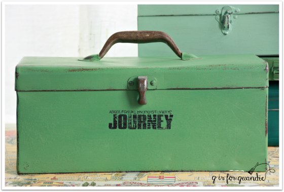
This toolbox is painted in Dixie Belle chalk paint in a color called Kudzu.

box kudzu

My initial thought was that I’d have to take a bunch of new photos of green stuff around my house, but then I started looking through my past blog photos and realized I already had a lot of green!

mac grove milk truck
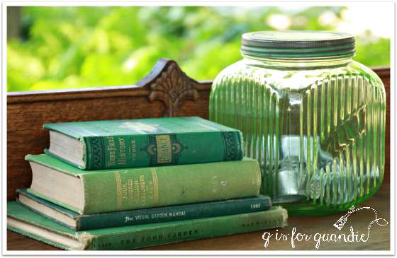
This green depression glass canister belonged to my grandmother.

french farmhouse styling

These pretty green depression glass sherbet cups were a garage sale find.

green glass

I sold this green birdhouse at my Carriage House sale one year, and I kind of regret it.  I should have kept this, it was so cute.

green birdhouse

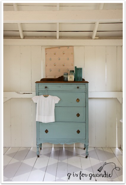
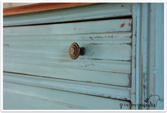
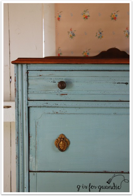
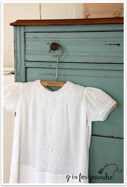
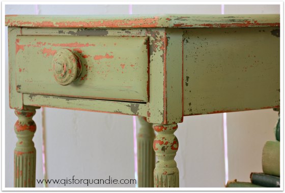
This green ‘french farmhouse’ dresser is one of my favorite pieces, but it still hasn’t sold.  Perhaps no one else out there loves green as much as I do?  The chippy finish on this one turned out perfectly.  Anyone need a green dresser?

french farmhouse corner

This farmhouse table is painted in the same Sweet Pickins’ milk paint color called In a Pickle and it did sell.

green desk and books

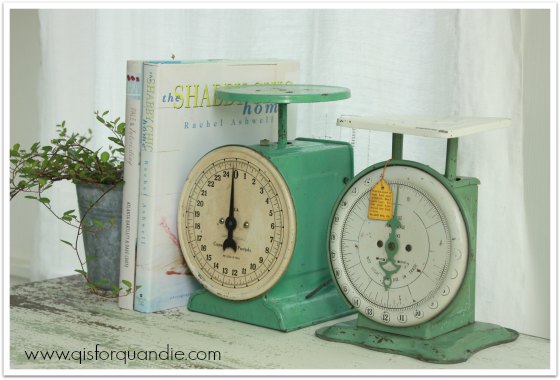
Goodness gracious, I do love me some green, don’t I?  I have a small collection of vintage scales in green.

porch scales

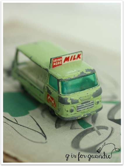
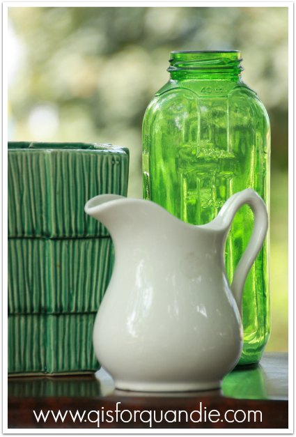
This is almost too easy.  I feel a little bit like I’m cheating.  Who knew I’d find so many greens!

green (2)

green crate (2)

This little table wears an undercoat of Miss Mustard Seed’s Boxwood, with Luckett’s Green over it.  This one also sold quickly.

green chippy close up

Apparently I’m even drawn to green ribbons.

vintage green ribbon

And obviously green vintage ornaments.

green ornaments

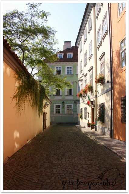
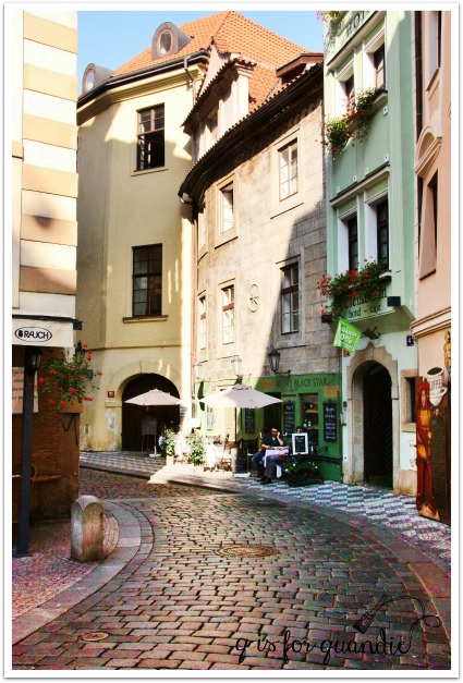
I found these green doors in Budapest.  I love me some graffiti doors.

budapest doror

Two years ago my front window box was monochromatic in green and white.  I loved this combo up close, but from the street it was a little bland.  I’m still debating this year’s window box design.  I’m thinking about a pink and chartreuse combo using caladiums, lime green potato vines, and maybe some coleous in pinks and greens.

test photo width

I posted about these sweet green outfits that my grandmother knitted for my Barbies way back when, you can revisit it {here}.

barbie

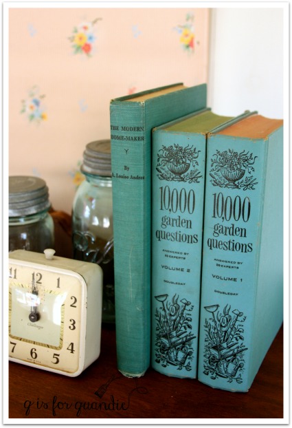
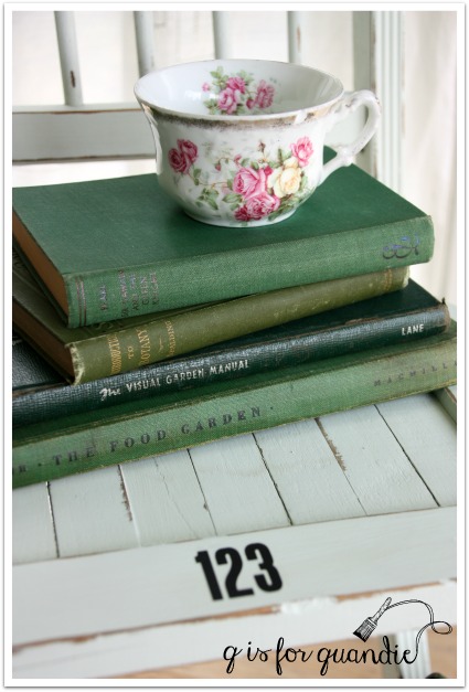
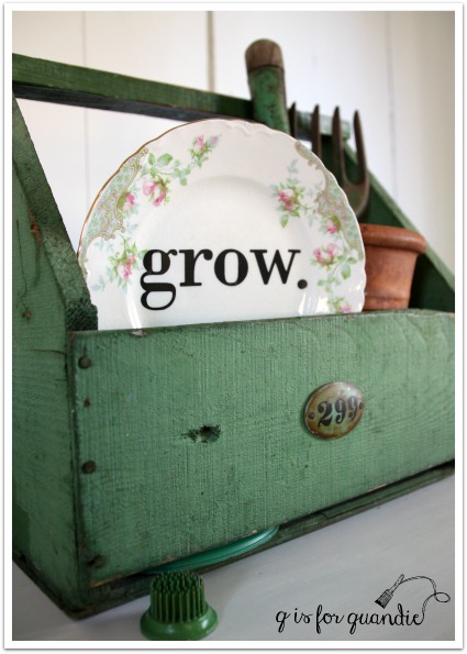
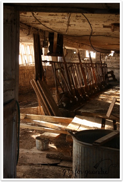
Of course, I use my vintage green garden tools and books in many of my photo shoots.

plant a garden manual

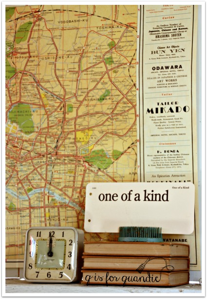
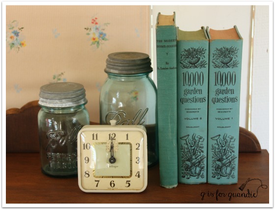
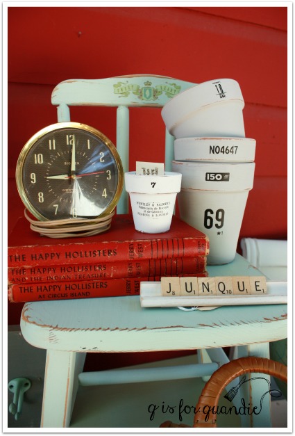
Naturally I have a green clock on hand for photo shoots as well.

stool with books and clock

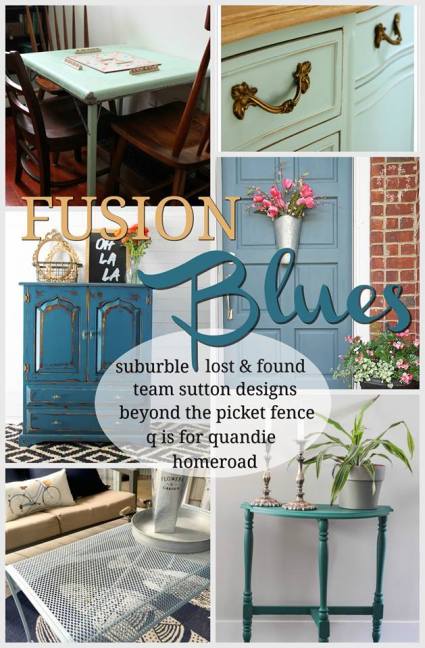
Fusion’s Lily Pond is another great green.  If you are looking for paint in the color of Jadeite, then Lily Pond is a great choice.

lily pond

How do you feel about green?  Is it your favorite?  In your top five?

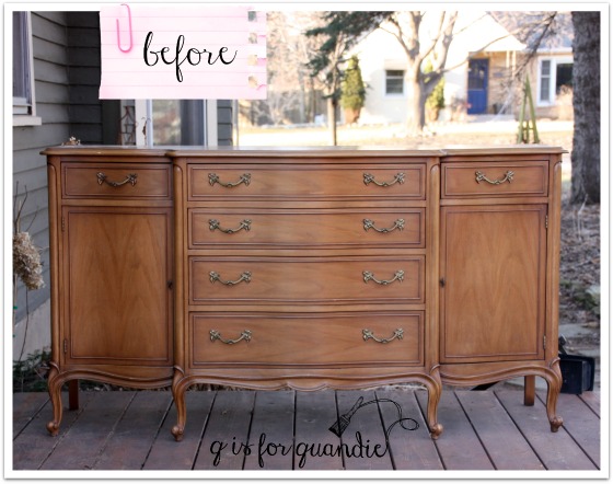
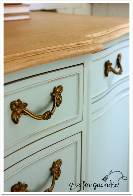
And as for that yellow dresser, it did sell quickly … as a matter of fact, it sold quickly twice!  I put it on Craigslist and had a buyer in less than 24 hours. But once they got it home, it didn’t fit up the staircase in their vintage home.  I could totally relate to that problem.  I also have a staircase with a turn at the top and have found myself in the position of having to return furniture that didn’t fit up the stairs.  The buyers brought it back and purchased a smaller dresser from me instead.  Meanwhile, another of my blog readers had expressed an interest in the yellow dresser, so when I mentioned that it was available again, she called dibs on it and picked it up a couple of days later.

Not only that, but two separate furniture blog parties chose the yellow dresser as a favorite!  First Terry at The Curator’s Collection and then Lucy at Patina Paradise.

So, it turns out that yellow is far more popular than I thought!

fusion blues giveaway.

Fusion blues

Recently Melanie from Lost & Found Decor asked if I wanted to participate in a Fusion blog party.  For this particular event each participating blogger was asked to choose one of Fusion’s shades of blue and use it in a project of some kind.  Melanie wanted each of us to choose a different blue, and it was first come, first served.  I was hoping to get Homestead Blue, which I was going to use on a typewriter stand (was going to add a Union Jack top), but that color was taken.  I also would have been happy to get Laurentien, since I used it on that pair of vintage school desks and it’s one of my favorite colors, but that was taken.  Another great choice would have been Seaside; it was taken too!  Now I’m not saying that there is anything wrong with the remaining color choices, but I tend to be a little bit particular about pairing just the right color with just the right project and I don’t have that many unfinished projects waiting in the wings.

Fortunately, another of my favorite Fusion colors wasn’t spoken for yet, Inglenook.  And I had just the right piece for it, this lovely french provincial sideboard.  I’ve done a few french provincial pieces in this color and each one has turned out gorgeous.

buffet before

I must start out by saying that this is probably one of the prettier ‘before’ pics I’ve ever shown.  This piece was very lovely to begin with, and structurally it’s in perfect condition.  The original finish was a bit worn out and yellowed though.  It was also shinier than I like.  Who am I kidding, this piece could easily have been left alone.  But that’s not what I do.  I paint stuff and give it a new look, so that’s what I wanted to do here.

First I stripped the top.  I was told that this piece is made out of walnut.  I always thought that walnut was a dark wood, but I did a little google research and discovered that walnut is one of the few woods that can range from very pale to a dark chocolate brown.  I really loved the pale color of this walnut.  To me it feels fresh and clean.  So I just added some clear furniture wax to protect it rather than adding any color using stain or a tinted wax.

blues 3

Next, after sanding lightly, I painted the rest of the piece in two coats of Inglenook.  Once the paint was dry, I distressed lightly to bring out the details.  Before I put the hardware back on, I refreshed it with some gold rub ‘n buff.

blues 2

And that was it.

Inglenook sideboard

blues 5

I used some old gold frames in my photos to bring out the gold hardware.

blues 1

I just haven’t been able to bring myself to part with these two frames.  I love the detail, and the fact that they are both just a little bit shabby.

gold frames

The frames are joined by a gilded cage full of vintage salt and pepper shakers.

gilded cage

What I really wanted to do was hang some sort of gorgeous landscape oil painting on the wall above this sideboard, but oh, wait, I don’t have one of those!  I’m still regretting the one I passed up at a garage sale last summer because it was $35 and that seemed high to me (kick, kick).

blues 4

But what I do have is a really gorgeous french provincial sideboard in the most lovely shade of blue.  In the end, it’s probably a good thing that many of the other blues were already spoken for!

If you have a space in your home for this gorgeous sideboard, be sure to check out my “available for local sale” tab to see if it’s still available.

Now for the fun part.  You have the opportunity to win a prize package from Fusion that includes 2 pints of any shade of blue, a brush and some Fusion Antique Glaze.  The giveaway is open to residents of the U.S. and Canada who are 18 years old and up.  You have until midnight on May 1, 2016 to get your name included in the drawing on Rafflecopter using this link:

a Rafflecopter giveaway

Please be sure to visit the other five bloggers that are participating in today’s blog party as well!

Melanie at Lost & Found Decor

Tara at Suburble

Crystal at Team Sutton Designs

Susan at Homeroad

Becky at Beyond the Picket Fence

And best of luck to you in the drawing!


out on the farm.

I’ve mentioned before that my in-laws live out on an old farm in Wisconsin.  They don’t farm, but they live in the old farmhouse that the people who farmed the land moved out of when they built a nicer, newer house.  So my in-laws just own the chunk of the land that encompasses the house and the old barn.  They are surrounded by farmland, but they don’t farm it themselves.  Was that an awfully long explanation?  Sorry.  Moving on.

I shared my f-i-l’s workshop last November, you can see that post {here} if you missed it.

toms workshop exterior

They built that from scratch.

Lately Tom (who is an artist with wood) has been working on the house itself.  First, let me show you a ‘before’ of the front of the house.

farmhouse front before

This farmhouse was definitely a fixer upper when my in-laws bought it.  That was exactly what they wanted.  They like to put their own stamp on a place.

Like this.

 farmhouse 1

Tom has added a new bay window on the front of the house, along with new custom siding that he designed and built himself.

farmhouse 2

And clearly he has added his own unique carved wood details.

farmhouse trim

Have you ever seen siding like this?

farmhouse siding detail

Or how about window supports like these?

farmhouse window supports

Yep, it’s pretty special.  Ultimately he will work his way around the entire house.  The next section to be worked on will likely included the screened porch that wraps around the corner of the house.

I don’t dare tell Tom that I kind of love the chippy finish that is currently in place on the porch door.

farmhouse door

When Tom & Naomi moved in, the barn that came with the property was still standing.  I took some photos of it back in 2011.

barn 2

barn 1

barn 3

It was a rickety old place, but it lent itself well to some very moody photos.

barn window

Just check out the creepy interior.  This place just has to be haunted, right?

barn interior

The saddest thing about this story is that none of the stuff inside the barn could ever be salvaged.  The structure was too unstable for us to go inside.  Can you just picture me standing outside peeking in the windows and wishing I could grab that old bucket, or some of the other fab vintage farm implements that were still inside!

As you can imagine, it nearly killed me to have to walk away from all of that cool stuff.

But sure enough, a couple of years later the barn did fall down.  And on the plus side, now I can salvage some stuff … at least the stuff we can get to without endangering our lives.  That includes plenty of barn wood!

barn wood

 So check back next week to see what Debbie & Ken have come up with using some barn wood.  You’ll also see a gorgeous new piece that I’m sharing on Monday as part of a Fusion blog hop that will include a great giveaway.  See you then!

throwback thursday no. 3

There are a few of you locals out there who have been coming to my occasional sales for years.  My friend Sue and I started hosting sales a long time ago.  Funny enough, neither of us really remembers how long we’ve been doing them.  I know it’s been more than 15 years.  We started out with just a very small ‘garage sale’.  Sue always had the most amazing stuff and rock bottom prices.  I just did my best to keep up with Sue.  Eventually our reputation started to grow.  In the early days we had an actual mailing list and would send out flyers via snail mail!  Imagine that!

2012 sale 1

Over time we gave our sale a name, the Carriage House sale, and we added an email notification list.  We experimented with adding various other partners, but somehow we always ended up back with just the two of us.

In recent years Sue and I have had so much inventory just between the two of us that we didn’t have room to add any more vendors!

2013 summer sale 1

At one point we had as many as three sales a year, then we scaled back to one, then we added one back and had two per year for a while.  We even had a Christmas sale a few years back.

xmas sale 1

For goodness sakes, why in the world did I part with this green scale?

xmas sale 4 Anyway, that sale was kind of a bust, so we never tried that again.

xmas sale 2

One problem with hosting a sale at my Carriage House is that there just isn’t enough space inside for all of the inventory, plus the shoppers, plus a check out area.  Obviously some stuff is going to be outside, including us.  That’s not a problem when it’s a beautiful sunny day.

2013 summer sale 3

But many of our customers still talk about the year that the tornado sirens went off and the sky unleashed a torrent of rain just as we were opening our doors.  Our flimsy tents helped a little, but when rain is coming down sideways things are bound to get wet.  It didn’t seem to discourage any of the shoppers, but some of the help (nnK in particular) were a little freaked out.

We’ve always had lots of great vintage stuff in our inventory.

2009 sale 1

vintage silver

super lectric fan

2014 Fall Carriage House Sale preview

And plenty of pretty china, although that doesn’t sell nearly as well anymore as it once did.

2013 summer sale 5

I ended up selling all of those pieces in a basket for some ridiculously low price.  I kind of wish I had kept a couple of those pretty tea cups now.

In addition to fun vintage pieces, both Sue and I also like to take cheap garage sale finds and add our own touches to them.

2012 sale 2

carriage house cutting board

Sue is also a very talented seamstress.  She made these pillow covers using an embroidered table runner (dresser scarf?)

pillows in a basket

Of course, I’ve always done furniture for the sale.

2013 summer sale 6

CH4 Summer 2014

And Sue does the occasional piece of furniture as well.

carriage house sues chairs

sue's settee 1

But sadly, historically furniture does not sell well (although Sue’s darling chairs did sell quickly). I generally end up having to put most of my furniture on craigslist after the sale is over.

We’ve always had a size-able garden section at our June sale.
CH5 Summer 2014

vintage sale

Both Sue and I are gardeners, and we often dig up and divide our own perennials before the sale.

CH11 Summer 2014

Last year we only had the June sale.  I found that after working a full time job, refurbishing vintage furniture and writing a blog, something has to give.  And after that June sale I was pretty burnt out.  I needed a break, so we decided not to have a fall sale last year.

Now this year, here it is the middle of April already and I don’t have any inventory accumulated for a June sale.  I have been focusing more on furniture rather than the small pieces that sell well at the Carriage House sale.  So, there will be no June sale.  We’re thinking about a fall sale though.  Maybe in the last half of September.  That gives us all summer to find and refurbish some amazing stuff.  My sister has agreed to be my garage sale wing man this summer and we’re already penciling in the neighborhood sales that we don’t want to miss.

In the meantime, I hope you all enjoyed this trip down memory lane for throwback thursday.  In case you are wondering, yes, every single photo used in this post is from one of our previous sales and shows items that we did indeed sell (including that vintage green scale!)

thank you

a teeny tiny chair.

tiny chair title

A couple of weeks ago when I purchased the pair of vintage school desks, they also came with this sweet little teeny tiny chair.

tiny chair before

I know that rusty patina isn’t everyone’s favorite, but I like a little well placed rust.  In the case of this chair, I decided that I didn’t want to paint it at all.  I just wanted to add a little extra pop of something.

So I added some Tim Holtz rub-on numbers to the back rest, as well as just below the seat.

chair numbers 2

chair numbers

Then I tried to use it in the school desk photos, but it just looked a little odd tucked under the desk.

tiny chair 4

On top of the desk was not much better.  So I didn’t use these photos for my post about the desks.

tiny chair 3

Then yesterday I decided to add some stripes to the seat.  I sanded it lightly, taped off the stripes and painted them using black acrylic craft paint.  I followed up with a coat of Miss Mustard Seed furniture wax to just liven up the finish a little.

chair racing stripes

And voila, the finished chair.

tiny chair after

By the way, this chair is a bit smaller than the typical little kid’s chair that I’ve painted.  This one is only about 21″ tall.  Here’s a photo I took to give you a better idea of the scale.

tiny chair scale

See what I mean?  Tiny.

But it sure packs a ton of cuteness into a tiny package.

springtime yellow.

springtime yellow

My craigslist spotter, nnK, spotted this dresser for me a week or so ago and I sent Mr. Q off to pick it up.

springtime before

It had a little bit of damage on the right side of the 3rd drawer down, some veneer is chipped off and the trim is missing.  But otherwise it was in great shape, aside from the finish being pretty dinged up.  It also looks like there was some water damage to the feet at some point.

For some reason, as soon as I saw this in person I thought ‘yellow’.  And luckily I already had some of Fusion’s Buttermilk Cream, which is the perfect shade of creamy yellow.  Not in-your-face lemon yellow, but a subtle dignified yellow.  This is a fairly dignified dresser, so it deserved a dignified color.

springtime yellow 3

Once I had it painted in yellow, I decided to give it a little more personality with the addition of white inside the trim.  I used Fusion’s Limestone for that.

Looking at the craigslist ad, I had no idea that the top half of this dresser had a curved front.  In fact, if you look at my own ‘before’ photo you can’t really tell either.  But in person it’s quite obvious.

springtime yellow 4

I thought about changing out the original hardware for some clear glass knobs, but there are 12 drawer pulls on this thing!  Even at only a few dollars each, that adds up when you need 12 new knobs.  So instead I spruced them up with a little gold rub ‘n buff.

springtime yellow hardware

This dresser has a formal, traditional feel so I opted not to go chippy with milk paint.  The Fusion is just so darn easy to work with in comparison with no need for a top coat, no mixing, no worries about color variations.  I did end up need three coats to get really good coverage though.  I distressed the edges just a little.

springtime yellow 5

The yellow and white on this dresser reminded me of some daffodils that I used to have in my garden that were yellow and white.  I really wanted to find some daffodils to use in my photos, but wouldn’t you know it, the flower shop near me was all out.  I had to settle for yellow tulips, which paired nicely with some ironstone.

springtime yellow 6

By the way, this dresser is quite large.  I think it’s often hard to tell in photos, especially in this case where I haven’t added a chair or anything to provide scale.  This baby is 52.5″ tall and 36″ wide.

springtime yellow 2

So let’s take a moment to talk about lining drawers, shall we?  Are you pro or con?  I am against lining a perfectly good drawer.  In my experience, a lined drawer ends up looking shabby much more quickly than an unlined drawer.  Loose paper liners don’t last very long, while sticky contact paper can be a nightmare to remove and it really doesn’t clean very well.  So for the most part, I don’t line the drawers of my pieces.

I make an exception to that when the drawer is really grossly stained.  Or in this case, I made an exception because two of the drawers in this piece had previously been lined with contact paper and it left behind an awful sticky residue that I couldn’t get rid of.  But, like I said, only two of the drawers had this problem.  So I only lined them.

springtime drawer lined

Two of the drawers have dividers in them …

springtime unlined drawer

And are in quite good shape.  The final two drawers aren’t divided, but also are in very good condition.  So I chose not to line them.

Is that weird?  If I were keeping this dresser, this is what I would do.  But will a prospective customer wish I had lined them all?  What do you think?  In general, are your pro-liner, or con?

springtime collage

Linking up with Friday’s Furniture Fix at Lost & Found Decor

and Making Broken Beautiful at the Curator’s Collection.

throwback thursday no. 2

If you’ve been reading my blog for a while, you might know that Mr. Q and I like to travel.  We can’t afford to travel as much as we’d like, but we keep a special travel fund and try to save enough for the occasional trip.  Travel is pretty much in my blood since my mom is a travel agent.  My sister got the bug too.  Lately we’ve been starting to plan our next trip which won’t be until 2017, but that doesn’t stop us from dreaming about what we want to do.  The original plan was to visit just Belgium, but now we’ve decided to kick it up a notch and take two weeks and visit Belgium and the Netherlands.

All of this dreaming about future travel motivated me to share a past trip for today’s throwback thursday post.

In 2011, Mr. Q and I went to Prague.

prague title

If you need to brush up on your geography, Prague is in the Czech Republic.  The Czech Republic is kind of smack in the middle of Europe, with Germany and Poland to the north and Austria to the south.

Prague is without a doubt one of the most picturesque places I have ever seen.

prague 1

Mr. Q and I spent an entire week there and that gave us plenty of time to just wander.  We like to look for the places that are off the beaten track and not full of tourists.  Trust me when I say, Prague was full of tourists.  Even in September.  The main tourist areas (by the astronomical clock, the Charles Bridge) were wall to wall people.

prague 2

But there were plenty of gorgeous spots to be found tucked away here and there.

prague 14

prague 21

prague 16

Prague sits on the Vltava River, and one rather touristy thing that we couldn’t resist was taking a boat ride on the river.

prague 22

They have these charming little boats that take you up and down the river …

prague boat 2

and through a narrow canal that runs alongside the river …

prague boat

By the way, you may have noticed that the sun is shining in every one of my photos.  We were there the last week of September and it was sunny and around 70 degrees every single day.  I don’t think that is the norm, we just got lucky!

No matter where we go when we travel, Mr. Q always has to try as many coffee beverages as possible and Prague was no exception.

prague 18

But we also enjoyed some really thick and rich hot chocolate beverages.  Yum!

prague 9

We visited the Jewish Quarter one afternoon and I thought the cemetery was fascinating.  Due to a lack of space, on occasion during the 300 years during which the cemetery was in use they would simply heap dirt on top of the existing graves and add another layer.  In some spots there are as many as 12 layers.  There are now retaining walls in place and the surface of the cemetery is several meters higher than the surrounding street level.

prague 12

Another tucked away spot in Prague is the Lennon wall.  That’s Lennon as in John Lennon, not to be confused with the communist Lenin.

prague 13

Young people started painting graffiti on this wall in the 1980’s as a way of rebelling against the communist government that was in place at the time.  This is what it looked like when were there in 2011, but I saw {this article} about it being painted over in white in 2014.  I wonder what it looks like today.

As usual, I kept my eye out for my lucky number and once again I found it on a tram.

prague 8

Prague has it’s fair share of lovely copper domes too.

prague 3

prague 11

We did travel a bit outside the historic center one day to visit Troja Palace.  I have to tell you that Mr. Q and I are rather hopeless when it comes to public transportation.  We have a tendency to not know what we are doing.  In this case, we debated which train to get on about 5 times before we actually got on one.

prague 5

But we ended up where we intended, so apparently we picked the right train.

prague 6

While I was hoping to find beautiful gardens at the palace, there was a modern art exhibit going on so what I really found was a giant yellow octopus in the middle of the lawn.

prague 7

Hmmmmm … not really my thing.

We had a little trouble with the return trip too.  There was an unmanned kiosk where we had to buy our tickets, and nothing was written in English.  We had absolutely no idea which buttons to push.  In addition, the machine only took coins, no paper money.  Fortunately we were able to scrounge together some coins, but we really had no idea if we were purchasing the right tickets!  We just bought the most expensive ones we could afford with the coins we had, and then kept our fingers crossed.

We would only have to show our tickets if a ticket agent happened to board our train.  I have to admit, I held my breath the entire trip back hoping we wouldn’t end up in big trouble for having the wrong tickets.

In hindsight, I think I would have preferred to visit Cesky Krumlov as a side trip from Prague.  It’s a 4 hour train ride away, but if you have a chance just google it and you’ll see why I wish we’d made the time for it.

When all is said and done, we really loved our visit to Prague.  If you’ve ever thought about going, I would highly recommend it.  Just make sure you get away from the touristy crowds and are able to see just how very charming it really is.

Prague us

We would go again in a heartbeat.

too cool for school.

I suspect that unless you are homeschooling your kids, most of you would not have looked twice at the craigslist ad for these vintage desks.

bts before

But the fact that they were a pair made me immediately think ‘nightstands’.  Plus I was kind of digging their mid-century vibe.  If you look at the base, you can see that the height is adjustable, so I knew I could raise them up a bit to be the right height for next to the bed.  So one recent Friday evening date night, Mr. Q and I drove out to one of my fave Minneapolis neighborhoods, Linden Hills, to pick these up.

I debated between two different concepts for them.  I thought about going ‘industrial steampunk’ by painting them black, ‘dipping’ the legs in copper paint and stenciling some numbers somewhere.  But in the end I decided to play up their mid-century look by painting the metal aqua and leaving the blonde tops as is.  They were in really good condition, so that seemed like a no-brainer.

I started by adjusting those legs.  That ended up being the most difficult part of this project.  Those bolts had obviously not been loosened in a very long time.  Luckily Mr. Q was able to use his brute strength to get the job done.  Then I painted the base of each table in Fusion’s Laurentien.  I absolutely love this color and am just finishing off my 3rd can of it.  I’m going to have to stock up on more!

bts side view

Once the paint was dry I sanded the edges a little to add some character, but I still felt like the paint job looked a little too new.  So although you don’t have to use a top coat with Fusion paint, I opted to wax these.  I started with a coat of Miss Mustard Seed’s furniture wax (clear).  The purpose of an initial coat of clear wax is to make the application of the next coat of dark wax easier to manipulate.  If you’ve ever tried using dark wax directly on a lighter paint color and it looked really streaky and you weren’t able to blend it as much as you’d like, that’s because you needed a base coat of clear wax first.

bts desk angle 2

I added some rub-on numbers to the pencil tray just to add a little whimsy.

bts interior

I staged some of my photos with a typewriter and of course you could use these as desks.

bts 3

bts typewriter

But really, they are just too cool for school.  I would use them as nightstands.  I just don’t have a good spot for taking photos of them next to a bed.  So if you are opposed to cookie cutter furniture and prefer unique one of a kind pieces, these are perfect for you.

bts pair

bts map

This Tokyo map paper had the perfect colors to match the desks.  There is something about that combination of aqua and french vanilla that I just love.

bts poster

How would you use these desks?

bts desk title

a chippy dresser and a clean floor.

I mentioned a little bit ago that it has been nice enough to be back out in the photo cottage already this year.  When I said that, what I meant specifically was that I could be out there taking photos without freezing my face off.  But it wasn’t quite warm enough that I wanted to be out there scrubbing away the winter grime.  Until last week (before we had another cold snap) when I came home from work one evening and it was 62 degrees outside.  So I decided there was no time like the present to head out there with my bucket of water and my scrub brush.  And now I have a fresh clean floor.  I was so happy with it, that I tried to include a bunch of floor space in today’s photos.

chippy dresser 2

All this talk of a clean floor is meant to distract you from noticing that I don’t have a ‘before’ photo of this dresser.

Drat!

I thought I had taken one, but if I did it is lost in the sea of 100’s of photos that I take every week (thus the urge to organize my photos that I mentioned yesterday).  This dresser has been patiently awaiting its turn to be made over, so it is possible that I took one some time ago and I just can’t find it!

Oh well, moving on …

I went with MMS milk paint on this one because I had a feeling it would get chippy, and indeed it did.

robins egg close up

I mixed some French Enamel and some Lucketts Green together to make this color.  I’ll be honest, I was expecting a much lighter color based on seeing what was said to be this same combination on a piece on pinterest.  This is a good reminder to everyone that colors in photos often don’t translate to how they look in real life.

This photos of this dresser are a really good example of that.  I think the dresser looks a bit more blue in the photos than it really is.  If you are proficient in MMS milk paint colors, this color is a bit lighter and a tad warmer than Kitchen Scale.

chippy dresser 3

This dresser has the prettiest drawer pulls on the lower three drawers.

chippy closeup 2

By the way, I did strip the top and then wax it with Cece Caldwell’s Aging Cream.

My vintage gardening books were the perfect color to use for staging.

chippy dresser staging 1

And I threw in one of those sweet hand sewn baby dresses that I keep just for staging furniture.

chippy dresser corner

This lovely dresser is for sale.  If interested, please feel free to leave a comment requesting the details or email me at qisforquandie@gmail.com.

garden questions


throwback thursday no. 1

I was in the process of doing some photo organization last weekend, and I decided that it might be fun to share some things with you guys from my pre-blogging days.  I started q is for quandie in November 2013, but I took lots of photos before that.  Lots.  So, I bring you … throwback thursdays!  Yeah, I totally stole that from Facebook, but hey, I can do it too, right?

  Our first throwback Thursday features the photo cottage before it became the photo cottage.  Oddly enough, I didn’t share much in the way of ‘before’ photos when I made it over, just one quick photo of the emptied out shell.

summer house before

Yikes!

So let’s back up just a tad and take a look at the place before it was emptied out.

potting shed sofa

These photos were taken in 2010, way before I ever thought I’d have a blog.  So yes, I had a ‘she-shed’ long before anyone even coined that term.  Just for the record, I kind of get the heebie jeebies over that name.  I don’t know why, there is just something about it that is like fingernails on a chalkboard for me, how about you?

I called it the ‘summer house’ (a much prettier name than ‘she-shed’), and it was very girly.

potting shed dishes

The walls were pink.  I remember the color was called Paris Pink, can it get any more perfect than that?  And I had scads of floral china everywhere.

potting shed window

Much of this china was later used for my ‘words on plates’ projects.

I had an awesome chandelier hanging from the ceiling, but it was just for looks.  I don’t actually have any power out there.  It’s a little hard to see in this photo, but I took photo copies of old black and white pictures and wrapped them around the ‘candle tubes’ which looked really cool.

potting shed chandelier

I still have the chandelier in storage.  I’m hoping that I’ll come up with the perfect spot for it again soon.

I had a green wicker chair in the corner next to a little metal garden table with a glass top.

potting shed green chair

See that wall sconce above the chair?  Does anyone remember those mirrored sconces?  I don’t know what the background story is on these, but they tend to be a dime a dozen at garage sales (were they from Home Interiors maybe?).  They are usually black.  I painted mine white and added the little green teacups to them.  After taking them down, I sold them along with the green chair at my Carriage House sale.

CH3 Summer 2014

I also recovered the cane back sofa and sold it.

cane sofa

This cupboard is the only piece that I kept in place out there.

potting shed cupboard

I’ve spruced it up just a little when I made over the cottage by adding some vintage wallpaper inside the drawers …

studio cabinet drawers 2

and repainting the inside …

studio cabinet empty

you can read more about that {here}.

As much as I enjoyed styling this little cottage back then, the sad reality was that I rarely used it.  I don’t have too much time to spend just relaxing, so when I do have time to just chill out I prefer to do so in maximum comfort.  None of the seating in my summer house was very comfortable.  It looked pretty, but didn’t function all that well.  So I really never just sat out there.  I have gotten a ton more use out of the photo cottage.  Two years after making that decision, I know it was the right one!

photo cottage exterior

So photo cottage it remains!

I hope you enjoyed throwback Thursday.  I’ve got lots of old photos to share, so next Thursday we’ll take another trip down memory lane, I hope you’ll check back.