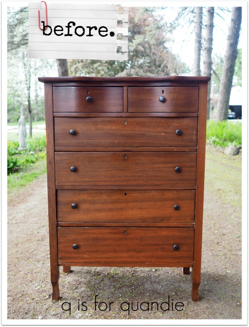
One very blustery sub-zero day last January my neighbor nnK called me to let me know about a buffet that was listed as ‘free’ on Craigslist. Normally I shy away from the free stuff for a few reasons. First, they are often in rough shape and need too many repairs. Second, I usually can’t get there fast enough to be the first in line. Third, the people giving away stuff for free are usually not terribly accommodating … and why should they be? After all, they are giving it away for free (I’m pretty sure my mother told me never to do that).
This time only two out of three were true. The buffet was in pretty rough shape, and the people weren’t very accommodating. They weren’t willing to help with the loading at all. However, it was located right on my way home from work and I was leaving work in about 20 minutes, plus Mr. Q was available to meet me there so that we could carry it out of the person’s walkout basement, through someone’s icy backyard and to our van. Perhaps the frigidly cold day worked in our favor because we were the first people who called and said we could pick it up right away.
And here is the piece we brought home that day.

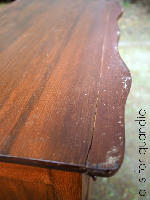
I know some people might like this look but I find it quite hideous. There is something about that mix of dark and light finishes that just does not appeal to me. I knew I could make it pretty though. But first I had to store it in my carriage house until it warmed up enough for my handyman/neighbor Ken to fix it up.
Fast forward to a couple of weeks ago when it finally warmed up around here. Ken came over and did some repairs to the drawers. He and I then worked together and glued some of the feet back together. Next I stripped the top of the piece using Citristrip. And then after cleaning the piece with some TSP substitute, I finally got to the painting.
I painted the outside lower body of the buffet in Dixie Belle’s Bunker Hill Blue. This is an interesting paint color. It looks very bright in the jar, and it also looks quite bright going on. So much so that you might be a little worried about your choice at first.

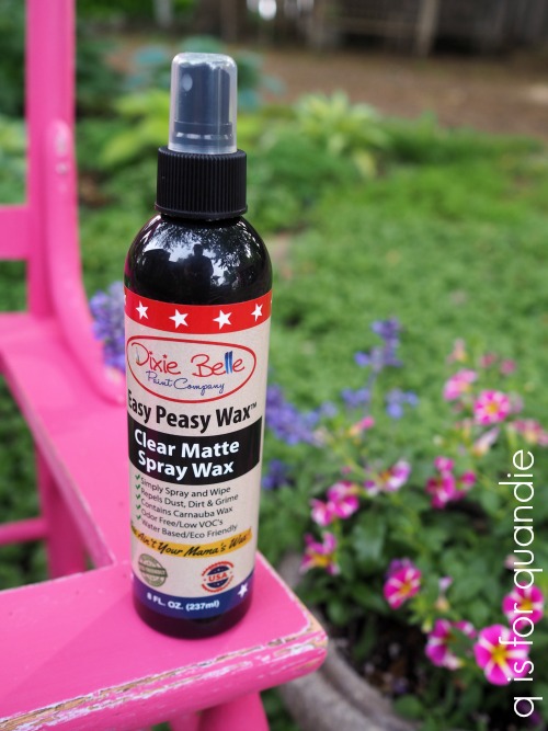
But it does dry quite a bit darker. To tone it down just one step further, I used Dixie Belle’s black glaze over the paint (paint and glaze were provided by Dixie Belle).

The glaze was super easy to use. I brushed it on with an inexpensive chip brush and then wiped it back with a clean cloth.
But I have to say, the look of the color really depends on the lighting. When the light hits this color just right it looks much more like a cobalt blue than a navy as you can see in this next photo.

As you may have noticed, I changed out the knobs. One of the originals was damaged beyond repair, plus they were kind of ugly.

I found these simple knobs at Hobby Lobby. They were large and heavy enough so that they didn’t get lost on this big ornate piece, but I think their simple look allows the rest of the buffet to take center stage.

The insides of this piece were definitely in need of a little TLC too, so I painted them with Fusion mineral paint in Coral.
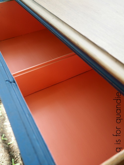
I kind of love that unexpected pop of color when you open a drawer or one of the cupboard doors on the side, don’t you?

I finished the top of this piece with Fusion’s furniture wax in Espresso. Although I absolutely love how creamy and easy to apply the Fusion wax is, I think I may go back over it again with Miss Mustard Seed’s Antiquing Wax which is a bit darker in color.

This buffet is definitely not short on detail, but I think my favorite are those little finials that hang down from the trim below the side doors. Aren’t they sweet!

I think this buffet has an entirely new look with its vibrant Bunker Hill Blue paint job. I hope I’ve encouraged some of you to give this color a try. Don’t be afraid if you think it looks a bit too vibrant in the jar, and remember you can always tone it down a bit with the black glaze or with some dark wax.

If you are local and in need of a beautiful blue buffet, be sure to check out my ‘available for local sale‘ page for more details!