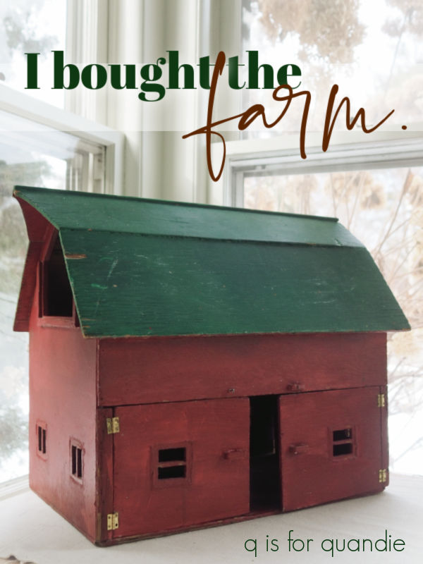
You’ll remember the mini barn that I purchased at my local Goodwill.
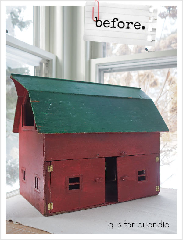
It was missing a bit of trim, and a section of wall between the two doors, so I sent it over to Ken’s workshop for some repairs.

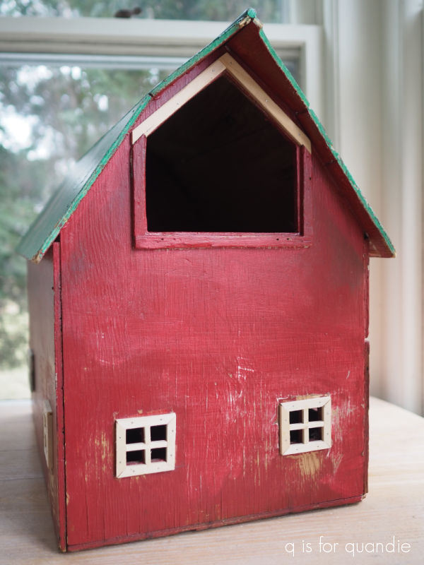
He replaced that section of wall, the trim on six of the windows, and one of the little door latches …

and he also added a little trim to the loft opening.
Next up I gave the entire barn a scuff sanding, and after wiping it down I gave it two coats of Dixie Belle’s B.O.S.S. in grey. I didn’t really need to block any stains, but I thought it would be easier to cover that red and green if I had a grey primer down first.
In hindsight, I wish I had painted the entire barn in a dark color such as DB’s Coffee Bean first so that I could have distressed my final paint back to the darker color. In the end, I could see both the grey B.O.S.S. and the green when I later attempted to distress the roof. Rookie mistake.
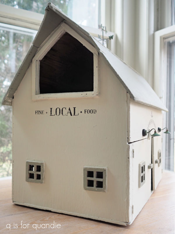
Next up I painted the roof and the interior of the barn in Dixie Belle’s Dried Sage, and the exterior walls in their Drop Cloth. It still took two coats of paint to cover the grey primer, so again, I would have been just as well off with a darker paint. Once my paint was dry, I experimented with some different colors on the window trim. I tried a bright white (DB’s Fluff) first, which was distinguishable from the Drop Cloth, but I didn’t like it. I tried Coffee Bean, but I didn’t like that either. I even considered just painting them with the Drop Cloth, but ultimately I decided to go with the Dried Sage.
After a bit of sanding to distress them, I think they look good.
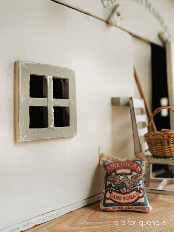
Next up I pulled out Dixie Belle’s Farmhouse silkscreen stencils

I especially thought the Fresh Eggs one would be perfect on the side of the barn.

I cut up the one with the chicken and just used the typography on both the other side …
and the front of the barn.

Once all of my paint was dry, I gave everything a coat of Dixie Belle’s clear wax.
And that brings me to the lights.
As I was working on this project I kept thinking how fun it would be to have some barn lights over the doors. So I went on Etsy just to see what was available out there. I ended up finding the perfect lights at Miniature Crush (although I ordered them through Etsy, you can also order items directly from Miniature Crush, and as a bonus for me, they are also located in Minnesota).
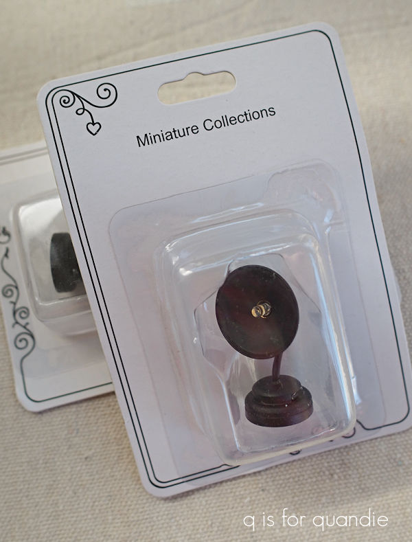
They came in a matte black color that was rather one dimensional though.

I wanted them to look galvanized so I pulled out some of Dixie Belle’s Gilding Wax. I started with the Zinc, but it was too dark and barely showed up over the black. So then I tried the Silver, which looked pretty good but was maybe just a bit too bright. I went back and added a bit of the Zinc over the Silver, and I still didn’t love it.

It doesn’t quite look authentic to me.
So then I pulled out the Dixie Belle Patina Paint in Copper, along with the Green activating spray. I first removed as much of the Gilding Wax as I could with a q tip dipped in mineral spirits. Then I painted over the lights with the Copper paint, and followed that up by dabbing the activating spray over the wet paint using a small brush.

Eureka! So much better. The totally look legit now.
One quick note about these lights. They are battery operated, and they have a little switch on the side to turn them on and off.

To get to the battery (which is replaceable) you have to screw off the back part of the base. So you can’t really glue these lights in place permanently. Instead they come with a tiny adhesive magnet on the back. You apply the adhesive side of the magnet to your item, then the light fixture hangs onto the magnet. Here’s the thing, that means they come away pretty easily. And that makes this item unsafe for small children who could pull them off and choke on them. So they would have to be removed if you wanted this to be a child’s toy.
In addition, the lights were $19.99 each! So now I have an additional $40 invested in this makeover. I’m not sure that was a wise decision, especially since I plan to try and sell this one.
But all of that being said, I sure do love how they look! And maybe someone else will as well.

I initially thought I would stop here, but then I was at Hobby Lobby and I came across a miniature weathervane.
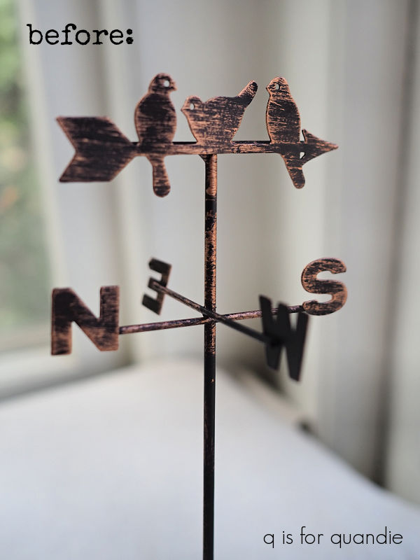
And at only $2.99, it was so much cheaper than the lights! So how could I resist?
I gave it the same treatment as the lights using the Copper patina paint.
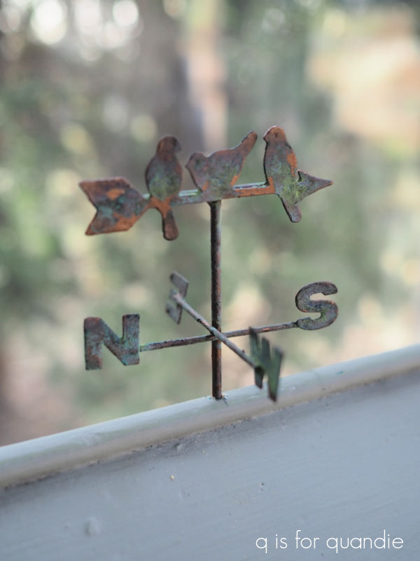
The verdigris patina develops pretty quickly with the Copper paint. And doesn’t the weathervane also look so much more authentic now?
I had to drill a hole in the roof of the barn to attach it, but that was fairly simple.

And with that, my barn makeover is complete.

How cute is that? I much prefer my toned down neutrals to the red and green.

What do you think?
If any of you locals just can’t resist adding this adorable barn to your decor, check out my ‘available for local sale‘ page for more details.


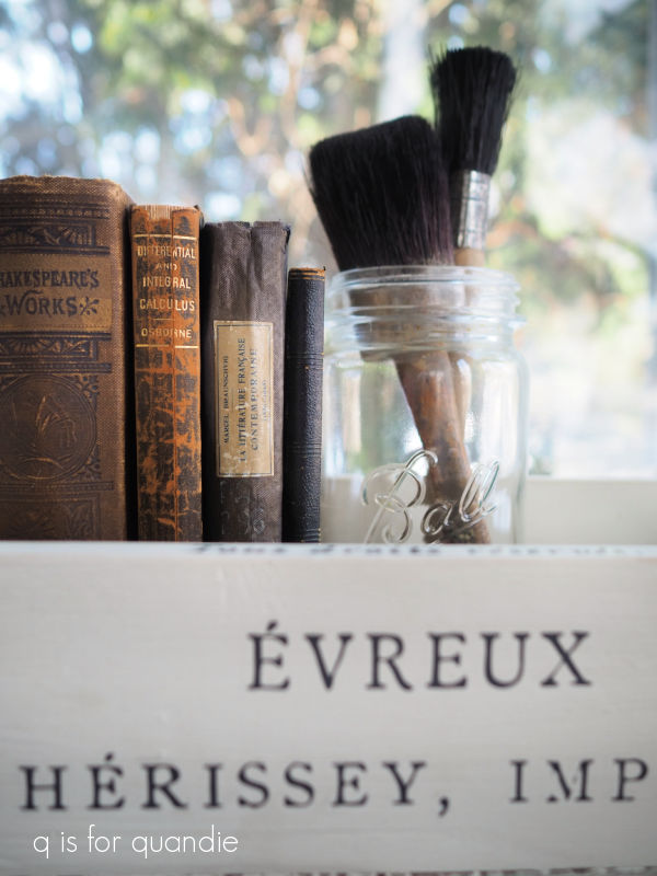


 That was one of my first cupboard door signs, but I really don’t remember when I painted it. I couldn’t find a blog post about it, so it may even be pre-blog. Back in 2014 (yikes! 10 years ago!) I put that French Market stencil on A LOT of items including cutting boards …
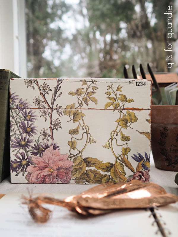