painted pumpkins.

I have mixed feelings about the color orange, how about you?

I love wearing it.  Over the years, some of my favorite articles of clothing have been orange.

I also tend to like orange foods.  Pumpkin, sweet potatoes, carrots, oranges, Dreamsicles … all good.

But I’m not a big fan of decorating with orange for fall.  At least not inside the house, outside might be a different matter with all of those beautiful fall colored leaves accented with some orange mums or pumpkins.

But inside, I want to go in a different direction so I decided to paint up a few pumpkins to match my decorating style a bit more.  I actually purchased these faux pumpkins last year after the fall season when they were 75% off.  I was thinking ahead for once!

I decided to give these a base coat of grey primer spray paint because I felt that would be easier to cover with my Dixie Belle colors than the orange.  Once I had them fully coated in the primer, I painted each one a different color.  I used Dixie Belle’s Sea Glass, Sawmill Gravy, Drop Cloth and French Linen (from left to right).

Next I added some transfers to each pumpkin.  This one got some bits from the IOD Label Ephemera transfer …

A couple of them got Classic Vintage Label transfers from re.design with prima …

and this one …

And this one got a section from their Paris Valley transfer …

Once the transfers were in place I pulled out some of my metallic waxes from re.design with prima to add to the pumpkin stems.

I used Eternal, which is a brighter gold, on two of them …

And I used Bronze Age on the other two, which is a little more subdued.

So, how about you?  Do you prefer a more traditional approach to decorating with pumpkins in the fall?

or would you be happier with something a little bit different?

You can find a recap of my less traditional fall decorating projects from previous years here.

As always, thank you to Dixie Belle Paint Co and to re.design with prima for providing the products used for today’s project.

If you’re looking for Dixie Belle products you can find them here.

If you’re looking for re.design with prima products you can find local retailers here, or online sources here.

some pig!

First up, congrats to Sue P and Jackie for winning the two Dixie Belle problem solver giveaways from last Monday (both winners have been contacted by email).

OK, I think it’s safe to reveal one of the new designs from re.design with prima today.  As you may know, as one of their brand ambassadors I get the opportunity to work with new designs before they are released to the public.  When they send these preview items to me, they come all rolled up together in a tube for a different transfer because the official packaging isn’t available yet.  In other words, I don’t really know what I’ve gotten until I take them out of the tube and unroll them.

Well, as soon as I unrolled the Farm Life transfers I fell in love with the pig.

Even Mr. Q said that was some pig.  It totally made us both think of Wilbur from Charlotte’s Web.  He does look ‘terrific’, ‘radiant’, and ‘humble’, doesn’t he?

You’d think I had a thing for pigs.  This is the 2nd time I’ve fallen in love with a pig.  The first time it was these knob transfers from prima’s Farmhouse Delight set.

But no, I don’t normally especially admire pigs.  Something about these two designs just spoke to me.

Anyway, as soon as I saw the new Farm Life set I knew I wanted to create a quartet of signs made on old cupboard doors.  There was only one problem, I didn’t have any old cupboard doors that were the right size.  So I decided to check out my local Habitat for Humanity ReStore.

I’d never been to a ReStore before, so I didn’t know quite what to expect.  I also was keeping my expectations low because really, what are the chances that I would find specifically what I was looking for at a 2nd hand store?

Well, as it turned out, apparently pretty good.  I found 4 cupboard doors that were exactly the size I needed.

Well, in fact I found 5.  So even though I only needed 4, I bought all five.  I can always do something else with the 5th one.

The prices were right too.  I got all 5 of them for just under $20.

I would have preferred old cabinet doors with several layers of old paint on them, but three of these were unfinished and the other two had a clear poly on them.  And I knew I could recreate that look myself.  I started out with a layer of Dixie Belle’s Cocoa Bean.

I just painted around the perimeter in this dark brown color because I wanted to see just hints of it when I distressed the edges.

Next I added a layer of Miss Mustard Seed’s Milk Paint in Kitchen Scale.  I think this color has a historic feel.  As though these cupboard doors were painted back in the 50’s, and then painted over again later.  Perfect for adding a little age to them.

Finally, I added several coats of Sweet Pickins Milk Paint in Window Pane.

I did get some good chipping, which is what I was going for.  However, I was surprised to find that the paint chipped all the way down to the original finish.  In other words, even the Dixie Belle Cocoa Bean paint chipped off in spots.

But that only happened on the two doors that had started out with a clear poly, so in hindsight that does make some sense.

Once all four cupboard doors were painted and sanded to distress the edges, I vacuumed away any loose paint and then added the transfers.  There are four designs in this set and each one is approx. 11″ wide x 16″ tall.

There’s the cows …

The chickens …

The horses …

And of course, the pigs …

There are some interesting bits of info on each one …

Who knew that the chicken was the closest living relative of the t-rex?

Once the transfers were in place, I added a topcoat of The Real Milk Paint Co’s Finishing Cream.  I used the Low Sheen version this time, but I have used the Dead Flat version in the past and I really don’t see much of a difference between the two.  I like using this product over chippy milk paint because it’s thick and therefore I’m not in danger of getting any runs.

Once that dried, I added some label holders to the bottom of each cupboard door.

I purchased these in sets of 3 from Hobby Lobby for $3.99. (although I’m sure I bought them during a 40% off sale and probably only paid $2.40 for them).

They are technically for scrapbooking and came with brads to attach them to paper, but I swapped out the brads for little tacks to hold them to my cupboard doors.

I filled them with some vintage price tags that I also had in my stash of scrapbooking supplies.

And just like that, I created some unique wall art.

Wouldn’t these doors be fun hung on the wall in a farmhouse style kitchen?

Although I’ve turned old cupboard doors into wall art, you could apply these transfers right to your kitchen cabinets.  They would also be perfect for adding to the cupboard doors on an old hoosier cabinet or hutch.  Or, you could cut up the designs and use smaller sections on canisters.  There are so many possibilities.  What would you do with them?

As always, thank you to re.design with prima for providing the transfers used in today’s project.  If you’re looking for a place to purchase their products, you can find info on online or retail stores here.

I’ve also used products from Dixie Belle Paint Co, Miss Mustard Seed’s Milk Paint, Sweet Pickins Milk Paint and The Real Milk Paint Co today, all of whom have provided me with free products (although I haven’t necessarily kept track of which ones I’ve paid for and which ones were complimentary!)

Finally, these Farm Life doors are for sale locally at $30 each (you must be able to pick them up at my house in a suburb of St. Paul, MN).  I’ll soon be taking them in to Reclaiming Beautiful (the shop where I sell on consignment), but in the meantime if you’re local and need some cute signs be sure to leave a comment or reach out via email at qisforquandie@gmail.com.

the vintage medicine cabinet.

First things first, congrats to Jennefer!  I drew her name as the winner of the red, white and blue giveaway from last Friday.

Now, on with the final post for this week.  I have to admit, sometimes I make choices that aren’t financially savvy.  I can get away with it because I’m just doing this as a hobby.  But if I was really trying to make a profit, or run a business, I’d be in trouble.  I know lots of you out there are working hard to do that and you probably just shake your head when I share projects like the one I’m sharing today.

But sometimes I just have to save a piece, even though I know I’m going to invest more time and money than it might be worth.  Maybe I should think of it in terms of emotional value rather than financial value, because I found the end result of today’s project really satisfying.

OK, so let’s start at the beginning.  I saw an ad on Facebook Marketplace for a pair of really beat up old chairs that would make perfect planter chairs so I made arrangements to go see them.

I seriously should have just walked away after looking at the chairs.  They were in really awful shape, they were filthy dirty and they were totally overpriced at $10 each.  Seriously, even if they had been free at the curb I think most sensible people would have passed them by.  At a minimum I should have bargained on the price.

But the sellers were super nice, and we got to chatting, and we’d come all that way (OK, well, really just to the next town over), so I bought them.  At that point the sellers must have seen ‘sucker’ written on my forehead, because the gentleman said ‘hey, I have some more old stuff you might be interested in, like this old cabinet …’

And after a bit of searching, he pulled this out of the pole barn.

As if the outside wasn’t grungy enough, just check out the inside …

Ewwwww.  Good grief, why would I take this on?  But there was just something about it that appealed to me.

The initial asking price was $20, but this time I at least had enough sense to bargain a bit.  I paid $15 which was still a bit high considering the condition.

That being said, I’m sure most some of you will agree that it definitely had potential.

So I brought it home, and washed it up using my Dawn Powerwash and the hose.

Next, I painted the inside using Dixie Belle’s Gravel Road 

I used Dixie Belle’s flat clear coat over the Gravel Road.  The dark grey is the perfect backdrop for a few pieces of ironstone.

I would have liked to salvage the original chippy paint finish on the outside of the cabinet, but it was just too grungy looking.  So instead I chose to use milk paint to refresh it without completely covering the entire piece.  I used Sweet Pickins milk paint in a color called Window Pane, a white with a grey undertone.

When I’m working on a piece like this, and I want it to retain its chippy, worn look, I try to be selective with my application of paint.  I avoid painting areas where the paint is totally chipped away …

I do end up allowing some of the original color to show (the cream colored areas), but overall the piece looks less dirty and more simply chippy and worn.

So, let’s talk about that transfer.  This is another section of the IOD Label Ephemera transfer that I used on yesterday’s card box.  Well, technically it’s two sections that I pieced together to fit on this cabinet.

Now, I think we all know that I don’t speak or read French.  So for all I know the wording on this makes absolutely no sense.  But it looks cool, and that works for me.

I also added a transfer to the inside of the door.

That is pieced together from the re.design with prima Ephemera Collector transfer.

This cabinet is meant to be hung on a wall.  If it’s just sitting on a table top it has a tendency to tip forward when the door is opened, so it has to be anchored in place somehow.

But I think it would be perfect for hanging on the wall in a bathroom.

Of course, you probably wouldn’t fill it with ironstone in that case.  Or maybe you would.  Who am I to judge?

For now I haven’t decided on the fate of this cabinet.  I kind of love it.  I’ll be carrying it around my house today trying to find a wall to hang it on.  I’m not sure if I can bear to part with this one.  You’ll just have to stay tuned to find out whether or not I found a spot for it.  In the meantime, have a great weekend!

abandoned hankie drawers.

I’m continuing to clear out the Carriage House.  Today’s project is this abandoned set of hankie drawers that I removed from a dresser some time in the distant past.

In fact, I searched back through my archives and for the life of me I can’t find a ‘before’ photo of a dresser with this section on top.  So it might even date back to the ‘pre-blog’ era.

Well, anyway, if you’ve followed me for a while you know that I’ve always liked to remove the hankie drawers from dressers.  I feel like a flat top makes the dresser more versatile so it can be used as a TV stand, or as a buffet type piece in the dining room.  I always save the cast off drawers though and turn them into a stand alone item (like this, and this, and this).  Usually they end up as individual drawers (like in those linked examples), but this one is a solid piece all the way across.

I painted the outside of the box in Dixie Belle’s Drop Cloth, and then I painted the insides of the drawers in their Apricot.  I used the DB Flat clear coat over the Apricot to give the insides of the drawers a little extra durability.

Apricot is quickly growing to be my favorite shade of pink.  It’s a peachy pink to be sure, and I really love the warmth of it.

Once the painting was done, I sanded lightly to distress and then added a section from the Violet Hill transfer from re.design with prima.

Isn’t that just gorgeous?  I have to admit, I felt a little guilty not saving this transfer to use on a full piece of furniture.  But what the heck?  I knew it would be perfect for this, and now I have a bunch of the transfer left over for more projects.

I have absolutely no recollection of what happened to the original drawer pulls.  Maybe I never had them?  Maybe I took them off to use on something else?  Who knows.  But I found a set of 3 vintage pulls in my stash of old hardware that ended up working out perfectly.

At this point you’re probably thinking ‘ok, well, that’s real pretty, but what would you do with it?’

I’ve got a couple of ideas.  The most obvious, put it on top of a dresser and use it as a jewelry box.

If you have lots of jewelry, this would be a great option because it would hold quite a bit.

Another idea, add it to your desk under your computer monitor to store office supplies and to give your monitor a little extra height.

For those of you still working from home due to COVID, this would be a lovely way to organize your work space.

Finally, this would be a great addition to a craft room to hold all sorts of various crafting supplies.

I brought this piece to Reclaiming Beautiful this week, so I guess we’ll see if anyone out there has just the right purpose for it.

As always, thank you to Dixie Belle Paint Co and to re.design with prima for providing the products used for today’s projects.

If you’re looking for Dixie Belle products you can find them here.

If you’re looking for re.design with prima products you can find local retailers here, or online sources here.


back to back barn sales.

I’m sure most of you have been hearing about the civil unrest that started in Minneapolis last week and has now spread to many other cities as well.  I’m not going to comment on that situation here on my blog because I like to keep this space positive.  Usually I’m a ‘glass half full’, ‘look on the bright side’ kind of person.  But I truly can’t find anything positive to say about what is happening in the Twin Cities.  The entire situation is simply heartbreaking.

After watching things go from bad to worse over several days, my sister, niece and I decided to literally put the city in the rear view mirror and head out into the country on Saturday.  It was a gorgeous, although a bit cool, sunny day.  We grabbed sweatshirts and hopped into my convertible VW bug and headed east.  We then drove north along the St. Croix River to Mr. Q’s home town, Marine on the St. Croix, where we stopped off to score some snacks at the general store.  Restaurants are still not open here in Minnesota, so we have to improvise.

Next up was The Garden Gate at Crabtree’s, a cute little shop with lots of garden ornaments.  From there we headed back west to the Gammelgården Museum in Scandia.

If you’ve followed me for a while, you know how much I love open air museums.  I’ve visited them in Stockholm, Oslo, Aarhus and of course there was The Beamish, in County Durham, England.

The Gammelgården in Scandia doesn’t really hold a candle to any of those, but it’s still fun to check it out.  Unfortunately, although we escaped from rioting and looting, we couldn’t escape from COVID.

The giant Dala horses all wore masks, and none of the historic buildings were open.  We were able to wander around the grounds and admire them from the outside though.

The Präst Hus was built in 1868 and I find the construction fascinating.  Just look closely at the corner of the building …

It’s dovetailed, like a giant piece of furniture!

After leaving the Gammelgården, we stopped at another historic site, the Hay Lake School.

Once again, the site was not open due to COVID, but we did peek in the windows.

This one room schoolhouse was built in 1896 and was in use until 1963!

As we started to make our way back home, we spotted a sign for a barn sale.  I can’t tell you how excited I was to see that!  A barn sale!  Of course we had to stop.

We followed the signs, made our way down a dirt driveway, and behold …

A legit barn sale!

I found a few goodies to purchase including a set of 4 old cupboard doors that I’ll turn into signs …

Some old buckets that I’ll dress up with transfers to be used as planters …

And this fab old shoe form.

And then, as if that wasn’t good enough, the proprietors of this sale told us there was a 2nd barn sale just up the road.  Back to back barn sales!  It was our lucky day.

This 2nd sale was actually more of an occasional sale, although it was technically in a barn.  They were selling pieces that have already been given a face lift, lots of painted furniture and other goodies.  As the guy at the first barn sale put it, he was the K-mart of barn sales and they were the Macy’s of barn sales.

None the less, I found a few things to buy including a glass jar and an old coffee pot that will both get dressed up with transfers.

Also, I had been looking for something to perch my Lunch Menu planter on and this $10 stool looked just about right.

I know it won’t hold up well outdoors forever, but for $10 it’s OK if it just lasts a season or two.

Our escape to the country on Saturday provided a much needed getaway for all of us.  We were able to forget about the world’s problems for a while and just enjoy some peaceful scenery on a beautiful sunny day.

Capping it off with back to back barn sales was the cherry on the sundae.

While normally Debbie and Kris would have stayed at our place afterwards for a bonfire, or a game night, they had to get home before the 8 pm curfew that was in place over the weekend.  That being said, we are all safe and healthy and I hope you are all the same!

when it rains, it pours.

I really don’t want this post to come across as a ‘poor me’ sort of post, but seriously you guys.  When it rains, it pours.

I’ve now had to have two emergency root canals in the last two months, the second one was this week and it required two visits (or about 3.5 hours of time in the chair) to complete it.  Apparently not only is the domino effect a thing when it comes to decorating, but it can also be a thing when it comes to root canals.

Ugh!

As I result, I have nothing to share today.

But rather than leave you hanging, here are some canals that are much more enjoyable than root canals.

Of course, when I think ‘canal’ I immediately think of Venice.

I’d much rather be enjoying the canals of Venice than a trip to the endodontist, wouldn’t you?

The canals in Copenhagen are really lovely too.

Naturally you can take a guided tour of them by boat.

Prague has some of the most picturesque canals I’ve ever seen.

And you can tour them as well on these charming little boats.

When my family lived in south Florida back in the 70’s, we lived on a canal.  Granted, a much less grand one than this one in Ft. Lauderdale …

But it had ocean access and we were able to keep a boat right at our own dock.  We often spent Saturday’s or Sunday’s cruising around the canals.

All in all, any one of these canals is much preferable to a root canal, wouldn’t you agree?

OK, not to worry, I do have some fun projects coming up.  I’ve been working with the newest re.design with prima transfers that are being released next Friday.  Here’s a little sneak peek at one of them …

OK, I know, you can barely see it back there, but it’s called Vintage Seed and it’s right up my alley.

You’ll just have to check back next Friday to see the full reveal!

my social distancing glasses.

Every now and then I drop hints about my age, and sometimes I even just come right out and say it out loud … I am 56 years old.  And these days that means I can’t see my hand in front of my face without ‘cheaters’.

Up until the age of 40 I had perfect 20/20 vision.  But I practically had to go out and buy a pair of readers on my 40th birthday.  Or at least it felt that way.  In many ways it seems like my previously perfect vision left me woefully unprepared to handle even the slightest blurring.

At first I only needed readers for the really small print, and only the lowest magnification.  But over time I found myself having to transition from the 1.25+ to the 1.5+ to the 2+.  Then I found myself needing the 1.25+ to see the TV clearly and read street signs while I drove, while I needed the 2.5+ to read small print.

For several years now I’ve found myself switching back and forth between a 1.25+ and a 2.5+ depending on whether I need to see up close, or far away.  It’s kind of a pain in the butt.

But when it really gets annoying is while garage saling … and we can’t have that!

I’d have to wear the 1.25+’s to scope out the whole scene and zero in on the items I wanted to head for first, but then switch out to the 2.5+’s to read the price tag.

I was constantly juggling two pairs of glasses over the past several years and it was really getting annoying.

So, in anticipation of garage sale season 2020, I finally made an eye doctor appointment a while back so I could get some bi-focals.  I paid around $600 for some progressive lens bi-focals (so they don’t have that line in them that immediately brands you as an old person).  Then COVID-19 starting going strong here in the U.S. and delivery of my glasses was delayed.  I finally got a call last week that they were in, but my eye clinic’s hours were reduced to 9 a.m. to 11 a.m. each day.  Fortunately, it’s not far from my office so I snuck out of the office one morning earlier this week to pick them up.

I have to say … bi-focals are definitely going to take some getting used to.

What I noticed about them initially is that in order to see someone’s face clearly I have to be right around 6′ away from them.  Any closer and they start to get blurry.

That’s when I realized!  I seem to have inadvertently purchased ‘social distancing glasses’.

In order to see the face of the person I’m talking to clearly, I will have to stand about 6′ away.

Did they make them this way on purpose?

 Recently I read an article that said we shouldn’t be calling this ‘social distancing’ at all.  We should simply be calling it ‘physical distancing’.  During these crazy, totally strange, emotionally unbalancing times, we don’t need to be socially distanced.  Instead we should be working on reinforcing our social bonds, or getting socially closer.  And we can easily do that by phone, email, text, Zoom video conferencing, Skype, Instagram, Facebook and any of the other multitudes of social media platforms out there.  The only distance we really need to maintain is a physical one, not a social one.

So how about we all start calling it ‘physical distancing’ instead of ‘social distancing’?  Who’s with me on that one?

And who else out there has graduated to the bi-focal?  How long is it going to take me to get used to these things?  Because for now I feel a bit sea sick wearing them, and it seems like nothing is perfectly clear … or maybe that’s just how everyone feels these days.

dying to try it.

Well here I am, like many of us, stuck at home.  I’m very fortunate to be able to do some of my regular day job work from home, and I’m still going in to the office every few days to take care of things I can’t do at home.  Aside from that, I’m trying very hard to do my part and comply with the Stay at Home order here in Minnesota.  The basic tenet of our Stay at Home order is that one should stay at home when at all possible.

For me, that means that for the time being I’m not buying or selling furniture via Craigslist or Facebook Marketplace.  If you’ve been reading my blog for long, then you realize that furniture painting/blogging is just a side gig for me.  It doesn’t pay the bills or put food on the table, I have the day job for that.  So in my case, I feel like I should avoid those transactions for now.

However, it’s important to note here that I do not think everyone has to be doing this.  I say more power to those who are finding ways to practice ‘social distancing’ while still working their businesses.  Reclaiming Beautiful (the brick and mortar shop where I sell on consignment) is posting their furniture pieces online and having some success with selling by appointment (check out their Facebook page here to see what they have).

But in my case, I’m going to try to continue to work with things that I already have on hand.  Of course, it’s a tad ironic that I started working my way through my stash of projects several months ago before we’d even heard of COVID-19.  In hindsight, I should have kept buying furniture to stock up instead, because then I would have plenty to work on now.

Instead, I’m having to dig deep for projects to work on.

When Victoria mentioned that she was sewing napkins in her comment last week it reminded me that I had a stash of linen napkins that I’ve been meaning to dye (thanks again for sparking that idea Victoria!).

Ding, ding, ding.  The perfect project to complete while ‘staying at home’.

So I grabbed some Dixie Belle paint in colors that I thought would be pretty on napkins.

I ended up choosing Mermaid Tail, Antebellum Blue and Honky Tonk Red.  That last one was meant to be Peony, but I grabbed the wrong jar.  However, as you’ll see in a few minutes, that worked out OK because I ended up with a pretty pink anyway.

Before getting started, I googled a few YouTube videos and blog posts about how to dye fabric using chalk paint.  As generally seems to be the case when researching online, I got some conflicting info.  So I tried to sort through the tips based on my previous experience with actual dye (I dyed lots of these vintage linen napkins back in the day using actual fabric dye).

Let’s run through the basic process first.

Step 1:  Wash the napkins in hot water.  This may or may not be necessary depending on the item you are dying.  Since I was using vintage linen napkins that looked as though they hadn’t been washed in decades, washing seemed like a good idea.   Another thing to note here, choose a natural fiber like cotton or linen.  Polyester can only be dyed with specially formulated dyes.

Step 2:  Fill a wash pan with luke warm water and then add your paint.  Stir well, making sure that the paint is fully dissolved and mixed in with the water.  If you have clumps of solid paint in your water you will get dark spots of paint on your fabric.  You should use approximately 1 part paint to 20 parts water.  I don’t think I used quite enough paint because I followed conflicting advice to use just one tablespoon of paint.  As you’ll see shortly, my color ended up very pale.

Step 3:  Add the napkins, still wet from being washed.  This is another conflicting piece of advice from my google results.  Some people added dry fabric, some added wet.  When I used fabric dye back in the day, I always put items in wet, so I went with that approach.

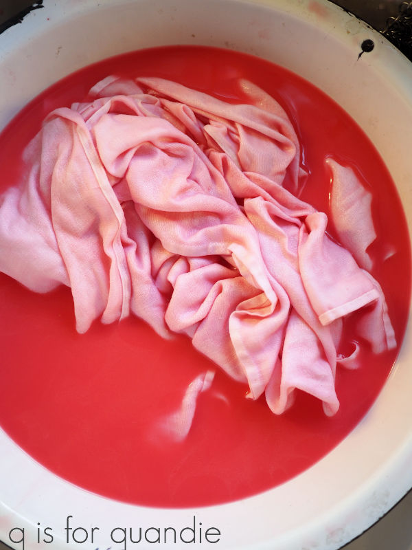
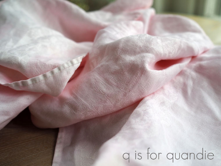
Step 4:  Swish the fabric around for about 5 minutes or so.  Again, this is another step where I read conflicting instructions online.  Some said to leave it absolutely no longer than 5 minutes, others said to leave it for at least 30 minutes or longer.  I went with five minutes on my first batch using the Honky Tonk Red.

Step 5:  Remove the napkins from the dye bath and rinse them (or not).  I found that rinsing removed quite a bit of the color leaving my napkins a pale pink.  Be sure to read to the end of this post to learn about the results I got without rinsing.

Step 6:  Dry the napkins in your clothes dryer using high heat to set to set the color.

Step 7:  Press the napkins using high heat to make doubly sure the color is set.

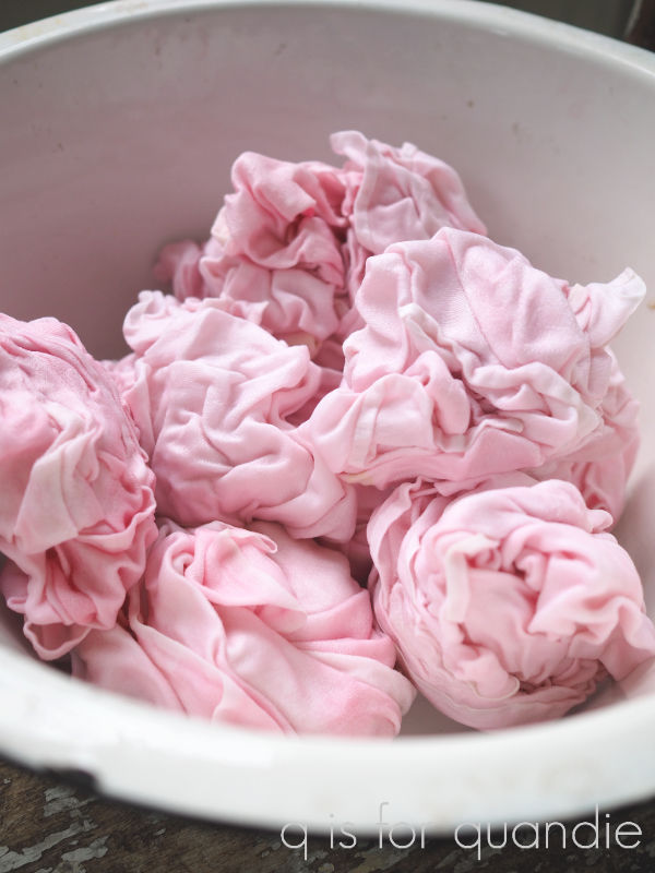
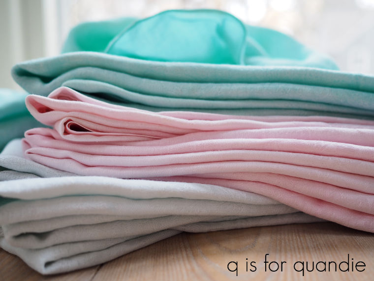
This was my first batch, and they turned out quite pretty.  If you keep in mind that you’re going to get a very pale version of the paint color, you will be happy with these results.

Also, keep in mind that hand dyed fabrics will have inconsistencies in the color.  But that’s part of their charm.

I followed the same process for my second batch, but used Dixie Belle’s Antebellum Blue as the color.

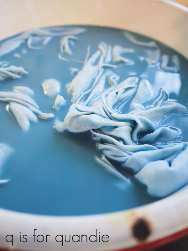
Again, the resulting color was quite a bit lighter than I expected. You can see how dark the paint color is in the spoon.

But the napkins ended up being a beautiful pale blue.

Things pretty much went off the rails with the third batch I tried using Mermaid Tail.

It sure looked pretty in the water.  But this time I wanted to try to retain more of the color so I decided not to rinse.  I was going to throw them in the dryer to set the color, but Mr. Q was worried I’d end up with paint in the dryer.  So I opted to try line drying them without rinsing, then setting the color with the hot iron.  That was pretty much a fail.  Line drying them left an obvious line of darker color where the napkin was hanging across the line.

I decided to cut my losses at this point and try washing out the color and starting over.  I can verify that if you don’t set the color with heat, most of it will wash out.

So it was back to the drawing board after that.  The second time around I put the napkins into the dye bath dry, added quite a bit more paint to the water (closer to the 1 part paint to 20 parts water), and shhhh, don’t tell Mr. Q but I didn’t rinse them.  I wrung them out and then threw them in the dryer.

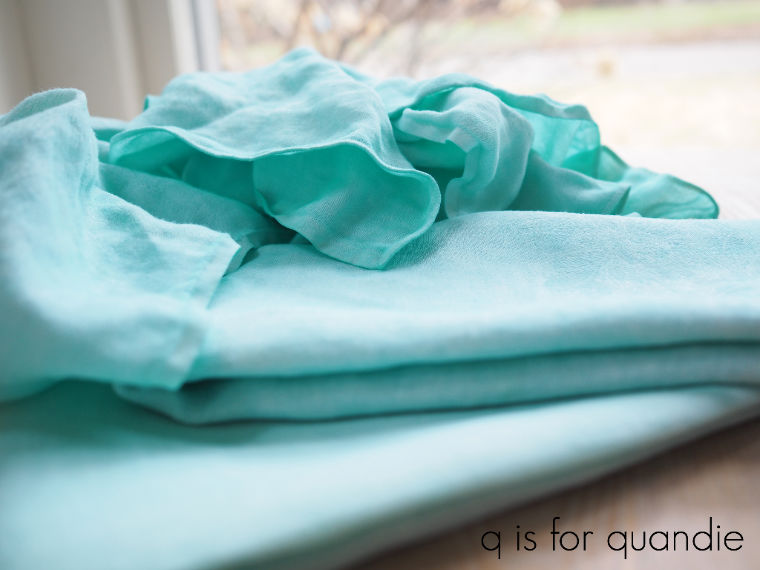
Eureka!  We have a winner!  They turned out gorgeous.

However, they did leave a film of Mermaid Tail paint inside my dryer.  Ooops.  Luckily it wiped right out using a damp cloth.  But keep this in mind if you decide to try it at home.  You will need to clean out your dryer immediately afterwards.

If you’re stuck at home and looking for a fun afternoon craft project, I highly recommend experimenting with dying fabric using chalk paint.  To recap, for best results, wash and dry your fabric first, use 1 part paint to 20 parts water luke warm water,  agitate while soaking for about 5 minutes, ring out excess water but don’t rinse, dry with high heat and then immediately wipe out your dryer.  Got that?

I’m curious, have any of you tried it?  Got any tips for the rest of us?

As always, thanks to Dixie Belle Paint Co for supplying the paint for this project.  Please note that many of the local Dixie Belle Paint retailers are still available to ship paint, or they may be offering curb-side pick up.  You can find your local retailer here.  If you don’t have a local retailer, you can also order Dixie Belle products here.  Dixie Belle Paint Co is continuing to ship orders as well.

the statute of limitations.

I think I’ve already mentioned that over the last year or so I’ve been trying to work my way through my stashes of stuff out in the carriage house.  For any of you who might be new to my blog, this is the carriage house …

It has a 2nd floor that we use for storage.  It sounds like an amazing set up for someone like me who does furniture makeovers, but the stairway to get upstairs is steep and has a turn in it and as a result we never haul any of the larger/heavier pieces of furniture up there.  I do have a few smaller things in a pile up there though.  A couple of chairs, small tables, and other random stuff.

One of the random bits of stuff was a fun half-chair shelf that a friend of mine made.  Way back when I hosted an occasional sale out of the carriage house she had brought this chair/shelf over to sell.  It didn’t sell, but she never came back for it.  I reminded her a few times that I still had it.  That was nearly five years ago.  We’ve since lost touch.  Meanwhile, the chair/shelf has been sitting there taking up space and collecting dust for all of that time.

So I figure the statute of limitations is up.  This piece is now mine to do with as I please.  So I gave it a little makeover last weekend.

I neglected to get a ‘before’ photo, but it was painted in a glossy-ish black.  Too shiny for my taste.  It also had book pages glued to the seat, but they were mostly falling off, so it was easy to remove them completely.  Once that was done, I decided to just work with the black so I painted over it with Dixie Belle’s Midnight Sky to give it a flat finish.

But then I decided that black just wasn’t going to cut it.  It’s such a funky piece, it needed more of a statement color.  So I mixed up some Sweet Pickens milk paint in my favorite of their colors, In a Pickle.

I added two coats of the milk paint over the Midnight Sky.  I was surprised to find that I got quite a lot of chipping.  I didn’t think the fresh Dixie Belle paint would resist the milk paint this much.  And much more so in some areas than others.

In hindsight, I wish I’d put a different color under the green.  Had I predicted this level of chipping, I definitely would have.  I’m not really loving the black and green combo, but I decided to work with it, instead of against it.  So, I added a section of black wording from re.design with prima’s Everyday Farmhouse transfer to help tie in the black.

Once I had that in place, I added a top coat of Dixie Belle’s Howdy Do Hemp Oil.

My q tip of the day;  always apply a transfer before you apply wax or hemp oil.  You will struggle to get a transfer to adhere over freshly applied wax or hemp oil.  If you have a piece with a wax or hemp oil finish already on it and you badly want to add a transfer, you should wait until the finish has cured a full 30 days.

It wasn’t until I actually tried to hang the shelf for a photo shoot that I realized that it wasn’t going to be very structurally sound using the hardware that was already on it (three strategically placed saw tooth hangers).  I was able to hang it long enough to get some photos, but I wouldn’t have wanted to put anything breakable on it, just in case.  So now I’m going to add a couple of ‘L’ brackets to it before taking it in to the shop to sell.  I want it to be functional as well as pretty.

As always, thank you to Dixie Belle Paint Co for supplying the Howdy Do Hemp Oil and to re.design with prima for supply the transfer.

have suitcase, will travel.

I really didn’t mean to have a ‘suitcase’ theme lately, but I seem to have been on a suitcase painting frenzy.

In addition to the two thrifted suitcases I brought home a week or two ago (I shared one of them last week), I also had a third suitcase waiting in the wings.  This is one that I shared a while back when my picker, Sue, found it for me.

I took into Reclaiming Beautiful to sell ‘as is’, and guess what?  It didn’t sell.

I wasn’t really surprised because this style of suitcase doesn’t appeal to many.  It was nice quality though, so I thought it was worth a shot.  But it hadn’t sold after months and months, so I brought it back home to give it a paint job.

When re.design with prima sent me some of their brand new 2020 transfers they included this one called Spring Flowers.

Wouldn’t that one on the lower right be perfect for a piano!

Anyway, it turned out that these were the just the right size for the suitcase from my picker.  So I chose the one on the bottom left to use on it.

I started out by painting it in Dixie Belle’s Sea Glass.  Once it was totally dry (I usually wait overnight) I applied the transfer and then distressed the edges of the case.  Then I added a thin coat of clear wax.

Super simple.  But so pretty.

The second thrift store suitcase was the same style, but a bit larger.

The makeover of this one could have been just as simple as the Sea Glass one, but oh no.  I decided to switch horses mid-stream, as you’ll see in a minute.

First I decided to use the top half of the Fresh Flowers transfer on it, the part with the pick up truck.

I had used the bottom half on a table last summer …

so I was waiting for something to come along that would be perfect for the top half.

I thought painting the suitcase black would be the perfect choice to work with that black pick up truck.  So, I started by painting the suitcase in Dixie Belle’s Midnight Sky.  The transfer itself is one solid sheet, but it’s not completely opaque.  So the color behind it will impact how it looks and I felt like black would be too dark.  Therefore I measured out where the transfer would go and painted just that area in Dixie Belle’s Drop Cloth (a creamy off-white).  Once dry, I applied the transfer.

Then I took a step back and looked at it.  Nope.  It wasn’t working for me at all.  I should have taken a photo, but it was evening and I didn’t have good light.

It’s possible someone else would have loved it, but I didn’t.

I decided it would look so much better if the whole thing was painted in Drop Cloth.

This project would have been SO much simpler had I just painted it Drop Cloth to begin with.  Instead I had to carefully paint around the transfer with two coats of paint.

In the end, I love how it turned out, but it could have been so much easier.

Not only did I have to go back to the drawing board while painting this one, I also had to start over not just once, but twice when trying to photograph it.  I felt like the first two attempts just didn’t do the suitcase justice.

I ended up setting up some garden themed staging just to create a backdrop for the suitcase.

Talk about overkill.

But, it was fun.  I love dreaming about gardening in the middle of January, don’t you?

I think I’m done painting suitcases for a while now.

On another note, by now you guys must be wondering ‘is Quandie ever going to paint another piece of furniture instead of all of these smalls?’

And the answer is yes!

I gave myself a bit of a break from the larger pieces over the holidays.  Then I got on a roll trying to finish up a bunch of smaller things that had accumulated over the course of last year’s garage sale season.  But I’ve been missing the furniture too.

First I had to find some though.  So over the last week or so Mr. Q and I brought home four pieces of furniture.  Here’s a couple of them …

I’ve also brought home another bed that my handyman Ken is working on turning into a bench.

The fourth piece is a dresser that I’m painting as part of a collaboration between the re.design with prima design team and a paint that I’ve never used before, Amulent Decor Paint from The Chippy Barn.

So, be sure to stay tuned, I’ll definitely have a few furniture makeover posts to share in the coming weeks.

As always, thank you to Dixie Belle Paint Co and re.design with prima for providing the products used on the two suitcases I shared today.