adding just a little glam.

First up, congrats to Jill O. I drew her name and will be sending her the paint blending giveaway from last week.  Second thing, the toolbox from Wednesday went super fast and I had about 4 more people who wanted it.  Clearly I need to be on the lookout for more toolboxes to paint!
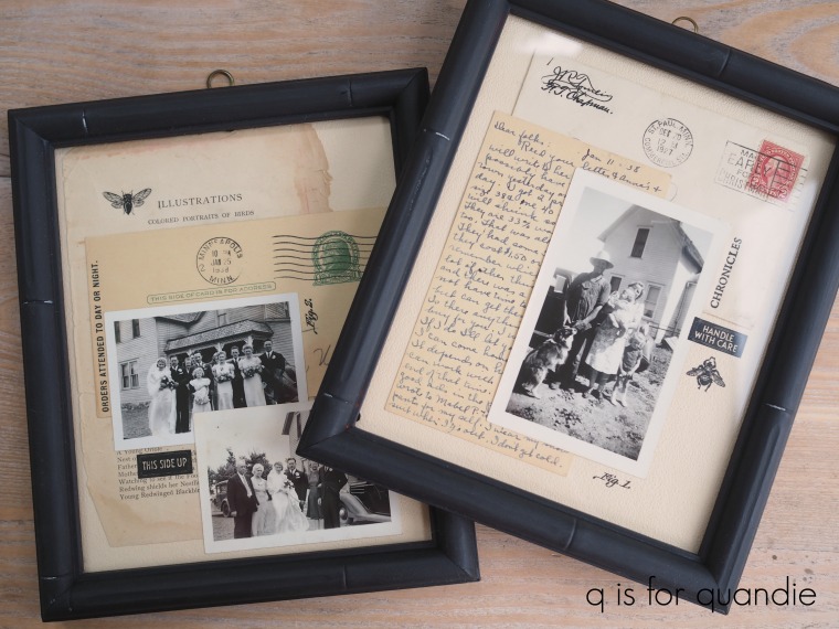
In the meantime, remember a while back when I painted these faux bamboo picture frames?

I have to confess that in the end, the paint was just a little bit too flat.  It didn’t bring out the bamboo-ish-ness of the frames at all.

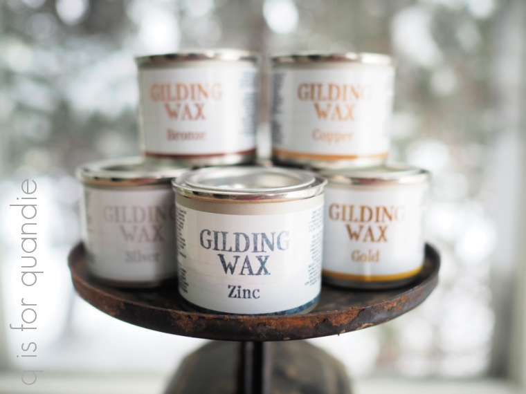
So when Dixie Belle sent me some of their new gilding waxes to try I decided to dress them back up again.

The gilding waxes come in six colors; gold, copper, silver, bronze, black and zinc and they have a metallic look to them.

Although these are just little bitty pots of wax, a little bit goes a long way with them.  I suspect one pot will last a long time unless you are gilding an entire piece of furniture or something.

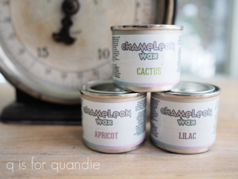
Dixie Belle also sent some of their iridescent wax called Chameleon Wax.

The first step was to test out all of the waxes to see how they looked, so I pulled out an old painted board and used a q tip to add a swatch of each wax.

My favorites are the gold (seriously, isn’t that gold amazing?) and the copper, and I really can’t wait to find something to use the zinc on.  You can really see the iridescence of the Chameleon waxes on my sample board too.

The black doesn’t look like much in my photo, but it does have a bit of a metallic look to it in person and reminds me quite a lot of the wax I used on this piece.

All of these Dixie Belle waxes would work brilliantly when applied with a stencil like I did on that buffet.

But for my frames I ended up deciding to go with the bronze.

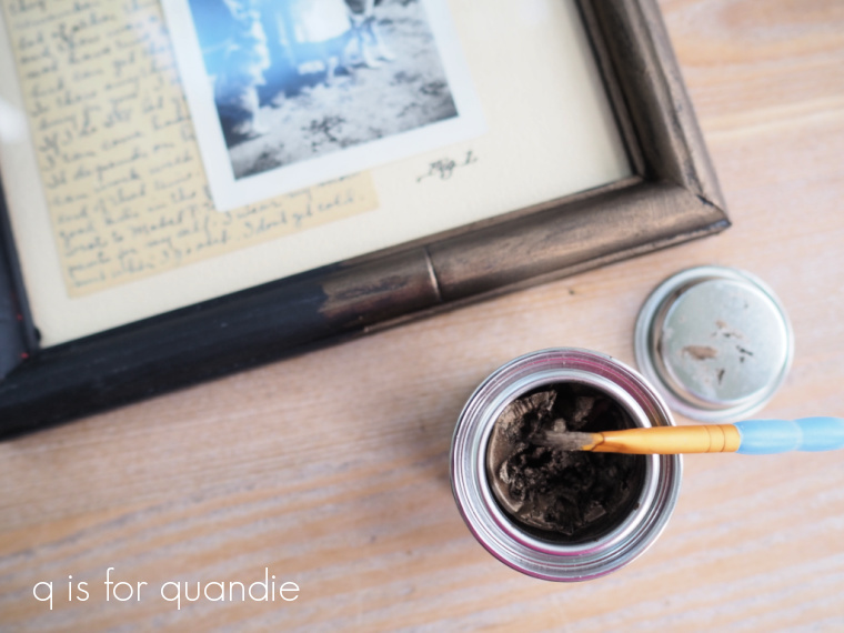
I used a small artists brush to apply the wax, but you could use your finger, a cloth, or a q tip.  In my case I wanted to wax the frame without removing the glass (pure laziness on my part), so I needed to be precise and the brush worked perfectly for that.

After applying the wax you can wipe it back immediately if you want to remove some of the product (and I did do that).  You need to do that right away, the wax will dry in 30 to 60 minutes and then you won’t be able to wipe it back.  Once the wax has dried for 12 hours, you can buff it to bring out more shine.

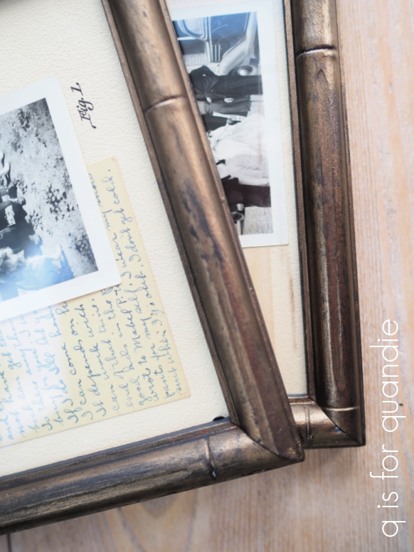
I tried to get a good photo of the difference once you buff it (above), but I’m not sure you can really see it.  The frame on top is not buffed, the one underneath is.  It does add quite a bit of shine if you buff it after 12 hours.

Just a couple of q tips on these waxes.  Keep in mind that they are not VOC free like so many of the products I use, so be sure to use them in a well ventilated area.  Also, they are an oil based product, so you’ll have to clean your brush (if you choose to use one) using mineral spirits.  Although in my case I used the Fusion brush cleaner and that seemed to work perfectly fine.

I had debated whether to use the gold or the bronze, but in the end I chose the more subtle look of the bronze.  The warmth of the bronze color works well with my collages of old family photos and ephemera.

Then again, if I change my mind later I could always add the gold over the bronze because these gilding waxes can be layered …

In fact, as I’m writing this I’m thinking maybe I should try that.  Just add a little touch of gold here and there.  Maybe I’ll just go do that real quick …

OK, I added just a dab of the gold here and there, mostly at the joints of the faux bamboo.  It really brightened things up, didn’t it?

If you’ve never tried any of these metallic waxes, I highly recommend giving them a try.  They are perfect for use on old metal hardware, or in this case on old picture frames.

What do you think?  Would you have left the frames in the flat black paint, or left them with just the bronze wax added?  Or do you like the brighter look with the gold added?

Thank you to Dixie Belle for providing me with the gilding wax used on today’s project.


another sales pitch.

I hope no one is too disappointed to realize that today’s post is nothing more than a thinly veiled sales pitch.  Well … for that matter it’s not really even veiled at all.  It just is a sale pitch.

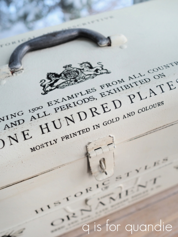
Remember the tool box that I shared back in October?

It was snatched up right away by one of my local readers.  There were a couple of additional readers who expressed interest in buying it, but they were too late.

However, I just happened to have more toolboxes on hand, so I told the 2nd interested party that I would paint another one for her.

As you can see, it’s not exactly the same.  I used some different sections of the IOD Label Ephemera transfer on this one.  But it’s very similar in style.

I also used a different color on the inside of this one.

This time I used Dixie Belle’s Flamingo to add a pop of color to the interior.  Last time I used Peony.

Once again I also lined the bottom using one of re.design by prima’s decoupage tissue papers.

So, you must be wondering at this point, why is Q calling this a sales pitch when she already has a buyer lined up for it?

Well, my buyer didn’t follow through.  I’ve reached out to her a few times but, as you can see, I still have the toolbox.  I’m not complaining, I know full well that people get busy, life gets crazy, etc.  The best laid plans and all … especially these days with COVID running rampant.

But I think it’s time for me to stop beating a dead horse, move on, and see if someone else wants to purchase it.

The price is $38 and the toolbox is 20.25″ wide x 8.5″ deep by 9.75″ tall.  Quick update:  I do have a buyer!

As you all know, I don’t like to ship things (I’m just not set up for it and so far haven’t found that I need to be) so the potential buyer will have to be a local who can pick it up.  If interested, you can email me at qisforquandie@gmail.com, or leave a comment here on the blog.  First come, first served.

If there aren’t any takers, it will go in the pile of things I’m putting together for the next time I take a load of items to the shop that sells things for me, Reclaiming Beautiful in Stillwater, MN.  I’m sure that eventually this piece will end up going to a good home!

the recipe box.

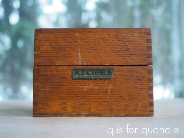
Well, you guys spoke and I listened.  When I posted the little wooden recipe box that I thrifted recently, I asked you guys if I should paint it or not.

I have to confess, I was rather surprised that almost all of you said don’t paint it.

Well, OK then, I’m willing to give it a shot.

What isn’t super apparent in that ‘before’ photo is that the box was filthy dirty.  Like … totally gross really.  So the first step was to clean it well.  I used my spray Dawn dish soap for that.  I scrubbed it with one of those plastic scrubby pads and the soap, and rinsed it with warm water.  You should have seen the dirt that came off it!

Once clean, I let it air dry.  Here’s how it looked after that cleaning.

Definitely not an improvement, right?

But don’t be put off by this step, this box is still salvageable without totally refinishing it.

Next I sanded it lightly all over (except over that Recipes label) with 220 grit sandpaper.  I followed that up with some of Dixie Belle’s Big Mama’s Butta.

Ahhhh, so much better.  Isn’t it fantastic what that stuff does for old, dried out wood?

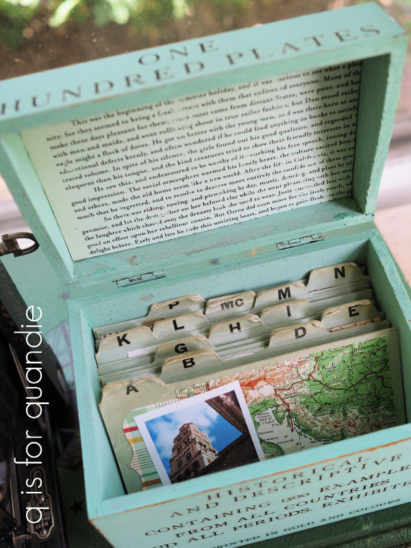
Several of you also suggested that I paint just the inside of the box, so I took that advice as well.  I painted it in Dixie Belle’s Gravel Road and then I added a little bit of the decoupage tissue paper from re.design with prima.

I love the way the dark grey works with the wood tone on the outside.

I just happened to have a set of index cards that fit the box perfectly.

I don’t suppose one typically uses alphabet index cards for recipes though, do they?  You’d probably more likely find cards that say ‘salads’, ‘appetizers’, and things like that in a recipe box.

Well, personally, if I was keeping this box I think I’d use it as a scrapbook instead of using it for recipes.  You may remember that I have done that before

So I’m going to leave the alphabet index cards with the box and see if it inspires anyone to do something similar.

At this point, it just remains to be seen whether or not the box will sell.  I’m going to price it at $18 and see what happens.  I’ll keep you posted!

making it my own.

A bit before Christmas, my sister and I stopped in at Hobby Lobby.  While we were browsing around, I mentioned that I needed a bigger vessel for holding my colored pencils.  So I wanted to look at their galvanized containers.

I found just what I wanted, but unfortunately the storage & organizing pieces weren’t 50% off that day.  I think we all know by now that you should only buy things at Hobby Lobby when they are half off (or with a 40% off coupon).  Otherwise, they are simply 100% overpriced.

As luck would have it, neither of us had thought to bring a 40% off coupon with us either.

I was about to put the item back on the shelf when my sister took from me and said “I need one more thing to get you for Christmas.”  I tried to talk her out of it.  It just made me cringe to see her spend twice as much as she had to for it.  But she brushed me off, pointing out that she wasn’t too worried about the extra $12.50 (the container’s full price was $25).

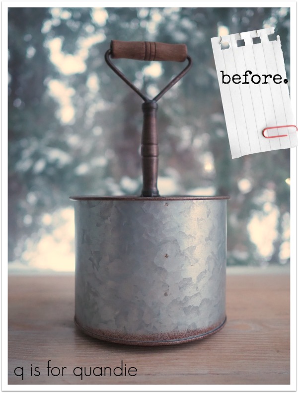
Here it is …

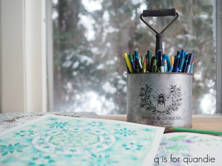
Yep, definitely overpriced at $25.  But from the start I planned to add a little something to make it my own.

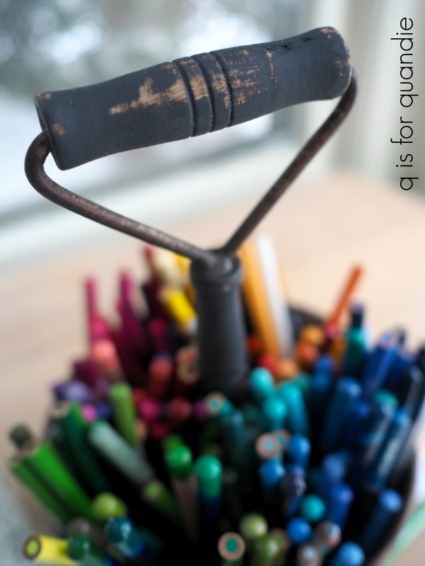
I started by painted the wooden parts of the handle black using Dixie Belle’s Midnight Sky.  Prior to being painted, the upper part of the handle was a cheap looking wood tone, and the lower part was a bronze color.  I knew black would be more my style.

I distressed the black and then added a clear wax finish.

Next I added a Classic Vintage Label from re.design with prima to the front.

It has so much more personality now, right?

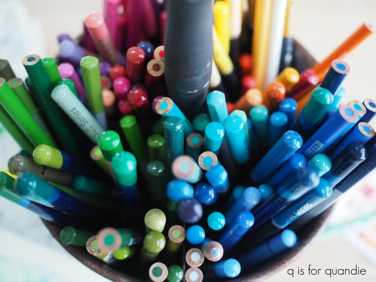
This container is divided into 4 sections, so it’s perfect for organizing my pencils by color.

I was always searching for the different shades of a color with my last storage system, which was basically everything thrown together in a mish mash.

Coloring is entirely a winter hobby for me.  In the summer I’m usually busy out in my workshop in the evening, but this time of year I can’t be out there.  Plus, it’s dark and cold and I really just want to put on some fleecy pajama pants and watch TV on the sofa after working all day.  Unfortunately, that kind of behavior also leads to excessive snacking.  But I find that if I keep my hands busy with something, I’m not as tempted to snack.

The one downside to this plan is that it’s difficult to watch anything in a foreign language (and we do tend to watch a fair amount of foreign stuff).  You can’t really read subtitles and color at the same time.

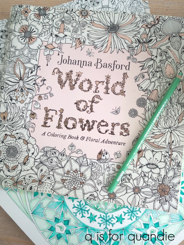
My favorite coloring books are those by Johanna Basford.  Her World of Flowers book is probably my most favorite.

My niece gave me her Christmas book for my birthday this year, so it’s been fun working on some seasonal designs lately as well.

Now that I have my colored pencils organized properly, I’m sure I’ll be able to crank out a few more pages before spring.

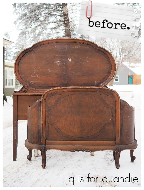
And speaking of making things over in my style, this amazing antique bed is the next project I’ll be tackling.

So be sure to stay tuned to see how it turns out!

imported and domestic.

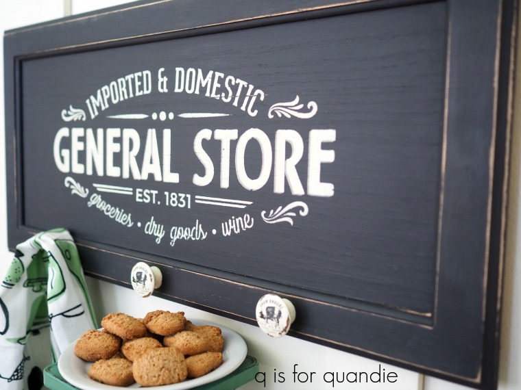
In my 2020 recap post I mentioned that you guys were going to see more signs made out of old cupboard doors this year.  Now that I know how easy they are to come by at the ReStore, I’ll probably be painting these up when I don’t have any other projects going on.

I picked up 4 cupboard doors that are approx. 13″ x 28″ the last time I was at the ReStore.

You’ve already seen one of them …

I painted up two more of them over the long holiday weekends.  One white, and one black.

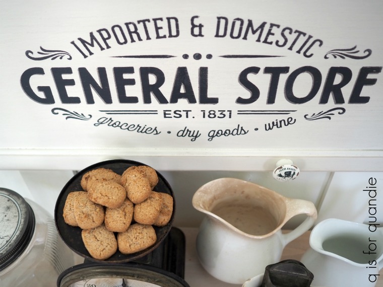
The white one is painted in Dixie Belle’s Drop Cloth.

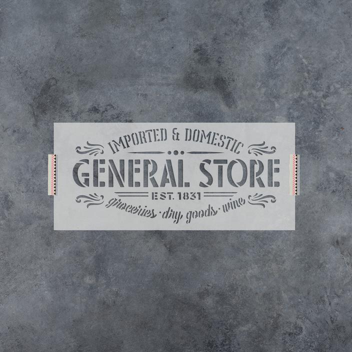
I stenciled it with another Wallcutz stencil (I have the 9″ x 20″ size).

Here’s a little tidbit I learned while googling to find that photo of the stencil.  The stencil from Wallcutz (shown above) has a border.  I had to tape that off to get the stencil to fit on my cupboard door.  But guess what, this exact same design is also available from Stencil Revolution, and their version does not have the border.

Interesting.

I’m curious about these two different companies offering what is nearly an identical design.  They obviously don’t create the designs themselves.  Do they buy them somewhere?  Are they using non-copyrighted images that are available to anyone?  I wonder.

Here’s some quick comparisons for you.  The similarly sized version from Stencil Revolution (8″ x 18″) is $18.99.  My Wallcutz stencil was $13.95.  Wallcutz offers free shipping if you spend over $50, Stencil Revolution offers free shipping if you spend over $35.

The Stencil Revolution version has more ‘bridges’ in the letters.  Take a close look at the “G” in each stencil.  The Wallcutz version doesn’t have any bridges, the Stencil Revolution version has three.

It’s a small detail, but if you aren’t a fan of that ‘stenciled’ look, or if (like me) you tend to fill in those bridges with a small paint brush after you’ve stenciled … well, you’ll be doing a lot more of that with the Stencil Revolution version.  Just sayin’.

I’m not affiliated in any way with either of these brands, I’m just sharing the info as I found it.  And I can say that I’m quite happy with the Wallcutz version that I purchased.

For the Drop Cloth sign, I added a small shadow to the words “GENERAL STORE” using Dixie Belle’s Hurricane Grey.  The black is their Midnight Sky.

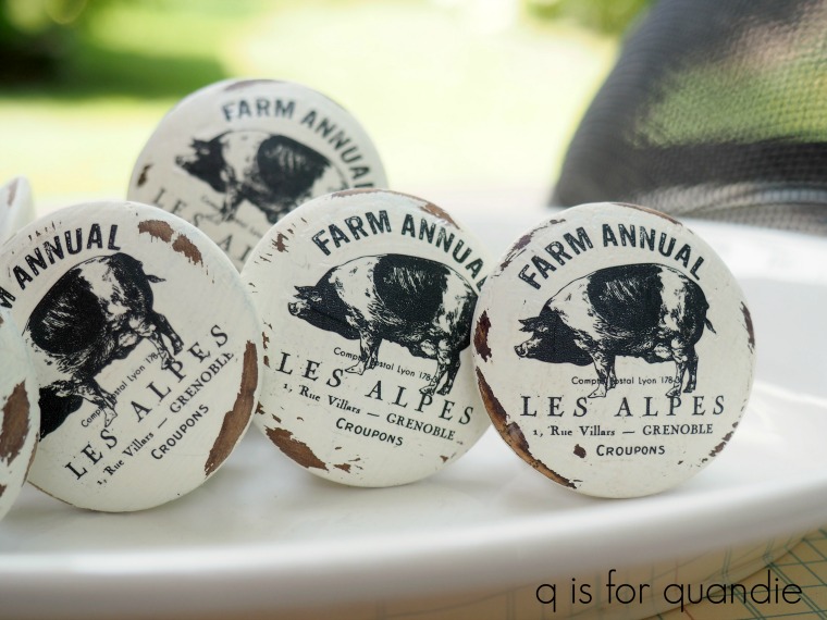
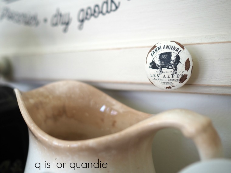
Much like with the Christmas signs I did in November, I added a couple of wooden knobs along the bottom of the sign so that one could hang something from them.  This time I used the little piggy knobs that I painted up way back in August 2018.

  The transfers on the knobs are from the Farmhouse Delight set from re.design with prima.

Gosh, time flies!  I’ve had these knobs sitting around for 2 1/2 years just waiting for the right project to come along.  For those of you who have followed me that long, can you believe it was so long ago?  In some ways it seems like just yesterday.

I think they worked out rather well on the sign.

I painted a second cupboard door in Midnight Sky.  The stenciling is done with a Hurricane Gray shadow with Drop Cloth over it.

I think the pig knobs worked nicely with the black as well.

I’ll likely end up taking both of these in to Reclaiming Beautiful to sell (and until then they are available locally).

In the meantime, while at the ReStore picking up these cupboard doors I also purchased this …

Ken and I have been hard at work on this one and I hope to be ready to share it with you next week.  So be sure to stay tuned!

As always, thank you to Dixie Belle Paint Co for supplying the paint used on today’s signs.

don’t let the door hit ya.

I don’t know about you, but I feel like 2020 is going to be remembered as the year that wasn’t.  So many things were just ‘on hold’ for nearly the entire year, things like travel, neighborhood garage sales, social gatherings, dining in restaurants, and festivals of all kinds.

I think most of us will be happy to see 2020 in the rearview mirror.  So long 2020, don’t let the door hit ya in the ass on your way out.

But then again, as I’m looking back over my blog posts for 2020, I see that it wasn’t all bad.  Once again I managed to crank out a few projects here and there, so let’s review, shall we?

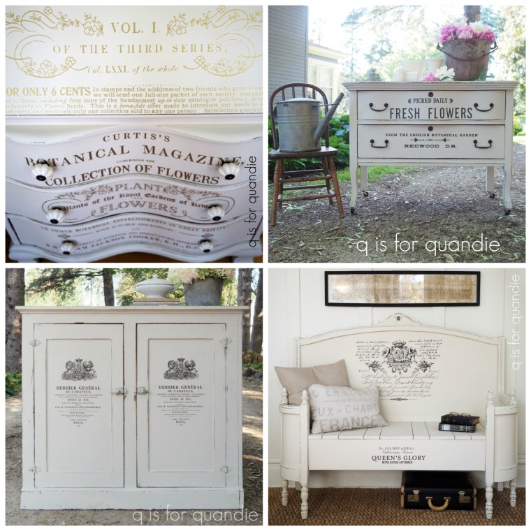
One thing that jumped out at me for 2020 was all of the things I painted white.  Not only do I find that white pieces sell more quickly, but white pieces just really appeal to me.  So I found myself reaching for the white paint quite a lot in 2020.

My current favorite white is Dixie Belle’s Drop Cloth (on the bench lower right and the serpentine cabinet with the gold transfers shown above upper left) followed closely by their Sawmill Gravy (on the other two pieces).

Another trend for me in 2020 was working on smaller items rather than larger furniture pieces.  I tend to find the bulk of my furniture pieces on Craigslist or Facebook Marketplace, but I found myself avoiding interacting with too many strangers in 2020.  To be honest, it doesn’t really make any sense.  I probably encountered more strangers at garage sales than I would have buying furniture online.

None the less, that led to a lot of smalls.  And again, with lots of white!

I didn’t entirely abandon my other favorite color to work with in 2020, black.

And I did also use some color in 2020.

I may have had to dig deep into the archives to find it though.

I also shared quite a few do-overs in 2020.

I was trying to work on things that I already had on hand, and that included a few pieces that hadn’t sold in their original look like the bench and the dresser).  Both of those pieces sold quickly after a do-over.  I also took advantage of the time and made over a couple of my own pieces like my Welsh cupboard and that little folding chair that is now hanging on the wall in my living room.

Then there was also the bench flip that I shared on Monday.

So over all, 2020 wasn’t all that bad.  My storage areas are pretty well cleaned out now, so that means I have a clean slate for starting 2021.

Here’s what I know you’ll see a lot more of from me in 2021 …

Black and white.  Because let’s face it, they are classic and never go out of style.

Signs made out of old cupboard doors.  Now that I know how easy these are to find at the Habitat for Humanity ReStore, I’m pretty sure I’m going to keep making lots of them.

Stenciling on unpainted wood.  This was an experiment for me recently, but I really love how it turned out.  I think you’ll see more of this look from me in 2021.

Thrifted items given new life with paint, stencils and/or transfers.  I just love taking a worn out item and giving it a fresh new life.  It’s so satisfying!

And here’s what I dearly hope you’ll see more of from me in 2021 …

Great hauls from neighborhood garage sales.  Because surely the awesome neighborhood sales will be back in business for 2021, right?

Travel posts.  Please, please, please let there be travel in 2021.

Garden posts.  Even if the world opens back up again, I still hope to keep up on my gardening.

Home tours.  Because everybody enjoys an awesome home tour.

So, let’s all raise a glass and ring in 2021.  It has to be an improvement over 2020, right?!

Happy New Year!

getting lucky at the restore.

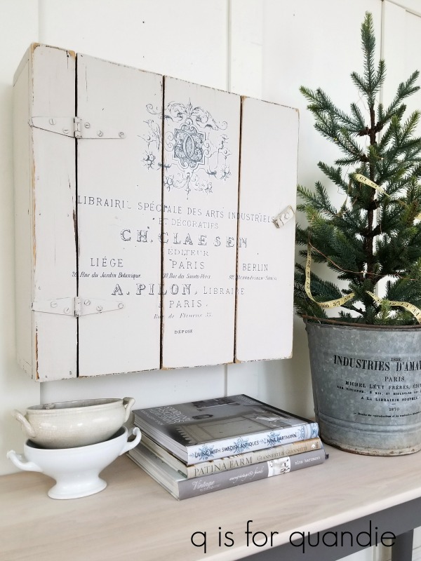
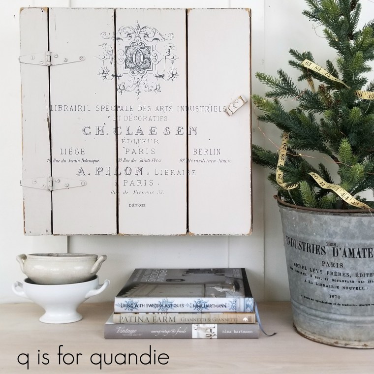
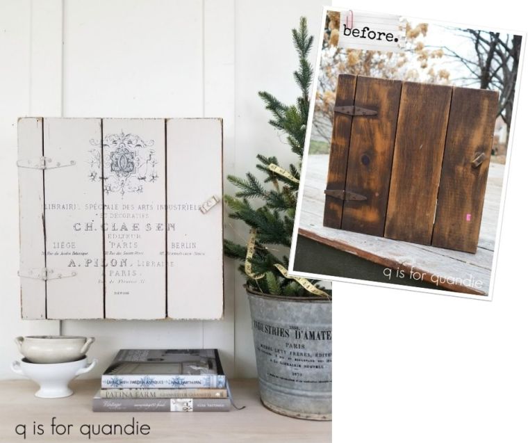
My sister and I headed over to our local Habitat for Humanity ReStore the other day.  I wanted to pick up a few more cupboard doors to use to make signs.  I found 4 good sized doors for $4 each, but before heading out we took a quick look around and I also found this fabulous little primitive cupboard.

I knew this would be a fun project to work on, and that a little paint and a transfer would really make it shine.

I started by sanding it lightly, then giving it a good cleaning.  Then I painted the inside in Dixie Belle’s Gravel Road and the outside in their Sawmill Gravy.

Once the paint was dry, I sanded heavily because I wanted a lot of distressing on this one.

Next I pulled out an old IOD transfer called Specimens and applied it to the front of the cupboard.

I only used the bottom half of the transfer, and that was perfect.

Next I added clear wax to the entire thing.  I also added some heavy duty D-rings to the back so that it could be hung on the wall.

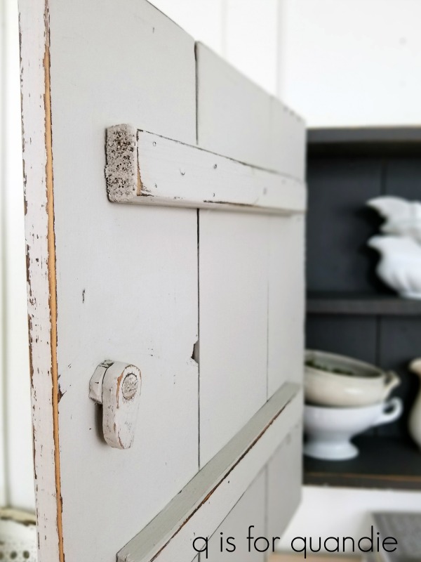
This cupboard has a clever little latching mechanism for keeping the door shut (it totally reminded me of the one on the washstand I shared a while back).

I’m always a sucker for these sort of primitive details, how about you?

I was channeling my inner Nina Hartmann when staging this one.

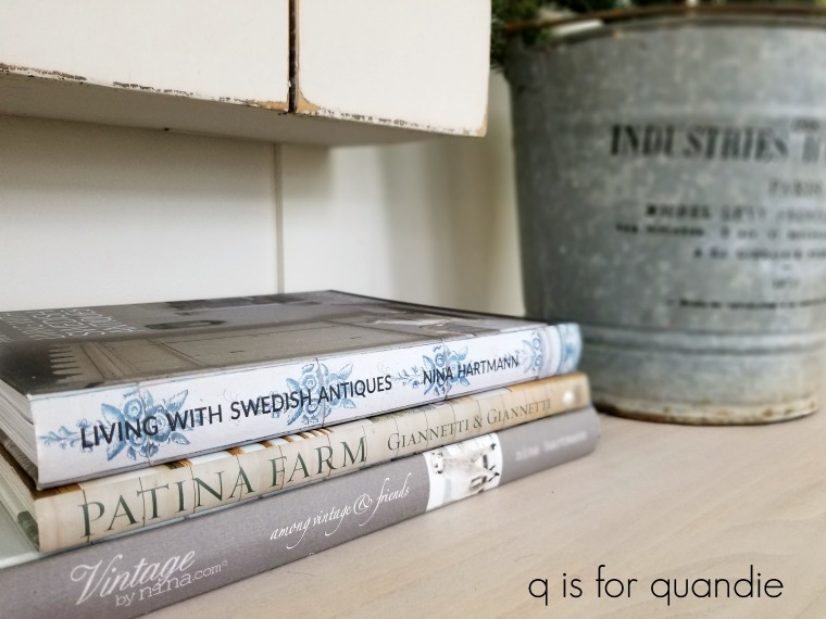
Are any of you familiar with her work?  I’ve mentioned her a few times here before.  I have several of her books, and they can be hard to come by here in the U.S.  I ordered the latest one, Living with Swedish Antiques, directly from her website (to order click on webshop, then books).  Don’t be totally freaked out by the price, it is shown in Swedish krona.  That being said, her books aren’t cheap.  After converting krona to dollars, I ended up paying around $80 for this one, including shipping.

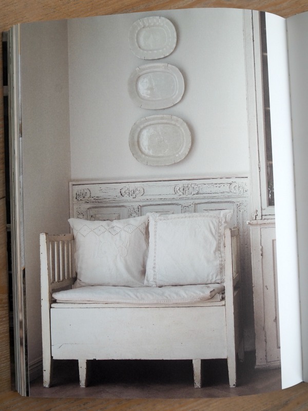
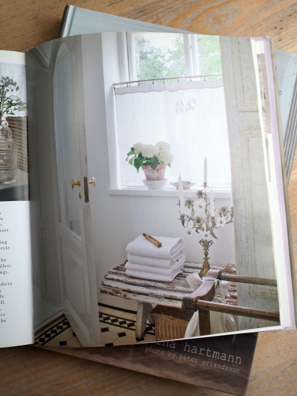
The book on the bottom of the stack, among vintage & friends, is also totally fabulous.  Here’s a page from that one …

I think you can probably see why it appeals to me.

But I think my favorite book of hers is My home with vintage & antiques.

Unfortunately, I don’t have any tips on how to acquire either of these older two books.  They are out of print and priced exorbitantly if you can even find them online.  So I apologize for telling you all about how amazing they are, and then following it up with ‘and by the way, you can’t get them anywhere.’  But you can get her newest book, so you may want to jump on that.

The primitive look of this cupboard, the color of the Sawmill Gravy (white with a hint of grey), the crackled ironstone and the mostly bare evergreen are all inspired by Nina’s style.

I love how this little cupboard turned out.  Once again, I’m tempted to keep this one.  Or maybe swap it out for some other piece I already have.

But then again, maybe I’ll just be happy to see it go to a good home.  So if any of my local readers are interested, be sure to check out my ‘available for local sale‘ page for more details.

So, how about you guys, are any of you already fans of Nina Hartmann?  or just simply fans of pale, painted wood pieces with lots of character?

As always, thanks to Dixie Belle Paint Co for supplying the paint used on this cupboard.

such a slacker.

First up, I want to say congratulations to Ruth H for winning my blogiversary giveaway.

I drew her name at random to win a few of my favorite Dixie Belle paint colors and a couple of other things.  Mr. Q has shipped off her prize and I hope she gets it in time to whip up a few things for the holidays.

What I didn’t mention in my original post about the giveaway was that I also had another complete package of all the same stuff to give to someone.  But rather than drawing a name at random for the 2nd set, I decided to give it to the person who left the most comments on my blog to date in 2020.  So I pulled up my blog stats and quite honestly I wasn’t at all surprised to find that that person was M. Constance Colvin.

Connie is a regular commenter, and she always sends the most lovely little messages, like this one …

“Well now……this post captures the essence of quandification (-: A pretty makeover of something that already looked great! “

and this one …

“A Quandie a day keeps the blog blahs away!!!”

Her comments always make me chuckle …

“Miss Quandie! Only TWO BUCKETS to share today? What a slacker!!!”

I’m super grateful to Connie for taking the time to leave comments.  They always make my day!

But speaking of being a slacker, I feel a bit like one this week.

Now that we are approaching the shortest day of the year, it’s dark when I leave for work in the morning and dark when I get home in the evening.  That means that if I want to photograph a project to share here on the blog I have to do it on the weekend.  If it’s not done by Sunday afternoon, then I am s.o.l.

Last weekend I spent some time finishing up my Christmas shopping, did my Christmas wrapping, and just enjoyed some down time.

I didn’t get a single thing painted.

Let’s hope I do better this weekend!

it even lights up!

A few weeks back I shared the birthday gift basket I put together for my friend Sue.

As I mentioned in that post, Sue has mastered the art of presentation and she always makes up the most amazing gift baskets for me on my birthday, so I knew she would appreciate my gift to her.

So today I thought I’d come full circle and share what she presented to me recently for my birthday.

She always leaves her gift in my office at the day job, and this time when I walked in I exclaimed, “it even lights up!”

I didn’t capture it well in these photos, but there is a string of battery operated lights woven throughout.  If any of you are putting together holiday gift baskets and you want a wow factor, consider adding some lights!

There were all kinds of other goodies tucked inside, like these vintage clothes pins in an old enamelware refrigerator container.

It probably seems silly, but I was really happy to see the soap too.

Funny story, last year my sister and my neighbor nnK both coincidentally got me a four pack of this exact brand of hand soap.  And that was before COVID and frequent handwashing were even a thing.  I had just cracked open the final bottle of that soap a couple of weeks ago, so it was perfect timing to get another!

Sue also threw in a candle from the White Cottage Co.

She and I have both been watching Mary Yoder’s YouTube channel for a while now.  If you haven’t seen her, you should take a look.  She shares lots of DIY and trash to treasure projects, and she’s very down to earth.  She makes a lot of things using a Silhouette machine, so if you’re looking for inspiration on that front, be sure to check her out.

Aren’t the vintage glasses Sue included fantastic?

I feel like one should drink things like a Manhattan, a Rusty Nail or a Sidecar out of these.  I may have to give that a try.

There were also a couple of magazines tucked inside the basket.

Sue has recently started sharing these American Farmhouse magazines with me, and I really like them.  The style is right up my alley, and they are chock full of great decorating inspiration.  The amount of content in each issue is almost overwhelming.  If you haven’t seen this one, I definitely recommend it.

And of course, no gift would be complete without some wine and chocolate!

This sweet little ‘believe’ pillow cover was wrapped around the wine bottle.  I just added some filler and voila …

That’s a lotta stuff all tucked into one package!  You can see why I so look forward to getting a birthday gift from Sue.  There were so many fab things that I can’t even begin to pick a favorite.  How about you?  What would have been your favorite item to receive?

the art of presentation.

My friend Sue has a lot of titles here on q is for quandie.  She is my picker, my co-worker, my garage sale mentor, my occasional sale partner, my garage sale spotter, my garden advisor and of course, my friend.

She is also the master at putting together amazing gift baskets.  Every year she gifts me with a spectacular collection of stuff for my birthday.

A while back when my sister and I were shopping in Excelsior, I came across this book …

and I immediately thought of Sue.  She loves the art of presentation, and this book is all about that.

The book also provided a jumping off point for creating a cheesy themed gift basket to give Sue for her recent birthday.

I started out by pulling out a galvanized container that I used to give a gift to Ken a couple of years ago.

Although he enjoyed all of the contents, as is his style, he returned the container for me to re-use.

So I started by sanding down the chalkboard paint on the front, and then painting the entire box with Dixie Belle’s Midnight Sky.

Then I added some transfers from prima’s Somewhere in France.

They don’t quite have a cheesy theme, but I thought they would do.

While I was out thrifting with Meggan last week, I asked her to help me keep an eye out for some items that I could add to my cheesy themed gift and she helped me spot a couple of good options.

I like finding things that I can add my own touch to using paint.  The wooden handle of the cheese knife got a coat of Dixie Belle’s Midnight Sky, and the wooden wedge shaped gift set got a paint job in Drop Cloth.

Then I added a JRV stencil to the front using the Midnight Sky.

Here’s the inside …

Next it was just a matter of adding some edibles.

Hopefully Sue will have fun putting together some cheese plates that will change lives!