milk paint magic.

Hey everybody!  Thanks so much for joining me this week for milk paint madness.  It has been fun sharing lots of info about milk paint with you.  I hope that all of you learned at least one or two new things.  Before I continue I want to take a moment to thank you guys for all of your comments, as well as your continued support of my blog.  I really do appreciate every one of you!

For today’s post I want to take everything we’ve learned over the last week and put it all into practice on piece of furniture.  So let’s get started.

My friend Meggan or, as I now call her, the thrift doctor (I’m trying to convince her to start writing her own column here on my blog called ‘ask the doctor’ with thrifting tips, what do you think?), texted me a few weeks ago letting me know that there was a fabulous desk at the local Goodwill with a bargain price tag.  Luckily Mr. Q was available to dash over there and pick it up for me because I know it would have gone fast.

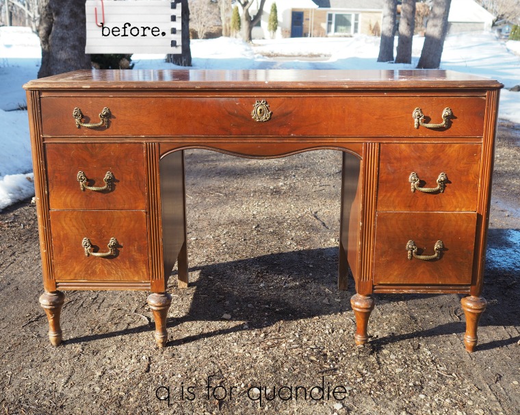
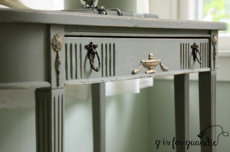
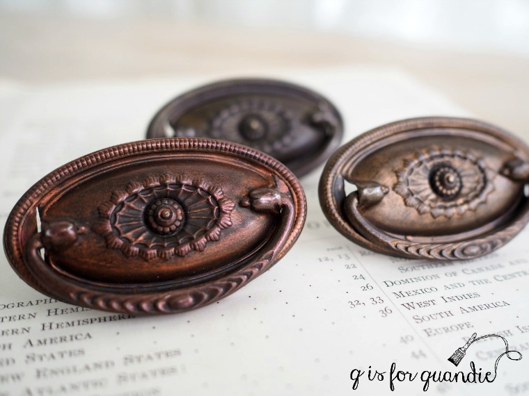
It doesn’t have a lot of frills, but I like the legs and the drawer pulls are really lovely.  It also was in fairly good shape.

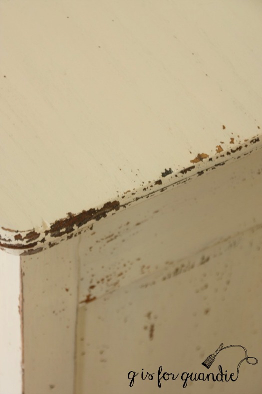
I really didn’t love the orange-y color of this piece though.  I didn’t even want that color to show through in the chippy spots.  So I decided to layer some colors on it using bonding agent in the first color so that it wouldn’t chip down to the wood.

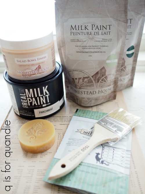
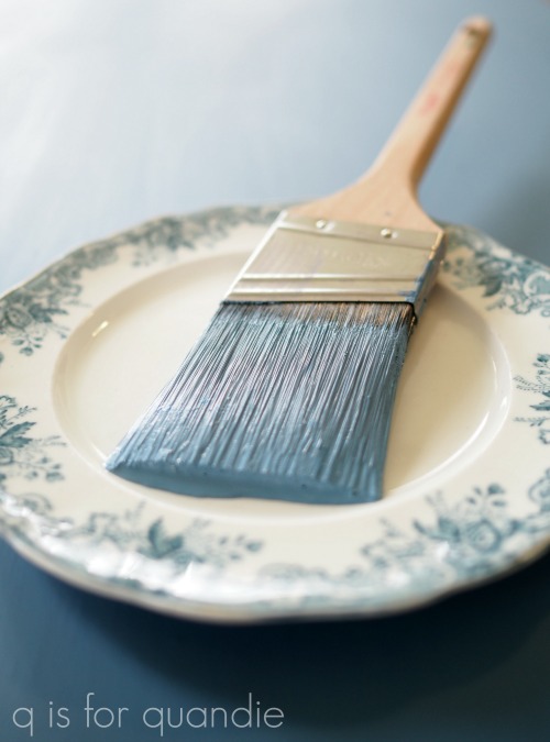
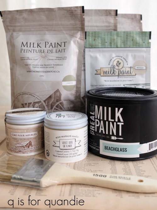
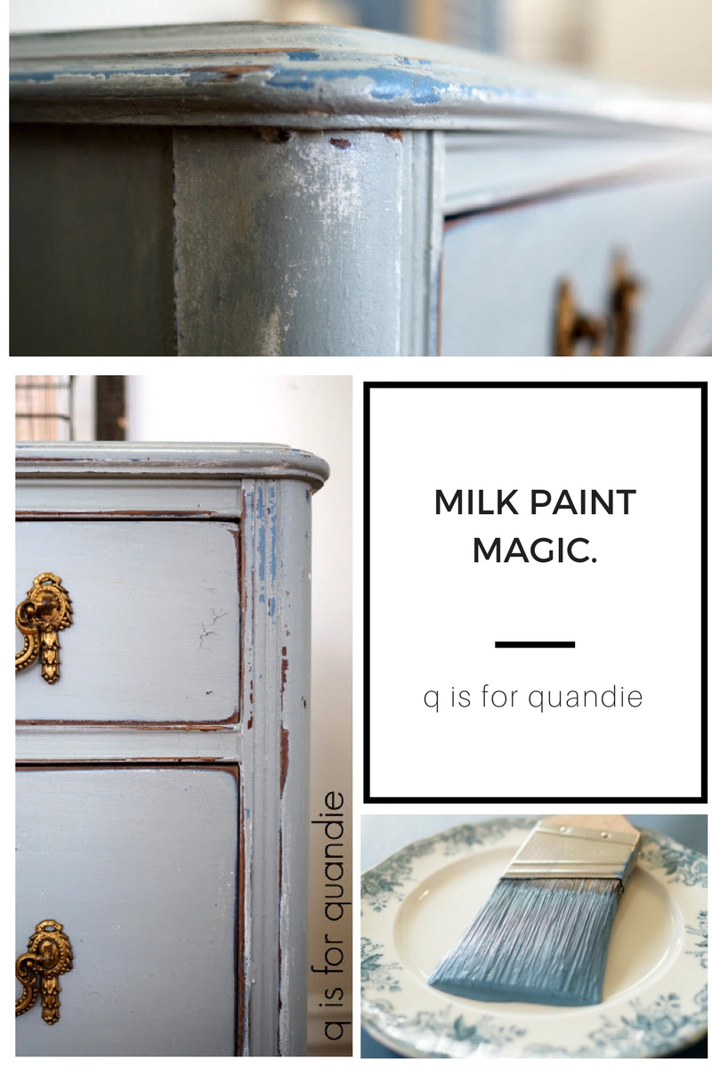
I could also have used a base layer of chalk paint or Fusion acrylic paint, but in this case I had a particular color in mind, Homestead House milk paint in Maritime.  A very pretty blue.  So I mixed my paint first using one part water to one part powder.  Once that was well mixed, I added another one part Miss Mustard Seed bonding agent and stirred it in.

Next I moved on to the prep work.  As I mentioned yesterday, good prep is key to controlling the chipping you might get with milk paint.  But in this case I was using bonding agent in my first layer of paint so I could slack off a little.  Still, I sanded the piece briefly by hand and wiped it down with a damp cloth.

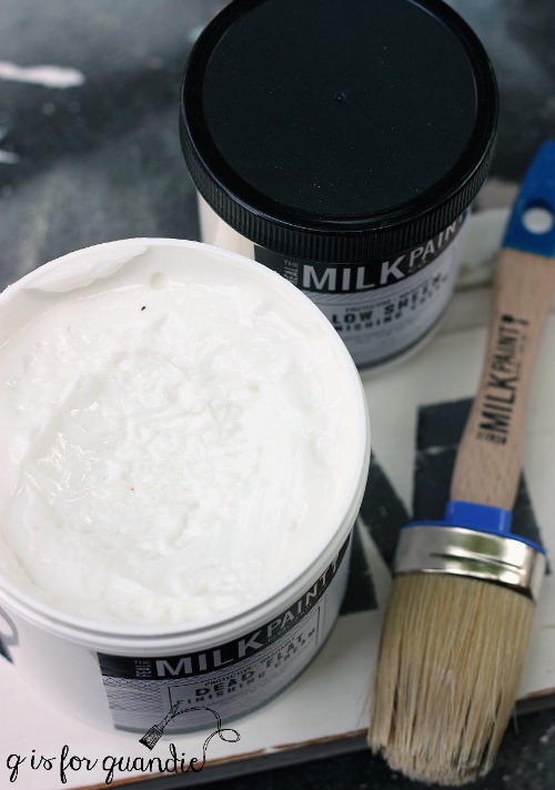
Then I brushed on just one coat of the Maritime milk paint with the bonding agent added.  Now, if I was a really good blogger I would have taken a photo at that point to share with you now.  But no, I didn’t (although that photo of the brush above is taken on top of the desk with its coat of Maritime).  I can tell you that the paint did not chip at all and it had just a little bit more sheen than milk paint normally does.  Similar to the slight sheen of Fusion acrylic paint.

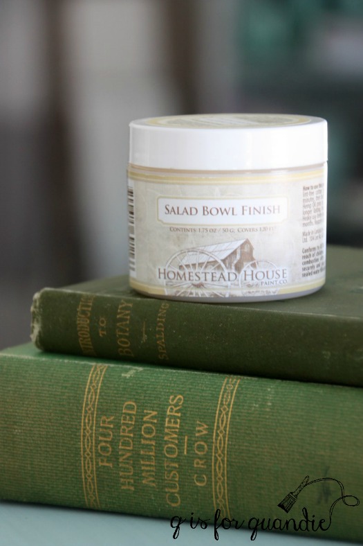
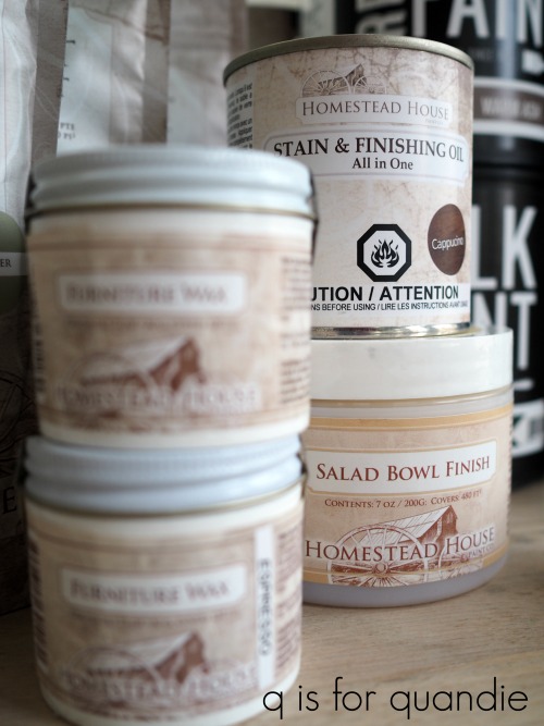
A couple of days went by before I got to the next step in my project, which gave the Maritime plenty of time to dry.  Next, my plan was to use the Homestead House Salad Bowl Finish (or beeswax finish) to encourage a controlled amount of chipping and paint over it with The Real Milk Paint Co’s Soft White milk paint.  So I mixed up the white milk paint, again using equal parts water and powder, and left that to sit while I used my finger to smear some beeswax finish along the edges of the desk.

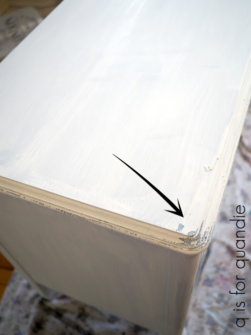
After painting one coat of the Soft White, you can see the areas where the beeswax is resisting the paint.    The areas without beeswax are not chipping at all.  This also gives you a good feel for the coverage of the Soft White over a darker color.  Pretty good for one coat I think.

I added a second coat of Soft White and left it to dry.

My initial plan was to leave the desk white, but you know what?  I didn’t like it.  I felt there was too great a  contrast between the white and the blue.  It looked splotchy instead of perfectly chippy.  Sorry, again no photo of that step!

One thing that I have learned over the years is to follow my instincts when it comes to these moments.  If my gut is telling me that I don’t like it, I switch gears instead of trying to make it work as is.

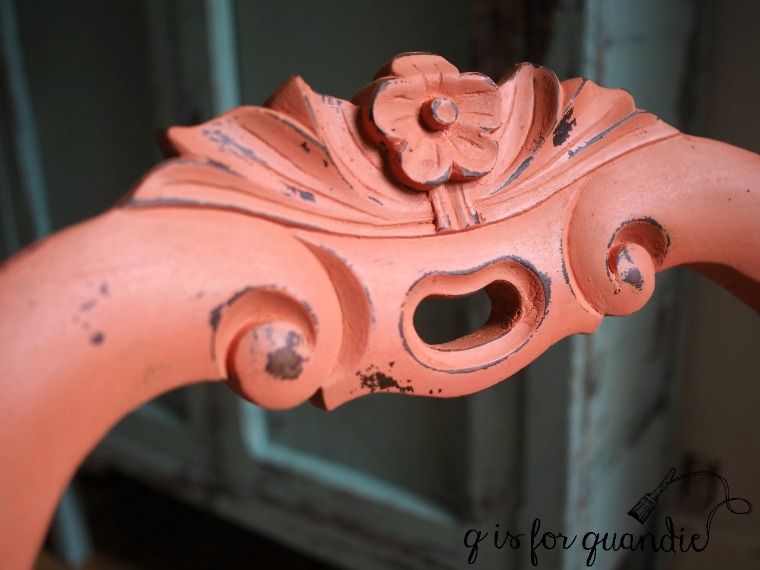
So I decided to mix a custom color of milk paint that was about halfway between the lighter Soft White and the darker Maritime.  I pulled out three almost empty bags of milk paint, Miss Mustard Seed’s Shutter Grey and Eulalie’s Sky and Homestead House’s Upper Canada Green and started mixing.

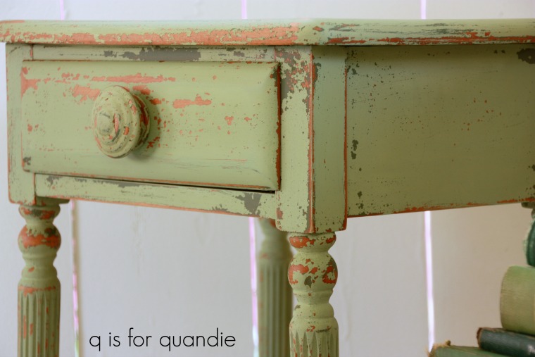
I ended up with this pretty smoky blue with just a tiny hint of green.

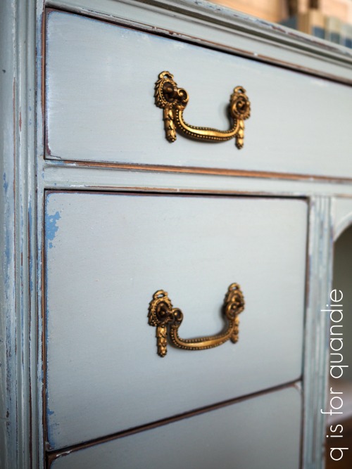
I added just one coat of this color over the white.  Once dry I started sanding the edges and discovered the most perfect chipping.

For me, this is the magic of milk paint.

I know you can get a similar look layering chalk paint or even Fusion paint, but I think milk paint always looks the most authentic.

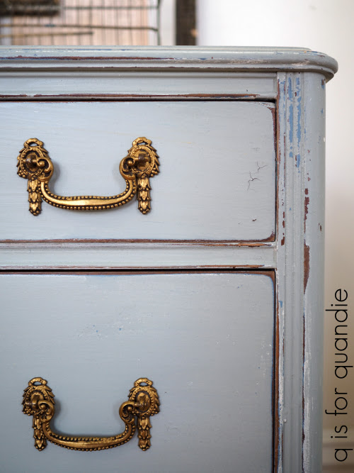
As you can see, I did end up with a little of the wood showing after all, but those are spots where I sanded through the layer of Maritime, not spots where the paint chipped due to the application of the beeswax.

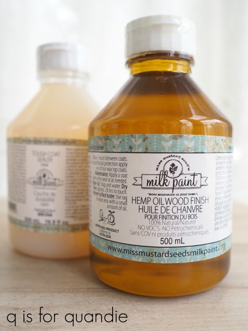
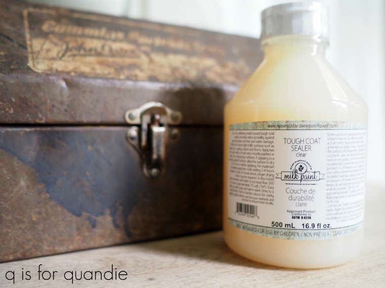
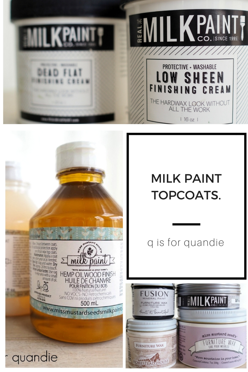
After sanding the entire piece lightly with some 220 grit sandpaper to get it nice and smooth, I added a topcoat of The Real Milk Paint Co’s Dead Flat finishing cream.  Since this is a desk there is the potential it will get a fair amount of use, so I wanted a little more protection than just wax.

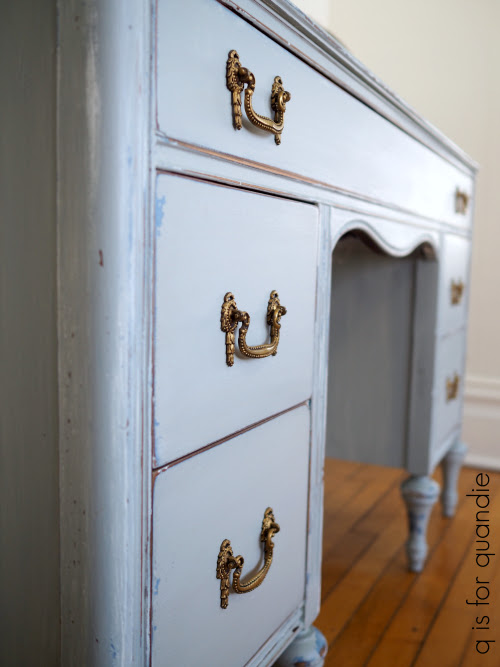
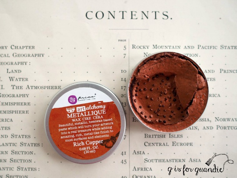
By the way, I spruced up the drawer pulls a bit by adding some of Prima Marketing’s Metallique wax in Vintage Gold.

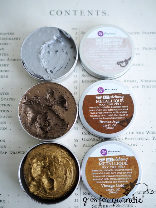
To learn more about that product check out this post.

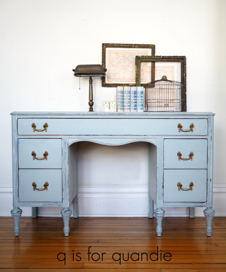
In the end I love how the desk turned out.  I think I’m going to do more multi-layered pieces using milk paint.  It really adds some authentic age to the piece to see multiple layers of color as though it has been painted several times through the years.

This brings us to today’s giveaway, and guess what?  I have two prizes for today!

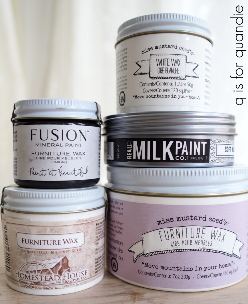
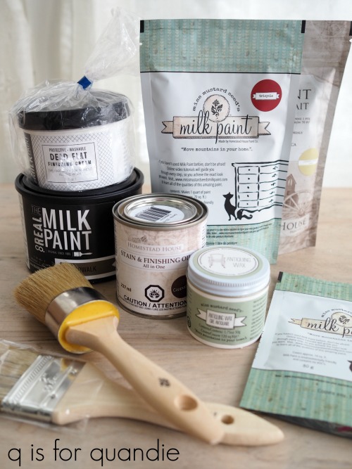
The first prize includes:  five colors of milk paint, a Homestead House Espresso wax, a Miss Mustard Seed white wax and a brush.  Thank you to Homestead House, Miss Mustard Seed and The Real Milk Paint Co for providing the items for this giveaway.  Approx. value:  $135.

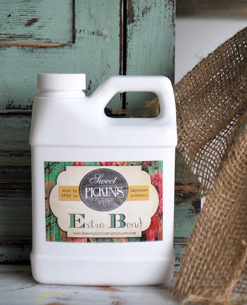
And I also have a bonus giveaway today!  A while back I had asked Sausha at Sweet Pickins if she wanted to participate in milk paint madness week by providing some merchandise to giveaway.  She said yes, but then life happened and she didn’t get her stuff shipped right away so I just received it in the nick of time in yesterday’s mail.  So I decided to just give that away as a bonus prize today.

Includes:  my absolute favorite Sweet Pickins color, In A Pickle, Oil Wax, Extra Bond, a sanding block, paint brush and paint mixing whisk.  Thank you to Sweet Pickins for providing these items.  Approx. value:  $55.

The basic rules:  to be eligible to win today’s prize leave a comment on this blog post telling me what your favorite milk paint color is.  Your comment must be left on the blog, not on Facebook.  You are not required to follow my blog, although it would be awesome if you did!

I will randomly draw the names of two winners for today’s prizes from all of the comments left on this post by Saturday, April 7, 2018 at the stroke of midnight.  You are eligible to win each day, so if you have left a comment on each day’s post, your name is eligible to be drawn for each prize.

The fine print: no purchase necessary, you must be 18 years of age or older to win, void where prohibited by law, the number of eligible entries received determines the odds of winning, if the prize is not claimed by Friday, April 13, another name will be drawn at random to win, blah, blah, blah.

I’ll be announcing the names of all six winners from milk paint madness week on Monday, so be sure to check back.

In the meantime, remember to pin today’s post for future reference.

And if you are local and in need of a pretty smoky blue desk, be sure to check my ‘available for local sale’ page for more details on the desk.

milk paint advanced techniques.

Welcome to day 4 of milk paint madness week!

Today I’m going to share some of my favorite advanced milk paint techniques including using bonding agent, layering milk paint with other types of paint, resists, how to control the chipping, how to create a crackle effect, and custom mixing.

bonding agent.

All of the milk paint brands sell a bonding agent.  The purpose of bonding agent is to improve the adhesion of milk paint.  I’ve never been a big fan of bonding agent, and here’s why.  If you don’t want any chipping when using milk paint, then why use milk paint?  I feel like bonding agent basically turns milk paint into an acrylic paint.  That may not be scientifically accurate, but you get the idea.  Your paint will become smoother and have a little bit more sheen.  If you want a creamy smooth paint that adheres well and doesn’t chip, use Fusion acrylic paint.  It will be cheaper to buy one jar of Fusion paint than it is to buy milk paint plus bonding agent plus a top coat.

However, bonding agent does have its place.  For example, when there is a milk paint color that you absolutely love and you want that exact color but you don’t want it to chip.  This came up recently for me (and you’ll read more about that tomorrow).  Another time you may want to use it is when you have a surface that you know is going to really resist milk paint far more than you want it to, you can paint a first coat of your color with the bonding agent and then a second coat without.  You’ll still get the look of milk paint with your second coat, but probably not a lot of chipping.

It’s easy enough to use bonding agent.  It’s important to mix your milk paint powder with the water first.  Once that’s well mixed, add the bonding agent directly into your paint and mix well.  You should add one part bonding agent to two parts paint.

layering.

Back when I first started using milk paint I was very confused about what you could paint over with milk paint and what you couldn’t.  Over time I’ve learned a little bit from other painters and a little bit from trial and error.  Here’s what I’ve discovered.

Chalk paint and acrylic paint are perfect for layering with milk paint, especially if you’re worried about milk paint chipping right off the existing finish on your piece.  Much like painting the first coat using bonding agent, you can also paint a first coat of chalk or acrylic paint.  Then use a resist to encourage the milk paint you put over it to chip where you want it to.  But more on resists and chipping in a minute.

When layering milk paint over chalk or acrylic paint you do not need to sand the chalk or acrylic paint.  Just paint right over it with your milk paint.  Please note, this is assuming you have a fresh coat of these paints, not an old paint job with a topcoat of some kind over it.

If you are painting over a piece that was painted previously and then sealed with wax or hemp oil, you need to be sure the topcoat is cured (30 days) before trying to paint over it with milk paint.

If you are painting over a piece that was sealed with The Real Milk Paint Co’s finishing creams or the Tough Coat Sealer you are fine painting over those with milk paint as soon as they are dry.

I treat old latex or oil based paint the same way I would an old varnished finish because all three of those will resist the milk paint to varying degrees.  I’ll go into that a bit more in a minute.

I have also found that milk paint does not adhere well to spray paint.  You’re probably wondering why in the world anyone would want to put milk paint over spray paint, but I have tried that when painting cane or wicker.  I also once tried to paint over a chair that was initially spray painted.  Not much of the milk paint stuck.

the chippy factor.

The most unique thing about milk paint is its tendency to chip when it meets resistance and thus can’t absorb into the surface that you are painting.

Resistance can take many forms.  It can be a pre-existing impervious finish like varnish, it can be layers of furniture wax or polish that have been applied to a piece over the years, it can be oils from handling (or from cooking in the case of kitchen cabinets), or it can be old oil based or latex paint.

With lots of experience painting pieces in milk paint I’ve gotten better at predicting whether or not something is going to chip, but it still sneaks up on me sometimes.

The best way to control unwanted chipping is with good prep!

I can’t stress that enough.  If you don’t want out of control chipping, prep your piece by sanding it well, vacuuming off the dust, then cleaning with a grease cutting cleanser like TSP Substitute.

But if you like to live on the edge and you can roll with the punches, just wipe your piece down with a damp cloth and then take your chances.  Sometimes that’s a fun way to go too.

resists.

Once you’ve prepped your piece you can apply your own resist in a purposeful way to encourage chipping where you want it.  There are lots of choices when it comes to a resist.  You can use hemp oil, furniture wax, petroleum jelly, a wax puck, canning wax or candle wax.  However, my favorite product to use is the Homestead House Salad Bowl Finish.

This is a beeswax finish that is formulated just a little bit differently from furniture wax.  It’s harder and a little bit more oily, and it works perfectly as a resist.  A little bit goes a long way.  I have the small jar and haven’t even used half of it yet, and I’ve probably used it on at least a dozen or more pieces.  As a side note, it works really well as a resist under Fusion paint too.  I’m giving away the larger jar as part of today’s giveaway, so the person who wins will practically have a lifetime supply!

I apply the Salad Bowl Finish much like one would apply lip balm.  Get a little on my finger, then use it to rub the wax onto the furniture in a very thin coat only where I want chipping.  Add it very sparingly if you just want a little chipping, add more if you want a lot.

Miss Mustard Seed and Sweet Pickins also carry a beeswax finish.

the tape method.

What if you painted your piece and totally forgot to add a resist to encourage chipping?  Or maybe you expected the piece to chip naturally and it just didn’t (because sometimes that happens too).

Well, all is not lost.  I’ve had great success with using tape to pull off some of the paint.  Just press some tape onto the area you want to chip and then yank it off again.  It’s sort of like the process of removing lint from your black slacks using tape.  I always start with the yellow Frog tape (for delicate surfaces).  However, if I find the paint still isn’t coming off I’ve been known to try a stronger tape like packing tape.  Just use caution when doing this, you can also pull off a big solid strip of paint which isn’t quite what you want.  Go slowly, start out with a very small area and go from there.

crackling.

Applying heat is a great way to encourage your milk paint to crackle.  You can do this the accidental way (which I totally do not recommend), which is to paint your piece in the hot sun on a summer day.  I’ve done that a few times and have gotten some great crackling, but that’s not very practical or predictable.  A better way to encourage crackling is to use a blow dryer which gives you a little more control.  I recommend mixing your milk paint a little bit thicker than you would normally, then as soon as you’ve painted it on add some heat by ‘drying’ it with the blow dryer on high heat.

If you want to emphasize the look of a crackled finish, try adding a colored top coat such as antiquing wax or white wax which will catch in those cracks and highlight them.

custom colors.

Mixing a custom color is one of my favorite ways to play around with milk paint.  I know you can mix other kinds of paints to create your own colors too, but somehow with milk paint it feels a little more mad scientist-y.  Maybe it’s because you mix various powders, then add water, then you have to wait 5 or 10 minutes to make sure the pigments are all fully dissolved before really getting a good look at the color you’ve created.  Or maybe it’s because I sometimes practice my evil mad scientist laugh while I’m mixing my own paint colors.

Some of my favorite custom mixed colors are Blue Alligator

British Rocker Mint

and French Desk Grey …

Mixing custom colors is a great way to use up those partial bags of milk paint that don’t have quite enough in them to paint a full piece of furniture.

I hope today’s post has given you some ideas for different techniques you can try with milk paint.  Now for the fun part, today’s giveaway:

Includes: Four colors of milk paint, a jar of Homestead House Salad Bowl Finish and a Miss Mustard Seed wax puck.  Thank you to Homestead House, Miss Mustard Seed and The Real Milk Paint Co for providing items for today’s giveaway. 

The basic rules:  to be eligible to win today’s prize leave a comment on this blog post telling me if you’ve tried any of these milk paint techniques, or if not, which one you want to try.  Your comment must be left on the blog, not on Facebook.  You are not required to follow my blog, although it would be awesome if you did!

Normally I make a point of answering every comment left on my blog.  If someone takes the time to leave a comment, I like to acknowledge that.  But I usually only get 10 to 20 comments so it’s easy to fulfill that promise.  But I’m guessing that I’ll get many more comments on these posts so I’m going to warn you up front that I won’t be answering each one.  That helps make it easier for me when it’s time to pick a winner too, so I hope you guys will cut me some slack on that this week.

I will randomly draw the name of a winner for today’s prize from all of the comments left on this post by Saturday, April 7, 2018 at the stroke of midnight.  You are eligible to win each day, so if you leave a comment on each day’s post, your name is eligible to be drawn for each prize.

The fine print: no purchase necessary, you must be 18 years of age or older to win, void where prohibited by law, the number of eligible entries received determines the odds of winning, approximate retail value of prize is $106, if the prize is not claimed by Friday, April 13, another name will be drawn at random to win, blah, blah, blah.

Be sure to check back tomorrow for the final segment of milk paint madness, and in the meantime remember to pin today’s post for future reference.


milk paint chalkboards.

Did you know that you can make a chalkboard using milk paint?

Yep.  No need to buy special chalkboard paint.  Plus the sky is the limit color-wise.

First, the technique.  It’s super simple.  Mix your milk paint as per usual (equal parts water and powder).

Let your paint sit while you prep the surface of your chalkboard by sanding it well, then cleaning it with TSP Substitute.  If I’m using new hardboard for my chalkboard I skip the TSP and just wipe it clean with a damp rag.  Remember, you don’t want a chippy chalkboard so be sure you’ve given your surface plenty of gripping power with good prep.

Give your paint another good stir or two and then brush one coat onto your chalkboard surface.  Once dry, lightly sand with 220 grit sandpaper.  Normally I don’t sand between coats of milk paint, but in this case sanding between coats will help keep your chalkboard super smooth.  Paint a 2nd coat of milk paint.  Once dry, sand again.  The final step is to season your chalkboard by rubbing chalk all over the surface, then wiping it away with a dry cloth.  No other sort of topcoat is needed.

And voila, you have a chalkboard.  Keep in mind that freshly applied paint is always easier to scratch than cured paint.  I’d wait a day or two before drawing on your chalkboard.

Black is a no-brainer and probably everyone’s first instinct for a chalkboard, but I’ve done several green chalkboards too.

I like the look of a green chalkboard with a white painted frame.  This is one of my favorite ways to re-purpose a dresser mirror.

I’ve used a recipe of 3 parts Miss Mustard Seed Boxwood mixed with 2 parts Miss Mustard Seed Artissimo to make a green chalkboard.  But I’ve also discovered that Homestead House milk paint in Bayberry is the perfect chalkboard green.

But you don’t have to stick with just black or green chalkboards.  I’ve also painted a chalkboard using Homestead House milk paint in Laurentien, which is a pretty aqua color.

I make a lot of chalkboards.  In addition to re-purposing a dresser’s mirror frame, it’s also a great way to use a picture frame that no longer has its glass.  I even like to turn unconventional items into chalkboards like small folding chairs …

 or washboards …

I always keep a packet of milk paint on hand for whipping up a quick chalkboard.

By the way, not sure what to do with your chalkboard once you have it painted?  I’ve used a few different techniques for drawing on a chalkboard.

You can use chalk to transfer a printed design onto the chalkboard and then fill it in (more details on that here), you can use a stencil (more details on that here), or you can just work on practicing your chalk lettering skills using the book that comes with today’s giveaway.

Speaking of which, it’s time for the fun part!  Today’s prize:

Includes: the Complete Book of Chalk Lettering, 4 colors of milk paint perfect for chalkboards, and a lovely Miss Mustard Seed paint brush for a smooth chalkboard finish.  Thank you to Homestead House, Miss Mustard Seed and The Real Milk Paint Co for providing items for today’s giveaway.

The basic rules:  to be eligible to win today’s prize leave a comment on this blog post telling me whether or not you have at least one chalkboard in your house (I have five!).  Your comment must be left on the blog, not on Facebook.  You are not required to follow my blog, although it would be awesome if you did!

Normally I make a point of answering every comment left on my blog.  If someone takes the time to leave a comment, I like to acknowledge that.  But I usually only get 10 to 20 comments so it’s easy to fulfill that promise.  But I’m guessing that I’ll get many more comments on these posts so I’m going to warn you up front that I won’t be answering each one.  That helps make it easier for me when it’s time to pick a winner too, so I hope you guys will cut me some slack on that this week.

I will randomly draw the name of a winner for today’s prize from all of the comments left on this post by Saturday, April 7, 2018 at the stroke of midnight.  You are eligible to win each day, so if you leave a comment on each day’s post, your name is eligible to be drawn for each prize.

The fine print: no purchase necessary, you must be 18 years of age or older to win, void where prohibited by law, the number of eligible entries received determines the odds of winning, approximate retail value of prize is $122, if the prize is not claimed by Friday, April 13, another name will be drawn at random to win, blah, blah, blah.

Be sure to check back tomorrow for the next segment of milk paint madness, and in the meantime remember to pin today’s post for future reference.


milk paint topcoats.

Welcome back for day 2 of milk paint madness week!

Today I’m going to share a bit of information about the various topcoats you can choose for your milk painted furniture, but I gotta say one could write an entire book about this stuff.  There are so many options out there!  I haven’t tried them all though, so I’m just going to scratch the surface on this topic (pardon the pun).  You may want to go grab a cup of coffee first, this is going to be a long one.  I’m going to list the finish options starting with least amount of protection/added durability and ending with the most durable finish.

going topless.

Before we get into the topcoats, what about not using a topcoat at all?  This is an option with milk paint.  It’s definitely not the most durable option and your milk paint won’t be especially water resistant or scrub-able, but if those factors aren’t important to you, you can go topless!  Without a top coat milk paint has a very matte finish.  I would probably never go without a topcoat on the darker colors, but I do like the look with white or other pale shades.

I didn’t use a topcoat on my Belgian bench.

I painted this piece back in July 2016.  We sit on it to put out shoes on, so it gets a fair amount of use.  The finish has definitely worn a bit more since I first painted it.  But if you’re a fan of the distressed, chippy look that’s a bonus.  The paint itself cures rock hard and won’t rub off on your skin or clothing.

hemp oil.

Hemp oil is one of my favorite topcoats over dark milk paint colors, especially black.  It’s all natural, has zero VOC’s and is solvent free.  Remember what I said yesterday about milk paint having similar qualities?  If you work with these things frequently, it’s important to think about not only the environment, but also your own health.  Homestead House, Miss Mustard Seed and The Real Milk Paint Co all sell an all natural hemp oil in their milk paint lines.

One thing to keep in mind when choosing a topcoat is that all topcoats may change up the color of milk paint to varying degrees.  Hemp oil will deepen the color quite a bit, that’s why it’s perfect for use over dark colors.  It works equally well over mid-tone or lighter colors, but you may want to experiment a bit to see how you like the color with the hemp oil topcoat.  Here you can see how much it changes up Sweet Pickins’ In a Pickle

I like to apply hemp oil with a cheap chip brush that I reserve especially for that purpose.  Once applied, I wipe off the excess with a clean cloth.  There is no buffing required with hemp oil.  Hemp oil dries to a matte finish with no sheen.

Your hemp oiled finish will be somewhat more water resistant and durable than if you went topless, but not as much so as the rest of the topcoat options.  Also, the hemp oil will wear away over time.  If you want to maintain that deep rich color you will have to reapply the hemp oil every year or two.

Here’s a q tip for you that’s just good to know, don’t use hemp oil on your leather goods.  According to The Real Milk Paint Co’s website:  ‘Because Hemp Oil is a drying oil it will soak into leather and dry. This will cause the leather to crack and prematurely destroy your leather goods. Repeated applications of Hemp Oil to leather will just speed of the destruction. Use oil products made to treat leather. These will protect your leather goods for the long term.’

wax.

Wax is another great topcoat for milk paint.  There are so many waxes on the market these days, I could probably write a week’s worth of posts just about wax.  I did write a post about how all waxes are not created equal back in January 2017 (read that here).  Based on the research that I did for that post there are some brands of wax that I won’t use anymore because of their harmful ingredients so be sure to read it for more info on that.

Wax comes in quite a few different colors these days too.  You can get clear, white, brown, grey and black.  Fusion even has some metallic furniture waxes available.

Clear wax will darken the color of your paint somewhat, but not as much as hemp oil.  Brown, grey and black waxes will deepen your paint color and add a tint of their own color to it, while white wax will lighten your color and add a bit of a whitewashed sort of look.

Here’s a great tip;  if you’ve never used colored wax, I highly recommend doing some experimenting with it before you apply it to a piece of furniture.  Paint an old board with your milk paint color, and then try the colored wax over it.  If the look is too dramatic for you, you can try applying clear wax first, then adding a colored wax over it.

I like to apply my wax with a wax brush.  I find it easier to get into the nooks & crannies with the wax.  Since I do a lot of waxing, I keep a separate wax brush for each color I use regularly.  That way I don’t have to clean them after every use.  I only clean them a couple of times a year (I probably shouldn’t admit that out loud).

  Once you’ve applied the wax using a circular motion, wipe away the excess with clean cloth in the direction of the grain.  After the wax dries for about 5 – 10 minutes you can go back and buff it with a clean cloth to get more shine if you want it, but I have to admit I rarely do that.

If you’ve struggled in the past with a waxed finish that ends up feeling tacky, you’ve likely used too much wax.  Keep switching to a section of clean cloth to wipe away excess wax until your surface feels smooth.  Once cured (after about 30 days) a properly waxed surface will feel smooth and silky.

Personally I love the look of a waxed finish.  It has a patina that appeals to me, not super shiny but not completely flat either.  A waxed finish is more durable than hemp oil, but still not really scrub-able.  It will resist liquids though, sort of like a freshly waxed car.  In addition, a waxed surface is pretty easy to ‘fix’ if it does get dinged up.  Just simply sand very lightly and re-wax that spot.  No need to touch up the entire surface.

Much like hemp oil, wax will wear away over time and to maintain water resistance you’ll want to reapply every year or two.  I’m not gonna lie though, I’ve yet to re-wax a single one of my waxed pieces.  But then durability is not something I really worry about in my household.  If you have small children it might be more important to you.

finishing cream.

The Real Milk Paint Co’s Finishing Cream is rapidly becoming one of my favorite topcoats for milk paint, especially for the lighter colors.  I’ve used the low sheen and the dead flat versions and I like them both.  This topcoat won’t change the color of your milk paint by much, if at all.  The low sheen adds just a minimal amount of shine and the dead flat is more matte.

You can apply this product with a rag, brush or damp sponge.  I usually go with a brush.  What I love about the finishing cream is that it’s very thick.  Sort of like the consistency of a body cream rather than a lotion.  Because of that you really don’t have to worry about runs (which seem to be a problem for me).  So far I have found this stuff to be pretty fool proof.  It also takes less effort and time than a hemp oil or waxed finish.  You just brush it on, no need to wipe away excess or buff.

After drying for 24 hours, a piece with this topcoat will be fully washable and more durable than hemp oil or wax.  You shouldn’t have to reapply the product unless your piece gets a lot of wear, in which case you can re-apply if necessary.  I used a finishing cream top coat on the nightstands in our bedroom to protect them from glasses of water left overnight.

One thing to note here, the Dead Flat version is not recommended for use over black or other dark colors.

tough coat.

Tough Coat Sealer is a non-yellowing, clear topcoat that is available under both the Miss Mustard Seed brand and the Fusion brand.  This product also will have a minimal effect on the color of your milk paint, although it may darken it just slightly.  It is considered a matte finish, but it gives a little bit more sheen than hemp oil or wax.  Please note, this topcoat is also not recommended for use over dark colors as it may look cloudy.

You can also apply the Tough Coat with a brush or sponge applicator, or just wipe it on with a lint free cloth.  The Tough Coat Sealer is more of a liquid than the finishing creams.  For that reason you want to be careful to watch for drips, especially on vertical surfaces like the sides of a dresser.  For more info on how to apply this product click here.

Tough Coat is very durable, and even more so if you apply two coats.  It’s a great choice for tabletops or other areas that will get a lot of wear.

stain and finishing oil.

Homestead House Stain & Finishing Oil All is made from safflower oil, tung oil, linseed oil, vegetable wax, safe odourless mineral solvent and cobalt free siccative which means effective drying without toxic cobalt dryers.  Initially I assumed this product was just meant for use over bare wood as a stain and sealer in one.  I never would have thought to use it over milk paint until I saw it done by someone else.

You might have noticed that both of the more durable topcoats I’ve mentioned so far, Finishing Cream and Tough Coat Sealer, are not recommended for use over dark colors.  There is some sort of science-y reason for that and it has to do with the matte finish which can look cloudy or spotty over dark colors.  For that reason I tend to use either hemp oil or one of the dark colored waxes over dark colors.  However, if you are looking for a more durable option that works great over dark colors, the Stain & Finishing oil is perfect for that.

This product comes in a selection of colors (see them here), the natural option will have the least impact on your milk paint color while the Cappucino will darken up your color quite a bit.  Multiple coats of SFO will increase durability, but also increase the color it adds to your piece.

I used one coat of the Cappucino SFO over black milk paint on this desk and got great results.

Refer back to that post for much more detail on how to use SFO over milk paint.

And that brings us to the fun part, today’s prize!

Includes: four colors of milk paint, Homestead House Stain & Finishing Oil in Cappucino, The Real Milk Paint Co’s Dead Flat Finishing Cream, Miss Mustard Seed’s Antiquing Wax, a Miss Mustard Seed waxing brush and a paint brush.  Thank you to Homestead House, Miss Mustard Seed and The Real Milk Paint Co for providing items for today’s giveaway. 

The basic rules:  to be eligible to win today’s prize leave a comment on this blog post telling me what your favorite topcoat is (or maybe you prefer topless!).  Your comment must be left on the blog, not on Facebook.  You are not required to follow my blog, although it would be awesome if you did!

Normally I make a point of answering every comment left on my blog.  If someone takes the time to leave a comment, I like to acknowledge that.  But I usually only get 10 to 20 comments so it’s easy to fulfill that promise.  But I’m guessing that I’ll get many more comments on these posts so I’m going to warn you up front that I won’t be answering each one.  That helps make it easier for me when it’s time to pick a winner too, so I hope you guys will cut me some slack on that this week.

I will randomly draw the name of a winner for today’s prize from all of the comments left on this post by Saturday, April 7, 2018 at the stroke of midnight.  You are eligible to win each day, so if you leave a comment on each day’s post, your name is eligible to be drawn for each prize.

The fine print: no purchase necessary, you must be 18 years of age or older to win, void where prohibited by law, the number of eligible entries received determines the odds of winning, approximate retail value of prize is $150, if the prize is not claimed by Friday, April 13, another name will be drawn at random to win, blah, blah, blah.

Be sure to check back tomorrow for the next segment of milk paint madness, and in the meantime remember to pin today’s post for future reference.

re.design with prima.

A while back the folks at Prima Marketing contacted me and asked if I’d like to try some rub on transfers from their new re.design line.

After I danced around the room with glee for a few minutes, I promptly responded with um, yes!

One of the designs they sent to me is called L’Amour Et Des Reves.

As soon as I saw it I knew it would be perfect for the blank wall above my guest bed.  Normally I use the rub-on transfers on furniture, but did you know that they can also be adhered to walls, windows or even mirrors?

So last Saturday I decided to get to work and apply it to the wall.

The first thing you’ll notice when you remove the transfer from the tube it came in is that it’s in separate pieces.  If you’re used to the IOD transfers that come on one big sheet, this is going to be different for you.  The L’Amour transfer came in four sections.

I laid them out on my guest bed to get a better look at them.

First of all, let me point out that I have the floral section upside down in that photo.  Oops.

But what kind of clicked in my brain at this moment was that I could pick and choose which sections of the transfer I wanted to use quite easily.  Also, this would be super handy if you’re putting the transfer on the front of a dresser and you want to put each section on a separate drawer front.

Initially I didn’t think the full design was going to fit on my wall centered above the bed.  I had to contend with that slanted ceiling.  So I thought I might not use the floral section (as shown above), or maybe just remove that one narrow section of wording (as shown below, with the flowers still upside down).

However, as I studied the design I bit closer I realized that I could overlap the sections a bit and then the entire design would fit my wall.

Make sure you notice that at this point I still have the waxy backing paper in place so that my transfers aren’t sticking to the wall yet.  I wanted to be able to play around with the layout first and make sure it was going to fit.  And apparently this was also fortunate since I still had the floral section upside down, duh!

Once I had the entire design placed where I wanted it, I removed the lower three sections and put them out of the way on the bed.  Then I moved my yellow tape from the side of the transfer to the top.  That makes it easy to keep the transfer in place while you carefully lift the top sheet and remove the waxy backing paper from behind it.

 Next I just followed normal procedure for applying a rub on transfer.  Using the flat stick that came in the package, just start carefully rubbing over the design while lifting the clear sheet slowly making sure that everything is sticking to the wall.  This is really the trickiest part of the entire process.  Just go slowly watching to make sure that each part of your design is sticking before lifting away the transfer sheet.

And remember, if you mess up in a couple of spots you’ll probably be the only one who notices.  I messed up in about 4 different places on this one.  I challenge you to find them.

Once the first section was applied, I kept going.  Putting each section in place, carefully removing the waxy backing paper and then applying the transfer to the wall.

And hey, look, I got the flowers right side up finally.

I didn’t time it, but I would say it took me about an hour from start to finish to get the entire transfer onto the wall.  That includes frequent stops to take the photos for this post.

Isn’t it gorgeous?  Seriously.  Every time I walk past the room I have to stop for a moment to admire it.

By the way, were you able to pick out my mistakes?

I lost the bottoms of a couple of S’s, and the very bottom of the F.  My point in showing you these is to show that it doesn’t matter if your application isn’t perfect.  The designs are meant to look distressed a bit, not new and shiny, but old world aged.

That’s just my kind of design!

If you want to order your own re.design transfer, you can order online from Red Posie.  You can also find them on Etsy.  In addition, currently both the How to Paint Like a Pro and the Paint it Beautiful Facebook groups are hosting giveaways from the re.design line so be sure to check those out too.


a pair of french chairs.

Before I get into today’s post, I have to mention … Fusion’s Park Bench green on mid-century pieces seems to be a magical combination.  The dresser I posted on Wednesday is already sold.  Once again, less than 48 hours from posting on Craigslist to being sold.  I’m going to have to start painting everything green!  How boring would that get for you guys?

Well, not to worry, today’s pieces aren’t green, and in fact they aren’t even painted … yet.

Do you guys remember the day for chairs last September?  I ended up bringing home 8 chairs from a neighborhood garage sale.

I love the carved detail and the pretty curvy legs on this trio of chairs.

Shortly after bringing them home I decided to save two of the chairs to deal with later, but paint the third chair for my guest room.

I used Miss Mustard Seed’s Apron Strings milk paint and the milk paint did its fabulously chippy thing.

My plan all along was to paint and reupholster the remaining pair, using the Iron Orchid Designs Decor Stamps on some basic muslin fabric for the upholstery.

Here’s the Decor Stamps how-to.

Step no. 1 – pull out your fabric, ink and stamps and do some test runs to be sure that the ink you are using will work well on fabric, and that you like the color combo.

Not all stamp inks are appropriate for use on fabric, so it’s always a good idea to test your ink first (or read this great article comparing various ink brands for use on fabric).  It’s also a good idea to see exactly how your ink color will look on your fabric before committing fully as well.  I was totally expecting that I would use the Sepia colored ink for this project, but after trying both that and the Watering Can I realized that I much preferred the latter.

Also, I have to note here that I like to use ink rather than paint for any stamping project (whether it’s on fabric, wood or paper).  Paint can be sloppy and harder to control than ink.  I get a much crisper image with ink.  That might just be my personal experience, but if you’re going to use paint be sure to fully test it on some scrap material first and make sure you like how it looks.

Step no. 2 – lay out your stamped design on the chair seats, making sure it fits properly.

I used stamps from two different sets of IOD Decor Stamps; the letters and no 2 are from the Alpha II set and the wreath and the crown are from the Grain Wreath set (by the way, the smaller wreath and rooster I used for my test are also from the Grain Wreath set).

Be sure that you have placed the pieces stamp side down with the smooth flat side up.  If you have any letters or numbers in your design you should be able to read them as shown in my photo above.

Once your design is laid out just place your IOD 10″ x 12″ acrylic stamp block over them and press down lightly.  It picks up the stamps almost like a magnet.  That smooth side of the rubber stamp will easily cling to the acrylic block.  At this point you could still change the placement of any of the stamps if you want to by pulling the individual stamp off and re-positioning it.

Now it’s time to ink up your stamp by pressing it into the stamp pad making sure it is evenly covered with ink  (hold it up to the light and you can easily see if it’s well inked).  Place your fabric on a flat, hard surface.  The surface under your fabric is going to determine how well your stamp works so make sure it is flat and doesn’t have any concave spots.  Place your stamp where you want it on your fabric (I tried to keep mine centered on a piece of fabric that was about 3″ bigger than my seat all the way around).  Then press firmly on the block over all of your design trying not to rock the stamp, just press straight down.  Use your hand to press down on the acrylic block above anywhere there is a stamp.

Step no. 3 – place the fabric over the chair seat, centering the design appropriately.  Staple your fabric in place, and voila! you are done.

Once I had the seat reupholstered I decided to just pop it on the as-yet-unpainted chair quick to see how it looked.  That’s when something really unexpected happened.  I kind of liked it as is.

I totally did not see that coming.  The finish is worn away in some spots and I think that is part of what I like about it.

So now I have to make a decision.  Do I leave these chairs unpainted?  In which case I would clean them up and maybe add a coat of hemp oil or wax for some added protection.

Or do I paint them?  Most likely in a chippy look using milk paint in white, or maybe pale grey (check out my pinterest board full of chippy chairs for inspiration)?

Any thoughts?  What would you do?  Let me know with a comment.

And in the meantime, be sure to pin this post for future reference!

shaken, not stirred.

When Dixie Belle asked if I’d like to try some of their products, their Patina Paint was at the top of my list.  I am super excited that they sent me a couple of different looks to try.

I love a good authentic aged patina.  Nothing can beat the real McCoy like the gorgeous verdigrised copper roof on this building in Vienna.

But finding the real thing isn’t always possible, or affordable.  And I’ve never been a fan of the faux paint jobs that use several paint colors to create something that ‘looks’ like verdigris or rust.

That is not how the Patina Collection from Dixie Belle works.  Instead it uses actual flakes of metal in the patina paint combined with a spray on acidic solution to create actual rust or verdigris.

I’m intrigued by the idea of trying this effect on a piece of furniture at some point, but for today I decided to start small with this lamp that I recently picked up at the thrift store.

The base on this lamp is metal, but you can also use the patina paints on any other paint-able surface.  However, when using them on metal you must start with a coat of the Prime Start (on all other surfaces you can prime your piece with a coat of regular paint).

The reason for this is simple.  The Prime Start contains an acid blocker that prevents the activator that you apply later from eating through the paint and degrading your metal item.  So be sure not to skip this step if you’re working with a metal item.

It’s not very pretty (unless you like orange), but don’t worry, you’ll be covering that up entirely.

Next you add two coats of your Patina Paint of choice.  I’m using the Iron Paint because I want a rusty patina on my lamp.  There is one very important instruction to take note of before you start using the Patina Paint, can you guess what it is?

Shake well!

I really want to say that the paint should be shaken, not stirred (you know I love my Bond) but I think you could also stir it if you prefer.  But the important thing is that you mix it well in order to distribute the metal flakes throughout.  These are what will give you the patina that you want.  If you don’t get them well mixed you will be disappointed with your end result.

The first coat of the Iron paint goes on fairly thin.

Now here’s the next important bit of info, after painting on a second coat of the Patina Paint you should immediately shake the Patina Spray well and apply it while the paint is still wet.

Now you can sit back and watch metal rust.  It’s sort of like watching grass grow.  It can take 2-6 hours to reach the full effect so I recommend going and getting yourself a vodka martini, shaken not stirred, while you wait.

Then spend some time watching your favorite Bond movie.  Mine is Skyfall which is 2 hours and 23 minutes long, perfect for killing time while waiting for your patina to develop.

In reality, I just went to bed after this step and when I got up in the morning my lamp looked like this.

That patina is so delicious I could just eat it up.

When looking at the ‘before’ photo of the lamp you may have noticed that it had a tacky yellowed plastic faux ‘candle’ at the top of the metal base.  I covered that up with a page from my old Swedish bible.  I simply cut the piece to fit, sprayed it with 3M Super 77 spray adhesive and wrapped it around.

I added a lamp shade that I purchased at Junk Bonanza several years ago.

The shade was made by Light Reading and if you follow my link to their Facebook page you can see that they are going to be at an event in Edina coming up soon.  So any of you locals who need an amazing lamp shade, you can check them out there.  I think I might swing by and try to score another lampshade myself.

In the meantime, I’m going to go look for some more stuff around my house that needs a rusty patina!


playing doctor.

I saw this desk listed on Craigslist shortly after painting the ‘young at heart’ dresser in Fusion’s Park Bench (green).

If you’ll remember, I’d purchased a 2nd pint of the Park Bench that I didn’t need for that dresser so I was looking for something else to paint green.  I did some searching for ‘green painted furniture’ on pinterest looking for some inspiration and I came across a very similar desk painted green.  So Mr. Q went off to New Richmond, Wisconsin to pick this one up.

The inspiration desk on pinterest was gorgeous.  Very fresh and modern looking.  But as it turns out I just don’t lean towards fresh and modern.  I really want to be young and trendy.  But when it comes right down to it, my vision almost always seems to go in a different direction.  I might as well face it, I am neither young nor terribly modern.

So let me show you what I did with desk instead, starting with the top.

The seller turned out to be one of those guys who buys out storage units where the renter has defaulted on their rental payments.  He had a huge pole barn full of stuff.  This desk had likely been stored for a while.  That’s always a bit of a dicey situation.  Furniture really doesn’t do well in storage, and sure enough this piece was not in the greatest condition, especially the top.

But underneath all of those stains, scratches and gunk I thought there might be some very pretty wood veneer.  It was time to play doctor and do some serious desk top surgery to save it.

I started by pulling out my Citristrip.

As I mentioned last week, this is my stripper of choice because I can use it inside the house in the middle of winter.  It has a slightly orange scent, not a nasty chemical smell.  And see?  Right on the label it says ‘safe for indoor use’.

It seems that there are two camps when it comes to refinishing wood tops; the strippers and the sanders.

I’m definitely a stripper (but please don’t quote me on that out of context).  There are a few reasons for that.  For one thing, when sanding veneer you have to be very careful not to sand right through it.  Second, when using a power sander you also have to be careful not to leave sanding marks behind.  Third, sanding to remove a finish in the middle of your living room (which is where I work in January) would be huge mess.  But the main reason is that I don’t enjoy using power tools of any kind, including electric sanders.  I know, hard to believe that a prolific furniture refurbisher like myself doesn’t like power tools.

It all stems back to a childhood incident.  My friend Heidi and I were playing with our Barbie dolls on her back porch one pleasant summer day.  I must have been about 8 years old or so.  The neighbor was out mowing his lawn when something must have gotten clogged in the mower, so he stuck his hand in to dislodge it.  Yep, you know where I’m going with this.  When he pulled his hand back out it was missing four fingers.  I still clearly remember vivid details from that day, like how much I loved my Malibu Barbie and the fact that the neighbor’s wife ran out of the house with an adorable embroidered vintage dish towel and wrapped it around his bloody hand.  Although of course the towel wasn’t vintage at the time, it was just your standard dish towel and obviously it never got the chance to fulfill its vintage destiny.

Anyway, you get the picture.  It was traumatic.  To this day I refuse to operate a lawn mower, or a snow blower, electric hedge trimmers or any kind of power saw whatsoever (thank goodness for Mr. Q).   I’ll probably get some sort of DIY blogger demerits for admitting that out loud, but there you have it.  I prefer to work with plain old hand tools whenever possible.  I still have to break out the electric sander sometimes, but I try to limit its use.

So, back to my desk.  Here is how the top looked after being stripped.

Hmmm.  Not sure that is an improvement.  And the stripping brought to light a secondary issue.  The veneer had started to buckle in a couple of spots.

Drat.  At this point even painting isn’t an option that will disguise that problem.

So I decided to attempt to fix it.  First off I had Mr. Q order some glue syringes via Amazon.  We paid $7.50 (free shipping with Amazon Prime) for a kit with two syringes and 4 tips (the yellow and metal part).  The tips are meant for a single use only because you can’t clean the glue out of them well enough to save them for another use.

To repair spots of buckling veneer you fill the syringe with wood glue and then insert the small metal tip under the loose veneer to get the glue way back in there.  If your veneer is buckled, but hasn’t cracked you may have to use a razor blade to make a small incision along the buckled area for inserting the syringe.

Incisions?  Syringes?  Paging doctor q, you’re needed in surgery, stat!

Once you’ve got plenty of glue under there, press the veneer flat and wipe away any excess glue that squishes out.  Then lay down a sheet of wax paper first, followed by lots of heavy stuff to hold the veneer flat while the glue dries.  Of course you can also use clamps if your repairs happen to be in a location where clamps will work.  Mine weren’t, so I used bricks and heavy books.  The purpose of the wax paper is to prevent you from gluing the books to the desk top.

Let your glue dry overnight, remove the books and voila!  No more buckling.

My next step was to sand the desk top smooth removing any last remains of finish that didn’t come off with the stripping.  This is not the heavy duty sanding that would be required to completely remove a finish from scratch, just a couple of passes with my new orbital sander.

Although the sanding made the water stains a little less dramatic, they were still fairly obvious.  This was the point where I had to step back and consider my options.  I debated using some Miss Mustard Seed antiquing wax and going with a more rustic look for the desk top.  I wasn’t sure how much of the discoloration would be disguised by the wax.  If I was keeping the desk, I would have chosen this option because I like a very rustic look.

But I’m not keeping it.  So I next considered using a milk paint stain made with watered down Miss Mustard Seed Curio (brown) to even out the color first, followed by the Homestead House Stain & Finishing Oil that I wrote about last week.  I knew the SFO would work beautifully over milk paint.

But ultimately I decided to use just the Stain & Finishing Oil in Cappucino alone and keep my fingers crossed that the color would be dark enough to disguise those stains.  In a worst case scenario, if the top looked awful, I would have to wait three weeks for the SFO to fully cure before painting over it.  I decided it was worth the gamble.

Luckily my gamble paid off.  Here is one coat of the SFO.

Pretty much amazing, right?

I do have a couple of wonky spots where I fixed the buckling veneer.  I suspect it’s because I didn’t quite get all of the glue off and the SFO wasn’t able to penetrate to the wood in those spots.

Next time I’ll try using some mineral spirits to make sure that I’ve gotten every last bit of the glue before applying the SFO.  Unless one of you has a tip for that?  If so, please be sure to share in a comment.

But despite those couple of marks, the difference between the ‘before’ and ‘after’ of this desk top is like night and day.

I am perfectly happy with this transformation despite a couple of flaws.

But it took me so long to explain this process that I’ve run out of time for sharing the rest of the desk today, so be sure to check back later in the week to see the total transformation!

In the meantime, be sure to pin this post for future reference.  You never know when you may have to play doctor and repair some buckling veneer.


s.f.o.

I purchased this table back in September at a garage sale.

I loved the detail on the base of the table, but didn’t love the dated dark, shiny, reddish finish which also was not in very good condition.  So of course I planned to give it a makeover.

I started by stripping the top of the table using Citristrip.  Although I stripped this piece outside in my driveway back in September, I like using the Citristrip because it can be used indoors also and it’s not as toxic as some of the stronger strippers.  But the trade off is that it doesn’t work as quickly as the stronger strippers.  Usually it works great to just remove some old varnish, but this piece had some serious red colored stain that just kept coming up.  In fact, even after three passes with the stripper I still hadn’t gotten quite all of it.  So I put the table in the back corner of the workshop to think about its bad behavior for a while.

Then over a frigidly cold weekend recently I pulled it into the house to finish the job.  Since the tabletop was not a uniform color, I decided to forgo my original plan of just waxing it and instead try the Homestead House Stain & Finishing Oil All in One (or SFO for short) in Cappucino.

Homestead House sent a complimentary sample of this product to me a while back, but this is the first chance I’ve had to try it out.  Although this product isn’t designed to cover up discolorations, my hope was that the dark color of the Cappucino would help disguise the fact that the wood tabletop was still just a little bit splotchy from that red stain.

First things first, the SFO is ideally meant for bare wood.  It is designed to soak into the wood rather than sit on top of another finish like a gel stain does.  Also, it is color and topcoat in one, no need for the multiple steps of stain followed by poly.  Once cured this stuff is even durable enough to use on floors.

Here is what Homestead House has to say about the ingredients:  “Our Stain & Finishing Oil is composed of plant products, Safflower oil, Tung oil, Linseed oil, Vegetable wax, safe odourless mineral solvent and cobalt free siccative which means effective drying without toxic cobalt dryers while being virtually odourless.”  And based on that, I felt comfortable using this product inside my home with no windows open.  It was -12F outside when I was working on this, so opening a window was definitely not an option.

To prep the table top I sanded it with 220 grit sandpaper, vacuumed the dust, and then wiped it down with a clean microfiber cloth.  I applied the SFO with an old brush, but next time I think I would just use either a lint free cloth or a stain applicator pad either of which can then just be tossed.  This is not a water based product and cleaning an oily brush is just not something I enjoy spending time on.

After applying the product I let it sit for about 10 minutes to absorb into the wood.  Then I used an old t-shirt to wipe away the excess.

And that was it.

Yep.  Done.

No need for an extra topcoat.  After 3 days this finish is cured enough for normal use and after 10 days it is fully washable making it a great choice for table tops.

Although you can use multiple coats to deepen the color, I found that just one coat was plenty dark for my table.  However, keep in mind that multiple coats will also improve the durability and increase the shine slightly with each coat.  If you don’t want to darken the color, but do want to increase durability or shine you can do your first coat in the color you want (Cappucino for example) and then add subsequent coats of SFO in Natural (allow 24 hours of drying time between each coat).

Seriously though folks, I am pretty much a novice stain-er.  I don’t have a lot of experience with wood stain and I am pretty intimidated by it.  It seems like you have to be very careful to keep the color even, etc. etc.  But this stuff was super easy to use.

I mentioned that the SFO is best suited for bare wood, but it also works great over milk paint.  I did a double take the first time I read that one myself.  I do a lot of painting with milk paint so I’m always interested in alternative top coats.  When you think about it, it makes total sense that the SFO will work well over milk paint since the paint itself is porous and will allow the finish to soak in.  I did a little practice board to see how the Cappucino SFO would look over both some Coal Black (top) and some Midnight Blue (bottom) Homestead House milk paint.

By the way, please try to ignore those white specks in my paint.

Don’t use sandpaper that was previously used over white paint to sand your dark milk paint, it will leave little flecks of white paint behind.  Lesson learned.

But hopefully you can see that the SFO looks fantastic over the milk paint.  It adds a richness to the color, but not a lot of shine.  I plan to try this technique on a piece of furniture that I’m working on currently.

With all this talk of SFO being an oil, designed to soak into porous surfaces like bare wood and milk paint, you might be thinking that you can’t use it over an existing sealed surface (such as Fusion or other acrylic paints).  While it’s true that it’s not ideally meant for those surfaces, you can do it.  Much like you can put hemp oil over Fusion paint.  It won’t soak in like it does over bare wood or milk paint, but it will harden as it dries and provide both color and added protection.  I tried a practice board for that too, using Fusion’s Plaster and Park Bench.

The difference when using the SFO over non-porous surfaces is that you need to wipe carefully.  If you wipe too vigorously you will just wipe away all of the SFO.  Wipe gently leaving a thin coat behind and then let it dry.  I think it gives a similar look to using a glaze, but again with very nice matte finish.  I love the Cappucino over the Park Bench.

I hope that some of this info about the Stain & Finishing Oil has helped give you a better understanding of how this product works.  I definitely plan to use it on a couple of upcoming projects, so I’ll be sure to keep you posted on that.  But meanwhile, back to my little table.

For the base of the table I pulled out some Fusion paint in a color that I’d never tried before called Cathedral Taupe.

I’d always thought this color had a bit too much pink in it for me, and it definitely does have a pink undertone.  I think the pink shows up more in photos than it does in real life actually.  The combination of the Cappucino colored top and the Cathedral Taupe base is gorgeous in person.  I feel like I didn’t really capture it well in my photos.

Once again I applied a little beeswax before painting to help make distressing the edges of the table base easier.

I plan to bring the table in to Reclaiming Beautiful to sell, unless one of you wants it first?  If interested, check out my ‘available for local sale’ page for more info.


adding the gleam of copper.

Recently the lovely people at Fusion offered to send me some of their Copper furniture wax to try.

  And I have a confession to make, I had it all wrong in my head.

I thought this was going to be a product similar to Rub ‘n Buff.  A heavy, thick wax that you could apply just to the edges of something to highlight them in copper.

But no.  This is a light, creamy furniture wax.  Much like the clear version that I used on the cutie patootie chair, but with the added gleam of metallic copper.

I originally pulled it out thinking I could use it just around the edges of this platter that I painted in Fusion’s Little Piggy.

I applied it to just the edges, and … well … nothing.  You could barely see it.

So next I applied it all over the tray, much like one would with any other furniture wax.  It added just a hint of a copper glimmer to the surface and it also darkened up the color overall much like a clear wax would, but I couldn’t capture the effect very well with my camera.

Obviously I was entirely mistaken about how this product should be used.  It really needs to be used on something that has a bit more detail to it so that it can build up in the crevices.  My tray is relatively flat and smooth.  This was definitely not the right piece to use to show off this wax.

But this little experiment made me realize that I’m probably not the only one who doesn’t always know the difference between the various metallic products out there and what applications they are best suited for.  So I thought I’d share some insight into that with all of you using copper as an example.

If you want a solid copper, my product of choice is Fusion’s Copper paint from their Matthew Mead Studio Metallics line.

That’s what I used on these jewelry trays.  I love the shimmer of the metallic paint.

If you want your copper to have an aged, oxidized patina, the patina metal effects kit from Modern Masters works great.

I used it on some dresser knobs and they turned out perfectly.  You start out by painting your item with the copper paint from the kit.

Then you apply the aging solution and let it do it’s magic.

I think this kit gives the most authentic look if you’re going for the verdigris color of oxidized copper (the rust kit is also fantastic, you can read about that here).  The small kit is a little pricey though.  I purchased mine at Hobby Lobby with a 40% off coupon though, so that helped.  The kit doesn’t go very far either.  You will use it up entirely on a project that is 2′ square.  However, it’s definitely worth the splurge if you want an authentic looking patina.

Finally there are the heavier waxes like the Rub ‘n Buff and other similar products.  Although I’ve used the Rub ‘n Buff in gold, I’ve never tried their Copper (although they do make one).

I have tried the Little Billy Goat Goat Sticks, including their Old Penny.  You can read more details on how to use them here.

I like this product, but it can be harder to find than some of the others.  My local shop, Reclaiming Beautiful, used to carry them but I don’t think they do anymore.  It’s also a little bit more expensive, usually also priced around $20.

Here is the Prima Marketing art alchemy metallique wax in Rich Copper.

I ordered it from Amazon for under $10 with two-day shipping (you gotta love that Amazon Prime).  You can read more details on how to use this product here.

You can see that this copper is a bit brighter than the Old Penny.  Here’s a comparison to show how each one looks on some metal drawer pulls.

That’s the Rich Copper on the left and the Old Penny on the right.  The drawer pull in the background is untreated.

Aside from the difference in color, I think both of these products work equally well, as does Rub ‘n Buff, to add a little color or shimmer back to old hardware like these drawer pulls.

These are just a few of your options for adding the gleam of copper to your projects.  Do any of you have a favorite product that I haven’t mentioned?  If so, feel free to share that info in a comment.