I can be refined.

Before I move on with today’s regularly scheduled programming, I just want to say a BIG thank you to everyone who took the time to leave a comment on my last post.  It was greatly appreciated.  You may have noticed that I didn’t really ask for ideas or suggestions for changes to the blog, I just wanted to make sure that there are some real people out there reading my blog.  I’m not looking to make big changes (aside from my recent addition of a logo) or add anything new.  I’m already doing what I love, so I can’t see making any changes any time soon.  So now I know that there are real live people behind those random numbers on my stats page and that you do like what I’ve got to offer.  So if you’ll keep reading, I’ll keep posting.  Deal?

So, onward …

My friend Terri has an uncanny ability to get things just a little bit wrong, usually in a rather funny way.  She gets sayings mixed up all the time.  For example, she’ll say things like “that opened up a big ball of wax!”  She also hears things just a little bit off.  Here in Minnesota we have a casino that is run by the Mille Lacs band of the Objibwe.  For years she thought they were called the “relaxed band of the Ojibwe” (for those of you not local, Mille Lacs does kind of rhyme with relaxed).  She just thought they were really laid back.  She never fails to crack me up.

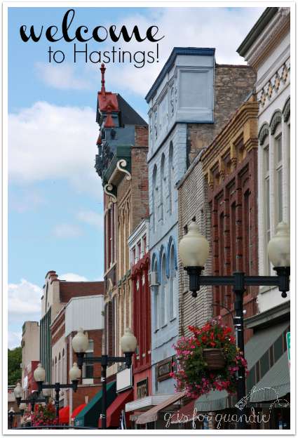
So, recently when I asked if she wanted to meet me in Hastings to check out the new shop I was going to be selling stuff in, she said sure.

Hastings welcome

I gave her all of the info over the phone.  Later, she told me she thought “I Can Be Refined” was kind of an odd name for a shop.

She was close, but Eye Candy REfind is so much better, don’t you think?

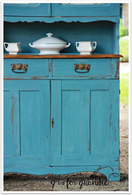
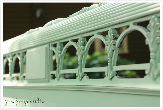
I’ve been working like a dog getting a bunch of things ready for Eye Candy REfind’s grand opening of their Hastings location this weekend.  I wanted to pull together a collection of pieces that really epitomized my style, so each item I’m bringing to Hastings was selected especially for this event.  I just finished up the last piece of furniture that I’m taking down there, the hydrangea cupboard.
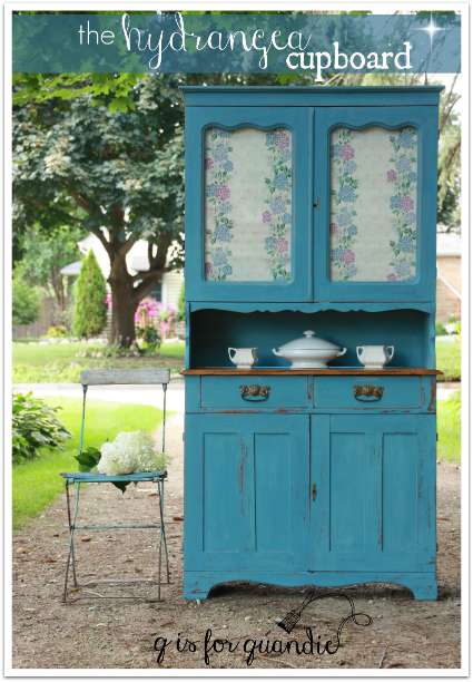
farmhouse hydrangea cupboard title

Isn’t she lovely?

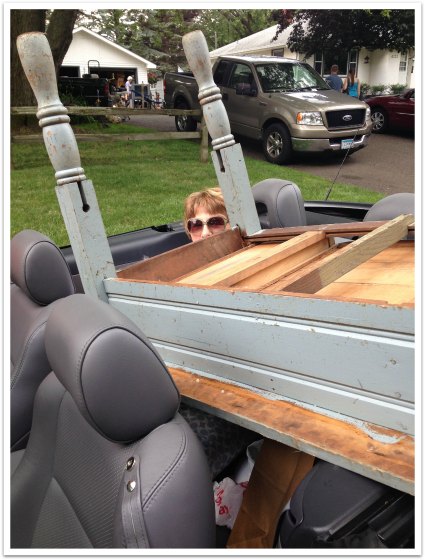
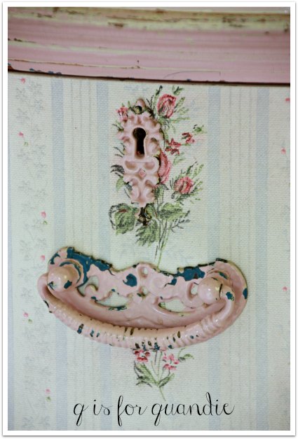
My sister and I drove out to Minnetonka to pick this one up.  It was the morning after some storms had come through the Twin Cities, and we ran into all kinds of problems.  Stop lights weren’t functioning, roads were out.  It was a mess.  But we finally got there and I was happy to take this cupboard off the seller’s hands.  It originally seemed like an antique.  However, after I got it home and did a closer inspection, I decided it was an antique knock off (much like my own Rooster cupboard) or as Mr. Q calls it, a ‘faux-tique’.  Here were the clues; the hinges don’t look old, the routing around the glass looks too modern, that curvy detail just below the glass doors looks a little bit 80’s.  In addition, the drawer pulls that came on this piece were too clean and new (I have replaced them with genuine antique pulls).

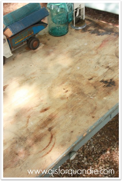
I think there is a possibility that the bottom half of the cupboard is genuinely old and maybe just the top half was added later.  The drawers look quite rustic inside.

farmhouse cupboard, lower half

But then again, maybe the whole piece is newer than I thought.

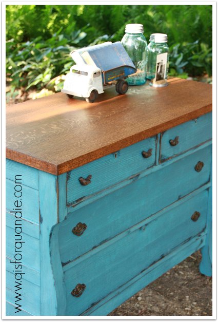
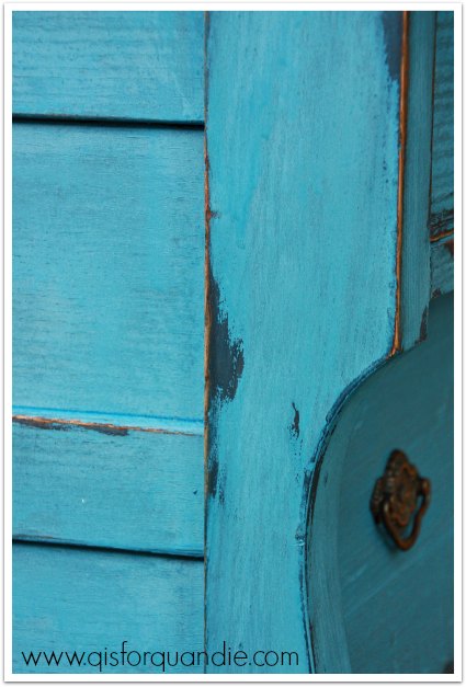
I did my best to make it look old though.  I painted it with an undercoat of Miss Mustard Seed’s Shutter Grey, then two coats of French Enamel.  I used my new method to encourage chipping, putting tape over the paint and pulling it off again (like waxing your brows, thank you for that analogy Lacy!) and once again it worked perfectly.

farmhouse cupboard drawer

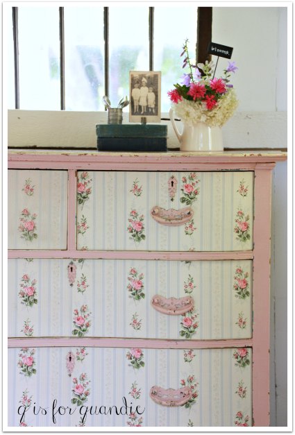
And finally, I couldn’t help but add my own special ingredient, some vintage hydrangea wallpaper.

farmhouse cupboard wallpaper

The wallpaper is just tacked into place, not permanently adhered.  I know that some potential buyers might prefer to display pretty things inside and be able to see them through the glass, so they can easily remove the wallpaper.

farmhouse cupboard interior

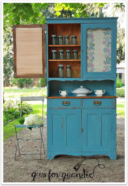
Oh, and that reminds me of yet another reason why I’m sure this is a faux-tique, the shelves are adjustable!

It seemed appropriate to use some hydrangeas for staging this piece and my Vanilla Strawberry are just starting to open up.  They start out white but gradually turn pinker towards late summer.

farmhouse hydrangeas

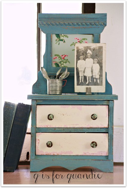
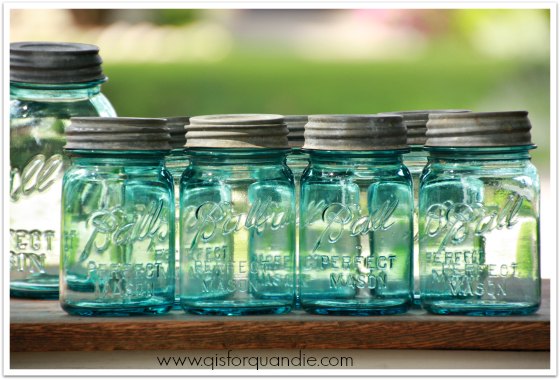
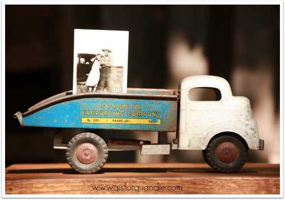
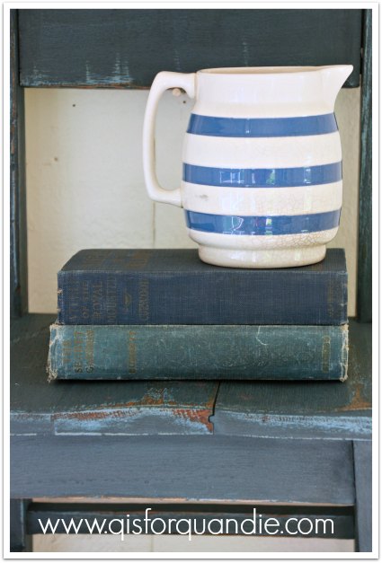
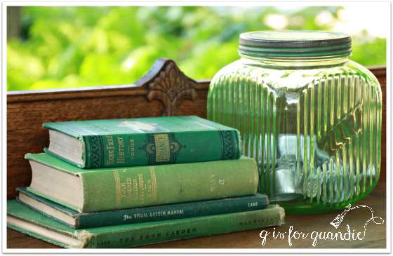
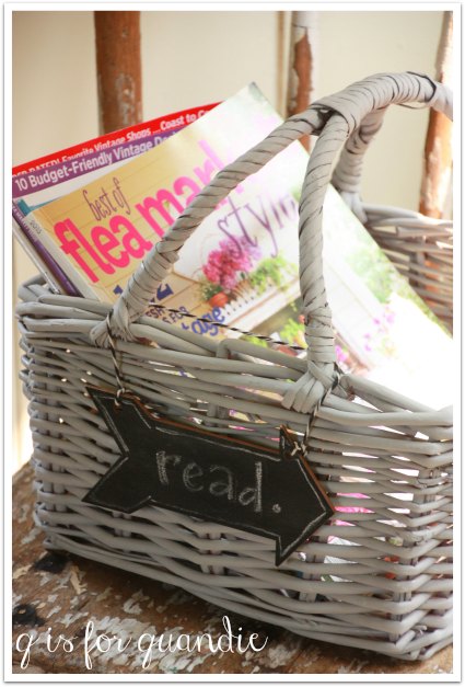
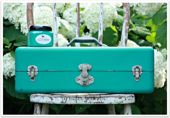
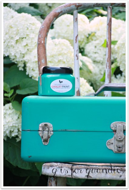
In addition to furniture, I have some great small pieces at Eye Candy as well.  Some painted suitcases, hatboxes, books, vintage cameras, some clean Balls (jars that is) and lots more!

I hope that some of my local readers can join me this Sunday for their grand opening extravaganza!

Where:  218 2nd Street East, Hastings, MN

When:  Sunday, August 2 from 2 pm to 5 pm

What:  brats, hot dogs, beer, wine, live music, fun activities for the kids, and some fabulous shopping for vintage eye candy!

Hastings 1

I’m pretty sure I can be refined, how about you?

accurate colors.

One drizzly evening last week Mr. Q and I picked up a lovely bedroom set.  This is one of my craigslist secret tips.  I hesitate to even share it here, because the competition for craigslist pieces has gotten seriously fierce in my neck of the woods.  Maybe I should start keeping my secrets tips to myself!  But no, here it is.  I often search for bedroom sets instead of individual pieces.  They might seem expensive at first glance, but if you break down the cost per piece they can sometimes be a great deal.  Plus there is the added bonus of getting multiple pieces in one trip.  Time and gas saving!

This set included a full sized bed,

ntnl bed before 1

a tall gentlemen’s dresser,

Natnl tall dresser before

and a lady’s dresser with mirror.

Natnl mirror dresser before

Personally, I think the coloration on these pieces is quite hideous.  OK, maybe hideous is a strong word … but …  well, yep, hideous.  The dark shadowing around the edges is a total turn off for me.  And then there is this odd looking flower detail.

natnl closeup

You can’t see it as well on the dressers, but they both have it too.  Gack!  The green center just boggles the mind.  Isn’t it kind of creepy?

But I had a sneaking suspicion that these pieces could be quite beautiful with a paint job.  The prettier details that were barely noticeable before really pop now.

See?

blaine bed 1

The difference is night and day, don’t you think?

I chiseled the weird flower from that raised circle on the foot board and replaced it with a 1902 stencil.

Blaine bed stencil close up

But first I had to use some Tough Coat Sealer just on this raised circle because the black kept bleeding through my paint.

Speaking of paint, this is a custom mixed Annie Sloan chalk paint color.  I used about 1/3 Louis Blue, 1/3 Pure White and 1/3 Old White.  Then I topped it off with a smidge of French Linen (grey) to tone town the ‘sweetness’ of the Louis Blue.

While we are on the subject of tweaking colors, let’s talk about white balance and how it messed up the color in my photos of this bed.  Do you use the white balance setting on your camera?  I know that the professionals calibrate their white balance for the exact conditions of their photo shoot.  I’ve done that with my camera, but I seldom get it right that way.  I’m a total amateur!  However, I do frequently change between the ‘canned’ white balance settings on my camera; sunny, shady, cloudy, tungsten light, and fluorescent light instead of using the ‘auto’ white balance setting.  Sometimes you have to play around with them to get the right setting for your conditions.  I find that in many cases I need the “sunny” setting even when I’m in the shade.  The two photos above were taken using the sunny setting, and as you can see, they were taken in the shade (but with a sunny background behind the subject).  The color in them is fairly accurate to the piece itself, except I think the color is a bit lighter in person.  A pale blue with not a lot of green in it.

Then just to experiment, I decided to switch my white balance to the “shade” setting.  And this is what I got.

Blaine bed color balance

A pretty picture, but not an accurate representation of the color.  This looks a lot like Duck Egg blue, which the bed definitely is not.  Sometimes you can fix this using a photo editing software, but I was unable to get the true blue of this bed using Picmonkey, Picasa or Windows Live Photo Gallery.  I kept getting a lot of extra pink thrown in.

blaine bed pink

I’m not an expert on white balance, but I have been working on getting it right in my photos since that translates to showing more accurate pictures of colors on my blog.  I feel like it’s important since a lot of you (like me) will see a color you like on a piece of furniture, and then be so disappointed when the color looks entirely different in person.  I still don’t get it right all the time, as was the case with these bed photos, but I try!

Did you know that even a lot of camera phones have a white balance setting?  Mine does.  It doesn’t have as many as my Canon Rebel camera but it has cloudy, daylight, fluorescent and incandescent.  So, if you aren’t already working with your white balance settings, give it a try.

And if you want to see the real color on this bed, drop in at Reclaiming Beautiful in Stillwater where it is sporting one of my new tags!

new tag 1

french farmhouse chippy.

That title sounds like some sort of rural floozy from Provence, although apparently the spelling should then be “chippie” (and if you don’t understand what I mean, look it up).  But in this case it’s this fabulous dresser.

french farmhouse corner

I started with this dresser that I purchased via craigslist.

tall dresser before

As usual, it looks great in the photo, but it had some flaws.  For one thing, the top was falling off.  Ken waved his magic wand and fixed her right up.  The finish was not in terrible condition, but there were some water rings on the top.  The main flaw, in my opinion, was that someone had put a rather shiny poly on it.  I am not a fan of shiny.

But shiny can work in your favor sometimes with milk paint.  In this case, I was able to get the absolutely perfect amount of crackling and chipping thanks to that previous finish.

french farmhouse close up

So, what do you think of the green?  I’ll admit, I wasn’t sure at first.  This is the same Sweet Pickins’ In a Pickle that I used on the farmhouse table.  At first I thought it might be just a bit too bold for a dresser and that it might have an adverse effect on my ability to sell it.  I seriously considered putting white over it and letting just some of the green peek through.  But then I thought to hell with it!  I love it.  If no one else loves it, too bad.  If it doesn’t sell, I’ll just keep it myself!

french farmhouse side view

This time I used my custom mixed dark wax (a mix of Johnson’s paste wax and dark brown Briwax) instead of the Miss Mustard Seed furniture wax.  That deepened the green a bit and helped bring out those fabulous crackles.

french farmhouse chippy

I used a new trick to get more chipping; tape.  After my paint had dried for about 24 hours, I pressed some blue painters tape along the edges of each drawer and then ripped it away pulling some of the paint with it.  It worked beautifully.  Maybe this piece would have chipped anyway once I vacuumed it, but it’s hard to say.  I recommend trying the tape thing yourself.

You can see that I switched out the knobs for glass.  I just felt like they brought out the vintage farmhouse look I was going for.

Why am I calling this a french farmhouse dresser?  Well, not because I know what kind of furniture they have in french farmhouses, but because I added a french stencil from Maison de Stencils to what I feel is a very farmhouse style piece.

french farmhouse title

Plus, I looked it up and the Pas-de-Calais region of France has 2,000,000 acres of farmland (Wikipedia said so).  So really, this stencil is very apropos for a french farmhouse dresser.

I’m a little disappointed that my stencil looks fuzzy in all of these photos.  It really isn’t fuzzy in person, but I continue to have problems with my photos looking fuzzy on WordPress.  You’ll just have to trust me when I say it isn’t this fuzzy.  Or, better yet, come and see it yourself at the grand opening event for Eye Candy ReFind in Hastings.

french farmhouse stencil details

My vintage “Young Folks History of France” book was the perfect shade of green for staging this piece, along with my grandmother’s green depression glass canister.

french farmhouse styling

So what do you think?  Are you in or are you out when it comes to green?

french farmhouse longshot

pretty in pink.

I spent a little time on Rachel Ashwell’s blog the other day.  She doesn’t really blog a whole lot, but every once in a while I check out what’s new.  Her latest post was about vintage furniture and here is what she had to say:

“When hunting for wooden pieces,  I am usually  looking for authentic paint in the Shabby palette (white, ivory, pale pink & blue, grey teal or bleached raw wood) or pieces that can create a rustic vintage decor and on a rare occasion I will repaint.  I get great joy when I see pieces come through our “restoration for reloving”  process.  Each piece is cleaned, shored up if wonky, drawers and shelves lined with vintage wallpaper, new glass, marble or hardware applied…and when ready we proudly tack on our branded brass plaque.”

Well, I am rarely lucky enough to find a piece that has an authentic vintage paint job in a color that I like so when I find one, much like Rachel, I like to preserve it.  Such was the case with the Nokomis dresser.

pink dresser before

It was really pink, but not a terrible pink.  It also had some great layering under the pink.  Some blue and some cream.  I like to believe that Rachel would have snatched this one up had she come across it somewhere too.

Even though I wanted to save the original paint, I felt like I needed to tone down the pink-ness just a tad.  Adding some vintage wallpaper to the drawer fronts was just the ticket.  I chose a paper that had pink roses, but also has the blue and cream (ordered from Hannah’s Treasures via Etsy).

rose dresser corner

To me this is the quintessential farmhouse floral wallpaper.

wallpapered drawer fronts

Now, I’m going to give some details on wallpapering furniture here.  If you are never in a million years going to wallpaper anything, feel free to just skip right over this next part.

But, if you have been thinking about using vintage wallpaper on something yourself, here are a few tips.  First of all, I use Zinsser Sure Grip all purpose adhesive (I got mine at Home Depot).  I use the powder, because I can just mix up as much as I need, which isn’t much.  I usually cut my pieces just a bit bigger than they need to be.  For example, these drawer fronts were about 7.5″ high, so I cut 8.5″ strips.  I apply the adhesive to the back of the paper using an inexpensive chip brush.  Then I “book” the paper.  This is basically just gently folding half of the paper over to the other half, glued sides together.  Gently!  Don’t make a crease in the middle.  I was taught to do this back when I was wallpapering entire walls.  I don’t really know why.  Google says two things.  One, if your paper is going to stretch, this allows it to do so before you apply it.  Two, this allows the adhesive to “activate”.  I don’t know if either of these things are really true or not, I just do it anyway.  Next, since this pattern had a stripe, I tried to pick an obvious position on the paper to start at the left hand side of each drawer.  I could go into a bunch of detail here about ‘repeats’ and stuff like that, but that would really get boring.  For the most part, I didn’t pay too much attention to the repeat on this paper.  If you know what I’m talking about, go back and take a look a the pictures.  Yep, didn’t get the repeat perfectly, did I?  Did you care the first time you looked?  Probably not.  However, I did have to get the stripes lined up.  That would have been easier had I started with the bottom two drawers, and then lined up the upper right hand drawer last.  But, never let it be said I do things the easy way.  I had to rip the paper off that upper right drawer and re-do it when the stripes didn’t line up with the bottom.  I didn’t take that piece separating the upper drawers into account.  Ooops.  Luckily I had enough paper.

I actually had more than one person ask me if it was going to be difficult to trim the wallpaper around the keyhole escutcheons.  Sometimes it catches me off guard when I realize that not everyone knows how some of these things work.  Although they were fairly painted over, the escutcheons were just held in place by two small nails.  I used a razor blade to loosen the paint around them, then just carefully pried them off.  After I wallpapered the drawers, I put the escutcheons back on using the nails.  Easy peasy, no trimming around them required.

rose dresser hardware

So far I have had very good luck with the Zinsser adhesive.  I find that the wallpaper goes on and stays on.  I wait 24 hours or so after applying it, and then I go back and sand the edges.  Yep, you read that right, I sand them.  It gives them a nice smooth edge, and leaves nothing loose to catch on stuff.

My little Artissimo blue chair makes a great companion to this dresser.  It cuts a little of the pink sweetness, and it brings out the blue in the wallpaper.

pink wallpapered dresser

I like to think that Rachel would approve of this one, what do you think?

pink wallpapered dresser

random makeovers.

I’ve been busy in my workshop lately with a lot of small projects that don’t really seem to merit their own blog post.  So I decided to throw them all together in one post.  So, here we go with some random makeovers!

Remember the bed I purchased in the Nokomis neighborhood?

bed before close up

I painted it in homemade chalk paint in one of my favorite colors, Aloe by Sherwin Williams.

Nokomis bed full

The detail on this bed was just lovely.

Nokomis bed close up

It sold very quickly at Reclaiming Beautiful in Stillwater.

Nokomis bed 1

I have to say that working with the homemade chalk paint (made by mixing Plaster of Paris with water, then adding to regular latex paint) reminded me how much nicer real chalk paint is!  The homemade stuff works and it’s certainly cheaper, but it’s tricky to get the proportions right.  The paint thickens up if left too long.  Plus, I’ve read that breathing in the dust while sanding the Plaster of Paris isn’t really good for you.  I don’t have any authenticated info on that, but just to be on the safe side, I think my homemade chalk paint days are officially over.

Next up, remember the basket from lunch time garage sales?

lunchtime finds

That’s it down in front, kind of an ugly brick red color.  I used a favorite cheat of mine to paint it.  I started with grey spray paint to cover all of the nooks and crannies easily.  Then, I added a lightly brushed on coat of grey chalk paint.

painted basket

It is so much easier to get good coverage first using the spray paint, and then the matte look of chalk paint by one quick brushed coat.

Next, I painted another toolbox.  Unfortunately, I don’t have a before picture.

rooster toolbox 2

It was sort of that ugly beige color that you often see these in.  Sue tried to sell it at our Carriage House sale, but there were no takers.  So I offered to take it off her hands and give it a makeover.

rooster toolbox 1

I painted it with Urban Rooster chalky paint in a color called Jaded Rooster.  Darrielle of D.D.’s Cottage and I recently swapped some paint.  I sent her some Fusion paint (and you can see what she did with it here, here and here), and she sent me some Urban Rooster paint.  I haven’t had much chance to use the Urban Rooster on a full piece of furniture yet, but I loved using it on metal.  It went on very smoothly.  I liked that it wasn’t as thick and texture-y as some chalk paints I have used.  I used two coats on this piece, then I sanded it and finished with wax.

Then I added a fabulous rub-on that has been in my stash for years.  Sometimes rub-on’s dry up over time and no longer work, so I was really happy that this one was still good.

rooster toolbox close up

This is a Rhonna Farrer Phrases Rub On, but sadly I don’t think these are available to purchase anymore which is too bad because they are fab.

rooster toolbox 3

My friend Terri and I were recently lamenting the fact that rub-on’s seem to have gone out of favor.  If any of you have a good source for them, I’d love to know about it!

And last but not least, I shared the ‘before’ of this little dresser way back in October.

mini dresser before
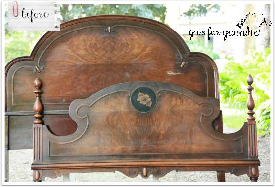
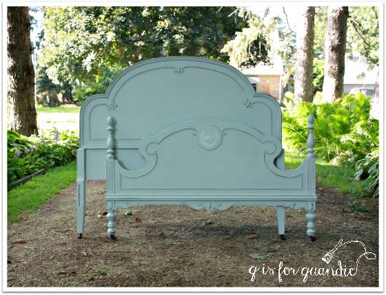
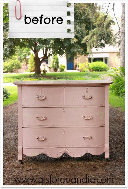
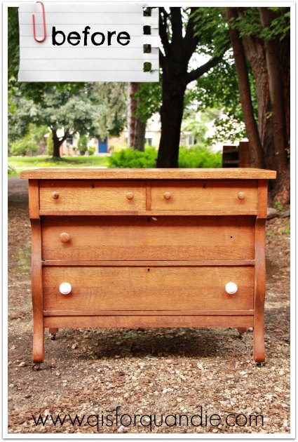
I have painted this three times since then!  Well, parts of it anyway.  I started out painting the whole thing in Sweet Pickin’s Sweetie Jane.  And nearly every single bit of paint chipped right back off.  I wanted it to be really chippy, but not that chippy.

mini dresser version 1

Next I just sanded down and painted the drawer fronts.  First in pink, then a layer of white.  The paint adhered better after the sanding, and I was very happy with how the drawer fronts looked.  You can see that change in this photo, bottom right.

mini dresser in Q branch

But after living with it a while, I realized that I didn’t like how white and un-chippy the drawers were compared to the rest of the piece.

So recently when I had some extra Miss Mustard Seed French Enamel left over, I decided to add another coat of paint to the body.

mini dresser after

Although I didn’t really plan it this way, having these different layers of color gives the piece the look of having been painted many times through the years.

Sometimes it takes me more than one do-over before I get it right, but as they say, if at first you don’t succeed …

So, which of these random projects is your favorite?  I’d love to know!


in a pickle.

I had a conversation with some creative types the other day, and we were discussing the idea that there are really very few original ideas out there.  I am the very first to admit that none of the ideas I come up with are original.  Somewhere, whether in a magazine, on pinterest, or watching HGTV, I have seen something that planted the seed of the idea in my head.  Hopefully I add a splash of “quandification” (another word for you, Victoria!) to what I do, but I don’t claim sole ownership of any of my ideas.

That is in large part why I’m comfortable with sharing everything I do here for the world to see.  I didn’t invent any of it.  Someone else somewhere has already done it.  I try to always give credit where credit is due when I can point at something and say ‘that is what inspired me’, and such is the case with the dirty farmhouse table that I picked up the other day.  I had seen a photo of a gorgeous farmhouse table with a green base in the 2015 Best of Flea Market Style magazine.  It was just a little photo (p. 4 if you are looking for it), and I couldn’t find credits for it anywhere.  I still don’t know whose photo it is (if anyone knows, please tell me).  However, I was able to find the photo itself online, and here is it.

green table inspiration

And here is my interpretation.

In a Pickle farmhouse table

I knew I wanted milk paint for this makeover, and I knew I wanted a vibrant kelly green.  Neither of Miss Mustard’s greens were going to cut it.  So, I ordered “In a Pickle” green from Sweet Pickins online and patiently (not) waited for it to arrive.  Fortunately, it was shipped to me lickety split so I didn’t have to wait long.

green desk and books

This is such a rich, vibrant green.  You’ll remember that the table base was already painted a grey blue color, so spots of that color do peek through on the edges.  I think it works.  The Sweet Pickins milk paint mixed up very nicely.  You can see that I didn’t really get any chipping with it, which kind of surprised me since I was painting over existing paint.  I did sand first.  This was the second time I used the Sweet Pickins paint.  I also have used her Sweetie Jane, which is the perfect shade of aqua/blue-green.  I finished the table with Miss Mustard’s furniture wax.

Here is a reminder of where this table started out.  Remember how dreadfully stained and dirty the top was?

farmhouse table collage

Gross!  After I literally hosed it down in the yard and then scrubbed it from top to bottom, Ken came over with his belt sander and we tried to knock back the worst of the stains.  I think we were pretty successful.

green desk top

I added some Dark Walnut gel stain and called it good.  It’s not perfect.  I wanted it to look beat up and rustic, but in a good way.

I filled my French Market wooden tote with Annabelle hydrangeas arranged in my now clean and sparkling Ball jars.

Annabelle hydrangeas

I’ve actually got this flower arrangement on my own dining room table at the moment, but I knew it would be perfect for staging this table.

This is one of those versatile pieces that could be used in several different ways.  It would make a fantastic desk.  It’s larger than the table I’m currently using as a desk, too large for my space or I’d be tempted to keep it.  It would be a great size for crafting.

Green farmhouse style desk

green desk with chippy chair

This would also be an amazing piece for a covered porch.  I can picture a candlelit dinner for two, listening to the crickets chirp, a glass of wine.

Or, another great idea, add some large casters to the legs and use this as a move-able kitchen island.

So many possibilities for this table.  What would you do with it?

farmhouse style.

In case you haven’t noticed, I’m drawn to farmhouse style.  Maybe it’s because I live in what was originally a farmhouse.  Or maybe it’s because I always enjoyed visiting the South Dakota relatives who still live on the family farm where my grandmother was born.  This photo of one of my grandmother’s sisters and her farmer husband was taken there.

washstand staging

Most probably, it’s just because it’s really popular right now and I tend to fall for trendy stuff.

Whatever the reason, when Mr. Q brought home this little washstand, I got a vintage farmhouse vibe from it.

washstand before

This came from the same couple who sold me the primitive cupboards.  When Mr. Q went back to pick up the 2nd cupboard, he was offered this piece plus a galvanized metal pie safe.  He figured it was a safe bet that I would want both of them, so he brought them home.  And he was right!

After stripping the top, I originally put two coats of Miss Mustard Seed’s milk paint in Mora on the rest of the cupboard.  If you’ve used the Mora, you know that although it is a very pale grey, it has an almost minty green undertone.  That green tone just wasn’t working with the dark wood top.  If a color isn’t working for me, I’ll cut my losses and start over rather than try to be happy with results I don’t like.  So, out came the Marzipan.  Turned out that the warm almond color was perfect on this piece.  By the way, the finish on this was so dry that I didn’t get any chipping at all with the milk paint.

washstand title

You may also have noticed that I changed out the hardware.  I was not a fan of the drawer pulls that came with this.  I filled in the extra holes on the drawer and used some distressed glass knobs instead.

washstand corner

I left the rustic inside alone, and as you can see I staged it with just some of my many, no longer dirty, vintage blue Ball jars.

washstand interior

This little cupboard was missing its original casters when I got it, but I could see that it must have had some at one time.  Luckily I have a stash of old casters so I was able to replace them.  I like how they lift the piece up off the floor (or in this case, the ground) a little.

The top of this piece was in slightly poor condition.  One section had split off from the rest.  I asked Ken to repair it for structural integrity, but leave it kind of rough looking.  I also stripped the remaining finish, but I didn’t try to sand out all of the imperfections.  I liked the rustic nature of it.  Once it was stripped, I added a new stencil that I just got from Maison de Stencils.  I used black acrylic craft paint.  Once it was dry, I sanded over it to give it an aged appearance.  Then I just waxed the top with Cece Caldwell’s Aging Cream.

washstand top

This little cupboard sold very quickly at Reclaiming Beautiful in Stillwater, so clearly I am not the only fan of farmhouse style out there!

getting dirty.

Are you one of those people who love to dig through piles of dirty, gunky, rusty, smelly stuff at garage sales?  Do you feel a special thrill knowing that you might unearth some fabulous treasure from the mound of unrecognizable stuff?  Do you love getting dirty?

Well, quite honestly, I don’t.  I often walk away from what are probably great deals because I just don’t want to get my hands dirty.  Or more importantly, I don’t want to encounter any big hairy spiders or scurrying mice!

But I made an exception the other day.  My friend Sue texted me to let me know that there was a garage sale just a block over from my house, and they had lots of old rusty junk!  I was in the middle of painting something, so I was dirty already anyway, so why not?

I called up nnK to see if she would be my partner in crime.  Her mom, we call her “the Jude”, was visiting so she let us take her beautiful, clean convertible.  That Judy, she is a saint.  She is also my number one packer at my Carriage House Sale, FYI.

Anyway, we popped over to the sale.  The first thing that drew my eye was a crate full of old blue canning jars.  Then I saw another, and another!  There were 4 crates in all, full of totally filthy blue canning jars.

Ball jars

I am so tempted to make a comment about dirty Balls here.  What is wrong with me today?  But I have to tell you, these Balls were super dirty.  Luckily nnK helped me dig through them because all of the ones with lids were at the bottom.  I brought home 20 of them.  I washed them up and now they are sparkly clean, but you should have seen the sludge that was left behind in my kitchen sink.

This ended up being one of those sales where they have some really cool stuff that unfortunately wasn’t taken care of and now was mostly ruined.  I hate seeing that, don’t you?

However, while looking through all of the items on the $4 table, I couldn’t help but take a closer look at the table itself.  It was kind of ‘vintage farmhouse fabulous.’  There was no tag on it though.  So I asked, “how much for the table itself?”  The sellers kind of looked at each other, and then the wife said “well, I guess it’s $4 too!”

dirty farmhouse table

Sold!  To the girl who doesn’t like to get dirty!  One small problem, how were we going to get it home?  I voted for nnK and I carrying it the one block home on foot.  It was pretty filthy, and the Jude’s car was shiny clean and all leathery and stuff.  But no, she insisted, ‘just pile it on’.  So, we did.

Judy and the table

Yep, that’s Judy back there under the table.  See what I mean?  She’s a trooper.

Ken had already left his mark on this table before I got around to taking the ‘before’ pictures.  He has shored up the legs, added supports under the drawers where there were none, and covered up a gaping hole above the middle drawer.  Now I just have to work my magic on it.

The first step will be giving it a bath, and then I’m going to try to salvage the very stained top.

dirty table top

And then I’m going to treat it to a milk paint makeover.  Stay tuned to see how it turns out.

I’ve got the blues.

Yep, I’ve got the blues.  The vintage blues!

vintage blues

I have become a big fan of rich, saturated blue hues like Miss Mustard Seed’s Artissimo, Flow Blue and French Enamel.  And I used all three of them on this dresser!

But let’s start at the beginning.  A couple of weeks ago on a beautiful summer evening, Mr. Q, my sister and I hopped into the truck and took a little road trip to Somerset, Wisconsin to pick up this dresser.

empire before

It was about dusk as we headed back home and we were dodging deer right and left on the road.  Luckily though, no deer were injured in the making of this blog post.

We got the dresser safely home and once I got a good look at it in the daylight, I realized it was really orange.  Gack!  It was definitely time for a change.

I stripped the top, sanded it down, added some Varathane Dark Walnut gel stain, and then waxed it with Cece Caldwell’s Aging Cream.  This is rapidly becoming my “go-to” process for tops.  I love the color of the Dark Walnut and the finish I get with wax.  I’ve tried the Wipe On Poly, but I’m still a wax girl at heart.  There is something very organic about the look of wax that I prefer over a harder finish.

blue dresser top

Once that was taken care of, I painted the body of the dresser in MMS Artissimo, a very dark blue.  I then used Vaseline to help make sure this undercoat showed through in some strategic spots.  Next I mixed Flow Blue and French Enamel together, about 2 to 1, and painted one coat of that over the Artissimo.

blue dresser close up

These photos are looking very bright on my computer.  This dresser is a rich shade of blue, but not super bright.

The hardware on this dresser was a bear.  If you refer back to the ‘before’ photo, you can see that it came with mismatched wood knobs (the bottom two were painted pale pink!).  Boring.  I originally planned to replace them with glass knobs, but I was in a hurry and couldn’t find the right size for this piece.  I purchased 3 different sets of potential knobs for this dresser and disliked all of them once I got them on.  At one point, I thought these funky white key hole knobs from Hobby Lobby would work, but I only had two of them.  When I went back to get two more, I bought the wrong kind.  Plus, the white really stood out too much next to the blue anyway.

In the end, nnK convinced me to pull out my stash of vintage hardware to find something that worked with the cute bird knobs that I used on the top drawers.  I had four matching drawer pulls that were perfect.

blue dresser corner

Now what am I going to do with the 26 knobs I purchased that I didn’t use?  Oh, I’m sure they’ll find a home eventually.

Before we go any further, have you noticed anything in my photos so far?  Like my amazing vintage blue and white toy truck?

I picked it up at my favorite occasional sale, which happens to be my own sale.  Ha!  No really, that’s only because I get first dibs on everything that my sale co-host brings to the sale, and that included this super darling toy truck this year.  I snatched that up before it was half way out of the box.

blue truck

Mr. Q brought this dresser, along with a few other pieces up to Reclaiming Beautiful in Stillwater where it is for sale.  If you are local, be sure to stop up there if you’re interested in purchasing it!  They are open all weekend!

Dresser painted in custom mix of MMS milk paint blues.

what to do with extra paint.

Remember the little chairs I picked up while garage saling last week?

lunchtime finds

Well, as it turned out, they are the perfect solution for using up some left over milk paint.  As most of you know, milk paint comes as a powder and you mix it up as you need it.  Once mixed, it only has a shelf life of about a week.  Although I’m pretty good at judging how much paint to make, there are usually a few tablespoons left over.

So after a recent dresser make-over (soon to be revealed), I pulled out one of these chairs to use up the extra paint.

blue chair on the wall

I simply sanded down the existing blue paint, then painted a couple coats of MMS’ Artissimo on the chair.

blue books

The Artissimo worked perfectly with the lighter original blue color of the chair peeking through.

blue chair on the wall 2

Once painted, I sanded the chair again and then added Miss Mustard Seed furniture wax.

I staged it with some fabulous vintage blue books and a Cornishware pitcher.

blues

 Did you notice how perfect these little chairs are for hanging on the wall and using as a shelf?

In the end that might be the fate of all three.  I’m still working on that idea a bit.  Stay tuned.