it’s officially fall.

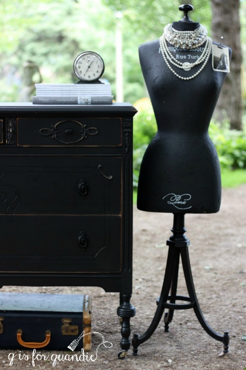
I tend to not do a whole lot of seasonal decorating.  How about you?  I find as I get older that time goes by so ridiculously fast that it doesn’t feel worth it to get out the Halloween decor because in five minutes it’s going to be time to get out the Christmas stuff.  Do any of you feel that way?

Plus, nature does such an amazing job of decorating for fall that it feels silly to have to add anything more!

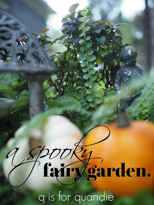
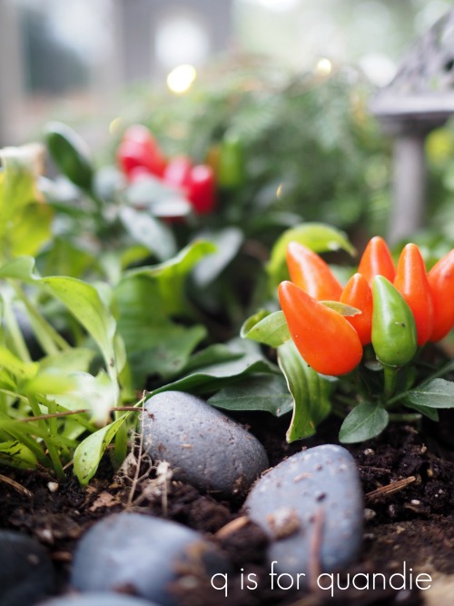
Apparently nature is trying to reinforce my opinion on that because the tiny pumpkins I added to my fairy garden last week have already been stolen.

I suspect that squirrels are to blame rather than klepto fairies though.  The white pumpkin disappeared first, and the orange gourd followed a couple of days later.  So much for that plan.

I have done a few fall craft projects in the last couple of years though, so I thought I’d recap them for you today in case any of you want to do some fall decorating yourselves.

I’ll start with my ‘hello fall’ book page banner.

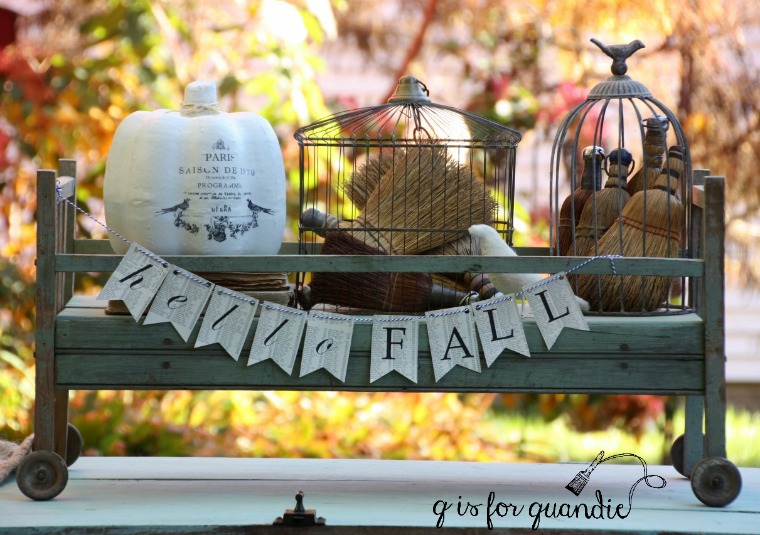
Last year I shared a quick tutorial on how to make one using old book pages and your printer.

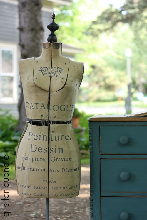
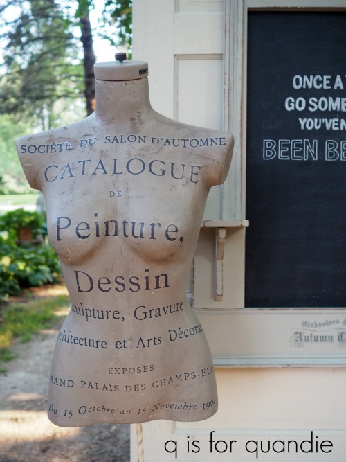
You’ve also already seen my french pumpkins.

The one above was made using a cardboard pumpkin, paint and some Fusion transfer gel.  Get all of those details here.

My second french pumpkin looked like this …

It’s an old wooden pumpkin transformed with some paint and a Prima Marketing transfer (details here).

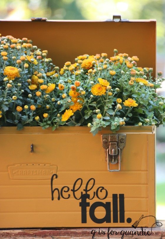
Then there were the ‘hello fall’ toolbox planters.  The one on the bottom is painted in Fusion’s Mustard.  The one on the top is in its original red.

I used my Cricut machine to cut the words out of adhesive vinyl.  These are perfect for just popping in some mums and calling it good.

While I had the Cricut out that year, I also made some ‘hello fall.’ plates …

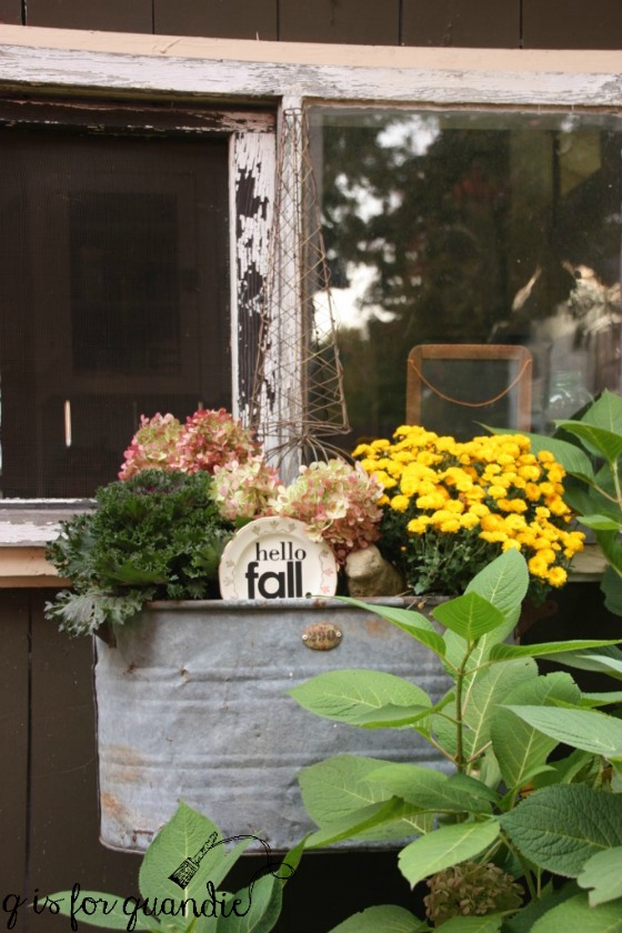
They are fun to add to planters full of mums, kale and hydrangea flowers.

I did whip up one more quick fall decoration this year.  I had a fake plastic pumpkin in my stash so I painted it white using Fusion’s Limestone.  Then I pulled out some Prima Marketing supplies; decor wax in a color called Eternal and a transfer called Simplicity.

Rather than try to apply the transfer as one whole sheet, I just cut out sections of the design to place randomly on my pumpkin.

It was a little tricky to place the flat designs onto a curvy pumpkin, but I’m OK with a little imperfection.

I used the Eternal wax to give the pumpkin a gold stem.  This was the first time I tried the Eternal, but it definitely won’t be the last.  It’s the perfect gold, and it was so easy to apply using a q-tip.

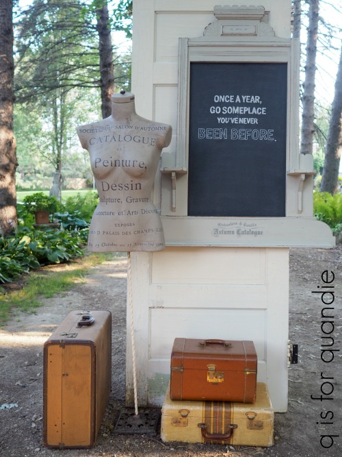
My new toile pumpkin pairs nicely with my french pumpkin, don’t you think?  OK, maybe not the most traditional looking fall decorations but they suit my style for sure.

too sexy for my shirt.

Back in May I picked up this manikin at the Roseville city-wide garage sales.

She’s probably a shop manikin, not to be confused with a dress form that can be adjusted for size.  She didn’t have a stand, and she’s just a Styrofoam type material underneath a stretchy knit fabric cover, but I still figured I could do something with her.

After all, I’d worked with something similar when I came up with Lulu.

If you look closely you can see that Lulu is also Styrofoam and she has a doorknob for a head (poor thing).  I’ve turned her Styrofoam-ness into an asset by using her as a pin board for old photos.

I painted her with black chalkboard paint and used the base to one of those table/lamp combinations to create a stand.

I can’t remember precisely how long ago I cobbled Lulu together, but it was before I had a blog which makes her at least 5 years old or more.  She’s held up remarkably well for being made out of painted Styrofoam.

Anyway, I felt sure I could do something similar with the manikin from Roseville.

First I had to come up with a stand of some kind.  I’d been waiting all summer to magically find another table/lamp but no such luck.  But then I remembered that I had an antique metal floor lamp thingie tucked away out in the carriage house.

Please pardon the terrible photo.  It was raining when I took it, but I just wanted to grab a quick photo to show you what it looked like.

Initially I thought I was going to have to have my handyman Ken cut it down to the right height, or at a minimum cut that top decorative piece off.  However, as it turned out the top piece screwed right off and then when I added the manikin torso (which has a hollow metal pole up the center) it ended up being the perfect height already.

Next I removed that hideous stretchy knit fabric from the manikin.

This was about when that song “I’m too sexy for my shirt” popped into my head (who else remembers that song?).

This torso is just way more, well, sexy than Lulu.  It almost feels a bit wrong to leave her unclothed.  She seems to have a lot more curves to her.

But, I pressed on.

I first gave her a coat of Rustoleum black chalkboard paint.  Since it had worked so well on Lulu, I thought it would make a good base coat for this manikin too.  But ultimately I knew I wanted to add a Prima Marketing transfer to her like I did with Collette, the dress form that I refurbished earlier this summer …

I had some Homestead House milk paint on hand in a color called Algonquin, which I thought would be perfect for this look.  If the milk paint got chippy, I didn’t want to see the yellowish color of the Styrofoam underneath hence the black base coat.

So once the black paint was dry I mixed up the milk paint and added a coat.  So far, so good.  Once that was dry, I added a 2nd coat and then left the manikin to dry overnight.

The next day I was so excited to get home from work and get the transfer added.  But, that was not how it went at all.  Instead I went into my workshop only to find that the milk paint had chipped like mad.  Except instead of revealing the black chalkboard paint, it was taking it along for the chippy ride and chipping all the way down to the Styrofoam underneath.

This was that moment that you dread in any project.  The moment when you realize that you have to start over.  Well, actually, even worse.  First you have to remove all of the chipping paint, and then start over.  Ugh.

Lesson learned:  Styrofoam, chalkboard paint and milk paint don’t mix.

Well, it was an experiment.  And now we know.

After chipping away all of the loose paint, I gave the manikin a light sanding just to be sure she was ready for another go.  Luckily I had some Fusion paint in Algonquin on hand.  Yes, same color as the milk paint, but this time in an acrylic paint.

Ahhh, much better.  One coat of Algonquin later and things were looking up.

As you can see, I ended up with a lot of texture (some might call it damage, I prefer to call it texture), but that just gives it more character.

Next I applied the transfer.

I knew it would be somewhat challenging applying it to a curvy surface rather than a flat one.  To make that easier, I cut the transfer into smaller sections which helped quite a lot.

In the end it went surprisingly well.  If you try something similar, just be sure to go slowly and make sure each letter is adhered before moving on to the next.

I still wasn’t done though.  Next I added a coat of Miss Mustard Seed Clear Wax followed by a coat of Fusion’s Expresso Wax.  It’s always wise to use a base coat of clear wax before adding a dark wax to make it easier to blend your dark wax.

I also painted the wooden topper on her neck in Algonquin and then added a Tim Holtz number rub-on.  I finished that off by adding some of the Prima Marketing metallique wax in Bronze Age to the screw that holds it in place.

When she was all done I decided to call her Coco.

She almost looks a bit like she’s made out of stone or plaster.

I ended up bringing her in to Reclaiming Beautiful (the shop where I sell on consignment) on Wednesday evening and even though I still wonder if she’s just a bit too sexy for her shirt, someone snatched her up right away Thursday morning!


the black bag.

A couple of months ago my friend Sue found this old black leather bag for me.

It doesn’t look like much in that photo, but I knew I could dress it up with a stencil.

The trick with stenciling something like this is being able to provide some support behind the surface you are stenciling.  In this case I laid the case on its side and filled it up with a stack of large books so that I would have a firm, flat surface for stenciling.

I stenciled it with Ceramcoat acrylic craft paint in Deep Taupe.  I know it appears white next to the black, but trust me.  It’s this color …

This is one of my favorite tricks for stenciling on black.  If you use a white paint the contrast will be much more stark.

I used just the lower portion of a stencil that I purchased from Maison de Stencils (and I noticed it just happens to be on sale at the moment).

Sue tells me that the person selling this bag said it was actually used as a doctor’s bag.  It is quite old, but unfortunately not in the greatest of shape.  You wouldn’t be able to use it as a bag anymore.  The zipper is broken and the leather handles are starting to give way.

But it works perfectly if you just want to use it as decor.

I filled it with crumpled paper to give it some shape and then I stitched the opening closed since the zipper wasn’t functional.

It looks great on a stack of vintage suitcases …

It has a bit of a spooky feel which is perfect for this time of year.

Adding a quick stencil is a super easy way to give something just a little more interest, don’t you think?

a spooky fairy garden.

And just like that, in the blink of an eye, it went from summer to fall here in Minnesota.  Last Monday it was sunny and warm and by Friday night we had our first frost warning of the season.

With highs in the low 50’s, it was too cold to paint in my carriage house workshop all weekend.  So instead I worked on pulling out all of the annuals that were past their prime in my planters and replacing them with mums, ornamental kale and pumpkins.

I decided to go traditional this year with oranges, reds and yellows.

While I was at it, I decided to add a little fall decor to the fairy garden too.

I started with a tiny white pumpkin and a tiny orange gourd (yep that’s technically a gourd and not a pumpkin).

They were only 99 cents each at my local Bachman’s.  Although they are tiny, in the fairy garden they become huge, blue ribbon worthy pumpkins!

I also came across some tiny pepper plants in the miniature section at Bachman’s.  Even though peppers don’t normally scream fall, I thought the red and orange coloring would lend an autumnal vibe.

Next I added some fun miniature decorations that I picked up last year at another local flower shop, Rose Floral in Stillwater.

With the additional of a few spooky tombstones and the fairy garden is definitely feeling more in season.

And who doesn’t love to see a tiny skeleton clawing his way out of the ground in their fairy garden?

I also put some fresh batteries in the tiny string of fairy lights on the evergreen shrub to make sure the fairies don’t get too frightened by the new decor.

And just like that we’ve got a spooky fairy garden!