Good morning from the garden.
This morning I thought I’d share a quick tour of the mid-August shade garden.
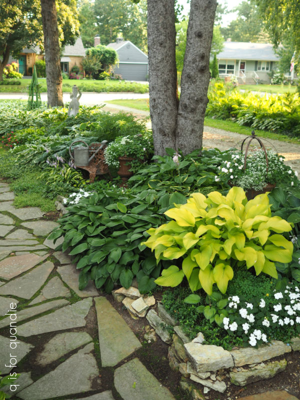
This shade garden runs between the house and the driveway. It is just a basic rectangle without any fancy curves or anything, but I consider it my favorite of all my garden beds.
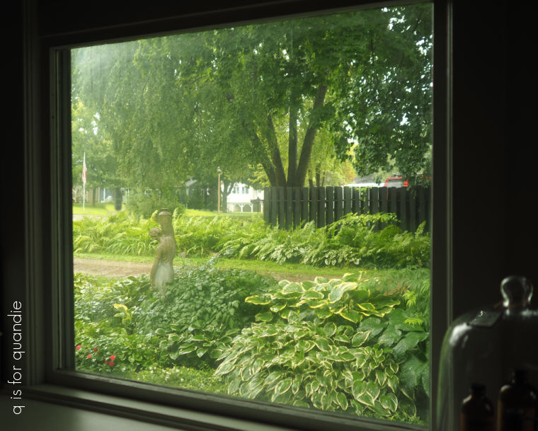
It’s also the one that is most visible from inside the house, so on rainy weekends like this one I can still enjoy the garden.
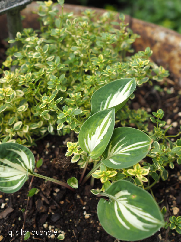
It contains some of the most well-established plants that I have, especially since the Hosta albomarginata was here when we bought our house 37 years ago.
It’s the hosta in the foreground of this photo …
I consider it one of the old standby traditional hostas that every foundation planting had 40 years ago. It’s a basic green with white margins, and it’s probably … no … definitely my least favorite hosta in the garden. That being said, it’s also a tremendous workhorse. I’ve divided mine so many times over the years that I now have dozens of them, and they are huge. So removing them and replacing them would be quite the project.
Sadly, it’s also the most susceptible to both hail damage and insect damage because the foliage is not as sturdy as some of the newer varieties. However, so far this summer we haven’t had any hail (knock on wood), and I’ve been using Sluggo Plus to take care of the slugs and earwigs and that’s working really well.

I just discovered Sluggo Plus this year (ordered from Amazon). I used to use the regular Sluggo which contains iron phosphate, which is effective against slugs and snails. Sluggo Plus, contains both iron phosphate and spinosad, a natural insecticide which is effective against earwigs and pill bugs. Last summer was pretty wet and the earwigs did lots of damage to my hostas, so I wanted to stay on top of that problem this year and it’s lucky I did because this summer continues to be fairly wet as well.
It’s nice to have hostas that still look good in mid-August.

That bright green hosta is Sun Power, and it just glows in the shade.
Another of my favorites is Lakeside Dragonfly (center front below).

It’s perfect for the front of a shady garden bed.
I’m still finding plenty of jumping worms in my garden, and I can tell that they have had an impact on the texture of my soil, especially in the shade garden. The top couple of inches of soil look very granular, and it dries out quickly. Fortunately we’ve had plenty of rain this summer, but I’m keeping a close eye on the garden and watering regularly if it gets too dry. I’m also adding nutrients in the form of both bagged compost and Espoma’s Plant Tone. There is conflicting info out there on whether or not using an organic fertilizer makes the problem worse by also feeding the worms, but I can’t find any better suggestions for keeping my plants well fed.
I would say that my well established perennials are doing just fine despite the worms, including my Japanese painted fern.

The annuals that I planted this year don’t seem to be struggling either. Some of you may remember that I filled in some empty spots with Impatiens.
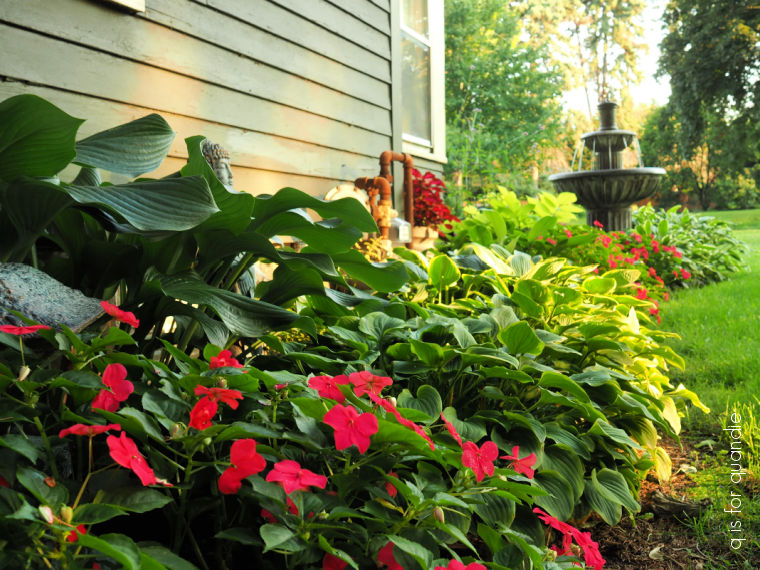
They filled in quite nicely and add a bright pop of color to my otherwise mostly green garden. The bright pink of the Lipstick impatiens is pretty, but it isn’t really my vibe though.

Perhaps next year I will use the Apple Blossom double impatiens instead.

They are looking quite lovely in my planters and are more in line with my personal aesthetic.

In the spring I mentioned that one section of my shade garden had completely died out over the winter including my Aralia cordata ‘Sun King’.
I replaced the aralia with one I purchased at Home Depot, and also added in a couple of new hostas, bleeding heart and astilbe.
They are all doing well, and the astilbe is blooming for a 2nd time!

This is Astilbe Younique Ruby Red and everything I’ve found online says this plant does not rebloom so I don’t know what to make of it.
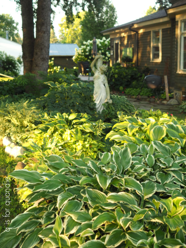
The Fairy Candles (or Black Cohosh, but seriously, isn’t Fairy Candles a way better name?) that I got from my friend Jackie are doing great growing around Cossetta’s feet.
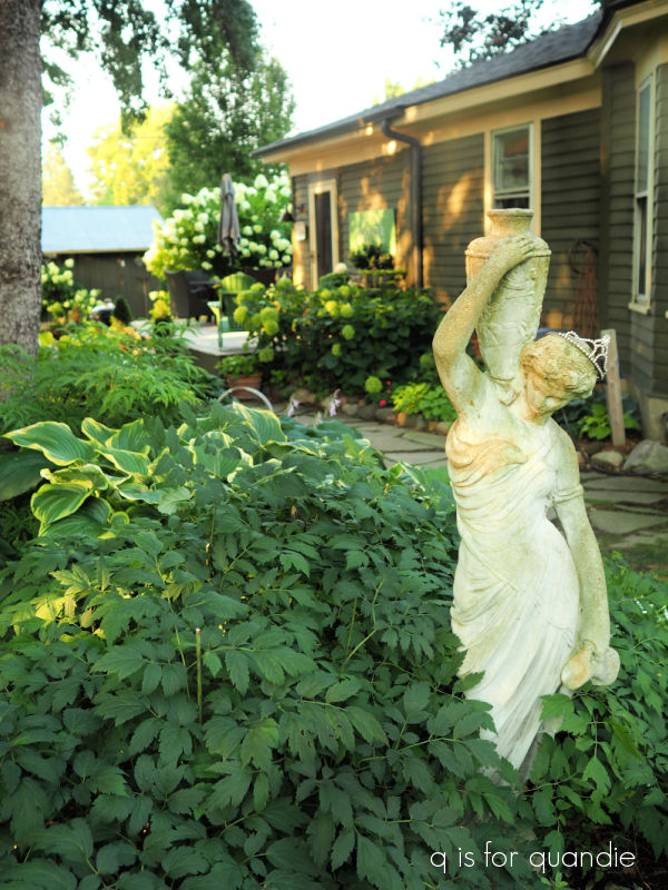
Cossetta is the statue that I purchased at a garage sale that was right behind Cossettas Italian restaurant in St. Paul. That was such an amazing find. I never seem to find things like this at garage sales anymore, what a bummer.
But anyway, the Fairy Candles are done blooming now, but here’s how they looked in bloom a few weeks ago.

And with that I’ll bring this tour of the shade garden to a close.
I hope you enjoyed seeing my shade garden and that it inspired you in some way. Leave a comment and let me know what your favorite element is in this garden!