As you know, last week my sister and I were out at our mom’s house near Las Vegas. It was mom’s birthday on Halloween, and we decided to take her on a little road trip to celebrate.
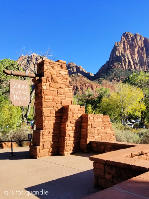
We loaded up the car and drove up to Zion National Park in Utah.
We opted to take the more scenic route through the Lake Mead National Recreation Area rather than taking the interstate all the way. This route makes a bit more sense when leaving from mom’s house in Henderson, Nevada rather than somewhere near the strip in Vegas, but it does also add about 30 minutes to the trip. Mainly because the speed limit on much of I-15 is 75 m.p.h. while the speed limit through the rec area is 50 m.p.h. Otherwise it only adds about 5 extra miles. It took us about 3 1/2 hours to get there due to some road construction as well though.
I should also note that you need a National Park Pass to drive through the Lake Mead rec area. My sister was able to buy an annual pass at the gate for $20 as a senior (you must be 62 or older, so I don’t qualify quite yet). We were then able to use her pass for all of us to get into Zion as well, so it was definitely $20 well spent.
And Zion was definitely worth both the drive and the fee!

We stayed at the Best Western Plus Zion Canyon and when we drove up to our hotel we were not disappointed.

But honestly, there were quite a few hotels along highway 9 in Springdale, and all of them had a similar view. I think one could be happy with any of them.
Before planning this trip I didn’t realize that Zion is the 3rd most visited National Park in the U.S. with over 4.5 million people visiting per year (wowza!). It’s only beat by the Great Smoky Mountains National Park and Grand Canyon National Park. I really thought Yellowstone would be higher up on the list, but it’s down at number 7.
Because of the large number of people visiting, the park has developed a shuttle bus system to move people around. There is a shuttle bus line within the park that travels the Zion Canyon scenic drive, and another shuttle bus line that goes through Springdale and has 9 stops including one right in front of our hotel. The shuttle buses are completely free of charge.
However, you should note that from March through November and around the Christmas holiday you are not allowed to drive your own personal vehicle on the Zion Canyon scenic drive (with one caveat, which I’ll explain later).
After arriving and checking into our hotel, my sister and I decided to walk to the visitor center while our mom rested up a bit.
It was a beautiful sunny afternoon, and even the walk through town was gorgeous.

It took a little over 20 minutes to walk to the park entrance.
After checking out the visitor center a bit, we decided to take a quick hike on the Pa’rus Trail. This is an easy 3.5 mile paved trail that starts right at the visitor center.

It follows the Virgin River up to Canyon Junction.

It was late afternoon by the time we started this hike and the golden light at that hour was absolutely stunning.
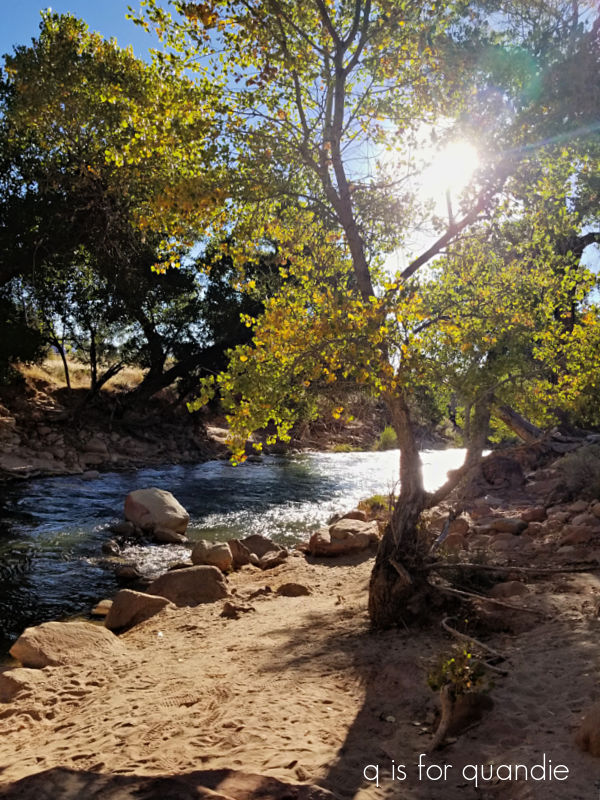
The leaves in Zion were just starting to turn for fall, they weren’t quite at peak color yet but were still very pretty.

The Pa’rus trail isn’t especially physically challenging, and in fact it’s even possible to do it with a wheel chair. The scenery along it is beautiful, so even if you aren’t much of a hiker, you could still really enjoy a visit to Zion.
As the sun was coming down, we decided to hop on the Springdale shuttle and head back to the hotel to pick up mom and get dinner somewhere.

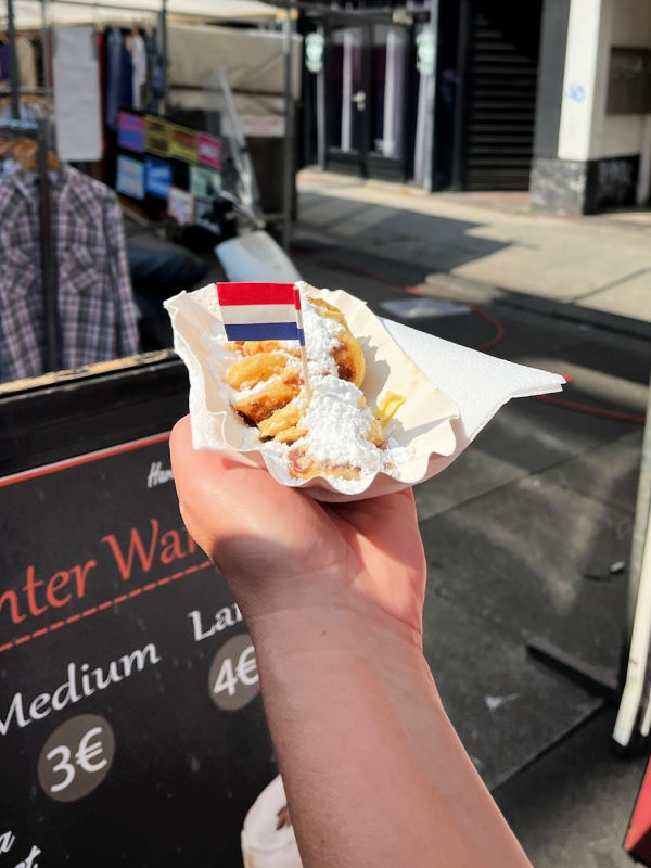
Funny sidebar tidbit, the two guys we sat next to on the shuttle were from Holland. Seriously, as I keep saying, it’s a small world! We were sure to tell them how much we loved our trip to Amsterdam in September.
We’d heard a lot of talk about how crowded Zion can be, and that there can be up to a 45 minute wait for the Zion Canyon shuttle. So we planned accordingly and decided to beat the crowds with a sunrise hike the next morning. We used this same strategy when we went to Sedona last year, and it worked out great.
The first shuttle leaves the visitor center at 7 a.m. So we got up at 6, enjoyed the included breakfast at our hotel with mom, then drove up to the visitor center. It was easy to find parking there at that hour (but the parking was completely full later). We also got right on the shuttle with no waiting, and plenty of space (also, FYI, when we returned at around 11 a.m. there was only a very short line for the shuttle, so visiting Zion in late fall is also a good way to avoid the crowds). We took the shuttle all the way to the final stop at the Temple of Sinawava.

This is where you will find the Riverside Walk that leads to the Narrows. This is a 2.2 mile trail that follows the Virgin River deeper into the canyon.
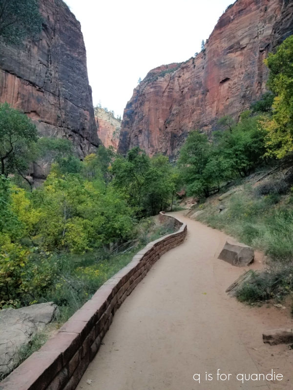
At that hour we nearly had the trail to ourselves and it was magical to watch as the sun came up and started to light up some of the peaks around the canyon.
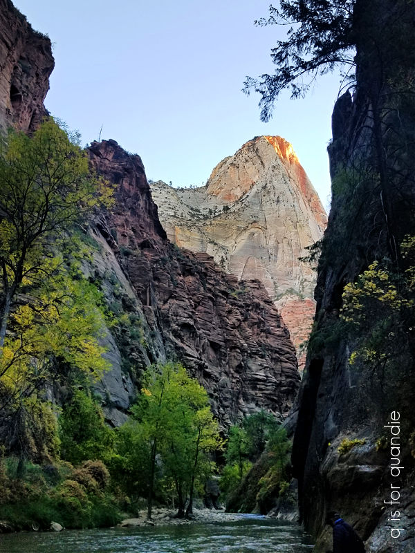
The popular thing to do at the end of the Riverside Walk is to continue your hike up through The Narrows by hiking in the river.
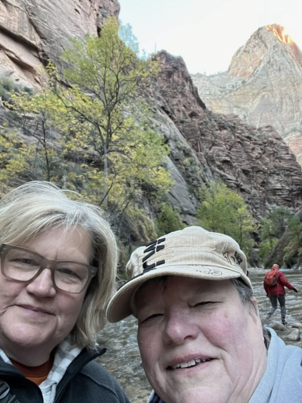
That explains all of the shoes left at the end of the trail.

But I have to tell you, it was 28° that morning. And we were told that the water was around 47°. Yeah, even us hardy Minnesotans weren’t brave enough for that, plus I’ve never really been one of the cool kids.
A few brave souls showed up while we were there though, and indeed they headed off in the water.

More power to ’em.
If you’re willing to suffer the cold, late October might be the best time to do this hike. I’ve seen photos of how crowded this spot can be in the summer months …

But we just took a quick selfie (me on the left, my sister on the right).
And then turned around and headed back towards the shuttle stop.

There was a shuttle waiting, so we hopped right on and headed back to stop number 7 for the Weeping Rock Trail.
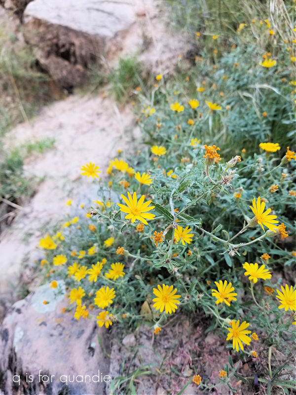
This is a short but steep trail that ends at a rock alcove with dripping spring water. Being rather afraid of heights, I stayed as far from the edge of the trail as I could get.

They had a lot of plant markers identifying many of the wild flowers growing alongside this trail which I found interesting, and they also provided a good excuse to stop and catch my breath periodically on that uphill climb.
By the way, I mentioned that it was about 28° that morning, and here’s proof.

All of that dripping spring water was creating icicles!
After that short hike it was back to the shuttle and stop number 4, the Court of the Patriarchs.

We were able to get to the Sand Bench Trail from this stop.

This was a lovely trail, but it also doubles as a horse trail. So much like our hike in Forestville State Park a couple of weeks earlier, we found ourselves dodging road apples (a.k.a. horse poop). We eventually gave up on it and headed back to take the shuttle back to the visitor center. It was time to return to the hotel, pick up mom, and find some lunch.
While riding the shuttle we asked the driver about handicap accessibility. The shuttles are handicap accessible and they have a motorized lift that will help people get up and into the shuttle. However, she also let us in on a not so well known tip. If you have a handicapped person in your party, you can get a special permit that allows you to drive your private vehicle on the Zion Canyon Scenic Drive along with the shuttle buses. You can also stop at any of the stops and park your car to get out and look around.
We went to the information desk at the visitor center and the park ranger was more than happy to provide us with this special permit.
So after lunch we once again headed into the canyon, this time with our mom. She enjoyed several of the scenic overlooks, like this one at Big Bend …

and she even walked a bit of the Riverside Walk with us (that paved trail we hiked at sunrise). She was able to use her walker and the trail is quite flat at the beginning.
We ended up back at our hotel by late afternoon, and mom was a bit worn out. So I have to admit we just lazed about for the rest of the evening. In hindsight, I regret not thinking about doing the scenic drive in the Kolob Canyons instead. That part of the park is about 40 miles north of where we were though, so it would have been a bit of a drive. Plus part of the scenic drive there is closed due to damage from a rock slide. So maybe I don’t feel so bad about missing it after all. Instead we enjoyed a quiet evening visiting with our mom on her birthday.
If you ever have extra time in Vegas, and access to a car, I highly recommend taking a little road trip out to Zion. It’s a little further out than Red Rock Canyon or the Valley of Fire, but definitely worth the drive. Have you been? Leave a comment and let me know!


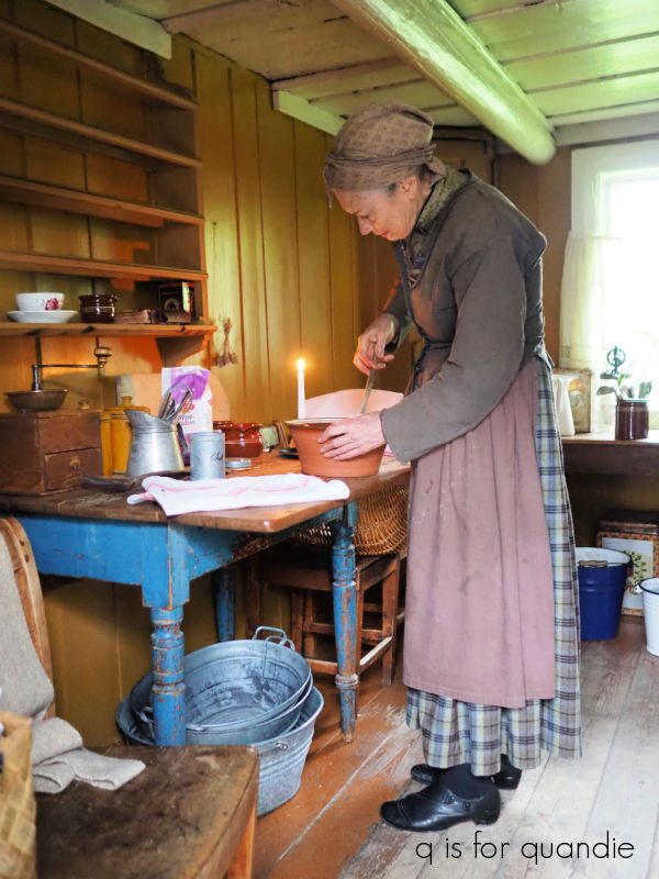 Can I just point out that table she is working on? If I didn’t know better I’d swear the base of that table was painted in Miss Mustard Seed’s French Enamel.