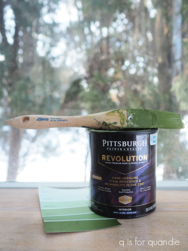
I’m not gonna lie people, my creative well has gone a bit dry lately. I’m still struggling with tooth extraction pain, and it took a while to get over the cold I brought home from Florida. OK, I haven’t exactly ‘bought the farm’, but I definitely haven’t felt very creative lately.
In addition, I’m heading out of town again tomorrow, this time on a solo trip to visit my mom. So it seemed like a the wrong time to get started on any sort of more complicated project.
I did manage to get out for some thrifting with my friend opK earlier in the week though. I didn’t find much, but I thought I’d share my very meager haul with you guys.
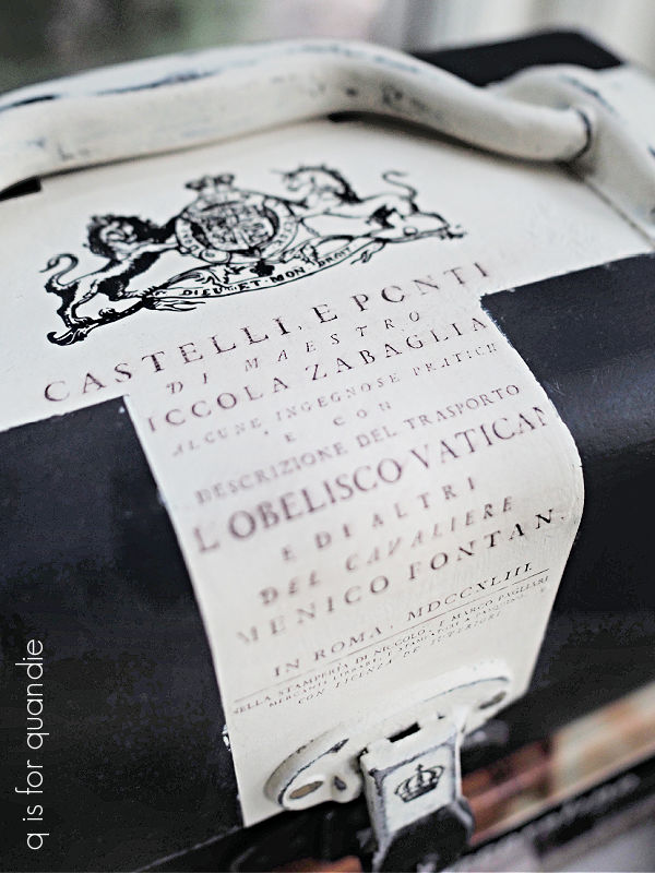
We started out at a Goodwill where I made just two purchases. First up, this amber bottle.

I brought it home, gave it a good wash and then added that faux French apothecary label.
I did some similar amber apothecary bottles in February last year …
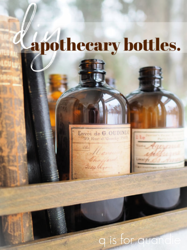
and I thought they turned out quite nicely, so I tried it again. I shared the source for printing those labels back in that post, so you can find that there if you’re looking for it.
The labels are easy to apply with some Mod Podge.

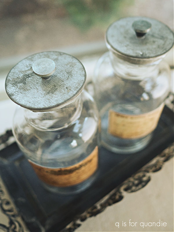
Since I already had the Mod Podge out and some labels printed, I decided to add labels to a couple of other jars I already had on hand.

I’ve had that pair of jars for ages and they originally had a much more faux looking paper label on them. I soaked those labels off to replace them, and these are so much better.
These jars have the cutest little galvanized lids.
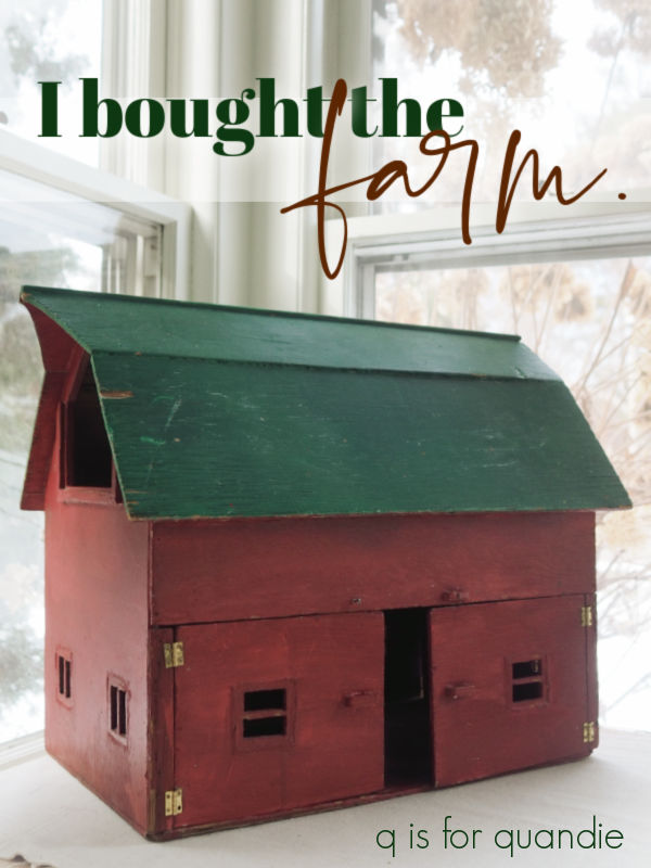
I also found this dollhouse barn at the Goodwill.

It needs a little TLC, but I couldn’t help but be reminded of the dollhouse that I fixed up back in December.
That was such a fun project to work on, so I’m thinking this one will be more of the same.
Here’s the other side …

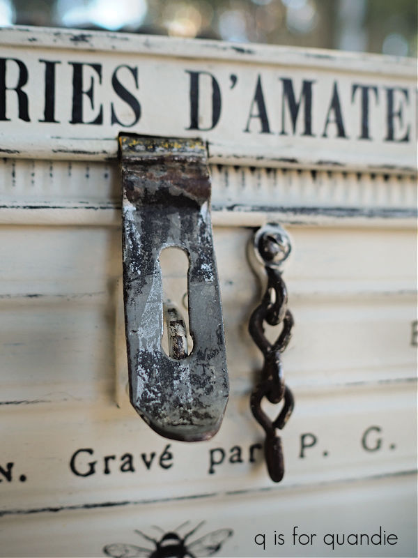
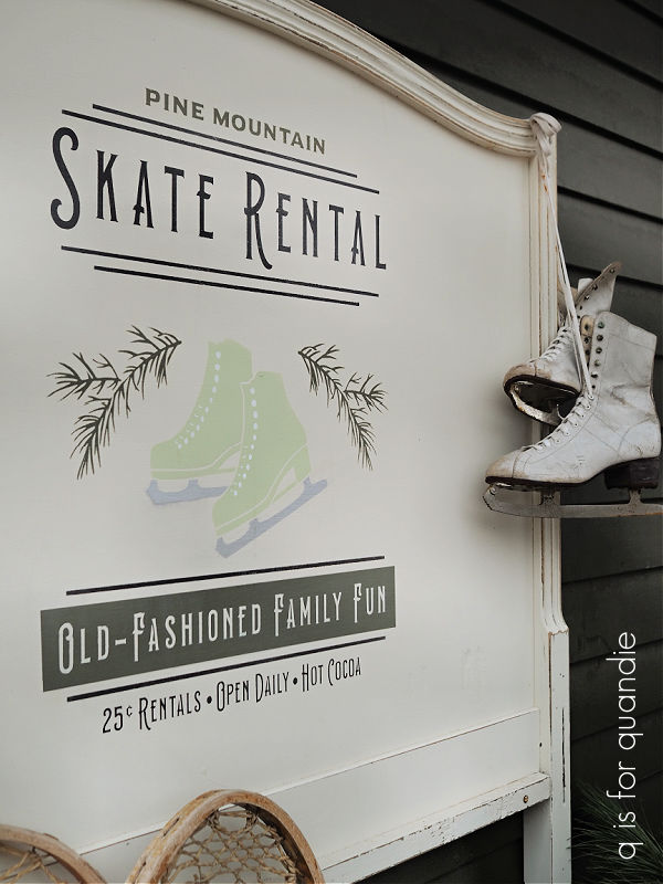
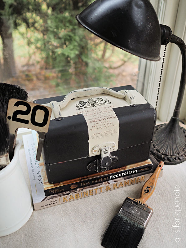
I had to laugh when I brought it up to the register and the clerk said “oh, I see you’ve bought the farm!” LOL.
Anyway, the barn has already gone over to Ken’s workshop for a few repairs. I’m looking forward to giving it a fresh look.
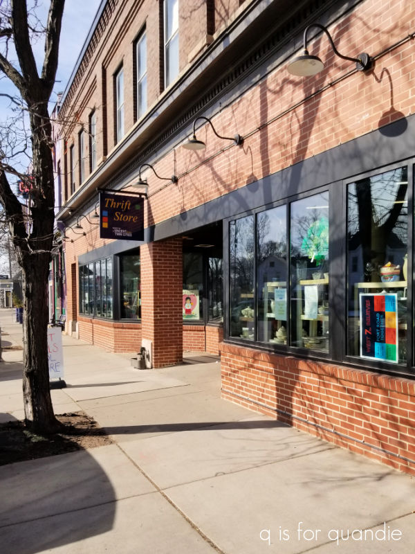
We headed to a spot that was new to me next, the St. Vincent de Paul Thrift Store in St. Paul.
By the way, can I just point out that it was a beautiful sunny day and the sidewalks were completely clear of snow and ice on the sunny side of the street. This is not the norm for Minnesota in February, but I’m loving it!
Unfortunately, I think their sidewalk sign was a bit of false advertising.

I didn’t find any hot deals. However, as we were waiting in line for opK to make some purchases I saw a shoebox full of old photos so I started flipping through them and this one caught my eye.

Just look at those stern faces! These guys were very serious about their sport.
The basketball … wait … is that a basketball? I guess I’m not 100% sure about that. Is there some other sport played with a ball that looks like that? Or is that what basketballs looked like in 1929?
Well, whatever it is, it says “E.F. HS 28 – 29” on the ball. There are no markings on the back of the photo, so that’s my only clue. So the age of the photo is obvious, but no idea where it was taken.
The photos were priced at a mere 15 cents each, so I thought I really should take it home with me.

I really have no plans for its ultimate fate, but for now I’ll just enjoy displaying it somewhere.
And that’s it. I only purchased three things. I’m really looking forward to garage sale season because I am not finding much at the thrift stores these days!
As I mentioned, I’m headed off to my mom’s tomorrow. She has a to-do list all ready to go for me. So far I’m doing her taxes, cleaning out her fridge and her closets, and replanting some of her pots on the patio. I’m looking forward to just spending some time with her though, and maybe enjoying some sunshine and warm weather. Once again I don’t have any blog posts planned during my absence, but hopefully I’ll be ready to get busy on some creative projects when I get back home again!