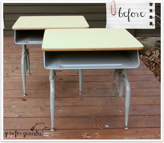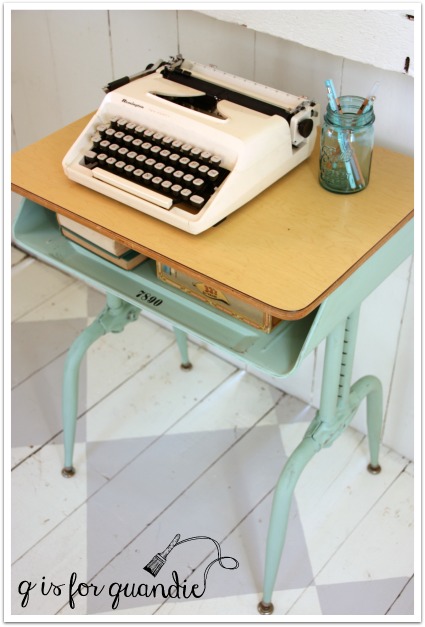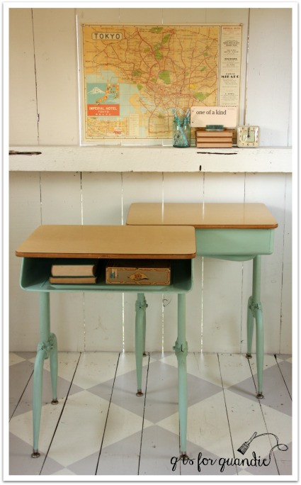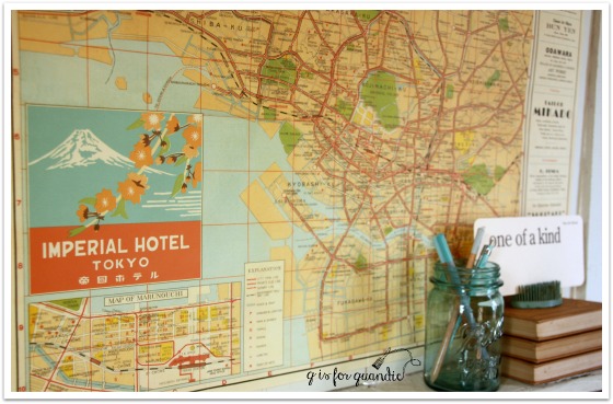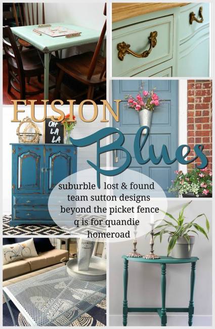
Recently Melanie from Lost & Found Decor asked if I wanted to participate in a Fusion blog party. For this particular event each participating blogger was asked to choose one of Fusion’s shades of blue and use it in a project of some kind. Melanie wanted each of us to choose a different blue, and it was first come, first served. I was hoping to get Homestead Blue, which I was going to use on a typewriter stand (was going to add a Union Jack top), but that color was taken. I also would have been happy to get Laurentien, since I used it on that pair of vintage school desks and it’s one of my favorite colors, but that was taken. Another great choice would have been Seaside; it was taken too! Now I’m not saying that there is anything wrong with the remaining color choices, but I tend to be a little bit particular about pairing just the right color with just the right project and I don’t have that many unfinished projects waiting in the wings.
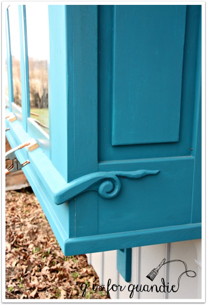
Fortunately, another of my favorite Fusion colors wasn’t spoken for yet, Inglenook. And I had just the right piece for it, this lovely french provincial sideboard. I’ve done a few french provincial pieces in this color and each one has turned out gorgeous.
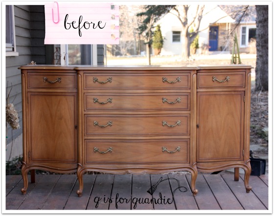
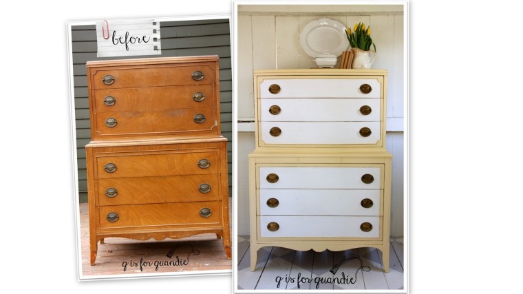
I must start out by saying that this is probably one of the prettier ‘before’ pics I’ve ever shown. This piece was very lovely to begin with, and structurally it’s in perfect condition. The original finish was a bit worn out and yellowed though. It was also shinier than I like. Who am I kidding, this piece could easily have been left alone. But that’s not what I do. I paint stuff and give it a new look, so that’s what I wanted to do here.
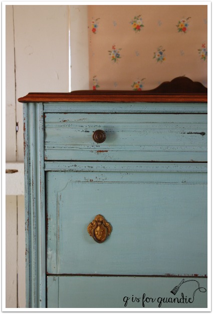
First I stripped the top. I was told that this piece is made out of walnut. I always thought that walnut was a dark wood, but I did a little google research and discovered that walnut is one of the few woods that can range from very pale to a dark chocolate brown. I really loved the pale color of this walnut. To me it feels fresh and clean. So I just added some clear furniture wax to protect it rather than adding any color using stain or a tinted wax.
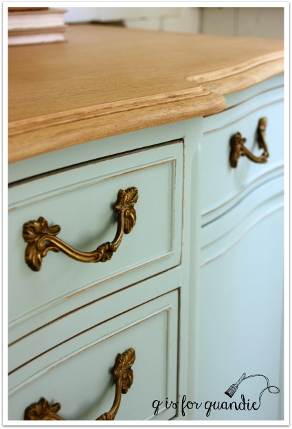
Next, after sanding lightly, I painted the rest of the piece in two coats of Inglenook. Once the paint was dry, I distressed lightly to bring out the details. Before I put the hardware back on, I refreshed it with some gold rub ‘n buff.

And that was it.


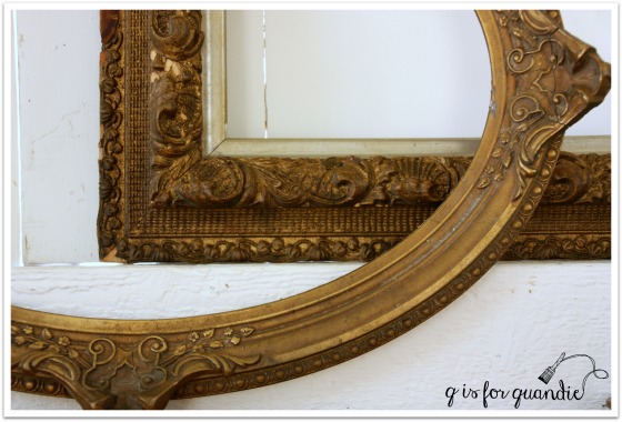
I used some old gold frames in my photos to bring out the gold hardware.

I just haven’t been able to bring myself to part with these two frames. I love the detail, and the fact that they are both just a little bit shabby.
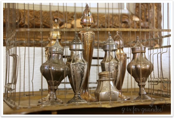
The frames are joined by a gilded cage full of vintage salt and pepper shakers.
What I really wanted to do was hang some sort of gorgeous landscape oil painting on the wall above this sideboard, but oh, wait, I don’t have one of those! I’m still regretting the one I passed up at a garage sale last summer because it was $35 and that seemed high to me (kick, kick).

But what I do have is a really gorgeous french provincial sideboard in the most lovely shade of blue. In the end, it’s probably a good thing that many of the other blues were already spoken for!
If you have a space in your home for this gorgeous sideboard, be sure to check out my “available for local sale” tab to see if it’s still available.
Now for the fun part. You have the opportunity to win a prize package from Fusion that includes 2 pints of any shade of blue, a brush and some Fusion Antique Glaze. The giveaway is open to residents of the U.S. and Canada who are 18 years old and up. You have until midnight on May 1, 2016 to get your name included in the drawing on Rafflecopter using this link:
Please be sure to visit the other five bloggers that are participating in today’s blog party as well!
Melanie at Lost & Found Decor
Tara at Suburble
Crystal at Team Sutton Designs
Susan at Homeroad
Becky at Beyond the Picket Fence
And best of luck to you in the drawing!


 Anyway, that sale was kind of a bust, so we never tried that again.