Our recent Holland America cruise sailed out of Copenhagen, Denmark and the last time Mr. Q and I were there we absolutely loved it, so we decided to fly to Copenhagen a few days before our ship sailed and spend some extra time in this gorgeous city that is known for its hygge.

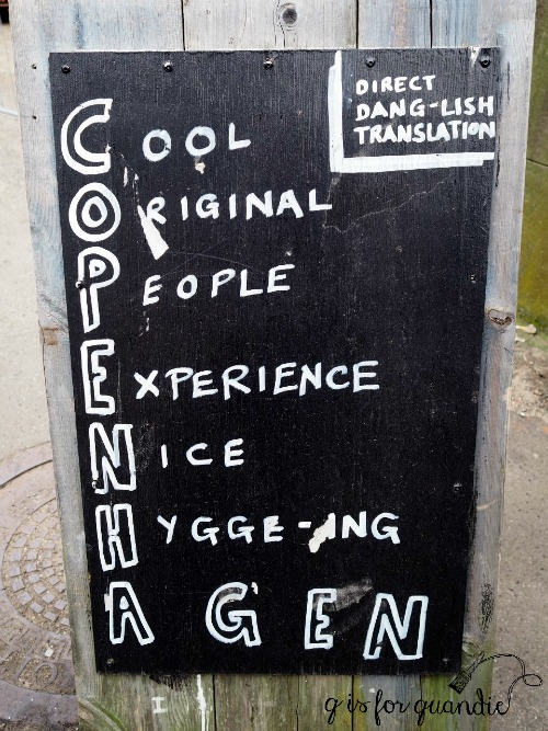
Hygge? I thought this was just the popular blogging buzz word of the moment. But oh no!
Pronunciation /ˈhʊɡə//ˈh(j)uːɡə/
NOUN
-
A quality of cosiness and comfortable conviviality that engenders a feeling of contentment or well-being (regarded as a defining characteristic of Danish culture)

Comfortable conviviality indeed! Copenhagen positively embraces its hygge!

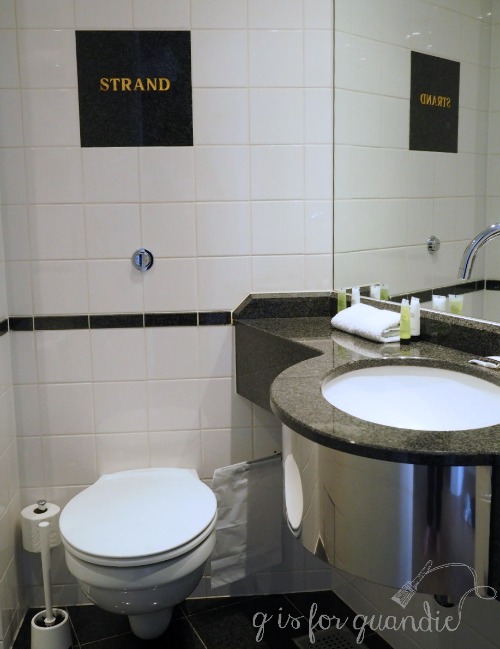
Upon our arrival Mr. Q and I checked into The Strand Hotel. We chose this hotel on a whim, after all our last name is Strand. How could we resist? It also happened to be in a pretty great location. It was kind of amusing to see our name above the door, on all of the floor mats, in the elevator … and even engraved in marble above the ‘throne’!

What can I say? We are easily amused.
I was hoping we’d get some sort of perk, like a really great room or some kind of freebies, but nope. The fact that we shared our name with the name of the hotel didn’t even raise an eyebrow. The very friendly and helpful clerk who checked us in didn’t even mention it!
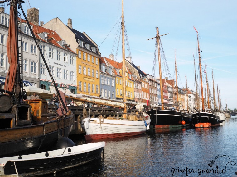
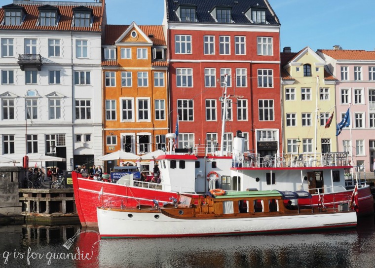
After dropping our bags in our room, despite being overcome with exhaustion after having been up for well over 36 hours (I just can’t manage to sleep on a plane), Mr. Q and I headed out for Nyhavn, the 17th century waterfront district in Copenhagen.

It was only a block away, so it seemed like the best choice considering our condition. We immediately hopped on one of the tourist boats that regularly depart Nyhavn for a scenic cruise around the canals of Copenhagen.
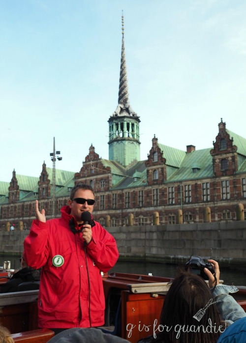
Despite being super touristy, these boats are still a fun way to get your bearings and see some of the sights without too much effort. It’s a great way to get acclimated on your first evening without having to worry about whether or not your brain cells are functioning properly.
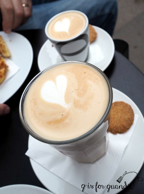
We had originally been planning to head outside the city to visit some castles the next morning, but when we finally managed to drag ourselves out of bed we realized that plan was maybe a little too ambitious for our current state of mind. Instead we fortified ourselves with some Danish coffee and pastries …

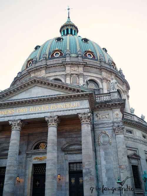
and then did our own little walking tour along the waterfront passing Amalienborg Palace and the beautiful Frederikskirke or Marble Church …

and ending up at the Kastellet (the citadel), a star shaped fortress built in the mid-1600’s.

For lunch Mr. Q insisted that we walk across the ‘kissing bridge’ from Nyhavn to the street food market on Papirøen (Paper Island). I resisted because my feet were starting to complain, it was starting to drizzle a bit and it looked like it was a long way away. But distances can be misleading and it turned out that the walk was not far at all. In the end, I was so glad he insisted.

This place was full of stalls featuring street food from all around the world.

We wandered around looking at all of our options. Many of the stalls offered free samples so you could test-taste their food. I loved the old vintage campers they used for some of the food booths.

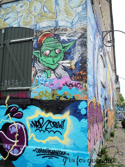
The drizzle had ended by the time we finished lunch, so we decided to head over to Christiania since it was nearby. If you’ve never heard about Christiana, follow this link to read more about it, but basically it’s a self-proclaimed autonomous neighborhood that was established in the 70’s as a sort of hippie commune of free-spirited people.
I was thinking of it an unconstrained liberal place with no rules, only to discover that I was breaking the number 1 rule, which is ‘no photos’! Leave it to me, a pretty dedicated rule follower, to manage to break the one rule in a place known for not having rules. I took quite a few photos before someone finally yelled at me when I tried to take one a little too close to the area where marijuana was being sold quite openly.

It was an interesting little detour outside my normal comfort zone, but we didn’t stay long. And in case you’re wondering, no, we didn’t buy any ‘souvenirs’ in Christiania!
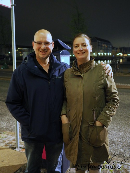
That evening was probably the highlight of our time in Copenhagen. Several years ago Mr. Q was contacted by a woman from Denmark, Susan, who was working with a Danish writer with a brain injury. Since Mr. Q has a brain injury and has published several books himself, she was given his name as a potential contact. They shared some emails and became Facebook friends, but had never actually met. As it happened she was going to be in the city when we were there and we arranged to meet up with her.
She is a lovely person, so welcoming and so generous with her time. She took us on the Metro out into the less touristy parts of Copenhagen, and then we had a long dinner in a charming, cozy (or should I say hygge?) restaurant where we quizzed her endlessly about what it’s like to live in Denmark. It’s always so much more interesting to hear about a place from a real local rather than a tour guide.

Just one of the many topics we discussed was the Danish practice of leaving your sleeping baby outside on the sidewalk in a pram while mom and dad shop or enjoy dinner in a restaurant. This is a very common practice in Denmark and something parents there have always done. Even in cold weather. First of all, you have to realize that the prams are totally kitted out for the weather, and the baby is bundled up appropriately. But also, as Susan explained to us, people don’t steal babies in Denmark. So parents just don’t worry about leaving their babies outside unattended. And she’s right about that. If you google it you’ll find that there has only been one single incident involving the kidnapping of a child in Denmark and it was over 30 years ago. Susan said people still talk about that today because it was such a rare and shocking occurrence.
After polishing off a bottle of wine, we took a couple of buses followed by a really lovely walk through the rain washed streets of the city to our hotel. One of the many things I love about Copenhagen is that you feel perfectly safe walking the streets at 11 pm.
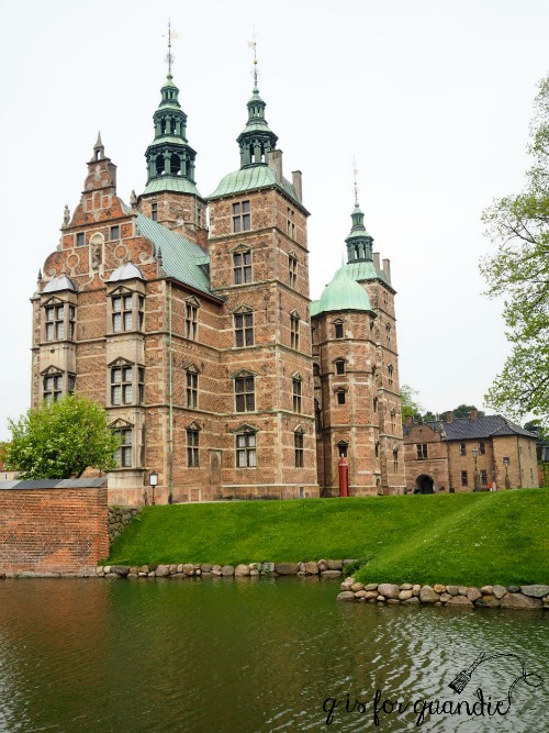
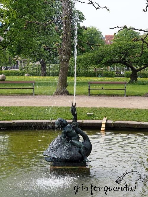
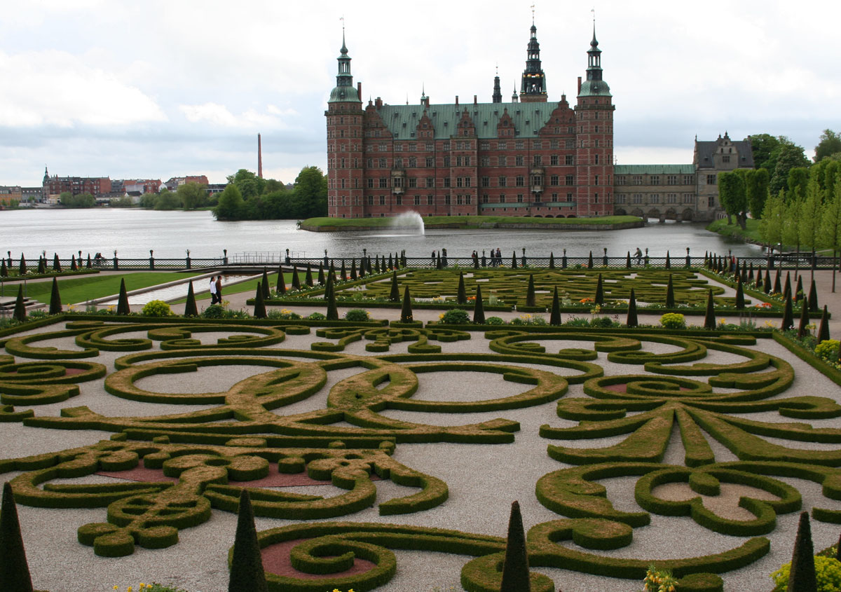
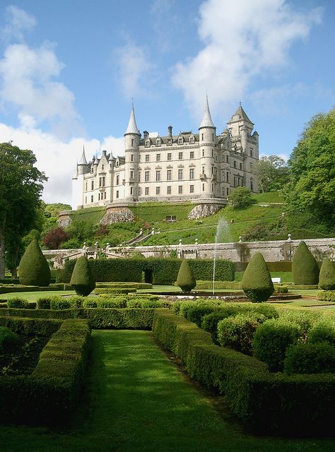
The next day we had a few hours to kill before boarding our ship so we walked over to Rosenborg Castle. Rosenborg was built in 1606 as a ‘country summerhouse’. Ha, if only we all had simple little summerhouses like this!

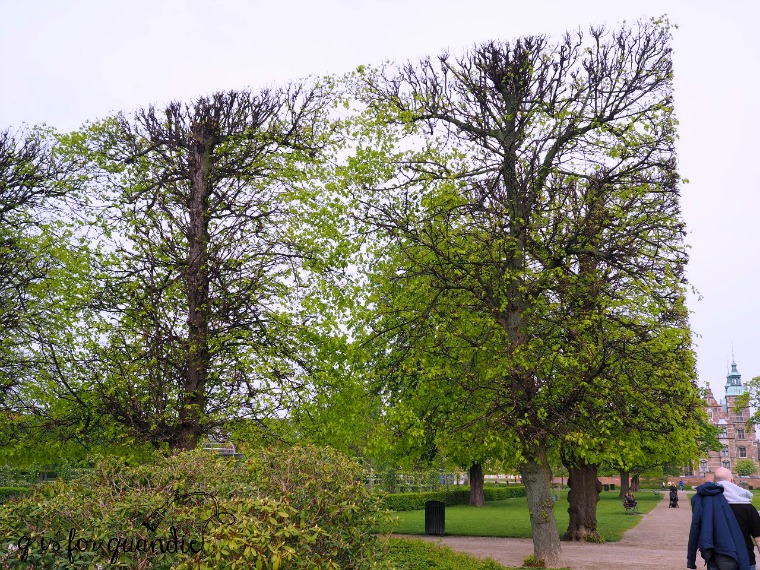
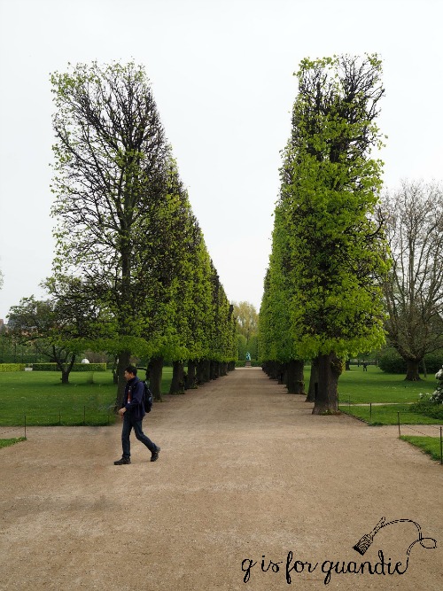
We didn’t take the time to see the inside of the castle, instead we explored the Kongens Have (or the King’s Gardens) surrounding it. It was such a lovely morning that we wanted to stay outside.

Check out these amazing pruned trees …

I’d never seen anything quite like them before.

You may have noticed that there is one word I’ve used a lot in this post (aside from hygge) and that is ‘walked’. Copenhagen is a very walk-able city. If you ever go there, be sure to bring a good pair of walking shoes. Although they have fantastic public transportation and it’s very easy to use, I always feel like you see so much more when you just walk around.
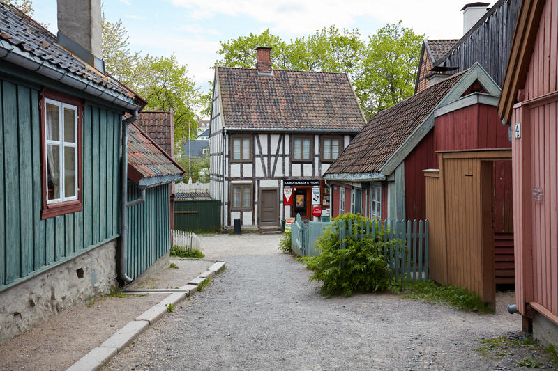
Sadly it was time to leave Copenhagen behind after our visit to Rosenborg. We checked out of our hotel and took a taxi to the port to board our cruise ship, the Zuiderdam. Be sure to stay tuned for more posts about our amazing trip over the course of the summer. Coming up next week: our first port of call, Oslo!
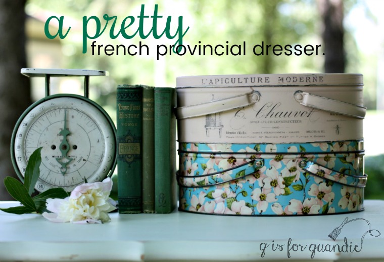
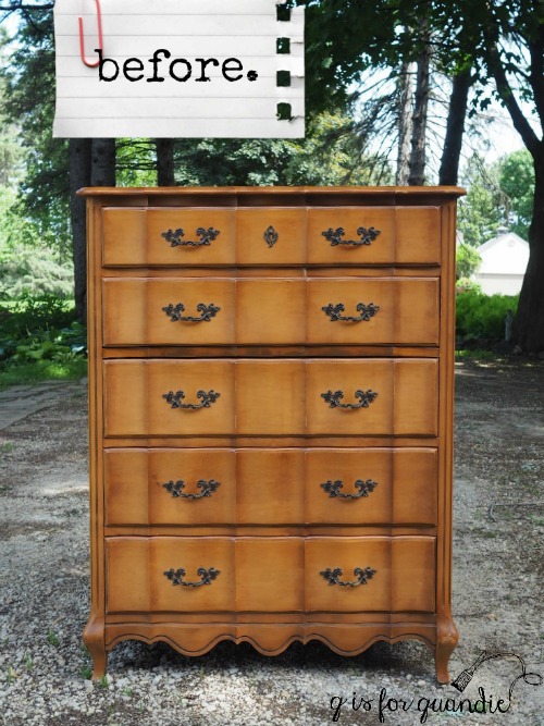
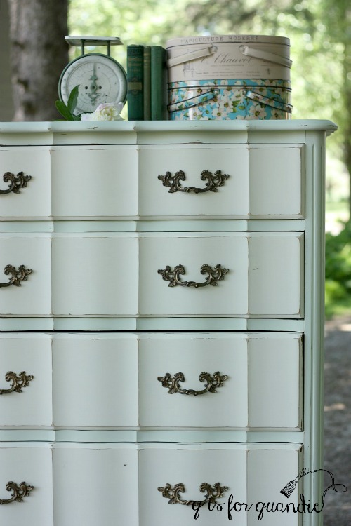
But not to worry, I still paint furniture too. It felt great to finally be back out in my carriage house workshop this week and I have a pretty french provincial piece to share with you on Friday, so stay tuned!