bergen.

Today I’m sharing the last of the Norwegian ports of call on our recent Holland America cruise, Bergen!

Bergen is known for being one of the rainiest cities in Europe.  Everything we read about this city said to be prepared for rain, and so we were … and it didn’t rain at all.  It was a bit overcast in the morning, but it cleared up after noon and was perfectly lovely.

Once again our ship was docked in the most convenient location just across the street from the Bergenhus Fortress.

We walked around the fortress and admired the grounds a bit.

Then headed out the other side to walk toward Bryggen.

Bryggen is the old Hanseatic Quarter of Bergen.  The oldest wooden buildings date from the early 1700’s and were built by the German merchants and traders who established a Hanseatic trading post here.

This area continues as a ‘trading post’ and was filled with touristy shops and tourists.

Next we hopped on the Fløibanen, or the funicular, to ride up to the top of Mount Fløyen to check out the views.

I have to admit, Mr. Q and I are not big fans of the ‘view panoramica’.  I guess we just prefer seeing things up close and personal rather than viewing sweeping vistas from on high.

So, after enjoying a cup of coffee with some friends from our ship, we didn’t linger long at the top.  We decided we’d prefer to walk back down, but we weren’t sure just how intense a walk that was going to be, so we took some advice from our Rick Steves’ guidebook and we took the Fløibanen halfway down, got off at the mid-way point and walked the rest of the way (note: if you are ever in Bergen and want to do this, only the funiculars that leave on the hour and half hour stop at the halfway point, Promsgate, the others do not stop).

As it turned out, we could easily have walked the entire way down.  It was a very lovely walk through a wooded area …

And then a really charming residential area.

By the way, Rick Steve’s calls these ‘delightful cobbled and shiplap lanes’.  Huh?  Shiplap lanes?  Clearly the Norwegians had shiplap way before Fixer Upper came along!

I loved the profusion of flowers along these cobblestone lanes.  Despite the almost total lack of garden space, there were still flowers everywhere.  They were even growing out of the crevices in the rock walls …

I recognized this corydalis right away, I have these in my own garden …

After making our way back to sea level, we headed out to the fish market.  I didn’t take a single photo there.  It was just so touristy and honestly, kind of lame.  We wandered around it for a few minutes, but then after hitting a couple of shops back in Bryggen we headed back towards our ship.

Along the way I spied this lovely azalea in front of the Domkirke, Bergen’s main church that is dedicated to St. Olav the patron saint of Norway.

We had a beautiful sunny evening for sailing out of Bergen.  Mr. Q and I enjoyed it from our balcony.

And alas, this was where we had to say goodbye to Norway, the land of my ancestors.  Our next stop, the Shetland Islands!

Be sure to stay tuned!


the dollhouse dresser refresh.

I posted all about our plan to makeover our master bedroom on Friday.  As is the usual case, the project has grown beyond its original boundaries.  When the college kids were out giving me a quote on the bedroom floor, they suggested I do all of the upstairs floors at once.  It makes sense since they all flow together.  Then, one thing led to another and since doing the floors involves moving all the furniture around anyway, we decided to swap the guest room and Mr. Q’s study.

Mr. Q’s study was in the smaller of the two rooms and he felt pretty crowded in there.  Our guest room, on the other hand, is only used once or twice per year and the rest of the year just lies idle.

There was one small … or kinda big … obstacle to this plan.  My dollhouse.  Yep, I have a pretty amazing dollhouse.  My dad made it after he retired.  He was bored and he needed a project.  When my dad took on a project, he pulled out all of the stops.

The dollhouse is big.  And cumbersome.  And bulky.  And any other word you can think of to describe a rather large item that takes up a lot of space in a room but doesn’t really serve any purpose.  The dollhouse was doing just that in the guest room.  Swapping the rooms is going to require relocating the dollhouse, but you’ll hear more on that plan later.  Today’s post isn’t about the dollhouse (but don’t worry, that will be coming soon), or about swapping the two rooms around, it’s about the dresser that the dollhouse sat on.  This may be the nicest ‘before’ photo of a piece of furniture on my blog ever …

I have to say, this dresser was pretty much invisible underneath that dollhouse.  I’d forgotten both how big it is and how pretty it is.

I don’t even remember how long ago I painted this piece.  I know it was quite a few years ago.  It was certainly before I knew about milk paint or Fusion acrylic paint, and even before I knew about chalk paint.  It’s from way back in the dark ages when I was painting with regular old latex paint.  I painted quite a few pieces in this color from Behr called Beluga (as in the caviar which is black, not the whale itself which is white).

The dollhouse did do a little bit of damage to the top of the dresser …

It left a couple of big scratches.  But the rest of the dresser still looked great.  So I decided to just freshen up the top with a couple of coats of Fusion paint in Coal Black.

I scuff sanded the top with some fine grit sandpaper, wiped it clean with a damp cloth and then added two coats of Coal Black.  Easy peasy.

Although the blacks don’t match precisely, it’s not noticeable at all.

The details on this dresser are really pretty.

Unfortunately, with the room switch taking place, I no longer have a place for it.  So I staged it up with my faux dress form, Lula, to get some pictures to use in my Craigslist ad.

Lula is made from an old yellow Styrofoam manikin body that I painted with black chalkboard paint, a lamp table base (also painted black) and an old black porcelain door knob.

One of these days I might change it up and paint her white and add an Iron Orchid Designs transfer … hmmm … I’ll just add that to my to-do list.

In the meantime, I got the dollhouse dresser all cleaned up and posted on Craigslist and it sold right away.

The new owner is going to add a sink and use it as a bathroom vanity!  Probably a much better use of this dresser than hiding it under a giant dollhouse, don’t you agree?


mission possible.

You may remember that earlier this year I posted about getting a quote to have my wood floors refinished.  The cost was over $6,000 to do the entire house.  But to be truly honest, not only was it the cost that bothered me it was also the idea that we would have to move all of the furniture out of our house and store it somewhere (including a baby grand piano).  Also, the quarter round on the baseboards would all have to be removed.  I don’t care how careful you are doing that, you are going to break some.  And you are definitely going to chip some paint, thus requiring the baseboards to be repainted throughout (by yours truly of course).

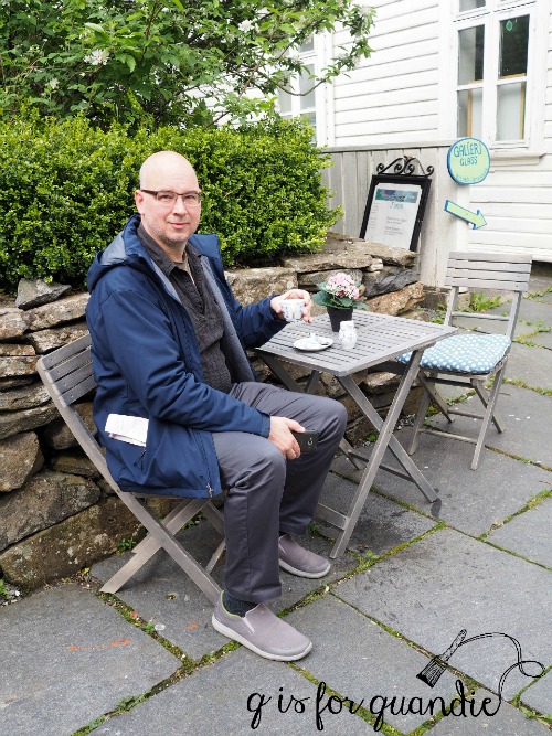
So after giving the matter some serious thought, Mr. Q and I opted to take our trip to Norway and Scotland instead.

Ironically both my BFF and nnK (that’s my neighbor across the street) did opt to have their wood floors refinished in the last couple of months.  They both chose a matte finish (which is also what I would have done) and they both now have gorgeous floors.

So as I gaze at their beautiful floors, do I wish I had decided differently?

Nope!  Our trip was amazing.  We’ll have those memories forever (well, until the Alzheimer’s kicks in anyway).

best.  decision.  ever.

I don’t have much money left over after our memorable trip though, so I decided to do a budget DIY makeover in our master bedroom this summer.

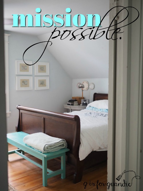
I’m dubbing this project ‘mission possible.’  Because while I felt like the whole house floor refinish was entirely impossible, I think this one room makeover is certainly possible.

Your mission, should you choose to accept it, is to hold me accountable.  You really don’t have to do anything, just the action of putting my plan in writing and sharing it here will give me some additional motivation to actually get this project done (I hope).  Also, feel free to leave occasional comments like “hey, what ever happened to the bedroom makeover?” As always, should I or any of my I.M. (interior modification?) Force be caught or killed, the Secretary will disavow any knowledge of our actions.

 So let’s go over the plan, shall we?
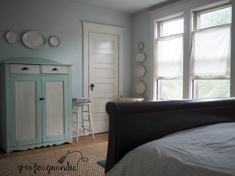
The walls.

I’ve been wanting to do a faux ship lap wall in here for some time now.  Ken (amazing neighbor/handyman) has already agreed to help Mr. Q and me with this project.  It’s just a matter of putting it on the calendar.  I plan to do just the angled wall behind the bed all the way up to the ceiling (wall seen in photo above).

But first, I have to paint that wall white.  The ship lap will be white also, and I don’t want any blue peeking through the gaps.

Although I think the current pale blue walls are pretty, I’ve grown a little tired of them.  So since I’m painting one wall anyway, I might as well paint all of them, as well as the ceiling.  I’m still trying to decide if the un-shiplapped walls will also be white, or possibly a very pale greige.

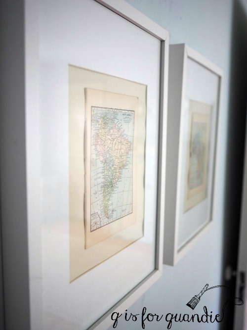
The framed vintage maps that are currently hanging on the walls are also going to go.  Those white IKEA frames are just not doing it for me anymore.

but I think my pretty floral plates may stay in some capacity.

The floor.

When we purchased our house 30 years ago (good grief, has it really been that long?), the downstairs wood floors had obviously been recently refinished while the upstairs floors had not.  Thus, the floors in here weren’t in the greatest of shape to begin with, and 30 years of living has taken its toll.

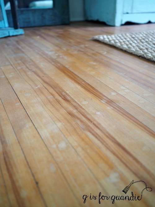
As it turns out, nnK knows some college kids that refinish gym floors as a summer job. I’ve scheduled them to do just my upstairs floors at a budget rate.  They may not do the same professional level work as the expensive guy, but it will most likely be good enough and for a fraction of the cost.

The fixtures.

The last time I remodeled this room I was going through a phase.  I liked the idea of combining antiques with modern, clean lines.  Um, yeah.  I don’t know where I got that ridiculous idea.  But as a result, I have a shiny modern chrome ceiling fan in place.

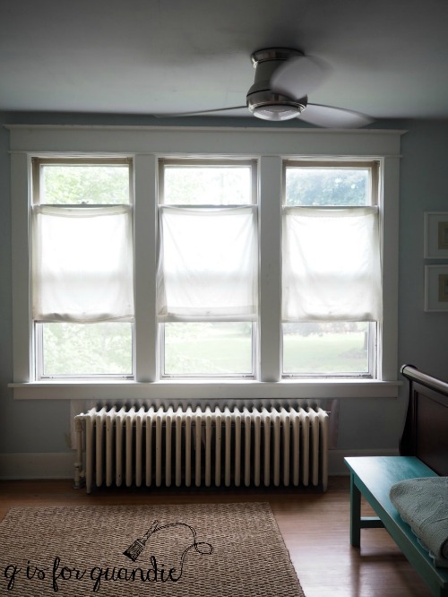
That’s going to be replaced.  I’m still debating replacing it with another fan, or just a light.  Ceiling fans are so ‘out’ at the moment, but they are so very functional when you don’t have central air conditioning.  And now that it’s the middle of July I’m realizing just how valuable it is to have a ceiling fan.  Anyone want to weigh in on this subject?

I’m also planning to replace the current bedside lamps.  I picked these up at a garage sale several years ago.  They are really functional, and actually not terrible looking.

But I found some vintage looking wall sconces at World Market a while back that I love, so they will be taking the place of these.

The furnishings.

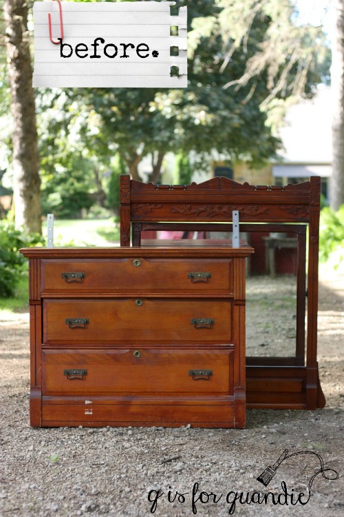
Back in the day buying a matching suite of furniture for your master bedroom was the thing to do.  Not anymore.  Now the key is to mix and match.  Over the last several years I have been slowly working on getting rid of each piece of my matching suite (I originally had bedside tables and an armoire to match my sleigh bed).

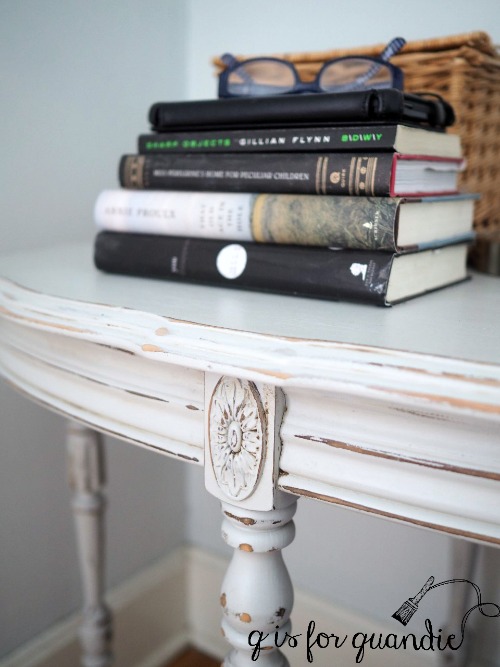
The bedside tables went first and I replaced them with a pretty table on my side …

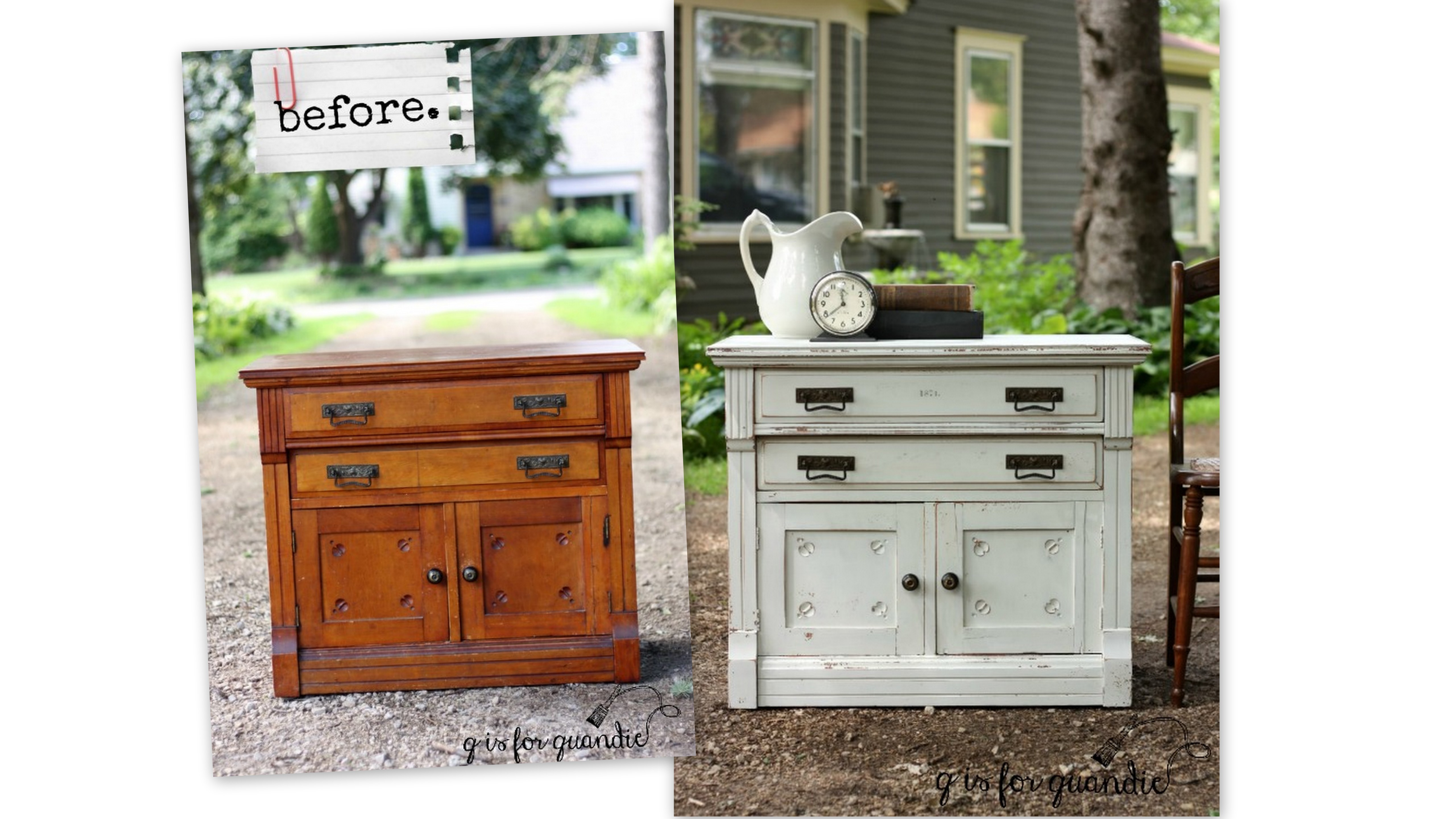
and my grandparent’s spoon carved washstand on Mr. Q’s side.

They are about the same size and height and they are painted in the same shade of pale grey, all of which makes them perfect as mismatched bedside tables.  So these two pieces are going to stay.  The pale grey never worked that well with the blue walls, but I think it will be perfect with my new look.

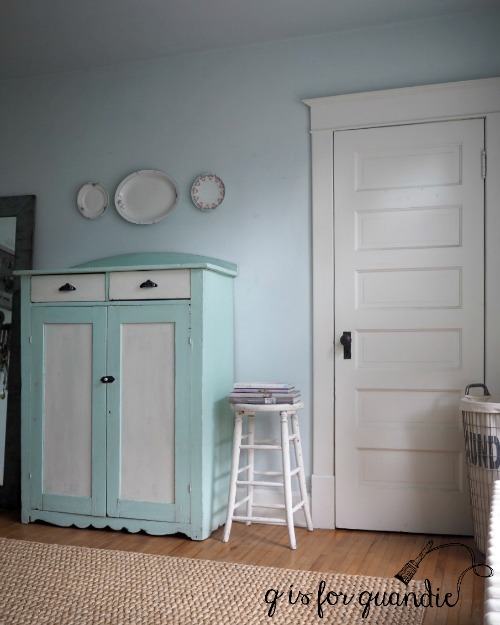
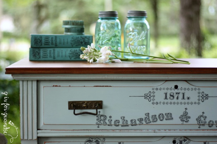
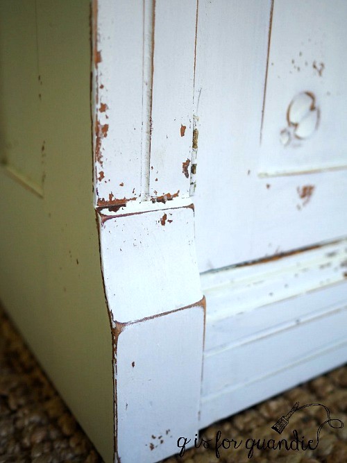
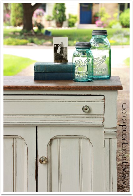
The current cupboard that holds my clothes will also be staying (now that I’ve cured its bad smell), although I’m probably going to paint it.  As much as I love the aqua and white combo, I’m going to be moving away from that color in the room.

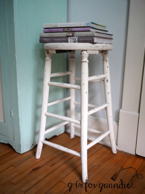
I also plan to keep the chippy white stool.

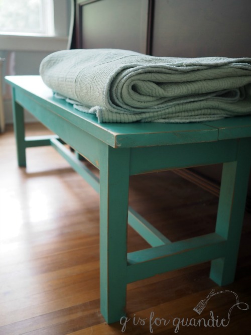
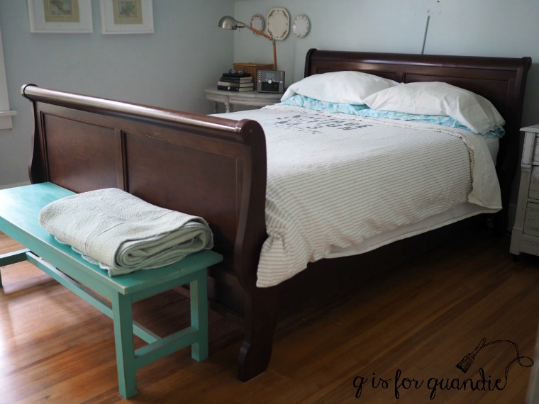
The bench at the foot of the bed is going to go.

Again, it’s the wrong color.  Plus I’ve found an amazing replacement for it, here’s a sneak peek.

so you’ll have to stay tuned to see more on that down the road.

I have a plan in mind for the bed too.

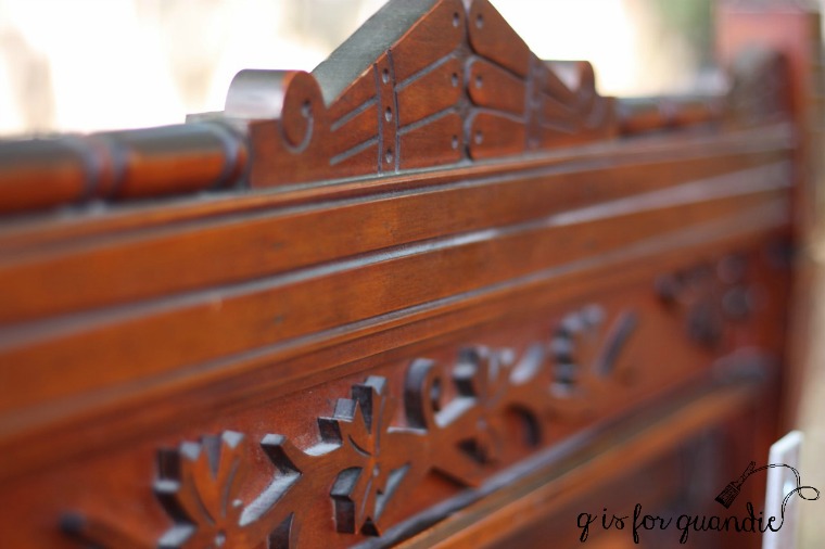
It’s definitely time for the old cherry sleigh bed to go.  Initially I debated just painting it, but Mr. Q really doesn’t like having a foot board.  Then I remembered an idea I saw a while back and was able to find just the right supplies needed to make it happen via Craigslist, here’s another sneak peek …

This is another future post to look forward to!

The window treatments.

I’ve had many different treatments on these windows over the years.  I’ve had wood slat blinds, bamboo roman shades, roller shades, fabric curtains on a rod, yada, yada, yada.  I really struggle with window treatments.  For the most part, I don’t like them.  I would prefer to have nothing at all, but that’s just not possible in a bedroom that faces the street, as well as the house across the street.  I’m sure nnK would prefer we have some kind of window covering.

The current treatment consists of three different vintage linens tacked to the lower half of each window.  The functionality of this system is spot on.  When I open the windows (remember, we don’t have a/c in this room), the curtains go up with them allowing for unimpeded air flow.  When the windows are closed, the top halves are uncovered which lets in maximum light, and the bottom halves are covered which blocks the view of any peeping toms out there.  I really love the trim around my windows too, so I hate to cover that up with heavy window treatments.

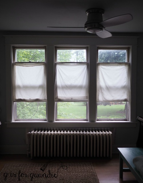
Plus, I also happen to have a really lovely view.  Even though these windows face the street, they also face nnK’s yard which is this year’s winner of the Acorn Award, the local award for properties that go ‘above and beyond’ with their landscaping efforts (here’s a post I wrote about her water feature).  As I frequently like to tell nnK, her yard looks amazing from over here!

Window treatments.  Still a question mark.  Any ideas?

So, Mission Possible starts next week, who’s with me?!
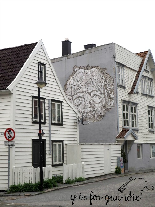
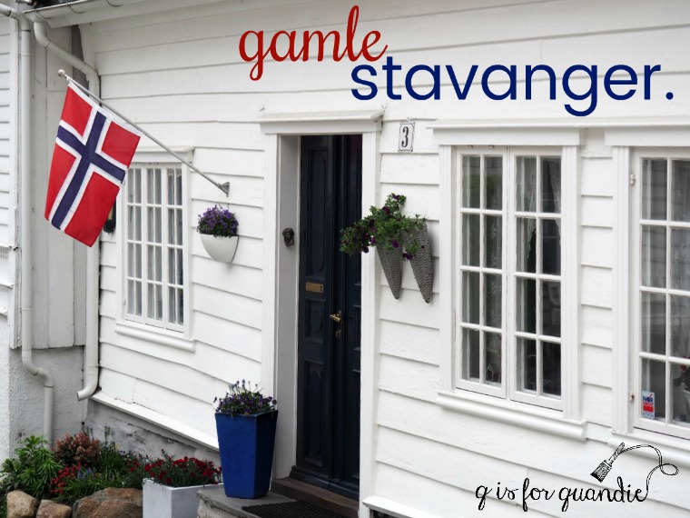
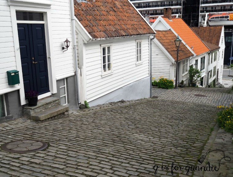
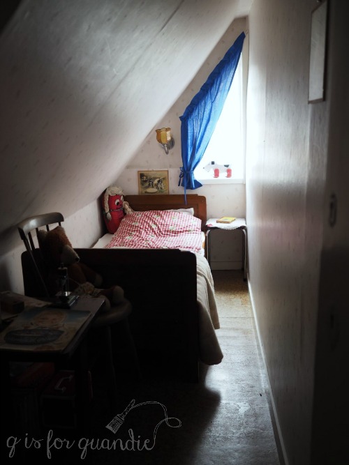


flåm.

For those of you who may be new to my blog, in May Mr. Q and I took a Holland America cruise to Norway and Scotland.  I’ve been slowly posting about each of our ports of call on Wednesdays.  So far we started in Copenhagen, then went to Oslo, Kristiansand and Stavanger in Norway.  Today I’m sharing our next port of call, Flåm, Norway.

I have to say that sailing down the Sognefjord and the Aurlandsfjord to Flåm was one of the most amazing travel experiences I’ve ever had.

Mr. Q and I woke up in the very early hours to this view outside our window.

We sailed through this misty and magical scenery for a couple of hours…

passing about a gajillion waterfalls.

By the way, this was one of the moments on our cruise when we were really glad we upgraded to a balcony cabin at the last minute.  We were sailing through here at about 6 a.m.  It was easy to just pop out of bed, walk out on the balcony and enjoy the scenery.  Had we been in an inside cabin I am quite sure we would have slept right through this, and wouldn’t that have been a shame?

We passed the little town of Undredal.

We docked in Flåm around 8 a.m.  The immediate area around the dock in Flåm is very touristy.

 There is a huge souvenir shop, a tourist info center, a couple of restaurants, the train museum and the train station.  I would say that probably 99% of the passengers on our ship either took the scenic train ride, or else they took a fjord cruise right from here.  We decided to do something else altogether.  We walked the 3 km along a rushing stream to the real town of Flåm.

According to the Rick Steves guidebook there isn’t much to see in Flåm proper and no real reason to go there, and I suppose he is right if you are looking for castles, museums, historic sites or other tourists.  He recommends taking the scenic train ride, as do most people I know who’ve been to this area.

But if you prefer your stunning scenery without having to battle for elbow room with 300 other tourists, well, then I recommend this walk instead.

Is anyone else tempted to break into song looking at that picture?  The hills are alive, with the sound of music … wait, wrong country.

This place simply could not have been any more beautiful.

As we walked further and further up the valley, the sun got brighter and the air got warmer.  It was so peaceful and quiet.  We saw very few other people.

Our final destination was the old church.

This church was built in 1670 (or 1667 depending on the source) and replaced the original stave church that once stood in this spot.  And P.S., there is a handy (and free) public restroom at the church.

We wandered around the tiny cluster of homes that made up the ‘downtown’ hoping to find somewhere to get coffee, but no such luck.

 So we turned around and headed back to our ship, which was getting ready to sail back down the fjord and out to sea.  Shortly before sailing, our captain made an announcement that a pod of Orca’s had been sighted in the Nærøyfjord.  So although our ship was too big to go very far down that fjord, he was going to take a detour down it to see if we could spot them.  Unfortunately we never saw them, but we did enjoy the dramatic scenery of the Nærøyfjord.  I think the most entertaining part was seeing how the ship did a complete 180 degree turn to get back out again!

This truly was one of my favorite days on our trip.  Mr. Q and I both really enjoyed being surrounded by spectacular scenery during our peaceful walk up the valley, as we practically had the place to ourselves.  We also loved sailing through the fjords.

Next Wednesday I’ll share our last port of call in Norway, Bergen (which we definitely did not have to ourselves)!

I hope you’ll stay tuned.


the seed & horticulture dresser.

I didn’t mention it earlier, but the washstand that I painted in Grain Sack a couple of weeks ago was part of an entire bedroom set.  There it is in the front.

I purchased this entire set for the bed.  I have plans for that bed.  You’ll just have to wait for that.  But in the meantime, I’ve given the dresser (just behind the washstand in that photo) a makeover.

Here’s a better look at just the dresser ‘before’.

Although it came with a mirror, the two will be parting ways.

I knew I wanted to use milk paint on this one, and I also wanted to use an Iron Orchid Designs transfer.  I’ve mentioned before that you have to be a little careful with this combo.  If your milk paint is too chippy, it’s hard to get the transfer to stick to the paint rather than the paint sticking to the transfer.  So I gave this one an extra good scuff sanding and then cleaned it with TSP substitute to help control the chipping.

I also decided to go with a wood top on this dresser, so I stripped the original finish off the top which was pretty scratched up.

Next I mixed a custom milk paint color, mainly to use up a few partial packets of paint I had on hand.  I started by mixing equal parts Miss Mustard Seed’s Eulalie’s Sky and Shutter Gray.  The resulting color was just a bit too blue for me, so I then added another equal part MMS Grain Sack to both lighten it up and add a little more grey.

I love this color!  I’m going to keep track of this color recipe for future use.

After the paint was good and dry, I added the Iron Orchids Design’s Seeds transfer.

I had to ‘cut and paste’ it a bit to fit the dimensions of this dresser, and also to avoid the rectangular drawer pulls.  Your hardware probably won’t be in place when you are adding a transfer, so don’t forget to take it into account.  In this case I had to move “Autumn Catalogue” up a bit to avoid the pulls.  The entire transfer didn’t fit on this dresser, but this is most of it.

I mentioned in my last post about the furniture transfer fail on the Bayberry dresser that Sally at IOD recommends distressing the transfer lightly with fine grit sandpaper to reduce the ‘halo’ effect.  I gave that a try with this transfer and it definitely minimizes it. That ‘halo’ is most apparent when looking at it from an angle, so here’s a good angle shot so you can see what I’m talking about …

It’s practically invisible looking at it straight on.

I decided to go a little old school on finishing the wood top.  After stripping and sanding, I stained it with Varythane Dark Walnut gel stain and then added a couple coats of Minwax Wipe on Poly in a satin finish.  By the way, I used Homestead House Beeswax finish over the milk paint and the furniture transfer.

I focused on the ‘seed catalogue’ garden theme of the transfer when choosing my props for these photos.

I really love how this piece turned out.

What do you think of it?

If you are local and interesting in purchasing this one, be sure to check out my ‘available for local sale’ tab for more details.

the greens of scotland.

While I was inspired by all of the shades of blue I saw in Norway on our recent trip, in Scotland it was all about the greens (and maybe the sheep!)

So when I saw this pretty green transferware platter at the Barn Chic Vintage sale, I snatched it up and decided that I needed to paint something green.

Mr. Q had recently brought home this tall serpentine dresser with lovely claw feet.  His step-dad’s ex-wife (is there a better title for that relationship?  step-ex maybe?), who is also a very supportive follower of my blog, snagged this for me from her neighbor who was having a garage sale (thanks again Sherry!)

It needed a little work.  Ken replaced a drawer bottom that was damaged beyond repair and I dealt with some veneer issues by patching with wood filler.

Next I pulled out my paints to see what my options were for green and I had quite a few.  I had some of Miss Mustard Seed’s Lucketts Green and Boxwood.  I also had several shades of green milk paint that Homestead House sent me, Upper Canada Green, Gatineau, Acadia Pear.  In the end I opted for Homestead House’s Bayberry.

I found it a bit challenging to get a photo that shows the true shade of this green.  It’s a deep green that leans more towards the blue side rather than yellow, and with a grey undertone.  I added a topcoat of hemp oil, which deepened the color quite a bit.

While working with the Bayberry, I discovered it makes the perfect ‘chalkboard green’.  That’s it on the gold framed chalkboard, without hemp oil and after being ‘seasoned’ with chalk.  From now on rather than mixing MMS Boxwood and Artissimo to make green chalkboard paint, I’ll just use Bayberry straight up.

I also tried a little experiment on this dresser.  I added part of an Iron Orchids Design furniture transfer.  I wasn’t sure how well it would show up on a dark color like this, and I knew I was taking a chance that it wouldn’t work at all and I’d have more work to do to correct it.

And as it turns out, transfers and dark colors don’t mix.  I expected that the transfer wouldn’t be as obvious over a dark color, but I didn’t expect that that filmy sort of white halo would be so much more noticeable.

Speaking of which, after getting a question from Nancy recently about the ‘cloudy halo’ that you can see with the IOD transfers, I reached out to Sally at Iron Orchid Designs.  She told me they are working on improving their product to minimize that halo, but in the meantime the transfers are best suited for light colors.  In addition, she said that a little light distressing with a fine grit sandpaper can help blend it more on light colors as well.

OK, so next came the ‘fix’.  I was hoping I could use a sharp razor blade to remove the transfer without damaging the paint too much.

Nope.  That didn’t work.  That transfer was stuck good.  Really, that’s good news since it means the IOD transfers are pretty durable and won’t just easily peel off your surface.

On to Plan B (or would it be C at this point?)  I knew this was going to be dicey at best, but it was worth a shot.  I sanded down the two drawers with the transfers, sanding off the transfer as well as most of the hemp oil.  Then I wiped them down with TSP substitute to further reduce the oil.  I had a little bit of my mixed paint left, so I stirred it well and added a fresh coat to the two drawers.

I’ve had issues in the past with getting different shades of green doing this.  I posted about that here.  Over time as green milk paint sits it tends to change color slightly.

So, I do know better.  But I thought I might as well try it since I had the paint.  Worst case scenario I have to re-do ALL of the drawers.

Yep, worst case scenario.  It’s not a really glaring difference, but enough of a difference that it bugged me.

So, back to sanding and cleaning each drawer with TSP substitute, mixing up a fresh batch of Bayberry paint and repainting each drawer.  I didn’t have to do the body of the dresser, just the drawer fronts.

In the long run it would have been smarter to try this experiment with Fusion acrylic paint or chalk paint.  That way I could have gotten away with just repainting the two drawers.  Hindsight is always 20/20.  I hope that by sharing my failures in this way, you guys can learn from them and not make the same mistakes.

To recap.  New lesson learned:  don’t use IOD transfers on dark colors.  Old lesson reinforced:  paint your milk paint pieces all at once, you can’t go back later and just paint one or two drawers.  Got that?

I promised ‘dibs’ on this dresser to the original owner.  But if she doesn’t want it back, it will be for sale.  Be sure to check my ‘available for local sale’ tab for more details.


stavanger street art.

Although Mr. Q pretty much indulged me and was very patient about wandering around charming old wooden houses in Gamle Stavanger on our recent trip, he’d pretty much had enough of that after a couple of hours.  That was when we headed into the Tourist Information center that was located right next to our ship and found a postcard about the Stavanger Street Art walking tour.

Before I go any further, let me give you Wikipedia’s definition of street art:  Street art is visual art created in public locations, usually unsanctioned artwork executed outside of the context of traditional art venues. The term gained popularity during the graffiti art boom of the early 1980’s and continues to be applied to subsequent incarnations.

Stavanger hosts a street art festival every year hosted by Nuart and is one of the world’s leading destinations for street art.  I’ve always been a big fan of street art and I love the idea that Stavanger is embracing this art form.  I had done a little reading about the street art in Stavanger before our trip, so I was pretty excited to realize that not only was there was a tour, it was conveniently starting in just a little over an hour!

We purchased tickets for the tour right there at the tourist info center (it was about $36 for two) and then headed back to the ship for a quick lunch.  Then Mr. Q and I headed back to the TI to meet our tour guide.  We were starting to wonder if we were in the right place because there were only two other people waiting, but our guide showed up and we realized the four of us were it.  The other two people on the tour were a writer and a photographer from Portugal who were doing an article on the Stavanger street art scene for a magazine.  A little later we were joined by two more ‘tour guide trainees’ who were learning from our guide, Michael (in the green jacket).

 I think you can easily pick out the photographer from the magazine in that photo, right?  She had a very nice camera!

Michael was very energetic and led us quickly from spot to spot while educating us about particular street artists as well as the various techniques they use such as stenciling.

Yep, basically the same kind of stenciling I do on furniture … well, sort of.

An artist named Jaune from Brussels did a series of these “working class heroes” pieces, and I just loved the humor in them …

as well as his use of actual infrastructure like the metal ring above or the 4 pipes coming out of the wall below.

As a former sanitation worker himself, Jaune is symbolically freeing them from their work.  Amen to that Jaune!

I also thought these electrical boxes stenciled to look like buildings by the German artist Evol were pretty cool.

They were so realistic looking, and you know how I love anything miniature!

This next piece by Norwegian artist Martin Whatson was another of my favorites.

The black and white character is stenciled first, and then the colorful ‘tags’ are added after.  I love his use of vibrant colors to contrast with the black and white, don’t you?

Speaking of color, Bortusk Leer paints these brightly hued ‘happy monsters’.

Our guide explained that Bortusk’s goal is to cheer people up, as evidenced by his motto “Cheer up you bastards”.  Ha!

This next artist likes to incorporate surrounding foliage.  I don’t think I would have noticed this piece if our guide hadn’t pointed it out.

However, this next piece caught my eye from a block away.

I was surprised that our guide wasn’t leading us over to this one.  I could tell that there was something a little bit different about it, so I kind of veered off from the group to take a closer look.

The writer from Portugal followed me over and started to tell me that this piece was done by a Portuguese artist named Vhils.  He uses a ‘hammer drill’ to remove the outer layers of the wall revealing the brick behind.  According to his website, by “applying his original methods of creative destruction, Vhils digs into the surface layers of our material culture like a contemporary urban archaeologist, exposing what lies beyond the superficiality of things, restoring meaning and beauty to the discarded dimensions buried beneath.”  That’s a kinda fabulous concept, right?

Soon Mr. Q and the magazine photographer had left our guide and wandered over to look at this piece too.

Our guide finally realized he’d lost his group and came over to accuse us of ‘eating dessert first’.  As one of the most impressive street art pieces on the tour, he’d been saving this one for last.  Ooops!  I messed up his plan.  I could tell that the pair from the Portuguese magazine were happy to realize that our guide wasn’t totally dissing their favorite artist!

Once our guide had us back under his wing, we checked out a couple more pieces and our tour was brought to an end.  We had just enough time to make our way back to the ship and hop on board before sailing to our next port, Flåm.

Be sure to check back next Wednesday because Flåm was definitely one of the highlights of our trip!


just the right white.

There are so many shades of white out there!  And I’m sure you will all agree with me that sometimes choosing the right shade of white can be just as difficult as choosing a color!

Normally I lean towards the creamy whites; Miss Mustard Seed’s Linen, Fusion’s Limestone and Annie Sloan’s Old White.  These warmer shades of white tend to play well with others.  A piece painted in one of these colors can be brought into your room without everything else suddenly looking dingy.  My ‘Specimens Cupboard’ (below) is painted in MMS Linen as are most of the white pieces in my own home.

When I brought home this charming antique washstand last week, I initially thought maybe I should paint it black.

You see, it has these amazing original black knobs.

I don’t know exactly what it is that appeals to me about these knobs, but I just love them.

And had I painted the washstand black, the knobs would have just blended in and I wanted them to really pop.  I also rejected the idea of pairing a color with the black knobs.  So that left white.

  As for what type of white paint, with an old piece like this washstand I like to go with milk paint.  I feel like nothing emphasizes the vintage character of an old piece like a chippy milk paint finish.

Choosing which shade of white ended up being a bit more complicated.

I started with my current go-to warm white milk paint, Homestead House’s Limestone (which is very similar to MMS Linen).  After painting the first coat I realized that it felt just a bit too creamy for this piece, so I decided to switch it up and for the 2nd coat of paint I went with Miss Mustard Seed’s Farmhouse White.  Once that was dry, it was really just a bit too … well … white.  It felt a bit sterile on this piece.

So I decided to try Miss Mustard Seed’s Grain Sack for my 3rd coat of paint.  Grain Sack is a white with a definite grey undertone.  I’ve paired this color with black accents before and loved the results (here).

Sure enough, the 3rd time was the charm!  The Grain Sack is perfect on this piece.

Now you might be thinking to yourself, “what a bummer to waste all of that paint before landing on the right white.”  But actually, this piece would have required three coats of paint for good coverage anyway.  And since these were all shades of white, I was able to get away with just that one final coat of Grain Sack.

The chippy-ness gods were smiling on me with this piece.  I got just the right amount of chipping.  It looks authentic, but not overdone.  I’ll admit I didn’t use any special technique to get this result.  I did scuff sand this piece, followed by a good cleaning with TSP substitute and then I just started painting.

Once the paint was dry, I sanded lightly and then vacuumed away any chipping paint.  The last step was to add some Miss Mustard Seed furniture wax which brought out a little more of the grey and also added some ‘age’ back to the finish.

Oh, but wait, I almost forgot!  Before I waxed I added just the tiniest portion of an Iron Orchid Designs furniture transfer to the upper drawer.  ‘1871.’

It’s just a subtle little touch that adds a bit of whimsy.

I have to note here that sometimes the white that works perfectly on one piece doesn’t work at all on another.  I was perfectly happy with Farmhouse White on my belgian bench, and I loved Homestead House Limestone on the farm fresh chalkboard, I just didn’t love either of those colors on this piece.  I’ve also found Grain Sack to be too grey for some pieces, while it worked perfectly on this washstand.

 Sometimes you just have to experiment a little to find the white that is just right.

Andy by the way, sometimes you have to experiment to find the staging for your photos that is just right too.  I started out using some geraniums and other green accents …

but out of two dozen photos this was the only one that I liked.

Next I decided to play up the black knobs a little more by using black props.

But I found I was having a really hard time getting the correct color of the grainsack in my photos because there was so much white inside the photo cottage.

So once again I resorted to photographing the piece outside.

Maybe outside photos are just going to be my thing and I should stop trying to fight it.  What do you think?

Meanwhile this sweet little washstand is for sale.  If interested, be sure to check out my ‘available for local sale’ page for more details.


choosing a color.

Sometimes when I bring home a piece of furniture to refurbish I have an immediate vision of what color I’m going to put on it.  Other times I really struggle with this decision.

Usually that’s because I’m trying to walk the line between choosing a color that I think will look amazing on something and choosing a color that I think will sell.  Sometimes these two are the same thing, but oftentimes they aren’t.  Since I can’t keep every piece I paint no matter how much I love them, I have to consider how well something is going to sell.  I find that the neutral pieces usually sell faster than colors.

Black is always a big seller (this next piece is painted in Miss Mustard Seed’s Typewriter).  It’s a classic, and every room needs a pop of black!

It’s easy for potential buyers to fit a neutral piece into their existing décor like this book shelf painted in Little Billy Goat’s Greyson.

A creamy almond is also an easy color to blend into an existing room.  The Miss Mustard Seed’s Marzipan on this little washstand is perfect.

It’s not quite as easy to add a vibrant blue like the Real Milk Paint Co’s Dragonfly on this dresser.  This one took a while to sell.

The fresh green of Sweet Pickins’ In a Pickle is one of my favorite greens.  This fab desk sold pretty quickly painted in this color …

but this dresser in the same color took over a year to sell.

On the other hand, I have to say that most shades of aqua sell pretty quickly, like this sweet dresser painted in Little Billy Goat’s Momma’s Fridge.

Even more saturated aqua’s have traditionally sold really well for me, like the Fusion Laurentien on this bar cart.

I’m always a little nervous when I paint something yellow, but most of my yellow pieces sell well also.  This next piece is painted in Fusion’s Buttermilk Cream and Limestone.

And this is Miss Mustard Seed’s Mustard Seed.

And just to prove my friend Lisa wrong (because she can’t believe I’ve ever painted anything red), here is a piece I painted in Miss Mustard Seed’s Tricycle.  This piece sold pretty quickly, but another dresser I painted in Tricycle was around for over a year as well.

Since I have a day job that pays the bills, I have the luxury of not relying on furniture sales to put food on the table.  But I also don’t have room to store unsold pieces indefinitely.

And honestly, it saps my motivation to paint more furniture when my finished pieces linger for too long unsold.  So I think long and hard before using colors with a bad track record.

Another consideration when deciding what color to use on a particular piece is what colors I have on hand.  I have so much paint!  Some women have so many shoes in their closet that they could never possibly wear them all, I have so much paint in my cupboard that I’m not sure I’ll ever use it all, mainly half used paint.  There isn’t enough left of each color to paint an entire piece of furniture, but I certainly can’t just throw it away!  This is where custom mixing comes in handy like this mix of equal parts Miss Mustard Seed Shutter Grey, Eulalie’s Sky and Layla’s Mint.

I mixed Fusion’s Liberty Blue and Homestead Blue to create a color called Lake Superior Blue.

Yet another factor that I keep in mind when choosing a color is you guys.  After all, how boring would my blog be if I painted everything in neutral shades like Annie Sloan’s Coco?

That would get old fast, right?  It would get boring for me too, always painting in the same old neutrals.

Don’t get me wrong, it’s not that they aren’t lovely!

But sometimes you just gotta mix it up.

How about you, do you have a favorite color?  Or if you are a furniture seller, what color sells best for you?  Is there a color that you absolutely love, but avoid using because it just doesn’t sell?  I’d love to hear about it in the comments.

gamle stavanger.

The 4th port of call on our recent cruise was Stavanger, Norway.  This was yet another instance where our ship docked right in the heart of town.  The historic area, Gamle Stavanger, was literally just across the street from our ship.  In fact, it kinda messed with a lot of my photos!  Somehow quaint Norwegian houses with a background of cruise ship balconies and orange life boats doesn’t quite work for me.

Here is what wikipedia has to say about Gamle Stavanger …

The area consists largely of restored wooden buildings which were built in the 18th century and in the beginning of the 19th century.

In the aftermath of World War II, a new city plan was created for Stavanger. It included razing most of the old wooden buildings in the city centre, and replacing them with new modern structures in concrete. One single voice spoke up against this plan, and today it is recognized that Gamle Stavanger owes its existence to Einar Hedén (1916-2001), then City Architect of Stavanger. In 1956 the city council voted to conserve part of the old city centre.

The area selected for conservation was the one considered the least desirable, consisting of small rundown wooden buildings located on the western side of Vågen, the inner harbor area of Stavanger. This area has a selection of preserved wood houses dating from both the 19th and 20th century. Some of the houses are owned by the municipality, but most are privately owned. Over the years the area has changed from seedy to trendy, and today is considered a choice location for the urban-minded with a sense of history. Gamle Stavanger has grown such that it now covers more than 250 buildings most of which are small, white wooden cottages. The area also includes the Norwegian Canning Museum which displays a typical factory from the 1920s.

The Municipality of Stavanger has received several awards for the preservation of Gamle Stavanger. During the Council of Europe’s 1975 European Architectural Year, Gamle Stavanger, together with the historic fishing village of Nusfjord in Nordland and the former mining town of Røros in Sør-Trøndelag, were identified as examples of how conservation of old buildings may well coincide with use, and how rehabilitation can be done without loss of character.

I’m sure that this story really speaks to you guys as much as it does to me, “rehabilitation … without loss of character” could very well be my own mission statement when it comes to furniture!

The all white houses (with the exception of the occasional rebel such as the blue one below) reminded me of the Jackson Meadows housing development that I posted about last fall.

Although in Gamle Stavanger, unlike Jackson Meadows, home owners clearly showed their own personalities in their choice of door color.

I could have walked around forever in this picturesque little area with my camera.

I wish I could have figured out how to get one of these street signs home in my suitcase!

Seriously, I could use a ‘strandgate’ sign in my garden!

Just for fun, here’s a little ‘miniaturized’ Stavanger.

I get such a kick out of this photo effect.  To read more about how I did it, check out this post.

Anyway, while we were wandering around someone tipped us off to the fact that one of the houses was open to the public.  Called The Workers Cottage, this house had been lived in by four generations of the same family.  It was built in 1836.

It has been restored and furnished based on two different time periods and opened to the public as a museum.  The main floor is c. 1920 …

and the upstairs is c. 1960.

I just loved the 60’s kitchen upstairs.

And the adorable kid’s bedrooms that were tucked under the eaves.

Doesn’t that just look like the perfect cozy kid’s hideaway?

Mr. Q isn’t quite as interested in vintage furnishings as I am, so he took a seat on the patio with some coffee to wait for me.

When I joined him there I somehow managed to knock into the table just right causing the whole thing to collapse sending his coffee, and the pretty china it was served in, crashing to the ground.  How mortifying!  But the ladies serving the coffee took it all in stride and in fact were very apologetic about the table saying that it wasn’t very sturdy and they really should just replace it.  They suggested we move to another table, brought out new coffee in more pretty blue and white china and all was well.

As lovely and enjoyable as gamle Stavanger was, it only took the morning to see all of it.  You’ll have to check back next Wednesday to see how we spent our afternoon in Stavanger!