Unlike some lucky furniture painters, I don’t have a pole barn full of furniture waiting to be painted. Although on occasion I’ve been known to have as many as 10 or so pieces out in the carriage house waiting for their moment in the sun, for the most part I don’t have room to store a lot of inventory.
I try to stock up a bit in the fall because typically by now there are slim pickings on Craigslist. In February people in Minnesota are hibernating, they aren’t cleaning out the attic or getting ready to move. Plus in the winter I’m obviously not finding pieces at garage sales either.
But I’ve pretty much worked through most of what I had stocked up and now I’m scouring Craigslist on a regular basis looking for candidates for a makeover and not finding a whole lot. The occasional piece that attracts my eye ends up either too far away, too expensive, or else it has already sold to someone else but the ad wasn’t deleted yet.
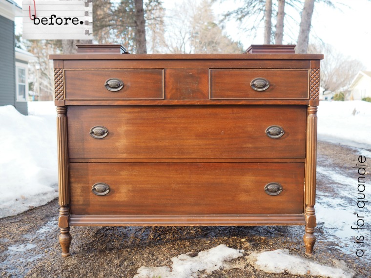
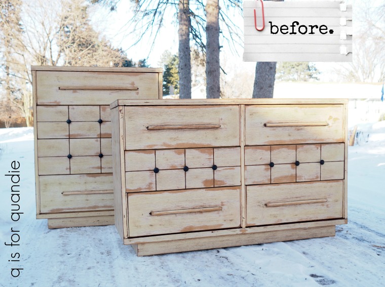
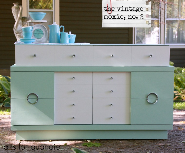
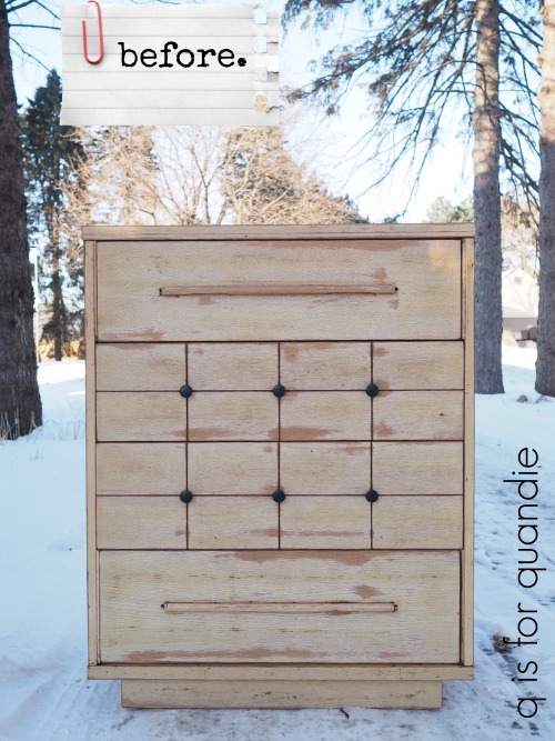
When I initially came across the ad for this pair of mid-century dressers I gave them a pass. I didn’t hate them, but I didn’t love them either. I do enjoy working on the occasional mid-century piece, but I usually prefer older stuff.

But week after week I kept seeing this ad. I suspect they weren’t selling because the seller wasn’t ‘working his ad’ very aggressively. By that I mean that he wasn’t renewing the ad periodically to keep it towards the top of the list. Over a month had gone by since the ad was originally posted and he’d never renewed it once.
Or perhaps the problem was that no one could see the potential in these pieces.
The price was certainly right, and after seeing the ad pass by a couple of times I stopped to take a closer look. You know what I saw? I saw two pieces where someone else had already done half of the work for me. They’d already been sanded and were pretty much ready to paint (and when Mr. Q and I picked them up the seller told me that he’d also already replaced all of the runners inside). So I realized that these two pieces could be a pretty quick turnaround.
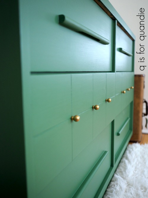
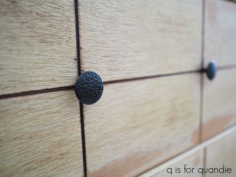
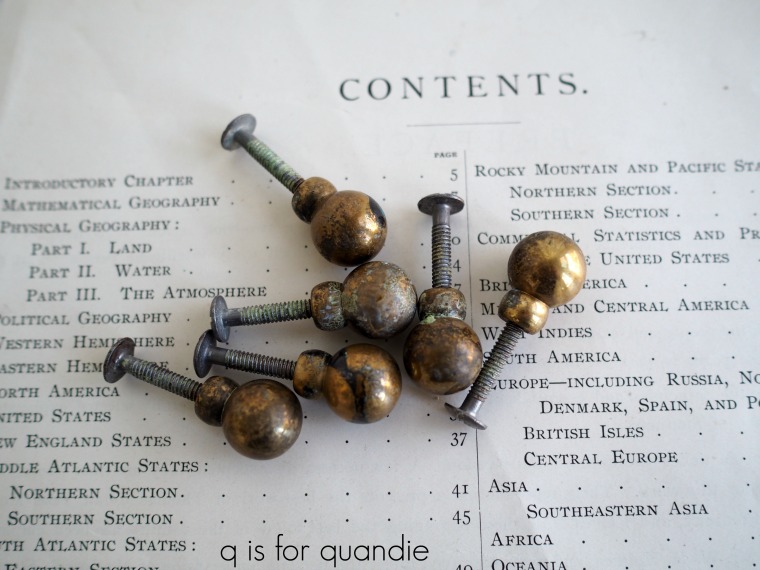
Unfortunately, in addition to the sanding and repairing, the seller had also replaced the original knobs with these awful cheap knobs from the hardware store that are all wrong and have zero mid-century style.

But imagine my glee when I opened one of the drawers and found a Ziploc baggie filled with the original knobs inside. Jackpot!

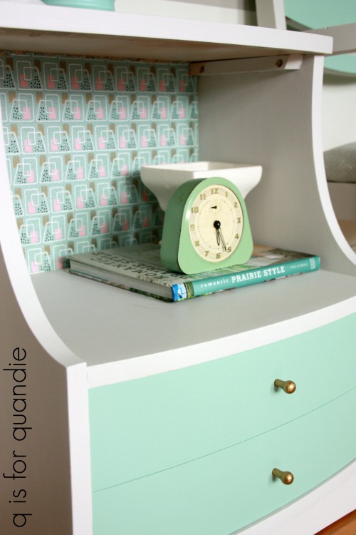
If you are thinking they look a bit grungy in that photo, just sit tight. You’ll see what I did to spruce them up in a few minutes.
As we got talking with him, the seller happened to mention that he’d also made a couple of … well … let’s call them adjustments to the style of the pieces. He said that originally the drawers with the long handles has been inset. He thought that looked weird, so he added stops inside the dresser to keep the drawers from pushing all the way back. Plus he moved the shims on either side of those drawers forward to bring all of the drawers flush with the front.
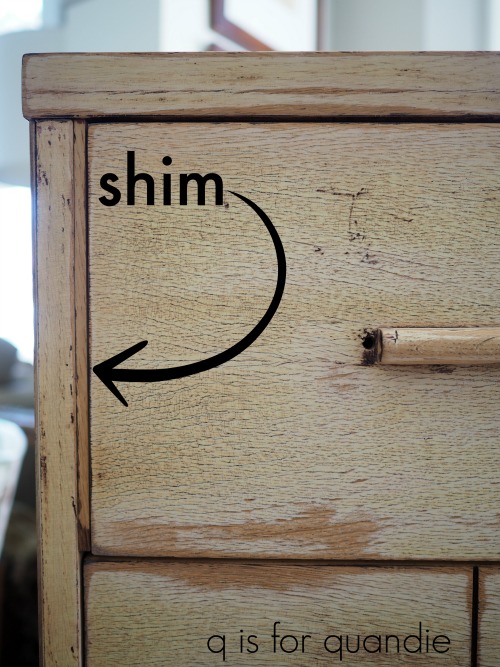
Now that you are aware of this, go back and look at the ‘before’ picture again. Yep, now your eye immediately goes to those shims and you realize they look kind of odd, right?
I realized that I had to un-do those changes before I could start painting. So much for the quick turn around. But that being said, thank goodness the seller mentioned this. I’m honestly not sure that I would have figured this out on my own. I know I would have been puzzled about those shims, but would I have realized that two of the four drawers were meant to be inset? Probably not.
I tried to remove the shims intact so that I could just simply move them back to their original location, but I ended up breaking two of them. That’s when I called my handyman Ken for a consultation. He came over and helped me get the rest of the shims off without breaking them (they were glued and stapled with heavy duty staples), and he took the broken ones home and cut replacements for me. What would I do without Ken?
While Ken was working on that I had to take care of one last problem before I could start painting.

It wasn’t until I was wiping the drawers down to paint them that I noticed there was a hole on either side of the long wooden drawer pulls. I’m guessing that there used to be a metal cap of sorts on either end of that pull. I wish I’d found those inside a drawer in a Ziploc baggie, but no such luck. So I needed to fill those holes. I used my usual trick of placing a piece of tape on the back side of the hole, but then this time I filled them using Dixie Belle’s brown Mud. It cracks me up that the label says ‘straight from the swamps of Dixie’.
Fortunately it does not smell like it’s straight from the swamps of Dixie 😉
I used a putty knife to press the mud into the holes and then I let it dry. Once the first pass was dry I went over the holes a second time with the mud to make sure they were level with the drawer front. Once dry again, I sanded them smooth and cleaned the drawer fronts with a damp rag.
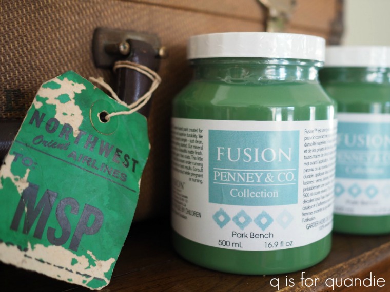
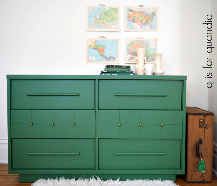
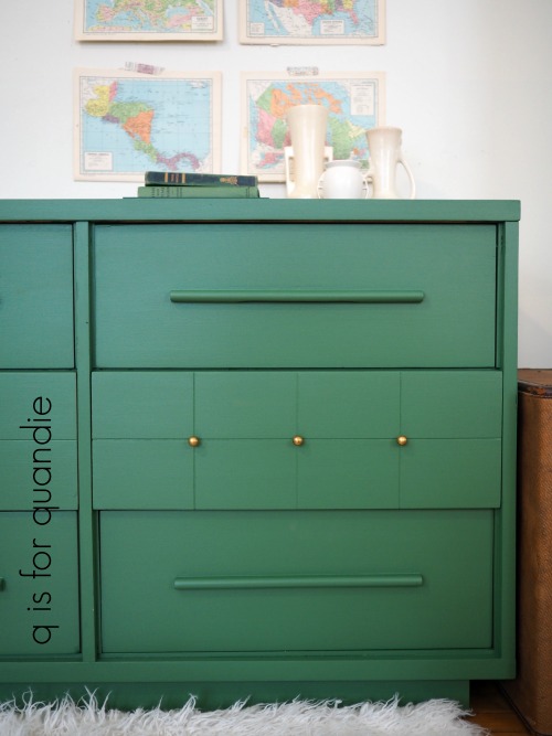
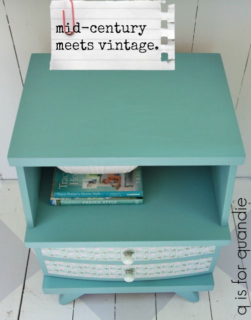
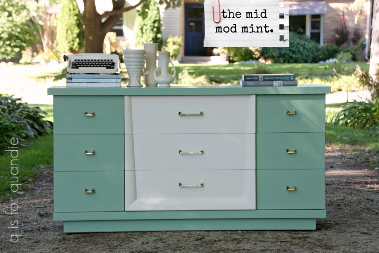
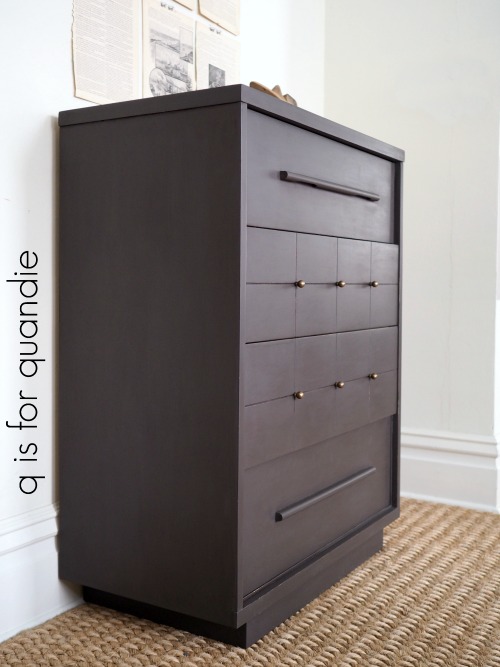
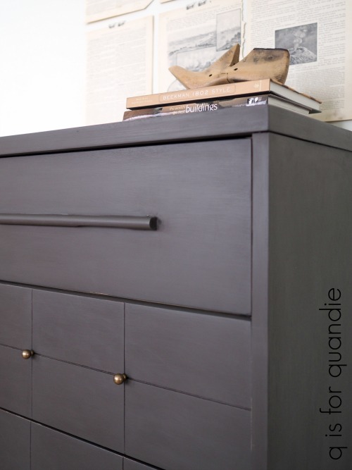
Now came the fun part, the paint! I always struggle with deciding between choosing a more neutral color that I think will sell more easily and choosing a more vibrant color that will be fun to paint with but may not appeal to as many buyers. So I made a deal with myself to paint one piece in a neutral and one in a brighter color. Today I’m starting with the taller piece, and it’s going more neutral.

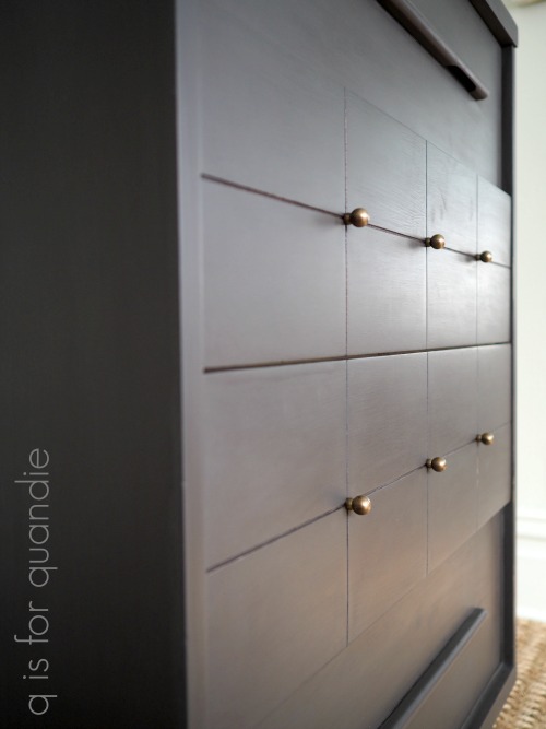
Dixie Belle’s Gravel Road, to be precise, which is a warm, dark grey. Once again I used Dixie Belle’s recommended method of painting. I dipped my brush in water periodically to thin down the paint. The paint goes on so smoothly using this technique. It does also thin it down a fair bit, so two coats were required. Also, in case you are wondering I used about half of the 16 oz jar for this dresser, so less than $10 worth of paint.

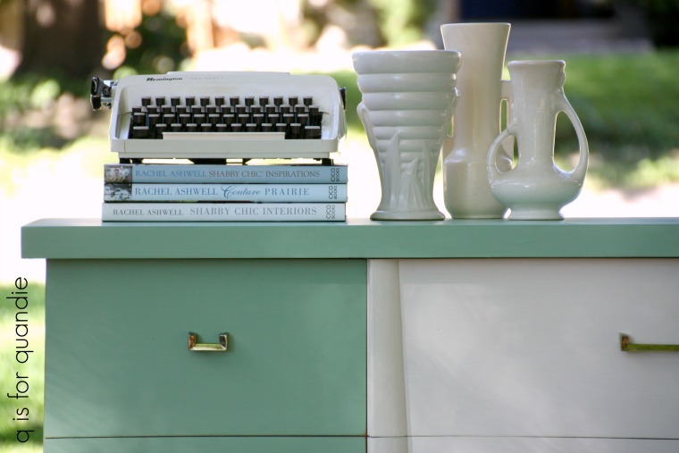
I use Dixie Belle’s Best Dang Wax! in brown as a top coat. I like how the brown wax warms up and deepens the color a bit.

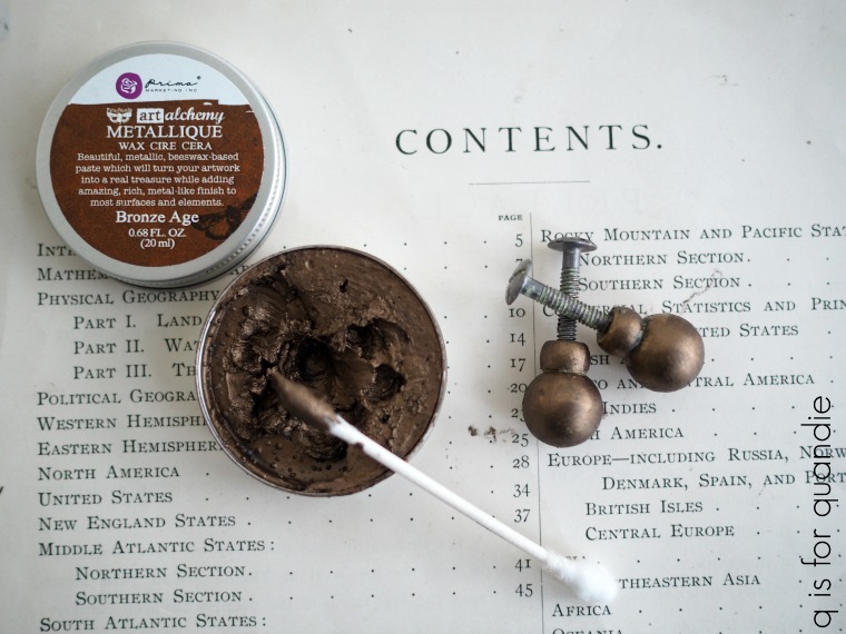
Before putting those original brass knobs back on, I washed them with soap and warm water and then once dry I added some Prima Marketing Metallique wax. I debated using the Old Silver and although I think that would have looked gorgeous, I went with the warmer tone of the Bronze Age instead.

I like to apply it with a q-tip (although some people just use a fingertip). The trick is to apply even coverage and then leave the knobs alone to ‘dry’ for a couple of hours. Once dry you can buff lightly to add some shine.

They look amazing on the dresser. It was so lucky that I was able to put the original knobs back on this piece.
I have to admit that I did not have high expectations for this dresser. I really expected to improve it somewhat with a paint job and call it good.

But in the end, after salvaging a bit of the original mid-century modern style, I am amazed by the transformation.

How about you?