tackling a tackle box.

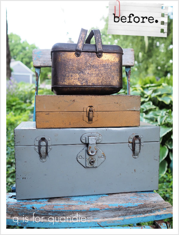
I can’t exactly remember how I came by the tackle box that I’m sharing today.

But I’m fairly sure that one of my friends must have found it for me.

I say that because I really don’t think I would have purposely chosen to tackle this one (ha, tackle, tackle box, get it?).

I tend to avoid things with old contact paper stuck to them like that yellow floral stuff in the tray.  This box is also pretty dented and misshapen.  Plus there was some kind of gunk that had totally hardened inside the bottom of the box.  Ewww.

But it was in my stash somehow (I don’t know, maybe I did purchase it myself?), so last fall when I was cleaning up a few other metal boxes out in the yard using the garden hose I added this one to the pile.  First I removed the contact paper, and then I scrubbed it with soap and water.  I then tried to scrape that hardened gunk off the bottom, but it wasn’t going anywhere.  I also tried to sand it down, but it was nearly impossible to get my little palm sander inside the box.

Eventually I just gave up on getting that stuff removed.  I moved on to painting the box with some of Dixie Belle’s B.O.S.S. and then shoved it to the back of the project pile again.

I pulled it back out a couple of weeks ago when I was working on some other Christmas themed items and decided to just see what I could do with it.

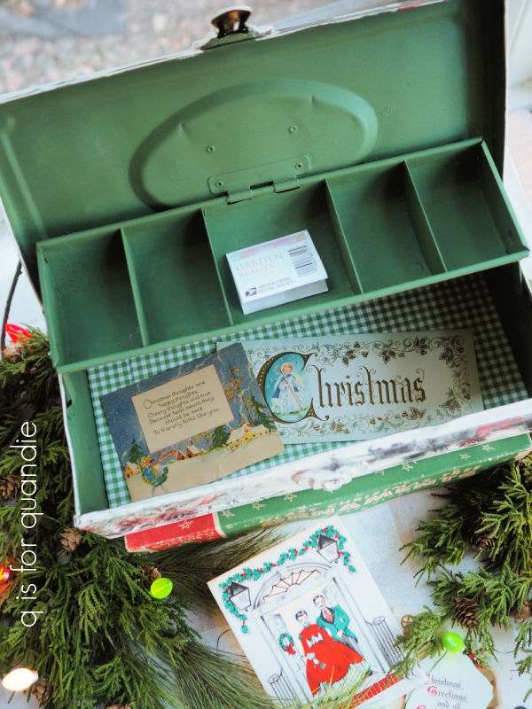
I started by painting the inside in Dixie Belle’s English Ivy.

This is such a pretty shade of green, and perfect for Christmas.

Since I couldn’t get the bottom nice and smooth, I opted to line it with some gingham scrapbook paper after I painted it.

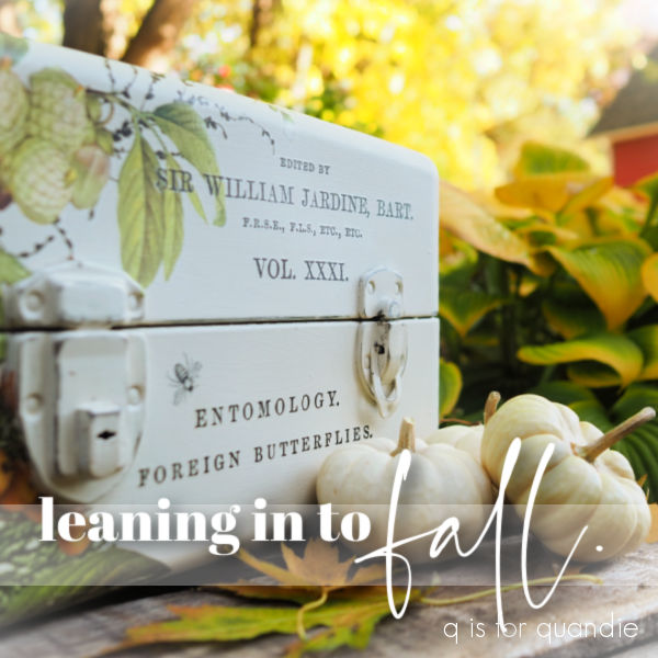
I painted the exterior in Dixie Belle’s Drop Cloth.  Once that was dry, I sanded it to distress the edges and then I brought out my transfer scraps to see what would work.

I ended up finding some cursive script that fit the top of the box.  I’m not sure what that was from, but it was most likely a re.design with prima transfer.

Once I had that script in place, I filled in some of the corners with bits and pieces from the Evergreen and Holly transfer from Dixie Belle.

This sweet little red breasted bird fit perfectly on the front of the box.

If you’re someone who pays attention, you might be wondering at this point how I seem to always have more of this transfer even though I’ve mentioned that it’s no longer available.  It was a limited release for Christmas 2022.

Well, as it turned out, one of my local readers purchased it online (you can still find it from various vendors online) and asked me to do a custom lockbox for her.  She had the lockbox, and the transfer, I just painted it up for her.

And as a bonus, she let me keep the remainder of the transfer after finishing her lockbox.

So I do have a bit more of the Evergreen and Holly and I’m rationing it out for a handful of projects.

Now, what would one do with a Christmas tackle box?

I suppose you could put your Christmas card supplies in it.  Is that a bit of a stretch?  Do very many people even do Christmas cards anymore?

What would you do with it?

If you are local and can think of a good purpose, this particular Christmas tackle box is for sale locally.  And I’m pricing it low due to that gunky bottom.  So be sure to check my ‘available for local sale‘ page for more details.

the candy cane toolbox.

Remember back when I said I prefer to work with vintage toolboxes rather than newer ones?

Well, there are always exceptions to every rule, right?

Today’s toolbox was not especially old.

Nor was it in the usual rusty and/or crusty condition.  Which is kind of a bonus really.  It didn’t take a whole lot of prep to get this one ready for paint.  I washed it and then gave it a coat of Dixie Belle’s clear B.O.S.S.  No sanding required.

And really, I probably didn’t even need the B.O.S.S. on this one.  But at the time I was prepping a whole bunch of toolboxes, sort of assembly line style, so I B.O.S.S.’ed them all.

I decided to stick with the red on the inside of this one, just giving it a fresh coat of Dixie Belle’s Honky Tonk Red.

Once that was dry, I added a candy cane transfer from I.O.D.’s Candy Cane Cottage inside the lid.

Next up I painted the exterior of the box in Dixie Belle’s Drop Cloth.  Then I started cutting up different elements from Candy Cane Cottage to see what I could come up with for the outside.

Rather than immediately rubbing transfers on as I chose them, I decided to place everything first to see what would fit.  That way if I needed to overlap some elements I could be sure to apply them in the right order.

This time around that only ended up impacting one spot, where the word “Old” overlaps the floral under it a bit.

If I had put down the wording first, I could have rearranged the floral so that it didn’t cover it, but in the end it’s easier just to do a little pre-planning.

Those florals were the sole reason I ordered this particular transfer.

They are such a pretty combination of floral and holiday with those red berries.

As I mentioned in a previous post, I only wish these images were larger.  I used the two larger florals included with the transfer on either side of the toolbox, and then supplemented those with two of the smaller florals on each side.

By the way, I should probably mention at this point that this limited time only transfer is sold out everywhere.  If you didn’t order it immediately upon release, you likely missed out.

I also added some wording from Candy Cane Cottage to the top of the toolbox.

I think it turned out pretty dang cute.

Now, you might be wondering, what in the world would you do with a Christmas themed toolbox?

Well, how about keeping your gift wrapping supplies in it?  Scissors, ribbon, tape, bows, etc.

Or, you could just use it as decor, placing it on a shelf or table top, or even just under the tree.

But I also really like the idea of filling it up and using it as a gift box.  Remember the toolbox I created a few years back as a Secret Santa gift?

This one would be perfect to fill up with the same sort of stuff.  Some peppermint schnapps, peppermint sticks, hot chocolate mixes and some fabulous retro shot glasses; everything you need to make a peppermint patty (the drink, not the candy).

Whatever you’d use it for, it is available for local sale so be sure to check my ‘available for local sale‘ page for more details if you’re interested.  Be sure to act fast if you want to pick it up, I’ll be bringing this one into the shop on Wednesday.

Also, be sure to leave me a comment and let me know if you’ve used the I.O.D. Candy Cane Cottage transfers, and if so, how did you like them?

leaning in to fall.

Today I’m switching it up just a little.  OK, OK, not by much.  Instead of a toolbox, today’s project is a tackle box.  I know I’ve done a lot of toolboxes/tackleboxes/lockboxes lately, but for whatever reason, those seem to be coming my way these days.

Not only is this one a tackle box, but it’s a double decker tackle box.

Or to be precise, it was a tackle box.  There was no way I was going to mess around with painting those trays though.  So I had my handyman Ken drill out the hinges and take them out (they are already out in that photo above, I’ve just placed them on top for the photo).

Once that was done I gave this one a good clean, and then I sanded the rusty spots with some 220 grit sandpaper.  Next I gave it two coats of Dixie Belle’s B.O.S.S.  I really wanted to try and prevent that rust from coming back through my paint.

When I initially began to work on this one, I wanted to do something using autumnal colors.  I’m stepping a little bit outside of my comfort zone here.  I don’t typically like browns, oranges, or yellows.  But I wanted to lean in to fall (fall the noun, not the verb, get it?).  You know, fully embrace the season.

That being said, I didn’t have any fall themed transfers on hand.  Conveniently, at that very moment, re.design with prima came out with a new release that includes a transfer called Harvest Hues.

It looked perfect for my needs, so I ordered it.

While waiting for my transfer to arrive in the mail, I painted the inside of the tackle box in Dixie Belle’s Mojave.

Whenever I see this color I automatically think ‘Harvest Gold‘.  If you were around in the 70’s, you know what I’m talking about.

Next I painted the outside of the box in DB’s Drop Cloth and waited for my transfer to arrive.

I was so excited when it came, but when I pulled it out of the tube I was startled to find that it came in two long strips.  I’ve gotten so used to using both I.O.D. and Dixie Belle transfers that come on smaller sheets.  I was a little flustered about how to manipulate the sheets to fit my tackle box.

Then tragedy struck when one of the sheets rolled up on itself without the backing paper while I was handling it.  Argh!  Has that ever happened to you?  That basically ruined about half of one strip as it stuck to itself.  Thank goodness I wasn’t planning to use the complete design on a bigger piece, that would have been a real bummer.  I really appreciate that the I.O.D. transfers now come in flat packaging, thus eliminating the whole rolling problem.

Anyway, that left me with trying to figure out how to make the remaining long strip work for my tackle box.  It also left me somewhat frustrated, so I set the whole thing aside for a couple of days.

I then realized that autumn was getting away from me, and if I didn’t get this one done soon I was going to miss the entire season.

Once I started working with the transfer, I realized it wasn’t much harder to fit it to the box.  I just had to play around with placement a bit, and do a little creative trimming here and there.

Once I had the Harvest Hues in place, I added some bits of wording from the I.O.D. Label Ephemera transfer in the blank spots on the top (sadly, this transfer is retired and getting difficult to find) …

I also added some Label Ephemera to the front …

The Harvest Hues transfer is wrapped around one side quite a bit.

But on the other side I added the color chart from the end of the transfer.

Those dots were transferrable, so I thought, why not?

In the end, I think it turned out nicely.  And I was able to stage my photos outside and capture some of those beautiful fall colors in the garden before they are gone!

How about you?  Are you a fan of harvest hues?  Or do you tend to lean more towards summer pinks or corals?  Then again, how about jewel tones?  Or maybe deep, dark navy?  Leave a comment and let me know.

In the meanwhile, this harvest hues toolbox is for sale.  Be sure to check my ‘available for local sale‘ page for more details.

Thank you to Dixie Belle Paint Co for supplying their products used for this project.

the norske toolbox.

When we were in Norway last month I was determined to find a set of 5 small Norwegian flags to bring home as a souvenir.  Yeah, I know, maybe not your typical souvenir.  But I have this vintage flag holder and although I have U.S. flags for it, I was thinking it might be fun to fly the Norwegian flag for a while.

Especially since nnK (my neighbor across the street) flies the Swedish flag!

I initially thought I might have to really hunt around for those flags in Norway, but no.  They were everywhere.  Nearly every souvenir shop we visited had them, and they had them in various sizes too.

So now I have them hanging on the carriage house and I love them.

Fast forward to a week or so ago when I found this red toolbox at a garage sale.

I was heading out to my workshop with it, and as I passed those flags I thought … hmmmm … the Norwegian flag would be perfect on the toolbox.

After all, I’ve done a few union jack pieces …

So why not the Norwegian flag?

So I cleaned up the toolbox and then gave it a coat of Dixie Belle’s Honky Tonk Red inside and out.  You’ll note that I skipped the B.O.S.S. step this time around.  This toolbox did not have any rust, and it also didn’t seem to have any greasy residue from anything.  So I thought I’d be O.K. skipping the B.O.S.S.

I let the paint dry overnight, and then I taped off the white stripes and painted those with Drop Cloth.  Once dry, I taped some more and then added the dark blue stripes using In the Navy.

Once I had the flag design in place I decided that it needed just a little something more.

So I decided to add a few roses.

The white roses are from the I.O.D. Brocante transfer, and the red roses are from their Redoute II transfer.

I wrapped them up and over the top …

And also around the side.

You may be wondering what roses have to do with the Norwegian flag.  Well, nothing really.  I just thought they looked nice together.  Plus, judging by the amount of rose hips I saw while visiting Norway, I’d say they grow plenty of roses there.

So it’s not entirely odd to have added roses to their flag.

I staged the toolbox with some old photos of my Norwegian ancestors.

The wedding photo in the front is my great grandfather who emigrated from Norway as a young man.  In the back row is my grandmother’s confirmation photo, then her wedding to my grandfather, and then there is this photo from 1909 …

My grandmother is the 2nd from the left in the front row.  I thought this photo was particularly relevant because several of the kids are holding Norwegian flags.  The back of the photo dates it to May 17, 1909.  May 17th is Norway’s Constitution Day, so they must have been celebrating that.  I have no idea why there are only men and children in the photo.  Where are all the women?  Probably in the kitchen making Kvæfjordkake or something.

By the way, a little sidebar, I did try Norway’s official national cake, Kvæfjordkake, while I was in Kristiansand …

And it was absolutely delicious.  Have you ever had it?

Anyway, I totally love how the Norske toolbox turned out.

I am going to attempt to sell it.  I’m banking on the belief that there are a lot of locals in Minnesota with Norwegian ancestry who just might want a Norwegian flag toolbox.

Maybe?

Well, I guess I’ll find out.  And if it doesn’t sell, well then, maybe it was meant to be mine.

If interested, be sure to check out my ‘available for local sale‘ page for more details.

the violet hill toolbox.

I’m pretty flush with toolboxes these days.  I have several friends who have been snatching them up for me, which is always appreciated.  Especially if those friends know how to discern a good vintage toolbox from a not so good one.

I’m drawn to unique shapes, good handles, and weight.  You can almost always judge age by weight.  The older toolboxes are heavier and constructed out of thicker steel (hmmm, I feel like this applies to me as well).  I’m not as big a fan of newer toolboxes (although that being said, you are going to see one of those newer varieties from me next week).

For today, I’m working with this one.

Not super exciting with its black plastic handle, but I do like its shape.  It’s heavy duty, and it has a good tray inside.  I like the trays that don’t have any dividers meant for a set of sockets.

I prep all of my toolboxes in the same way.  I wash them out in the yard with the garden hose and some Dawn dish soap (you need a good grease cutting cleanser).  Once dry I may sand them if they have chipping paint or a lot of lumpy spots.  Then I give them a coat of Dixie Belle’s B.O.S.S. to block any potential stains from bleeding through my paint.

Actually, the photo above shows this toolbox after all of that prep.  As you can sort of see, the B.O.S.S. does look a bit filmy.  This product is always meant to be painted over, never left as a final coat.

Next up I painted the tray and the interior of the box in Dixie Belle’s English Ivy, and the outside of the box in their Sawmill Gravy.

Then I went through my stash of transfers.  I’m really trying to work on using up transfers that I’ve had for too long.  As I’ve mentioned before, transfers lose their stickiness over time, so you really can’t hang onto them for years.

I ended up pulling out an old re.design with prima transfer called Violet Hill.

I have to confess, this is not one of my favorites.  I’m drawn to warmer shades of pink, and the florals in this one are in cooler shades leaning towards violet (hence the name).  I have used snippets of it in the past.  First on a cast off hankie drawer

and then on a pair of ice skates.

But I had enough of this transfer left to use on a toolbox, so I decided to go for it.  Even though these aren’t my favorite colors, I know there are those of you who love them.

I thought these darker florals would be more appropriate for the season too, they aren’t quite as summery looking as others that I use.

I added some of the Violet Hill transfer to the tray as well.

I pulled out another of the old prima transfers that Monica sent to me to add some French wording to the top of the toolbox …

as well as to the side of the tray.

By the way, isn’t that vintage velvet ribbon gorgeous?

It was the perfect color to work with the colors in that Violet Hill transfer.

I purchased that ribbon years ago at a garage sale and although I pull it out occasionally to stage a photo …

I haven’t come up with a permanent use for it yet, but one of these days I will.  In the meantime, I’ll just keep using it as a photo prop.

As for the Violet Hill toolbox, it is for sale locally.  So if any of you locals love these colors, and could use a fab vintage toolbox, be sure to check out my ‘available for local sale‘ page for more details.

the flora parisiensis toolbox.

Recently I decided that I’m going to just start using some of the transfers that I’ve been holding on to while waiting for just the right piece of furniture to come along (a.k.a. hoarding).  I know it doesn’t make a lot of sense to use a $30+ transfer on a piece like a toolbox that I’ll be lucky to sell for $55.  However, it also doesn’t make sense to keep hanging onto transfers that I purchased a year ago or more.  Those transfers aren’t worth anything sitting in my cupboard drying out.

Transfers do deteriorate a bit over time, have you noticed that?  They lose some of their stickiness, making them more difficult to rub on.

That’s why I decided to use the Flora Parisiensis transfer from I.O.D. on a toolbox.

This transfer is 24″ by 32″, and you might wonder how I would fit that on a toolbox.  Well, you’re about to find out.

My friend Sue found this toolbox for me recently.

It has a pop up tray, but I still would consider it a toolbox rather than a tackle box based on its size, and the fact that there is only one divider in that tray.

Tackle boxes typically have a lot more than just one divider, don’t they?

It looks at though this toolbox was originally red, and then at some point it was painted silver.  Although that pop up tray doesn’t have any red.  Maybe it was originally aluminum, then painted red, then painted silver again.  LOL, who knows?

But this time around I’m painting it peaches and cream.  Well, technically, Dixie Belle’s Apricot and Drop Cloth.

First though, the prep work.  I cleaned this one with some Dawn dish soap and the garden hose.  Then I used a razor blade to scrape away some clumpy bits here and there.  They looked like maybe bits of glue, or possibly glops of polyurethane or something.  Whatever, I scraped them off.  Recently someone asked me if I sand my toolboxes before painting them, and sometimes I do.  If they have a chippy finish on them, or a lot of rust spots, I will sand them a bit to get them more smooth.  I don’t get carried away though, just a quick sanding.

Next up I added a coat of Dixie Belle’s clear B.O.S.S.  Personally I wouldn’t go without the B.O.S.S. on most toolboxes, it prevents both rust spots and greasy residue (these are toolboxes after all, they are bound to have some greasy residue) from coming through your paint.

Then I painted the inside in Dixie Belle’s Apricot.

I knew I was going to use the Flora Parisiensis transfer on the outside, and after pulling out all three of the pinky coral shades of Dixie Belle paint, I decided that Apricot was the best choice.  Although honestly, any of the three would have worked.  And by the way, stay tuned for an upcoming post comparing those three coral colors!

The exterior of the toolbox received two coats of Drop Cloth.  I painted over everything but the handle.

Then I started cutting up the Flora Parisiensis transfer to fit it to the toolbox.  I started with the two biggest rose elements, applying them to the front of the toolbox and wrapping them up and over the top.

As you can see, I cut the transfer out around the latches.  I usually do a dry fit of the transfer when working on a piece like this, cutting around those latches before removing the backing paper.

Once those were in place, I added the wording to the top of the toolbox, layering some of it over the roses.

I added a section of rose leaves to the front of the box, and once I was done with that, here’s what I had left from the transfer.

Lots of stems and one big rose.

So technically I will likely get one more project out of this one, or I’ll at least have lots of filler to use with other floral transfers.

Next I added a bee under the handle.  It came from the re.design with prima Middy French Labels.

The Rosier du Pont. wording that I added to the front is from I.O.D.’s Redouté II transfer.

I also added another bee from the French Labels set inside the lid.

People often ask me what one would do with a pretty floral toolbox like this one, and I think my best answer is ‘whatever you want’.  Fill it with anything that fits in a box, put it on a shelf somewhere in your house.  Surely everyone needs at least one pretty toolbox, don’t they?

This particular toolbox is for sale locally, so be sure to check my ‘available for local sale’ page if interested.

Thank you to Dixie Belle Paint Co for providing the B.O.S.S. and paint used for this toolbox makeover.

the arts décoratifs toolbox.

Remember the toolbox I brought home recently?

I fear that some of you are going to be disappointed when you read that I have painted it, but yes, I did.  Of course I did.

I followed my usual process.  Washing it with Dawn dish soap and the hose out in the yard, letting it dry and then giving it a coat of Dixie Belle’s B.O.S.S. inside and out.  Oh, and there is a tray with this one, and that got the same treatment.

Next up I painted the interior of the toolbox and the tray in Dixie Belle’s new Cottage Core color called Cottage Door.  Once dry, I added some wording to the tray from an old prima transfer called Catalogue.

This is another of the transfers that my reader Monica donated to me.

I once used this same transfer on a dress form, and I absolutely loved the result.

Transfers have come a long way since the early days when they were much more simple (and less expensive), and were mostly just cool typography and nothing else, like this one.

After adding the wording to this tray, I’m reminded of how impactful adding even just a simple bit of typography can be!

Next up I painted the outside of the box in Dixie Belle’s Drop Cloth, and then I added the last two pieces I had from I.O.D.’s Elysium transfer.

As a reminder, this transfer comes on four 12″ x 16″ sheets.  It’s a little bit pricey at around $30 – $35, depending where you shop.  But I was able to use it on three different pieces.  This toolbox, and these two other boxes …

So I got three items out of one $30+ transfer.  That’s not too bad.

Once I had the floral transfer in place, I had a couple of somewhat blank spaces in the opposite corners that needed just a little something.

I added a small portion of the old, small Seeds transfer (also sent to me by Monica!) to the front corner.

That tiny crown at the bottom is from one of the knob transfers from re.design with prima.

As are the bees and crowns that I added to the latches.

I added a few more scraps here and there from various transfers.  I have a big pile of random bits that have been left over from previous projects.

Once the transfers were in place, I protected everything with Dixie Belle’s flat clear coat.

I did opt to leave the handle unpainted …

And as a nod to the original finish and color, I also left the little clasp thingie unpainted.

I just have to say, that Elysium transfer is so pretty.  And it works just beautifully with that new Cottage Door paint color from Dixie Belle.

Don’t you agree?

By the way, I just couldn’t resist using my Limelight hydrangeas as a background for these photos.

They are looking particularly fine at the moment.

I absolutely love the way this one turned out, and I hope not too many of you are disappointed that I painted it.

Leave a comment and let me know what you think!

This toolbox is for sale locally (sorry, I don’t ship my items).  Check out my ‘available for local sale‘ page for more details.

Thank you to Dixie Belle Paint Co for providing the B.O.S.S., paint. and flat clear coat used in this project.

more sweet boxes.

I’m back with the remaining two metal boxes that I promised from last week.

As a reminder, here is the stack of boxes that my friend, opK, gave me.

I shared the end result of the largest box on the bottom of the stack last Friday (and it is sold, fyi).

Now let’s look at the middle sized box.  I have no idea what this box was originally intended for.  It has built in dividers inside that would have worked for holding a screwdriver and screws, or maybe some other sort of hardware and/or tools.  Who knows?

I have to say that initially I wasn’t sure I even wanted to bother with it because of those dividers.  They sort of limit what you can keep in the box.  But then again, they also provide a way to keep some bits and bobs organized, don’t they?

Rather than trying to paint a coat of Dixie Belle’s B.O.S.S. inside those little cubbies, I opted to spray paint it.  I find that spray paint also does a pretty good job of blocking stains.  I didn’t have a color of spray paint that I liked though, so after the blue spray paint was dry, I brushed over it with a custom mix of Dixie Belle’s Silk paint.

I mixed up this color a while back for another project.  I was trying to match Annie Sloan’s Scandinavian Pink, and I think I did a fairly decent job.

The outside of the box did get an initial coat of B.O.S.S. followed by two coats of Dixie Belle’s Dried Sage.  Then I added a few random scraps of transfers from my stash.

The florals are from the I.O.D. Floral Anthology transfer, and the wording is from their Label Ephemera transfer.

I especially love the little blue and white daisies that I put on the front of the box.

I also really like the way that this one distressed.

I think it has a very authentically aged feel.

As for the smaller box, I did give that a coat of B.O.S.S. inside and out.  Then I painted the inside in one of the colors from Dixie Belle’s new Cottage Core Collection called Cottage Door.

Isn’t that a gorgeous warm coral pink?  I love it.

After adding the bee transfer from re.design with prima’s French Labels set …

I protected the interior with a coat of Dixie Belle’s flat clear coat.

Next I painted the outside of the box in my favorite Drop Cloth, and then added some florals that are also from I.O.D.’s Floral Anthology transfer.

I love the way the Cottage Door color works with the those Floral Anthology blooms.

As for the top of the box, I went with a scrap of wording from an old re.design with prima transfer called Paris Valley.

The little “No. 1483” on the lid is from a Tim Holtz transfer.

This box is really a little bit wonky.  You can shut the lid, and you can maneuver the little handles up over the top, but it does take a bit of finagling.

That being said, I think I’d be tempted to just leave it ajar.

Cuz it’s awfully cute.

So … boxes before and after …

Which one is your favorite?

everything’s coming up roses.

Recently my friend, opK (that’s oar painting Karen) offered me a stack of metal boxes.

Before I got started making them pretty, I gave them all a good cleaning with some Dawn dish soap and the garden hose.  Then I let them dry in the sun, and followed that up with a coat of Dixie Belle’s B.O.S.S. inside and out.  I like to use the B.O.S.S. to reduce the chances that any rusty spots will seep through my paint job.

I decided to paint them all in different colors, which required the use of a lot of paint stir sticks and brushes.  At one point I had six different paint brushes going, lucky I have a lot of brushes.

I started with the largest box.  I painted the inside in Dixie Belle’s Silk Paint in Fiery Sky.

Then I painted the outside in DB’s Sawmill Gravy.  I’d used this combo on a toolbox once before and really liked it, so I thought I’d do it again.

I also already knew I wanted to use I.O.D.’s Redouté II transfer on the outside, so the Fiery Sky was going to be the perfect compliment.

In case you aren’t familiar, Pierre-Joseph Redouté was very famous for botanical paintings, especially those of roses.  I bet that back in the 90’s quite a few of us shabby chic lovers had a Redouté print or two hanging on the wall, I know I did.

I picked up this transfer recently at a brick and mortar shop that’s not terribly far from me called Liza Jane Designs (in Afton, MN).  I thought I’d share her info for any of my local readers who use I.O.D. products because she had a pretty much complete inventory of everything (which I think can be rare in a brick and mortar); transfers, paint inlays, molds, stamps and ink .

This particular transfer is an older release from 2021, but I’d never used it before.  It comes with 8 full pages of roses, so I’m sure I’ll get a number of projects out of it.

I added a small Tim Holtz number transfer to the latch on the front of the toolbox.

I love adding small details like that, and like the bee under the handle (from re.design with prima’s French Labels transfer, which has plenty of bees, FYI).

As per usual, I wrapped the roses around the sides of the toolbox too.

And speaking of wrapping, I’m just wrapping up the finishing touches on the other two boxes and I’ll be sharing those next week.  So be sure to stay tuned for that.

In the meantime, how do you like this rosy makeover?

This toolbox is available for sale locally (details can be found here).

Thank you Dixie Belle Paint Co. for providing the B.O.S.S., paint and flat clear coat used on this project.

stretching your transfers.

I’m sure that many of you saw that I.O.D. came out with a new summer release recently.  It included a couple of really pretty transfers.  Even though I’m trying not to buy new transfers, and instead use up the ones that I have, I just couldn’t resist this one called Elysium.

This transfer costs around $30 (plus shipping in most cases), so adding it to a smaller item, like a toolbox for example, that I am planning to sell for less than $50 doesn’t seem like a smart plan.

But I figured I could break it up and get at least 4 smaller projects out of just this one transfer, and suddenly the cost seems a lot more realistic.

So far I’ve used it on two pieces, so I thought I’d share those together today.

First up is the rustic box that’s underneath the wood tote in this photo …

It may once have looked pretty cool with that paper label on the front, but there wasn’t enough left of the label to salvage.  So I cleaned the box first, then sanded off most of that label.  As I was working with the box, I realized that it was pretty much falling apart.  So I did a little gluing and nailing too.

Finally it was ready for paint.  I first painted the interior in Dixie Belle’s Kudzu.

Other than paint, I left the inside quite plain.

I kept the pretty stuff on the outside.

After painting the exterior of the box in Dixie Belle’s Drop Cloth and sanding it well to distress the edges, I added just one sheet of the Elysium transfer to the top (this transfer comes in 4 pieces).

One thing to note with this transfer is that there is some typography in the background.  It’s subtle, but it’s there.  So you want to be careful to not place it with the words upside down.

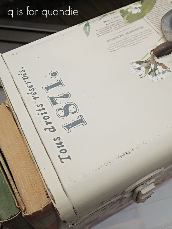
 Next I layered on some wording from the I.O.D. Label Ephemera transfer.

Once I had those in place, I decided that the box needed some rustic hardware, so I added this old rusty handle that I had in my stash.

And voila, a fun box that would be perfect for housing your stash of Jeanne d’Arc Living magazines (or any sort of magazine really).

The 2nd project using just one sheet of the Elysium transfer is this tackle box.

I picked this out of a ‘free’ pile on the curb in my neighborhood.  Mr. Q and I were passing by on our daily walk and there it was, so I grabbed it.

It didn’t look too terrible on the outside, but the inside was a gunky mess.

I actually ended up discarding the tray because I didn’t think it was worth the effort to save.  But for the rest of the interior I first soaked it in soapy water and then scraped off as much gunk as I could.  Then once dry, I sanded it down until it was mostly smooth.

Then I applied a coat of Dixie Belle’s B.O.S.S. to prevent any kind of bleed thru problems in the future.  I followed that up with two coats of DB’s Holy Guacamole.

Then I sealed it with two coats of DB’s flat clear coat.  My main goal here is to make the inside of the box suitable for use, whether that use is containing art supplies, storing old photos or holding your makeup.

I painted the outside in two coats of Drop Cloth, and then I added the Elysium transfer.

Once I had the floral in place, I again added some wording from the I.O.D. Label Ephemera transfer to the top.

With this section of the transfer, it would be much more apparent if the background typography was upside down.

So there you go, two projects down and I still have two more sections of the transfer to use on a couple more things.

Both of these items are for sale, so be sure to check my ‘available for local sale‘ page for more details if interested.

As always, thank you to Dixie Belle Paint Co for supplying their products used in these makeovers.