everything’s coming up roses.

 The shop where I sell on consignment, Reclaiming Beautiful in Stillwater, MN, recently asked if I had any floral toolboxes to bring in.  I always find it difficult to figure out what to bring in to sell this time of year,  the holidays are over, it’s too early for garden themed items, and I’m not really into Valentine decor.  So I really appreciated this little nudge in the floral direction.

I also did happen to have a floral toolbox on hand.  This one

I’m not sure why this one didn’t sell last year, but it has been listed on my ‘available for local sale’ page for months.

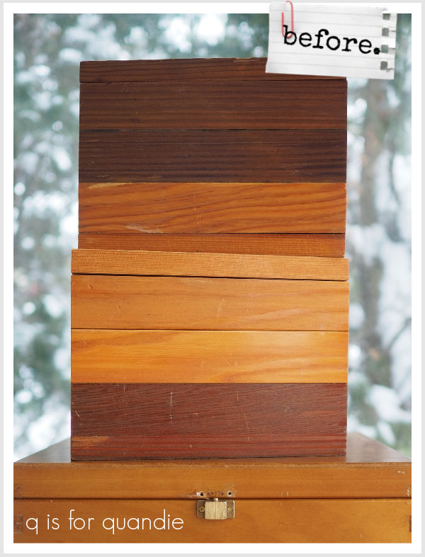
I also decided to go ahead and paint up a 2nd floral toolbox to bring in while I was at it.  So I pulled out one of the toolboxes that I brought home from my recent trip to the ReStore.

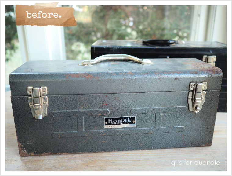
To prep the toolbox for paint I first sanded it thoroughly.  This one had a bit of rust and flaking paint, so I wanted to remove as much of that as possible.  After then giving it a good cleaning with Dawn dish soap, I gave it a coat of Dixie Belle’s clear Bonding Boss.  That will slow down any further rusting, help prevent the existing rust from bleeding through my paint, and help the paint adhere to the slick metal surface.

After waiting 24 hours, I then painted the inside of the toolbox in my favorite pink, Dixie Belle’s Cottage Door, and the outside in my favorite warm white, Drop Cloth.

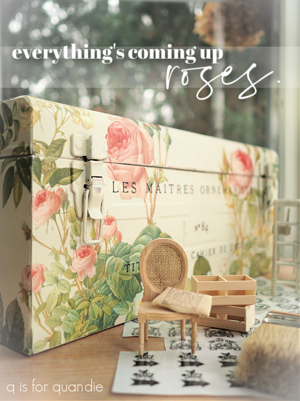
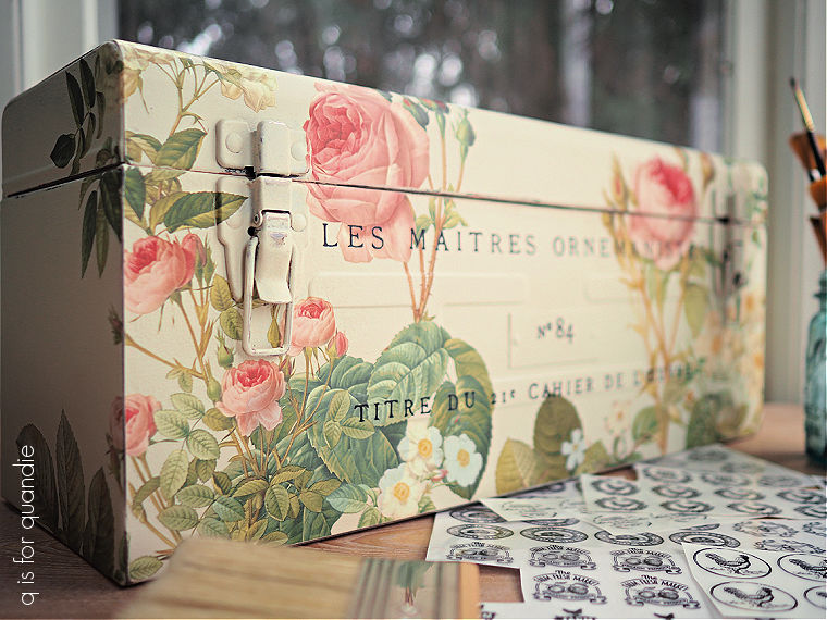
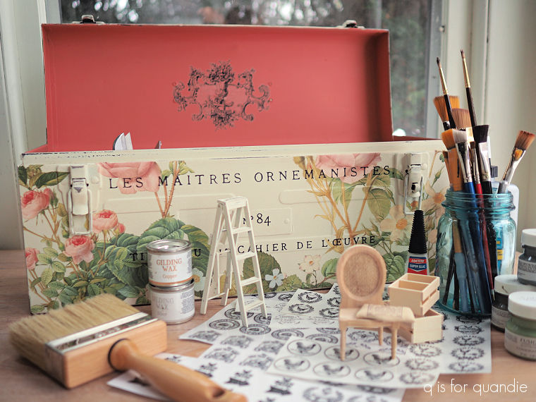
Once the paint was dry I pulled out the Rose Botanical transfer from I.O.D. and started laying out my design.  This particular transfer includes 30  individual images of roses in four different sizes.

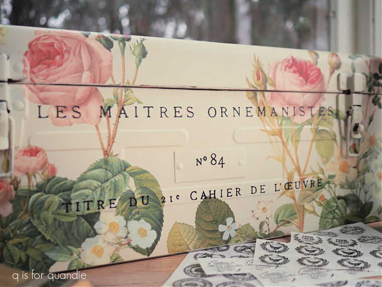
I ended up using eight of the roses on my toolbox, trimming off leaves here and there and layering them over each other to fit where I wanted them.

The wording on the front of the toolbox is from the I.O.D. Cosette transfer.  You’ll see some more of that wording when I get to the dollhouse bathroom, which I hope to share soon.

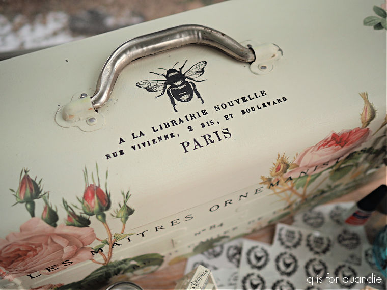
For the top of the toolbox I added a large bee from the re.design with prima French Labels Middy transfer.  The wording beneath that is from the I.O.D. Label Ephemera transfer.

So, in other words, I cobbled together bits and pieces from a few different transfers to get this look.  And I also added a re.design with prima classic vintage label inside the lid.

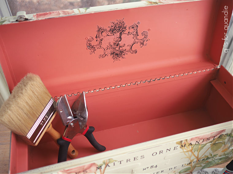
To finish off the toolbox, I sanded the edges to distress them a bit, then I used Dixie Belle’s clear wax on the outside and their flat clear coat on the inside for added durability.

As I was finishing up the toolbox I was thinking that it would be a nice size to hold all of my supplies for working on miniatures.

So that’s how I staged up my photos.  But I won’t be keeping this one for that purpose, I brought it into the shop instead.

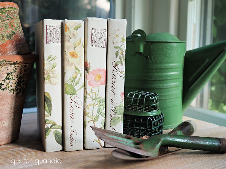
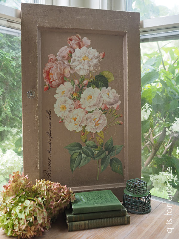
As I was pulling together my things for the shop I remembered that I also had a few other pretty floral pieces.

So I also brought in this suitcase.

As well as my Rose Botanical books.

And this rose themed cupboard door.

So if any of you locals are suffering from cabin fever after our recent cold snap (18° below zero was a bit much for both me and my car) and you want to get out and enjoy the warm up this weekend (yes, the mid-20’s feels positively balmy after -18° and can be called a warm up in January), head over to Stillwater.  Not only can you stop in at Reclaiming Beautiful for a hit of some florals, you can also just head down the hill and check out the ice and snow sculptures at the World Snow Celebration which runs through Sunday.

As for the rest of you, what do you think of my rose covered toolbox?

As always, thank you to Dixie Belle Paint Co for providing their products used in this makeover.

my holiday merch.

Before I get into today’s post, congrats to Amanda whose name I drew to win my Christmas Inspiration giveaway!

Earlier this week I brought just a small sampling of my Christmas items into the shop where I sell some of my things on consignment, Reclaiming Beautiful in Stillwater, MN.

By a small sampling, I mean I was limited to just five items this week.  It was a bit of a struggle for me to determine which five things to drop off, but ultimately I went with these five …

First, the skates that I shared with you guys last week.

These are priced at $55.

Next up, this stenciled sled.

It is 37.5″ tall x  22″ wide and is priced at $58.

I also brought in this adorable green kid sized chair …

It is 22.5″ tall x 13.5″ wide x 12″ deep and is priced at $48.

Item no. 4 that went in to the shop already is this wooden stenciled sign.  I thought perhaps I should round out my selection with something that wasn’t in the traditional red and/or green.

This sign is 28.5″ wide x 21.5″ tall and priced at $45.

Lastly, I brought in the birdcage centerpiece that I created last year.

The birdcage is 12″ tall x 10″ deep x 13.5″ wide and is priced at $48.

So that’s the five items that have already gone to the shop.  It’s certainly possible that they have not been purchased yet (although last night was the shop’s holiday open house), but you locals would have to visit the shop to find out!  Check out their Facebook page for hours and location.

Now, how about taking a look at a bunch of the other pieces that I have ready to take to the shop next week?  Let’s call this a bit of a pre-sale for any of my local readers who might be interested.  If you are interested, you can jump on them now by leaving me a comment or by sending me an email at qisforquandie@gmail.com.

I’ve been working hard pulling together a bunch of items for Christmas and I wanted to show them all here, but I’ll be taking the time to write proper blog posts about a few of these items over the next several weeks as well, so stay tuned for more detail.

I have one more vintage sled with metal runners (personally, this one is my favorite with its neutral shades).

This sled is 38.5″ tall x 23″ wide and is also priced at $58.

I also have this next sled, which doesn’t have metal runners, but it still turned out pretty darn cute.

This sled is 37″ tall x 12″ wide and is priced at $48.

I have another kid sized chair, this one is painted in my favorite warm white, Dixie Belle’s Drop Cloth, and I think it has a bit of a Scandi vibe with the red and white.

This chair is also 22.5″ tall x 13.5″ wide x 12″ deep and priced at $48.

This wooden ‘bomb box’ is going into the shop priced at $45.

At 10″ tall x 13.5″ wide x 12″ deep it’s the perfect container for a small tabletop tree.

I turned this old beadboard cupboard door into Christmas decor, and it’s for sale as well.

It is 25″ wide x 22″ tall and for sale at $55.

I’ll be bringing this lantern in priced at $32.

I have this ‘let it snow’ kid sized vintage shovel, which I actually painted up last year and kept for myself.  But I’ve decided to let it go this year for $45.  It is 34″ tall.

Speaking of things I kept last year, but am going to bring in to the shop this year, this sign falls into that category too.

This one is 13″ tall by 28.5″ wide and also $45.

I’m willing to part with these petite vintage ice skates for $25 …

and this adorable lantern (on right) for $26.

I also have a few faux grain sack stockings leftover from last year.

I’m marking them down to $11 each, so I’m hoping they sell this time around.

Next up is a random cutting board that I had in my stash.  I painted it in Dixie Belle’s Drop Cloth, and then I trimmed up an image from the I.O.D. Candy Cane Cottage transfer set to fit.

Super simple, and pretty cute, right?  It’s for sale at $18.

Did I also mention that I didn’t just buy one of the Candy Cane Cottage sets?  I bought two just in case I really loved it, and they sold out quickly.  Turns out it was lucky I did that, they are already sold out and pretty much impossible to find.

I put that same Hot Cocoa design from my 2nd set on a vintage gingham tray that I had on hand.

That gingham pattern kind of messes with my camera’s ability to focus, but I promise, in person it looks good and it’s priced at a mere $12.

I also used the Grandma Kringle’s Candy Canes design on a vintage enamelware coffee pot.

Once again I had to trim off a little bit of the design in order to get it to fit my piece, but that was easy enough to do.

The candy cane coffee pot is priced at $25 (and FYI, both of the rolling pins in it are for sale at $10 each).

Next up are some bottle brush trees that I dressed up by adding them to vintage silver pieces.

I tucked some battery operated fairy lights into some of them, the battery pack just slipped right inside the silver piece.  Those with lights range from $18 to $22, those without lights are $16.

I also did some bottle brush trees in vintage door knobs, priced at $12 each.

They all look festive grouped en masse on a large silver tray (priced at $24).

And there you have it.  Most (but not all) of my holiday merch.  I’ll still be working on some fun holiday projects and sharing them here along with some more detailed posts about a few of the items shown above.

If you locals (Twin Cities, MN) are interested in purchasing any of the items (other than the first five that are already at the shop), be sure to leave a message here or send me an email at qisforquandie@gmail.com.  I’ll try to modify this post to mark items as sold if they get spoken for.  First come, first served, and you may want to act fast because I’ll be delivering these to the shop next Wednesday.  I should also note that I don’t always see the emails right away, so your best bet is to leave a comment here.

the other half.

I’ve been working on refining my non-collection of ironstone lately.

I have a fair number of pieces, and my Welsh cupboard was getting rather full.

I went through my stash and pulled out some pieces that could go.  While I was pricing them up for the shop, I thought maybe it would be nice to have a way for them to easily display them and potentially move them around if needed without too much effort.

So I went out to the carriage house to see what I had that might work and I came across this wooden caddy.

As you can see, it was nothing special ‘as is’.  Just something a handyman whipped up out of plywood, probably to hold tools of some kind.

After giving it a good cleaning, I decided to paint it in Dixie Belle’s Coffee Bean.

I’d recently been watching a YouTube video where the creator was using this color and called it a ‘warm black’.  Hmmmm.  I’d never thought of it that way.  To me it’s always been a dark chocolate brown.

As you can see, my jar of Coffee Bean is well used.  But not being a huge fan of brown, I’ve only ever used it as a base coat underneath another color or as the dark shadow color for a stencil.  But after hearing it called a warm black, I’m seeing this color with new eyes.  Maybe it does deserve its moment in the sun.  So I pulled it out and added just one quick coat to the caddy.

I can certainly see where someone might call this color a warm black.

You might just start seeing me use a bit more Coffee Bean now.

Once the paint was dry, I pulled out that 2nd sheet from the Harvest Hues transfer that I used on the tackle box I shared on Monday.  Remember?  It’s the one that I damaged by allowing it to roll up on itself.  But luckily, the undamaged portion was just long enough to fit the side of this caddy.

Plus the transfer was tall enough that I could cut it in half lengthwise and put it on both sides.

I also had a few random pieces that could wrap around the corners.

After adding the transfer, I sanded the edges of the caddy to distress them and then used Dixie Belle’s Easy Peasy spray wax to seal everything in.

All that was left was to fill it up with ironstone.

I thought this pretty covered casserole with its wheat design was especially appropriate for fall.

The caddy itself is for sale, as is all of the ironstone.  I brought it all in to Reclaiming Beautiful on Wednesday.  So if you’re in need of a few more ironstone pieces or a warm black wood caddy, and you’re a local, stop in to the shop this weekend!

a pile of painted pumpkins.

Is it too soon for pumpkins?

I think so.  However, sometimes I feel like I have to jump on the bandwagon simply because I plan to take some painted pumpkins to the shop, and many shops (ie. Hobby Lobby, Target, Marshall’s, Home Goods, etc) were already decked out for fall several weeks ago.  I actually feel like I’m behind on fall décor!

In addition, we have a big trip coming up!  Have I mentioned that yet?  Remember way, way back in 2019 before Covid?  We had booked a European Capitals cruise.  When the Covid thing started in early 2020, I remember thinking ‘oh, this will be over long before our fall trip‘.  Little did I know that it would be four years before we managed to get back to Europe!

But we’re finally going!  This time my sister, niece and nnK’s brother are all joining us.  We’re spending six days in Amsterdam, followed by a 7 day cruise around Norway.

Anyway, that means I need to get a jump on seasonal fall stuff because by the time we get back from that trip I’ll need to get started on Christmas décor!  LOL.  Good gracious … that’s actually true though, I definitely have to get a jump on that.

So let’s take a look at some painted pumpkins.

Last year I picked up a variety of faux pumpkins at after-holiday bargain prices.

Most of them are white, but three of them are paper mache.

My original plan was to paint the paper mache pumpkins, and the medium-sized bright white pumpkins (those bright white ones were particular plastic looking).  I left that large creamy white pumpkin alone, that one is going to go outside in the garden later in the fall.  I was also planning to leave the smallest creamy white pumpkins ‘as is’ and use them to fill a bowl or other container at my own house.

But then I was thinking about some re.design with prima Middy label transfers that I ordered a while back, and they were the perfect size for the smallest of the pumpkins, and before I knew it, I’d added them to almost all of the little pumpkins.

I know, they aren’t exactly fall colors.  Nor are they really fall-ish looking designs.

But if you’re not into the traditional orange, these might be a good alternative.  The blue transfers are from the Vintage Labels I set, and those in the next photos are from Vintage Labels II.

The prima website calls the color a soft, warm grey.  Hmmmm.  They definitely read as a lavender to me.

I painted the three larger paper mache pumpkins, and the three creamy white mid-sized pumpkins in three different Dixie Belle colors, Dried Sage, Sawmill Gravy and Sea Glass.  I didn’t do any sort of prep before painting, and you don’t really have to when using the Dixie Belle chalk style paint over a non-smooth, non-glossy surface, and the pumpkins qualified.

I love the two that I painted in Sea Glass.

Totally not a traditional fall color, I know.  I turned the stems on them gold using some of Dixie Belle’s Gold Gilding Wax.  The combination of Sea Glass and gold always feels very ‘Louis XIV’ French’ to me.

I also added DB Gilding Wax to the stems on the other two medium sized pumpkins, only in the Bronze color.  I felt like the original stems looked really plastic in their original speckled green color.

The bronze worked beautifully with the Dried Sage

Applying the transfers to an uneven, rounded surface can be a little bit tricky.  But, I don’t think they have to be perfect either.  If you look closely, some of them may be a bit on the wonky side.  But I think that just adds to their charm.

I added another of the blue transfers to the medium pumpkin that was painted in Sawmill Gravy.

The paper mache pumpkins both ended up with French labels.

The transfer on the left is an old I.O.D. French Pots transfer (back when they were still grey rather than black), and the one one the right is from the Classic Vintage Labels from re.design with prima.  By the way, that photo does a better job of showing the paint colors with Sawmill Gravy on the left, and Dried Sage on the right.

I tied some velvet ribbon around the stems on these two rather than gilding them.

I finished off all of the painted pumpkins with some clear wax to add a little bit of protection, but still, these are only suitable for indoor use.

This was a fun little project for a rainy afternoon, and you can find these sorts of faux pumpkins at any craft store.  But if any of you locals don’t have time to create your own, I took these in to Reclaiming Beautiful in Stillwater this week.  You can always swing by and pick one up!

Thank you to Dixie Belle Paint Co for providing the paint used on these pumpkins!

a pair of camp-ish buoys.

Remember the buoys that I found while thrifting way back in March?

I have to admit, they look pretty good in that photo.  And they were pretty good.  Except that up close and personal they looked a little too fake to me.

I had tucked them aside for summer, and when the shop where I sell (Reclaiming Beautiful in Stillwater, MN) decided to have a Ralph Lauren-ish summer camp sort of theme in their window this weekend, I decided to give them a quick makeover.

When I hear Ralph Lauren, I automatically think red, white and blue.

I don’t know, is that just me?

Well, either way, that’s what I decided to go with on my buoys.

I painted one of them in Dixie Belle’s Honky Tonk Red

and the other in their Deep Sea.

After two coats of paint were dry, I sanded well to distress them.

Today’s q tip:  Always, always, always sand a dark color first before adding a white detail over it.  I’ve learned the hard way that if you sand a dark color (and especially red) and a white at the same time, you’ll end up smearing the dust from your color into the white.  And that never looks good.

So I sanded, wiped the dust away, and then used painters tape to add some stripes in Dixie Belle’s Endless Shore.  I then also stenciled some numbers onto the taller buoy with that same paint.

I have to admit, in hindsight I’m guessing that quite a few of you would have preferred I left them alone.  But they definitely have more of a hand-painted look now.

I’m also wondering if I got Ralph Lauren mixed up with an Americana sort of theme.

But then, Ralph Lauren and the American flag kind of go hand in hand.

And the shop certainly turned out fabulous …

There are my buoys, see them in about the middle of the frame?  I think they fit right in.

And here’s what’s in the window.

Lots of stuff that would be fabulous in your lake cabin, or on your three season porch.  Or maybe even just in your cabin themed guest room.

If any of you locals are looking for something fun to do this weekend, I recommend heading into Stillwater and checking out Reclaiming Beautiful (open 10 a.m. to 5 p.m. Thursday, Friday and Saturday, not open Sunday).

Thank you to Dixie Belle Paint Co for supplying the paint used for today’s project.

hoppin’ down the bunny trail.

Throughout the year, I’ve been picking up cute bunnies whenever I see them at the thrift store or garage sales.  I’ve managed to accumulate a handful of them.

And now it’s time to pull them out and get them spruced up for the shop.

The galvanized bunny mold just needed a good cleaning, and some goof off to remove the residue left by the packing tape that was holding his two sides together.

Isn’t he sweet?

The copper mold bunnies also just needed a bit of cleaning.

Next up came the faux stone bunny.

I think he was supposed to look like he was carved out of granite, or something like that.  I’m not sure.  But in reality he is some sort of resin or other man made material.

I decided he could be improved with some of Dixie Belle’s Patina Paint.  I debated going rusty at first, but ultimately decided to go with the bronze paint paired with the green spray (you can find all of the details on using this product in this post).

The patina paints lend a very authentic looking faux finish, in my opinion.

I went ahead and added a couple of quick coats of Rustoleum’s matte clear coat to protect him from any excess handling.

Next up is the cute bunny pull toy.

I really didn’t like the heavy grain of the wood, or that particular shade of brown, so I gave him a paint job using Dixie Belle’s French Linen.  I followed that with a quick stencil job using a portion of one of JRV’s Crock Minis stencils and Dixie Belle’s Drop Cloth paint.

I also painted the wooden dowel handle to the pull toy in Drop Cloth.

While working on the rest of the bunnies, I also remembered that I had a trio of ceramic bunnies that my friend Sue found for me.

Normally this sort of thing is not my style at all.  But I’d seen a video … or maybe it was a blog post?  I really don’t remember … but I’d seen someone, somewhere, spray paint these in a chocolate brown to make faux chocolate bunnies.  So I thought I’d give it a shot.

Of course, when you live in Minnesota, it’s winter and you aren’t blessed with any sort of well-ventilated spray painting booth, you have to get creative.  So here’s what I do …

I rest a big flat piece of cardboard on a snowbank, spray quick, and then haul everything back inside to dry.  I had to do that about 4 times to get the bunnies fully coated on all sides.  But I made it work on a slightly warmish afternoon last week.  Well, OK, it was 37°, but hey, that’s above freezing.

My paint of choice for chocolate bunnies was this one …

It’s a paint and primer in one, and they say it will work on any surface.  Since I was painting glossy ceramic bunnies, I wanted to be sure it would stick.  It’s also has a satin finish rather than the matte finish that I usually prefer, and I think that makes these look more like glossy chocolate.

Yum!  Doesn’t he look delicious?

These would be great to incorporate into a tablescape for Easter when you don’t want anyone to eat the decorations!

Or you could just pop them into an Easter basket.

I’ll be hoppin’ on into the shop with these on Wednesday, hopefully there’s enough time left between now and Easter for all of these bunnies to find a good home.  And maybe I’ve inspired you to create some faux copper or chocolate bunnies of your own!

this little piggy.

I picked up this pig shaped cutting board a while back.  Well, to be honest, far enough back that I don’t really even remember where I got it.  Was it a garage sale?  A thrifted find?  I’m not sure.  But I had it in the stash waiting for a makeover.

I have a feeling that there was a time when every high school shop class churned out these pig shaped cutting boards by the millions.  They seem to be fairly common around here.

I added a French Market stencil to one way back when I was still hosting an occasional sale out of my carriage house.

In fact, I stenciled quite a few different cutting boards back then.

But lately I’ve been more into painting them.

But for this pig, I decided to go back to my roots and give him a quick stencil using one of Dixie Belle’s silk screen stencils from their Farmhouse set.

First up, I washed the cutting board thoroughly with very hot water and some Dawn dish soap.  Often times these old cutting board are pretty grungy.  Then I sanded it down to some fresher wood.

Then I applied the stenciled design using Dixie Belle’s Midnight Sky paint.

Let’s talk for a minute about silk screen stencils.  They are a bit different from traditional stencils.  For one thing, they are made out of a flexible, adhesive backed vinyl rather than the stiffer mylar of typical stencils.  Also, rather than a fully cut out design, the area to be stenciled is backed with silk screen.  That means bridges aren’t required in the design.

If you aren’t familiar, bridges are the areas that hold inside pieces in place, like below in the letters “P”, “O” and “A”.

So silk screen stenciled designs can look less, well, stenciled.

One downside to the silk screen stencils is that they don’t hold up to tons of use though.  I find that the silkscreen gets a little clogged with paint after a few uses if I’m not super diligent about cleaning them immediately after use.  And as we all know, I’m definitely not super diligent about that.

So if lots and lots of repeated use is something you value, and you aren’t all that good about cleaning your stencils, you may not like the silkscreen stencils.

You can see the result of a slightly clogged silk screen stencil on my pig.

Once I saw that rather rustic result from the stencil, I decided to make it work by adding some age back to the wood using Homestead House’s Antiquing Wax.

In hindsight, I kinda wish I had followed my own regularly given advice to lay down a coat of clear wax before adding the dark wax.  That allows you to move the dark wax around a bit more for a uniform look.

But no, I didn’t do that.

So I did end up with the dark wax being more pronounced over my stencil, basically where the cutting board was more worn.  This is definitely a case of do as I say, not as I do.

I will say that I think I certainly accomplished my goal of adding back some age though.

This definitely doesn’t look like freshly sanded wood with a newly painted stencil, right?

I should be sure to point out that this little piggy is no longer food safe, but rather intended for décor only.

What do you think?  Do you prefer the stenciled look, or the painted with transfers look?  Leave a comment and let me know.

diy apothecary bottles.

My friend Sue popped by the other day with some thrift finds for me.  I’d told her all about the dark academia themed window we were putting together at the shop (fyi, if you want to see how it turned out, check out the Reclaiming Beautiful Facebook page), so when she saw these amber Kombucha bottles she thought they would be a fun addition.

She suggested that I use some of the white I.O.D. Traditional Pots transfers on them.

But I was reminded of a video I’d watched from Canterbury Cottage (that Sue had also sent to me) where she printed out apothecary jar labels and applied them to bottles.  The video even has convenient links to the .pdf for printing out the labels (find that here).

So I thought I’d go half and half.  There were 8 bottles total, so four got white transfers and four got labels.

First up I washed all of them in hot, soapy water and let them dry.  Then it was super simple to apply the white transfers to four of them.

The white transfers have definitely improved over time.  When they first came out, I wasn’t a fan.  They had more of that filmy halo around them.  But I think these look really good.

There certainly is still some halo, and you can see it in that close up photo.  But to the naked eye it’s pretty insignificant.

People always ask if I seal transfers when applying them to glass, and I do not.  They stick like gangbusters to glass.  In fact, I usually warn people to make sure you’ve got your placement just right before allowing the transfer to touch the glass because it will get sucked down onto the glass like a magnet.

As for wear, they will be fine if handled gently.  You can hand wash them with soapy water, but don’t scrub on the transfer.  For that matter, when you get sick of them you can scrape the transfer off using a razor blade.

For the next four bottles, I added those apothecary labels using Mod Podge.

Personally, I prefer working with the matte version.  You all know I’m not a big fan of shine.  I also think that in this case it gives those paper labels a more authentic look.

I had printed the labels out on your basic printer paper.  Once I had them cut out, I brushed a thin layer of Mod Podge on the back of the label and applied it to the jar.  In contrast to those white transfers, you can easily slide the label around on the glass until you have it on there straight.  Once I had it in place, I smoothed it down with my finger to remove any air bubbles and then added another layer of Mod Podge over the top of the label.

I then carefully wiped away any excess Mod Podge around the edge of the label using a damp paper towel.

And that’s it.  Super simple.  I just had to let them dry.

Unlike the bottles with the transfers, these labels would not hold up well if you got them wet.  So I would not advise washing these other than possibly wiping them down with a dust rag now and then.

That being said, they really did turn out kind of fabulous, don’t you think?

Once I was done adding labels to all of my bottles, I thought it might be fun to update this little wooden crate to hold them.

This was a super simple project.  I scuff sanded the wood, wiped it down with a damp cloth and then stained it using DIY Liquid Patina in Dark & Decrepit.

I have to admit, I haven’t found a lot of uses for this product.  I experimented with it over paint and didn’t really like that look.  However, it worked perfectly for this.  I just applied it with a rag, and then wiped away the excess with the same rag.  I did have to use a q tip to get into some of the corners, but that wasn’t difficult.

It dried quite quickly, and once dry I added some more decoupaged apothecary labels to the sides.

Easy peasy.

Unfortunately, I did not get these finished in time to take them in to the shop this week.  And in other news, my sister and I are flying out to visit our mom on Saturday, so I won’t be around to take them in for a couple of weeks.  But eventually they will make their way into Reclaiming Beautiful.

In the meantime, which style is your favorite?  The white transfer, or the labels?  Personally I’m digging those labels.  They look so authentic to me.

Posts will be hit or miss over the next two weeks while I’m off at mom’s, but I’ll be back before you know it so be sure to stay tuned.

a mid-winter thrift haul.

My friend Sue and I headed out for a little thrifting again last week.  It was a cold but sunny day, perfect for an outing in early February.

I came home with quite the haul.  I found a few metal items, a copper chafing dish, a pewter tray, some gold candlesticks and some silver pieces.

My favorite is the little footed tray.

I decided to give it a bit of a polish before taking it in to the shop.

I don’t normally polish my silver, I kind of prefer the tarnished look.  But this tray was a bit grungy so I decided to give it a go.  Now it’s shiny and clean.

These little trays are perfect as soap dishes in the bathroom.  You could fit matching liquid soap and lotion bottles on it too.  Or you could use it in the kitchen for olive oil and spices, like this one that I thrifted last April.

I also brought home a pile of wooden items that all went into the ‘to be painted’ stash.

I always enjoy painting stacking boxes like these.

These were particularly nice quality wooden ones.  It seems like burgundy and forest green might be coming back into fashion lately, but I still don’t like them.  You know my motto, never say never.  In a year or two I might be painting things burgundy, but for now I wanted to give these a more neutral theme.

So I painted them in Dixie Belle’s French Linen, Sawmill Gravy and Drop Cloth (bottom to top).  Then I added some re.design with prima transfers from both their Classic Vintage Labels and the new Middy French Labels.

When you’re out thrifting, don’t forget to consider the out of season stuff.

I snapped up these nautical items, but will hang onto them until summer and then bring them to the shop.  I do also plan to repaint those buoys.

I found quite a bit of glassware while we were out too.

I certainly wasn’t looking for glassware, but I was specifically on the hunt for items that I thought fit Dark Academia style.  Have you heard of it?  I’ve seen it mentioned here and there lately.  Here is how Wayfair describes it, “Dark academia interior design embraces dark colors, rich textures, and vintage-inspired decor. Dimly lit rooms with flickering candles, alcoves full of intrigue, and an eclectic collection of knick-knacks are not at all out of place.”

Reclaiming Beautiful (the shop where I sell items on consignment) is planning a dark academia themed window display this week, so I needed some stuff that would work for that.

I thought that I could makeover some of the glassware to have that dark academia feel starting with the cloche.  I painted the base in Dixie Belle’s Midnight Sky, and then added some I.O.D. transfers.

The bee is from their Brocante transfer, and the wording on the glass is from Label Ephemera.

I also added some I.O.D. wording to the glass vessel in the front of my haul photo.

That’s from the Traditional Pots transfer.

Last up were these 4 glass vases.  Funnily enough, I found all four of them at 3 different thrift stores but they all happen to match.  It makes me wonder of these are vases used by a flower delivery service or something like that.

I chose them because I like the shape and size of them, and because I knew these transfers from the I.O.D. Brocante set would fit them perfectly.

There are 4 different versions of this transfer in the Brocante set, so a different one for each of my glass vases.

My favorite dark academia find of the day has to be this Nefertiti bust.

She is perfect for that design aesthetic!

I don’t often find furniture that I want at the Goodwill, the stuff there is usually either cheaply made or badly damaged.  But I did find this small dresser this time around.

I think this is going to be perfect for another Wallcutz stencil project that I’m planning.  You’ll just have to stay tuned for that one.

I really wasn’t able to pick a ‘find of the day’ favorite this time around.  Nothing totally jumped out at me as the best item.  Instead I will end this post with the item I almost put back on the shelf.

Sue picked up that 500 Gr. measuring cup and handed it to me.  Initially I thought it was one of those World Market knock offs.  I actually have one of those that we use all the time in our kitchen …

So I wasn’t sure I wanted to spend a whopping $9.50 on another.  But I decided what the hell, might as well, and I brought it home.

However, my World Market version is clearly marked “World Market” on the bottom, and this thrifted one has this mark …

So, hmmmm, it appears to be the genuine article.

Now, do I keep it?  Or sell it?  Decisions, decisions.


mistakes were made.

I picked up a pair of wooden boxes while thrifting a week or so ago.

After sanding and cleaning them, I painted them with Dixie Belle’s Endless Shore, which is from their Silk paint line (ie. an acrylic paint with a built in primer and top coat).

I pulled out I.O.D.’s Floral Anthology transfer to decorate box no. 1.

After applying the florals, I added some French wording from the I.O.D. Label Ephemera transfer.

Full disclosure, I have only the vaguest idea of what these words mean so it could be total nonsense.  But it looks good to an English speaker.

After decorating the first box, I was about to do something similar with box no. 2.  But then I remembered a customer who once told me that she wished I didn’t put French words on everything!  So, I decided to go in a slightly different direction on the second box.

I first added some grain sack stripes using Dixie Belle’s French Linen.  Then I added the sheep from the I.O.D. Brocante transfer.  The little “No. 1120” and the date in the corners are from a Tim Holtz transfer.

I also added a farm name to the side of the box from the Everyday Farmhouse transfer from re.design with prima.

Finally, I applied one of the re.design with prima knob transfers to the top of the box.

I didn’t paint the insides of either box for a couple of reasons.  First of all, they aren’t real roomy inside and getting in there with a brush would have been a pain.  Second, they are clean inside, so they didn’t really need to be painted.

So far, so good, right?

But this is where I made my mistake.  As you can see in the photos, I distressed the edges of my boxes quite a bit.  Although the Silk paint has that built in topcoat, the transfer still needs some sort of sealer.  In addition, because I sanded the edges down to the bare wood, the Silk paint finish is compromised and will benefit from some protection on those edges as well.  Unfortunately, I decided to topcoat with Dixie Belle’s flat clear coat.  As I’ve learned in the past, sometimes a water based sealer will draw tannins out of the wood.

Honestly, I should have known better.  Look back at that ‘before’ photo, this wood was very orange-y red.  The Silk paint has a built-in stain blocking primer, and it was working quite well up until I added that flat clear coat.  All of the preceding photos were taken before the clear coat was added.

But about 24 hours after adding that clear coat, the boxes started to show bleed thru.

It’s much more obvious on the back of the boxes, but if you’re familiar with the look of bleed thru you can see it on the front as well.  Especially in the area I’ve circled below.

Also, FYI, the bleed thru continued to worsen over time.  Be forewarned, that can happen with bleed thru.  It has been about two weeks since I finished these and they seem to have stopped getting worse now.

If I could go back and start over I would opt to give these boxes a coat of Dixie Belle’s B.O.S.S., followed by their chalk style paint in Drop Cloth, and then a top coat of clear wax after applying the transfers.

But I can’t go back in time, so now what?

If these were pieces of furniture there is no way I would feel good about selling them ‘as is’, but these boxes?  Maybe?  I don’t know, what would you do?  Leave a comment and let me know!