clip board art.

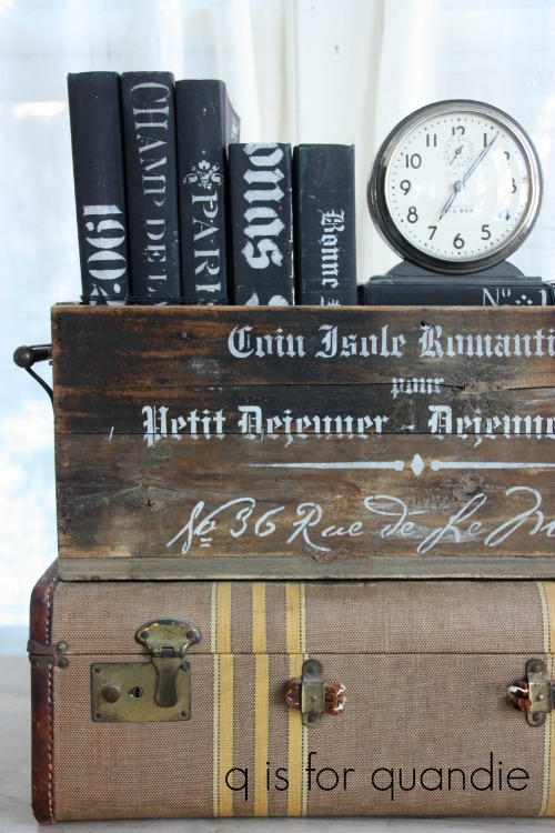
I spent part of last week digging out my carriage house workshop after the long winter.

For those of you who aren’t familiar, this is my carriage house.  I park my car on one side in the winter and store future projects on the other side.  In summer, I paint out there.

Awww, it looks so pretty in pictures.  Especially winter pictures when the red pops against the white snow.  Now don’t be confused, it really isn’t still winter here in Minnesota, I just didn’t have a summer photo of the carriage house handy.

But the reality behind the pretty photo is that the carriage house is not at all weather or critter proof.  In the winter I mostly just shove stuff in there to store it until spring because it’s far too cold to spend any time at all out there.  When the weather starts warming up again I have to sort through all of that stuff and get my workshop situated so I can bring my painting supplies back out and resume painting out there.

While doing that this spring I encountered a possum, a chipmunk and a robin inside the carriage house.  Eeeeeek!  I’m telling you, it’s not critter proof at all.  And clearly my cat Lucy is not doing her job properly.

Well, the critters will soon figure out that I am taking back my workshop and hopefully find somewhere less busy to hang out.

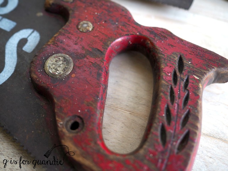
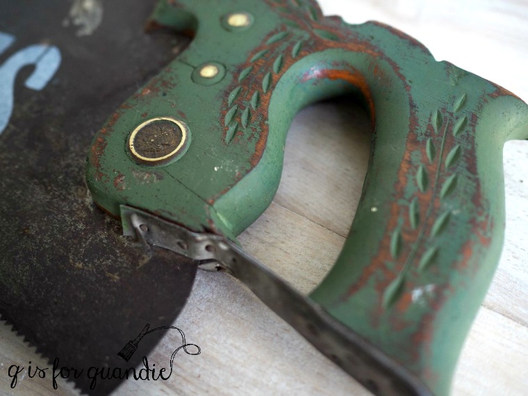
In addition to the possum, I also came across a stash of clipboards that I’d been acquiring over the course of last summer’s garage sale season.

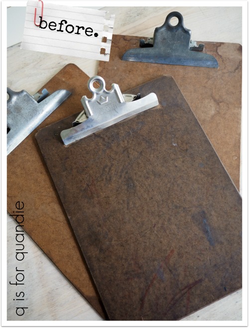
At the time I thought it would be fun to paint these up and use them as ‘frames’ for some prints but I never got around to it last year.

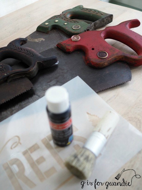
The vintage book of Audubon bird prints I found at the Tangletown sales had some perfect candidates for the clipboards though, so I decided to whip something up.

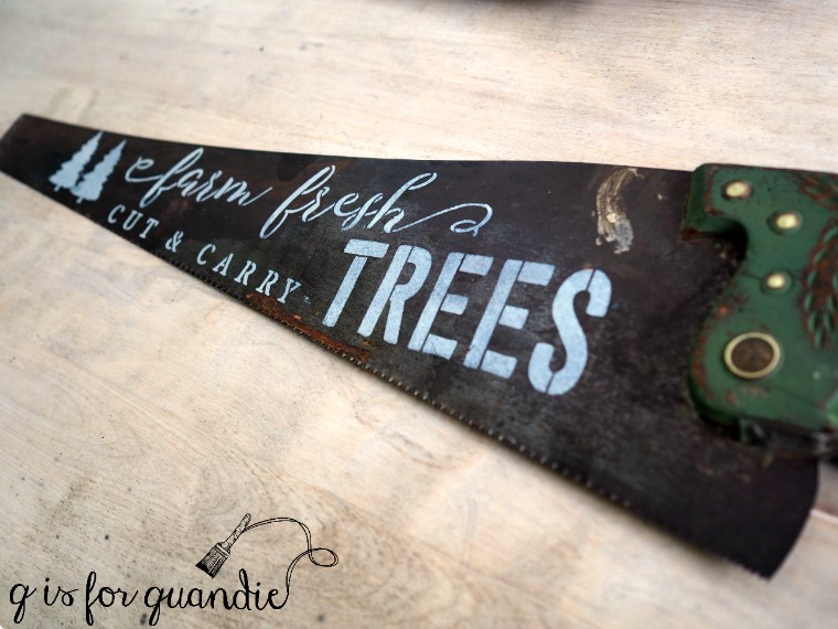
Since the prints had a lot of shades of green in them, I decided to go with green on my clipboards.

I pulled out an old jar of Little Billy Goat chalk paint in a color called Porch Swing.  A couple of years ago Little Billy Goat sponsored a few projects with me and sent me some of their paint to try.  I loved most of it, but I was quickly reminded that I didn’t love the Porch Swing while working on this project.  For some reason the Porch Swing ends up looking weirdly splotchy for me once I add a top coat.  The first time I used it I painted an entire dresser, and ending up having to paint it over again with something else when I got this splotchy look.

In the case of the clipboards, I tried to use Miss Mustard Seed wax on the first one and it looked terrible (sorry, I neglected to get a photo).  I tried Miss Mustard Seed hemp oil on the next two and got better results, although still slightly splotchy.  So I repainted the first one (after using mineral spirits and a green scrubbing pad to remove the wax) and then used hemp oil on it also so that all three would match.

Next I added some Tim Holtz rub-on numbers to the clips.

Then I just simply added my Audubon prints and they were good to go.

These would be perfect for hanging above your potting bench.

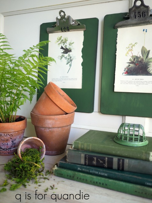
Or maybe just hanging on the wall in a sunroom.

What a simple, inexpensive way to add some interest to your walls!

more fun with rust.

You may remember the recipe box that I painted last fall.  It started out looking like this …

Then I painted it with a sample of Miss Mustard Seed’s Bergere, added an IOD rub-on transfer and a metal key-hole escutcheon.

But I have to admit, that shade of blue just wasn’t doing it for me so I decided to start over.

I took my inspiration from the stool I painted when I first sampled the Dixie Belle chalk paint …

I repainted the box with the same Dixie Belle paint in Drop Cloth, with grain sack stripes painted in Dixie Belle’s Yankee Blue.  I even added a smaller version of the same Milk and Cream graphic using Fusion’s Transfer Gel.

I used some Tim Holtz rub-on numbers to add the “1953” to the front of the box.  This was to become a birthday present for my friend Terri, and I think you can all now guess what year she was born.  Then, instead of putting the key-hole escutcheon back on, I decided to add a little clasp to the front of the box.

I debated spinning a yarn here about how I found this old rusty hardware in a coffee can full of rusty bits and pieces that I picked up at an estate sale held in a big ol’ red barn out in the countryside, and I bet you guys would have believed it, right?  That would have been an awesome story.

But the real story is that I purchased a pack of 3 of these at Hobby Lobby for $2.50 during a half off sale and they were a sort of ugly ‘antique gold’.

So I used the Dixie Belle Patina Collection to add some rusty goodness.

I used the Prime Start first again since this little clasp is made out of metal.  Then I painted it with the Iron paint, followed by a spritz of the Green Patina spray (for more detailed instructions on using these products check out this post).  And now the little clasp looks like this …

I love that I can take something new and make it look old and rusty with this stuff!

Yep, I am much happier with the outcome this time and I’m pretty sure Terri liked it too!


painted books.

It’s been a while since I’ve painted some books.  Unless you’ve followed me from the beginning, or gone back and read to the beginning, you probably haven’t seen my painted books.

The first batch I painted were all done in Miss Mustard Seed milk paint in Typewriter, then stenciled in a pale grey acrylic craft paint and finished with some hemp oil.

Then I branched out and added some grey books (painted in Miss Mustard Seed’s Trophy)…

and some pale minty green books.

For a while now I’ve been thinking it would be nice to have some white painted books.

So I pulled out some old hardcover books (find them at your local thrift store for as little as .15 ea when they are having a sale) and started by painting the covers with Dixie Belle’s Drop Cloth and sealing them with The Real Milk Paint Co’s Dead Flat.

Then I pulled out a bunch of my stencils.

Don’t worry about the stencils being larger than the books.  I think it just adds to the look to have the design running over the edges.

This is a great way to get a bunch of decorative books to fill up some shelves on a budget.  Displaying things en masse always has more impact.

It seems that the Drop Cloth goes particularly nicely with some old ironstone.

The painted books also make great props for furniture photo shoots.

If nothing else, it’s just a fun project for a cold winter day!


heartless.

Happy Valentine’s Day everyone!

I don’t have a pretty, frilly pink or red filled post for you today.  Valentine’s Day just isn’t a holiday that I decorate for.  I’m pretty much heartless, at least when it comes to decor.

A while back my thrifting friend Meggan and I were at our local favorite thrift store (Arc Value Village on White Bear Ave, for those of you locals who might be curious) and I was laughing over the plethora of items with hearts on them.  I pointed them out to Meggan, and we both agreed that hearts are pretty much out these days from a home decor point of view (thus they end up in thrift stores by the dozens).  I mentioned to Meggan that I have a couple of tricks for dealing with them though and she suggested that would be a great idea for a blog post.  So I filled my cart with some hearts …

The easiest way to get rid of a heart is to just simply cover it up.  That’s what I did with the heart cut out on this little wall shelf.

But first I transformed the shelf with Dixie Belle’s Patina Collection.  You may remember that they sent me some of their Iron paint and Patina Spray to play around with a couple of weeks ago.  At the time I mentioned that I wanted to try this stuff on wood to see how it looked, so this shelf was the perfect candidate for a little experimentation.

Since the shelf is made of wood, you don’t need to use the special Prime Start primer (you just need that if you are painting over metal).  Instead you can just start with a layer of any color paint.  I used Dixie Belle’s Gravel Road since I happened to have it close by, but the color really doesn’t matter since you’ll be covering it up entirely.  Once that dried I added a coat of the Iron paint and allowed that to dry.  Then I added a second coat of the Iron paint and while it was still wet, I sprayed it with the Patina spray.

Next I just dug through my stash of random bits and pieces and found this back plate to a drawer pull.  It was already rusting on its own, plus it was just the right size, so I thought it was the perfect cover up.

Both Meggan and I simply couldn’t resist this next item.

It’s got both a heart and a cow … a classic.

And actually, in the end I didn’t get rid of the heart cut out, just the cow with her heart shaped face and the country welcome.

I removed the glued on words, sanded the entire thing down and then painted it in Dixie Belle’s Drop Cloth.  I added the grain sack stripe in Dixie Belle’s Driftwood.

Then I added an Iron Orchid Designs rub-on from one of the French Pots collections.

A vast improvement, even if it isn’t totally heartless.

Unfortunately I ran out of steam (and straight into that cold that I’m still getting over) before I could get to the rest of those heartfelt pieces from the thrift store.  I may have to hang onto them until next year.

But to prove that perhaps I’m not entirely heartless after all, I couldn’t leave the thrift store without this sweet Dinner for Two cookbook.

It has some great illustrations …

A candlelit dinner for two served on a gondola in Venice would be my idea of the perfect Valentine’s celebration.

So sweet.  This is much closer to my idea of a little Valentine decor.

How about you?  Valentine’s Day decorating, yeah or nay?


jodie’s box.

Hello!  I’ve been down for the count with a cold since last Friday, so I don’t have anything earth shattering to share on the blog today.  Instead I pulled together a post on this quick project I worked on a while back.

You probably don’t recognize this box, but it has been shared here on q is for quandie once before.

It belongs to my friend Jodie, and the box made it into the photo of Jodie’s dining room back in December when I shared a tour of her home.  There it is on her dining room table …

Recently Jodie decided the box needed just a little more oomph, so she asked me if I would stencil it for her.

Of course I agreed.  Stenciling is just so quick and easy, and really cost effective once you already have the stencils (and I have quite a few).

Jodie was pretty flexible and said I could use whatever stencils I thought would look good, so I went with some french stencils that seemed appropriate for a dining room.  I used a different one on each side.

By the way, both of these are just portions of a larger stencils.  I just used sections that would fit and looked good on the box.  I purchased both of these stencils via Etsy which is a great place to find them.  You might recognize the first one I showed, it’s the same stencil I used on the Windsor chairs last Friday.

Jodie asked me to use white paint for the stencils, but I suggesting going with a pale grey instead.  I think a crisp white would have been too stark and would not have worked with the rustic, aged look of the wood.  The pale grey (this is Martha Stewart Multi-Surface acrylic craft paint in a color called Wet Cement) reads as white next to the wood.

How’s that for a quick and easy update?

Hopefully I’ll get my energy levels back up to normal soon and be able to share something a little more exciting with you.  Until then, be sure to stay tuned!

more fun with rub-on’s.

I’ve always loved a good rub-on.  Wait.  That doesn’t sound quite right, does it?

But seriously, I’ve been in love with these things since the 70’s.  I think they went out of vogue for a couple of decades, but they came back when the scrapbook craze started to take off.

Two of my favorite brands are Tim Holtz and 7 Gypsies.

I have had hit or miss luck finding these in craft stores.  Hobby Lobby used to have a good selection of the Tim Holtz brand, but they don’t seem to any longer.  Meanwhile, Michael’s currently seems to have a large section devoted to the Tim Holtz line, but a small selection of his rub-on’s themselves.  Ever since my favorite scrapbook store went out of business, I haven’t been able to find the 7 Gypsies brand anywhere except online.

I’ve always been a little bummed that these designs are so small, obviously meant for small paper crafts.  That’s why I was so thrilled when I discovered the Iron Orchid Designs Decor Transfers, which are basically rub-on’s that are sized for furniture.

Adding rub-on’s to vintage pieces, big or small, is a quick and easy way to give them a little extra pizzazz.

You saw me do this a little while back with the vintage graters that I turned into photo holders.

 Today I’ve decided to add some rub-on’s to this …

But first, what is it?  I don’t actually know.  Perhaps one of you does?  Those pieces on the side flip out to become a sort of handle.

Now, before you guess some kind of campfire cooking pot, I know it’s hard to judge size from these photos.  This thing is only about 1.5″ deep and 4.5″ across.  It’s way too small to cook in, it’s even way too shallow to be some sort of campfire coffee cup.

I’m baffled.

But whatever its original purpose, I think it would make a great little container for any number of things.  Hairpins?  Jewelry?  Nuts and bolts?  Spare change?

Or perhaps stamps.

I’ve suggested that with my choice of rub-on’s for one side, but on the other side I went more generic with just some numbers.

I added a little something to the top too.

It’s just a fun way to add some interest to an otherwise plain container.

 So if you’re looking for something fun to do this weekend, get yourself some rub-on’s and see what you have lying around that needs a little pizzazz.

the art of the thank you.

This year my birthday fell on the Wednesday before Thanksgiving.  Taking the day off at my day job would have made for a very nice five day weekend.  It seems like a bit of a no-brainer, right?

But I didn’t do it.  Why?

Because my co-workers always make my birthday feel special.  This year they made Eggs Benedict for me, my favorite!

Not only that, but I got some awesome birthday presents from them.  Really, who doesn’t want to show up at work if there will be presents?

Since they went all out I wanted to do something special in return for the thank you notes, not just send store bought cards.  Now, before you start thinking that I am super clever and just came up with this idea out of the blue, I have to give credit to my friend Annie.  She did something similar for her wedding thank you notes many years ago.  Those thanks you’s were so fun and clever and the idea has always stuck with me, so I borrowed it for my birthday thank you’s this year.

Step no. 1:  take photos of the gifts.  Remember to leave some white space in your photo to have room for the wording.

Step no. 2:  add ‘thank you’ using Picmonkey or some other photo editing software.

Step no. 3:  print your photos on matte photo paper and cut them out.

It couldn’t be easier, and now you have customized thank you notes for your friends and family.

It really didn’t take very long, maybe a couple of hours from start to end.

Well, unless you count this next one because it did take me a little bit longer to drink that whole bottle of wine.

My co-workers tend to know me and my non-collections pretty well, I received not just one but two vintage cameras this year.

With Christmas coming up, maybe you’ll need to make some customized thank you notes of your own!

What do you think?

traditional red & green.

So far I’ve shared a pretty in pink Christmas including some pretty pink ice skates  and Christmas in black & white.

But maybe you are more of a traditionalist and you prefer the classic red & green!

I’m not much of a traditionalist myself, but I have a handful of red and green holiday decorations that I just can’t seem to part with.

Plus, I whipped up a couple of Christmas decorations in red and green to sell at Reclaiming Beautiful this year.

For starters, I found this oil can at a garage sale last summer and loved the patina of the red paint.

I washed it up with some Dawn dish-washing liquid (to cut the grease), I added a couple of Tim Holtz rub-ons, and then I clipped on a Dec 25 card.

It definitely makes for a unique Christmas decoration, despite its classic red color.

Next I purchased a green kid-size shovel from my friend Sue a few weeks ago.  She always has the best garage sale finds.  Unfortunately, I neglected to take a ‘before’ photo of it.  But I added a “Merry Christmas” in adhesive backed white vinyl that I cut on my Cricut machine.

I already had another similar shovel that I stenciled last year …

The shovels would be perfect hung on a door.

Last year I used the older one in the planter on my deck.

And finally, I painted this Christmas Tree sign for my sister using traditional red and green yesterday.

She stopped by to pick it up, and already has it hanging on the wall above her Christmas tree.

How about you?  Are you a traditionalist who loves red and green for Christmas?

P.S.  congrats to Melissa from New York who won my blogiversary giveaway!

cut and carry.

Last summer I was at an estate sale and found a whole pile of old hand saws for sale.

Apparently I am just drawn to anything with a chippy painted finish, including old hand tools, because that red handled saw just jumped out at me.

My initial thought was “I bet that I could paint the other handles to look just as old as that red one using milk paint,”  sort of setting a little challenge for myself.  In my humble opinion, the greatest quality of milk paint is its ability to create an authentically aged looking finish.

Plus the price was right, so I bought them.

Next I dug out some Miss Mustard Seed milk paint in Boxwood (green), Tricycle (red) and Typewriter (black).  I mixed up just about a tablespoon of each color and I painted each handle a different color.  The Typewriter covered in one coat, but I needed two coats of the other colors.

Once dry, I sanded to distress them and then added a little bit of hemp oil as a top coat.

Now, you be the judge.  Here is the original finish on the red handled saw …

And here is the Boxwood milk paint finish …

Well, what do you think?  Does it look legit?

So now I’ve proven what you can do with milk paint, so what in the world am I going to do with old saws with Christmas colored handles?  Add stencils of course!

I used a stencil that I purchased from Etsy.  The entire stencil didn’t fit perfectly on each saw blade so I just used bits and pieces and fit them where they looked good.

I added some 3M Command Strips to the back of each saw so that they could be hung on the wall …

or perhaps attached to an outdoor window box?

The black handled saw ended up being my favorite, and it would have looked great in my black & white Christmas display.  But I ended up deciding to take them all in to Reclaiming Beautiful so see if anyone else wanted a Cut & Carry saw!

Christmas in black and white.

First things first, I want to say a huge thank you for all of the kind and really supportive comments many of you left on my blogiversary post yesterday!  You guys are the real reason why I keep doing this blog!  If you didn’t see that post yet, be sure to check it out and leave a comment by Thursday to be included in the giveaway drawing.

Now, on with today’s post!

I’m going to go out on a limb and guess that not many of you immediately think of black & white when it comes to Christmas decorations.  But I’m about to prove that it can be a festive combination (I hope so anyway).

A couple of years ago my sister gave me this funky barn wood Christmas tree.

She was definitely on the right track with a gift for me.  It’s distressed and rustic, which I love, but the traditional red and green just weren’t working for me.  Especially with the black ‘trunk’.

So I decided to give it a q-style makeover.

I started by painting the horizontal boards with Miss Mustard Seed milk paint in Linen.

Next I added an IOD transfer.

This is the small (11″ x 14″) Memoir transfer.  I cut it apart in sections to fit perfectly on my tree.

One caution I have for you is that sometimes the transfer backing will lift off chippy milk paint rather than leaving the transfer on your surface.  You can see where that happened on the right portion of the scroll-y design around the word “memoires”.  That’s just something to keep in mind if you are pairing a chippy milk painted piece with a transfer.

Personally I’m OK with this look, I just think it adds to the overall distressed style I’m going for.  But it could be frustrating if you don’t expect it.  You can prevent this by adding a sealing top coat (Miss Mustard Seed Tough Coat Sealer, or the Dead Flat I used later) over your milk paint first, then adding the transfer, then adding another layer of top coat.

I added my transfer directly over chippy milk paint though.  Once applied, I sanded lightly all over and then added my top coat of The Real Milk Paint Co’s Dead Flat finishing cream.  I really love how easy this stuff is to use.  No worries about drip marks, no smells, flat sheen, soap and water clean up, and a little goes a long way.  The Dead Flat will help prevent any further chipping.

And now it looks like this …

I loved it so much that I decided to hang it next to my specimens cupboard and decorate the whole area with black & white Christmas decor.

My painted black & white sled is leaning on the wall under the ‘tree’.

I draped a faux evergreen garland with cotton bolls, that I picked up on sale last year, over the cupboard.

My friend Sue gave me the calendar for my birthday.  Although she bought it at a garage sale (she seriously always finds the most amazing things at garage sales), there is a sticker on the back from Decor Steals.

She had it set to my birthday when she gave it to me, and I thought that was so clever, so why not set it to Christmas Day to instantly turn it into a Christmas decoration?

Normally I have a photo of my grandmother on the little metal wheel that hangs on the knob of my cabinet, but I switched it out for the holiday too.

I have no idea who The Binke’s are, but I love their black & white holiday post card!

So what do you think?  Is a black & white Christmas for you?

Or do you prefer more color for Christmas?