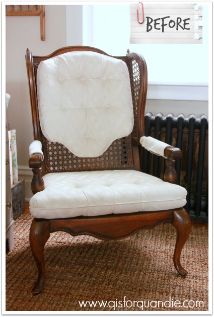
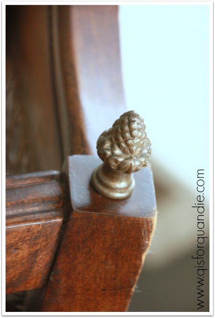
Remember the cane back chairs I picked up a while back?
Well, they are promised to one of my favorite customers, Nikkii. We once added up all of the pieces she has purchased from me, and it was in the double digits.
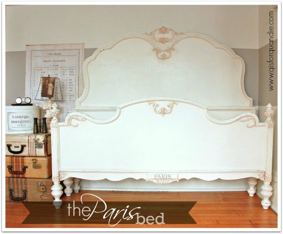
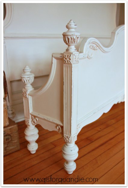
I think the very first piece she purchased from me was this bed, back in my pre-blog days.
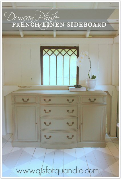
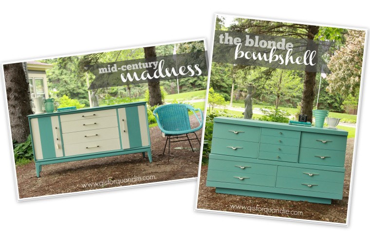
She also has the Duncan Phyfe sideboard …
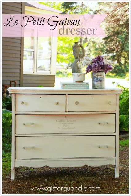
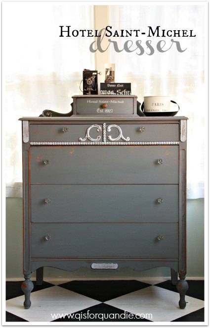
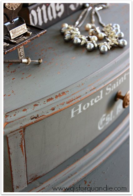
and this sweet white dresser …
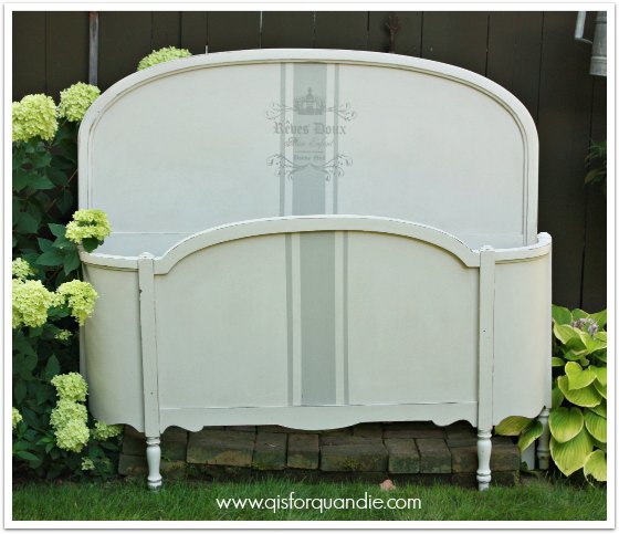
Not to mention the footboard chalkboard.

Plus a bunch more!
So I am happy to be working on these chairs for her. I know they will be right at home along with the other pieces she has!
However, they are turning into one of those projects. The ones where you just keep running into snag after snag. And they still aren’t done, but I thought I would give you an update (mainly because I don’t have anything else to share today!).
My original plan was to start with removing those arm rest patches so that I could just paint the arms.
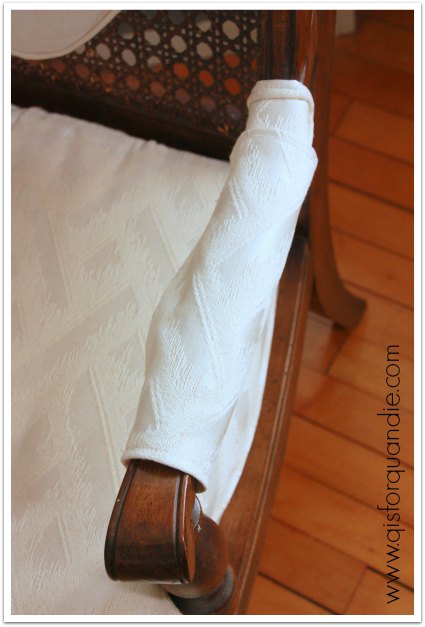
Easier said than done. The Velcro slipcover thingie came right off, but the upholstered arm cover had about 400 million staples holding it in place. I spent over an hour on the first one, and still had about 20 firmly embedded staples left in the arm that I simply could not get out. It was time to consider a plan B. I am going to attempt to re-upholster them. Miss Mustard makes it look so easy, I hope it is.
Once I made this decision, I decided to go ahead with the painting. I painted one coat of chalk paint on the first chair, and quickly realized that it was going to be a challenge to cover all of that cane with a brush. Time for another plan B.
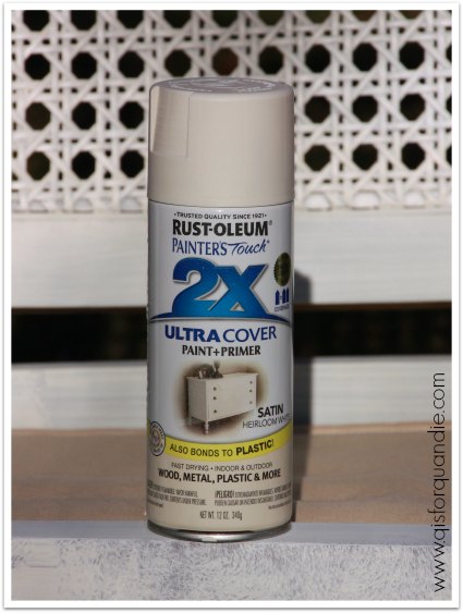
I decided to spray paint the cane first, then cover it with a final coat of chalk paint. I generally avoid spray painting indoors though, so I had to wait until the weather cooperated so I could haul them outside for this step. I am not a big fan of spray painted furniture, but when it comes to both cane and wicker, it can often be the best option.
While manhandling the chairs for spray painting, I realized that one of the arms was really wobbly. I thought I could shore it up by just tightening the screw that holds it in place. No dice. I called my handy man/neighbor/furniture miracle worker, Ken, for a consultation. He decided he could work some magic with glue and by adding an additional screw where the arm meets the chair back. Since I’m going to paint these, he knew I could patch and paint over the screw head. Thank goodness for Ken, but of course this was another delay in getting the chairs painted.
Meanwhile, I was working out a plan for the cushions. Luckily my friend and Carriage House Sale partner, Sue, is a fabulous seamstress who doesn’t mind tackling the occasional sewing job for me. I sent the cushions home with her along with some drop cloth fabric. She whipped up some slip-covers for me in no time!
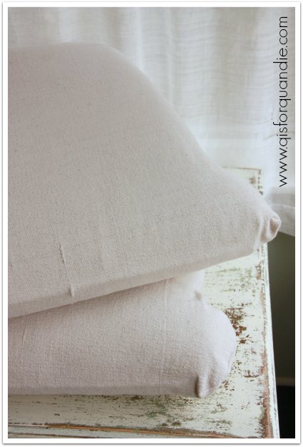
She made them with an unstructured pillow sham-like design, so they could be slipped off and washed. Since Nikkii has some little ones at home, I know she will appreciate this feature. Here is the underside, with two ends that overlap so the cushion can be slipped out.
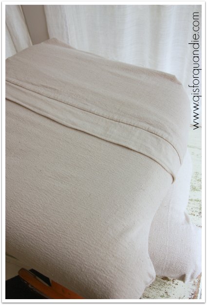
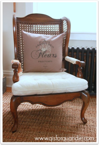
And here is how one looks on a partially finished chair.
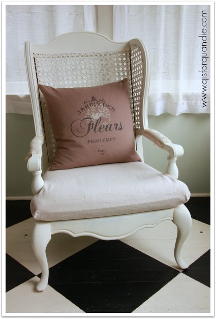
Nice, right?
So … progress is being made … but I’m not quite done.

I still need to add another coat of white, distress and wax, then re-cover the arm patches. I’m hoping to get all of that done this coming weekend. Wish me luck!
On a related note, for you Fixer Upper fans, remember when I first posted about these chairs and I mentioned that Joanna had used similar chairs in one of her fixer uppers? Well, she did it again. In the most recent episode, Asian Ranch, she used them again …

Does she re-use furniture for staging the homes for the show, and then take them back and use them again?
Or does she have a supplier of these chairs that she just goes back to for more?
Does anyone else wonder about this?
And while we’re on the subject of Fixer Upper, did anyone else notice the piano in the Asian Ranch episode? It came with the house and looked like this …
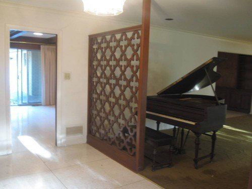
And they kept it in the house …

See it tucked away back there behind the table? It’s a little difficult to see in this photo, you can see it a little bit better in the episode, but I think they painted it black.
And I love it.
So now I’m tempted …

What do you think? Black piano? I could use MMS Typewriter milk paint. Do I dare?


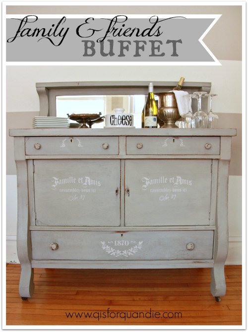

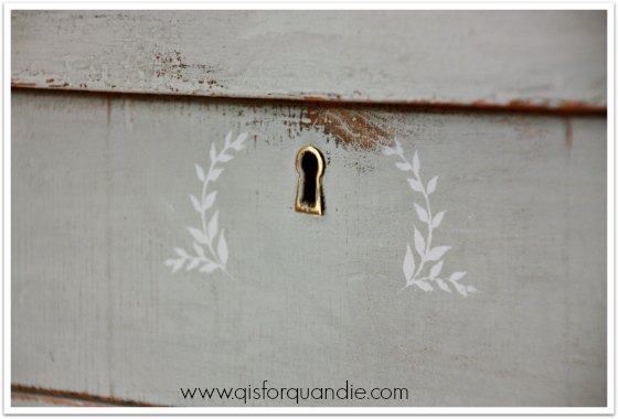
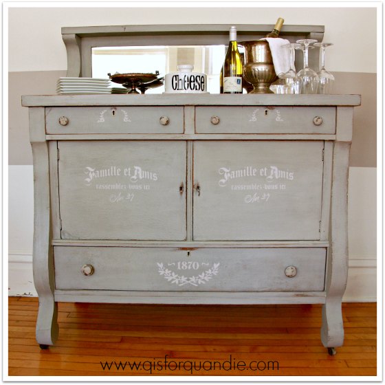
 As you can see, I used just part of it on the doors of my buffet and then I used just the lower portion of the stencil on my lower drawer.
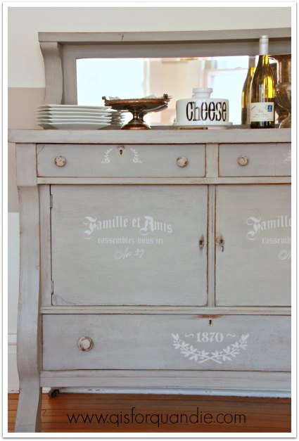


 Those are definitely coming off!
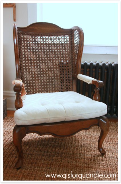 Ahhhhh, getting better already. I also found upholstered arms under those funky sleeves, and started ripping one off. There are about a million staples holding it in place though, so that little process is going to take some patience.