the seed & horticulture dresser.

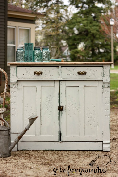
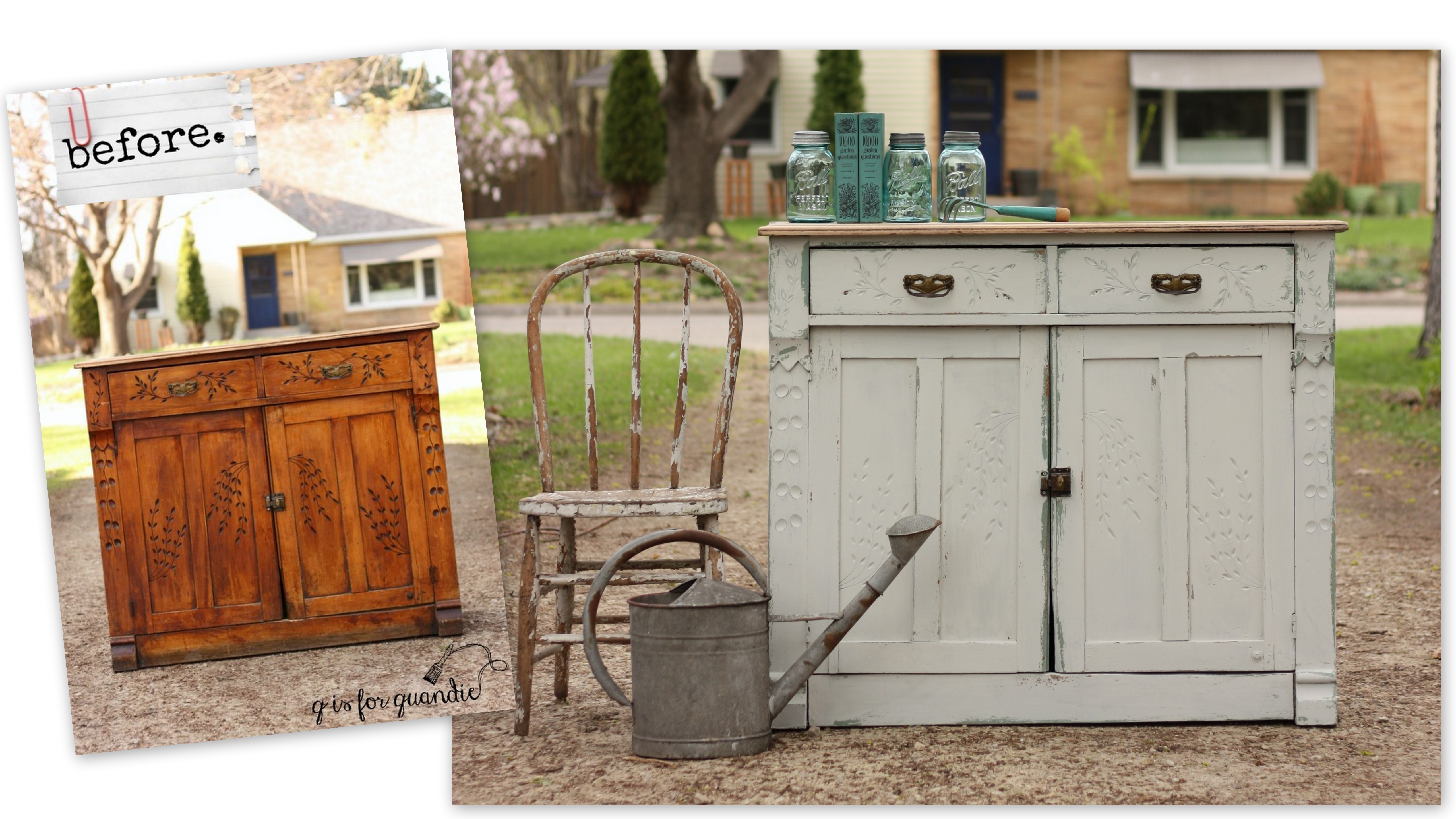
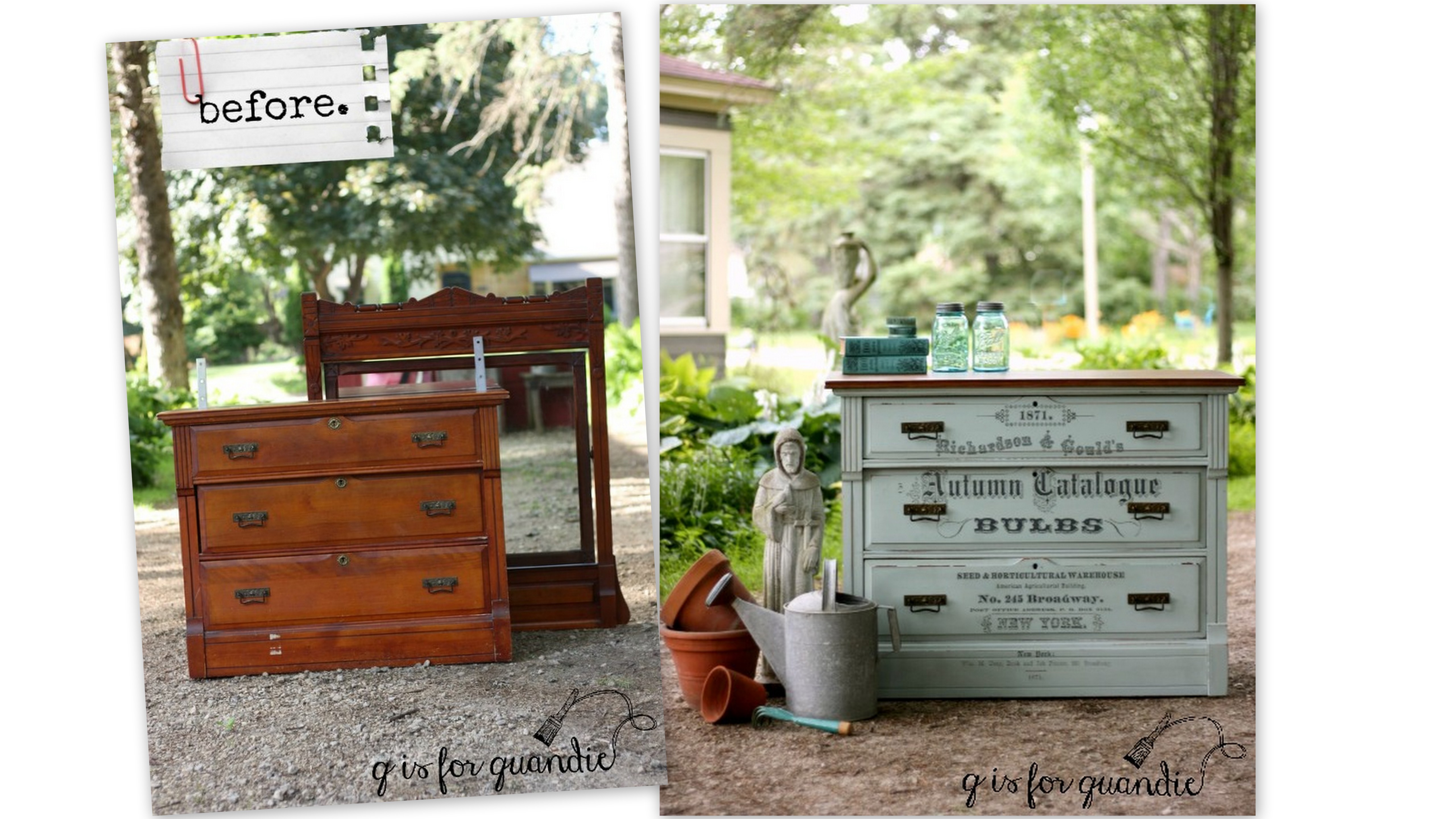
I didn’t mention it earlier, but the washstand that I painted in Grain Sack a couple of weeks ago was part of an entire bedroom set.  There it is in the front.

I purchased this entire set for the bed.  I have plans for that bed.  You’ll just have to wait for that.  But in the meantime, I’ve given the dresser (just behind the washstand in that photo) a makeover.

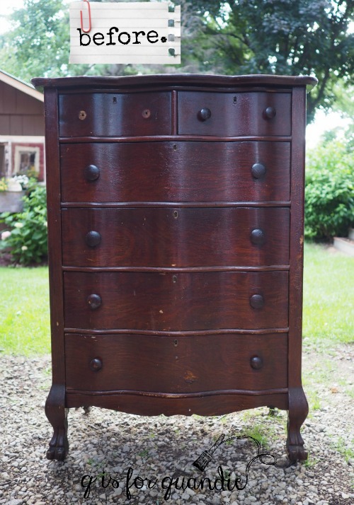
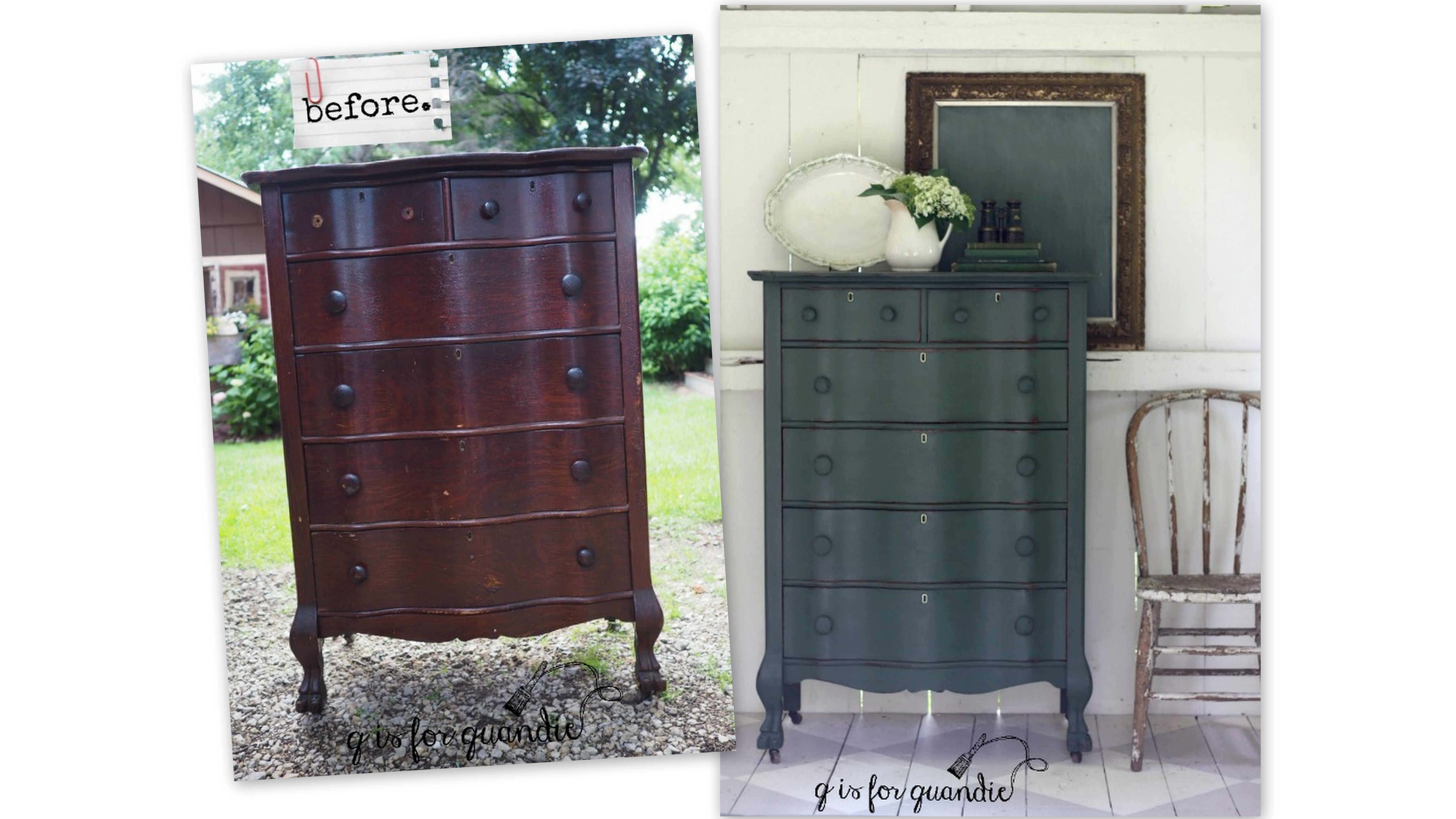
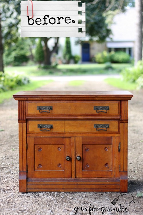
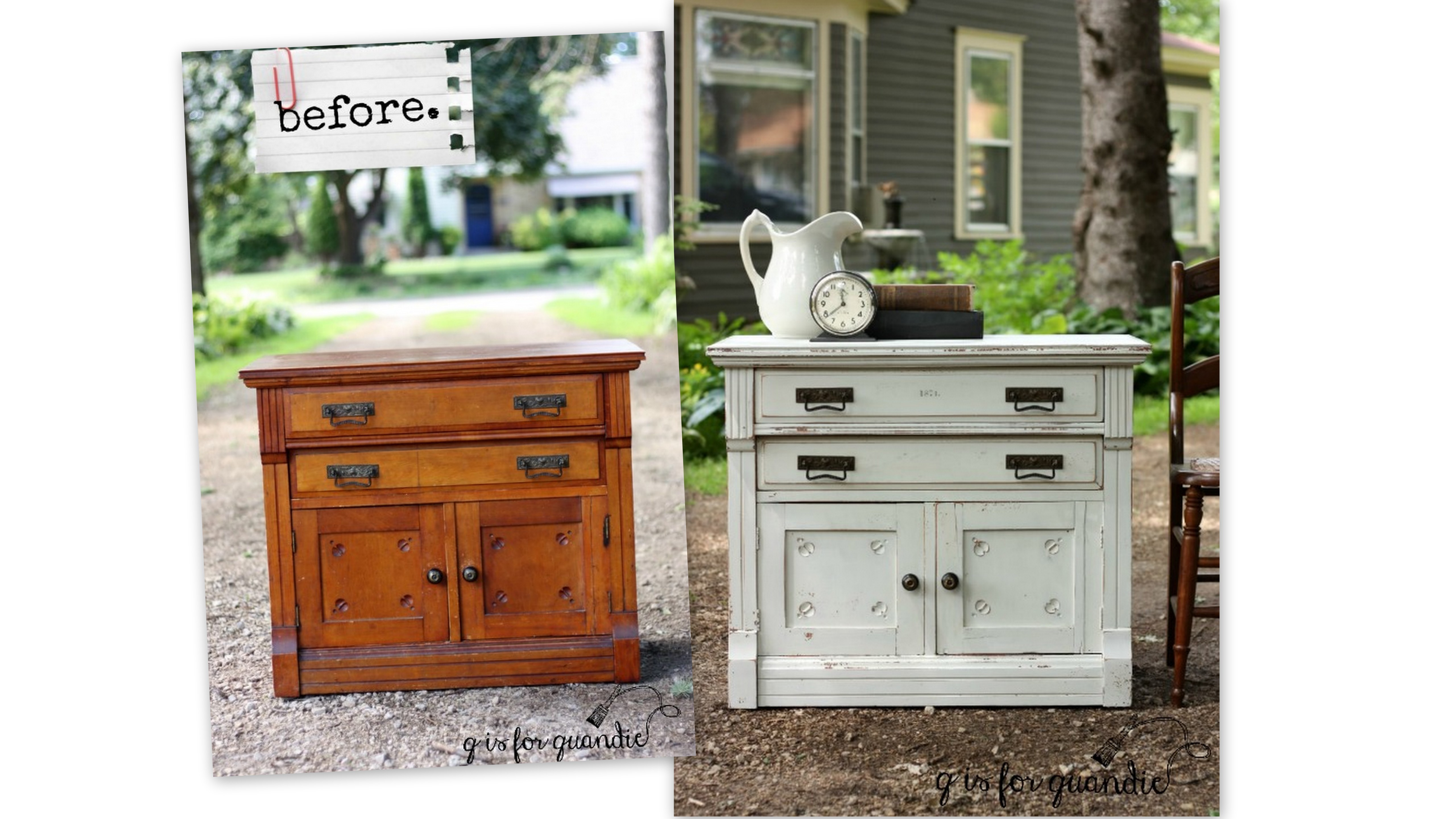
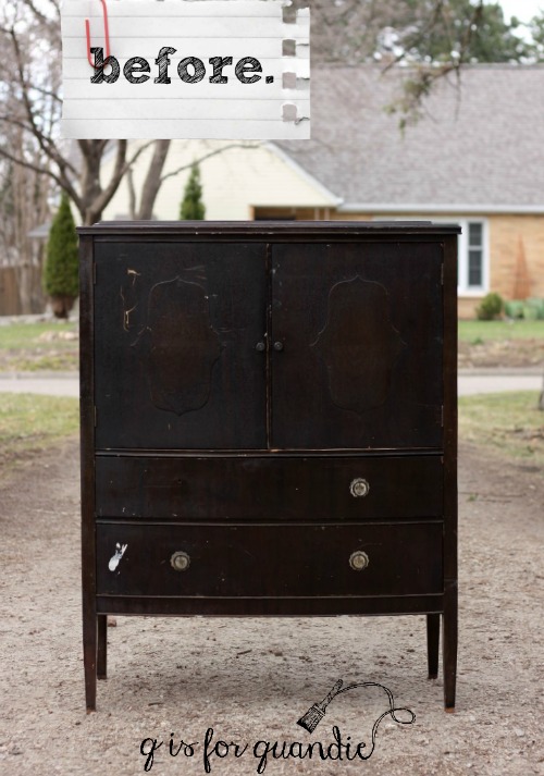
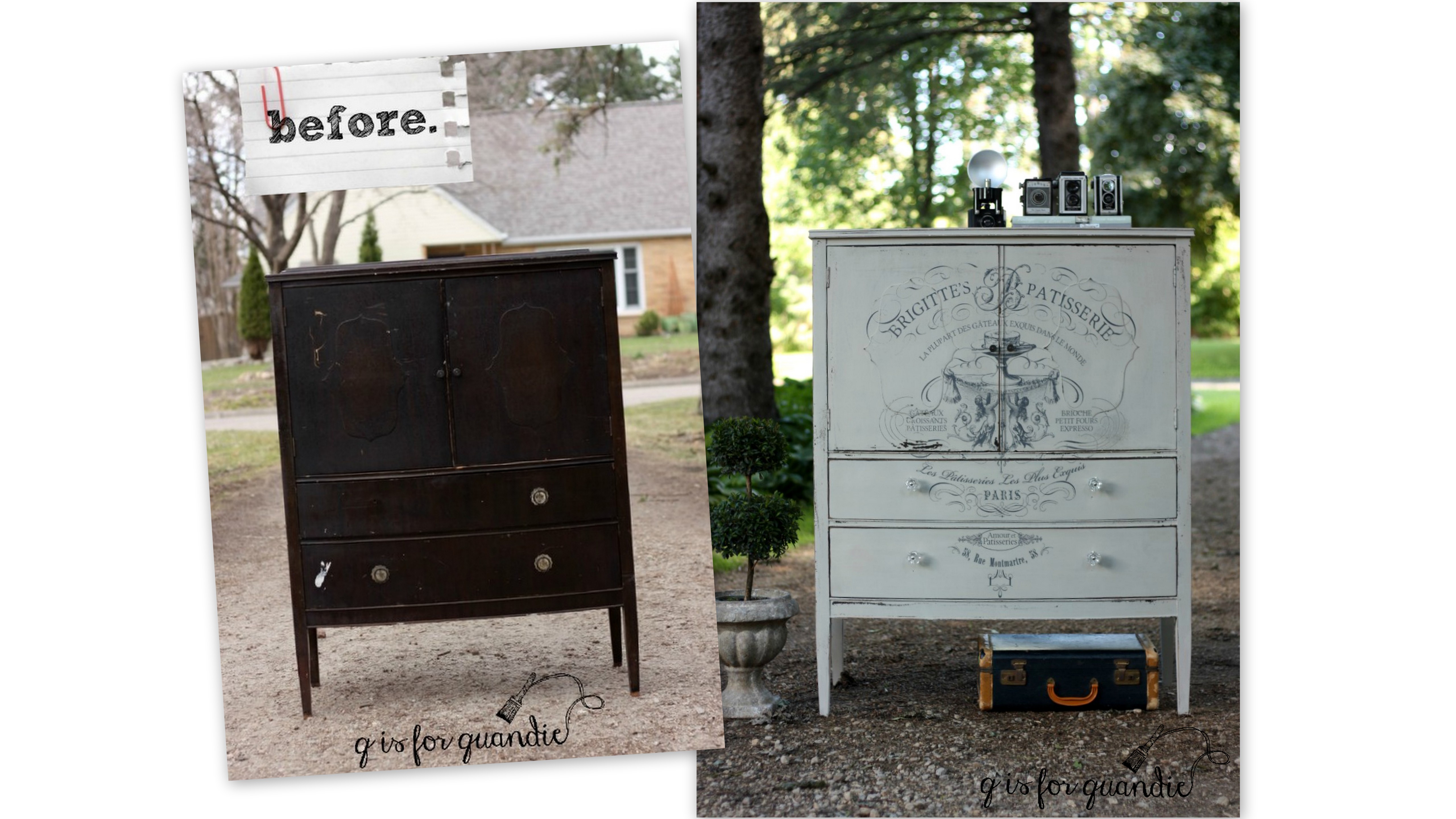
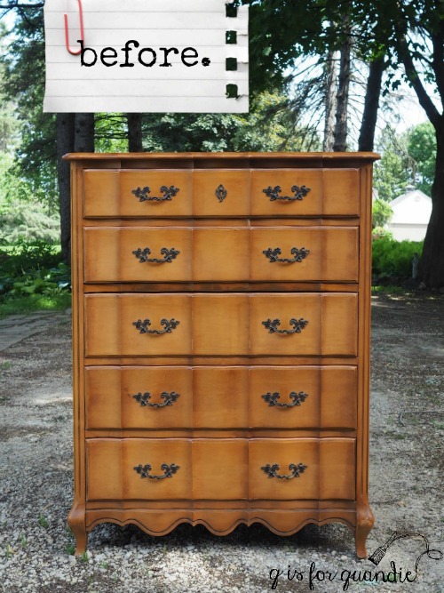
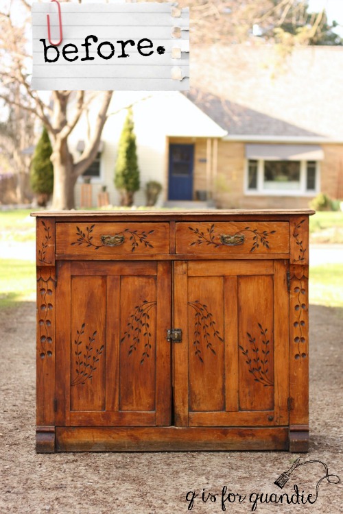
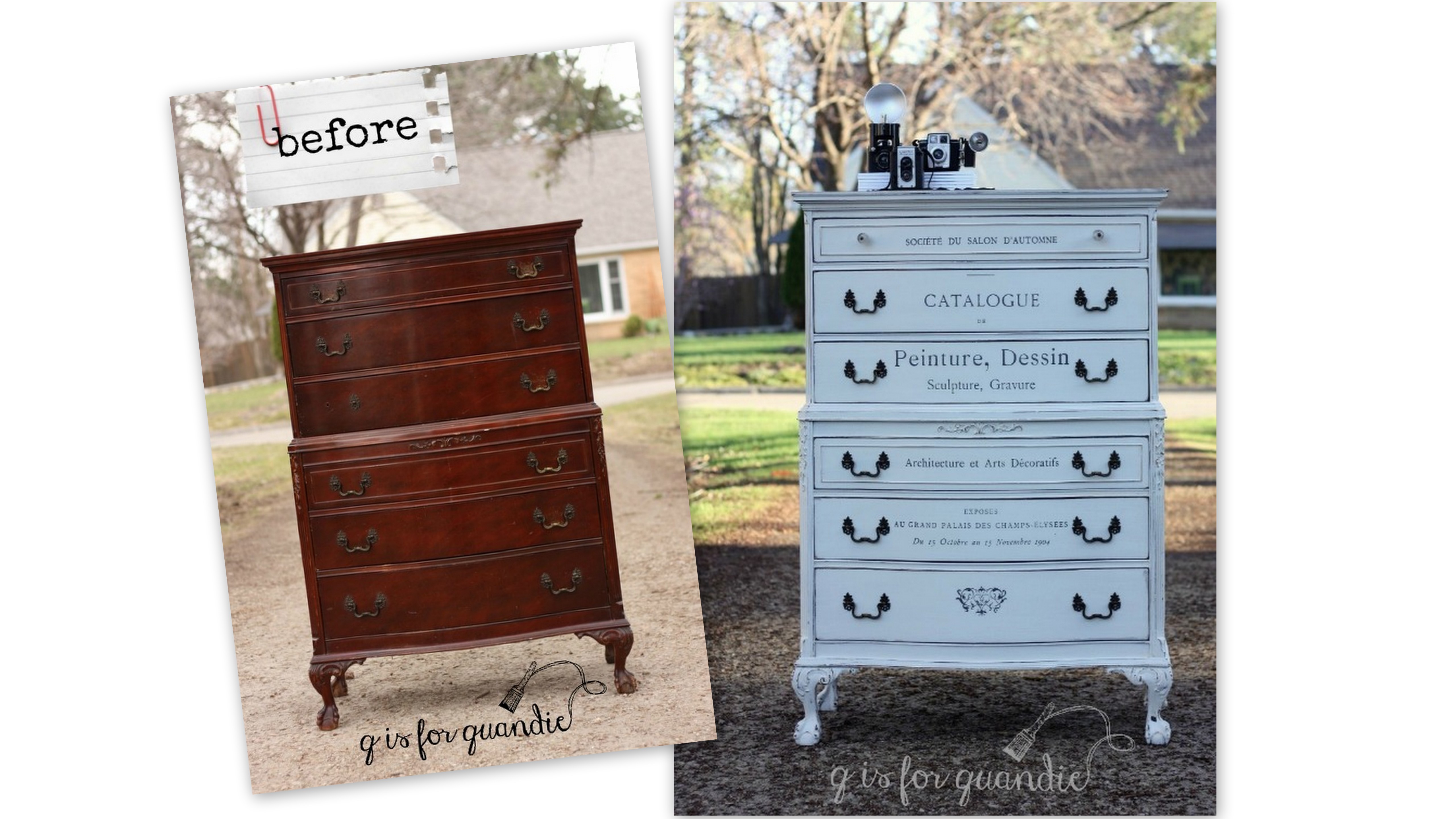
Here’s a better look at just the dresser ‘before’.

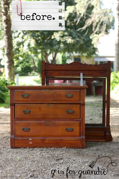
Although it came with a mirror, the two will be parting ways.

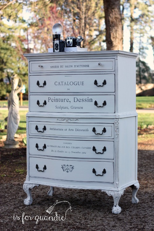
I knew I wanted to use milk paint on this one, and I also wanted to use an Iron Orchid Designs transfer.  I’ve mentioned before that you have to be a little careful with this combo.  If your milk paint is too chippy, it’s hard to get the transfer to stick to the paint rather than the paint sticking to the transfer.  So I gave this one an extra good scuff sanding and then cleaned it with TSP substitute to help control the chipping.

I also decided to go with a wood top on this dresser, so I stripped the original finish off the top which was pretty scratched up.

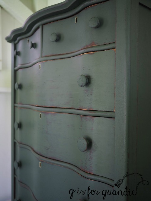
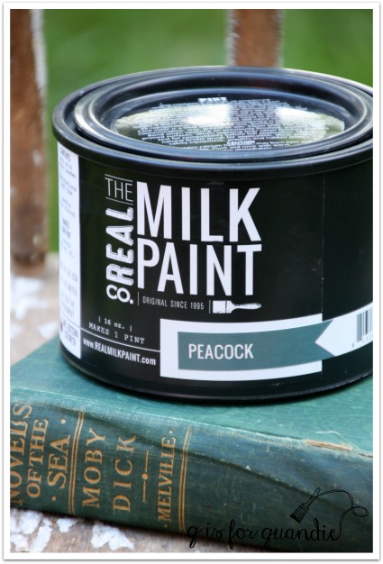
Next I mixed a custom milk paint color, mainly to use up a few partial packets of paint I had on hand.  I started by mixing equal parts Miss Mustard Seed’s Eulalie’s Sky and Shutter Gray.  The resulting color was just a bit too blue for me, so I then added another equal part MMS Grain Sack to both lighten it up and add a little more grey.

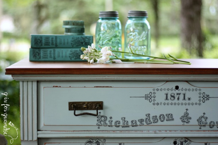
I love this color!  I’m going to keep track of this color recipe for future use.

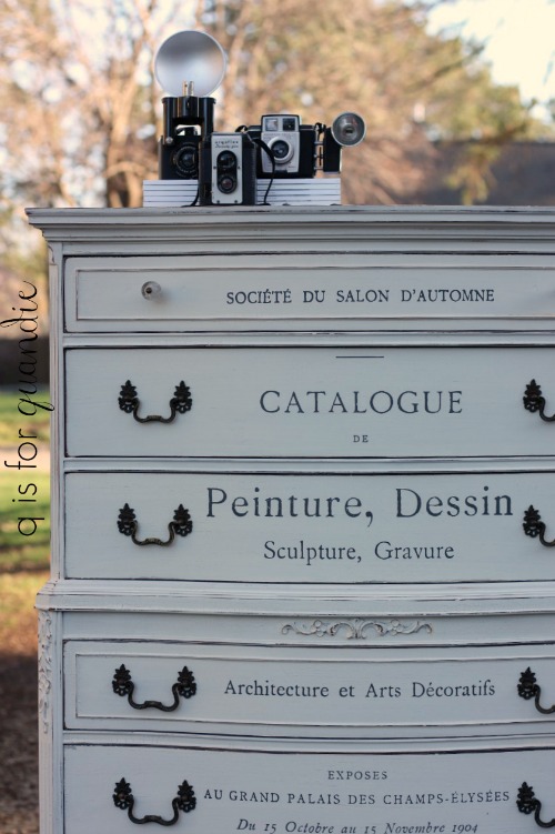
After the paint was good and dry, I added the Iron Orchids Design’s Seeds transfer.

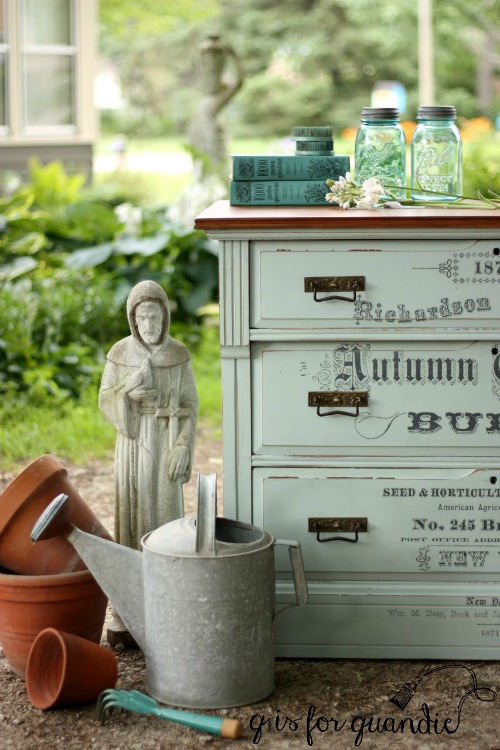
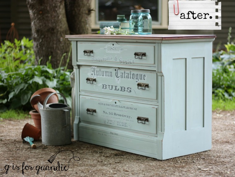
I had to ‘cut and paste’ it a bit to fit the dimensions of this dresser, and also to avoid the rectangular drawer pulls.  Your hardware probably won’t be in place when you are adding a transfer, so don’t forget to take it into account.  In this case I had to move “Autumn Catalogue” up a bit to avoid the pulls.  The entire transfer didn’t fit on this dresser, but this is most of it.

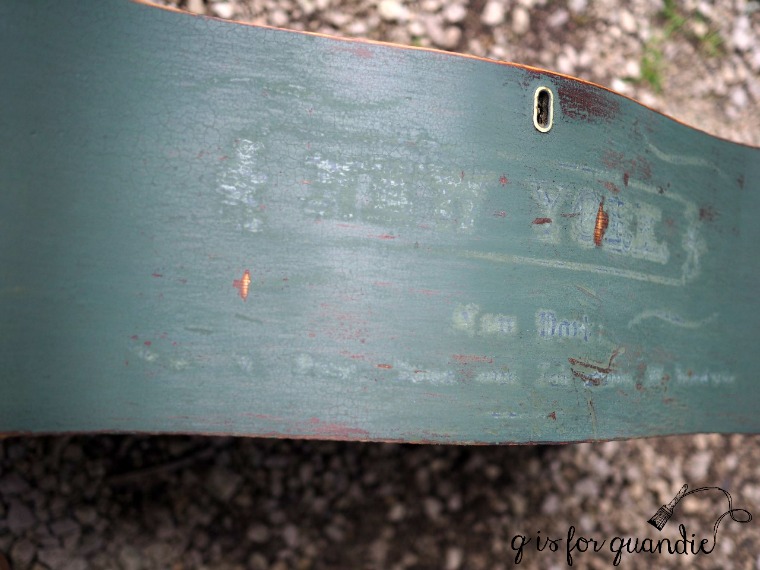
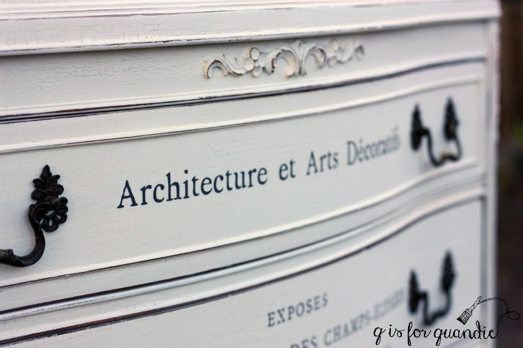
I mentioned in my last post about the furniture transfer fail on the Bayberry dresser that Sally at IOD recommends distressing the transfer lightly with fine grit sandpaper to reduce the ‘halo’ effect.  I gave that a try with this transfer and it definitely minimizes it. That ‘halo’ is most apparent when looking at it from an angle, so here’s a good angle shot so you can see what I’m talking about …

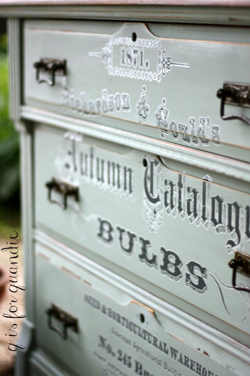
It’s practically invisible looking at it straight on.

I decided to go a little old school on finishing the wood top.  After stripping and sanding, I stained it with Varythane Dark Walnut gel stain and then added a couple coats of Minwax Wipe on Poly in a satin finish.  By the way, I used Homestead House Beeswax finish over the milk paint and the furniture transfer.

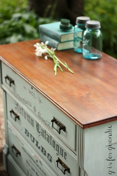
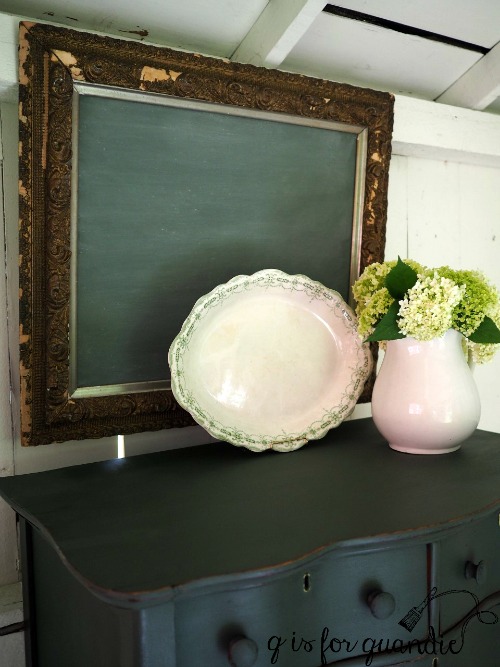
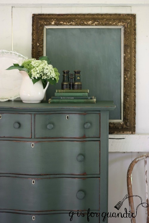
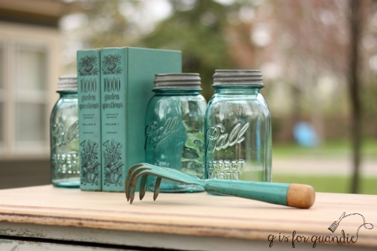
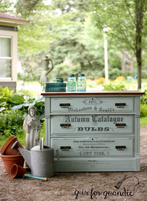
I focused on the ‘seed catalogue’ garden theme of the transfer when choosing my props for these photos.

I really love how this piece turned out.

What do you think of it?

If you are local and interesting in purchasing this one, be sure to check out my ‘available for local sale’ tab for more details.

the greens of scotland.

While I was inspired by all of the shades of blue I saw in Norway on our recent trip, in Scotland it was all about the greens (and maybe the sheep!)

So when I saw this pretty green transferware platter at the Barn Chic Vintage sale, I snatched it up and decided that I needed to paint something green.

Mr. Q had recently brought home this tall serpentine dresser with lovely claw feet.  His step-dad’s ex-wife (is there a better title for that relationship?  step-ex maybe?), who is also a very supportive follower of my blog, snagged this for me from her neighbor who was having a garage sale (thanks again Sherry!)

It needed a little work.  Ken replaced a drawer bottom that was damaged beyond repair and I dealt with some veneer issues by patching with wood filler.

Next I pulled out my paints to see what my options were for green and I had quite a few.  I had some of Miss Mustard Seed’s Lucketts Green and Boxwood.  I also had several shades of green milk paint that Homestead House sent me, Upper Canada Green, Gatineau, Acadia Pear.  In the end I opted for Homestead House’s Bayberry.

I found it a bit challenging to get a photo that shows the true shade of this green.  It’s a deep green that leans more towards the blue side rather than yellow, and with a grey undertone.  I added a topcoat of hemp oil, which deepened the color quite a bit.

While working with the Bayberry, I discovered it makes the perfect ‘chalkboard green’.  That’s it on the gold framed chalkboard, without hemp oil and after being ‘seasoned’ with chalk.  From now on rather than mixing MMS Boxwood and Artissimo to make green chalkboard paint, I’ll just use Bayberry straight up.

I also tried a little experiment on this dresser.  I added part of an Iron Orchids Design furniture transfer.  I wasn’t sure how well it would show up on a dark color like this, and I knew I was taking a chance that it wouldn’t work at all and I’d have more work to do to correct it.

And as it turns out, transfers and dark colors don’t mix.  I expected that the transfer wouldn’t be as obvious over a dark color, but I didn’t expect that that filmy sort of white halo would be so much more noticeable.

Speaking of which, after getting a question from Nancy recently about the ‘cloudy halo’ that you can see with the IOD transfers, I reached out to Sally at Iron Orchid Designs.  She told me they are working on improving their product to minimize that halo, but in the meantime the transfers are best suited for light colors.  In addition, she said that a little light distressing with a fine grit sandpaper can help blend it more on light colors as well.

OK, so next came the ‘fix’.  I was hoping I could use a sharp razor blade to remove the transfer without damaging the paint too much.

Nope.  That didn’t work.  That transfer was stuck good.  Really, that’s good news since it means the IOD transfers are pretty durable and won’t just easily peel off your surface.

On to Plan B (or would it be C at this point?)  I knew this was going to be dicey at best, but it was worth a shot.  I sanded down the two drawers with the transfers, sanding off the transfer as well as most of the hemp oil.  Then I wiped them down with TSP substitute to further reduce the oil.  I had a little bit of my mixed paint left, so I stirred it well and added a fresh coat to the two drawers.

I’ve had issues in the past with getting different shades of green doing this.  I posted about that here.  Over time as green milk paint sits it tends to change color slightly.

So, I do know better.  But I thought I might as well try it since I had the paint.  Worst case scenario I have to re-do ALL of the drawers.

Yep, worst case scenario.  It’s not a really glaring difference, but enough of a difference that it bugged me.

So, back to sanding and cleaning each drawer with TSP substitute, mixing up a fresh batch of Bayberry paint and repainting each drawer.  I didn’t have to do the body of the dresser, just the drawer fronts.

In the long run it would have been smarter to try this experiment with Fusion acrylic paint or chalk paint.  That way I could have gotten away with just repainting the two drawers.  Hindsight is always 20/20.  I hope that by sharing my failures in this way, you guys can learn from them and not make the same mistakes.

To recap.  New lesson learned:  don’t use IOD transfers on dark colors.  Old lesson reinforced:  paint your milk paint pieces all at once, you can’t go back later and just paint one or two drawers.  Got that?

I promised ‘dibs’ on this dresser to the original owner.  But if she doesn’t want it back, it will be for sale.  Be sure to check my ‘available for local sale’ tab for more details.


just the right white.

There are so many shades of white out there!  And I’m sure you will all agree with me that sometimes choosing the right shade of white can be just as difficult as choosing a color!

Normally I lean towards the creamy whites; Miss Mustard Seed’s Linen, Fusion’s Limestone and Annie Sloan’s Old White.  These warmer shades of white tend to play well with others.  A piece painted in one of these colors can be brought into your room without everything else suddenly looking dingy.  My ‘Specimens Cupboard’ (below) is painted in MMS Linen as are most of the white pieces in my own home.

When I brought home this charming antique washstand last week, I initially thought maybe I should paint it black.

You see, it has these amazing original black knobs.

I don’t know exactly what it is that appeals to me about these knobs, but I just love them.

And had I painted the washstand black, the knobs would have just blended in and I wanted them to really pop.  I also rejected the idea of pairing a color with the black knobs.  So that left white.

  As for what type of white paint, with an old piece like this washstand I like to go with milk paint.  I feel like nothing emphasizes the vintage character of an old piece like a chippy milk paint finish.

Choosing which shade of white ended up being a bit more complicated.

I started with my current go-to warm white milk paint, Homestead House’s Limestone (which is very similar to MMS Linen).  After painting the first coat I realized that it felt just a bit too creamy for this piece, so I decided to switch it up and for the 2nd coat of paint I went with Miss Mustard Seed’s Farmhouse White.  Once that was dry, it was really just a bit too … well … white.  It felt a bit sterile on this piece.

So I decided to try Miss Mustard Seed’s Grain Sack for my 3rd coat of paint.  Grain Sack is a white with a definite grey undertone.  I’ve paired this color with black accents before and loved the results (here).

Sure enough, the 3rd time was the charm!  The Grain Sack is perfect on this piece.

Now you might be thinking to yourself, “what a bummer to waste all of that paint before landing on the right white.”  But actually, this piece would have required three coats of paint for good coverage anyway.  And since these were all shades of white, I was able to get away with just that one final coat of Grain Sack.

The chippy-ness gods were smiling on me with this piece.  I got just the right amount of chipping.  It looks authentic, but not overdone.  I’ll admit I didn’t use any special technique to get this result.  I did scuff sand this piece, followed by a good cleaning with TSP substitute and then I just started painting.

Once the paint was dry, I sanded lightly and then vacuumed away any chipping paint.  The last step was to add some Miss Mustard Seed furniture wax which brought out a little more of the grey and also added some ‘age’ back to the finish.

Oh, but wait, I almost forgot!  Before I waxed I added just the tiniest portion of an Iron Orchid Designs furniture transfer to the upper drawer.  ‘1871.’

It’s just a subtle little touch that adds a bit of whimsy.

I have to note here that sometimes the white that works perfectly on one piece doesn’t work at all on another.  I was perfectly happy with Farmhouse White on my belgian bench, and I loved Homestead House Limestone on the farm fresh chalkboard, I just didn’t love either of those colors on this piece.  I’ve also found Grain Sack to be too grey for some pieces, while it worked perfectly on this washstand.

 Sometimes you just have to experiment a little to find the white that is just right.

Andy by the way, sometimes you have to experiment to find the staging for your photos that is just right too.  I started out using some geraniums and other green accents …

but out of two dozen photos this was the only one that I liked.

Next I decided to play up the black knobs a little more by using black props.

But I found I was having a really hard time getting the correct color of the grainsack in my photos because there was so much white inside the photo cottage.

So once again I resorted to photographing the piece outside.

Maybe outside photos are just going to be my thing and I should stop trying to fight it.  What do you think?

Meanwhile this sweet little washstand is for sale.  If interested, be sure to check out my ‘available for local sale’ page for more details.


choosing a color.

Sometimes when I bring home a piece of furniture to refurbish I have an immediate vision of what color I’m going to put on it.  Other times I really struggle with this decision.

Usually that’s because I’m trying to walk the line between choosing a color that I think will look amazing on something and choosing a color that I think will sell.  Sometimes these two are the same thing, but oftentimes they aren’t.  Since I can’t keep every piece I paint no matter how much I love them, I have to consider how well something is going to sell.  I find that the neutral pieces usually sell faster than colors.

Black is always a big seller (this next piece is painted in Miss Mustard Seed’s Typewriter).  It’s a classic, and every room needs a pop of black!

It’s easy for potential buyers to fit a neutral piece into their existing décor like this book shelf painted in Little Billy Goat’s Greyson.

A creamy almond is also an easy color to blend into an existing room.  The Miss Mustard Seed’s Marzipan on this little washstand is perfect.

It’s not quite as easy to add a vibrant blue like the Real Milk Paint Co’s Dragonfly on this dresser.  This one took a while to sell.

The fresh green of Sweet Pickins’ In a Pickle is one of my favorite greens.  This fab desk sold pretty quickly painted in this color …

but this dresser in the same color took over a year to sell.

On the other hand, I have to say that most shades of aqua sell pretty quickly, like this sweet dresser painted in Little Billy Goat’s Momma’s Fridge.

Even more saturated aqua’s have traditionally sold really well for me, like the Fusion Laurentien on this bar cart.

I’m always a little nervous when I paint something yellow, but most of my yellow pieces sell well also.  This next piece is painted in Fusion’s Buttermilk Cream and Limestone.

And this is Miss Mustard Seed’s Mustard Seed.

And just to prove my friend Lisa wrong (because she can’t believe I’ve ever painted anything red), here is a piece I painted in Miss Mustard Seed’s Tricycle.  This piece sold pretty quickly, but another dresser I painted in Tricycle was around for over a year as well.

Since I have a day job that pays the bills, I have the luxury of not relying on furniture sales to put food on the table.  But I also don’t have room to store unsold pieces indefinitely.

And honestly, it saps my motivation to paint more furniture when my finished pieces linger for too long unsold.  So I think long and hard before using colors with a bad track record.

Another consideration when deciding what color to use on a particular piece is what colors I have on hand.  I have so much paint!  Some women have so many shoes in their closet that they could never possibly wear them all, I have so much paint in my cupboard that I’m not sure I’ll ever use it all, mainly half used paint.  There isn’t enough left of each color to paint an entire piece of furniture, but I certainly can’t just throw it away!  This is where custom mixing comes in handy like this mix of equal parts Miss Mustard Seed Shutter Grey, Eulalie’s Sky and Layla’s Mint.

I mixed Fusion’s Liberty Blue and Homestead Blue to create a color called Lake Superior Blue.

Yet another factor that I keep in mind when choosing a color is you guys.  After all, how boring would my blog be if I painted everything in neutral shades like Annie Sloan’s Coco?

That would get old fast, right?  It would get boring for me too, always painting in the same old neutrals.

Don’t get me wrong, it’s not that they aren’t lovely!

But sometimes you just gotta mix it up.

How about you, do you have a favorite color?  Or if you are a furniture seller, what color sells best for you?  Is there a color that you absolutely love, but avoid using because it just doesn’t sell?  I’d love to hear about it in the comments.

the bedford linen press.

Way back in April, I purchased this dresser via craigslist.

As you can see, it was in pretty rough shape with splotches of white paint here and there.  There was also a broken leg that you can’t quite see in the photo.  Depending on the brightness of your computer screen, it may almost look black in this photo, but it’s just a really dark stain.

I call pieces with doors that open to reveal inner drawers a ‘linen press’.  I can’t find an authoritative source online that confirms that, but if you google ‘linen press’ you’ll get lots of images of pieces like this.  So let’s go with it, OK?

I’m a big fan of the linen press.  This is the 4th one I’ve done (you can see the others here, here and here).  However, they do tend to be a bit more work because you have to paint the inside too.

In this case, I painted the inside in a custom mixed Navy Blue Fusion paint (equal parts Liberty Blue and Coal Black).  I love using Fusion paint on the interiors of pieces for a couple of reasons.  First, it doesn’t have to be top-coated (adding wax or another topcoat inside a cupboard can be a real pain) .  Second, it’s fully washable which can be handy with both drawers and shelves.

You’ll notice that I didn’t paint the outside sides of the inner drawers …

I purposely chose not to do so because these drawers fit pretty tightly.  Adding paint to them would have likely caused them to stick.  In addition, the paint would have gotten pretty scratched up over time.  I don’t care how durable your paint is, having it rub against another surface like this will scratch it.

I love these drawers for storing pretty vintage linens.

But I bet you are wondering what I did with the outside.  You’ve gotten a little glimpse of it so far just to tease you.

OK, OK.  I painted the outside with Homestead House milk paint in Bedford (paint provided compliments of Homestead House).  This color is a lovely pale greige; not quite grey, not quite beige, but a perfect blend of the two.

Then I added another gorgeous Iron Orchid Designs rub-on furniture transfer (you can find these from various sources online).

This is a good time to caution you about mixing chippy milk paint and a rub-on.  If your milk paint is fairly chippy, or in other words it’s not well-adhered to your surface, it may come off with the transfer backing sheet.  Basically, instead of the rub-on sticking to your dresser, the paint will stick to the rub-on … does my explanation of that make sense?

You can see where I had a little trouble with that on the bottom of the door on the left (in the above photo).  The key to using a rub-on with milk paint is to make sure you prep your piece really well (scuff sand and clean with TSP substitute) to limit how much the surface resists the paint.  Especially in the area where the rub-on will go.

Oh, by the way, I switched out the original pulls on the bottom two drawers because I was missing one of them.  I chose glass knobs because I wanted them to fade away and let the transfer be the star of the show.

One more comment about applying the rub-on.  For the bottom two drawers, I cut the transfer apart and did each drawer separately.  I did that because I needed to adjust the spacing vertically just a tad to fit the drawers.  For the top half of the dresser, I placed the full transfer over the shut doors and applied it that way.  I debated cutting the transfer in half down the middle, but I think that would have messed with the design.  I didn’t want a weird space down the middle.  It was a little putzy to do it this way, but I’m glad I did.

My advice to you if you are going to try this is to be patient, go slowly, and don’t remove your taped on transfer sheet until you are sure you have the entire design transferred.  I usually leave mine taped to the surface at the top of the sheet so that I can pull it up slowly, and potentially let it fall back in place if I find I missed something.

By the way, I used Miss Mustard Seed furniture wax as my top coat on this dresser.  I waxed right over the transfer using a light touch and it worked beautifully.

So there you have it, the Bedford Linen Press.

Massive improvement, right?

And of course, this piece is for sale locally (while it lasts).  Be sure to check my ‘available for local sale’ page for more details.

Sharing at Silver Pennies Sundays!


norwegian blue.

Kim left a comment on one of my posts about my trip asking if I’d been inspired by any of the colors I saw in Norway or Scotland, and the answer is a resounding yes!

As I mentioned in my post about Oslo on Wednesday, I loved the vibrant blues that I saw at the folk museum.  The bright blue on this bed is stunning.

While the faded blue on this trunk may not be as bright as it once was, it’s still lovely.

And in fact, beautiful shades of blue were everywhere, like on this door in Stavanger.

I don’t think I even realized just how much blue had caught my eye until I started going through my photos.

Even the Norwegian posters were blue!

I just love the perfect chippy, worn blue on this chair.  If I could have brought this home as a souvenir, I definitely would have.  Do you think I could have shoved this into the overhead compartment on the plane?

Probably not.  Instead, I had to create my own version of it at home.

I purchased this little stool at my ‘breakfast meeting‘ the other day and it was the perfect candidate for a Norwegian blue paint job.

Funny enough, Behr actually makes a color called Norwegian Blue (N470-5), but nope, not the color I wanted at all.  So I chose to use Miss Mustard Seed’s Flow Blue milk paint, it’s the perfect Norwegian blue.

I followed my usual m.o.  A little sanding, followed by a cleaning with TSP substitute, followed by two coats of paint.  And this time I finished with Miss Mustard Seed furniture wax.  I got just the right amount of chipping/distressing on this adorable little stool.

Although it looks pretty great paired with the desk in my Q-branch, it’s definitely not comfortable enough for the amount of time I sit here writing my blog.  So it won’t be staying in this spot.  But I’m going to carry it around my house for a while and see if I can come up with a spot for it.  Just a little something to remind me of the beautiful blues of Norway!

By the way, did you notice?  There is a little sneak peek of one of my upcoming travel posts on my computer screen.

We’re not going to get to Flam until sometime in July though, so you’ll just have to stay tuned for that one!


a pretty french provincial dresser.

I was recently contacted via Facebook by the daughter of one of my regular blog readers (thanks again for that Wanda!) who had a couple of dressers she wanted to sell.  She was conveniently located in Stillwater and the price was right, so I sent Mr. Q to pick them up on his way home from work.

The first one is a pretty french provincial dresser.

I decided to ease back into furniture painting slowly after my trip, and for me that means using Fusion paint.  Compared to milk paint, or even chalk paint, Fusion is just so darn easy to use.  It requires minimal prep, two quick coats of paint, and bam!  You’re done.  No need for a top coat.

Fusion recently shared a really great chart for determining how much prep your furniture needs before painting (be sure to pin this for future reference) …

My piece had a fairly glossy varnish on it to begin with so I followed that darker green route.  I scuff sanded with 220 grit sandpaper and cleaned it well with TSP substitute.  Then I just got out my brush and started painting.

I went with a two tone look starting with Fusion’s Little Speckled Frog, which is a pale minty green, on the body of the dresser and finishing up with Fusion’s Limestone, a warm creamy white, on the drawer fronts.

 Fusion sent me a free sample of the Little Speckled Frog when they came out with their Tones for Tots line.  It would be the perfect pale green for a nursery, but I think it works equally well on a piece for a ‘grown up’ don’t you?  I wanted to go with a ‘pretty’ color on this piece and these two were the perfect combo!

Once the paint was dry, I hit the high spots with some sandpaper to distress the finish.  Always remember to do this shortly after Fusion paint dries, if you wait too long the paint will cure and be more difficult to sand off.

I used my Little Billy Goat goat stick in Gold Leaf to brighten up the existing hardware (you can read more about goat sticks and how to use them here).

I didn’t add a solid coat of the gold, but rather just highlighted a bit here and there.

See what I mean about pretty?  This is just such a pretty feminine piece with all of those curves.

This was a super easy makeover for a slightly dated piece of furniture.  Now that I’ve got my painting mojo back, maybe I’ll tackle another milk paint project next!

This dresser is for sale locally.  Please check out my ‘available for local sale’ tab for more info.

sometimes the chippy sneaks up on you (alternatively titled ‘hold on to your hat Betty’).

I’m arriving home from my trip to Norway and Scotland this evening, but it may take me a few days to recover from the jet lag and get back into the furniture painting groove.

But in the meantime, I’m sharing this pretty little dressing table that I painted just before I left.

Isn’t it sweet?

I debated keeping the painted flowers on the drawer, but in the end I just didn’t want to work with that color scheme of greens and oranges.  Instead, the Homestead House milk paint color I chose for this piece is called Stone Fence.  It’s a lovely pale greige.  If you hold it up next to a warmer color it looks quite grey, but if you compare it to a cooler grey it looks quite beige.  It’s one of those great colors that blends well with anything.

I followed my normal procedure with this piece.  I sanded it lightly, cleaned it with TSP Substitute and then painted it with two coats of Stone Fence.  I followed up with two coats of Homestead House Limestone on the details (much like I did with the Gatineau table).  I did notice some areas starting to chip before I added the Limestone, but not anything excessive.  However as I added the Limestone once again I could see that more of that color was going to chip off.

I decided to keep an open mind and just keep going.   So I sanded to distress and knock off any flaking paint, then I went over the whole piece with my shop vac.  At that point I had quite a bit of chipped paint on the Limestone details, but still only mild chipping of the Stone Fence.

That’s where I probably made a wrong turn.  I decided to add a coat of General Finishes Flat out Flat.  I thought it would seal the piece to prevent further chipping.  I’ve used it over milk paint before and had good results.

But this time I couldn’t have been more wrong.  As the Flat Out Flat dried, it lifted even more paint including the Stone Fence!  In addition, for some reason the top of the dressing table got very streaky looking.  I don’t have an explanation for this, but am just sharing my experience.  I’d say use caution if you ever decide to add Flat Out Flat over milk paint.

So hold on to your hat Betty, this one got really super chippy!

For those of you who aren’t familiar, Betty is one of my readers who isn’t terribly fond of my chippy pieces.  I once accused her of being my mother using an alias because my mom also can’t imagine why anyone in their right mind would want a chippy piece of furniture.  I am very slowly trying to win Betty over to my side, but I’m betting she’s not going to like this one!

As you can see in this next photo, the sides and legs of the dressing table didn’t chip nearly as much as the front.

I know that there are fans of the chippy look out there that will love it, even though this look isn’t for everyone.

Although technically this piece is a dressing table, or perhaps could be considered a small desk, it’s really quite petite.  I think it would make a perfect bedside table instead.  It would have plenty of room for your alarm clock, some bedtime reading material and possible a reading lamp.

So what do you think?  Is super chippy for you?

a Swedish spoon carved cupboard.

Nnk (my number one Craigslist spotter) spotted the ad for this spoon carved cupboard and sent it to me recently.

I can never pass up a good spoon carved piece.

For those of you who aren’t familiar with it, spoon carving is a style of wood carving that looks scooped out like the bowl of a spoon.  It is not carved with a really sharp spoon (which is what I always thought when I was a kid).  I’ve always considered this a Swedish style, probably because my own spoon carved washstand was passed down from the Swedish side of my family.

I haven’t been able to find any references to spoon carving being associated with Sweden online.  If you google Swedish spoon carving you get information on carving actual wooden spoons.

Well, regardless, I’m calling this a Swedish spoon carved cupboard.

It has some really interesting drawers.  Let me see if I can properly explain how they work.  There is an isosceles trapezoid shaped piece of wood that is attached to the underside of the top of the cupboard.

There is a matching notch cut out of the back ‘side’ of the drawer.

As the drawer slides into the cupboard, it basically hangs from this trapezoid piece of wood.  This is the only thing holding the drawer up in the back.  There are no glides or runners that the drawer rests on underneath it.  In the case of this cupboard, the bottom edges of that piece of wood that the drawer hangs from were totally worn down from use over time, which meant the drawer would fall off of it in the back once pushed in.

Luckily I have the ever resourceful Ken the handyman neighbor on my team.  He cut a new piece of wood for the drawer to hang from and attached it to the underside of the top.

Problem solved.

Then I started with stripping the top, sanding and cleaning the bottom, and then painting a base coat of color.  I wanted to cover up all of that orange toned wood, so I painted two coats of Homestead House milk paint in a color called Cartier.  It’s a very subtle grey-green color.

Once I had two coats of Cartier on, I decided I’d like to see several layers of color to really make this piece feel like it has been painted several times over the years.  So I added just a few swabs of a little bit of the Blue Alligator that I had left over from the headboard shelf from last week.

When you are adding layers of base colors that you will eventually cover up with your final color, it’s OK to not paint the whole thing.  However if one of your colors is really dark and the other is really light, that contrast may be hard to cover with your final color thus requiring more coats.

After my undercoats of paint dried I discovered that I had quite a lot of spots where the paint was lifting (chipping).  I really didn’t want to see so much of that orange stain.  So I decided to try something.  I added a coat of Miss Mustard Seed Tough Coat Sealer next.  That sort of sealed the chippy-ness in place rather than allowing the paint to all flake off.

Next I added some Homestead House Beeswax Finish in spots where I wanted my final color to chip to reveal the layers of color underneath, and then I painted on two coats of Homestead House milk paint in Raw Silk.

Raw Silk is a white with a grey undertone, or a very, very pale grey, depending on how you want to look at it.  It changes depending on the lighting and what is around it.

By the way, the Tough Coat Sealer trick worked perfectly.  I have very few spots where I can see chipping right down to the original wood color.  And in fact the only chipping I have in my final coat of Raw Silk is where I put the beeswax.

Usually when I paint a spoon carved piece I like to highlight the spoon carving by painting it with a lighter color, but this time I didn’t do that.  I felt like the carving on this piece was pretty busy and maybe didn’t need to be highlighted.

I left the top of the cupboard natural with just a coat of custom mixed grey wax (a mix of Homestead House black & white waxes).

This is a very rustic piece of furniture.  In fact, it’s the perfect piece to feature after our discussion on Monday regarding the problem with perfection!  For those of you who love a piece that shows its age, this one is right up your alley.  It has obviously been around for a long time and previous owners have taken turns patching it up.  There are several charming repair spots that I left as is, like these pieces of wood that are nailed, and in one case even bolted into place to shore up the door.

Ken did do a little work on the hinges of the doors so that they open and close properly, but otherwise he left them as is.

And I left the inside of the cupboard alone as well even though the shelves are rather crooked.  I find those details charming, and based on the comments on Monday’s post I’d say many of you do as well!

I suspect this piece may have originally had a hutch that sat on top, don’t you?  I don’t normally see cupboards like this on their own.  Perhaps at some point the top wasn’t salvageable anymore and someone discarded it and just kept the bottom.

I can picture this piece providing great storage in a laundry room or a bathroom.  Or fill it with board games in the family room.  It would fit right in on a three season porch too.

Where would you use it?

P.S.  This piece is for sale, be sure to check my ‘available for local sale’ tab if interested.

the catalogue dresser.

It probably goes without saying that I have gotten just a little addicted to the Iron Orchid Designs furniture transfers.  I can’t seem to stop putting them on things.

Today’s victim is a gorgeous dresser that I picked up a few weeks ago.

This dresser also came with a matching bed (you’ll see what I did with that later this week), and this was definitely a case where the seller was not a craigslist pro and thus didn’t understand some of the tips for improving the chances of selling your item.  Why?  Because first of all, she had one ad for both the dresser and the bed, and her lead photo was a dark and blurry photo of the bed.  So right off the bat she wasn’t going to entice anyone to click on the ad to see more.

Second, the photo of the dresser was also dark and blurry.  You really couldn’t see any of the gorgeous details it has.  Furthermore, she had very little text with her ad.  I think it said something like ‘bedroom set for sale’, which meant anyone searching for ‘dresser’ or ‘antique’ or ‘vintage’ wasn’t going to see this ad.

All of this worked in my favor because no one snatched this set up before I could get there.

I wanted to use another furniture transfer on this dresser and I wanted a white background for that.  Painting one of these mahogany pieces white is always a challenge, plus this one required a little extra repair work as well.  In order to spare you from too many boring details, here’s what that included:  Ken repaired one of the back feet using a peg and some glue, I filled the drawer pull holes on the top drawer to make up for just one missing handle, I sealed the whole thing with Rachel Ashwell Clear Primer to prevent bleed through, I painted a base coat of Fusion’s Putty so I would have something to show underneath any chipping that wasn’t just red mahogany, I added three coats (yes, it still took 3 to get good coverage, even over the Putty) of Miss Mustard Seed milk paint in Linen, I applied the transfer, I sealed the whole piece with General Finishes Flat Out Flat.

Phew!

 But I think it was worth it, don’t you?

If you’re wondering about the transfer, I cut it apart and did each drawer separately which allowed me to center the design from top to bottom on each one.

In hindsight, if I had to start over on this one, I think I would have switched over to all glass knobs.  But maybe that’s just me.

I think the drawer pulls take your attention away from the transfer a bit too much.  But by the time I put them back on it was too late to change my mind on that without having to re-paint the whole thing.  I also debated painting the handles white to help them fade away.  But in the end I decided that I should leave them alone.

And if you’re wondering why I bothered with the undercoat of Putty, it was for exactly this result …

It adds a subtle depth to the dresser where the milk paint chipped without being too obvious of a contrast.

There are so many beautiful details on this dresser including the gorgeous ball and claw feet.

I love a good ball & claw, don’t you?

This was the first time I’ve used the Flat Out Flat.  I love how flat this finish is and that it doesn’t alter the color of the milk paint at all, which is a quality that I especially like when using white milk paint.  I did find that it crackled the milk paint just a tad.  You can see that in this next photo …

It’s possible that I added it too soon, maybe I should have let the milk paint cure for a couple of days first.  I’ll continue to experiment with the Flat Out Flat and keep you posted.

But in the meantime, this lovely dresser is going to be for sale.

Be sure to check out my ‘available for local sale’ if you are interested.