the catalogue dresser.

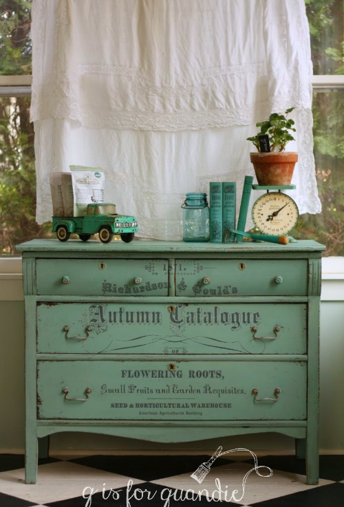
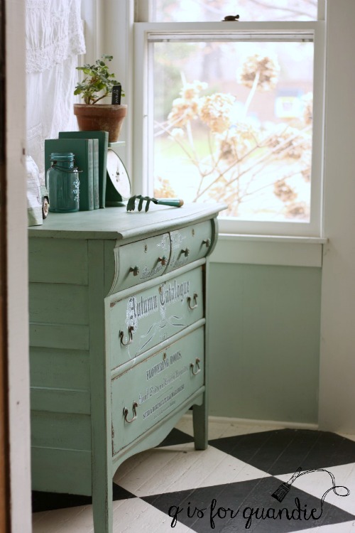
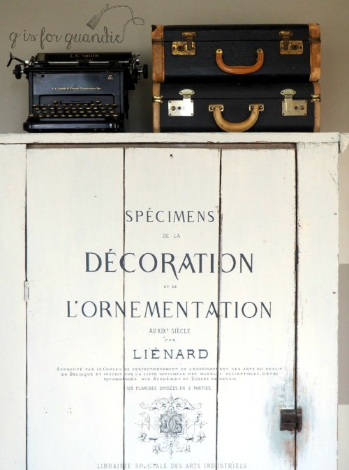
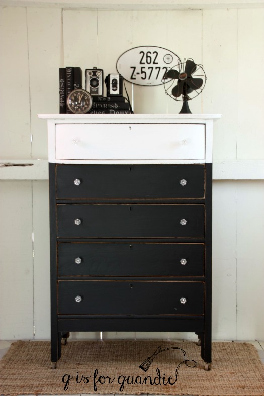
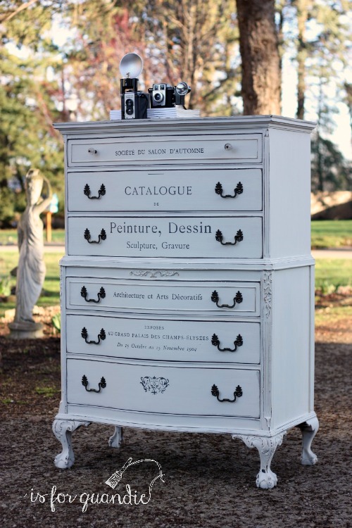
It probably goes without saying that I have gotten just a little addicted to the Iron Orchid Designs furniture transfers.  I can’t seem to stop putting them on things.

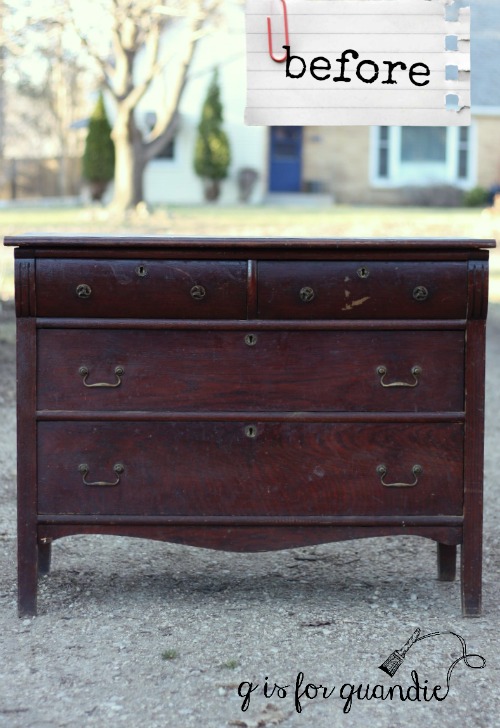
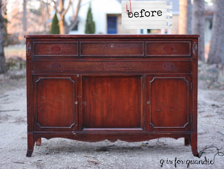
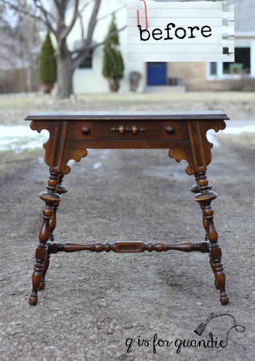
Today’s victim is a gorgeous dresser that I picked up a few weeks ago.

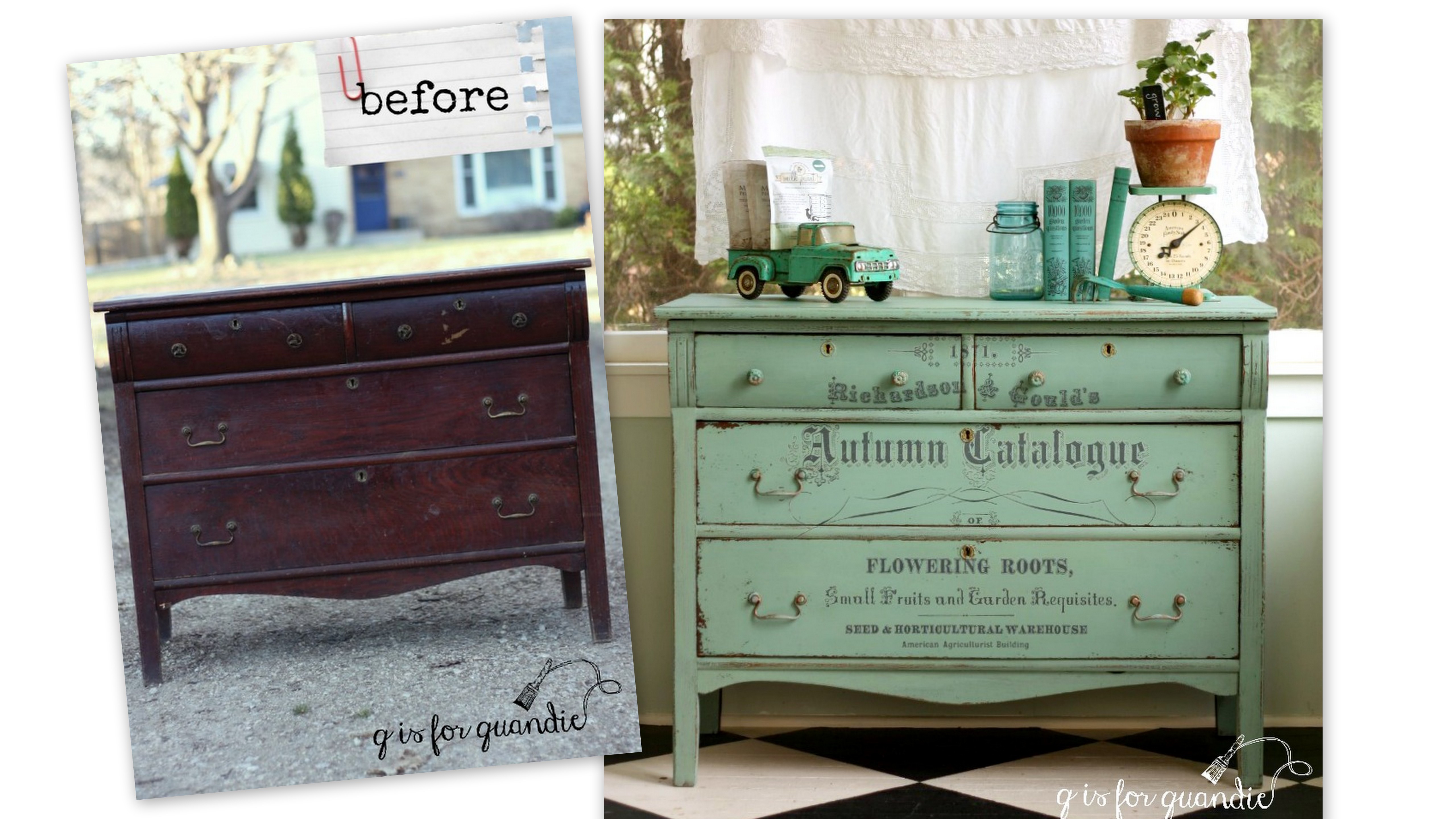
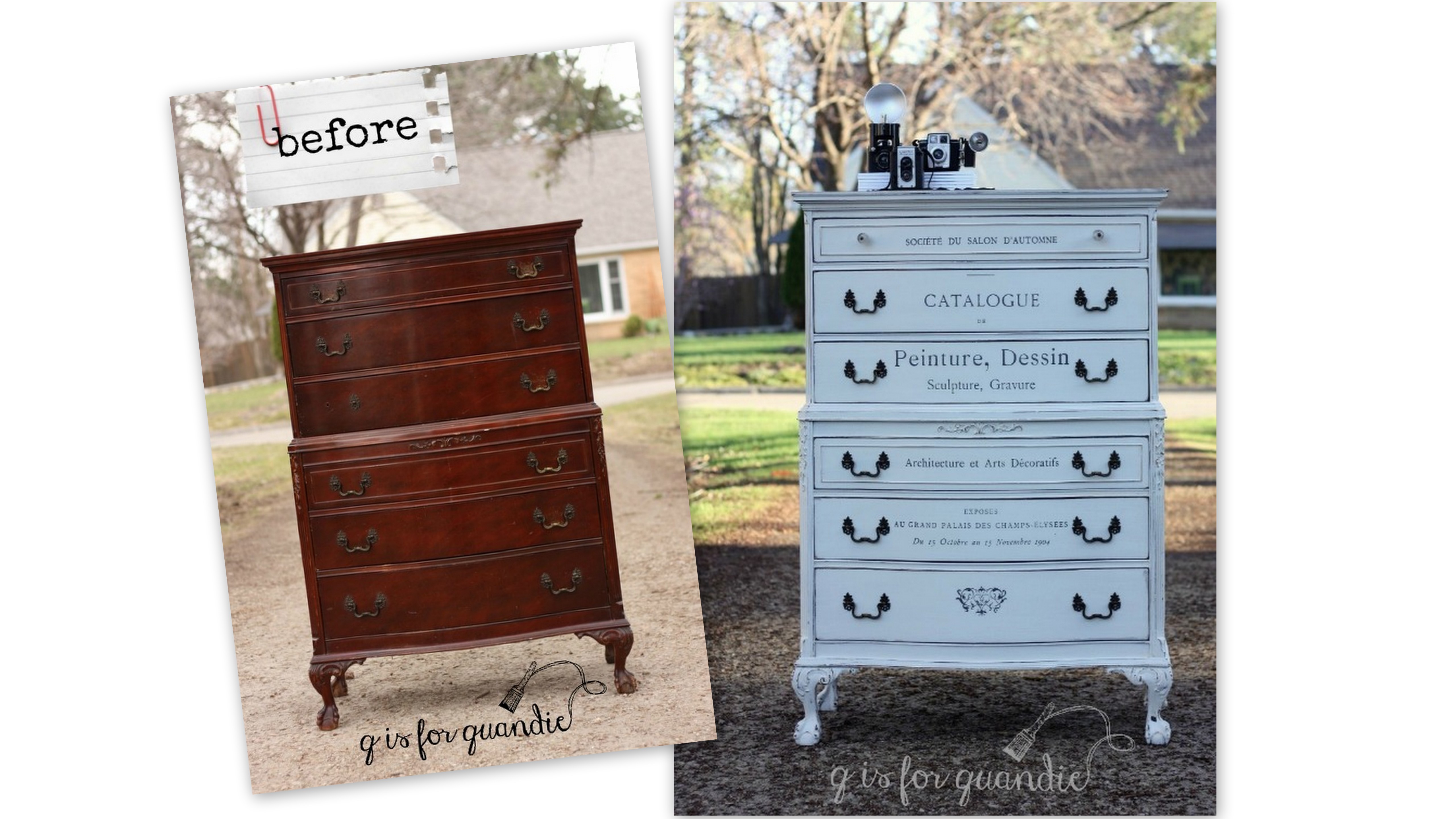
This dresser also came with a matching bed (you’ll see what I did with that later this week), and this was definitely a case where the seller was not a craigslist pro and thus didn’t understand some of the tips for improving the chances of selling your item.  Why?  Because first of all, she had one ad for both the dresser and the bed, and her lead photo was a dark and blurry photo of the bed.  So right off the bat she wasn’t going to entice anyone to click on the ad to see more.

Second, the photo of the dresser was also dark and blurry.  You really couldn’t see any of the gorgeous details it has.  Furthermore, she had very little text with her ad.  I think it said something like ‘bedroom set for sale’, which meant anyone searching for ‘dresser’ or ‘antique’ or ‘vintage’ wasn’t going to see this ad.

All of this worked in my favor because no one snatched this set up before I could get there.

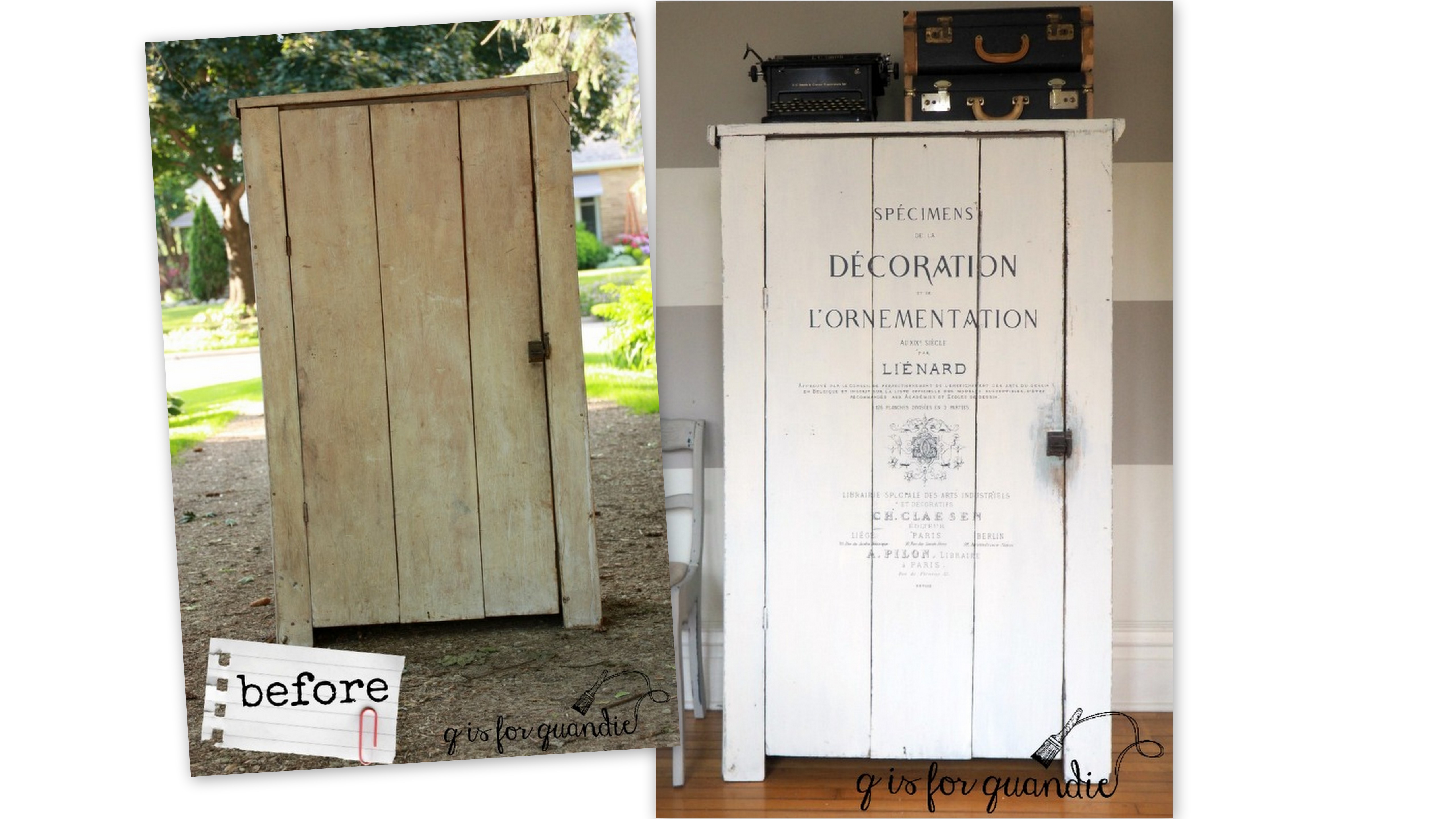
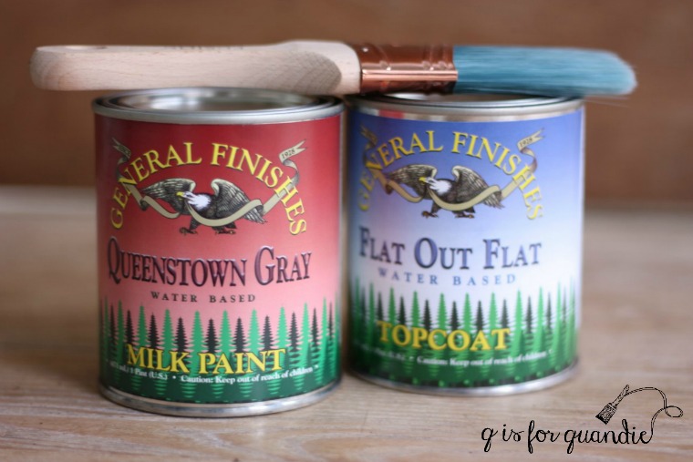
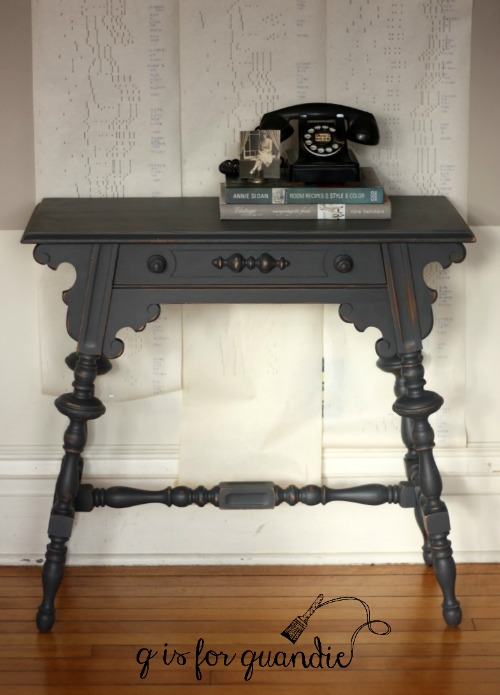
I wanted to use another furniture transfer on this dresser and I wanted a white background for that.  Painting one of these mahogany pieces white is always a challenge, plus this one required a little extra repair work as well.  In order to spare you from too many boring details, here’s what that included:  Ken repaired one of the back feet using a peg and some glue, I filled the drawer pull holes on the top drawer to make up for just one missing handle, I sealed the whole thing with Rachel Ashwell Clear Primer to prevent bleed through, I painted a base coat of Fusion’s Putty so I would have something to show underneath any chipping that wasn’t just red mahogany, I added three coats (yes, it still took 3 to get good coverage, even over the Putty) of Miss Mustard Seed milk paint in Linen, I applied the transfer, I sealed the whole piece with General Finishes Flat Out Flat.

Phew!

 But I think it was worth it, don’t you?

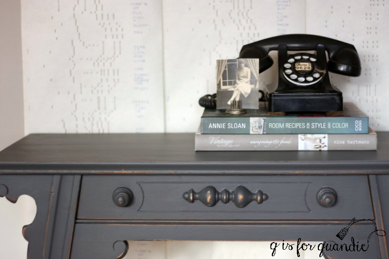
If you’re wondering about the transfer, I cut it apart and did each drawer separately which allowed me to center the design from top to bottom on each one.

In hindsight, if I had to start over on this one, I think I would have switched over to all glass knobs.  But maybe that’s just me.

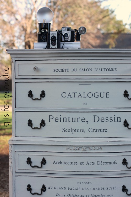
I think the drawer pulls take your attention away from the transfer a bit too much.  But by the time I put them back on it was too late to change my mind on that without having to re-paint the whole thing.  I also debated painting the handles white to help them fade away.  But in the end I decided that I should leave them alone.

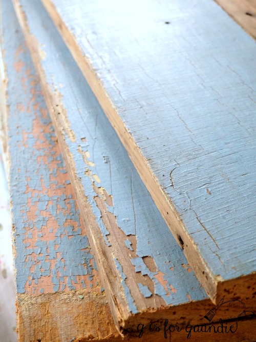
And if you’re wondering why I bothered with the undercoat of Putty, it was for exactly this result …

It adds a subtle depth to the dresser where the milk paint chipped without being too obvious of a contrast.

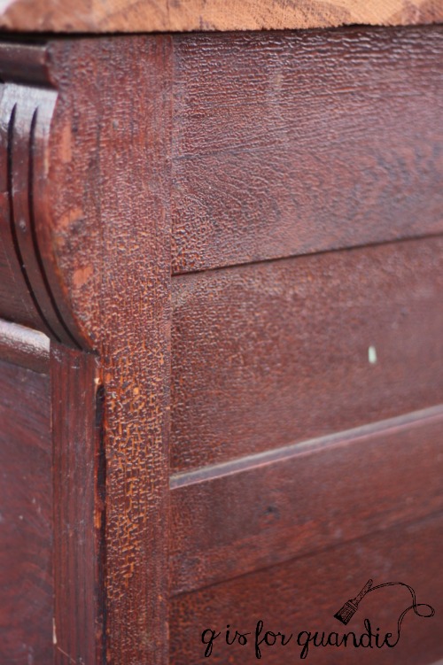
There are so many beautiful details on this dresser including the gorgeous ball and claw feet.

I love a good ball & claw, don’t you?

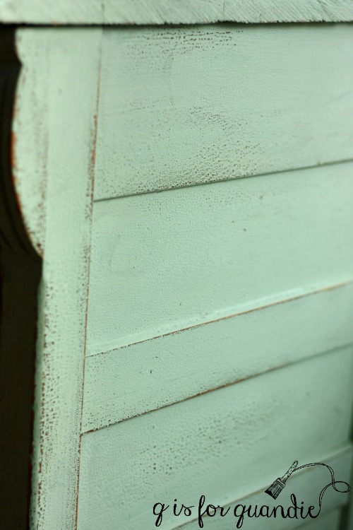
This was the first time I’ve used the Flat Out Flat.  I love how flat this finish is and that it doesn’t alter the color of the milk paint at all, which is a quality that I especially like when using white milk paint.  I did find that it crackled the milk paint just a tad.  You can see that in this next photo …

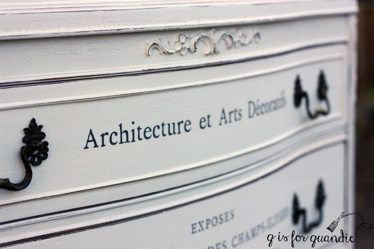
It’s possible that I added it too soon, maybe I should have let the milk paint cure for a couple of days first.  I’ll continue to experiment with the Flat Out Flat and keep you posted.

But in the meantime, this lovely dresser is going to be for sale.

Be sure to check out my ‘available for local sale’ if you are interested.

when is rusty just a little too rusty?

My friend Sue snagged this rusty old Cosco stool for me last summer.  I posted it on my Facebook page at the time with this caption.

I struggle with this question.  More so when I’m going to sell something rather than keep it.  Personally I like distressed, beat up items that show their age (no wise cracks about Mr. Q here please).  I sometimes cringe when people cover up a beautiful distressed patina with fresh new paint.  If I had been keeping this for myself, and if I liked the yellow and white, I would have cleaned it up and kept it as is.

But alas, I don’t need another stool, and I really feel like this item will sell better with a paint job.  This led to the next question, how should I prep it?  I have found that if you don’t seal a rusty metal piece, the rust will seep through your new paint.  Again, I don’t necessarily mind that.  It’s a fun way to change up the color of a metal item, but to instantly re-gain some of that rusty patina.

But again, how rusty is too rusty?  This stool had a lot of rust.  So I decided to go ahead and seal it.  I started by vigorously sanding the seat and back fairly smooth and lightly sanding the rest.  Then I painted on a coat of the Rachel Ashwell Clear Primer.  Once dry, I painted a coat of Fusion’s Laurentien on the base and Fusion’s Raw Silk on the seat back.

I know I’ve said it before, but it bears repeating.  I absolutely love Laurentien.  It’s a gorgeous pop of turquoise!

When the paint was dry, I felt like the stool looked far too crisp and freshly painted though.  So I sanded down the edges of the seat back.  And the tops of the steps.

But when I started sanding the edges of the seat itself I quickly realized that I didn’t like seeing the yellow peek through, so I decided against any further sanding.

As I studied the ‘finished’ stool, I really felt like it needed just a little something more.  So I pulled out my Iron Orchid Designs transfers.  The bottom section of the small “Richardson Seeds” transfer was a perfect fit for the seat back (I used the full transfer on the green window recently).  This is another of the cool things about these transfers, you can use just a portion of one and save the other part for another project.

To give the transfer a little extra protection, I waxed over it with clear furniture wax.  But I assume the future owner of this stool won’t actually be sitting in it leaning against the back too terribly often.  If I was expecting that kind of use I would add a matte finish poly over the transfer.

Although this would be adorable in a potting shed, I think the comments on my post for the Blue Alligator dresser on Monday pretty much established the fact that most of us aren’t lucky enough to have one.

 So, how about just using it in your kitchen as intended?

After all, when a step stool is handy, everything else is too!

blue alligator.

I had been keeping an eye on the Craigslist ad for this dresser for at least a month.  I thought it had potential, but at $100, it was overpriced (which is why it sat on Craigslist for so long).  I finally decided to send the seller a lower offer and they agreed to my price.

When Mr. Q and I arrived to pick it up, the seller told me that she’d had it posted for $200 originally and it never sold.  She’d ultimately realized that she really just wanted it out of her garage, so that’s why she lowered the price to $100 and then further agreed to my even lower offer.  The implication being that it was worth way more and I was getting a heck of deal.

Some people seem to think that anything that is more than 80 years old is a valuable antique.  Not true.  Condition is everything in the world of antiques, and this dresser was in pretty poor condition.  Starting with the fact that at some time in its life someone cut the sides off the top.  I assume they needed to fit it into some narrow space and the only way to accomplish that was to trim it down a little.  In addition, just check out this alligator-ed finish …

On top of that, the knobs on the top drawers were completely bent and misshapen, the drawers were hard to open, and there were paint drips all over the top.  And did I mention that it was positively filthy and obviously had been in that garage for quite some time?

But I bought it anyway.  I could see it still had potential, just not $100 worth of potential and certainly not $200 worth!

To get started, I sanded it down just slightly and then cleaned it with vinegar water.  Next I sanded down the sides of the drawers (where they sit on the glides) and then rubbed a block of canning wax over them so they would glide more easily.  Then I once again used my ‘perfect chipping method‘ and added some Homestead House Salad Bowl Finish (you can also use Miss Mustard 100% beeswax) in spots that I wanted to chip.

Choosing to go with milk paint on this dresser was a no-brainer.  Milk paint and alligator are the perfect pair.  The tricky part was deciding on a color.  Since I’d gotten several comments recently from readers who love seeing more color and are bored with white, I thought it would be fun to go more colorful with this one.  I wasn’t in the mood for any of the straight up milk paint colors I had on hand though, so I decided to create my own.

Now I’ll just go ahead and apologize right now to those of you who might want to try and recreate this color.  Not that you can’t do it, but it will require three different colors and two different brands of milk paint because this color is a mix of equals parts Homestead House Loyalist, Homestead House Upper Canada Green and Miss Mustard Seed Kitchen Scale.

I think I’ll call this color Blue Alligator.

And see what I mean about milk paint and alligator?  Such an awesome effect.

I’m not sure any of my photos do justice to Blue Alligator, and I don’t think I can adequately describe how it differs from straight up Kitchen Scale.  It has a little more green than Kitchen Scale (thanks to the Upper Canada Green), and it’s a little more muted (thanks to the Loyalist), and it’s a little bit lighter.

And I have to tell you, I loved this color so much I painted two more things with it.  A chalkboard and another piece that you’ll be seeing in the next week or two.

Painting this piece ended up being the easy part.  Two quick coats and it was done.

Next came the exciting part.  I pulled out another of my Iron Orchid Designs transfers.  This is the larger version of the same design I used on my green window last week.  In fact, this transfer was actually too large to use on this dresser ‘as is’, so I cut it apart and just used the sections that worked.  If you look closely you’ll see that my dresser is a mishmash of various pieces of it. I did each layer (top, middle, bottom) of drawers separately.

According to the Iron Orchid Designs YouTube videos, you can put any typical top coat over their transfers.  So I went ahead and waxed the dresser with Homestead House furniture wax next.

Finally, I found some knobs in my stash for the top two drawers.  They looked a bit too new next to the original drawer pulls though, so I decided to try a new technique on them and added a copper patina.  I’m going to post about that process in more detail later this week, so be sure to check back for that.

So now, what do you think?  Is this thing just gorgeous or what?

OMG!  Right?

Wouldn’t this dresser be amazing in a potting shed?

I could also see it working perfectly as a small buffet in a dining room.

It actually looks pretty much perfect right in that spot on my front three season porch.

But I’m not planning to keep it.

Of course, if it doesn’t sell … well, let’s just say I won’t be crying in my coffee.

For now though, this dresser is for sale, so if you are local and need a gorgeous dresser be sure to check out my ‘available for local sale’ tab.

rescued from a bad 80’s makeover.

For a little while there I was having a serious furniture dry spell.  I had one piece in the Carriage House that was waiting for warmer weather and for Ken to perform some handy-man miracles (Ken is very susceptible to the cold).  Other than that, the Carriage House was empty.  Yep, you heard that right.  I am not one of those furniture re-vampers who has a storage facility full of pieces waiting for their moment in the sun.  I actually get a little twitchy when I have too much stuff being stored.  I prefer to turn pieces over quickly.

But the downside is that sometimes I run out of furniture to work on and there is nothing available on Craigslist.  And when I say nothing, what I mean is nothing that meets my criteria of not too far away, not too expensive, and with lots of potential.

As usual though, when it rains, it pours.  I went from finding nothing to spending three evenings in a row picking up pieces.  I came home with a three dressers, a bed, a desk and this washstand.

I paid a little more than I normally would for this piece.  Why?  Because it was crying out for a rescue from its 80’s style makeover.  Just check out those grape cluster decals.  Gack!  And those horrible knobs.  Ugh!  I have to tell you guys, one of my pet peeves is when people put two knobs in the holes that were originally meant for a drawer pull with two screws.  I get why they do it, but every time I see it I cringe a little inside.  It’s just not right.

But if you look past the bad knobs, those awful grapes, and that really splotchy orange-y stain, this is a gorgeous little washstand.  Such pretty details, right?

The prep on this piece started with stripping the top.  The wood was so lovely that I wanted to show off some of it.  While the stripper was doing its job, I scraped off those decals.  They came right off with a sharp razor blade.

Next I dealt with those pesky knobs.  I was really hoping that I had 4 matching vintage pulls that I could use, but no such luck.  I did have a pair of absolutely gorgeous pulls that I have been saving for special piece though.  And it just so happened the holes on the upper drawer were spaced exactly right for them.

So I decided to use those on the upper drawer and just simple single knobs on the two lower drawers and the door.  To accomplish that on the drawers, I had to fill in the existing holes and later drill a new single hole in the middle.  Filling holes like this is really very easy.  Put some tape across the hole inside the drawer so that as you add wood filler from the front it doesn’t just escape out the back.  Then, fill the hole with wood filler.  I used Elmer’s Pro Bond Wood Filler in Walnut on these drawers, mainly because that’s all I had on hand.  The walnut was a bit dark, but I was painting over it anyway.  All of the wood fillers claim to ‘resist shrinking’, but I find that they all shrink.  In other words, when your fill dries it will recede back a little.  So go back with another application of fill.  Sometimes you’ll even have to do this a third time (I did with this piece).  But you want that filler to be nice and flush with the surface of the drawer, not sunken in at all, or they will show later.

I let my stripper and my drying wood filler sit overnight.  The next day I scraped the stripper off the top and gave it a good cleaning.  Then I sanded the body of the whole piece lightly and gave it a good cleaning too.  I decided to use my method for perfect chipping again on this piece (more details on that method here), so I added a little beeswax to all of the edges.

Then I painted three coats of Miss Mustard Seed milk paint in Marzipan.

Once again, perfect chipping, just where I wanted it!

See my little photo bomber?  My cat Lucy is hiding underneath the washstand.  I couldn’t get her to stay out of my photos.

I was initially considering staining the top of this piece, but the wood was so pretty in its bare and natural state so I waxed it with Homestead House furniture wax.  But that brought out a little too much of the golden hue of the wood, so I toned it down by adding some Homestead House white wax over that.

Not so golden, and definitely no longer orange!

What do you think?  Did I successfully rescue this washstand from the 80’s?

This little charmer is for sale while it lasts.  Pieces this size make a perfect bedside nightstand!  Check out my ‘available for local sale’ tab for more details.

a swing and a … miss?

I have a decorating split personality.  I really struggle with it.  You see, the problem is, I like more than one style.  As a result I often find myself going sort of half-way there and ending up missing the mark entirely because I can’t commit fully one way or the other.

For example, I love the French Nordic look with mostly white painted pieces, lots of age showing and maybe a hit of black or grey.  Love, love, love this look.

source

That’s the direction I headed in with my new Specimens cupboard.

But I also love color.  Especially pale aqua, but also blue and greens, and I don’t mind mixing in some pinks or yellows as evidenced by the collection of stuff in my pantry.

You can’t really mix these two styles without diluting them somewhat.  Certainly not in the same room, or rooms that are visible from one another.

So my problem is, I really want to gravitate towards the French Nordic look, but I can’t bare to part with some of my favorite more colorful pieces.  I’ve been making a concentrated effort to head in that direction over the past year or so though.  That is partly behind my switch from the Kitchen Scale buffet (even though I still love that color!) to the Specimens cupboard, although function also played a part in that decision.

As part of that switch, I also recently repainted my grandmother’s chair.  If you’ve been following me since the beginning you may vaguely remember when I painted this chair in Miss Mustard Seed’s Flow Blue.  That was three years ago!  My how time flies.

I wasn’t too sure about the Flow Blue on this chair.  It was the first time I’d used that color and I was a little startled by how bold it was.  But it grew on me over time and it worked well with my blue walls.

But in keeping with my switch to a more neutral palette, I decided a muted grey would work well on this chair.  Since I have a ton of milk paint on hand already, and I’m pretty frugal, I also wanted to use a color I already had.  I went to my milk paint supply cupboard and looked for some Miss Mustard Seed Trophy.  Nope, didn’t have it.  How about some MMS Schloss, that’s what I really wanted.  Nope, didn’t have it.  Then I saw my bag of Homestead House milk paint in Bedford.  I love this color, but it is definitely a very warm greige rather than a typical grey.  But I thought it might work.  So I mixed some up and painted the chair.

Hmmm.  A swing and a miss?  When I put the chair back in place, I really didn’t love it.  I don’t think it works that well with the blue walls.

But then I moved it over next to the Specimens cupboard …

And it seems to be much more at home.   So for now I think I’ll leave it in this spot, and I’ll keep on working towards that French Nordic style.  The next thing to go might be those horizontal stripes on my walls in this room.  Be sure to stay tuned!

the specimens de la decoration cupboard.

I’m not terribly savvy when it comes to Facebook.  I don’t seem to notice when people leave me messages there, so if you have ever left me one and it took me forever to get back to you, please don’t take it personally.  Somehow I just don’t see them.  I also rarely post stuff on Facebook.  I do have my blog linked to my Facebook page so my blog posts appear there automatically, but if you really want to interact with me the best way is to leave a comment here on the blog.

That being said, I recently joined a new Facebook group, How to Paint like a Pro, that was started by the Fusion people.  It has reminded me to never underestimate what you might learn from a group of like-minded individuals on Facebook.

I was randomly perusing the posts and I stumbled across one about some new furniture rub-on’s that are available from Sweet Pickins.

Seriously, are you freakin’ kidding me?  How long have I been wishing I could find large furniture sized rub-ons??  And how did I not know these were available?

I immediately dropped everything I was doing and went online and ordered two.  Each one was $23, plus I paid a flat $6 for shipping.  I think that is a bargain when you consider that one is 24″ x 36″ and the other is 18″ x 36″.  These are large rub-ons (or transfers, if you prefer).

They also arrived lickety split.  I ordered them on Wednesday and they arrived on Friday.

And I simply could not wait to give one a try and luckily I had the perfect ‘canvas’.

A couple of summers ago I purchased a pair of primitive cupboards.  I sold one, but kept the second one.  It was a bit dingy and had some water stains.

I was planning to use it in my bedroom, and I even went so far as to paint it with one coat of Miss Mustard Seed’s Eulalie’s Sky, but that was as far as I got.  It had been sitting out in my carriage house ever since.  I even removed the door and used it to display merchandise at my last Carriage House Sale.

I wanted to go back to white, so I started by painting the cupboard with a couple of coats of Rachel Ashwell’s Clear Primer.  Those water stains that I mentioned earlier had bled through the Eulalie’s Sky, and I didn’t want to see them coming through the white.  Next I added three coats of Miss Mustard Seed’s Linen milk paint.  The primer did its job perfectly, no stains.

I intentionally left the area around the door’s hardware unpainted and blended my paint around the edges of that area, I love the worn look it gives the cupboard.  I also sanded the edges a bit to distress.  You can’t see that very well in the photos but it did make a difference.

Next I separated the transfer from its backing paper and taped it in place on the door.

I adjusted it a couple of times to get it centered and straight.  Once I was satisfied with the placement, I used the little wooden tool that came with the transfer to carefully rub the entire design onto the door.  This was a little putzy and a bit of an arm workout to be honest.  It took close to 30 minutes to do the entire thing.  But it was so worth it!

Once I was satisfied that I had the design rubbed on sufficiently I very slowly and carefully pulled away the plastic sheet it came on making sure as I went that the entire design was adhered to the cupboard door.

It worked beautifully.

By the way, these transfers are charcoal grey rather than black.  I like that about them too.

In fact, I could not be any more in love with this product, or this cupboard.  So much so that I am going to keep it right here in this spot.

You may have realized at this point that this is where my Kitchen Scale buffet used to reside.

Yep, it’s being replaced.  I’ve actually been thinking about making this switch for a while.  You see, the thing is, this is the room that I paint in during the winter.  Instead of housing china and silver, my buffet was storing paint supplies.  This cupboard is going to work so much better for that.

Somehow it now seems entirely appropriate that the door to this cupboard says “specimens de la decoration et de l’ornementation” right?

By the way, I didn’t alter the inside of the cupboard at all.  It came with these painted boards as shelves and I just love their chippy patina.

After all, I’m just storing painting supplies in this cupboard.  If I was going to use it for clothes or linens I would add a coat of two of some kind of sealer to the boards.

What do you think?  Would you have kept the buffet, or made the switch like I have done?  And what do you think of the cupboard’s new look?

If you’re thinking of ordering a couple of transfers yourself, I should warn you that I went back and ordered six more yesterday so you better get on it before they are all sold out.

And P.S. the Kitchen Scale buffet is for sale.  Check out my ‘available for local sale’ page for more details.

Sharing at Silver Pennies Sunday.

the queenstown gray buffet.

I shared the ‘before’ picture of this buffet with you last week.

My friend Sue purchased this piece via Craigslist for herself.  She got as far as removing the hardware to get it ready for painting, but then she decided she didn’t really want to tackle it after all and she offered to sell it to me.

Since Sue lives only a couple of blocks away, this was one of my easiest ‘Craigslist’ pickups ever!

I waffled between using Fusion’s Midnight Blue or the General Finishes Queenstown Gray on this buffet and I think either one would have been a great choice, but in the end I went with the gray.  Had I realized I would end up posting this on St. Patrick’s Day I would have chosen green!  No, not really.  Green might be a bit much on this one.

Plus, there was a pretty good chance that the red stain on this piece was going to bleed thru my paint, so going with a dark color helps disguise that.

I’ve generally had really good luck with this strategy, but be forewarned that a dark color does not always solve bleed thru problems.  Sometimes you will have to seal a piece to prevent bleed thru from showing and you can use shellac or a clear primer for that.  I like using the Rachel Ashwell clear primer when I need to seal something.

But I did not seal this piece.  I sanded it very lightly, wiped it clean with a damp rag and started painting.  After giving the first coat of paint about 24 hours to dry (because some times bleed thru can take a while to show up), I gave it a close inspection to see if there were any spots of bleeding.  If there had been, I would have then added some clear primer to those spots before adding a second coat of paint.  However, there weren’t, so I added a very light second coat of paint and voila …

I staged it with a lamp wearing my Florence map lamp shade.

I purchased my lamp shade at Junk Bonanza from a vendor called Light Reading (check them out here).  They make gorgeous stuff, and it looks like they will be at the Minnesota Junk Bonanza again this spring.  So if you are in the Twin Cities and could use a cool lamp shade, check them out.

The 2nd drawer down on this buffet is very shallow and has dividers for silverware storage.  It came with some pretty grungy felt lining.  I replaced the felt with some toile patterned fabric instead.

When my sister popped by to pick me for another afternoon of house hunting last weekend, she really loved this buffet.  But she has to wait until she has a house before she’ll know whether or not she needs any new furniture.  And actually that may be soon, but I don’t want to jinx it so I won’t say more.

 In the meantime, this buffet is for sale!  Check out my ‘available for local sale’ page for more details.

general finishes milk paint.

There are several furniture refurbishers out there whose work I really admire and they extol the virtues of General Finishes Milk Paint.  So when I ended up in a shop that sold this product while out shopping with some friends recently I decided to pick some up and give it a try.

The first thing you need to know about General Finishes Milk Paint is that it isn’t really milk paint.  I know, confusing right?

Here is what they say about the paint on their website:  GF’s Milk Paint is not a true Milk Paint – it is premixed and does not contain any casein based ingredients. We named our product Milk Paint with the intention of putting a clear, bright, contemporary spin on an old fashioned furniture paint tradition. It is designed to mimic the low luster finish of old world paints.

So if you are buying this paint and expecting to find a powder you’ll mix with water inside the can, guess again.  And if you are used to using this ‘milk paint’ and then you buy some Miss Mustard Seed or other true milk paint, don’t be surprised to find that it’s totally different.  Also, just know that you won’t get the chippy look that milk paint is known for with this paint.

The fine print on the can says that this is an acrylic paint, and for that reason it didn’t surprise me to find that it is very similar to Fusion paint.  Much like Fusion, it does not require a top coat (whereas chalk paint and milk paint require a top coat to be water resistant).  It also has the same self-leveling properties as Fusion.  It also distresses in a similar fashion, and by that I mean that neither of these paints distresses as easily as a chalk or milk paint.  These paints are meant to be very durable, so the longer you wait between painting and distressing, the harder it will be to sand off the edges for a distressed look.  Just be sure to distress promptly, if you plan to distress at all.  For those who prefer a non-distressed finish, both of these paints are perfect for that.

OK, so now that we have all of that info out of the way, let’s see how it looks.

I started with this petite desk that a friend gave me a while back.

I have to admit, I thought this desk was kind of hideous but it was either me or the Goodwill so I took it.  If nothing else, it provided a great canvas for testing out a different brand of paint.

You got a little sneak peek at this one in my post about my painting chair

Yep, this is where I paint in the winter.  Smack in the middle of my house.  And that chair was the perfect height for painting all of those spindly legs.

And now that it has a couple of coats of General Finishes Milk Paint in Queenstown Gray, well …

it’s kinda cute now, don’t you think?

As you can see, I did distress this piece and I did it about a week after I painted it.  So it can definitely still be done, it just takes a little more effort.

I lined the drawer with some pretty map paper.

Although I’ve called this piece a ‘petite desk’, it’s definitely too small for me to use as a desk.  It would be perfect for a youngster’s desk, but I think it would also work really well as a console table in a foyer or behind a sofa.  It also is the perfect height to be used as a nightstand.

Back in the day, it would have made a great telephone table, but nobody needs those anymore, right?

In the end I think this paint is very comparable to Fusion paint.  It’s just a bit more expensive (at least at the shops where I buy my paint), but not a lot.  If you love working with the General Finishes Milk Paint, you will also love Fusion paint and vice versa.  But obviously, if you’re looking for a true milk paint you aren’t going to find it here.

If you noticed in my first photo, I also bought a can of General Finishes Flat Out Flat topcoat.  I did not use that on this desk.  I have heard really good things about it as well, and I hope to test it out on something soon so stay tuned.

In the meantime, this little desk/nightstand/telephone table is for sale.  Be sure to check my ‘available for local sale’ page for more details.

the shoemaker’s children go barefoot.

The shoemaker’s children go barefoot.  You’ve heard that expression, right?  In this case it’s more like the shoemaker herself who is barefoot.  I am always painting things to sell and often don’t get around to projects for myself.

But it has been a slow couple of months in the world of furniture sales, or at least for me it has been.  So this past weekend I decided to tackle something of my own that I’ve been meaning to paint for quite some time.

It’s another small chair that I use while painting furniture.

painting-chair-before

This chair is nice and low and allows me to paint the bottom half of furniture in comfort.  Normally it’s out in my carriage house workshop and it really doesn’t matter what it looks like, but in the winter I bring it in the house.  When I’m not using it, it sits in the corner somewhere, so it would be nice if it weren’t quite so ugly.

Initially I was going to paint it in Fusion’s Laurentien, which is a pretty turquoise, but after finishing the cutting board makeover I did last week I decided to go with those colors instead.

So I started by painting the entire chair in Fusion’s Putty.

painting-chair-with-putty

Hmmmm, pretty blah, right?  I almost switched gears again at this point and just painted it turquoise.  But then I reminded myself that I still had to add a few details.

So I added some grain sack stripes in a creamy white, and then a fun stencil.

painters-chair-close-up

I ordered this stencil from Etsy a while back, but hadn’t had a chance to use it yet.  It fit perfectly on my chair seat.

painters-chair-stencil

painters-chair

Now I have a charming little chair to sit on while I paint furniture smack in the middle of my piano room (which is where I paint in the winter).

And I won’t have to hide it in a closet when people drop by for a visit.

What do you think?

black & white.

Black and white has always been one of my favorite combos.  Back in June 2015 I painted this fun mid-century piece

black and white title

And then about a year ago I painted some black & white suitcases

inspiration title

I was really itching to do another black & white piece when I saw this dresser on craigslist and decided it would be perfect for it.

black-and-white-before

From the outside it looks like it’s in great shape, but in reality it was pretty wonky.  One drawer was completely missing a bottom, and most of the bottom sides of the drawers (where they rest along the glides) were pretty worn down.  So I sent it over to Ken’s workshop and he fixed it right up by replacing the missing bottom and adding new wood to the bottom sides of several drawers.  He also removed the top and re-glued the corner joints and added some wedges of wood for more stability.   All I had to do was add the paint!

black-and-white-1

The black is Fusion’s Coal Black and the white is Fusion’s Casement, two coats of each color.  Every time I paint with Fusion I am reminded of how ridiculously easy it is to use.  A quick sanding to rough up the surface (especially on this piece because the existing finish was very shiny), a wipe down with some vinegar water, two coats of paint, and a little sanding to distress the edges and you are done.  No need for a top coat.  Fusion has pretty much replaced chalk paint for me for that last reason.  Originally when I first started using Fusion I felt like it was hard to distress compared to chalk paint.  However, when I distress a piece of furniture I mainly just wear down the edges and that is pretty easy to do with Fusion as long as you do it shortly after the piece dries.  Don’t wait until the paint has cured because this paint is very durable at that point.

I really debated doing this look again because that earlier black and white piece took a while to sell.  But in the end, I’m so glad I went for it.  I think this dresser went from boring to interesting with just some paint and some new glass knobs.

black-and-white-close-up

The white is wrapped all the way around both sides.

black-white-side

This is one instance where I didn’t discard the mirror that came with the dresser.  I painted it white and the future owner can choose to keep it in place, or not.

black-white-dresser-with-mirror

By the way, have you noticed anything about my photos today?

black-white-photo-cottage

Yes!  I’m out in the photo cottage.  Are you having this amazing warm spell where you are too?  Sunny and 60 is practically unheard of for February in Minnesota.  I have taken full advantage by putting the top down on my convertible, grilling steaks for dinner, watching Mr. Q trim trees, hanging laundry out on the line and staging furniture in my photo cottage.  Woo hoo, it feels like spring!

black-white-dresser-with-fan

This dresser is for sale.  If you are local and interested, please check out my ‘available for local sale’ page for more details.

But first, tell me, what do you think of the black and white?

Sharing at Finding Silver Pennies Sunday!