the rest of the bed.

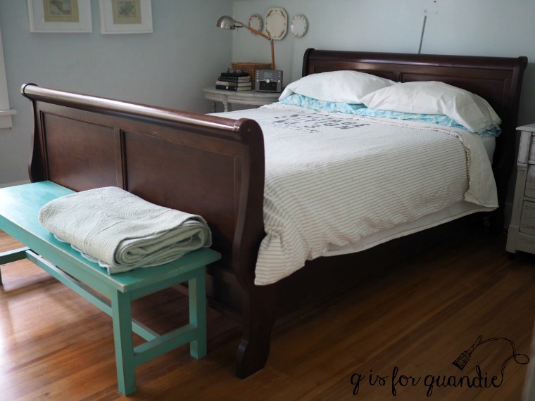
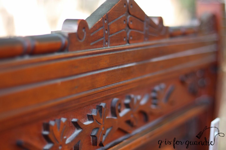
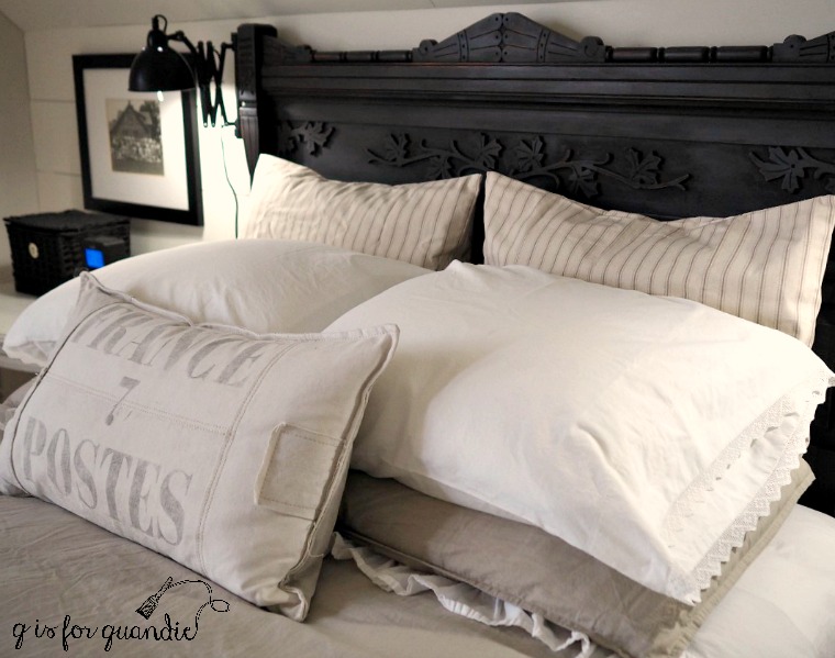
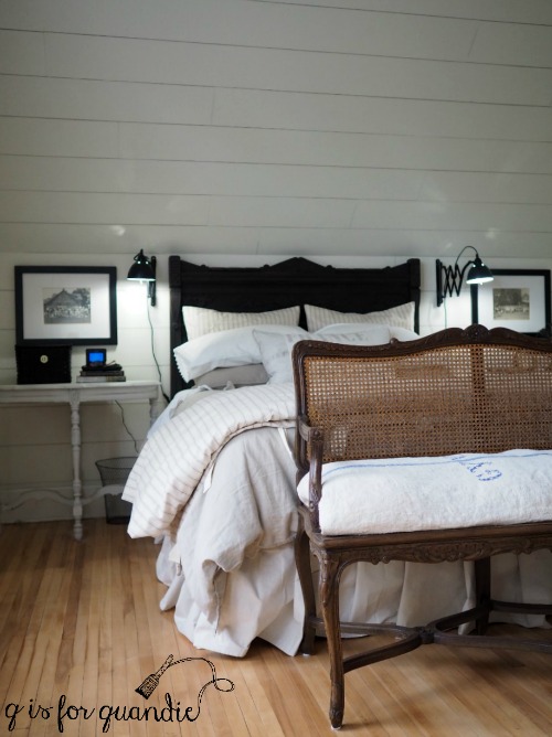
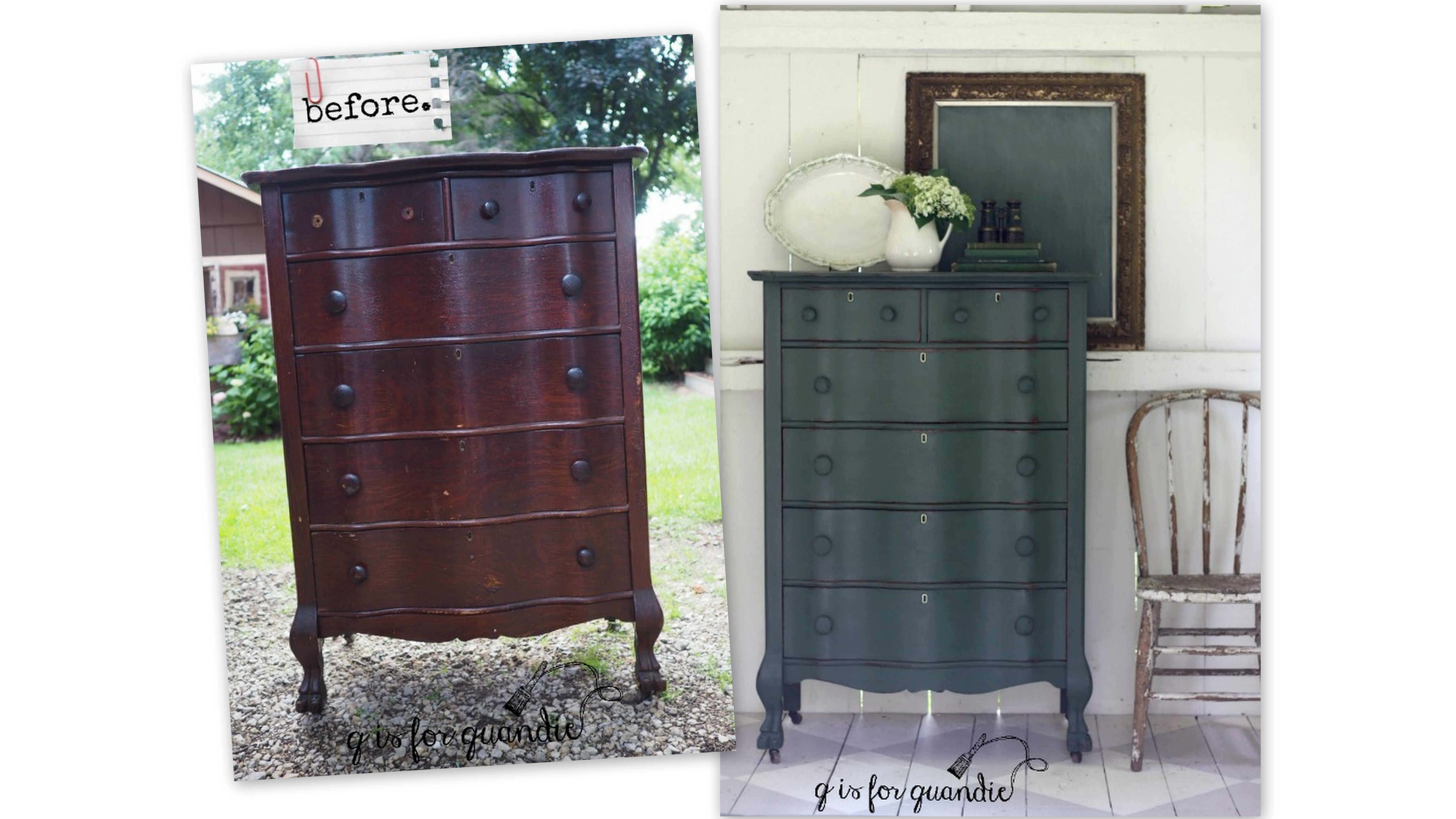
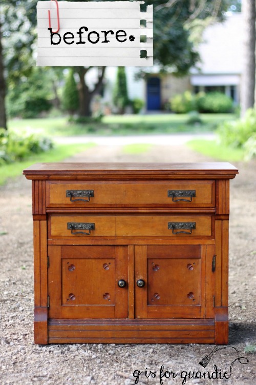
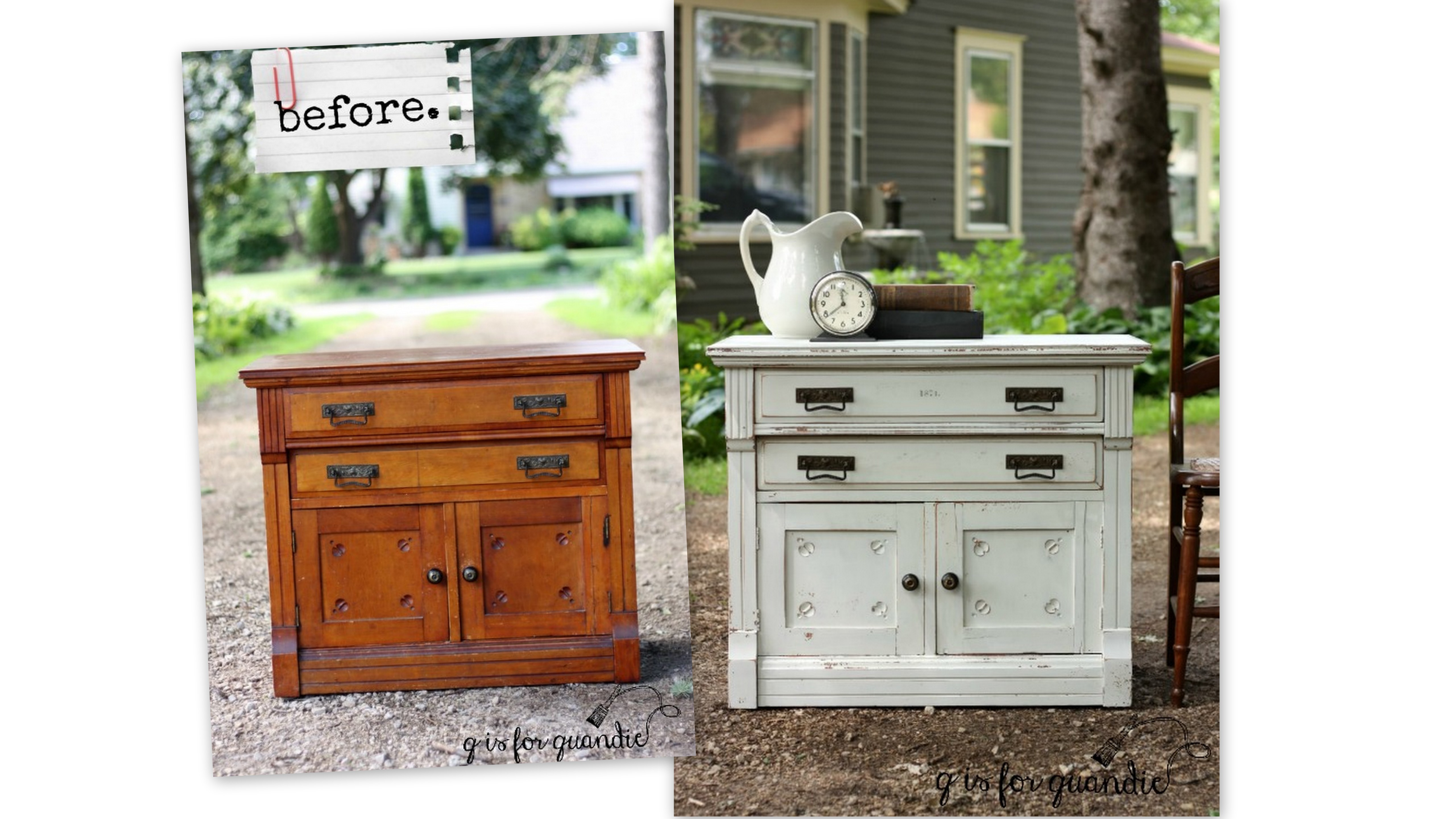
I showed you guys the full bedroom set that I purchased just to get the headboard for my master bedroom.

If you look just in front of the tall headboard you can see that the bed came with a foot board.  It also had side rails, but they aren’t pictured.

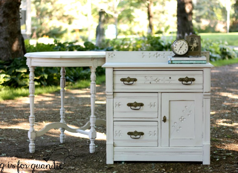
Since I modified the full size headboard to fit my queen size bed, I couldn’t use the side rails or the foot board, so I decided to re-purpose them.  I called Ken over for a consultation and explained that I wanted him to cut down one of the side rails and attach it to the foot board as a shelf.  Oh, and cut several inches off the legs.  Ken has gotten so used to me now that he doesn’t even question my crazy ideas anymore.  He just takes the pieces away to his workshop and a few days later brings them back completed.

And then I take it from there.

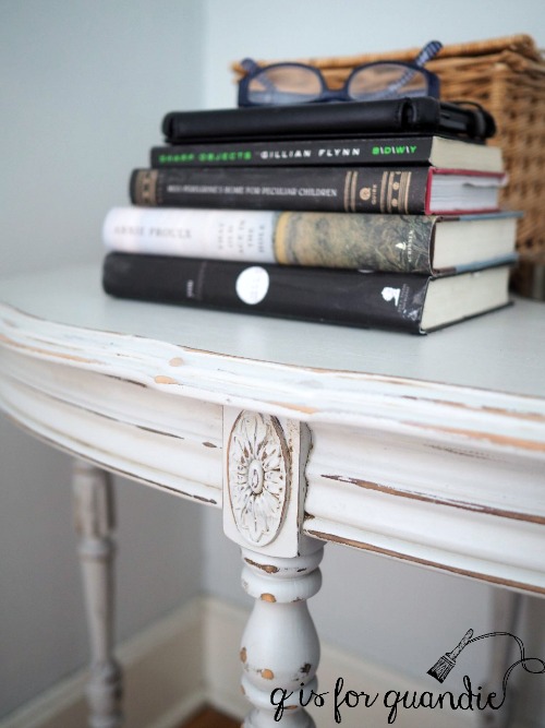
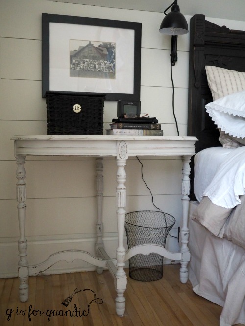
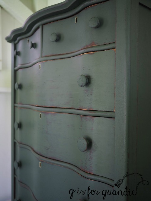
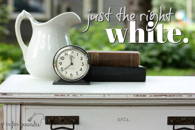
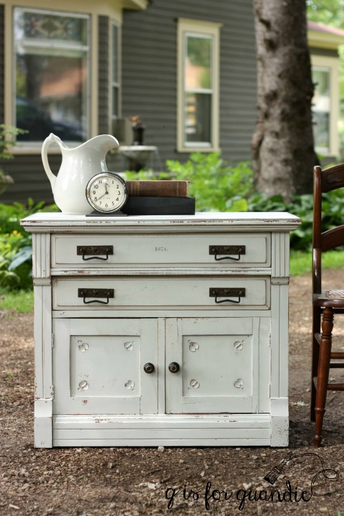
Initially I was going to paint this piece white.  I pulled out the packets of milk paint that Homestead House generously provided me with last winter to see what I had in white. I had Sturbridge White, a fairly bright white, and Champlain, which is more of an off white.  I also had a packet of Miss Mustard Seed’s Ironstone, also a bright white.  I knew I didn’t want bright white, so I chose the Champlain.

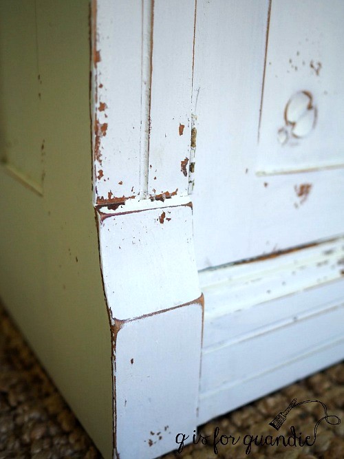
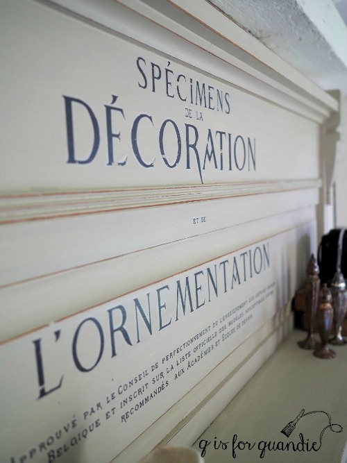
One thing you should know about the lighter colors of milk paint is that they sometimes will take on color from whatever is underneath them.  It’s not necessarily the same thing as when the stain bleeds through your paint because it’s more of an overall color not so much random spots of bleed thru.  This foot board had a very orange-ish colored stain on it.  That gave my Champlain a bit of a peachy look.  Ugh.  Not what I was going for at all.  So after two coats of Champlain, I switched gears and added a final coat of Homestead House milk paint in Stone Fence.

I love this color.  It’s a pale greige.  In hindsight this would have been the perfect color for something in my own bedroom!  It reminds me quite a bit of the Edgecomb Grey I used on my walls.

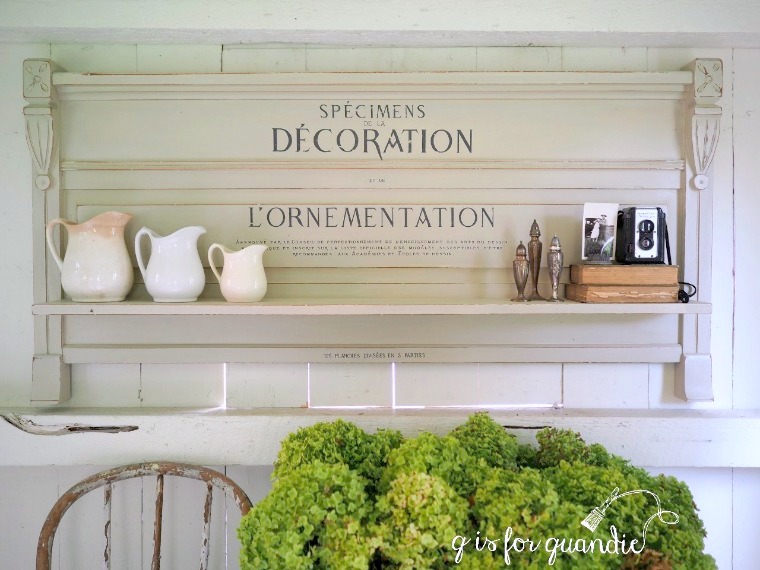
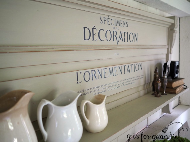
Once the paint was dry I sanded to distress, vacuumed away the dust, wiped it down with a clean cloth and then added an Iron Orchid Designs transfer.  I had to cut and paste the elements of the design to fit on the foot board, but that worked out perfectly.

I sanded over the transfer just lightly with 220 grit paper to take away a little bit of the shine.

Finally I applied some Dead Flat Finishing Cream from The Real Milk Paint Co.

A while back I tried the Low Sheen Finishing Cream from The Real Milk Paint Co and I loved it.  I wanted something just a bit more flat though, so I asked if they would be willing to send me a free sample of the Dead Flat in exchange for a review on my blog.  They were game and sent some out asap along with a brush for applying it.

The first thing that I really love about this product is how easy it is to apply.  It has the consistency of a thick body cream …

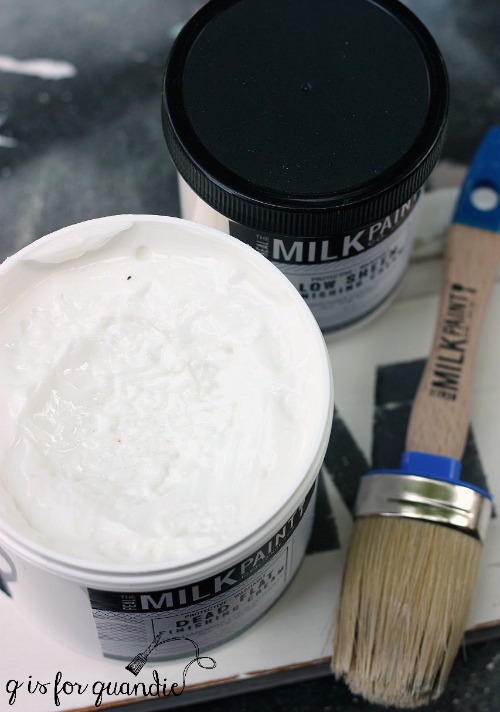
To apply I just dipped the end of my brush in the cream and then brushed it onto the surface.  You don’t have to work it in like wax, you don’t have to wipe away any excess like with hemp oil.  You just brush it on without over working it.  It dried quite quickly for me and I was careful not to over brush as it started to get tacky.

What I also love about this product is that there is very little smell.  I would definitely feel comfortable using this inside my house in the winter, which is an important quality for painters in Minnesota!  Furthermore this is a non-VOC product, it’s water based so you can clean your brush with soap and water, and after 24 hours drying time the finish itself is washable.  Also, you can paint back over the Dead Flat with milk paint as soon as the finish is dry.  That is not the case with wax or hemp oil.  That could be very handy if for some reason you need a do-over.  Say for example you realize that an IOD transfer looks terrible over dark green milk paint (been there, done that) and now you want to just start over.

I’d been looking for a finish to use over milk paint that is more durable than wax or hemp oil, but still has that matte look that I love and this one fits the bill perfectly.

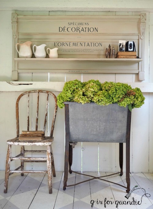
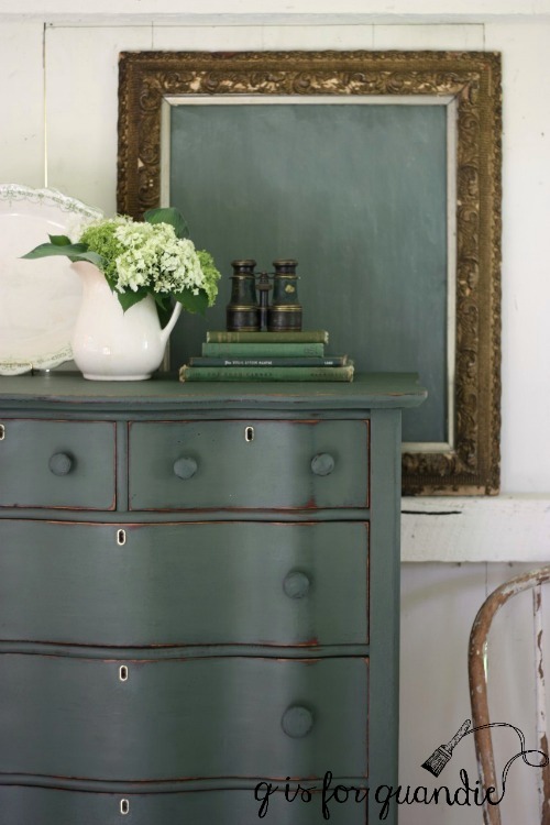
I used an old galvanized tub full of Annabelle hydrangeas in my photos.

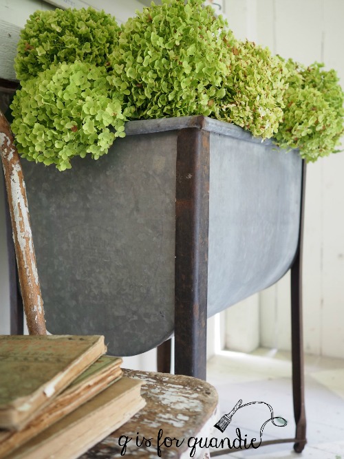
I’ve had this tub for years and I usually use it to hold shopping bags for my annual occasional sale.  Since I’m not having a sale this year, I decided I should dig it out and use it for something more decorative.  I filled it with flowers from the Annabelle hydrangea that is out back in my cutting garden.  This time of year the Annabelle’s turn really green, while the Limelights are starting to get a pink tinge.

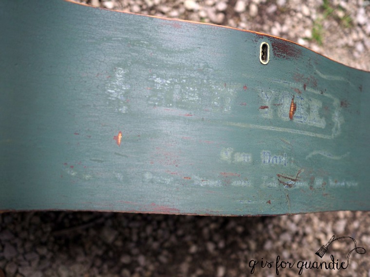
Oh, and as for the other side rail from the bed, I turned it into a Farmers’ Market sign.  I painted it with the Homestead House Sturbridge White milk paint, stenciled it with Funky Junk’s Farmer’s Market stencil, sanded it lightly and then finished with the Dead Flat.

It would be perfect hanging above a sideboard in a dining room, don’t you think?

Since I don’t have an appropriate spot for either of these pieces in my own house, they are both for sale locally.  If interested, check out my ‘available for local sale’ page for more details.


les industries d’amateurs.

I find that things never tend to look quite like I pictured them in my head.  This is especially true when I am decorating a room.  I’m sure there are people out there who are much better able to envision exactly how something will look, but those people are probably professionals while I am definitely an amateur.  Although then again, I’ve been watching old Fixer Uppers on Hulu lately and I just saw one where Joanna Gaines repainted an entire house because her first color choice didn’t look right.  So maybe we all have this problem.

When I started planning my bedroom makeover I knew I wanted to paint the jelly cupboard in my bedroom that I use for storing my clothes.  Easy enough.  I painted it in Miss Mustard Seed milk paint in Grain Sack, and then I added some Iron Orchid Designs transfers to the doors.  So far, this is exactly how I pictured the cupboard would look.

By the way, the IOD transfers that I used are meant for clay pots (google ‘Iron Orchid Designs French Pots III’ to find sources for purchasing online).  They come in a set of 3 different designs.  To get two of the same design I purchased two sets.  As you can see the design is curved to work with applying it to the curved surface of a pot, but I thought it worked just fine on the flat surface of my cupboard door as well.

I felt like the design of the one I chose was particularly appropriate.  Les industries d’amateurs for sure!

It was the next step that threw me off.  I had this vision of bringing up the vintage suitcases that were beside the Welsh cupboard in my dining room.  In my head they were going to be perfect stacked next to the cupboard.

But once I had them in place they looked really … well … brown.

Don’t forget that on the other side of the room is my black headboard …

But I do also have the brown bench.  And the bedding and walls are very warm greige tones.  So brown isn’t wrong, but I felt like the stack of suitcases was throwing the balance of the room in favor of brown tones and I didn’t like it.

So I took them away and I brought up the cane back chair from the living room.  I also added an old black shutter on the wall layered with a framed architectural drawing.

Definitely less brown.

But the height of the chair is a bit off, don’t you think?  It’s just too low for next to the tall cupboard.  But I love the shutter and print in that spot.

So I took away the chair and shopped around my house for something else to put in front of the shutter and I came across my faux dress form, Lula.

Turns out she is the perfect height for that spot, don’t you think?

When it comes to adding details to a room I often tend to ‘shop’ my own house.  I like to move things around, they always feel fresh when they are placed in a new spot.

I had to laugh when I was editing the above photo by the way.  Can you see why?  There are two things that are upside down.  I hadn’t really noticed that until I took a close look at the picture.  Did you spot them?  The Arctic Aire label on the fan, and the label on the spine of the book are both on upside down.  What a weird coincidence!

Anyway, I didn’t purchase any new things for this side of the room.  I just worked with items I already had.  Which is a good thing since I am pretty much out of money for this makeover after buying all of that bedding.  Luckily it’s almost done.  I’m just waiting on some mail order items and once they arrive and are installed I’ll share the full reveal.  In the meantime, I’m back to working on other projects.  I have a gorgeous dresser almost completed that I’ll be sharing soon.  So be sure to stay tuned.


the bed.

As part of my bedroom makeover, I knew I wanted to get rid of our 90’s sleigh bed.

I thought about using the barn doors that I salvaged from my in-law’s barn as a headboard.  But with the ship lap wall behind the bed the planked barn door felt like it would be a bit redundant. I also considered using a vintage door that I had on hand and placing it sideways on the wall behind the bed.

But then I saw this idea of modifying an antique headboard from Rachel at Shades of Blue Interiors.

Isn’t it gorgeous?

I started looking around on Craigslist for likely candidates and it quickly became apparent that the slanted wall behind my bed definitely limited my options.  Just scroll back up and look at that inspiration photo again, it’s tall!  And the height is a big part of what makes it fabulous.  I found several similar beds on Craigslist, all of which were far too tall to fit under my slanted wall.

Next I started looking for an antique headboard that either was short enough already, or could be cut down.  That’s when I spotted the ad for this bedroom set.

The headboard was about 4” too tall, plus the photo with the ad showed the bed with a mattress and box spring in place.  I couldn’t see the legs of the headboard to determine if they could be cut down.  So I contacted the seller and he happily provided both a photo of the legs and the opinion that I could easily cut 4” off the bottoms of them.

As you may know, Queen and King sized beds did not become popular until the 50’s and 60’s.  For that reason it’s next to impossible to find antique bed frames in those sizes.  But you can modify a full sized antique headboard to fit a queen sized bed pretty easily and I’m about to show you how.

The first step was to send the headboard over to Ken’s workshop.  It was a bit wonky and most of the joints were coming unglued.  Ken enjoys a project like this.  Remember the Humpty Dumpty dresser?  He likes to take these pieces apart and then put them back together again with all new glue (he also really enjoys jigsaw puzzles).  At one point the headboard was nothing more than a pile of pieces.  But Ken put it all back together again and now it’s nice and sturdy.  He also cut 4” off the bottom of each leg.

In the meantime, Mr. Q ordered a basic metal bed frame from Amazon.  Free shipping with Amazon Prime, and it was priced at less than $40.

Next we measured the width of the bed frame and Ken cut a board to fit that width and I painted the board black.

I debated stripping and refinishing the bed, which would have been lovely but a bit of a project with all of those details.

Since I firmly believe that every room should have a pop of black I ultimately decided to paint it black instead.  I painted it with Homestead House milk paint in Coal Black and I used their black wax as a finish.  I like pairing the black wax with the black milk paint because it deepens up the black so nicely.  By the way, in case you are wondering, the black wax has not rubbed off on our pillows at all and I waxed the bed about 4 days before we started using it.

Once all of the details were in place, we brought the headboard, the metal frame and the black board up to our room.  Ken thought it would best to assemble it in place.  Assembly was super simple.  Ken started by drilling holes in the board and bolting it to the metal frame.

Then we simply snugged it up to the headboard and attached the headboard to the board with screws.  Easy peasy.  As you can see, the metal frame is just a couple of inches wider than the headboard.  Once all of the bedding is in place, this difference won’t be noticeable at all.  Honestly, this could not be any simpler.  Anyone can accomplish this with a drill and some hardware.  So if you’re thinking about a new look for your bedroom, check out your local Craigslist and find a gorgeous antique that you can modify (if you are in the Twin Cities and can have a taller bed than I can, check out this one and this one).

Next came the bed skirt.  Since I wasn’t able to use the side rails and foot board that came with the bed, it definitely needed to have a bed skirt.  I looked at several online that I liked and the cheapest option was still $110.  It was much more affordable to copy from Catherine on Home Talk (check out that link if you want specific details) and use painter’s drop cloths.  I was able to get by with one 4’ by 15’ drop cloth that I cut in half lengthwise giving me two pieces that were 2′ by 15′, and it cost less than $15.

Catherine used upholstery tacks to attach the drop cloth, but I just used staples.  Honestly, I’m not sure how well they are going to hold it in place over time, but I can always reattach it with tacks if it becomes a problem.

Now comes the pricey part of the whole deal, the bedding.  Have you ever noticed that it’s easy to spend more on bedding than you do for a bed?  It adds up fast.  In my case I felt like it really was time to update more than just the duvet cover, it was time for new pillows, a new featherbed and a new down alternative duvet, plus the duvet cover and pillow shams that are the only items visible.  So I headed to my local Bed, Bath & Beyond to see what they had.  This was the second highest expense of the entire makeover.  I’d like to say that this post is sponsored by Bed, Bath & Beyond and they gave me all of this bedding for free, but no, I paid for it.

In addition to the pillows, etc. I found a Kenneth Cole stone washed linen duvet cover and pair of shams in the discount bin.  The color is called Mineral and is perfect with my wall color.

Since I wasn’t sure about all of the different shades of greige I had going on in the room plus the lack of any kind of pattern, I also ordered a ticking stripe duvet cover and pair of Euro shams from Ballard Designs in a color called Sandalwood.

I didn’t really intend to keep both duvet covers.  I thought I could try each and pick a favorite.  Instead I discovered that the bed looks amazing with both of them.  Dang!

In addition, the Ballard duvet cover is really very heavy, perfect for winter, while the Kenneth Cole duvet is quite lightweight, perfect for summer.  Can you tell that I’m working really hard to justify this expense?

I didn’t need new sheets, I’m just using a set of white sheets that I already had.  I’m also using a pair of vintage pillow cases with a tatted edge that I purchased at a garage sale.  You’ll sometimes find vintage linens like these at garage sales and it’s obvious that the owner never used them.  They probably were a wedding shower gift and were put in the cupboard back in 1959 and never taken back out.  These vintage linens have the most amazing weight, so much better quality than most things you can buy new.

The France 7 Postes pillow is one I purchased many years ago, I’m pretty sure from Restoration Hardware.  I have a pair of these and they get moved around all the time.  The mate to this one is currently being used on the Belgian bench in my dining room.

Overall, the bedding was a huge splurge for us and this is by far the most beautifully dressed bed we’ve ever had.  I figure now that we’ve made it nearly to our mid-50’s it’s about time we had some grown up bedding, right?

By the way, there is the cane bench at the foot of the bed.  What do you think of my choice to leave it unpainted now that you’re seeing it in place?

I’m loving how much more ‘presence’ the bed has now.  The height of the headboard is perfect.  It fills up the space all the way up to the angle in the wall.  I also love the black up against the ship lap.  I really could not be any happier with how the bed turned out.

So, at this point I’ve shared my faux ship lap wall, my refinished floors, the refreshed cane back bench, my repainted nightstands, and now my bed.  But there is still more to come for Mission Possible, I hope you’ll stay tuned!

Sharing with Feathered Nest Friday on French Country Cottage.

mismatched bedside tables.

I shared my mismatched bedside tables with you in the post about Mission Possible.

His.

Her’s.

I was loosely planning to leave them ‘as is’ in the new version of the room, but as tends to be the case, the more silvery gray on the nightstands ending up being all wrong next to the Edgecomb Gray on the walls.

So I sanded them just a little, cleaned them with some TSP Substitute and painted them both with two coats of Miss Mustard Seed milk paint in Grain Sack.

Painting previously painted pieces with milk paint can sometimes be a little bit of a gamble.  Especially if you don’t know what kind of paint you are painting over.  Paints with a satin or glossy finish will likely resist the milk paint giving you a chippy look which can be great if you don’t mind the original color showing through all of those chips.  In this case I really didn’t want to see that color.

However, I originally painted these two pieces with homemade chalk paint (latex paint mixed with plaster of paris and water).  So I knew a little sanding and cleaning with TSP substitute would be all I needed to make sure my milk paint adhered fairly well.

I always feel a little more comfortable experimenting with new products on pieces that I’m keeping rather than selling, so I decided to try using Low Sheen Finishing Cream from the Real Milk Paint Co. to top coat both of these pieces.

I applied it using my Miss Mustard Seed wax brush.  The Finishing Cream is really quite different from wax.  First of all, it has a consistency sort of like a thick body cream.  You brush it on, but you don’t work it in like wax.  You also don’t need to buff it when you’re done applying it.  It’s quite a bit less labor intensive than wax.  It is a no-odor, zero VOC, water based gel top coat.  Although I applied it outside this time, you know I love products that I can also use in the house during our cold Minnesota winters and this will be great for that.  After 24 hours of drying time the finish is fully washable.

I read mixed messages online about whether or not this finish will change the color of milk paint, but in my experience it darkened up the color just ever so slightly.  Not as much as a wax would, and definitely not as much as hemp oil would.  It also adds just a little bit of a sheen.  Personally I prefer the really flat finish of milk paint without a top coat, but I want to add protection to my pieces.  The Real Milk Paint Co also makes a version of their Finishing Cream called Dead Flat.  I’m looking forward to trying that one next.

My bedroom is really coming together now.  Here’s my nightstand in place.  Initially I’d thought I might re-hang the floral plates that were over the nightstands before, but I soon realized that they didn’t work with my new look at all.  Instead I added some old black & white family photos in black frames.  I also hung some reading lamps that I purchased from World Market on either side of the bed.

I spray painted the lidded wicker basket where I keep my important bedside items out of sight, like lotion, tissues and lip balm.  I found the inexpensive alarm clock at Target.  Here’s what it has going for it; dual alarms, lights up at night, doesn’t tick (it’s electric) much smaller than my old clock.  Here’s what it’s missing; style of any kind.  If any of you have a source for vintage looking alarm clocks with modern functionality (I must have dual alarms), I’d love to hear about it.  I scoured the internet and came up empty.

Here’s Mr. Q’s nightstand …

It’s totally ‘staged’ for this photo with a vintage alarm clock and fan (both non-functioning).  These won’t actually stay on his nightstand, but it was fun to pretend just for these photos.

The room is really coming together now.  I’ll be sharing the story behind our new headboard on Friday, be sure to check back!

to paint or not to paint.

I gave you a little sneak peek at this cane back bench when I posted about my current mission, making over our master bedroom.

Here’s a proper full-on ‘before’ photo …

It’s a little dirty, the finish is dried out and dinged up, and see all of that stuff hanging down under the left side?  That’s because there is a big ol’ hole in the cane seat …

I purchased this bench from my friend Lisa.  If you think I paint a lot of furniture, well, I’ve got nothing on Lisa!  She often posts photos on Facebook of pieces she’s brought home to work her magic on.  When she posted a pic of this bench I knew I had to have it.  I asked her if she’d consider selling it to me ‘as is’, even though I knew her plan was to paint it and add an upholstered seat.  Luckily she said yes!

You see, I knew I wanted a bench to place at the foot of my bed, but I wasn’t sure that I wanted it to be painted.  You might be surprised to learn this, but I prefer a mix of painted and unpainted pieces in a room.  I like to have some warm wood tones mixed in with all of the painted pieces.  In the Q Branch it’s my desk top that remains wood.  In the living room it’s my factory cart coffee table.  Up until now it has been the bed in my bedroom.  But now I’m thinking it will be this bench (I plan to paint my new headboard, I’ll be sharing that soon).

So, keeping all of that in mind, here’s what I did with the bench.  First I cut out the bad portions of the cane with a utility knife.  You don’t want to see those raw edges hanging down under the bench right?

I suppose I could have removed all of the cane from the seat, but why bother?  This was much quicker.

Next I asked Ken to cut a piece of hardboard to fit the seat.

Then I used some Murphy’s Oil Soap and hot water and gave the bench a really thorough cleaning.  Once the bench was dry, I decided to try freshening up the finish with some Miss Mustard Seed hemp oil.

I’ll be honest, once I’d made the decision not to paint I didn’t even consider stripping and re-finishing.  That would have been a far too putzy job with all of the detail on this bench.  Plus, I didn’t know how to work around the cane.  In addition, I really didn’t want a brand new looking finish.  I wanted the bench to look old and worn.  That’s my favorite look after all.  But I did want to clean it up some.

So, I poured a little hemp oil into my measuring cup and applied it with an inexpensive chip brush that I use exclusively for hemp oil.  I let the oil saturate the surface and then wiped away the excess with a rag.

Here’s a semi-presentable photo of how much better the wood looks with a little hemp oil.  It darkened up quite a bit, and the oil adds a bit of shine.  You can sort of see how very thirsty this wood was!

Now, had I been planning to sell this bench, I would have used a sturdier piece of plywood for the seat.  Then I would have added some foam and batting and then upholstered it by stapling some fabric over it.  Finally I would have used screws to attach the new seat.

But since I’m keeping this, I’m cheating a little.  First of all, I know we’re never going to sit on this bench.  It will be at the foot of our bed and the most weight it will need to hold is a pile of clothes fresh from the laundry.

After splurging on an authentic European grain sack that I ordered from Etsy, I stuffed it with a couple of pillow forms.  Then I placed it on the bench and realized that it made the perfect slouchy cushion as is without requiring any sewing, cutting or stapling.

It completely covers up the hardboard, so I decided to just go with it.

By the way, how amazing does that wood look now?

I knew that you could refresh wood with hemp oil like this, but I am still wondering how long it looks this good.  How fast does it dry out again?  Well, we’re going to find out.  Since I’m keeping this bench I’ll be sure to report back with some updates down the road.

Now I know that some of you might be thinking ‘dang, that bench would look so amazing painted with some nice, chippy milk paint’, and I’m not going to disagree with you on that.  It definitely would.  But for my purposes right now I think it will work better in my room in its original wood.

But I could always change my mind down the road and paint it.  Once the hemp oil is cured, I could wipe this down with some mineral spirits or some TSP substitute and go ahead and paint it.  You never know, one day I just might …

the family discount.

I was so surprised by the outpouring of comments on my post about the dollhouse from Friday!  My dad would be have absolutely loved hearing all of the compliments from everyone.  A huge thanks to all of you for taking the time to leave a comment, I appreciated every single one!

Now, on with today’s post.

A while back Mr. Q brought home two dressers from the daughter of one of my blog readers.  The first was the french provincial dresser that I painted a couple of weeks ago, and the second was this one.

It’s a bit more traditional than the pieces I normally choose to work with, but it’s a  solid, well-made dresser.  I love giving pieces like this a new lease on life with some paint.  This dresser is going to last another 75 years easily.  It’s not going to fall apart in 5 years like inexpensive (or sometimes not so inexpensive) new furniture made out of particle board (not that I’m naming names, such as IKEA, or anything).

Ken helped me out with reattaching a drawer glide that had come free, but otherwise it didn’t need much work.  Ironically the aspect of this job that took the longest was removing the old contact paper that was lining the drawers.

I wish I had gotten a photo to illustrate, but basically that stuff came out in a million little pieces that I painstakingly scraped off with a razor blade.  And it left behind a sticky gooey mess that required a couple of applications of Goo Gone to remove.  This is exactly why I rarely choose to line the drawers of dressers that I sell.  Because I know that inevitably down the road someone is going to have to get that stuff back out of there and it won’t be fun (and oftentimes that someone  is me!).  The only time I line drawers is when the drawer bottom is too stained to salvage.

Funny little story though, I slogged through the first 7 drawers one evening after work.  Stripping out that liner, cleaning with Goo Gone, removing the hardware, sanding the drawer front and cleaning it with TSP Substitute.  I really wanted to finish all nine drawers that evening so I could start painting right away the next evening.  But as the sun was setting, I looked at those last two drawers still in the dresser and thought “nope, I just can’t face them, I’ll have to do them tomorrow” and I went to bed.  The next evening I went to pull out the first of the remaining two drawers and guess what?  It wasn’t lined!  Neither was the last drawer.  Ha!  Had I only looked inside the previous night I would have realized that I could easily prep them before bed.  Too funny!

Anyway, the next step was painting and that part was a breeze.  I used Fusion paint in a rich, dark grey color called Ash.

I painted two coats of paint, and shortly after the 2nd coat was dry I sanded the edges lightly to distress.

Just the other day my friend Sue was commenting on the fact that a lot of the furniture painters out there don’t distress their pieces.  She and I are of the same mind when it comes to distressing.  We are not fans of non-distressed pieces.  The only time I don’t distress is when I’m working on a mid-century modern piece with really clean lines.  Otherwise, in my opinion distressing is what really brings out the character of a piece.  I know it’s a personal preference thing though, and it just happens to be my preference (and Sue’s!).

One tip, you absolutely don’t need to add a topcoat over Fusion paint, but when I distress the edges I’ll often put a little Homestead House or Miss Mustard Seed beeswax on a cloth and run that over those exposed edges.  It will help protect that little bit of bare wood, but more importantly it will take away the ‘freshly sanded’ look of the wood and make it look more as though it was worn over time.

I have to tell you, I did absolutely nothing to the drawer pulls.  I didn’t polish them or even really clean them. Yet this next photo really shows how different they look on the grey.  Isn’t that kinda crazy?

So normally this is the point where I say “this dresser is available for sale”, but no, this one isn’t!  My sister stopped by shortly after I finished it, decided she really needed to have it for her new house and asked if she could get a ‘family discount’.  Naturally I agreed.  I’m pretty thrilled because she’ll be replacing an IKEA dresser with it!  My plan is to slowly work on her over time until her whole house is de-IKEA-fied.  I’m working on convincing her to replace the console thingie that her T.V. sits on next, but shhhhh, she doesn’t realize it yet so don’t tell her.


the dollhouse dresser refresh.

I posted all about our plan to makeover our master bedroom on Friday.  As is the usual case, the project has grown beyond its original boundaries.  When the college kids were out giving me a quote on the bedroom floor, they suggested I do all of the upstairs floors at once.  It makes sense since they all flow together.  Then, one thing led to another and since doing the floors involves moving all the furniture around anyway, we decided to swap the guest room and Mr. Q’s study.

Mr. Q’s study was in the smaller of the two rooms and he felt pretty crowded in there.  Our guest room, on the other hand, is only used once or twice per year and the rest of the year just lies idle.

There was one small … or kinda big … obstacle to this plan.  My dollhouse.  Yep, I have a pretty amazing dollhouse.  My dad made it after he retired.  He was bored and he needed a project.  When my dad took on a project, he pulled out all of the stops.

The dollhouse is big.  And cumbersome.  And bulky.  And any other word you can think of to describe a rather large item that takes up a lot of space in a room but doesn’t really serve any purpose.  The dollhouse was doing just that in the guest room.  Swapping the rooms is going to require relocating the dollhouse, but you’ll hear more on that plan later.  Today’s post isn’t about the dollhouse (but don’t worry, that will be coming soon), or about swapping the two rooms around, it’s about the dresser that the dollhouse sat on.  This may be the nicest ‘before’ photo of a piece of furniture on my blog ever …

I have to say, this dresser was pretty much invisible underneath that dollhouse.  I’d forgotten both how big it is and how pretty it is.

I don’t even remember how long ago I painted this piece.  I know it was quite a few years ago.  It was certainly before I knew about milk paint or Fusion acrylic paint, and even before I knew about chalk paint.  It’s from way back in the dark ages when I was painting with regular old latex paint.  I painted quite a few pieces in this color from Behr called Beluga (as in the caviar which is black, not the whale itself which is white).

The dollhouse did do a little bit of damage to the top of the dresser …

It left a couple of big scratches.  But the rest of the dresser still looked great.  So I decided to just freshen up the top with a couple of coats of Fusion paint in Coal Black.

I scuff sanded the top with some fine grit sandpaper, wiped it clean with a damp cloth and then added two coats of Coal Black.  Easy peasy.

Although the blacks don’t match precisely, it’s not noticeable at all.

The details on this dresser are really pretty.

Unfortunately, with the room switch taking place, I no longer have a place for it.  So I staged it up with my faux dress form, Lula, to get some pictures to use in my Craigslist ad.

Lula is made from an old yellow Styrofoam manikin body that I painted with black chalkboard paint, a lamp table base (also painted black) and an old black porcelain door knob.

One of these days I might change it up and paint her white and add an Iron Orchid Designs transfer … hmmm … I’ll just add that to my to-do list.

In the meantime, I got the dollhouse dresser all cleaned up and posted on Craigslist and it sold right away.

The new owner is going to add a sink and use it as a bathroom vanity!  Probably a much better use of this dresser than hiding it under a giant dollhouse, don’t you agree?


the seed & horticulture dresser.

I didn’t mention it earlier, but the washstand that I painted in Grain Sack a couple of weeks ago was part of an entire bedroom set.  There it is in the front.

I purchased this entire set for the bed.  I have plans for that bed.  You’ll just have to wait for that.  But in the meantime, I’ve given the dresser (just behind the washstand in that photo) a makeover.

Here’s a better look at just the dresser ‘before’.

Although it came with a mirror, the two will be parting ways.

I knew I wanted to use milk paint on this one, and I also wanted to use an Iron Orchid Designs transfer.  I’ve mentioned before that you have to be a little careful with this combo.  If your milk paint is too chippy, it’s hard to get the transfer to stick to the paint rather than the paint sticking to the transfer.  So I gave this one an extra good scuff sanding and then cleaned it with TSP substitute to help control the chipping.

I also decided to go with a wood top on this dresser, so I stripped the original finish off the top which was pretty scratched up.

Next I mixed a custom milk paint color, mainly to use up a few partial packets of paint I had on hand.  I started by mixing equal parts Miss Mustard Seed’s Eulalie’s Sky and Shutter Gray.  The resulting color was just a bit too blue for me, so I then added another equal part MMS Grain Sack to both lighten it up and add a little more grey.

I love this color!  I’m going to keep track of this color recipe for future use.

After the paint was good and dry, I added the Iron Orchids Design’s Seeds transfer.

I had to ‘cut and paste’ it a bit to fit the dimensions of this dresser, and also to avoid the rectangular drawer pulls.  Your hardware probably won’t be in place when you are adding a transfer, so don’t forget to take it into account.  In this case I had to move “Autumn Catalogue” up a bit to avoid the pulls.  The entire transfer didn’t fit on this dresser, but this is most of it.

I mentioned in my last post about the furniture transfer fail on the Bayberry dresser that Sally at IOD recommends distressing the transfer lightly with fine grit sandpaper to reduce the ‘halo’ effect.  I gave that a try with this transfer and it definitely minimizes it. That ‘halo’ is most apparent when looking at it from an angle, so here’s a good angle shot so you can see what I’m talking about …

It’s practically invisible looking at it straight on.

I decided to go a little old school on finishing the wood top.  After stripping and sanding, I stained it with Varythane Dark Walnut gel stain and then added a couple coats of Minwax Wipe on Poly in a satin finish.  By the way, I used Homestead House Beeswax finish over the milk paint and the furniture transfer.

I focused on the ‘seed catalogue’ garden theme of the transfer when choosing my props for these photos.

I really love how this piece turned out.

What do you think of it?

If you are local and interesting in purchasing this one, be sure to check out my ‘available for local sale’ tab for more details.

the greens of scotland.

While I was inspired by all of the shades of blue I saw in Norway on our recent trip, in Scotland it was all about the greens (and maybe the sheep!)

So when I saw this pretty green transferware platter at the Barn Chic Vintage sale, I snatched it up and decided that I needed to paint something green.

Mr. Q had recently brought home this tall serpentine dresser with lovely claw feet.  His step-dad’s ex-wife (is there a better title for that relationship?  step-ex maybe?), who is also a very supportive follower of my blog, snagged this for me from her neighbor who was having a garage sale (thanks again Sherry!)

It needed a little work.  Ken replaced a drawer bottom that was damaged beyond repair and I dealt with some veneer issues by patching with wood filler.

Next I pulled out my paints to see what my options were for green and I had quite a few.  I had some of Miss Mustard Seed’s Lucketts Green and Boxwood.  I also had several shades of green milk paint that Homestead House sent me, Upper Canada Green, Gatineau, Acadia Pear.  In the end I opted for Homestead House’s Bayberry.

I found it a bit challenging to get a photo that shows the true shade of this green.  It’s a deep green that leans more towards the blue side rather than yellow, and with a grey undertone.  I added a topcoat of hemp oil, which deepened the color quite a bit.

While working with the Bayberry, I discovered it makes the perfect ‘chalkboard green’.  That’s it on the gold framed chalkboard, without hemp oil and after being ‘seasoned’ with chalk.  From now on rather than mixing MMS Boxwood and Artissimo to make green chalkboard paint, I’ll just use Bayberry straight up.

I also tried a little experiment on this dresser.  I added part of an Iron Orchids Design furniture transfer.  I wasn’t sure how well it would show up on a dark color like this, and I knew I was taking a chance that it wouldn’t work at all and I’d have more work to do to correct it.

And as it turns out, transfers and dark colors don’t mix.  I expected that the transfer wouldn’t be as obvious over a dark color, but I didn’t expect that that filmy sort of white halo would be so much more noticeable.

Speaking of which, after getting a question from Nancy recently about the ‘cloudy halo’ that you can see with the IOD transfers, I reached out to Sally at Iron Orchid Designs.  She told me they are working on improving their product to minimize that halo, but in the meantime the transfers are best suited for light colors.  In addition, she said that a little light distressing with a fine grit sandpaper can help blend it more on light colors as well.

OK, so next came the ‘fix’.  I was hoping I could use a sharp razor blade to remove the transfer without damaging the paint too much.

Nope.  That didn’t work.  That transfer was stuck good.  Really, that’s good news since it means the IOD transfers are pretty durable and won’t just easily peel off your surface.

On to Plan B (or would it be C at this point?)  I knew this was going to be dicey at best, but it was worth a shot.  I sanded down the two drawers with the transfers, sanding off the transfer as well as most of the hemp oil.  Then I wiped them down with TSP substitute to further reduce the oil.  I had a little bit of my mixed paint left, so I stirred it well and added a fresh coat to the two drawers.

I’ve had issues in the past with getting different shades of green doing this.  I posted about that here.  Over time as green milk paint sits it tends to change color slightly.

So, I do know better.  But I thought I might as well try it since I had the paint.  Worst case scenario I have to re-do ALL of the drawers.

Yep, worst case scenario.  It’s not a really glaring difference, but enough of a difference that it bugged me.

So, back to sanding and cleaning each drawer with TSP substitute, mixing up a fresh batch of Bayberry paint and repainting each drawer.  I didn’t have to do the body of the dresser, just the drawer fronts.

In the long run it would have been smarter to try this experiment with Fusion acrylic paint or chalk paint.  That way I could have gotten away with just repainting the two drawers.  Hindsight is always 20/20.  I hope that by sharing my failures in this way, you guys can learn from them and not make the same mistakes.

To recap.  New lesson learned:  don’t use IOD transfers on dark colors.  Old lesson reinforced:  paint your milk paint pieces all at once, you can’t go back later and just paint one or two drawers.  Got that?

I promised ‘dibs’ on this dresser to the original owner.  But if she doesn’t want it back, it will be for sale.  Be sure to check my ‘available for local sale’ tab for more details.


just the right white.

There are so many shades of white out there!  And I’m sure you will all agree with me that sometimes choosing the right shade of white can be just as difficult as choosing a color!

Normally I lean towards the creamy whites; Miss Mustard Seed’s Linen, Fusion’s Limestone and Annie Sloan’s Old White.  These warmer shades of white tend to play well with others.  A piece painted in one of these colors can be brought into your room without everything else suddenly looking dingy.  My ‘Specimens Cupboard’ (below) is painted in MMS Linen as are most of the white pieces in my own home.

When I brought home this charming antique washstand last week, I initially thought maybe I should paint it black.

You see, it has these amazing original black knobs.

I don’t know exactly what it is that appeals to me about these knobs, but I just love them.

And had I painted the washstand black, the knobs would have just blended in and I wanted them to really pop.  I also rejected the idea of pairing a color with the black knobs.  So that left white.

  As for what type of white paint, with an old piece like this washstand I like to go with milk paint.  I feel like nothing emphasizes the vintage character of an old piece like a chippy milk paint finish.

Choosing which shade of white ended up being a bit more complicated.

I started with my current go-to warm white milk paint, Homestead House’s Limestone (which is very similar to MMS Linen).  After painting the first coat I realized that it felt just a bit too creamy for this piece, so I decided to switch it up and for the 2nd coat of paint I went with Miss Mustard Seed’s Farmhouse White.  Once that was dry, it was really just a bit too … well … white.  It felt a bit sterile on this piece.

So I decided to try Miss Mustard Seed’s Grain Sack for my 3rd coat of paint.  Grain Sack is a white with a definite grey undertone.  I’ve paired this color with black accents before and loved the results (here).

Sure enough, the 3rd time was the charm!  The Grain Sack is perfect on this piece.

Now you might be thinking to yourself, “what a bummer to waste all of that paint before landing on the right white.”  But actually, this piece would have required three coats of paint for good coverage anyway.  And since these were all shades of white, I was able to get away with just that one final coat of Grain Sack.

The chippy-ness gods were smiling on me with this piece.  I got just the right amount of chipping.  It looks authentic, but not overdone.  I’ll admit I didn’t use any special technique to get this result.  I did scuff sand this piece, followed by a good cleaning with TSP substitute and then I just started painting.

Once the paint was dry, I sanded lightly and then vacuumed away any chipping paint.  The last step was to add some Miss Mustard Seed furniture wax which brought out a little more of the grey and also added some ‘age’ back to the finish.

Oh, but wait, I almost forgot!  Before I waxed I added just the tiniest portion of an Iron Orchid Designs furniture transfer to the upper drawer.  ‘1871.’

It’s just a subtle little touch that adds a bit of whimsy.

I have to note here that sometimes the white that works perfectly on one piece doesn’t work at all on another.  I was perfectly happy with Farmhouse White on my belgian bench, and I loved Homestead House Limestone on the farm fresh chalkboard, I just didn’t love either of those colors on this piece.  I’ve also found Grain Sack to be too grey for some pieces, while it worked perfectly on this washstand.

 Sometimes you just have to experiment a little to find the white that is just right.

Andy by the way, sometimes you have to experiment to find the staging for your photos that is just right too.  I started out using some geraniums and other green accents …

but out of two dozen photos this was the only one that I liked.

Next I decided to play up the black knobs a little more by using black props.

But I found I was having a really hard time getting the correct color of the grainsack in my photos because there was so much white inside the photo cottage.

So once again I resorted to photographing the piece outside.

Maybe outside photos are just going to be my thing and I should stop trying to fight it.  What do you think?

Meanwhile this sweet little washstand is for sale.  If interested, be sure to check out my ‘available for local sale’ page for more details.