the garden beds.

A couple of you have suggested that I share a tour of my gardens, and based on that title you might be thinking that this is it.  But no.  I am working on a garden post, but I’ve also got lots of furniture posts coming up so I’m not sure if I’ll get to it and I’m not making any promises.  Plus, that would require at bit more weeding than I’ve been doing lately.

As for today’s post, ‘garden beds’ is just a play on words.

You might remember this pair of twin beds that I purchased at the Roseville City Wide Garage Sales.

I simply couldn’t resist a matched pair of vintage twin beds.  That’s just not something that I see very often.

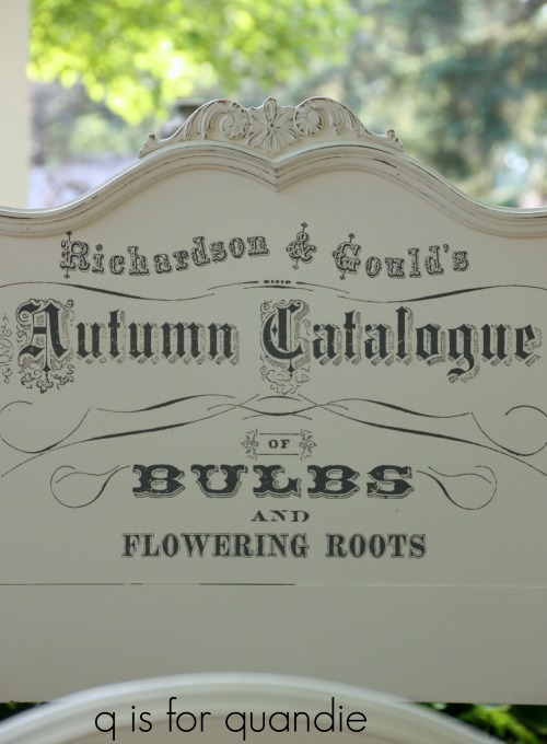
Because they have some nice flat expanses on both the headboards and the foot boards, I thought they would be wonderful candidates for some Prima Marketing transfers.  I was running this idea past my friend Sue and trying to decide between the Seeds transfer and the Catalogue transfer when she suggested that it would be fun to use the Seeds transfer and call them Garden Beds!

I started by prepping the beds with a little light sanding and a good cleaning with TSP Substitute.  Next I painted them with two coats of Fusion’s Limestone.  This is my favorite of the Fusion whites because I like a warm creamy white rather than a crisp, bright white.

The reason I chose Fusion paint for this project was simple.  I wanted to avoid having to both paint and add a top coat.  It was a lot of painting, and I went through almost an entire jar of the Limestone on these beds.  But don’t forget I was painting two headboards, both the front and back of two foot boards plus four side rails.

Once the paint was dry, I sanded the edges to distress them.

Next I pulled out two of the large Seeds transfers (there is also a smaller version of this transfer available) and rolled one out to decide on the placement that I thought would work the best on the beds.

This transfer really is quite large and that’s one of the things that I love about it.  You get a lot of bang for your buck with this one (you can find it online as low as $17.99, so google it and shop around).  Well, actually that’s true with all of the large Prima Marketing transfers.  Believe it or not I wasn’t even able to use the entire thing between both the headboard and the foot board of each bed.  I cut off the top line, plus another line that was under “flowering roots”.

And that made them perfect.

In addition to the fun of calling them ‘garden beds’, I thought the Seeds transfer was also a good match for the flower detail on the beds.

By the way, these transfers went on easy peasy.  It’s hard to take photos of the process while you are doing it so I’ve never done a full on tutorial on how to apply them.  I’ll have to add that to my to-do list right after ‘weed the garden’.

I really couldn’t be any happier with how these beds turned out.

I think they’d be perfect for a lakeside cabin guest room, or for a girl’s room.

I wish I had a spot for them at my house, but there is no room at the inn.  They will be for sale while they last and for now I hope to sell them together as a set.  I suppose if they don’t sell I’ll have to re-visit that plan, but I’m hoping someone will keep them together.  If you are local and in need of some twin beds, be sure to check out my ‘available for local sale’ page for more details.

When I decided that the Seeds transfer would be the right choice for these beds, I contacted my friends at Prima Marketing and asked if they would like to sponsor this project as well as a giveaway for my readers.  They responded very enthusiastically and sent me not only several Seeds transfers in both small and large, but also several more transfers to give away.  Not only that, but they also sent a bunch of their Metallique waxes and I’ll be giving those away later next month.

But for today I am giving away these two transfers from Prima Marketing’s new re.design line.

Both of them are large transfers that are perfect for applying to furniture, but you can also apply them directly to the wall like I did in my guest room.

To be eligible to win one of these transfers all you have to do is leave a comment on this blog post by Friday, June 29 at midnight (U.S. central).  I’ll draw two names at random and each winner will get one transfer.

The fine print: no purchase necessary, you must be 18 years of age or older to win, void where prohibited by law, the number of eligible entries received determines the odds of winning, approximate retail value of prize is $25, if the prize is not claimed by Friday, July 6, 2018 another name will be drawn at random to win, blah, blah, blah.

Be sure to stay tuned this week for more transfer giveaways!

modernized traditional.

A while back Mr. Q stopped off at the thrift store to drop off some things and while he was there he decided to take a look at the furniture for me.  He ended up purchasing this piece.

Funny, I didn’t realize exactly quite how long ago it was until I dug out the before photo and realized there were no leaves on the trees yet!

Anyway, the piece is pretty traditional and not quite my normal style but I decided to modernize it a bit with Fusions’ Ash, a beautiful dark grey.

I’d done a similar piece in the same color last year and it turned out gorgeous (my sister ended up with that one).

This was a fairly simple makeover.  My handyman Ken had to re-glue a couple of runners for the drawers first, then I sanded the entire thing down to try and smooth out some of the more obvious scratches in the finish.  I cleaned the piece with TSP Substitute and then painted it with two coats of the Ash.

Once that was dry I sanded just the edges very lightly for some subtle distressing.

I was determined to keep the original knobs and pulls because there are 14 drawers on this thing!  The cost for new ones would add up rather quickly at that rate.

I love using the Fusion paint on a large piece like this because you don’t have to add a topcoat which saves a lot of time, effort and money.  Once cured, the Fusion paint will be fully washable as is.

I did use a little bit of the Homestead House Salad Bowl Finish around the distressed areas to protect any bare wood that was exposed.

A little bit of this stuff goes a long way.  I’ve had this one small 1.75 oz jar for ages and have used it on many pieces, yet it is still more than half full.

The peonies were in full bloom when I took the pictures of this piece last weekend and I thought the varying shades of pink worked beautifully with the color of this dresser so it was a no-brainer to use them for staging.

The white, dark pink and medium pink peonies are all from my own garden while those gorgeously subtle pale pink ones are from nnK’s garden.

We’ve had some relatively cool weather lately so it seems like the peonies are lasting just a little bit longer this year.

There’s nothing like a whole bucket full of peonies to make your house smell amazing!

As you can see, things have changed a bit around here since I took that ‘before’ photo.

The trees definitely have leaves now, and everything is a lot greener!

And I think the dresser itself is much improved as well.

This piece is available for sale while it lasts.  Check out my ‘available for local sale‘ page to see all of the pieces I currently have in stock.

a painting fairy tale.

Once upon a time in a land far, far away (Stillwater) I saw a beautiful painted dresser in a shop.  The color was a gorgeous, deep, dark blue-green.  I ask the proprietress of the shop if she knew what paint was used on the dresser and she said it was milk paint from The Real Milk Paint Co.  Sadly though, the evil queen had cast a spell upon her and she couldn’t remember exactly which color it was.

OK, I made up the part about the evil queen, but the rest is true.  The shop owner thought it was either Dragonfly or Peacock, but she just wasn’t sure.

So I embarked upon a quest to find that magical color and paint something with it myself.

I started with Dragonfly

But it was clearly way too blue.

Next I tried Peacock

It was much closer, definitely the same level of darkness, but it was a bit too green.

Trying to recreate a color exactly like one on a piece that you’ve seen, in person or even worse, online, can be rather difficult.  Especially so with milk paint which is far more translucent than other kinds of paint.  Sometimes the original color of the wood that you are painting over will make a difference in the look of the final color.  I’ve also found that there can be pretty wide variations from package to package of the same color of milk paint (well, that can be true of other paints too).  In addition, the topcoat you use can also really affect the color.  In the case of that Peacock dresser, I think the hemp oil topcoat combined with the orange-ish color of the wood really brought out the green.

Still hoping that I would be able to find that magical color, I tried The Real Milk Paint Co’s Blue Spruce next.  But as it turns out, this was no fairy tale.  The third color I tried was not ‘just right’.  Instead it was even more green than the Peacock.

After giving it some more thought, I realized that the original dresser I saw in that shop was probably painted in Peacock.  Maybe it just didn’t have a hemp oil topcoat?  I had enough Peacock left to give it another go, so I pulled out this dresser that I purchased at the Linden Hills sales.

Before painting it I stripped the top using Citristrip.  While the Citristrip was working its magic, I started prep on the drawers.  I grabbed my screwdriver so I could remove those wooden knobs for painting.  Imagine my surprise when I couldn’t find screws on the back.

Turned out that the knobs themselves just screwed into the drawer.  Pretty cool, right?

After the top was stripped and I’d prepped the rest of the piece by sanding it lightly and cleaning it with TSP Substitute, I mixed my paint.  That’s when I had what turned out to be kind of a dumb idea.  I decided to mix a little blue milk paint into the Peacock to ensure it would be a little less green than last time.  So I pulled out some of Homestead House’s Homestead Blue.  I didn’t add much, maybe a heaping tablespoon of Homestead Blue to a quarter cup of Peacock.

And after two coats of paint and a top coat of Miss Mustard Seed’s clear wax, here’s the color I got.

Hmmmmm.  In case you are in doubt, this is nowhere near the color I wanted or expected.  How did it end up so light, and so very blue?  What happened to the green?

For a minute I even thought maybe I confused the Dragonfly for the Peacock while I was mixing, but no, I checked.  This was definitely the Peacock.

Go figure.

Did that heaping tablespoon of Homestead Blue really make that much of  difference to the Peacock?  Or was it the clear wax topcoat?  Honestly, I’m baffled.  This color not at all what I envisioned for this dresser, so I’m having trouble being happy with how it turned out.

But I’ve realized that even though this isn’t what I expected, it is a pretty color.

The moral to our fairy tale story is that you don’t always get what you wish for when mixing your own shade of milk paint, so you have to be flexible and willing to just go with the flow.

The top of the dresser turned out beautifully.  As I said, I stripped it.  Then I sanded it a bit and finished it with Miss Mustard Seed’s Antiquing Wax.  I love that it has some dings from many years of use, but looks clean and fresh with the wax.

I staged this piece for a laundry room complete with my new dress form, Collette, and some pretty vintage linens.

I’m going to be bringing some of these linens to Reclaiming Beautiful to see if they will sell.  I’ve always sold pretty vintage pillowcases, napkins, tablecloths and sheets at my own occasional sale so I’ll see if they sell well in a shop or not.

These are all in incredibly good condition, which tends to mean that the owner received them as a gift and never used them.  I hate to see them wasting away in a linen closet, so I hope someone buys them and uses them.

I hope you enjoyed today’s painting fairy tale.  I’ve got another for you on Friday!


And in the meantime, if any of you locals need a pretty blue antique dresser be sure to check out my ‘available for local sale’ page!


the bunker hill blue buffet.

One very blustery sub-zero day last January my neighbor nnK called me to let me know about a buffet that was listed as ‘free’ on Craigslist.  Normally I shy away from the free stuff for a few reasons.  First, they are often in rough shape and need too many repairs.  Second, I usually can’t get there fast enough to be the first in line.  Third, the people giving away stuff for free are usually not terribly accommodating … and why should they be?  After all, they are giving it away for free (I’m pretty sure my mother told me never to do that).

This time only two out of three were true.  The buffet was in pretty rough shape, and the people weren’t very accommodating.  They weren’t willing to help with the loading at all.  However, it was located right on my way home from work and I was leaving work in about 20 minutes, plus Mr. Q was available to meet me there so that we could carry it out of the person’s walkout basement, through someone’s icy backyard and to our van.  Perhaps the frigidly cold day worked in our favor because we were the first people who called and said we could pick it up right away.

And here is the piece we brought home that day.

I know some people might like this look but I find it quite hideous.  There is something about that mix of dark and light finishes that just does not appeal to me.  I knew I could make it pretty though.  But first I had to store it in my carriage house until it warmed up enough for my handyman/neighbor Ken to fix it up.

Fast forward to a couple of weeks ago when it finally warmed up around here.  Ken came over and did some repairs to the drawers.  He and I then worked together and glued some of the feet back together.  Next I stripped the top of the piece using Citristrip.  And then after cleaning the piece with some TSP substitute, I finally got to the painting.

I painted the outside lower body of the buffet in Dixie Belle’s Bunker Hill Blue.  This is an interesting paint color.  It looks very bright in the jar, and it also looks quite bright going on.  So much so that you might be a little worried about your choice at first.

But it does dry quite a bit darker.  To tone it down just one step further, I used Dixie Belle’s black glaze over the paint (paint and glaze were provided by Dixie Belle).

The glaze was super easy to use.  I brushed it on with an inexpensive chip brush and then wiped it back with a clean cloth.

But I have to say, the look of the color really depends on the lighting.  When the light hits this color just right it looks much more like a cobalt blue than a navy as you can see in this next photo.

As you may have noticed, I changed out the knobs.  One of the originals was damaged beyond repair, plus they were kind of ugly.

I found these simple knobs at Hobby Lobby.  They were large and heavy enough so that they didn’t get lost on this big ornate piece, but I think their simple look allows the rest of the buffet to take center stage.

The insides of this piece were definitely in need of a little TLC too, so I painted them with Fusion mineral paint in Coral.

I kind of love that unexpected pop of color when you open a drawer or one of the cupboard doors on the side, don’t you?

I finished the top of this piece with Fusion’s furniture wax in Espresso.  Although I absolutely love how creamy and easy to apply the Fusion wax is, I think I may go back over it again with Miss Mustard Seed’s Antiquing Wax which is a bit darker in color.

This buffet is definitely not short on detail, but I think my favorite are those little finials that hang down from the trim below the side doors.  Aren’t they sweet!

I think this buffet has an entirely new look with its vibrant Bunker Hill Blue paint job.   I hope I’ve encouraged some of you to give this color a try.  Don’t be afraid if you think it looks a bit too vibrant in the jar, and remember you can always tone it down a bit with the black glaze or with some dark wax.

If you are local and in need of a beautiful blue buffet, be sure to check out my ‘available for local sale‘ page for more details!

peony season.

If you’ve been reading my blog for a couple of years or so, you probably already know that peonies are one of my favorite flowers.  They have just two downsides; first, their blooming season is way too short (I wish they would last all summer) and second, ants love them.

I have quite a few old fashioned pink double peonies.  When we purchased our house about 30 years ago there were two of these plants in the existing garden.  Since then I’ve divided them many times, shared them with friends, and moved some back to the cutting garden behind the carriage house.

They are very reliable bloomers and really don’t require much care back there.  I find that the old fashioned varieties of most plants are usually less temperamental than the newer hybrids.  I like to have these out of sight in the cutting garden because then I don’t feel guilty about cutting them all off and bringing them in the house (shaking off the ants first).

I’ve also added a few other varieties to the garden over the years.  The white are definitely the most fragrant.

But my absolutely favorite peony is this gorgeous bright pink variety that I planted about 4 years ago.  I think this is going to be the first year that I get a really good quantity of blooms on the plant.

The color of these peonies just glows from the garden in the evening.  They are so vibrant!

And I think that is exactly what drew me to Dixie Belle’s paint color called Peony.

I wonder if whoever created and named this color also has these peonies growing in their garden.

By the way, I’m faking you out a little with all of the peony photos.  They are from previous years because this year’s peonies aren’t blooming quite yet.  Although they will be soon with this ridiculous heat we’ve been having!  But even though my peonies aren’t quite here, this gorgeous paint color is!  Dixie Belle was kind enough to provide me with some of this paint for a dresser makeover I have planned.  But whenever I try a brand new paint color that I haven’t used before, I like to test it out on a smaller piece before I put it on a large piece of furniture.

So I pulled out one of the chairs that I purchased at the Tangletown sales.

It’s another bottomless chair that is destined to become a planter chair.

So why not go with a vibrant pink!

Well, in the spirit of full disclosure, first I went with Rachel Ashwell chalk paint in a pale blue which was very pretty, but then I opted to try sealing it with Miss Mustard Seed’s Tough Coat Sealer and the original stain on the chair bled through the paint.

This brings me to a good q tip.  If you aren’t familiar with this phenomenon, sometimes even though a pre-existing stain didn’t initially bleed through your paint, once you add a water based sealer over it, the sealer will draw the bleeding stain through the paint.  This can be a huge bummer when you’ve painted your piece and it looks amazing and you’re at the final step of sealing it and bam!  Bleedy stains all over the place.  I don’t really have a great tip for preventing this (unless you want to pre-seal every piece just in case, but that seems extreme to me), but if this happens to you there are a couple of options for dealing with it.  1)  seal the piece with a stain blocking sealer (like Dixie Belle’s BOSS for example), re-paint and then add your water based sealing top coat.  2)  continue on with the water based sealer and once dry paint again, and then add a wax topcoat.  Waxes will not pull the stain through like a water based top coat will.

Or, you can do what I did.  Go with an entirely different color and then seal it with wax.

Speaking of wax, you know how chairs are so much easier to paint if you spray them?  Well, when I went to wax this chair I remembered that a while back Dixie Belle had sent me some of their Easy Peasy spray wax.

It occurred to me that … duh … this stuff would be perfect for chairs!  And it was.

Simply spray it on, wait 10 to 15 seconds and then wipe away any excess.  It truly is Easy Peasy.

So I’ve tested the Peony and I love it, but you probably won’t see that dresser for a couple of weeks.  In the meantime I’ll have a lovely buffet and a couple of other fun projects to share with you first.  So be sure to stay tuned!

patina.

For those of you in the U.S., I hope you are enjoying the long Memorial Day weekend.  I don’t exactly know what happened here in Minnesota.  It feels like we went right from winter to summer without stopping at spring in between.  Our temperature is supposed to hit 97 today, while a mere six weeks ago we had blizzard conditions.  Seriously, what is up with that?

So, I’m curious, how many of you have come across this photo on pinterest?

Maybe it’s just me.  Maybe I’m the only one who is utterly obsessed with that gorgeous color and that amazing authentic looking chippy patina.

I pinned that photo way back in the day when pinterest was new and you had to be invited to join, does anyone else remember that?

It took a bit of digging to find the origin of the photo.  I started by following it back to whomever pinned it, but that just led back to someone’s tumblr account.  Next I checked out the watermark, aprilpizana.com and found the photographer who took the photo.  I kept digging and finally found the answer.  April Pizana was hired to take photos at Rachel Ashwell’s b&b in Texas and that’s where this photo was taken.

So it’s a Rachel Ashwell piece.  Of course it is.  It has Rachel written all over it, doesn’t it?  The color, the gorgeous floral wallpaper, the fresh flowers.  The whole shabby chic-ness of it all.

But sadly, my research did not lead where I hoped it would.  To a blog where someone listed precisely what brand and color of paint is on that dresser.  In fact, I suspect it’s an original 60+ year old paint job.  So I gave up on finding this precise color.

But then I saw the Sweet Pickins color called Patina.

It’s pretty close to the same color, right?  A bit brighter, and with a bit more blue perhaps.  So I ordered some to use on an antique Eastlake style dresser that I’ve been hanging onto for a while.  However, once the paint arrived I simply could not wait to paint something in it, and the Eastlake still needs some repair work, so I pulled out this dresser instead.

This one also needed a few repairs, but my handyman/neighbor Ken had already done them.  The main problem with this dresser was the broken top.

Ken did a great job re-attaching that broken piece using dowel pins and glue and it’s firmly in place now, but the crack is still pretty obvious even though I filled it with Dixie Belle mud before I painted.  The entire top of the dresser is warped and Ken struggled with getting it to lay flat again.

Ironically the crack is not very visible in any of the photos I took, but trust me, it is much more noticeable in person.

But I’m hoping that someone else out there will appreciate this piece despite its flaws, even embrace them because they add character to the piece.

I ended up having to put three coats of the Patina on this dresser to get good coverage, but it did start out pretty dark.

I really expected it to have better coverage than that, but I could still see streaks of the original dark color after two coats.  So three coats it was.

I sanded to distress and then used Miss Mustard Seed clear wax as the topcoat.

When I purchased this dresser I thought those knobs on it were just simple wooden knobs that I could paint.  But when I went to remove them I realized they were metal.  Very plain, boring, solid metal knobs.  Obviously not original to the dresser.  In fact, if you go back to the ‘before’ photo and study them, the scale is just a bit too small.  Luckily I have a rather large stash of wooden knobs that I’ve taken off other pieces and I happened to have 10 of them that were a better fit for this dresser.

I painted them up and I love how they look!

I didn’t do anything fancy with this piece.  I felt like it had a simple vintage farmhouse vibe and I wanted to retain that feel.  The color itself has enough impact, wouldn’t you say?

The next time I use this color I might try to mix in just a bit of a more pale, minty color to get just a little bit closer to my Rachel Ashwell inspiration piece.  We’ll see how it goes.

But for now I have to say I am loving the Patina on this dresser!

bottomless chairs.

Are you a fan of cane chairs and benches?

I love them.  I have half a dozen of them myself.

But the sad truth about cane is that it’s easy to damage.  So far the cane on two of my chairs has ripped.  And I don’t have the patience for replacing damaged cane.  So, in my opinion, cane chairs are best reserved for occasional use, not rough every day use.

I see a lot of damaged cane chairs for sale at garage sales and on Craigslist.  Sometimes they are priced super cheap, although I also see plenty of ads for pricier chairs where the seller says ‘you can easily add new cane’.  I always laugh when I read those ads.  If it was so easy to do, why didn’t they do it themselves?

I’ve come up with a few ways to work around ruined caning.  On the bench I put in my bedroom I added a cushion where there once was caning.

  On the ‘cheater, cheater, pumpkin eater‘ chair I added an upholstered seat …

Originally I planned to do something similar with a pair of chairs that I picked up last summer at a garage sale.  Don’t be confused by the snow on the ground in this ‘before’ photo.  I purchased the chairs last summer, but took this photo sometime last winter.

 I did add a seat to one of the chairs, which I then paired with the Sea Glass dressing table.

But with spring just around the corner, I decided to turn the 2nd chair into a planter chair.

But first, in case you’re not familiar, what’s a planter chair?

Here is one that I gave to my mother-in-law for mother’s day a couple of years ago.

It’s basically a bottomless chair with a hanging basket of flowers filling up the hole where the caning or other seat once was.

I love the whimsical touch they add to a garden.

Obviously these chairs are not meant for outdoor use normally.  I find that they will hold up well for 2 or 3 years if you store them in the garage for the winter, but they won’t withstand outside weather indefinitely.

But that’s OK, everything in life doesn’t have to be permanent, right?

For this planter chair I decided to go bright.  I pulled out an old jar of The Urban Rooster chalky paint in a color called Jaded Rooster but I was worried I might not have quite enough paint left for the chair so I also grabbed a small tester size jar of Annie Sloan’s Florence that was half used.

As you can see, these two are practically the same color.  One has maybe just the tiniest bit more green than the other though, so I simply mixed them together to stretch my paint a little further.

I painted two coats on my chair.  Once dry I used acrylic craft paint in Oyster White to stencil “Fleurs” on the back of the chair.

Next I sanded to distress and then added a coat of Miss Mustard Seed’s Tough Coat Sealer to protect the paint from the elements.

When I went to add a hanging basket to the chair for photo purposes, I discovered that the hole in the chair was larger than the typical hanging pot size.  So I added a couple of straps to hold the pot in place.

And ta da!  There you have it, a planter chair!

 I took this chair and another I had on hand in to Reclaiming Beautiful this week to sell.  So if you’re local and you don’t feel like making your own planter chair, be sure to stop in and see if they have any left!

I just can’t help myself.

First a quick update.  I sold both the flip top bar and the Millennial Pink dresser this past weekend.

I had to laugh when chatting with the couple that purchased the pink dresser.  They knew all about Millennial Pink!  Apparently they are fans of John & Sherry over at Young House Love , and YHL is all about the pink.  Their beach house is painted in it.

And they even have a vintage Millennial Pink stove in their beach house kitchen.

So my Millennial Pink dresser was a big hit.  I’m sure you’ll see more pieces in this color from me this year.

But for today I’m going back to my other proven seller, Fusion’s Park Bench.  In case you are keeping track, the credenza that you are about to see is the fifth mid-century piece that I’ve painted in this color since January.  But seriously, I just can’t help myself.  These pieces are selling so well.  People are loving this gorgeous green on the mid-mod stuff.  I’m so sorry if I’m boring you with yet another one, but this is what I’m working on at the moment.  So it’s this or nothing.

I’m also going to share the non-chemical process for stripping paint off metal hardware in this post so be sure to keep reading if you’re interested in that.

Mr. Q picked up this mid-century credenza at the same time he picked up the Millennial Pink dresser.

I’m still working on training Mr. Q in the fine art of furniture purchasing.  The ad for this piece said it was in excellent condition except for the finish.  It neglected to mention that one of the drawers behind that center door was missing!  Although Mr. Q has really improved when it comes to noticing other details such as bad smells, loose joints and missing hardware, it never even occurred to him to look behind door number one to make sure all of the drawers were there.  Well, to be specific, he didn’t even realize there might be drawers behind that door.  He thought it would be shelves.

Keep this in mind if you are ever purchasing furniture on Craigslist.  Open all of the doors and drawers!

Well, no use crying over spilled milk.  I decided to ask my handyman/neighbor Ken to finish off the uppermost section as a shelf instead of a drawer.  There was already a hole cut at the back to feed electrical through, so I suspect the reason the drawer was removed in the first place was so that someone could put a DVD player in this spot so why not make it official?

Once Ken had the shelf in place, I sanded the piece thoroughly, cleaned it with TSP Substitute and then painted it with two coats of Fusion’s Park Bench.

Initially I’d planned to keep the hardware silver on this one, even though I used gold hardware on all four of my previous Park Bench pieces.  I threw the handles in some soapy water to clean them up first though and that ended up removing some paint.  Turns out they were originally an aged brass color and had been painted silver (I’m guessing with spray paint).  That nixed the idea of leaving them as is.

I’d never stripped paint off metal hardware before, but I’d heard that simmering it in a crock pot of water first will loosen up the paint leaving it easy to remove.  Well, I didn’t want to wreck my crock pot (adding ‘cheap spare crock pot’ to garage sale shopping list), so I grabbed an old crusty pot and tried simmering them on the stove.

And you know what?  This worked exceptionally well.  No dangerous chemicals required.

Here is the method that worked best for me.  First, simmer the hardware for about 30 minutes.  I never brought the water to a boil, just a low simmer.  Remove one handle at a time using tongs.  Run it under warm water until you can touch it without burning yourself (important precaution).  That only took a couple of seconds.  Finally, rub off the loosened paint using one of those green scrubby pads.

I show a paint scraper in my photo above, but using that lasted about two seconds.  The green scrubby did a much quicker, better job and didn’t scratch the finish.

Today’s q-tip:  Leave the remaining handles in the simmering water until you’re ready to work on them, just take one out at a time and scrub it.  If you pull them all out at once the paint hardens up again before you can get to all of them.  If the paint isn’t coming off easily, pop them back in the simmering water for 10 to 15 minutes and try again.

Once I had the paint off, I really didn’t like the aged brass look of the handles so I added my favorite metallic wax, Prima Marketing’s Metallique Wax in Vintage Gold.

I like to apply the wax with a q-tip, let it dry overnight and then buff it to a shine.

 So there you have it.  My latest Park Bench green mid-mod piece.

If you’re just not a fan of mid-century modern, don’t worry.  I’m moving on to some different styles next.  I have a few pieces underway in the workshop, plus I ordered some Sweet Pickins milk paint to play around with.  So be sure to stay tuned!

flippin’ the flip-top.

A couple of weekends ago nnK (that stands for ‘new neighbor Karen’ because when she moved in across the street we already had a Karen next door.  Granted, that Karen died a couple of years later and now there is just one Karen, but nnK stuck) called me and said there was a huge garage sale a couple of blocks away, did I want to check it out?

So I jumped in her SUV and we headed over there.  It was about 3:30 on a Saturday afternoon though, so my expectations were low.  Usually by then all of the good stuff is gone.

I was wandering around the sale, which truly was huge, when nnK flagged me over to look at a mid-century piece.  She’s a big fan of mid-century modern and she knows I’ve been doing more and more mid-mod pieces lately.

It wasn’t really ‘me’, but I could see the appeal for mid-century lovers, so I bought it.

It’s a flip top bar made out of walnut with a black melamine surface that is exposed when open.  It’s in great condition and even has the original casters.

Initially I was going to paint it with my favorite aqua, Fusion’s Laurentien.  But then I did a little research and found the exact same piece on 1stDibs where it sold for $2,450.

Now I take the prices on 1stDibs with a grain of salt.  I’m not sure who the people are who are paying that much for stuff.  I suspect they are all designers in places like New York City or L.A.  People who have wealthy clients who don’t bat an eye at the cost.  I certainly can’t get those amounts myself.

Nonetheless, seeing the piece listed there and also knowing that the finish on mine is in really good condition made me realize I probably shouldn’t paint it.

So I decided to simply flip the flip-top.

I cleaned the piece well first, and then freshened up the finish with some of Miss Mustard Seed’s hemp oil.

Then I staged some photos using some of the fab mid-century props I found while out garage saling last weekend.

I can’t decide which is my favorite prop, the fake ice cubes or the atomic themed glasses.

I’m not generally a flipper, but I have flipped a few mid-century pieces in the past like this  American of Martinsville pair.

I also flipped these two mid-mod pieces.

When I come across pieces like these and they are just staring me in the face and daring me to flip them … well, how can I resist?

the millennial pink dresser.

Have you heard of Millennial Pink?  Did you know it was a ‘thing’?

As is typical for me, I am only just discovering this trend while the cool kids are already saying it has to go.

Seriously, I am never on top of these things.

But before we get to the Millennial Pink, I first have to admit with some embarrassment how I learned about it.  You see, I have a secret guilty pleasure.  I watch the Trackers on YouTube.  I can hear many of you now asking, ‘um, who?’

Tim & Jenn Tracker are YouTube vloggers.  They live in Orlando, Florida and they mostly vlog about the various theme parks in that area including Disney World.  I came across them while looking for Disney info prior to our trip down there last October.  I started watching a few of their vlog posts and bam!  I was hooked.

I really can’t explain why.  Of course, I enjoy watching their excursions into the parks.  And I love that they share insider tips as well as honest reviews of everything from the food to the rides.  They share the real thing, not doctored up versions designed to look good on camera.  But I have to confess that I also sometimes watch their vlogs about shopping at Target, or cutting up left over pizza, adding it to eggs and frying it up in a pan to make ‘pizza eggs’.

They are just so darn adorable!  Somehow I now feel like I know them and am invested in their lives.  So I’ll admit it, I’m a vlog lurker, and apparently so are about 364,000+ subscribers to their YouTube channel.

And this brings us back to Millennial Pink.  Lately Tim & Jenn (see?  it’s as though we are on a first name basis) have been frequently mentioning Disney goods that are available in Millennial Pink, especial the Mickey ears.

So the last time this came up, I turned to Mr. Q  – because, oh yes, he sometimes indulges in this guilty pleasure with me, even though he’d rather poke his eye out with a sharp stick than go to Disney World – and said “what is this Millennial Pink they keep talking about?  Is it just a Disney thing?”  So he googled it for me and said, “I guess it’s just a color thing, and it applies to home décor too.”

Who knew?

Well, probably everyone but me … and Mr. Q.

Obviously the next step was to paint something in Millennial Pink so I could be one of the cool kids, so I started keeping an eye out for just the right piece.

And then I found it …

a beat up mid-century piece that I thought would look amazing in Millennial Pink.

Luckily I already had a jar of Fusion’s English Rose on hand.  I hope they don’t mind that I took the liberty of renaming it just for this post.

Before I started painting though, my handyman Ken and I shored up the base of the dresser because it was a little wobbly.  Ken is one of those people who like to do things the right way.  So we removed the base, re-glued and clamped the cross piece, and then once that was good and sturdy we re-glued the base back onto the dresser.  Now it’s rock solid.

Once again, the top of this mid-mod piece was plastic laminate so I painted that with a coat of Fusion’s Ultra Grip and let it dry overnight before moving on to the rest of the painting.

It took three coats of the English Rose to get good coverage on this one.  I’d already used about 1/4 of my jar of paint on something else, so it took every last bit of paint I had left to complete the job.

I used Prima Marketing Metallique wax in Vintage Gold to add a little glam to the original drawer pulls.

If you haven’t tried this stuff you should.  I use a q-tip to apply it, wait overnight for it to dry and then buff with a clean cloth.  Easy peasy, and it looks amazing.  It’s also super affordable (it’s available online for about $6).

It comes in a tiny little tin, but a little goes a very long way.  I’ve barely made a dent in mine and I’ve used it on countless knobs.  I much prefer the packaging of this version over others like Rub ‘n Buff.  The tin it comes in has a screw on lid that is easy to open and close tightly, so your wax doesn’t dry out.  I had nothing but trouble with those little tubes that the Rub ‘n Buff comes in.

I pulled out some vintage mid-century wallpaper, some aqua and cream pottery and my cream colored Remington Ten Forty for staging.

Isn’t this dresser much prettier in pink?

Let’s talk for a moment about the (pink) elephant in the room.  You may have noticed that I seem to be doing more mid-century pieces these days.  That’s because I’m finding that mid-century is selling really well for me while many of my more farmhouse style pieces are taking a bit longer to find the right buyer.

I feel like I’m walking a bit of a thin line between producing pieces that will sell and producing pieces that my blog readers want to see.  I hope that most of you enjoy seeing the mid-century makeovers even if it isn’t quite your thing.  There are going to be more of them to come, I brought home two more mid-mod pieces last weekend.  But don’t worry, I’ll still mix it up with some of the chippy, farmhouse style pieces that I love.  And hopefully they’ll start selling a little better now that the weather has improved here in Minnesota.  I did sell both the spring fling dresser and the indigo desk this past weekend, so I think that’s a good sign.

That being said, what do you think of Millennial Pink?

This dresser is available for sale, so if any of you locals are interested check out my ‘available for local sale’ page for more details.