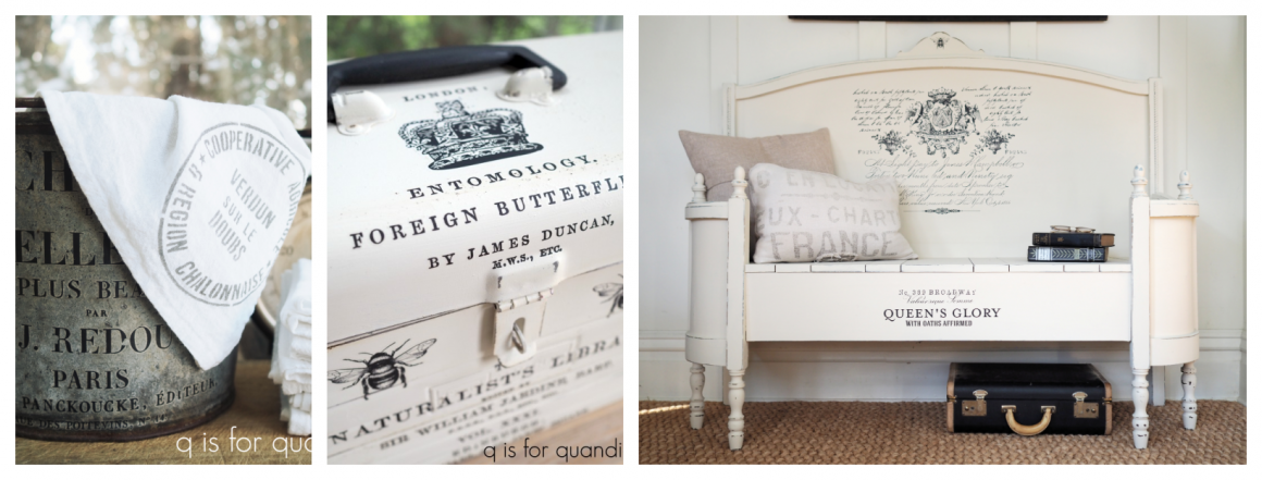

simply beautiful.

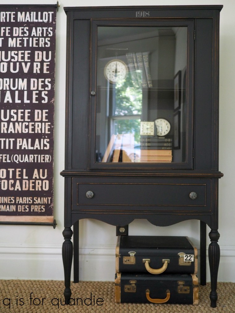
As much as I love the gorgeous pieces I’ve done lately using those beautiful Prima Marketing floral transfers, or the really cool buffet that I shared last Friday stenciled with the re.design decor wax, sometimes I like to just keep it simple.  So that’s what I decided to do with today’s piece.

I picked this one up a week ago at the Lynnhurst/Fulton garage sales.
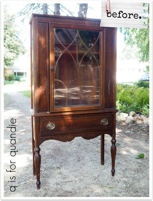
It was ridiculously bargain priced, but it also was in pretty rough shape.  I didn’t get a good ‘before’ shot that shows how badly warped the top was so you’ll just have to trust me on that.  But my handyman Ken had to literally cut it into strips and then glue them back together again to attempt to flatten it out.  He made several other repairs that I neglected to get photos of too.

Once Ken was done with the repairs, it was my turn to make it pretty again.

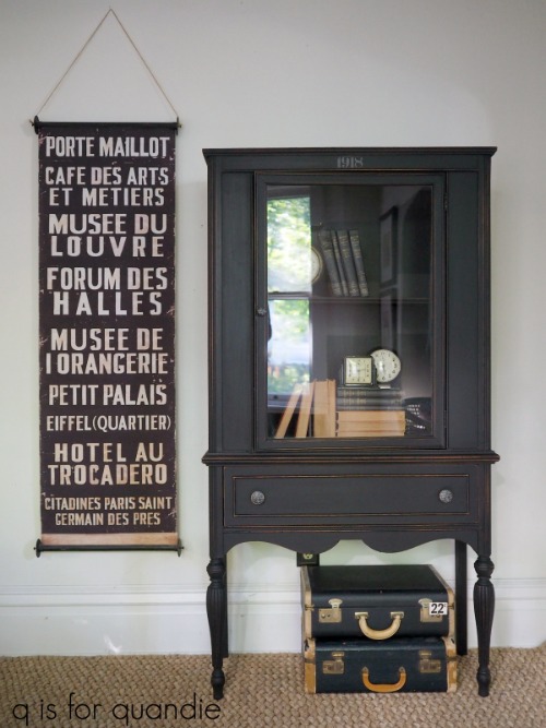
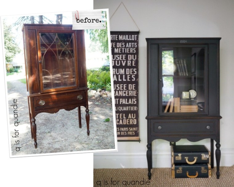
I started by painting the inside in Fusion’s Coal Black and the outside in Dixie Belle’s Caviar.  You might be wondering why I didn’t go entirely with one or the other, and the honest answer is that I didn’t have enough of either one to paint the entire piece!

So I opted for the Coal Black on the inside because it will be fully washable once cured which is really nice on a shelf.  Plus it’s rather putzy to wax the inside of a cupboard.  The Fusion paint doesn’t need a topcoat, so I avoided that task.  I went with the Caviar on the outside because I just slightly prefer the look of distressed and waxed chalk paint over the look of Fusion.  The Fusion paint has just a little bit more shine (although it is still considered matte) than the waxed Dixie Belle paint.  And by the way, I waxed over the Caviar using Fusion’s Black Wax.  I absolutely love all of the waxes from that company whether it’s Miss Mustard Seed, Fusion or Homestead House.  It’s soft and creamy smooth, so it goes on easily.  Plus it’s perfectly safe and doesn’t contain any aromatic hydrocarbons (if you don’t know about those, check out my wax post).
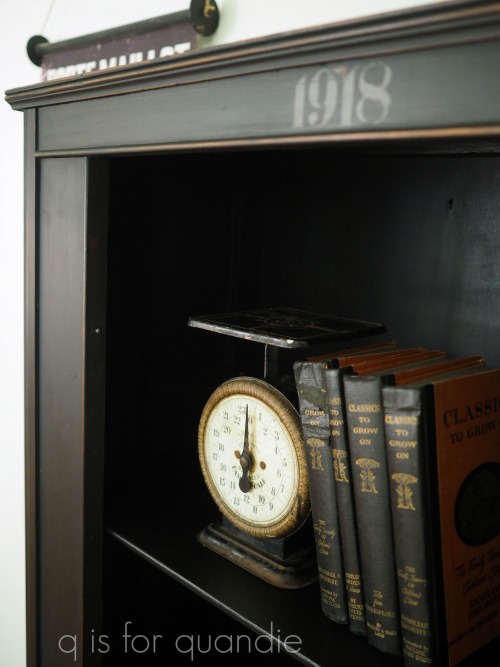
I added a simple little ‘1918’ stencil above the door.  You know me and my numbers, I’ve got a thing for them.
You may also have noticed that I chose to remove the fretwork from behind the glass.  I really feel like I could have gone either way with that.  Some people love that look, and others prefer a more simple look.  Since I was going for simple with this one, I took it off.
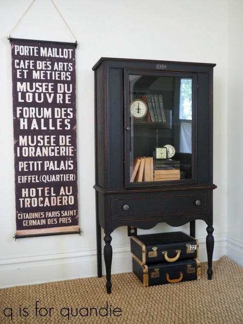
Then finally, the pièce de résistance, I used some of the Prima Marketing re.design knob transfers on the knobs!

This design is from the Cursive Letters set.
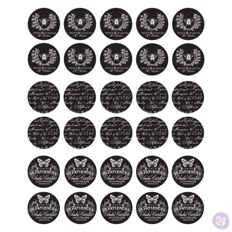
Let me explain how this style with the black background works.  These are black rub-on’s.  The portion that shows as white in the picture above is clear, these are not white rub-on’s.  So if my knobs were painted solid black, the design wouldn’t really show up much.

Instead I painted my knobs black on the ‘stem’ of the knob, but a creamy white on the face.  Then I applied the transfer.  Once that was in place, I sanded around the edges of the knob to remove any excess white paint and to give them a distressed look.  I followed up with a topcoat of Fusion black wax.
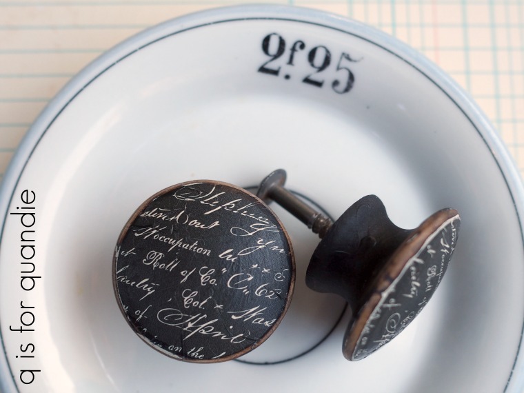
It may appear like the entire knob was painted black and then the transfer was applied over the black, so I just wanted to make that clear (pardon the pun).

I love how the knobs add just a little touch of the unexpected to this cupboard.
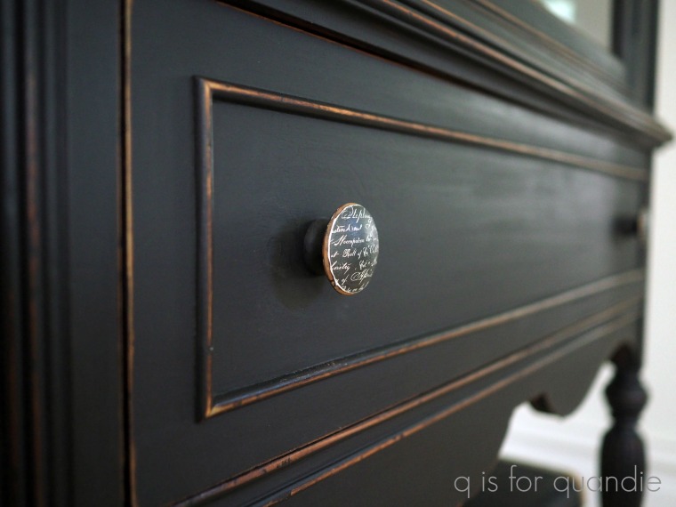
I feel like this piece is a great example showing how you don’t necessarily have to do something fancy or use complicated techniques to salvage an old piece of furniture.  Sometimes all it takes is a little paint  …  and maybe some cool knob transfers … and your piece will turn out simply beautiful.
If you’re wondering where to purchase the Prima Marketing re.design knob transfers, check out their ‘where to buy’ page.

If you’re wondering where to buy the Fusion paint in Coal Black or their black wax, check out their ‘where to buy‘ page.

If you’re wondering where to buy the Dixie Belle Cavair paint, you can shop with them directly online or find a retailer near you.

And finally, if you happen to be local (Twin Cities, MN) and in need of a simply beautiful cabinet, check out my ‘available for local sale’ page for more details.
a galaxy far, far away.

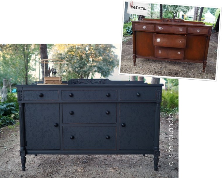
Sometimes I take on a piece that I think is going to be a fairly simple makeover and it just ends up taking forever.  Today’s piece is one of those.

First off, we drove to a galaxy far, far away (to the opposite side of the Twin Cities) to pick this one up.  I’m really not sure what possessed me.  Normally I won’t go that far for a piece of furniture.  And it wasn’t particularly bargain priced either.

I guess something about it just spoke to me.  I also thought it would be a quick paint job, but that ended up not being the case.

My initial plan was to strip and wax the top, but then I discovered that it’s full of really deep scratches.  So deep they seem to go right through the veneer in some spots.

So that scraps that idea.

Next, one of the pulls was missing and one was broken.  Sigh.  You know what that means.  All new hardware.  Then as the icing on that cake, when I removed the rest of them I found that they had all left big gouged out rings around the holes.  Those had to be filled before I could move on because the new knobs I selected wouldn’t cover up those rings entirely.

Next, as Mr. Q and I were moving this piece around to get that ‘before’ photo taken I realized that one of the back legs was a bit wonky.  So I had to ask my handyman Ken to take a look at that and do some repair work.  That required taking the back off the piece so that Ken could get to some nails that were holding the leg in place.  He removed the nails, then the leg, and then added fresh glue and new screws to hold the leg in place.  It’s much sturdier now.

Finally, my initial plan was to paint this piece either white or pale grey and then use a Prima Marketing transfer on the front.  However, I quickly realized that the mahogany stain on this piece was going to be difficult to cover with a pale paint color.

So at that point I re-evaluated.  It was time to consider using a dark color to save myself further headaches, and that meant no transfer.

Then I remembered a tutorial by Brandy from Brushed by Brandy  I believe you have to join the How to Paint Like a Pro Facebook page to watch that video though, so if you aren’t already a member I encourage you to become one.  Brandy used the new Prima Marketing re.design decor wax with a stencil.  Eureka!  If I hadn’t seen her video, I don’t think it would have ever occurred to me that I could stencil with these waxes.

And it just so happened that Prima Marketing had provided me with a bunch of their new waxes, as well as some of their amazing stencils.  So I had all of the necessary ingredients to try this technique.

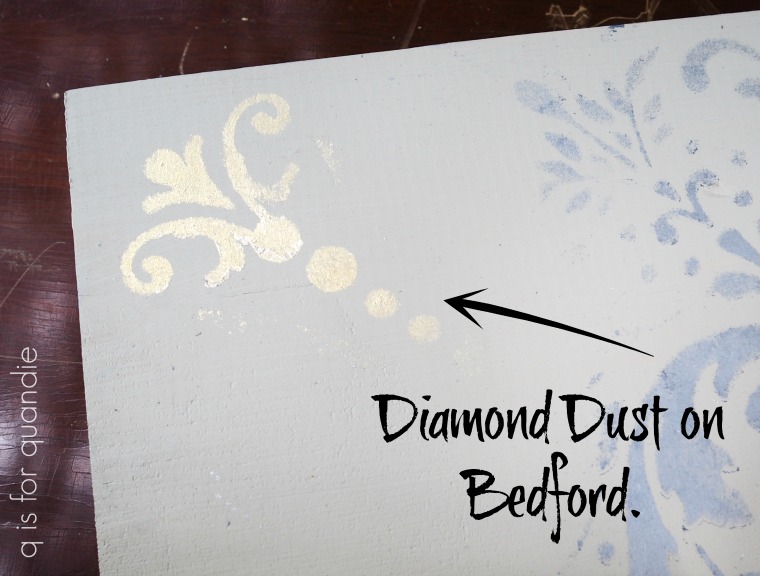
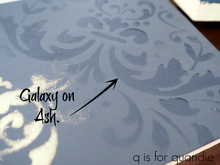
So I started  with some test boards.  These were just scrap chunks of unfinished board.  I painted them with various Fusion paint colors and then stenciled them with the different wax colors.

From left to right the paint colors on the boards are Ash, Bedford and Midnight Blue.  I tried several wax colors over each paint color.  This was a great way to both practice stenciling with the wax, and also to see how I liked the various colors together.

I quickly realized that my two favorite combos were the Diamond Dust wax on the Bedford paint …

and the Galaxy wax on the Ash paint.

Obviously I’m a fan of the more subtle combinations, but there are many different looks that you can get using these waxes with a stencil.

Since I wanted to keep my paint color dark, I decided that the Ash would be my best bet, paired with the Galaxy wax (now are you getting my galaxy far, far away title?)  Some black knobs with a matte finish that I found at Hobby Lobby would be the perfect finishing touch.

After my usual prep of light sanding followed by cleaning with a damp rag, I painted the buffet with two coats of the Ash.

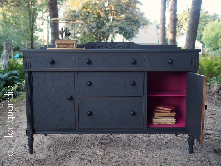
Once that was dry, I used the Imperial Damask stencil and the Galaxy Decor Wax (both from the Prima Marketing re.design line) to add the most subtle textural-looking design onto just the door and drawer fronts.

Isn’t that a cool look?  Although it looks fairly pronounced in that photo, it actually looks a little bit more subtle in real life.  In a dimly lit room you can barely even see the damask pattern.  And it also shows up better at certain angles more than others.

In case you are wondering, once it has dried/hardened the wax does not smear or rub off.

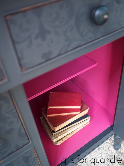
I couldn’t resist adding a gorgeous pop of color to the inside of the buffet with Dixie Belle’s Peony.

I just love this beautiful vibrant pink.  Using this color on the outside might scare off some of my more conservative mid-western buyers, but having it on the inside is a whole different story.  It’s just there to make you smile when you open those doors.

I debated adding some of the wax to the carved details on the buffet to highlight them, but in the end I just distressed them and left them alone.

This next photo gives you a better feel for how subtle the waxed stencil pattern is from straight on.

In the long run, I’m very happy with how this piece turned out!

If you’re wondering where to purchase the Prima Marketing re.design stencils or decor wax, check out their ‘where to buy’ page.

If you’re wondering where to buy the Fusion paint in Ash, check out their ‘where to buy‘ page.

If you’re wondering where to buy the Dixie Belle Peony paint that is inside the buffet, you can shop with them directly online or find a retailer near you.

The knobs came from my local Hobby Lobby but you can also find them online.

And finally, if you happen to be local (Twin Cities, MN) and in need of a gorgeous dresser, check out my ‘available for local sale’ page for more details on the buffet from a galaxy far, far away.

the imperial garden dresser.

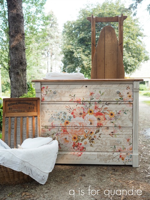
You probably remember this beautiful dresser that I shared a couple of weeks ago with its amazing … and huge … Prima Marketing Rose Celebration transfer.

Prima had sent me several of the new transfers in their re.design line and this was the first one I tried.  What I didn’t mention when I shared this was that I chose my ‘least favorite’ of all the transfers they sent to try first, just in case I got it wrong and wrecked it somehow (which obviously didn’t happen).

Now, before you take that wrong, that definitely doesn’t mean that I didn’t love this transfer.  What that really means is that the rest of them are even more fantastic.  If that one was my ‘least favorite’, just imagine what the rest of them are like!

As soon as I finished that dresser I was on the hunt for another dresser to add a mammoth transfer to .

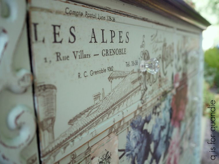
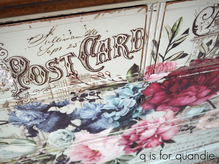
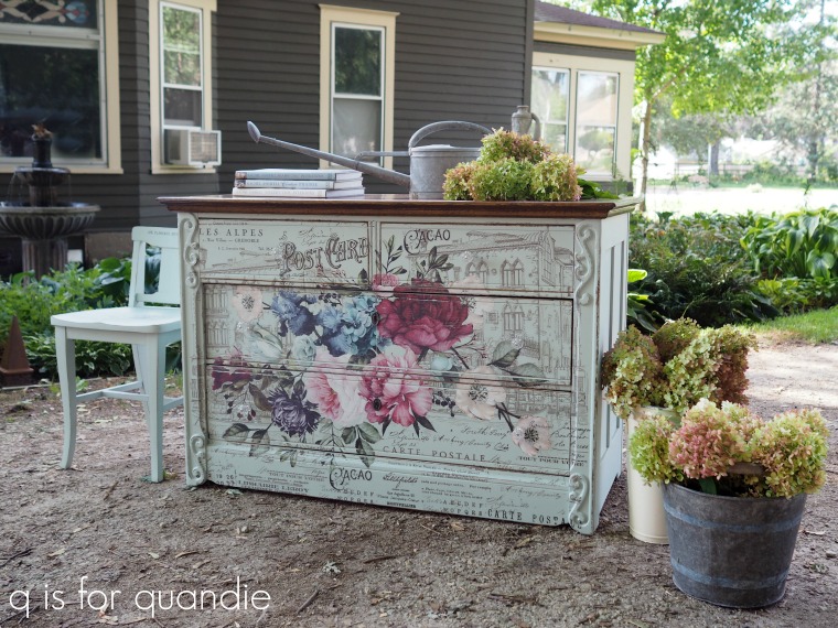
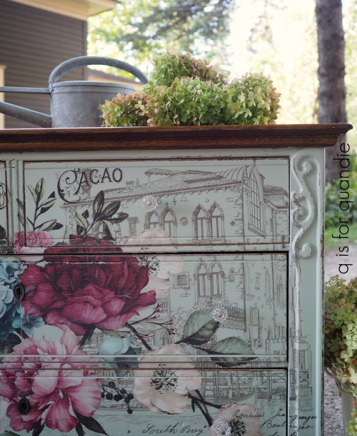
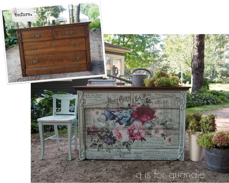
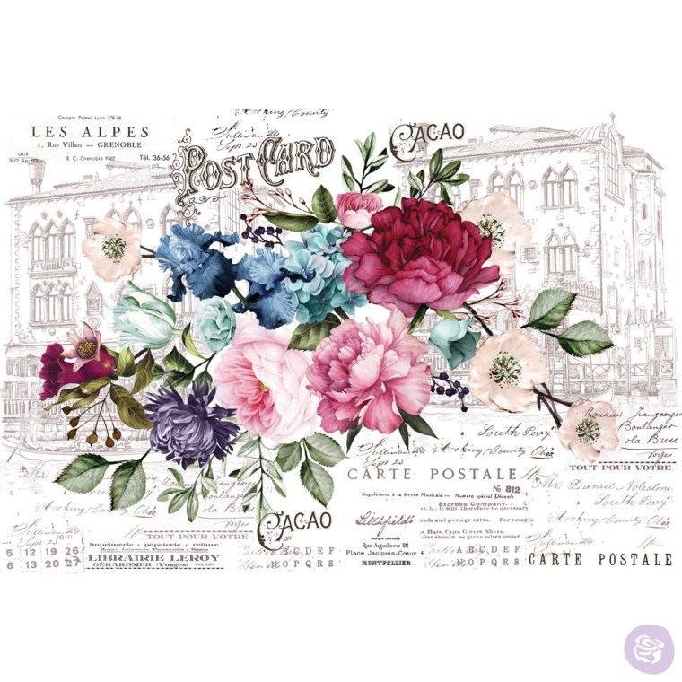
To be specific, this time it’s the Imperial Garden transfer (this one is 44″ wide x 30″ tall) and it looks like this.

If you look closely at the background you might guess why I fell in love with this transfer at first sight.  Do you see it?  It’s Venice!  See the gondola (lower left)?  And those classically Venetian buildings?  Since I’ll be spending my 55th birthday in Venice this year, this transfer felt special.

I wanted to find a dresser that would accommodate most, if not all, of the design.  If you’ll remember I had to trim about 6″ off of the sides of the transfer on that previous dresser.

So when nnK sent me the Facebook Marketplace ad for a dresser that someone she knew was selling, I jumped at it.  It looked right about the perfect size.

Mr. Q picked it up while I was at work one day last week, but as soon as I got home I took some measurements and discovered I was right.  It’s the perfect size!

The next step was to pick a paint color.  There were so many possibilities.  I could have gone with an off-white, of course.  But I also could have chosen a pale pink, either Dixie Belle’s Pink Champagne or Fusion’s Little Piggy (both of which I had on hand).  Either of those would have been gorgeous.  I also debated using Fusion’s Lichen, which is a pale green grey.  It was a perfect match for some of the greens in the leaves.

But I ended up choosing Fusion’s Inglenook.  I absolutely love the pale blue green color and I thought it would work beautifully with the colors in the transfer.

I also made the decision to leave the top ‘as is’.  I think this is a first for me.  But the dresser had been recently refinished and although the finish is a bit shinier than I would have chosen, it was in really good shape so I left it.

I figured that if I didn’t love the way it looked after finishing the rest of the dresser, I could always paint it later.

I also made the decision to remove the existing hardware and not put it back on.

These pulls might work for another piece down the road, but they would have fought with the design of the transfer.  So I filled the holes for the original hardware using Dixie Belle’s Mud before painting and I added glass knobs instead.

I followed my usual protocol of sanding lightly and cleaning with a damp rag, then I added two coats of Fusion’s Inglenook.  Once the paint was dry, I distressed the edges of the dresser by hand sanding them with 180 grit sandpaper.

Next I applied the transfer.  I used the same method I used last time (find that here).

Once the transfer was applied, I sanded over it very lightly by hand with 220 grit sandpaper to give it a more faded, vintage look.  That’s totally optional and just a matter of preference.  Some of you may prefer the look of the transfer without sanding it.

Adding the transfer completely transformed this dresser.

Although it was in nice shape before, it was kind of ho hum.  The previous owners did a nice job refinishing it, but I think they robbed it of its character.

But now it has plenty of personality again.

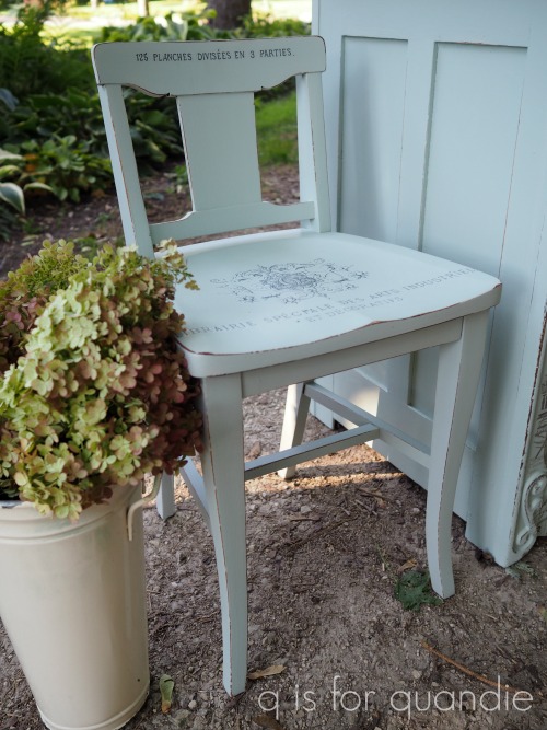
The little chair in the photos is from the Mac-Grove sales.  I started out painting it grey, but it ended up being a bleeder (ie. the red stain bled through the paint) so I zapped it with some spray on shellac and then ended up giving it a coat of the Inglenook while I was painting the dresser.

Then I used the left over remnants from another Prima Marketing transfer to dress it up a bit.

I love the petite size of the chair.

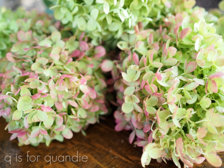
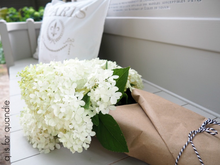
I also used a few of my hydrangeas to stage this piece.

They are looking pretty much amazing at the moment, so it was hard to resist getting them in a few photos!

If you’re wondering where to purchase the Prima Marketing products, check out their ‘where to buy‘ page.

If you’re wondering where to buy the Fusion paint, check out their ‘where to buy‘ page.

If you’re wondering where to buy the Dixie Belle Mud that I used to fill the old drawer pull holes, you can shop with them directly online or find a retailer near you.

If you’d like to order the glass knobs I used on this piece, you can find them at D Lawless Hardware.

And finally, if you happen to be local (Twin Cities, MN) and in need of a gorgeous dresser, check out my ‘available for local sale’ page for more details on the Imperial Garden dresser!


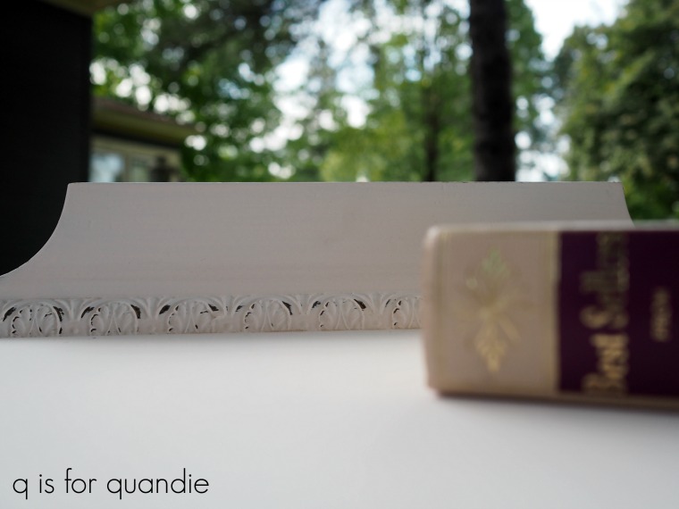
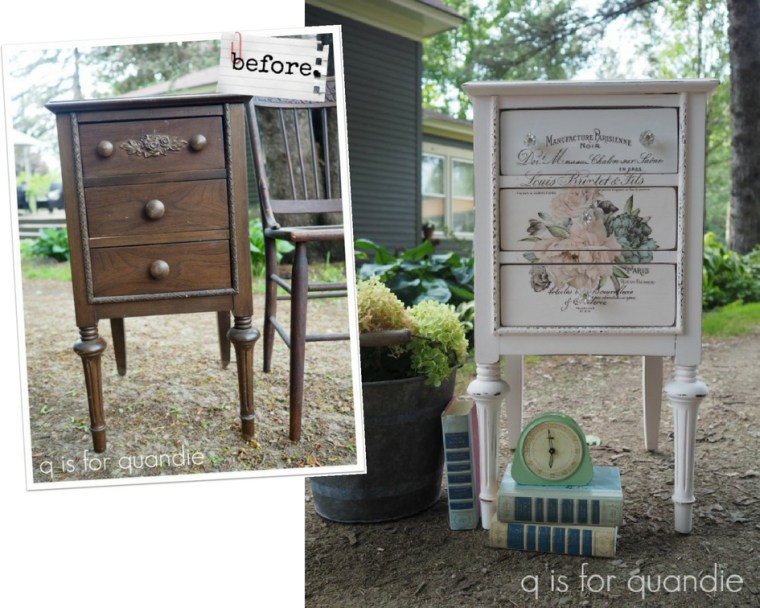
a sweet floral nightstand.

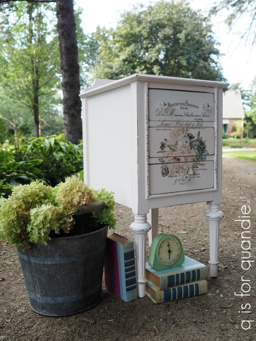
I purchased this sweet little nightstand at one of the neighborhood garage sales earlier this summer.

I sort of threw it in at the last minute because the price was right and I thought it would make a great smaller project for winter when I have to go back to painting in my living room.

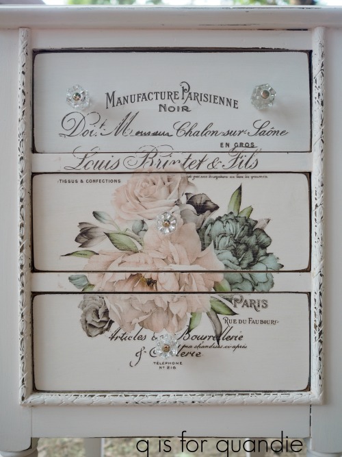
But then Prima Marketing sent me a few of the new transfers from their re.design line, including the Floral Home set.

And I realized that the one on the lower right would be perfect on this piece.

Shortly after that, Dixie Belle sent me some of their paint in a color called Pink Champagne.  It’s the most delicate pale, pale pink and I thought it might just be perfect behind that beautiful transfer.  So I simply couldn’t wait until winter to get started on this makeover.

Before I got started painting though I wanted to remove that carved rose detail from the front of the top drawer.  It looks OK in that ‘before’ photo, but in real life it looked really plastic-like.  I had to chip it off with a putty knife because it was made out of some strange rubbery, plastic, waxy, I don’t know what, kind of material.

But I got it off, did a little patching with some of Dixie Belle’s Mud and then painted the nightstand with three coats of the Pink Champagne.  Next I sanded the edges and the detailed trim to distress.

Then came the fun part.  Adding the Prima Marketing transfer.  The transfer design had a pretty scroll-y frame around it, but I cut that off because it was just a tad bigger than my drawer fronts with the frame included.

One detail you might notice in that photo is that I don’t just apply the transfer to the drawer fronts leaving gaps where those cross pieces are between the drawers.  I did that once and I thought it looked kind of funny.  I prefer to put the drawers back in place and then apply the transfer without any blank spaces between the drawers.

If you use this technique, just be absolutely sure that your drawers are back in the right spots before you begin because there’s no going back.

Once the transfer was applied, I went over it ever so lightly with some fine grit sandpaper to give it a little bit of a distressed look as well.  I finished the piece with some of Dixie Belle’s Spray On Wax.  I used it right over the transfer and it worked beautifully.  That stuff is just so darn easy to use.

I replaced the original wood knobs with some petite glass knobs that I purchased from D Lawless.  These are the 1″ version.

Let’s face it, something this pink and flowery was just calling out for glass knobs.

I’m still dying to put those gorgeous Prima Marketing knob transfers that I shared with you a couple of weeks ago to work, but obviously it would have been a bit much to have knobs with transfers on top of a larger transfer.

I’m sure I will come across just the right piece for some knob transfers soon though.

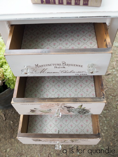
In keeping with my ‘never say never’ motto, I once again lined the drawers with pretty paper.  I just happened to have this old roll of wallpaper in my workshop, so why not?

By the way, after working on this piece I came to the conclusion that it was probably originally one half of a dressing table.  There are some screw holes on one side, plus the wood on one side looked a little bit rough around where it would have connected to a center piece between the two sides (although you have to look closely in person to notice those details, they don’t show up at all in a photo).

I wonder what happened to its other half.

Didn’t this one turn out sweet?

As usual, if you are local and in need of a new nightstand, be sure to check my ‘available for local sale‘ page for more details.
the mid mod madness continues.

I told you guys all about my July dry spell, only one piece of furniture sold in the entire month.  As a result of the dry spell, I spent some time re-evaluating my business plan (that’s a fancy way of saying that I obsessed about this while I was in the shower every morning) and decided to look for a few more mid-century pieces because they seem to sell more quickly.

So I picked up a few mid-mod pieces in the first part of August and got to work.

And then while I was working on those, I sold eight pieces.  All of them vintage farmhouse style rather than mid-century.

Naturally.

Well, of course that’s a good thing because those are the pieces that I love working on.  So now I feel confident in doing more of them.

In fact, sales really took off in August.  I went from having my worst month ever in July to having my best month ever in August.  Such is the world of furniture sales I guess, it’s like a roller coaster.

Meanwhile, I finished up one more mid-mod piece last week.  It’s the third piece in a set of three.  You’ll remember the first two that I painted in Fusion’s Ash.  Unfortunately I totally neglected to get a ‘before’ photo of this last piece, but suffice to say it looked just like the other two …

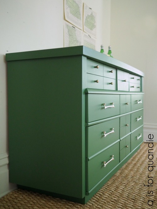
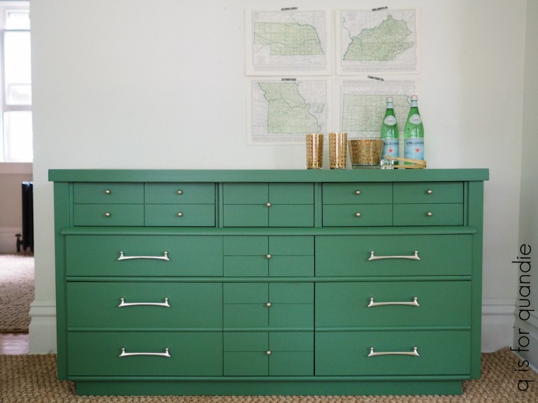
But this time, instead of the Ash, I went with my go-to color for mid-century low boys … Fusion’s Park Bench.

This shade of green just works beautifully with the mid-mod vibe.

I followed my usual m.o. of sanding lightly, cleaning with Krud Kutter kitchen degreaser, rinsing with clear water and then painting with two coats of Park Bench.

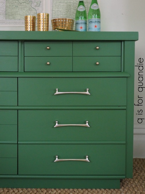
You may remember that I spruced up the hardware on the dark grey pieces using Prima Marketing’s Metallique wax in Bronze Age.  But for this piece I wanted to retain the light gold on the drawer pulls, so I just washed those with soapy water and put them back on.  But the little round knobs were a much darker brass color than the pulls.  To get a better match, I again used the Metallique wax, but this time in a color called White Gold.

It ended up being the perfect match for the existing color on the pulls.

Just for fun, I staged the piece as a buffet.

These pieces are really very versatile.  Of course you can just use them in a bedroom, but they also work beautifully as a sideboard in the dining room or to hold a wide screen TV in the living room.

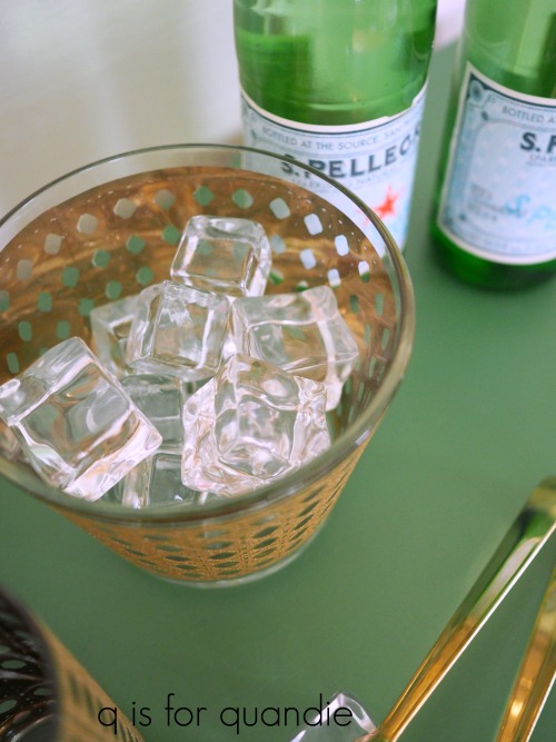
Remember my fake ice cube purchase at a garage sale?  I still just love the fake ice and how much fun it is for photo shoots!

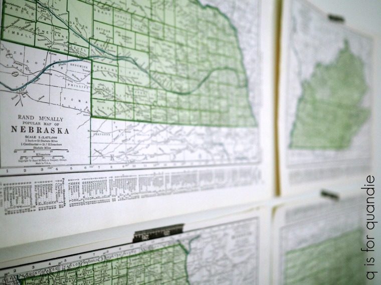
You may also remember that I purchased an old Atlas at a garage sale earlier this summer because I thought the predominantly green maps inside would be perfect for styling pieces painted in Park Bench.

Yep, perfect shade of green.

Have you noticed that there are a lot of furniture re-finishers out there who line their drawers with really pretty paper.  I think that looks gorgeous, but I rarely do it.  Mainly that’s because I find lining drawers to be an annoying little task.  But also, the really pretty paper is kind of expensive.

I’ve checked Spoonflower.com and a 26″ x 72″ roll is typically about $15 plus shipping unless you spend at least $60, then shipping is free.  I would need three rolls to line all of the drawers in this dresser … so yep, $45 plus shipping.  Yikes!  That adds up fast.

However, when my sister and were out at the Mac-Grove sales last Saturday we stopped for lunch at Billy’s on Grand and right next door was the Paper Source.  The full price for most of their rolls of paper was $9.95 and the rolls contain two sheets of 27″ x 39″ paper, so just a tad more paper for a bit less money than the Spoonflower rolls, but still a bit pricey.

They also have loose sheets of 20″ x 30″ paper starting at $4.95 per sheet.

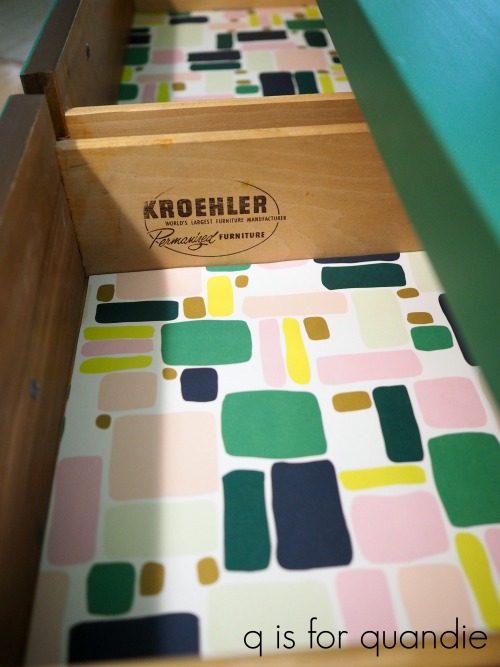
But the real bargain turned out to be the summer clearance rack where the loose sheets of paper were 50% off.  That’s where I found the perfect paper to go with the Park Bench green.

Unfortunately there weren’t enough sheets to do all of the drawers, so I just lined the top three.  But I was able to do it for less than $5.

I wish they’d had more of this paper, it would work really well with the Millennial Pink mid-mod pieces I do too.

I’ll be listing this piece online today and I’m hoping it sells as quickly as my previous Park Bench pieces.

Fingers crossed!

And of course, if any of my local readers need a fabulous green dresser, be sure to check my ‘available for local sale‘ page for more details.
the free dresser.

I’ve been so excited to share today’s piece with you guys!  I actually finished it over a week ago, but I had so many other posts waiting to go … plus I had been bumping the wax giveaway post for several weeks so I had to get that one up last week (by the way, the winners have all been notified via email and are Pat, Laura & Sheri).

OK, so on with today’s post!

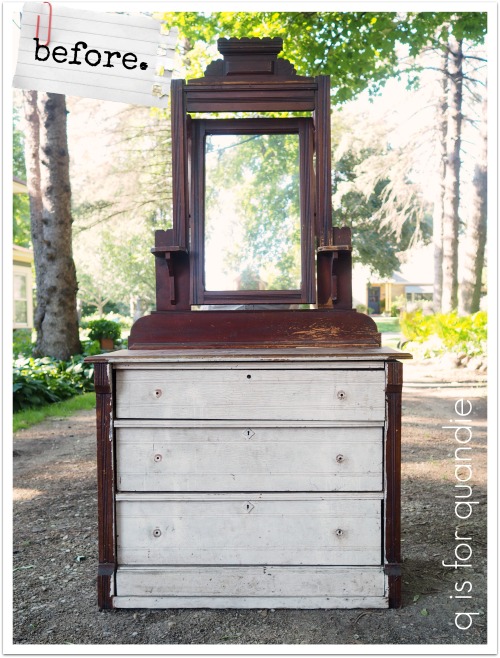
You’ll remember that back when I shared a tour of Jackie’s garden (here and here), I mentioned that she had offered me a free dresser.

Obviously it had seen better days, that’s why it was free.

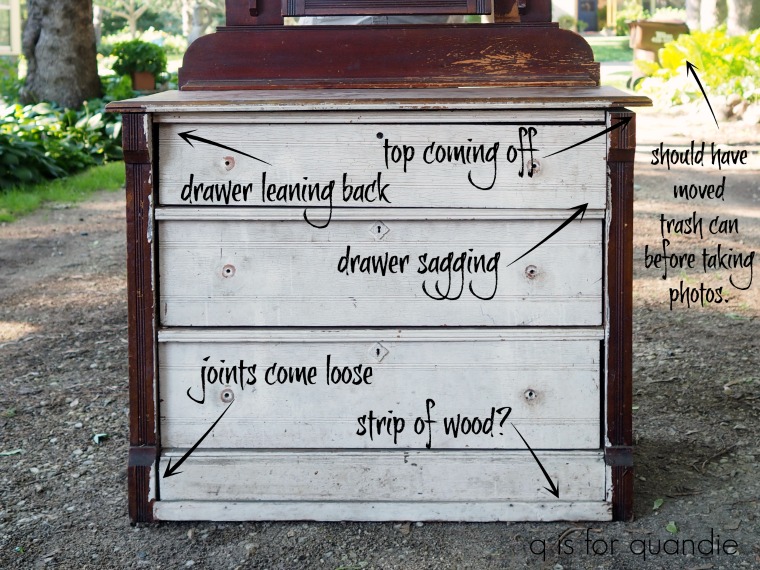
Let’s start by identifying the issues.

My handyman neighbor Ken hauled this piece next door to his own workshop to give it a complete overhaul.

He started by removing that odd strip of wood that had been added to the bottom front of the dresser.  I suspect that was added at some point as a quick fix to hold the dresser together.  Ken took it off and then glued and clamped those joints back together.  He also removed the top of the dresser and re-glued it with dowel pins.

Next he replaced one of the drawer slides for the top drawer that was missing from the inside.  That was why the top drawer was sagging down on the right side.

Then he also built up the bottom sides of that drawer.

The sides of a drawer can wear down after rubbing on those slides after 75+ years or so!  That causes the drawer to tilt backwards a bit at the top when it’s pushed in.

As you’ll see shortly, the top drawer now sits in place perfectly thanks to Ken’s repairs.

Once the repairs were all finished, I stripped and waxed the top of the dresser using my usual technique.  Stripping with Citristrip, cleaning, sanding and then waxing with Miss Mustard Seed’s Antiquing Wax.

When I have a piece with a solid wood top like this with plenty of stains and dings, I prefer to leave them.  I love the patina they add, the sense of age and of this being a piece that was well used.

Next I sanded the rest of the piece and cleaned it well using Krud Kutter kitchen degreaser, followed by a rinse with clean water.

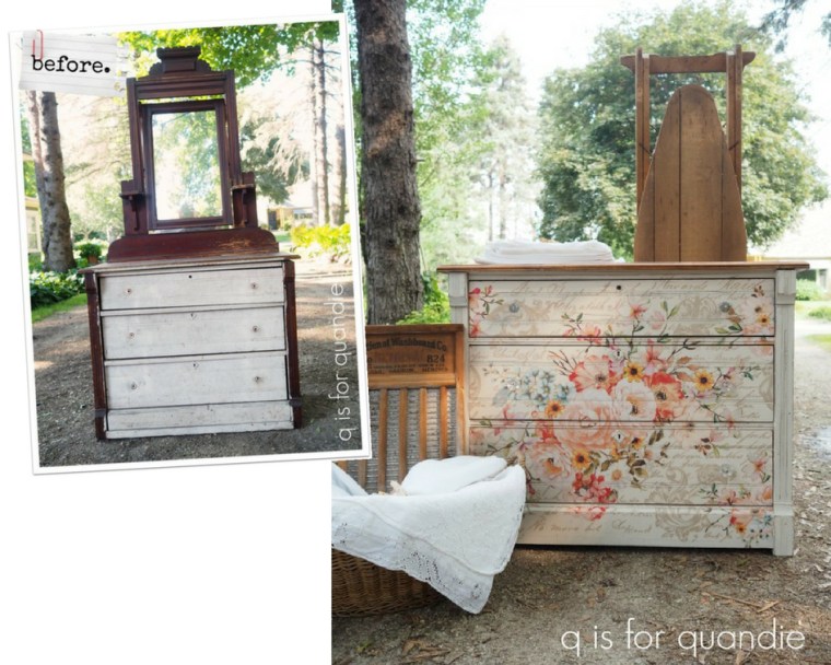
The chippy, vintage look of milk paint is perfect for these antique Eastlake style pieces so I pulled out my stash of partially used bags of milk paint.  I had just a small amount of paint left in three different colors, Homestead House Raw Silk, Homestead House Casement and Miss Mustard Seed Marzipan.  None of them would have made enough paint for the entire piece, so I mixed them all together which ended up creating the perfect creamy color for this dresser.

I ended up doing three coats of paint on the body of the dresser to get good coverage with the light color over the dark original stain, but I only need two coats on the drawers fronts which were already painted white.  I had briefly debated the idea of just leaving the drawer fronts as is, but once I started painting the rest of the piece I could see that they really needed fresh paint as well.

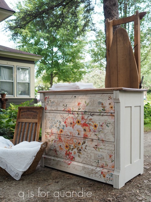
Next came the really fun part of this project.  I went through some of the new transfers that Prima Marketing sent me from their re.design line.  I pulled out an amazing floral design called Rose Celebration that comes on six sheets (two across and three down) and is a whopping 44″ wide x 30″ tall.

I really debated whether or not to use it on this dresser because the drawer fronts are only 32″ wide, so I knew I would be trimming about 6″ off each side of the design which felt sort of sacrilegious.  But in the end I decided what the heck.  I’m never going to find a dresser that is perfectly sized for the transfer, better to modify the transfer than endlessly search for a piece exactly 44″ wide, right?  Plus, since this dresser came from Jackie and she has such an amazing garden, it seemed entirely appropriate to go with this gorgeous floral transfer.

A quick q tip:  before you get started with one of these transfers, lay it out on a large table (or in my case, your baby grand piano) and make sure you have the pieces ready to go in the right order.

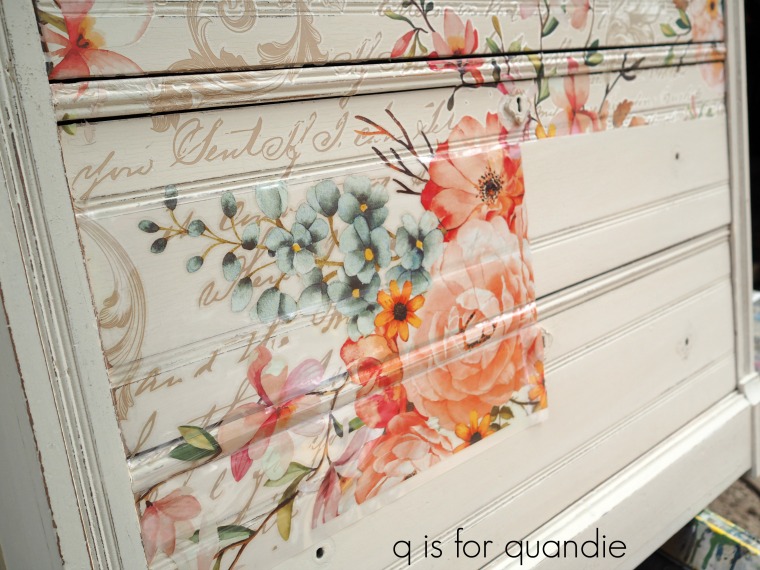
I then put the dresser up on some horses so that it was at a convenient height to work on.  With the drawers in place, I measured to find the center of the front of each and marked it with a pencil.  Next, I trimmed off most of the excess 6″ from the left side of the first sheet I’d be working with just to make it more manageable.  Then I removed the backing paper from the transfer and lined up the center of the design with my pencil marks at the center of the top drawer.  Once I was sure I had it even and level, I pressed it into place with my hands.  Before continuing on, I used a razor blade to trim the transfer more precisely on the left side and to slice the plastic sheet at the top and bottom of the drawers so it would lay more flat.  Then I used the wooden stick that comes with every transfer to apply it to the drawer.

Next I lined up the top right side piece of the transfer and followed the same process.  Then I moved down and lined up the top of the next piece with the bottom of the piece that was already applied above it.

Lining up the design was similar to lining up a repeat pattern on wallpaper.  If you’ve ever wallpapered, you will easily be able to line up one of these transfers.

I just continued to follow this process and applied the transfer going across and then down the rest of the dresser.

Keep in mind that perfection is not the name of the game here.  There were a few spots where I didn’t get the transfer adhered entirely, and things got a little kittywampus as far as keeping a straight line all the way across.  But as you’re about to see, that is entirely unnoticeable in the finished piece.

OK, you’ve gotten this far into my post and you’re probably dying to see the whole picture.  I won’t leave you in suspense any longer.

What the what?  How amazing is that?

You might be wondering at this point what happened to the mirror.  I like to remove them and turn them into separate pieces and you’ll see that later in the week, so stay tuned.

But back to this dresser itself …

I could just sit around and stare at it because it’s so pretty.

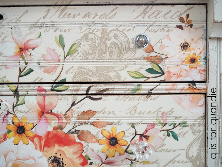
I like to use clear glass knobs on pieces with transfers because they don’t distract from the design of the transfers.

By the way, I have not added a top coat of any kind to the body of the dresser.  To make the piece more washable, I would add the Real Milk Paint Co’s Finishing Cream in Dead Flat over the paint and transfer.  That product is my favorite for pieces like this because I like the sheen (or lack thereof) and I like that its thick, gel-like consistency means little danger of drips (I’m bad about drips).  If you aren’t as drippy as I am, the Miss Mustard Seed Tough Coat is also a good option.  And of course, you could just use wax as well (yes, you can wax over the top of these transfers).

However, I have a couple of milk painted pieces in my own home including one with a transfer that I didn’t top coat and they have held up beautifully.

The top of the dresser is likely to see the most danger from sweating drinking glasses or other wet things being placed on it, and that is protected with the Miss Mustard Seed Antiquing Wax.

If you want to find out where to buy any of the Prima Marketing re.design products near you or online, check out this link to their ‘where to buy’ page.

I have to say, I am very proud of the work that both Ken and I did to salvage this dresser.  It always feels good to take a piece that most people would have chucked into the bin and turn it into something beautiful.

If you are local and in need of a beautiful floral dresser, be sure to check my ‘available for local sale‘ page to see if this piece is still available.

the french bench.

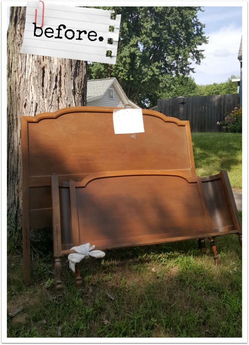
A while back one of my regulars, Suzy, emailed me because her neighbor had a headboard and foot board at the curb with a free sign on it.  She thought it might be something I’d like and she was willing to pull it off the curb and save it for me if I wanted it.

Here’s the photo she sent me.

Naturally I said yes.  Mr. Q and I drove out to Hudson, Wisconsin that evening to pick it up.

Although it was a bit plain looking (especially compared to that gorgeous bed I finished earlier this month), to me it looked like the perfect blank canvas for something creative.

However, the bed didn’t have its side rails.  There are kits that you can buy to add modern metal rails to a vintage headboard and foot board, so I was going to go that route.  But then I gave it a little more thought.  I’ve always admired benches that are made out of beds (in fact, I have one myself), so I wondered if my handyman Ken would be willing to turn these two pieces into a bench.

So I called him over for a consultation.  I showed him some examples on pinterest.  Then we took a few measurements and came up with a plan.  We made an agreement to split the profits equally on this piece since it would be about as much work for Ken to build the bench as it would be for me to finish it.

Then we carried the pieces over to Ken’s workshop (he lives just next door).

A few days later Ken called me and asked if I wanted to come over and take some photos of the bench building in progress (Ken’s workshop is so neat and tidy compared to mine).

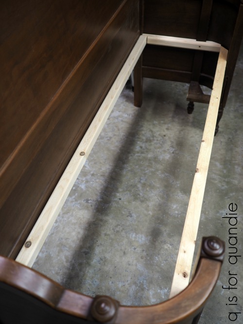
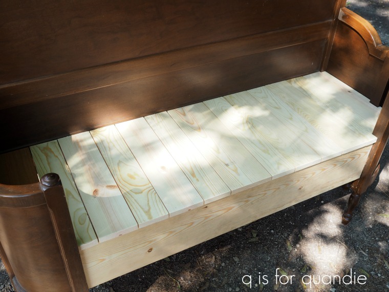
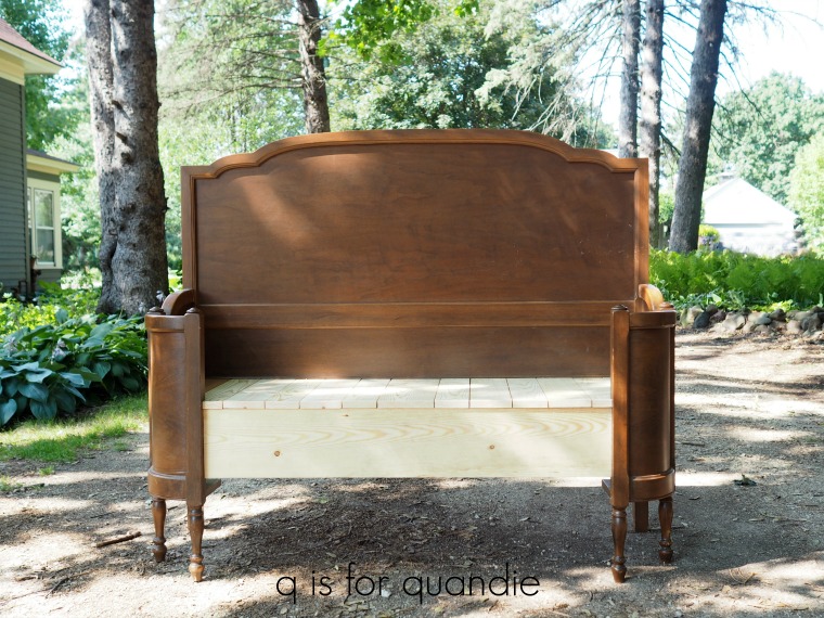
So far Ken had cut the foot board down and attached a section to each side of the bench.  There was about a 15″ section of foot board from the middle that wasn’t used.  Then he built a framework for the future seat of the bench to rest on.

He attached it with screws.

The next day Ken called again to say the bench was ready to go!

We had discussed the type of seat I wanted, planks that were perpendicular to the back of the bench and were varying widths.

I had considered doing some sort of upholstered seat, but in the long run I felt like a wooden seat was a better option.

Ken also added that trim board under the seat along the front.

Now it was my turn!

I sanded the headboard and foot board portions of the bench and then cleaned it all with just a damp rag.  Then I painted the entire thing with Fusion Mineral Paint in a color called Putty.

This is a great pale neutral greige sort of color.

Once the paint was fully dry, I sanded the edges of the headboard and foot board portions of the bench to distress.  If I had wanted to also distress the new wood seat, I could have stained it to match the older pieces before I painted so that the wood wouldn’t have looked quite so new in the distressed areas.  But I skipped that step.

Next came the pièce de résistance.

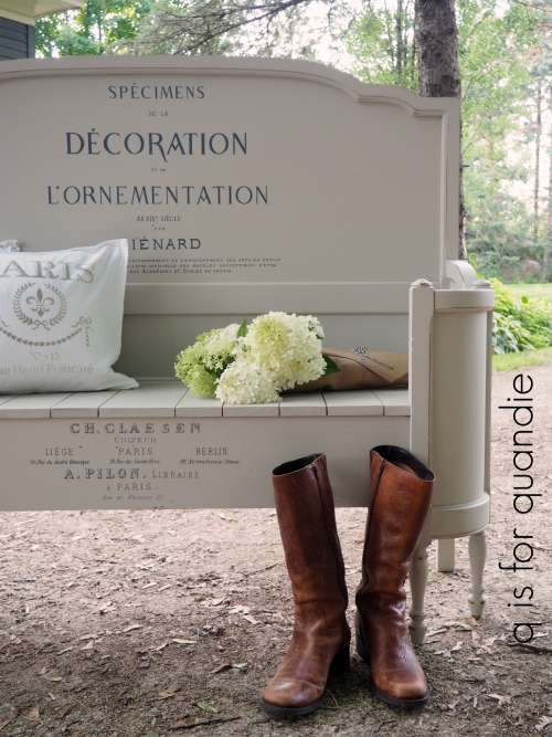
I added one of my favorite Prima Marketing furniture transfers to the bench.

I was careful to get the design centered and level, but otherwise it was very simple to apply.  This is the Specimens transfer and I’ve seen it online for as low as $14.39 from Scrapbook.com.

I didn’t use the entire design.  There was a little chunk in the middle that I left out.

By the way, I had to laugh when I started editing these photos.  My boots look positively huge in most of them.  Yes, I have giant feet.  Size 11 to be precise.  Maybe I need to buy some adorable size 6 boots the next time I’m at the thrift store just to use as a prop for photo shoots like this one.

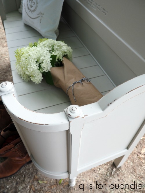
Those are Limelight hydrangeas on the bench.

I’m going to try and pull together a blog post about the various hydrangeas that I have before the summer is over, but suffice to say the Limelight is one of my favorites.

I’m going to share a separate blog post about the pillows too.

So you’ll have to stay tuned for that!

So what do you think of our french bench?  I know Ken is really proud of the work he did on this one.  He enjoyed the challenge of taking something that was no longer useful (without its side rails) and creating something functional out of it.

Ken makes things functional and then I make them pretty.  We make a dynamic duo.

If I didn’t already have an amazing bench, I’d definitely be keeping this one.  But, I do.  So this one is for sale while it lasts.  If you are local and interested in more details, be sure to check my ‘available for local sale page‘!

Thank you to Fusion Mineral Paint for supplying the paint for this project, and Prima Marketing for supplying the Specimens transfer.

more millennial pink.

A couple of weeks ago nnK (my neighbor across the street) purchased this mid-century modern dresser via Craigslist.

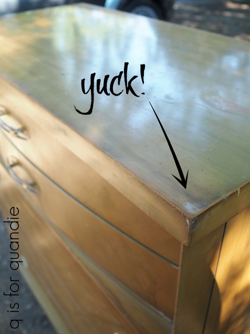
Once she got it home though, she asked me if I wanted to buy it from her and paint it.  I’m not sure why she decided not to keep it herself.  Perhaps because the finish was in kind of disgusting condition.

Sure, it looks OK in that photo, but here’s a close up that gives you a better idea of how gross it was.

Can you see all of that grime on there?  It had also been written on a few times and had plenty of scratches and dings.   All of this is by way of saying that often a piece can look pretty good from a distance in the ‘before’ photo while up close and personal it looks pretty bad.

As nnK handed the dresser over to me she suggested I paint it in Fusion’s Park Bench, my favorite shade of green for mid-century pieces.  But I’ve got a different piece that I’m currently painting in Park Bench, so I told her I wanted to paint this one pink.  She wasn’t too thrilled with that idea.  In fact, at first she tried to tell me that I could paint it any color but pink.

However, I’m pretty sure that she knows me well enough by now to know that once something belongs to me, I’ll do whatever I want to with it.

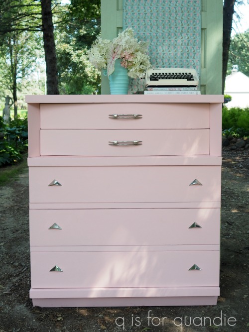
So I handed her the cash for it, and then I painted it pink!

Well, technically, first I sanded it down and cleaned off all of the grime with some Krud Kutter kitchen degreaser.  Then I painted it pink.

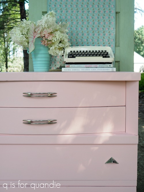
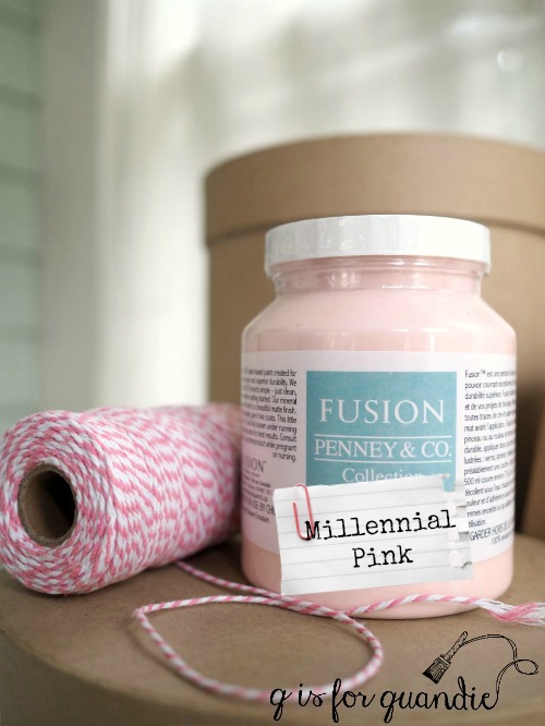
This is Fusion’s English Rose, but I prefer to call it Millennial Pink (simply so that I can jump on that bandwagon since it’s so popular right now).

I used some Brasso to clean up the original hardware and it shined up quite nicely.

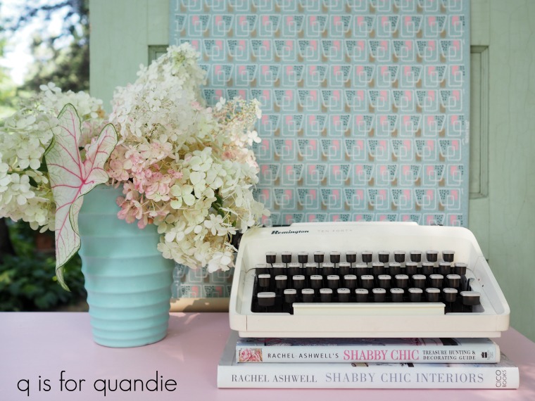
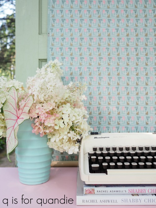
My Vanilla Strawberry hydrangea is covered in flowers this year, so obviously I had to use some of them to style these photos.

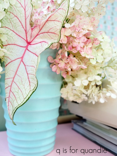
The flowers start out white and gradually turn pink over time.

The colors in the hydrangea were a perfect match for the colors in the caladium that I have in one of my window boxes, so I had to add a sprig of that too.

Thank you to Fusion for providing the paint that made this makeover possible.

I have another mid-mod piece in the works this weekend, but I also have another piece I’m working on that is much more ‘me’.  So be sure to check back next week!

Oh, and remember, if you are local and in need of a Millennial Pink mid-mod dresser, be sure to check my ‘available for local sale‘ page for more details.
this furniture is permanized.

So here’s the truth.  July was a complete bust as far as selling furniture is concerned.  I sold one piece in the entire month, and that was a small table that sold at Reclaiming Beautiful.

I’m not gonna lie, lack of sales is the biggest drain on my creativity.  Sounds mundane and prosaic to depend upon sales for the motivation to get creative, but that’s just how it works for me.

I also tend to start questioning the entire thing when nothing is selling.  Should I give up on the furniture painting hobby completely?  Or am I just painting the wrong pieces?  Is vintage farmhouse style out already?  Should I switch over to entirely mid-mod?  Maybe it’s my color choices.  Should I forget about shades of blue and move on to green?  Should I just paint everything black?

Ugh!

I suspect the answer is a combination of things, but mostly the fact that July is typically just a slow month for furniture sales.  People are spending time at the cabin or taking family vacations, not decorating.

Nonetheless, I decided to make a concerted effort to add a few more mid mod pieces to my line up because the mid-century stuff was selling really well for me for earlier this year.  My friend Sue forwarded a Craigslist ad to me for a 3-piece mid mod bedroom suite, so I contacted the seller and made arrangements to pick it up.

This past weekend I got started on the headboard and the tall dresser.

I wonder how many of you are looking at those photos and thinking yuck!

I have to admit, after I brought these home and took a proper look at them I was sort of thinking I’d made a mistake too.

But paint can perform miracles.  You’ll see.

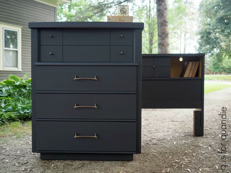
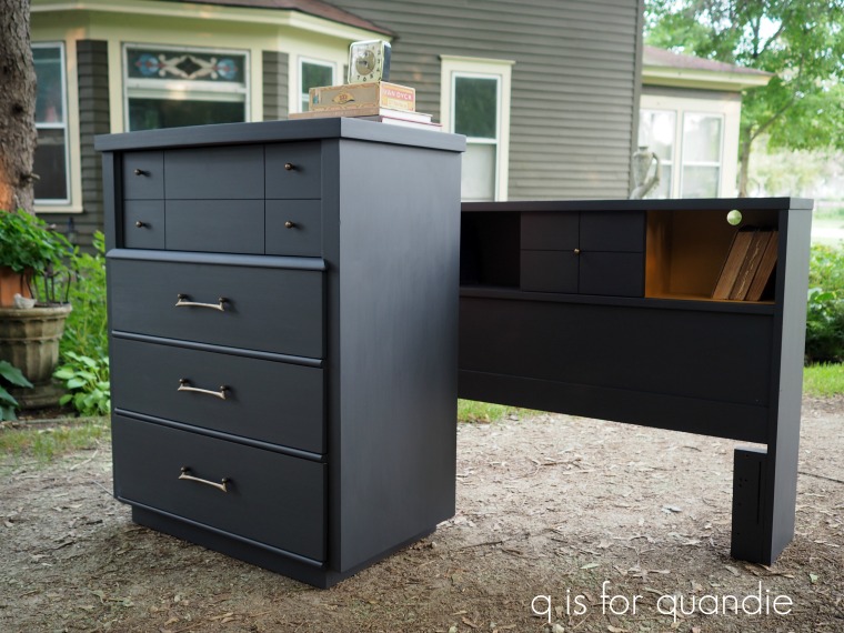
Although I’m normally not a fan of matching suites of furniture for any room, I decided to keep these two pieces together and paint them as a pair.  I was thinking they’d be perfect for a kid’s room.  They have a bit of a masculine feel to me, so I chose to paint them in Fusion’s Ash (thank you to Fusion for supplying me with the paint).

Let’s just jump right to the ‘after’ and then I’ll share the details of how I got there.

Amazing difference, right?

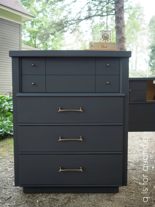
And here is my little secret.  This makeover was incredibly simple.  I prepped the pieces by removing the hardware, sanding them lightly, cleaning them with Krud Kutter Kitchen Degreaser, and then rinsing with clear water.  Once they dried out, I started with one coat of the Ash.  I almost could have gotten away with just one coat but there were a couple of spots that needed some additional touch up so I added a 2nd coat of paint.

The beauty of Fusion Mineral Paint is that it doesn’t require a top coat.  There is no additional step after prep and painting.  Ta da, you are done.  Well, unless you count putting the hardware back on.

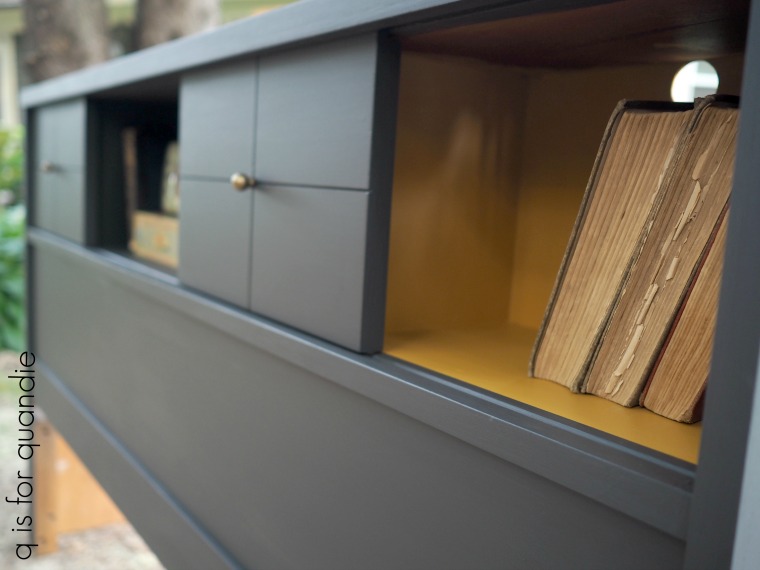
Once the Ash was dry, I taped off the inner cubbies on either side of the headboard and painted them with Fusion’s Mustard.

I know not everyone loves Mustard, although it does pair beautifully with this dark grey (and corn dogs), so I only painted the two sides.  The sliding doors can be pushed to each side creating a solid dark grey piece.

Or, slide the doors to the middle for that pop of Mustard.

I took that photo from a fairly low position which makes those holes for electrical wires look kind of obvious.  In person they aren’t noticeable at all.  They do make it convenient for an alarm clock and a phone charging station though.

The beauty of the sliding doors is that you can move them around any way you like.

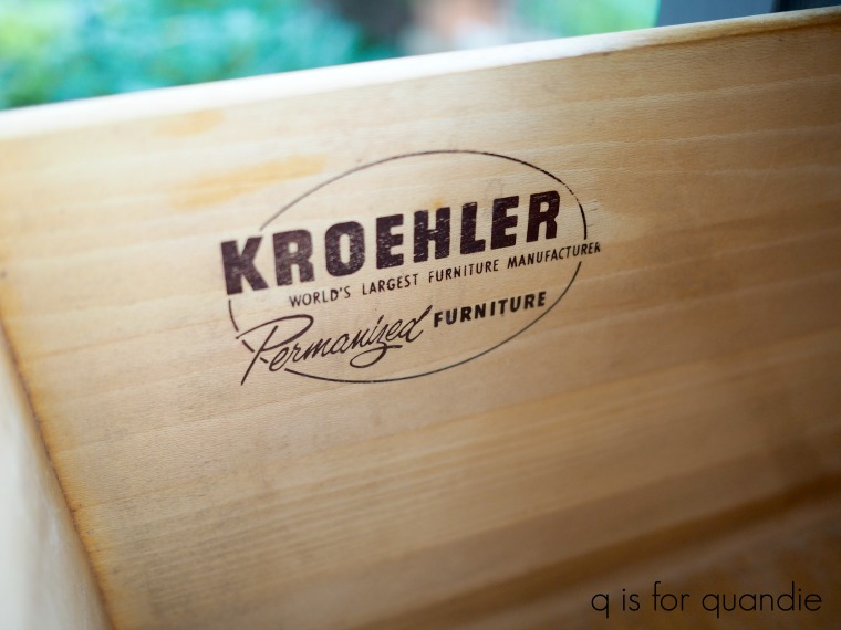
The dresser is also painted in Ash.  The insides of the drawers were in pristine condition and there was no need to line them, or paint them Mustard.  Maybe that’s because this dresser was permanized by the world’s largest furniture manufacturer!

Ha!  I don’t know what ‘permanized’ means, but I suspect the real reason that the drawers are so clean inside is because they were all lined with paper.  Not sticky, gross, contact paper but just sheets of loose paper that came right out.  Nice!

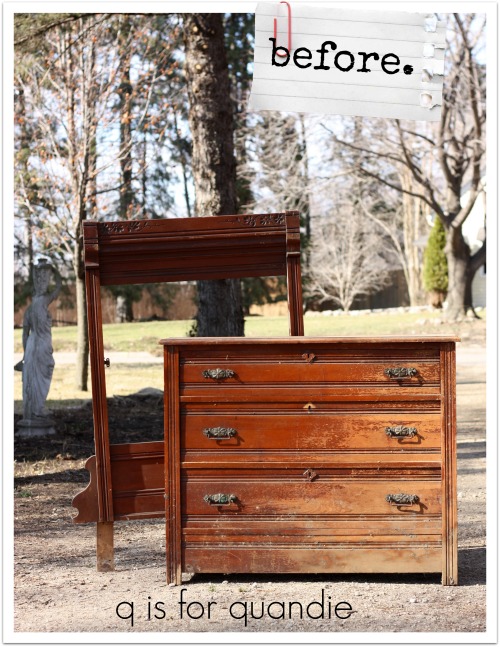
 Have you noticed that the knobs and pulls on this piece look just a little bit different in the ‘after’ photos?  Scroll back up and check them out again in the ‘before’ photo.  See?  They were a bright, shiny gold.

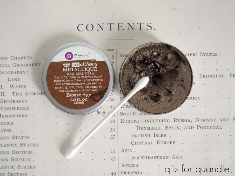
To tone them down a bit I sanded them to give them some tooth, and then I coated them with Prima Marketing’s art alchemy Metallique wax in Bronze Age.

This color looks gorgeous next to the dark grey and gives the hardware a more industrialized or masculine look.

I’ve got some of this wax to give away, but I just haven’t gotten around to it yet.  I’ll try to get it on the schedule for next week, so be sure to keep an eye out for that post.

By the way, the forest fires out west were creating a bit of a haze for us here in Minnesota last Saturday morning when I took these photos.  We were under an air quality alert and that haze definitely affected the quality of the light in my photos.

Anyway, there you have it.  A mid mod makeover that took about one day to accomplish.

Now let’s see if it sells!

If any of you local readers need a mid-mod dresser and headboard, be sure to check my available for local sale page for more details.
it’s a million miles from the morning light.

It’s the darkest hour
Of the darkest night
It’s a million miles
From the morning light

Anybody else remember that song by Gary Moore, Midnight Blues?  I’m probably dating myself again.  Well, if you’re in the mood for some bluesy guitar riffs check it out on YouTube.

But if you’re in the mood for some bluesy furniture, stick with me.

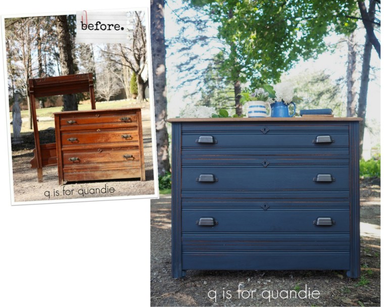
Let’s start at the beginning with a ‘before’ photo.

If you’re paying attention to details in the photo you might guess that I brought this dresser home last spring before there were any leaves on the trees.  But actually I brought this dresser home in spring of 2017.

I initially wanted it for its mirror frame.  I turned that into a chalkboard way back then, but I’ll be darned if I can find the blog post about it!  I’ve done so many that they are all starting to blend together in my mind.

But anyway … that left the dresser.  Which then sat in my carriage house for over a year.  I hate storing furniture that long.  It’s not good for the furniture.  My carriage house is damp, stinky and full of critters like spiders and mice and possums, oh my!

However, as you can see from the photo, this one was already in terrible shape so I suppose another 16 months or so in storage didn’t do too much additional damage.  I finally pulled it out a few weeks ago to get started on it.

First my handyman Ken had to do some work.  The top of the dresser had split its seam, so he took it off and repaired it with glue and dowel pins.  Then reattached it to the dresser.  Ken wasn’t entirely happy with the repair because he wanted the seam to be invisible.

I try to explain to him that I like the rustic look.  As long as the piece is sturdily glued and isn’t going to fall apart, I’m happy with a non-perfect look.

Once the repair was done, I stripped the finish from the top, sanded it down and then waxed it with Miss Mustard Seed’s Antiquing Wax.

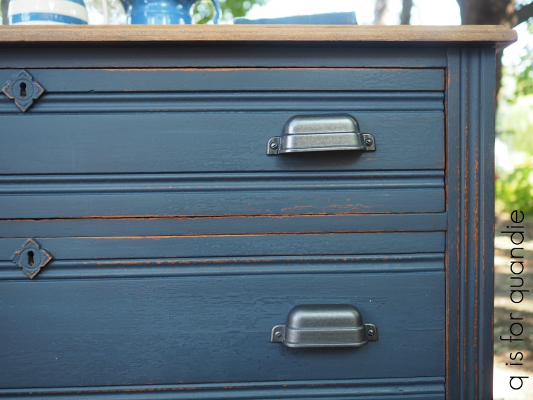
I painted the rest of the piece with Homestead House milk paint in Midnight Blue.

I’d say this color is certainly a million miles from the morning light.  It’s the most gorgeous deep, rich, navy blue.  The color of darkest night.

You might be wondering why I chose the milk paint version of the paint rather than the Fusion acrylic version of the paint, because both come in Midnight Blue (and if you didn’t already know this, Fusion Mineral Paint and Homestead House Milk Paint come from the same company, as does Miss Mustard Seed Milk Paint).  However, I wanted a more aged looking finish on this dresser.  Something that looked more authentically old to match the age of the dresser itself.

Plus, there was quite a lot of texture left on this piece from the previous finish.  I could have sanded that down to bare wood, or stripped it, but I like the look of that texture.  Especially with milk paint.

I also wanted to distress the piece and that is easier to do with milk paint.  You can do it with Fusion, but it just doesn’t have quite the same look and it takes just a little bit more elbow grease (or pre-treatment with Homestead House Salad Bowl Finish, but that’s another subject altogether).

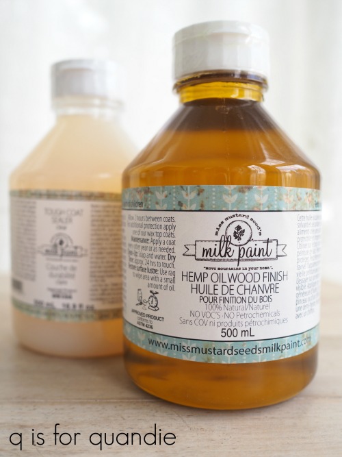
After two coats of the milk paint were dry, I sanded with 180 grit paper and then added a coat of Miss Mustard Seed’s Hemp Oil to give me the darkest version of the color.  Hemp oil will give you a deeper, darker version of your milk paint color while wax will leave the color a little bit lighter.

Also, keep in mind that most water based sealers like the Miss Mustard Seed Tough Coat or The Real Milk Paint Co’s Finishing Cream may look cloudy or streaky over dark colors and neither product is recommended for use over deep, dark colors like this one.

The final obstacle in the makeover of this dresser was the drawer pulls.  Looking at the before picture you might be tempted to think that the originals were pretty fab and could be put back on.  However, in reality they were pretty beat up; bent out of shape, rusty and crusty.  Plus one was missing its bail.  I wanted to replace them with some brass cup pulls but I had a heck of time finding just what I wanted at a reasonable price.
I found what I thought was a great option on Amazon until I realized they came in a five-pack.  Ugh.  A five-pack?  What are they thinking?  Who needs an odd number of pulls?  Well, maybe for a kitchen I suppose.  But I would have had to order two packs at around $25 each and then would have had 4 left over.  I may have been able to use 4 pulls down the road, but who knows.

So instead I ended up with these pulls from Target.  These came in a six-pack which was perfect.  They were $27.99 plus tax.  They also happened to fit the existing holes from the original hardware.
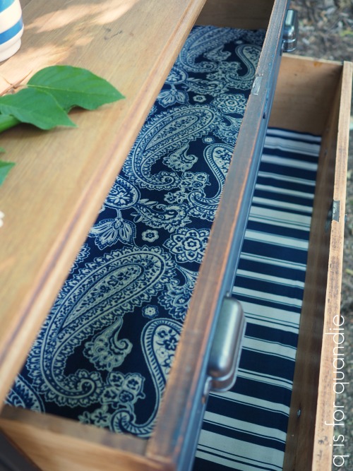
The drawer bottoms for this piece weren’t in really awful shape, but they did show some signs of their age.  So I opted to line them with some fabric that I purchased at a garage sale a couple of years back.

I didn’t have enough of either fabric for all three drawers, so the top drawer got the paisley and the bottom two got the coordinating stripe.  To line drawers with fabric I simply cut the fabric to fit and then use some spray adhesive to hold it in place.  If the future buyer wants to remove it down the road, it will be easy for them to pull it back out and clean off the adhesive residue.  It comes out much more easily than contact paper or, heaven forbid, paper that was decoupaged into place.

I think it goes without saying that this piece was definitely improved.

The cup pulls give it an updated feel.  It’s all spruced up and ready for a new home.

If you are local and need a Midnight Blue dresser check out my ‘available for local sale‘ page for more details!

I’ll be sharing the rest of the tour of Jackie’s garden on Wednesday this week, so be sure to stay tuned.

Please note that Homestead House provided the milk paint used on this dresser, but all opinions are my own.