A while back I mentioned that I’d seen a YouTube video where the creator was using Dixie Belle’s Coffee Bean paint and calling it ‘black’.
That led me to take a 2nd look at Coffee Bean.

I had some on hand, and I’d used it here and there as a base coat, or a shadow color with stencils and I’d always considered it a dark chocolate brown. And brown has never been one of my favorite colors. So I pulled it out to take a closer look.
And you know what? It’s pretty dark. You have to look closely to see those warm hints of dark brown. At first glance, it really does look black.
This revelation dovetails nicely with a gradual change in my appreciation for black.
Back in 2018 I was painting everything in Dixie Belle’s Caviar.

Caviar is a rich, deep, super dark black.
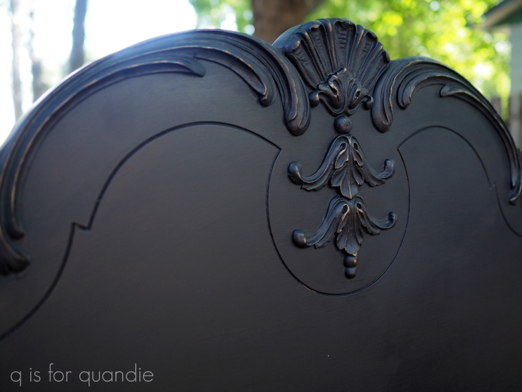
But then in 2019 I discovered Dixie Belle’s Midnight Sky and it became my new go-to black.
Midnight Sky is just a little bit less black, sort of a slightly faded version of black.

It’s a little less harsh. It also has the added benefit of not showing quite as many fingerprints as Caviar tends to do.
As a side bar, the Anchor shown in that photo above is from Dixie Belle’s Silk line, so it’s an acrylic paint rather than a chalk style paint. It’s also a deep, rich black like the Caviar.
I painted our baby grand piano in Midnight Sky.

If you’ve read my blog for long, you know that no one in our household actually plays the piano. It’s a long story, but someone gave me this piano and I had intended to learn to play. Um, yeah, in my spare time (which I still don’t seem to have even though I’m now retired from the day job). However, it has turned out to be the most versatile piece of furniture for me. It’s the perfect spot for folding laundry, wrapping presents, doing a jigsaw puzzle, or putting out a buffet at a party. I also have a huge drop cloth that I drape over it and it becomes my workbench in the winter when I can’t be out in the carriage house.
The beauty of the Midnight Sky is that it barely shows the inevitable dings and dust that result from that kind of use. Since it’s a chalk style paint, it’s also super easy to repair more significant damage. For example, I tried to use the piano as an ironing board at one point without thinking about what the steam setting would do to the paint job. But the fix was as simple as sanding that area down a bit, feathering in some more Midnight Sky in that one spot, and then buffing everything with another coat of clear wax. Easy peasy.
Actually, it was literally easy peasy because I used Dixie Belle’s Easy Peasy spray wax.
But I digress.
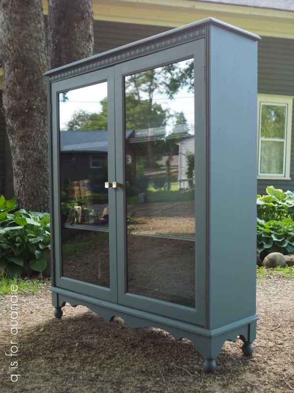
I still use Caviar on some pieces, like this armoire …

But I’d been reaching for the Midnight Sky a little more often.
It was gorgeous on this spoon carved set.

But lately I’ve found that I’m no longer as fond of black. It feels just a little too … well … sort of cold. Don’t get me wrong, I still like dark shades. But I want them to be just a little bit warmer.
And that’s where the Coffee Bean comes in.
I used it a last fall on this wooden tote, and I really liked it.

Still, I really thought I’d never see the day when I’d decide to paint a piece of furniture ‘brown’. Yet that’s exactly what I decided to do with this vintage bankers chair.
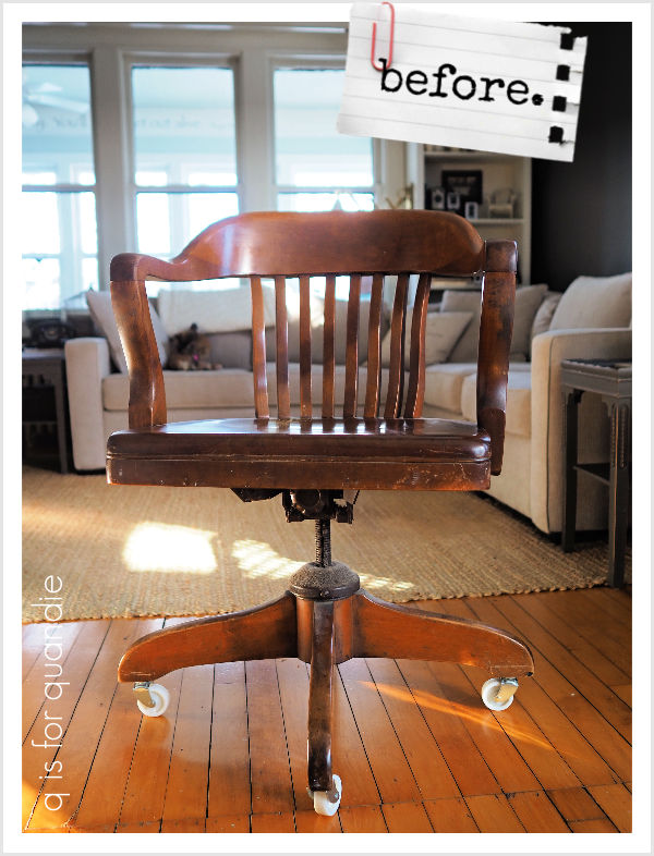
Mr. Q used this chair in his study for … well … a long time. I’m not exactly sure how many years it has been. But now that he is spending more and more time editing videos for his YouTube channel, he decided it was time for a comfier chair.
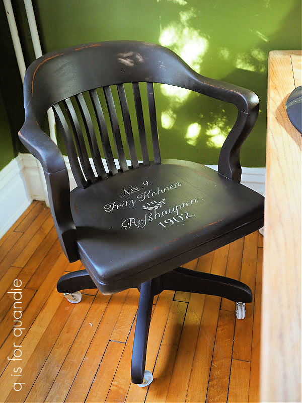
The chair was quite beat up after all of that use, and also quite filthy! So after giving it a good cleaning, I decided to paint it in Coffee Bean. Once painted, I added a quick stencil to the seat using Dixie Belle’s Putty.

Gosh, in that photo the stencil looks as though it was done using a white paint, but trust me, it’s Putty. Let’s try a close up photo to see if I can capture the color more effectively.

That’s better.
By the way, I’ve used this stencil quite a lot without cleaning it properly afterwards. As a result, I am no longer getting a nice crisp image. So I decided to order a new one to replace it, but it seems as though the company I originally ordered it from, Maison de Stencils, is no longer in business. Their website is unavailable and the most recent post on their Facebook page is from June 2022. They also no longer seem to have a presence on Etsy under the name Maison de Stencils. After a bit more searching, I did find this same stencil available from Euro Stencil Design on Etsy. It also appears as though this may be the same seller, but with a name change?? I’m really not sure, but if you’re looking for this stencil, start there.
I sanded the stenciled design down, along with the rest of the chair to give it some age.

I then finished it off with some of Dixie Belle’s Big Mama’s Butta in the Orange Grove scent.
I staged the photos in my newly painted q branch, but I won’t be keeping this chair. I prefer something a little cushier myself. But hopefully I can find a buyer for it. I did a bit of googling and found lots of similar chairs out there including a reproduction option at Wayfair for $203 and lots of authentic versions on Etsy ranging from $389 and up.
I’ve decided to price mine at $125 so someone out there can get a bargain. It’s in good shape and is quite sturdy. So if any of you locals need a vintage bankers chair, be sure to check out my ‘available for local sale‘ page for more details on this one.
As for the rest of you, leave a comment and let me know what you think of Coffee Bean as the new black.
As always, thanks to Dixie Belle Paint Co for providing the products used on this chair.