the problem with perfection.

I’m pretty sure we all suffer from self-doubt, right?

Well, I often feel like an impostor.  Like I’m just faking this furniture re-styling/blogging thing.  I’m not doing it for real, I’m just doing it for fun.

I frequently compare my work to others and find it lacking.  I feel like my work isn’t good enough to put me in the same league as what I call the ‘professional’ bloggers (those are the ones who make money from their blogs, but who also spend money on their blogs in the form of professional web design, expensive camera equipment, trips to blogging conferences, and they are also the ones for whom blogging is their job).

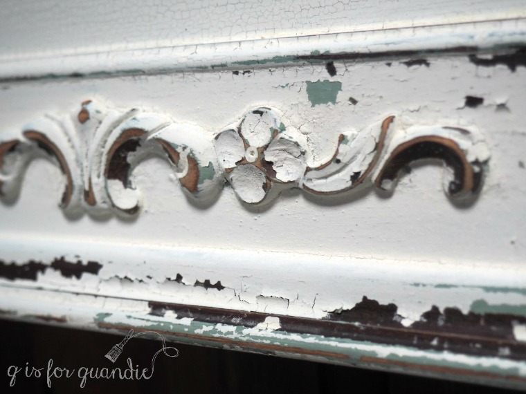
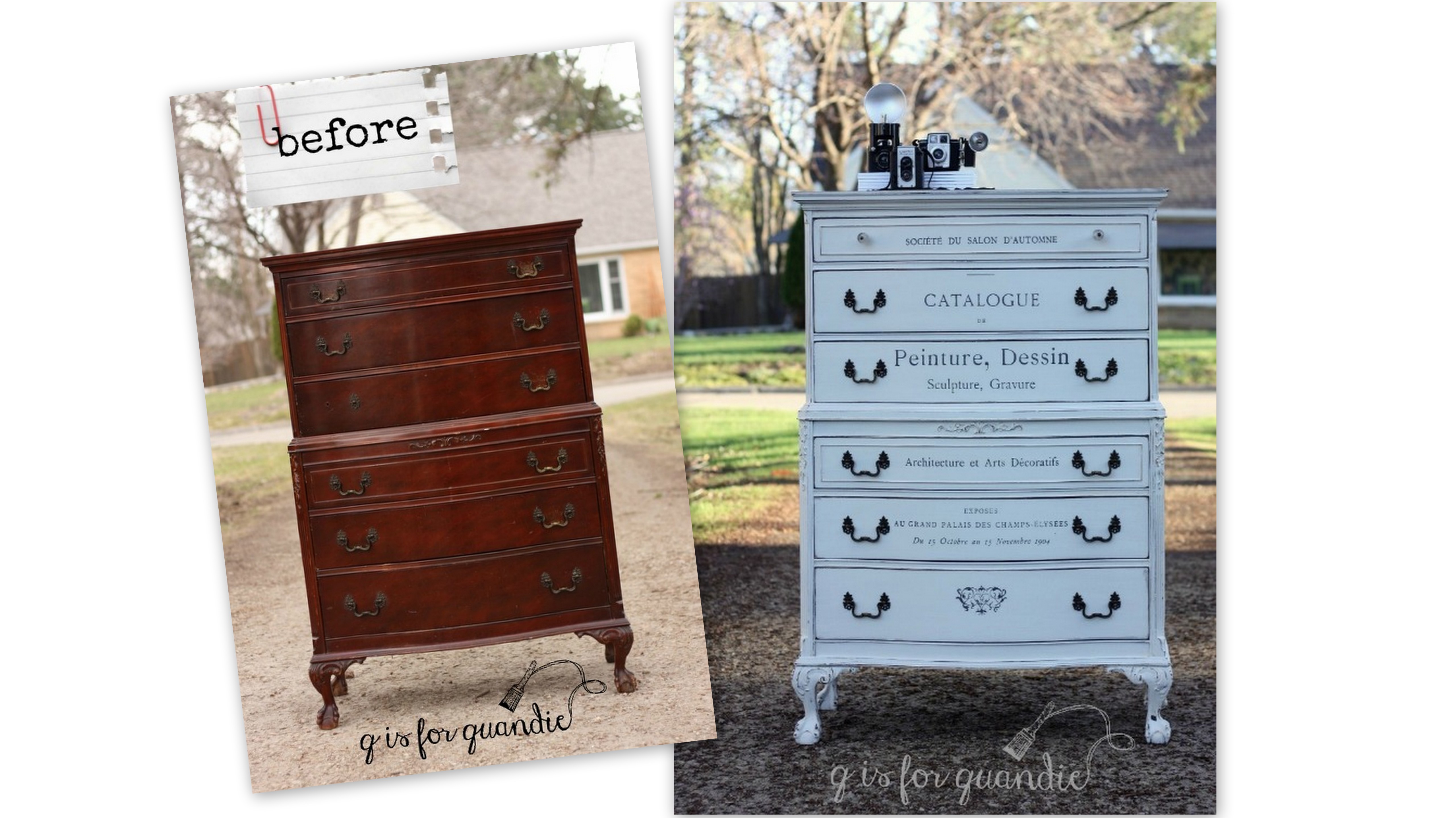
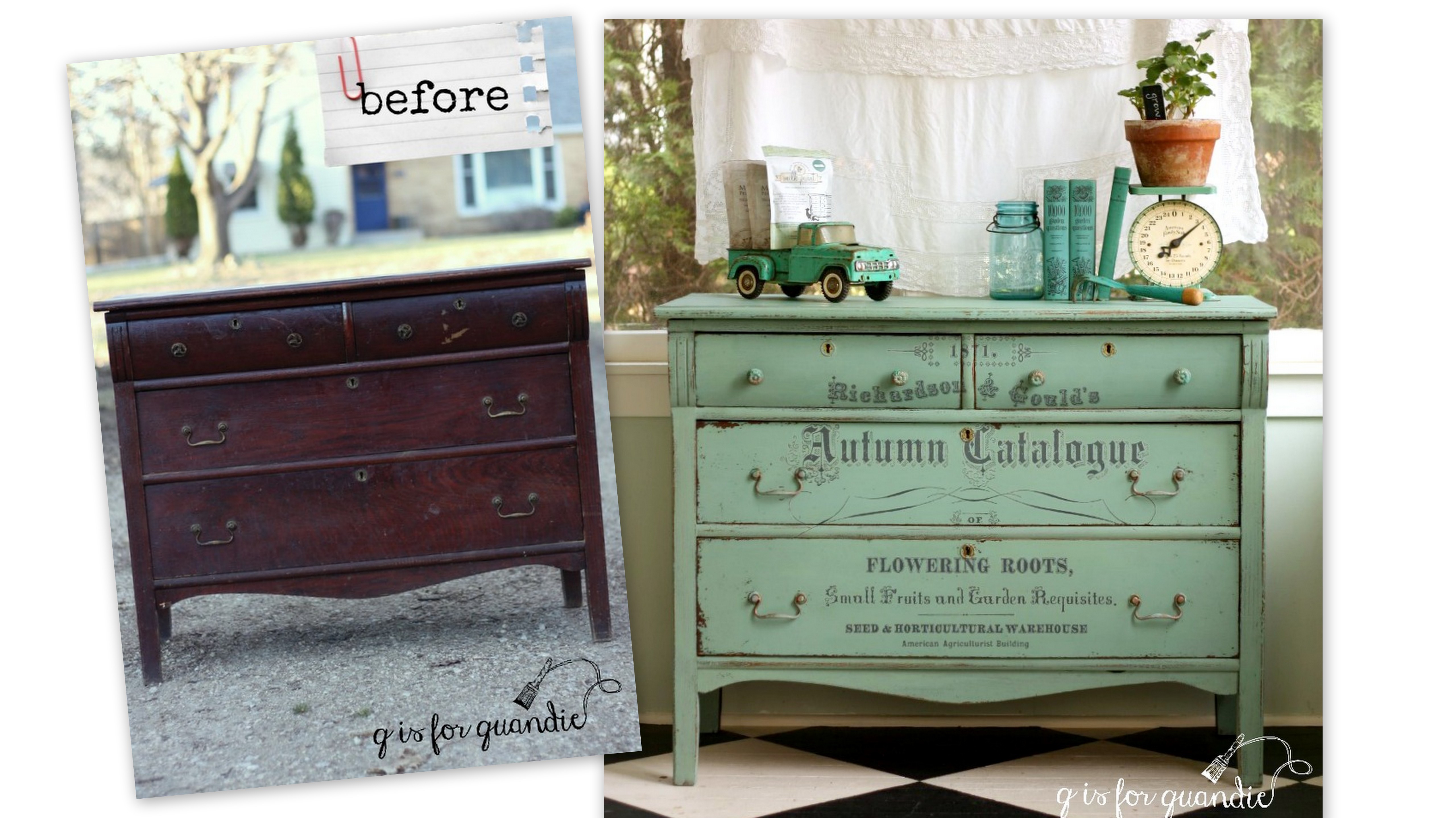
Recently I was reading a blog post by another furniture refinisher who takes the time to use spackling compound to fill any scratches or gouges in the furniture she is about to paint.  Her completed piece was beautiful, for sure.  It had a totally smooth, blemish-free finish.  And I found myself immediately thinking “oh my gosh, I should be doing that, why am I not doing that?” which really translates to “my work is inferior.”

I was just about to add “buy spackling compound” to my to-do list when I realized, hey, wait a minute, I actually prefer furniture with some flaws.

You see, the problem with perfection is that you can’t maintain it for very long. And let’s face it, that little bit of wisdom applies to pretty much everything, not just painted furniture.  It’s true about relationships, hair styles, gardening, new cars … that first ding on your new car is always such a disappointing moment.

Eventually every piece of furniture (or relationship, or car) is going to end up with some dings and scratches though.  Someone is going to set a cup of hot coffee on it, or bash the lower corner with the vacuum cleaner.  That’s life.

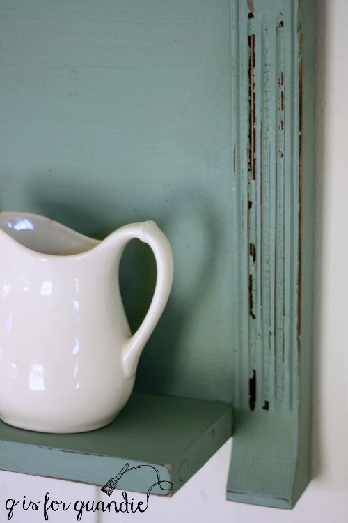
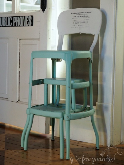
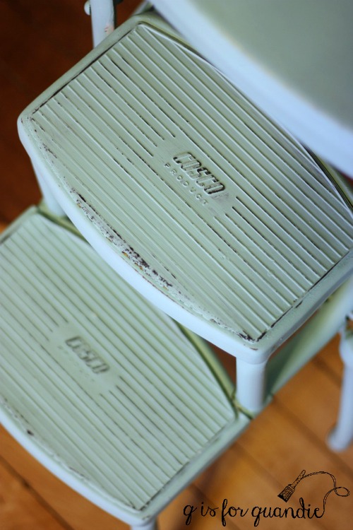
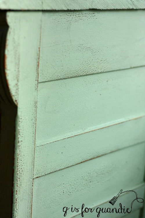
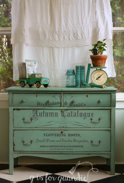
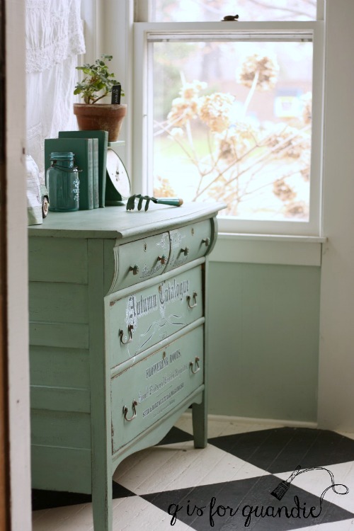
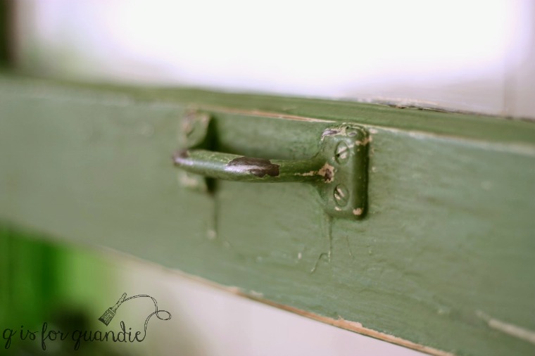
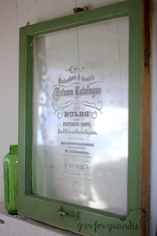
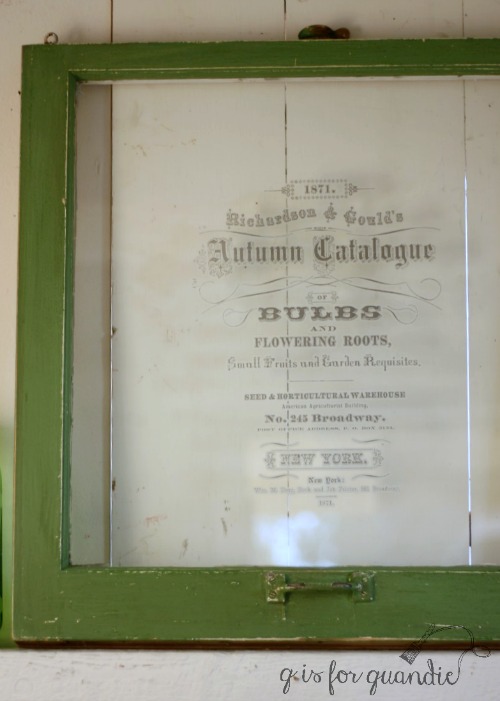
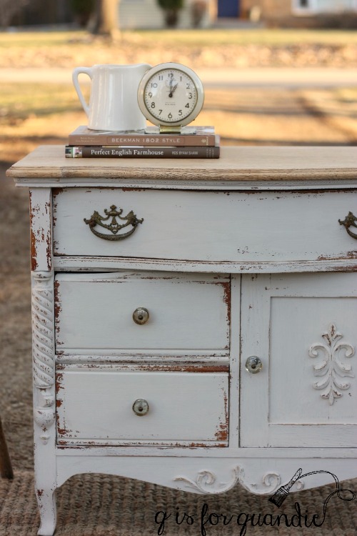
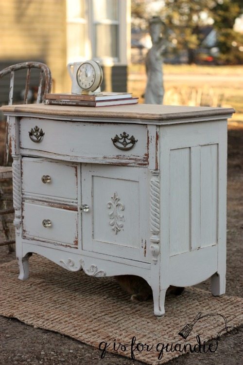
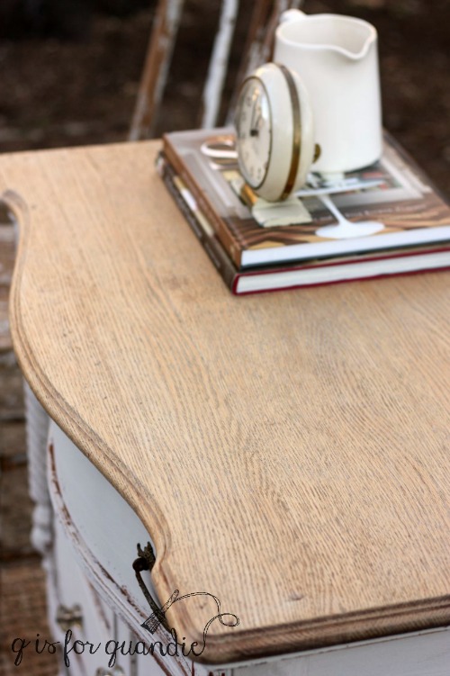
So here’s the thing.  If your furniture already has a distressed, chippy, not quite perfect yet still totally beautiful finish then one more scratch or ding isn’t going to make any difference what-so-ever.  In fact it’s not even going to be noticeable.

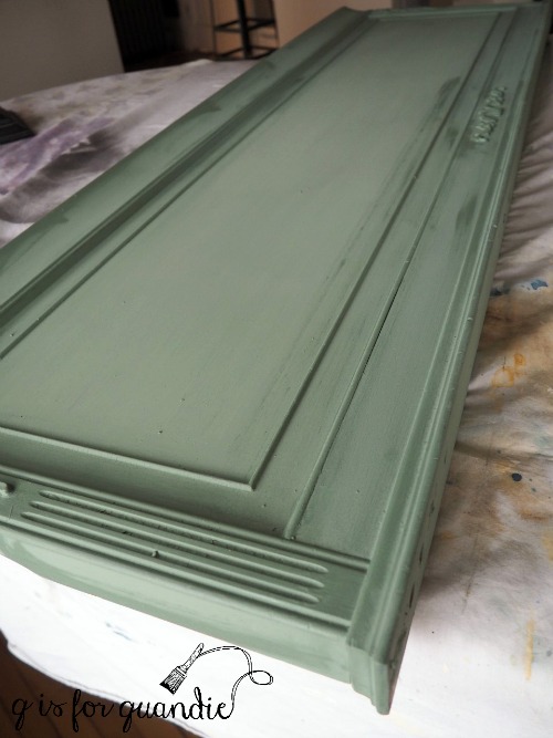
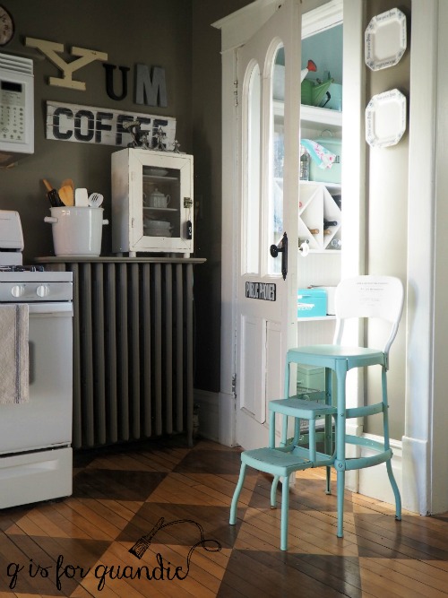
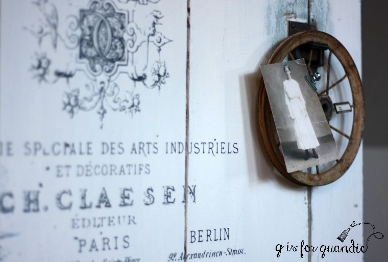
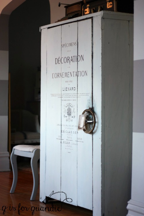
And that is precisely what I love about working with milk paint.  It’s not supposed to look perfect.  It’s supposed to look as though the finish has evolved over time.

And if it chips a little more down the road or if Mr. Q forgets to use a coaster for his hot cup of coffee, that’s perfectly fine.

As I get older, I am realizing that life is all about embracing the flaws and not wasting time trying to achieve perfection.

Who’s with me on this one?

putting this bed to rest.

In Monday’s post about the ‘catalogue dresser’ I mentioned that it came with a bed.

Although they aren’t pictured, it did include side rails and slats as well as the headboard and foot board.  But have you noticed anything odd?

Here’s a closer look …

Wow, right?  The seller told me that the bed was too tall for her elderly grandmother, so her dad’s solution to that problem was to cut off the original feet and replace them with a block of wood and tacky white plastic wheels.

And I am guessing that this bed probably originally had ball and claw feet on the foot board to match the dresser …

Sigh.  Let’s all observe a moment of silence over the loss of those feet, shall we?

OK, moving on.  Once I had this bed home, I asked Ken to come over and consult about the feet … or lack thereof.  After discussing some options, both Ken and I agreed that it was going to be difficult to add new feet and to attain the kind of stability that you really want in a bed.  More difficult than it was worth anyway.

Obviously it was time for this bed to be put to rest!

So I decided to turn it into two separate pieces.  I started with the foot board and simply removed the blocks of wood and the tacky wheels.  Then I painted it with a coat of Rachel Ashwell Clear Primer to prevent stain bleed-thru later.  I had some of my custom Blue Alligator milk paint left over from the dresser I painted a couple of weeks ago, so I started with a base layer of that.  To clarify:  once mixed, milk paint can only be saved for 2 to 3 days.  I painted this base coat at the same time as that dresser not two weeks later.  Once the paint was dry I added beeswax in areas that I wanted to chip.  You can see those smears of beeswax in this photo …

Next I added three coats of Miss Mustard Seed milk paint in Farmhouse White.

Sure enough, I got amazing chipping wherever I had smeared on the beeswax.

I really love how this one crackled and chipped!

For the the pièce de résistance, I added another fabulous transfer from Iron Orchid Designs (FYI this design is not available at Sweet Pickins, I found it at Red Posie) …

I sealed the whole thing with General Finishes Flat Out Flat, and added a couple of hangers on the back.

And voilà, the foot board has been reinvented as a sign.

Although I currently have hung this on the wall in my dining room, I have other plans for this spot at some point so I’m going to go ahead and list it on my ‘available for local sale’ page.

I did something similar with the headboard, except I got a little help from Ken to add a shelf at the bottom.  The shelf was made from the support board that went between the two legs of the headboard.  Basically Ken cut off the legs just below the headboard, and then turned the support board perpendicular to the headboard and screwed it on from below.

Ken made an executive decision to leave just a 1/4″ below the curve on the two sides of the headboard.  He thought it would look more intentional that way, and he was absolutely right.

I mixed up some more Blue Alligator for the headboard shelf, and this time I left it that color.

I used the bottom section of the Iron Orchid Designs ‘Specimens’ transfer on this one.

I think this piece would be perfect hanging over a desk, or on the wall above a sofa.  And it’s the perfect spot to display your collection of ironstone pitchers or maybe vintage alarm clocks.

Unfortunately I definitely don’t have a spot for this piece myself, so check my ‘available for local sale’ on this one too!

the catalogue dresser.

It probably goes without saying that I have gotten just a little addicted to the Iron Orchid Designs furniture transfers.  I can’t seem to stop putting them on things.

Today’s victim is a gorgeous dresser that I picked up a few weeks ago.

This dresser also came with a matching bed (you’ll see what I did with that later this week), and this was definitely a case where the seller was not a craigslist pro and thus didn’t understand some of the tips for improving the chances of selling your item.  Why?  Because first of all, she had one ad for both the dresser and the bed, and her lead photo was a dark and blurry photo of the bed.  So right off the bat she wasn’t going to entice anyone to click on the ad to see more.

Second, the photo of the dresser was also dark and blurry.  You really couldn’t see any of the gorgeous details it has.  Furthermore, she had very little text with her ad.  I think it said something like ‘bedroom set for sale’, which meant anyone searching for ‘dresser’ or ‘antique’ or ‘vintage’ wasn’t going to see this ad.

All of this worked in my favor because no one snatched this set up before I could get there.

I wanted to use another furniture transfer on this dresser and I wanted a white background for that.  Painting one of these mahogany pieces white is always a challenge, plus this one required a little extra repair work as well.  In order to spare you from too many boring details, here’s what that included:  Ken repaired one of the back feet using a peg and some glue, I filled the drawer pull holes on the top drawer to make up for just one missing handle, I sealed the whole thing with Rachel Ashwell Clear Primer to prevent bleed through, I painted a base coat of Fusion’s Putty so I would have something to show underneath any chipping that wasn’t just red mahogany, I added three coats (yes, it still took 3 to get good coverage, even over the Putty) of Miss Mustard Seed milk paint in Linen, I applied the transfer, I sealed the whole piece with General Finishes Flat Out Flat.

Phew!

 But I think it was worth it, don’t you?

If you’re wondering about the transfer, I cut it apart and did each drawer separately which allowed me to center the design from top to bottom on each one.

In hindsight, if I had to start over on this one, I think I would have switched over to all glass knobs.  But maybe that’s just me.

I think the drawer pulls take your attention away from the transfer a bit too much.  But by the time I put them back on it was too late to change my mind on that without having to re-paint the whole thing.  I also debated painting the handles white to help them fade away.  But in the end I decided that I should leave them alone.

And if you’re wondering why I bothered with the undercoat of Putty, it was for exactly this result …

It adds a subtle depth to the dresser where the milk paint chipped without being too obvious of a contrast.

There are so many beautiful details on this dresser including the gorgeous ball and claw feet.

I love a good ball & claw, don’t you?

This was the first time I’ve used the Flat Out Flat.  I love how flat this finish is and that it doesn’t alter the color of the milk paint at all, which is a quality that I especially like when using white milk paint.  I did find that it crackled the milk paint just a tad.  You can see that in this next photo …

It’s possible that I added it too soon, maybe I should have let the milk paint cure for a couple of days first.  I’ll continue to experiment with the Flat Out Flat and keep you posted.

But in the meantime, this lovely dresser is going to be for sale.

Be sure to check out my ‘available for local sale’ if you are interested.

when is rusty just a little too rusty?

My friend Sue snagged this rusty old Cosco stool for me last summer.  I posted it on my Facebook page at the time with this caption.

I struggle with this question.  More so when I’m going to sell something rather than keep it.  Personally I like distressed, beat up items that show their age (no wise cracks about Mr. Q here please).  I sometimes cringe when people cover up a beautiful distressed patina with fresh new paint.  If I had been keeping this for myself, and if I liked the yellow and white, I would have cleaned it up and kept it as is.

But alas, I don’t need another stool, and I really feel like this item will sell better with a paint job.  This led to the next question, how should I prep it?  I have found that if you don’t seal a rusty metal piece, the rust will seep through your new paint.  Again, I don’t necessarily mind that.  It’s a fun way to change up the color of a metal item, but to instantly re-gain some of that rusty patina.

But again, how rusty is too rusty?  This stool had a lot of rust.  So I decided to go ahead and seal it.  I started by vigorously sanding the seat and back fairly smooth and lightly sanding the rest.  Then I painted on a coat of the Rachel Ashwell Clear Primer.  Once dry, I painted a coat of Fusion’s Laurentien on the base and Fusion’s Raw Silk on the seat back.

I know I’ve said it before, but it bears repeating.  I absolutely love Laurentien.  It’s a gorgeous pop of turquoise!

When the paint was dry, I felt like the stool looked far too crisp and freshly painted though.  So I sanded down the edges of the seat back.  And the tops of the steps.

But when I started sanding the edges of the seat itself I quickly realized that I didn’t like seeing the yellow peek through, so I decided against any further sanding.

As I studied the ‘finished’ stool, I really felt like it needed just a little something more.  So I pulled out my Iron Orchid Designs transfers.  The bottom section of the small “Richardson Seeds” transfer was a perfect fit for the seat back (I used the full transfer on the green window recently).  This is another of the cool things about these transfers, you can use just a portion of one and save the other part for another project.

To give the transfer a little extra protection, I waxed over it with clear furniture wax.  But I assume the future owner of this stool won’t actually be sitting in it leaning against the back too terribly often.  If I was expecting that kind of use I would add a matte finish poly over the transfer.

Although this would be adorable in a potting shed, I think the comments on my post for the Blue Alligator dresser on Monday pretty much established the fact that most of us aren’t lucky enough to have one.

 So, how about just using it in your kitchen as intended?

After all, when a step stool is handy, everything else is too!

happy birthday to reclaiming beautiful.

Hey local readers, Reclaiming Beautiful is celebrating their 2nd birthday today!

They will be open from 3 pm to 8 pm, and they’ll have door prizes, special event pricing and refreshments.  Plus as a added bonus they are giving away a Reclaiming Beautiful Candle with every purchase over $50!!!! (while they last, so get there early)

Reclaiming Beautiful is located in beautiful historic Stillwater, Minnesota next to the post office at 216 Myrtle Street West.  Hope you can swing by!

copper patina.

In Monday’s post I mentioned that I used a new (to me) technique on the hardware for the blue alligator dresser.

The original drawer pulls on the two bottom drawers of the dresser (which I kept) were a very well aged brass, but my 4 replacement knobs for the top drawers were a kind of tacky new ‘brassy’ color.

I realized this would be the perfect opportunity to pull out the Modern Masters Metal Effects patina kit that I purchased last year at Hobby Lobby and use it to unify my old and new hardware.

(By the way, I used the rust kit on my rusty bull last year)

The copper patina kit comes with a small jar of primer (which I ignored), a small jar of copper paint and the activator.

I started by painting my knobs and the original drawer pulls with the copper paint.

Before the second coat of paint was dry, I sprayed on the “green patina aging solution” that came with the kit.

As it dried, I could see the patina beginning to form.

Which made these knobs just about perfect for the blue alligator dresser.

They blend quite nicely with my custom Blue Alligator milk paint color, thus allowing that gorgeous transfer to be the star of the show.

The only thing I’m not sure about is how well the finish will hold up to use over time, and whether or not I should be sealing it with something.  Here is what the Modern Masters website has to say about it:

Applying Sealer Effect, a protective sealer and top coat is highly recommended over the Iron/Rust Finish. Particularly on interior surfaces where there may be contact or exterior surfaces to prevent runoff of the rust finish caused by rain or sprinklers onto surrounding areas. It is not necessary to seal/topcoat the Copper/Green Patina or Bronze/Blue Patina finishes, except if the patina surface is subject to repeated hand contact, such as hand rails.

So … yes?  no?  maybe?  Do any of you have experience with how these finishes hold up over time?  If so, please share your knowledge in a comment!

blue alligator.

I had been keeping an eye on the Craigslist ad for this dresser for at least a month.  I thought it had potential, but at $100, it was overpriced (which is why it sat on Craigslist for so long).  I finally decided to send the seller a lower offer and they agreed to my price.

When Mr. Q and I arrived to pick it up, the seller told me that she’d had it posted for $200 originally and it never sold.  She’d ultimately realized that she really just wanted it out of her garage, so that’s why she lowered the price to $100 and then further agreed to my even lower offer.  The implication being that it was worth way more and I was getting a heck of deal.

Some people seem to think that anything that is more than 80 years old is a valuable antique.  Not true.  Condition is everything in the world of antiques, and this dresser was in pretty poor condition.  Starting with the fact that at some time in its life someone cut the sides off the top.  I assume they needed to fit it into some narrow space and the only way to accomplish that was to trim it down a little.  In addition, just check out this alligator-ed finish …

On top of that, the knobs on the top drawers were completely bent and misshapen, the drawers were hard to open, and there were paint drips all over the top.  And did I mention that it was positively filthy and obviously had been in that garage for quite some time?

But I bought it anyway.  I could see it still had potential, just not $100 worth of potential and certainly not $200 worth!

To get started, I sanded it down just slightly and then cleaned it with vinegar water.  Next I sanded down the sides of the drawers (where they sit on the glides) and then rubbed a block of canning wax over them so they would glide more easily.  Then I once again used my ‘perfect chipping method‘ and added some Homestead House Salad Bowl Finish (you can also use Miss Mustard 100% beeswax) in spots that I wanted to chip.

Choosing to go with milk paint on this dresser was a no-brainer.  Milk paint and alligator are the perfect pair.  The tricky part was deciding on a color.  Since I’d gotten several comments recently from readers who love seeing more color and are bored with white, I thought it would be fun to go more colorful with this one.  I wasn’t in the mood for any of the straight up milk paint colors I had on hand though, so I decided to create my own.

Now I’ll just go ahead and apologize right now to those of you who might want to try and recreate this color.  Not that you can’t do it, but it will require three different colors and two different brands of milk paint because this color is a mix of equals parts Homestead House Loyalist, Homestead House Upper Canada Green and Miss Mustard Seed Kitchen Scale.

I think I’ll call this color Blue Alligator.

And see what I mean about milk paint and alligator?  Such an awesome effect.

I’m not sure any of my photos do justice to Blue Alligator, and I don’t think I can adequately describe how it differs from straight up Kitchen Scale.  It has a little more green than Kitchen Scale (thanks to the Upper Canada Green), and it’s a little more muted (thanks to the Loyalist), and it’s a little bit lighter.

And I have to tell you, I loved this color so much I painted two more things with it.  A chalkboard and another piece that you’ll be seeing in the next week or two.

Painting this piece ended up being the easy part.  Two quick coats and it was done.

Next came the exciting part.  I pulled out another of my Iron Orchid Designs transfers.  This is the larger version of the same design I used on my green window last week.  In fact, this transfer was actually too large to use on this dresser ‘as is’, so I cut it apart and just used the sections that worked.  If you look closely you’ll see that my dresser is a mishmash of various pieces of it. I did each layer (top, middle, bottom) of drawers separately.

According to the Iron Orchid Designs YouTube videos, you can put any typical top coat over their transfers.  So I went ahead and waxed the dresser with Homestead House furniture wax next.

Finally, I found some knobs in my stash for the top two drawers.  They looked a bit too new next to the original drawer pulls though, so I decided to try a new technique on them and added a copper patina.  I’m going to post about that process in more detail later this week, so be sure to check back for that.

So now, what do you think?  Is this thing just gorgeous or what?

OMG!  Right?

Wouldn’t this dresser be amazing in a potting shed?

I could also see it working perfectly as a small buffet in a dining room.

It actually looks pretty much perfect right in that spot on my front three season porch.

But I’m not planning to keep it.

Of course, if it doesn’t sell … well, let’s just say I won’t be crying in my coffee.

For now though, this dresser is for sale, so if you are local and need a gorgeous dresser be sure to check out my ‘available for local sale’ tab.

use extreme caution.

I told you guys that I ordered a half dozen more of those gorgeous Iron Orchid Designs transfers from Sweet Pickins.  They arrived last Friday and I was so excited!

I had decided that I wanted to use one of them on an old window.  I actually nabbed this window last year at a neighborhood trash to treasure day (you can read about that here).

The window is leaning against the back of that pile of stuff, on the left, see it?

Just your basic old window.  Not super old, probably from the 50’s or so, but it had a cute little handle which gave it a little extra personality.

To give it a little additional appeal, I first painted it with Sweet Pickins’ milk paint in a color called In A Pickle.  I love this rich green color!

Next I cleaned the glass thoroughly.  I got out one of my new transfers, removed the backing paper and went to place it on the glass.  That’s when disaster struck, well, sort of.  I forgot about how glass and rub-on transfers are attracted to each other like magnets.  As soon as that transfer hits the glass there is no picking it back up again.  This was quite different from the experience I had with the Specimens cupboard.  With that I was easily able to move and re-position my transfer several times before I got it straight.  Not so this time.  I put it down and it was not going anywhere.

I definitely should have known better.  I’ve used plenty of transfers before, on glass, metal, wood, paper and plastic.  I just wasn’t thinking.

Luckily I had placed it down fairly centered and straight!  I would have preferred to have the design centered a little bit better vertically, but it wasn’t a total fail.

The instructions on the box this transfer came in say “these rub ons adhere best to a matte surface” so I guess I was breaking the rules a bit by putting it on glass.  Forewarned if forearmed though people!  So if you decide to try using a transfer on glass, use extreme caution when you place it.  Be sure you’ve got it in exactly the right position the first time.

I added some eye hooks and chain to the window so that it would be hung somewhere.

By the way, I used the smaller version of this transfer which is 11″ x 17″.

There is also a larger size and I’m hoping to use that on a dresser I’m working on next, so be sure to stay tuned.

reinventing the wheel.

Have you ever seen a rusty, crusty old item with amazing patina and decided you simply must have it?

But what to do with it?

Such was the case with this old metal wheel.  I have no idea what it was on originally, by the time it came to me it was just a single chippy wheel.  Maybe it came off a vintage toy baby carriage?

Whatever its original use was, I turned it into a photo holder of sorts.  The photo of my grandmother is just clipped on with little metal clip and the metal label holder is a Tim Holtz product from his Idea-ology line (although they may be hard to find as they have been ‘retired’).

I’ve recently been moving some stuff around in my house and this wheel found a new home resting on the door handle on my Specimens cupboard.

I love the way it looks hanging there, but I have to admit it isn’t very practical.  I have to move it every time I want to get into the cupboard.

The combination of the old photo, the chippy wheel and that delicious furniture transfer is just about perfect though.

So until I get absolutely tired of moving it every time I open the cupboard, I think it will stay in this spot for now.

Do you have any odd little items that you’ve found a use for?  If so, I’d love to hear about it.  Be sure to leave a comment!

rescued from a bad 80’s makeover.

For a little while there I was having a serious furniture dry spell.  I had one piece in the Carriage House that was waiting for warmer weather and for Ken to perform some handy-man miracles (Ken is very susceptible to the cold).  Other than that, the Carriage House was empty.  Yep, you heard that right.  I am not one of those furniture re-vampers who has a storage facility full of pieces waiting for their moment in the sun.  I actually get a little twitchy when I have too much stuff being stored.  I prefer to turn pieces over quickly.

But the downside is that sometimes I run out of furniture to work on and there is nothing available on Craigslist.  And when I say nothing, what I mean is nothing that meets my criteria of not too far away, not too expensive, and with lots of potential.

As usual though, when it rains, it pours.  I went from finding nothing to spending three evenings in a row picking up pieces.  I came home with a three dressers, a bed, a desk and this washstand.

I paid a little more than I normally would for this piece.  Why?  Because it was crying out for a rescue from its 80’s style makeover.  Just check out those grape cluster decals.  Gack!  And those horrible knobs.  Ugh!  I have to tell you guys, one of my pet peeves is when people put two knobs in the holes that were originally meant for a drawer pull with two screws.  I get why they do it, but every time I see it I cringe a little inside.  It’s just not right.

But if you look past the bad knobs, those awful grapes, and that really splotchy orange-y stain, this is a gorgeous little washstand.  Such pretty details, right?

The prep on this piece started with stripping the top.  The wood was so lovely that I wanted to show off some of it.  While the stripper was doing its job, I scraped off those decals.  They came right off with a sharp razor blade.

Next I dealt with those pesky knobs.  I was really hoping that I had 4 matching vintage pulls that I could use, but no such luck.  I did have a pair of absolutely gorgeous pulls that I have been saving for special piece though.  And it just so happened the holes on the upper drawer were spaced exactly right for them.

So I decided to use those on the upper drawer and just simple single knobs on the two lower drawers and the door.  To accomplish that on the drawers, I had to fill in the existing holes and later drill a new single hole in the middle.  Filling holes like this is really very easy.  Put some tape across the hole inside the drawer so that as you add wood filler from the front it doesn’t just escape out the back.  Then, fill the hole with wood filler.  I used Elmer’s Pro Bond Wood Filler in Walnut on these drawers, mainly because that’s all I had on hand.  The walnut was a bit dark, but I was painting over it anyway.  All of the wood fillers claim to ‘resist shrinking’, but I find that they all shrink.  In other words, when your fill dries it will recede back a little.  So go back with another application of fill.  Sometimes you’ll even have to do this a third time (I did with this piece).  But you want that filler to be nice and flush with the surface of the drawer, not sunken in at all, or they will show later.

I let my stripper and my drying wood filler sit overnight.  The next day I scraped the stripper off the top and gave it a good cleaning.  Then I sanded the body of the whole piece lightly and gave it a good cleaning too.  I decided to use my method for perfect chipping again on this piece (more details on that method here), so I added a little beeswax to all of the edges.

Then I painted three coats of Miss Mustard Seed milk paint in Marzipan.

Once again, perfect chipping, just where I wanted it!

See my little photo bomber?  My cat Lucy is hiding underneath the washstand.  I couldn’t get her to stay out of my photos.

I was initially considering staining the top of this piece, but the wood was so pretty in its bare and natural state so I waxed it with Homestead House furniture wax.  But that brought out a little too much of the golden hue of the wood, so I toned it down by adding some Homestead House white wax over that.

Not so golden, and definitely no longer orange!

What do you think?  Did I successfully rescue this washstand from the 80’s?

This little charmer is for sale while it lasts.  Pieces this size make a perfect bedside nightstand!  Check out my ‘available for local sale’ tab for more details.