

I wonder how many of you are old enough to be Moody Blues fans, or to have played their albums over and over. You know, back when we had record players and albums. Oh boy, I’m probably really dating myself now. Although now that I think about it, I probably listened to them on cassette tapes in my car more than on albums.
Once upon a time, in my wildest dreams.
Anyway, today’s post isn’t about music, it’s about the moodier shades of blue available from Dixie Belle Paint Co (and be sure to read to the end because I’m giving some away). I’ve been using a few of them lately, so I thought it might be helpful to show you guys a comparison of their In the Navy, Bunker Hill Blue, Yankee Blue and Cobalt Blue. Just in case you are struggling to pick one.
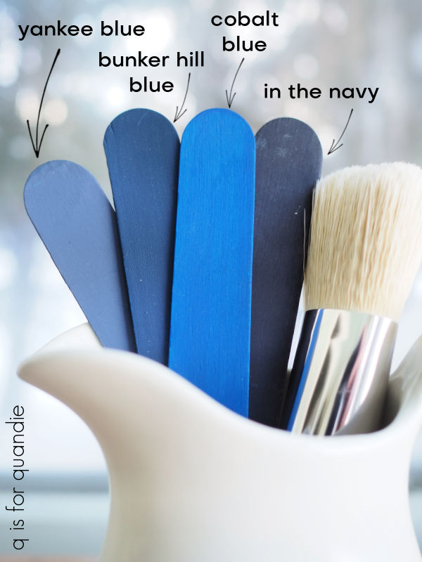
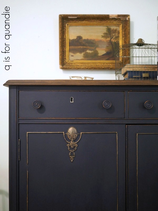
The darkest one is In the Navy. This color is almost, but not quite, black. I used quite a bit of this one for a while. One of my all-time favorite pieces painted in this color was this linen press dresser.
I also painted a waterfall style desk with In the Navy.

Lately I’ve been using more of the next darkest shade, Bunker Hill Blue, most recently on this dresser.

I really like this shade on mid-mod pieces such as this dresser that was a curb-side find.

It looks gorgeous paired with gold hardware.
I’ve also been known to mix In the Navy with Bunker Hill Blue to tone down the Bunker Hill Blue just a tad, or brighten up the In the Navy, whichever way you want to look at it.
That’s what I did on this piece.

Well, to be perfectly honest, I only mixed them because I didn’t have enough Bunker Hill Blue at the time to paint the whole dresser so I stretched it by adding In the Navy. But it ended up being a fantastic combo.
I haven’t used so much of the Yankee Blue. This one is the lightest shade of these four colors, and has a bit more grey to it than the other three which becomes more obvious when you look at them all side by side.

Yankee Blue is actually one of the very first Dixie Belle colors I ever used when I paired it with Drop Cloth on this stool.

I’ve used it to create quite a few grain sack stripes since then, including the ones on this desk.

I also used it inside the drawers on that piece after blocking some ink stains using Dixie Belle’s B.O.S.S.
That brings me to the brightest of the four colors, and one I was only recently brave enough to use, Cobalt Blue.
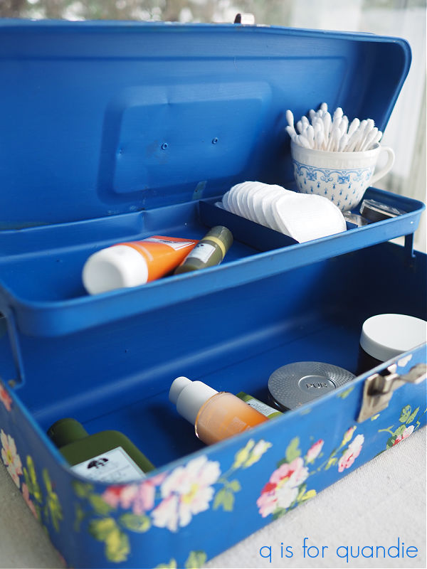
It was gorgeous paired with the I.O.D. Rose Chintz paint inlay on this tackle box.

I’m not sure I’m quite ready to use it on a piece of furniture yet, but I could see mixing the Cobalt Blue with the Bunker Hill Blue to get something somewhere in between the two.
How about you, have you tried any of these colors yet? And if so, do you have a favorite?
If not, now’s your chance. I’m giving away a 16 oz. jar of each to one lucky winner.

And I’m even going to throw in a CD of the Very Best of The Moody Blues, just for fun.
The rules for today’s giveaway: Simply leave a comment on this blog post (and please forgive me if I don’t respond to every one, but know that I read and appreciate all of them).
Your comment must be left on this blog post, not on Facebook or Instagram. You are not required to follow my blog, or follow my Facebook or Instagram accounts, although it would be awesome if you did!
I will randomly draw the name of a winner for today’s prize from all of the comments left on this post by Friday, March 10, 2023 at the stroke of midnight (U.S. Central time).
The fine print: no purchase necessary, you must be 18 years of age or older to win, void where prohibited by law, the number of eligible entries received determines the odds of winning, approximate retail value of prize is $100, if the prize is not claimed by Friday, March 17, 2023 another name will be drawn at random to win, blah, blah, blah.
Thank you to Dixie Belle Paint Co for providing the paint included in today’s giveaway.

Blue is my favorite wand I would love a chance to try these colors out! Thanks for all the work you do sharing your makeovers. I truly enjoy seeing your beautiful work.
LikeLiked by 1 person
I think I love In the Navy best! It looks like a nice rich hue, and does those vintage dressers/chest some justice! As always, great work! 🙂
LikeLiked by 1 person
The navy blue is my favorite, although they are all great colors. Great job showing the differences between shades. Blues are the hardest to color match…best to keep a stick or swatch of some type with you when shopping for things to coordinate.
LikeLiked by 1 person
Oh, I so remember the Moody Blues! “Breathe deep…..” Some good stuff!
LikeLiked by 1 person
Love all the projects with these different blues. I like the navy color the best. Definitely remember the Moody Blues, too!
LikeLiked by 1 person
Love the Moody Blues! The band and the colors. In the Navy has been a favorite of mine and have done numerous pieces in it for my grand boys bedroom and pieces I have sold. Thanks for the walk down memory lane – musically and projects from the past.
LikeLiked by 1 person
Love the Moody Blues. Your Wildest Dream is my favorite. In fact, I was at the Rock and Roll hall of fame when they got inducted and did a short mini concert. Just getting started on trying to be creative now that I’m retired. I don’t have any blue in my supplies right now so winning this would be very nice! I love your tool box makeovers but I’m having trouble finding any.
LikeLike
I knew there would be some more Moody Blues fans out there 😉
LikeLike
P.S. I find that the best source for toolboxes are garage sales, and of course there aren’t any of those right now … at least not here in Minnesota. I did stock up last summer though. So you may have to plan to hit some garage sales come spring.
LikeLike
I’ve never been a big blue fan but the darker blues would be my pick over the light ones.
LikeLike
I definitely prefer the darker shades as well 🙂
LikeLike
I, too, remember listening to the Moody Blues! And the new paint colors really do them justice! My favorites are the two darker shades. Thanks for the give-away!!
LikeLiked by 1 person
Ah the moody blues. I remember listening to them with teenage angst. Caused me to laugh out loud with my own dramatic recitation of that part where the guy talked in “ Nights in White Satin.” Good memories 🤣. Anyway I love In the Navy. Did a dresser in this and it turned out great.
LikeLiked by 1 person
Would be thrilled to try all the blues! I have not used Dixie Belle paint yet.
LikeLiked by 1 person
I’m using In The Navy on a coffee table piece. I love the color, just need to feel out what to add to make the piece stand out. Love your usage of the blues 😉
LikeLiked by 1 person
Take my winter blues away! I loved that you showed the different blue colors on all your different projects. It’s very helpful to see the variations in color and how you mix your own as well. Thank you!
LikeLiked by 1 person
Dixie Belle has such beautiful shades of blue. Is there a shade called Blueberry? I feel like I’ve heard that name sometime.
Anyways, thank you Linda for continuing to post your blog. I look forward to reading them!
LikeLike
Yep, there is a Blueberry (I used it inside this toolbox). The four I’m showing today are just their darker shades of blue. They have lots more lighter blues, or blues with more green in them. Maybe one day I’ll get around to featuring those!
LikeLike
I know I have told you before but I love your work I have been following for years and have saved so many with intentions of doing the same thing one day. Not anywhere as talented as you But always follow your example I love the Navy now to find a new project. Thanks for sharing your beautiful work
Diane
LikeLiked by 1 person
I love the dresser that you painted with In the Navy! That would be my first choice to use on a piece of furniture. However, any of the blues that you’ve used on tool box repurposes are fabulous! I’m a fan 🥰.
LikeLiked by 1 person
Even harder to believe is that the 50th anniversary of Days of Future Passed was 5 years ago!!! Yes, I’m that old. I used the Bunker Hill Blue to paint a bookcase/printer stand, and tall shutters that frame my office space. Would love to try mixing some navy with it on a veneered-drawer bowfront dresser in the same room (I’d leave the veneer drawers and just paint the wood)! Thanks for considering! Kathy
LikeLike
The darker blues do pair beautifully with wood tones.
LikeLiked by 1 person
In the Navy is my favorite though I might try the next one on a MCM piece.
I haven’t had luck selling painted furniture and worried that trend is gone. What do you think?
LikeLike
I was just chatting with a friend about this last night. She says she’s still seeing painted furniture everywhere (while shopping for furniture for her home makeover) and it’s still popular. I think people are using more of a mix now, some painted pieces mixed in with some stained pieces. The shop where i sell is still selling lots of painted pieces! Personally, I think the raw wood look is super hot right now, but I find it to be so much work to accomplish!
LikeLike
Love both Dixie and Moody Blues! I used to speak the part on Nights in White Satin when it played. Enjoy following your posts!
LikeLiked by 1 person
LOL, sounds like you’re not the only one 😉
LikeLiked by 1 person
When I saw the blog title I was hoping it was about the blues – paint I mean. You are speaking my language and I would say I am an “In the Navy” gal. Dixie Belle is hard to find in my neck of the woods so would love to try it. Thanks
LikeLiked by 1 person
Tuesday Afternoon playing as I pull a late night in college…loved the Moody Blues.
Would love, too, to play with this quartet of blues!
LikeLiked by 1 person
I probably wore that album out! As I remember those days, I often frequently went to junk shops and picked up others trash and repurposed it for my home. I love all the blues. I want to redo a secretary desk in blue. I enjoy reading all your posts and your frequent visits to your moms.
LikeLiked by 1 person
Thank you for doing the “blues” comparison. My next project (night stands) is going to be blue and I’m having a tough time deciding on the perfect blue. I’m definitely drawn to the darker blues…but, which one?
LikeLike
I vote you choose Bunker Hill Blue!
LikeLike
I have never used any of those Dixie Belle Blues. Thank you for showing us all of your cool projects using them!!
LikeLiked by 1 person
I love all the different blues. Have not tried any of them yet,
but you gave us lots of ideas. I’m ready to paint 🙂
LikeLiked by 1 person
While I am not a big lover of blue items, the tackle box with the transfer is gorgeous. Makes me think I can handle blue in small doses. And I too listened to The Moody Blues on cassette!
LikeLiked by 1 person
I love all the blues – my entire house is blue and white (with maple trim). I find blue to be cheery rather than moody. I still love the big blue dresser in the pic (combo of In The Navy and Bunker Hill Blue) that I purchased from you. Great post.
LikeLike
I always love hearing that my pieces are still being loved!
LikeLike
Love these blues!! This would be a fun collection of paint colors to try!
LikeLiked by 1 person
Blue is my favorite color along with most Americans. What could be more suitable than blue in all things from the sky to the color in our flag. Blue is a winner all around!
LikeLiked by 1 person
Such a useful resource seeing all the different shades of blue. Thank you for sharing.
LikeLiked by 1 person
You always do very nice work!! Thanks for sharing!!
LikeLiked by 1 person
I enjoyed your comparison of all the DB Blues. My favorite piece of yours is the linen press dresser in “In the Navy” with gold accents. It’s elegant and stately to say the least. I have not used the “Cobalt Blue” yet either but, if I win the paint, I will certainly find something to use it on!
LikeLiked by 1 person
I am more of a green and blue green fan, but dark blues are pretty too. I have painted with Bunker Hill Blue and found it slightly too bright for my taste, but I think combining In the Navy and Bunker Hill Blue is inspired! As usual you have given me a tip I may use on future projects. Definitely remember the Moody Blues – but just as part of the soundtrack of my youth – never had an album or tape. Keep having fun with your posts – they are fun to read!
LikeLiked by 1 person
Love the first 3 but you lose me at cobalt. Why is that? So funny that for no real reason some are appealing and others don’t catch your eye. Just like eras. Victorian, Edwardian, Art Deco, mid century modern, …I wonder if it has something to do with what we grew up with….I definitely have a sweet spot that makes me stop at some and skip others.
LikeLike
The Cobalt is pretty much ‘in your face’ bright, so I am not surprised that it doesn’t appeal to everyone. I would probably only use it in small doses 😉
LikeLike
Ah yes….Moody Blues….sigh…saw them in concert…good times, great music! Thank you for the giveaway…can’t go wrong with blue!
LikeLiked by 1 person
I love the title of this post! Yes, I do remember The Moody Blues, great band! I think all of the blues are beautiful, my favorites are the darker shades although I must admit the box you painted with the cobalt is very pretty. I absolutely love your color “curbside find”, it’s gorgeous!
Once again, thank you for all your posts, I look forward to them😊
LikeLiked by 1 person
I sure wish I could find curbside finds like the ones you find. Love those blues.
LikeLike
That particular find was an exception rather than the rule for me, I don’t often find great pieces of furniture on the side of the road 😉
LikeLiked by 1 person
I really like the color blue. I have a dresser that I wood like to paint in navy. I think that I will try your mix so that it isn’t so dark. Thank you for giving us the chance to win the wonderful giveaway. 😄
LikeLiked by 1 person
I love all of the shades of blue! I have painted several pieces in navy and would be willing to try them all. Though probably not Cobalt on furniture. I don’t know that it would sell in my area. Thanks for a great post!
LikeLiked by 1 person
Loved this blues post! Thank you for taking so much time on it! The examples were very helpful!
LikeLiked by 1 person
I have used and love In The Navy and Yankee Blue but haven’t yet tried Bunker Hill or Cobalt. I don’t think there’s a shade of blue I don’t love though, to be honest. Mixing the two really did give you a gorgeous hue. Thanks for the chance to win. ❤️
LikeLiked by 1 person
I like your mix of the two darker blues the best
LikeLiked by 1 person
It really helps to see the colors side-by-side! They’re beautiful.
LikeLiked by 1 person
I remember listening to the Moody Blues on vinyl and cassette tape.😮 I love your furniture pieces painted blue.
LikeLiked by 1 person
The Moody Blues are/were one of my all time favorites! As is ‘In The Navy’. I did use Bunker Hill during our COVID era when I couldn’t find In The Navy anywhere for a project but wasn’t really happy with it. The Yankee Blue looks really good on that stool. I’ll have to try that one!
LikeLiked by 1 person
I love seeing all the fun you have had with the blues!
LikeLiked by 1 person
Saw the Moody Blues in concert in Rochester many years ago. Would love to try In the Navy on a piece of furniture. Love all your pieces you shared!
LikeLiked by 1 person
Love the Linen press! Now I want to paint something navy!
LikeLiked by 1 person
You are always my go to for painting technique and color ideas. If I need help, I Know You’re Out There Somewhere.
LikeLike
Good one Ruth! I know you’ll find me somehow, somehow …
LikeLike
All these pieces are gorgeous in shades of blue!
I love The Moody Blues and saw them twice in concert back in the 90s/early 00s not in their stadium days.
LikeLiked by 1 person
I love, LOVE, the cobalt blue tackle box and the name “Josephine” has a special meaning to me as do roses since my mother loved to grow them! Would love to win the paint, find a tackle box and learn to make one like yours! Thank you for sharing your beautiful work as inspiration.
LikeLike
That “Josephine” is from the I.O.D. Traditional Pots transfers, in case you want to use that exact one!
LikeLike
Oh, thank you so much for that piece of information on where “Josephine” can be found!
LikeLike