a literal furniture flip.

Way back in March I shared this bed …

I’d gotten it at a neighborhood garage sale, and it did not come with its side rails.  But the former owners assured me it was a twin sized bed and that they used it with a twin mattress, they had just misplaced the side rails.

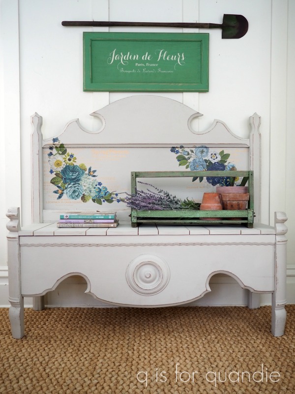
So after giving it a makeover with some Dixie Belle paint in Sawmill Gravy and the Cosmic Roses transfer from re.design with prima, I sold it as a ‘twin bed’.  One of my regular customers purchased it, and then purchased some metal side rails to use with it.  But after monkeying around with it to get a twin mattress to fit, she determined that this was not a twin sized bed but rather a 3/4 bed.

Lesson learned:  always measure myself.

If you aren’t familiar, 3/4 beds are somewhere in between the size of a twin bed and the size of a full (or double) bed.  It’s a little bit difficult to find a 3/4 mattress, although they can be found online.  I imagine it would be equally difficult to find bedding, especially if you want a fitted sheet that actually fits.  Jumping through those hoops might be worth it for a really spectacular antique bed, but certainly not for this one.

You can buy side rail extender thingies to turn a 3/4 bed into a full sized bed, and that probably would have worked out OK here.  You end up with a few inches of mattress sticking out past the headboard on either side.  I’ve done something similar with the bed in our own principle bedroom, I’ve converted an antique full bed to fit a queen mattress.

You could also modify some side rails to fit a twin bed, thus leaving a few inches of head board sticking out from either side of your mattress.

In this case however, my customer wanted a twin bed.  And she also wanted to place it in a corner so both the headboard and the side of the bed would be up against a wall.  That meant that having a couple of extra inches of width to the headboard would have left a gap between the mattress and the wall.  Not a good plan for a small child’s room.  Can you just imagine how many things would get stuck between the bed and the wall (including the child)?

So, long story short, I took the bed back.

Then I considered my options.  Re-market it as a 3/4 bed modified to fit a full?  Or turn it into a bench.

I’d chosen not to turn it into a bench initially because the footboard was far too low to work for creating sides to the bench like in all of the previous benches that my handyman/neighbor Ken has made.  Usually he cuts the foot board in half and creates arm rest type sides, like in this example …

But then I thought perhaps we (and by ‘we’, I mean Ken) could make an ‘armless’ bench using just the headboard.  That would have been OK.  But I really wanted to incorporate the foot board somehow.  Then a lightbulb went off in my head.  Why not flip the foot board the other way around, so that the flat part was at the top and the curved part at the bottom.  And then use it as the front of the bench.

My first job was to convince Ken that this was do-able.  He always doubts his ability, while I always believe he can work miracles.

So I sent the foot board home with him to see what he could come up with.  Sure enough, he was able to remove the center section from the legs, flip it around and re-attach it to the legs at just the right height for a seat.

Ta da!  See?  I knew Ken could do it.

After flipping the foot board, Ken added his usual planked seat.

  Don’t ask me how he does that, he just works his magic and I get to see the completed piece when he’s done.

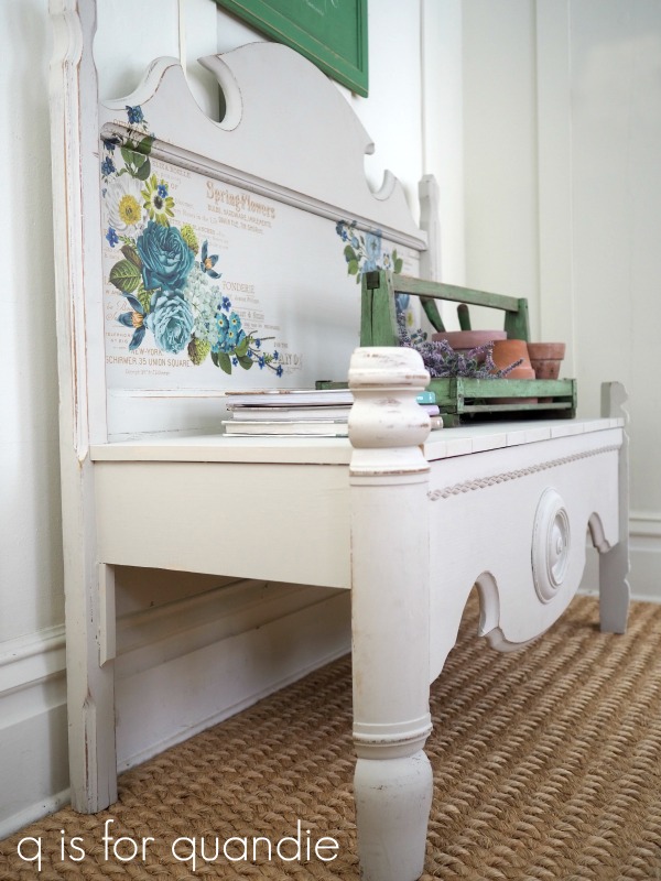
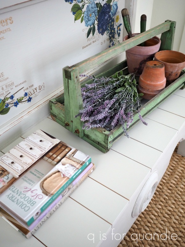
I was able to retain the Cosmic Roses transfer on the headboard.  I just had to touch up the existing paint in a few spots and also paint the new portions of the bench.  I decided to paint the back of the headboard this time around too.  You never know when someone is going to want to place a bench in a spot where the back is visible.

I decided to play up the floral motif of the transfer when staging the photos for this bench.  Plus, Christmas is over, it’s time to start thinking spring, right?!

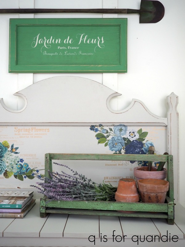
I added an old wooden berry tote with some pots and some lavender.  Then I painted up a cupboard door sign in a very similar shade of green.  The paint on the tote is original, but the sign is painted in Dixie Belle’s Kudzu.  I sanded it well to distress the finish, then added a coat of clear wax followed by a coat of antiquing wax.  It’s not exactly the same color, but it’s close.

So, the 3/4 bed is now a bench.  And it’s available for sale if any of you local readers are interested.

If you ever come across a 3/4 bed and you just don’t want to deal with trying to fit a mattress to it, you could consider turning it into a bench.  And if you have a piece that isn’t working ‘as is’, considering flipping it!

As always, thanks to Dixie Belle Paint Co for providing the paint used on this bench, and to re.design with prima for providing the transfer.

good tidings of comfort and joy.

I thought I’d squeeze in one more holiday post before the big day.

On Monday I shared a sweet little chair that I revamped using a stencil from Wallcutz (you can find them on Etsy).  Well, when I ordered that Fresh Honey stencil, I also ordered a couple of others including some Christmas stencils.  I knew that I wouldn’t be able to get anything completed and out to the shop to sell before the end of the holiday season this year, but there’s always next year right?

Plus, I wanted to make something for myself.  Shocker, right?  Nine times out of 10, I’m making things to sell.  But I wanted a black, stenciled sign for my own house.  I made up this one earlier in the month …

I loved it, but the dimensions weren’t quite right for the spot I had in mind.  So I sold it.

Then I saw this stencil from Wallcutz.

North Pole Stencil – WallCutz

Pretty adorable, right?

So I went back to the Habitat for Humanity ReStore and found some more cupboard doors that it would fit on.

I painted mine in Dixie Belle’s Midnight Sky, and stenciled it using French Linen for a shadow (just around the words North Pole) …

and Drop Cloth for the 2nd layer of stenciling.

I sanded everything, and this is definitely one of those cases where sanding all of the edges really brought out a lot of detail.

I hung it in this spot for getting some suitable photos of it, but ultimately it’s going to go on the wall behind the piano.

You can catch just a glimpse of my non-collected Christmas village in the background of the photo above.  I put it up on my giant pine cupboard.  I love the way it looks all lit up at night.

I use things like vintage suitcases, old books and game boxes to create varying heights.

And this year I put Ebenezer’s house in a bird cage.

So, probably not your typical Christmas village set up, but I like it.

These pieces are all from the Dept 56 Dickens Village.  If you buy them new they are silly expensive.  But I’ve gotten all of mine at either garage sales or thrift stores.  I don’t think I’ve ever paid more than $15 and usually it’s less.

I also want to share the throw pillow on my chair …

I found that at the Turn Style consignment store in Roseville for only $10.50.  They had quite a few of them when I was there last week.  I don’t know if they have a big post-holiday sale on Saturday or not, but some of you locals might have a shot at getting one even cheaper.

And on that note, I wish you all good tidings of comfort and joy!  Mr. Q and I will be enjoying a quiet Christmas this year with my niece and sister.  I have a couple of year-end wrap up posts planned over the next week, but other than that I plan to just chill out, rest up and get ready to ring in 2021.  It has to be an improvement on 2020, don’t you think?

an experiment.

This summer I picked up another kid-sized chair at the Lowry Hill & East Isles sales.

There it is on the right hand side of this photo …

My original plan was to paint it and put a Christmas stencil on it like the ones I did last year.  But as it turned out, the seat was a bit smaller on this one and I didn’t like the way any of the Christmas stencils fit on it.

Then I ordered some new stencils from an Etsy vendor called Wallcutz, including this one …

honey bee stencil farm fresh honey stencil reusable stencil image 0

I purchased it for another project (which I’ll be sharing soon), but I realized that in addition to being quite adorable, it was also the perfect fit for the chair.

So this past weekend I pulled the chair out of the carriage house.

And one thing that struck me about it was that the finish was in pretty darn good shape.

Normally I would automatically paint a piece like this.  After all, painting furniture is what I do, right?  Also, my experience tells me that painted pieces almost always sell better than unpainted pieces.  At least historically.  That being said, I’m noticing that more and more people are returning to wood finishes instead of paint (which frankly is kind of a bummer for me).

So I thought I’d try a little experiment with this chair.  Rather than painting it, I decided to just add the stencil to the seat leaving the wood finish ‘as is’.  Well, sort of ‘as is’, I did sand the seat lightly to make sure the stencil paint would adhere well.

I used my method for adding a little bit of a shadow to the word ‘honey’.  Basically I stenciled just that word first using Dixie Belle’s Putty, then once dry, I moved the stencil just a hair up and to the right and then stenciled the entire design using DB’s Drop Cloth.

It’s such a simple thing, yet it adds so much depth to the stencil, don’t you think?

Once the paint was dry, I sanded lightly over the seat with 220 grit sand paper to smooth out the surface.  Then I added a coat of clear wax to the entire chair.

I staged my photos with a couple of tiny pieces of ironstone.

As someone who loves both miniature versions of things and ironstone, these are a couple of my favorite things.  Especially that little tureen, it’s only about 4″ tall.

So, now it remains to be seen.  Will this chair sell?  I’ll keep you posted on that.

Or maybe one of you local readers wants to snatch it up?  If so, be sure to check out my ‘available for local sale‘ page.

In the meantime, what do you think?  Do you prefer items that are painted?  Or do you think this chair works ‘as is’?

getting lucky at the restore.

My sister and I headed over to our local Habitat for Humanity ReStore the other day.  I wanted to pick up a few more cupboard doors to use to make signs.  I found 4 good sized doors for $4 each, but before heading out we took a quick look around and I also found this fabulous little primitive cupboard.

I knew this would be a fun project to work on, and that a little paint and a transfer would really make it shine.

I started by sanding it lightly, then giving it a good cleaning.  Then I painted the inside in Dixie Belle’s Gravel Road and the outside in their Sawmill Gravy.

Once the paint was dry, I sanded heavily because I wanted a lot of distressing on this one.

Next I pulled out an old IOD transfer called Specimens and applied it to the front of the cupboard.

I only used the bottom half of the transfer, and that was perfect.

Next I added clear wax to the entire thing.  I also added some heavy duty D-rings to the back so that it could be hung on the wall.

This cupboard has a clever little latching mechanism for keeping the door shut (it totally reminded me of the one on the washstand I shared a while back).

I’m always a sucker for these sort of primitive details, how about you?

I was channeling my inner Nina Hartmann when staging this one.

Are any of you familiar with her work?  I’ve mentioned her a few times here before.  I have several of her books, and they can be hard to come by here in the U.S.  I ordered the latest one, Living with Swedish Antiques, directly from her website (to order click on webshop, then books).  Don’t be totally freaked out by the price, it is shown in Swedish krona.  That being said, her books aren’t cheap.  After converting krona to dollars, I ended up paying around $80 for this one, including shipping.

The book on the bottom of the stack, among vintage & friends, is also totally fabulous.  Here’s a page from that one …

I think you can probably see why it appeals to me.

But I think my favorite book of hers is My home with vintage & antiques.

Unfortunately, I don’t have any tips on how to acquire either of these older two books.  They are out of print and priced exorbitantly if you can even find them online.  So I apologize for telling you all about how amazing they are, and then following it up with ‘and by the way, you can’t get them anywhere.’  But you can get her newest book, so you may want to jump on that.

The primitive look of this cupboard, the color of the Sawmill Gravy (white with a hint of grey), the crackled ironstone and the mostly bare evergreen are all inspired by Nina’s style.

I love how this little cupboard turned out.  Once again, I’m tempted to keep this one.  Or maybe swap it out for some other piece I already have.

But then again, maybe I’ll just be happy to see it go to a good home.  So if any of my local readers are interested, be sure to check out my ‘available for local sale‘ page for more details.

So, how about you guys, are any of you already fans of Nina Hartmann?  or just simply fans of pale, painted wood pieces with lots of character?

As always, thanks to Dixie Belle Paint Co for supplying the paint used on this cupboard.

goldilocks and the 3 grays.

I purchased this sofa table at the Goodwill nearly a year ago.

I struggled to get a good ‘before’ photo of it.  You can’t really tell, but the top is that sort of yellow-ish, shiny wood finish that was popular in the 90’s and the base is a dark forest green.

I’m not really sure why I grabbed this piece, except that the price was right and I figured it would be a quick makeover.

I knew I wanted to strip the top, and that’s a summer job for me.  I prefer to avoid stripping pieces in the house during the winter.  So I set this table aside for a few months.  Then last summer I stripped the top.  After I had it down to bare wood, I decided I liked the pale color but it was still a bit too golden.  So I white washed it using Dixie Belle’s Drop Cloth (check out this post if you want to learn more about white washing).

After white washing, I added a top coat of clear wax.

I loved how the top turned out, so next I moved on to painting the base.

I thought it would work well to stick with the pale color scheme, so I painted the base in Dixie Belle’s French Linen.  Normally I like French Linen, but for some reason it didn’t work on this piece.  It just looked strangely washed out.  I thought maybe the piece needed more contrast between the top and the base , so I pulled out the Gravel Road next and re-painted the base.

But you know what?  I didn’t like that either.  It was too dark.

So I did what I tend to do in this situation.  I threw a drop cloth over it and used it to stack stuff on out in the carriage house for a few more months.

Flash forward to a week or so ago.  I had ordered some more Gravel Road from Dixie Belle, but somehow they sent me their Hurricane Gray by mistake.  At first I was slightly bummed by this mistake, but then I realized that the Hurricane Gray might actually be just perfect for the base of this table.

Here’s a comparison of the these three shades of gray.

That’s French Linen on the left, Hurricane Gray in the middle and Gravel Road on the right.  If the French Linen was too pale, and the Gravel Road was too dark, maybe the Hurricane Gray would be just right.

So I pulled the table out of ‘storage’ and repainted the base once again.

Perfect.

I staged it up with a few of my favorite things.

I think it works to balance the cool tones of the black & white photo and the Hurricane Gray  with the warm golden tones of the lamp, clock, books and old wooden crate .

A little bit of paint gave a fresh new look to a rather tired, dated looking piece, don’t you agree?

Hopefully the neutrality of this piece will help it sell quickly.

Speaking of which, if any of my local readers are in need of a sofa table, be sure to check out the details on my ‘available for local sale‘ page.

As always, thanks to Dixie Belle Paint Co for providing the products used for this project.

such a slacker.

First up, I want to say congratulations to Ruth H for winning my blogiversary giveaway.

I drew her name at random to win a few of my favorite Dixie Belle paint colors and a couple of other things.  Mr. Q has shipped off her prize and I hope she gets it in time to whip up a few things for the holidays.

What I didn’t mention in my original post about the giveaway was that I also had another complete package of all the same stuff to give to someone.  But rather than drawing a name at random for the 2nd set, I decided to give it to the person who left the most comments on my blog to date in 2020.  So I pulled up my blog stats and quite honestly I wasn’t at all surprised to find that that person was M. Constance Colvin.

Connie is a regular commenter, and she always sends the most lovely little messages, like this one …

“Well now……this post captures the essence of quandification (-: A pretty makeover of something that already looked great! “

and this one …

“A Quandie a day keeps the blog blahs away!!!”

Her comments always make me chuckle …

“Miss Quandie! Only TWO BUCKETS to share today? What a slacker!!!”

I’m super grateful to Connie for taking the time to leave comments.  They always make my day!

But speaking of being a slacker, I feel a bit like one this week.

Now that we are approaching the shortest day of the year, it’s dark when I leave for work in the morning and dark when I get home in the evening.  That means that if I want to photograph a project to share here on the blog I have to do it on the weekend.  If it’s not done by Sunday afternoon, then I am s.o.l.

Last weekend I spent some time finishing up my Christmas shopping, did my Christmas wrapping, and just enjoyed some down time.

I didn’t get a single thing painted.

Let’s hope I do better this weekend!

making do.

Over the past several years I’ve sort of accidentally started a new Christmas tradition for myself.  Each year I create a new theme for my holiday gift wrapping.

Last year I kept the colors really neutral and I used some Deer transfers from re.design with prima.

I also made gift tags using photocopies of old black and white family photos.

In 2018, I was inspired by a recent trip to a velvet making factory in Venice and I stenciled my own wrapping paper to simulate the look of their beautiful fabrics.

In 2017 it was a pretty in pink Christmas.  I painted boxes pink and used Fusion’s transfer gel to apply some 12 Days of Christmas graphics to them.

Back in 2016 I used Fusion’s Copper paint and old rolls of player piano music to create some unique Christmas gift packages.

I started this 2020 holiday season feeling a little bit stumped about what I was going to do.

Then I remembered this set of IOD Crockery stamps that I purchased a while back.

I absolutely love the designs on these, but here’s the thing … I really think it’s difficult to use rubber stamps effectively on anything other than paper.  I’ve used them on fabric in the past, and also on painted furniture, but I didn’t like the results well enough either time to repeat the experience.  I’ve also seen people use them on curved surfaces, but to me the results always just look sloppy.  In my opinion, it’s extremely difficult to get a crisp look with a stamp on anything other than a flat surface.  It’s also entirely possible that I am just a tad too picky about these things 😉

What I wouldn’t give to have some transfers in these designs, they’d be gorgeous on jars, plates, clay pots, the possibilities would be endless (come on IOD, make these as transfers!).  Unfortunately you can’t get anywhere near this level of detail with a stencil, or that would be awesome too.

Anyway, despite the fact that they aren’t Christmas-y at all, my idea was to somehow use these stamps to create some holiday gift wrapping.  I made up a shopping list for the craft store and planned to get some supplies and see what I could come up with.

I was literally in the process of putting makeup on so I could go out in public (to Hobby Lobby) on Black Friday when I decided that I really didn’t want to go to a crowded store.  I’d just avoided going to my in-laws for Thanksgiving, and that would have been just six of us.  How could I possibly justify going to a crowded store on Black Friday of all days?

Instead I decided to just make do with things I already had around the house.

I had a roll of brown craft paper, and some brown paper shopping bags.  I also pulled out some book pages and some simple shipping string.

I started with the bags.  I needed to cover up the store logos, so that’s where the book pages came in.  I wasn’t sure if I’d like the look of the stamps over a book page, but I gave it a shot.

Always make sure you have a firm, flat surface underneath your paper when stamping.  I used a large clip board on top of my drop cloth covered piano.

Turns out that I did like the look of the stamps over book pages, so I made up a couple and glued them to the bags to cover up those store logos.

And then I wrapped some boxed gifts in craft paper and added book pages to them as well.

If you aren’t a fan of the book page look, or if you simply can’t bear ripping apart an old book, you could also just use plain paper.  Or in this case some paper that was tea stained to make it look old.

But the look that ended up being my absolute favorite was to just stamp right on the brown craft paper.  This was a little tricky because I stamped on the paper first, then had to keep that design semi-centered while wrapping the gift.  You could try stamping after wrapping, but again, you need that firm hard surface to get a good result.  If your gift box has some give, you’ll not get a crisp image.

But seriously, how adorable are those?!  Totally worth the effort.

The best things come in small packages!

I needed some tags to go with my packages, so I used my Creative Memories tag punch and cut some out of cardstock.

Even though the stamps are a bit larger than the tags, I still think they worked.

I have to admit, I feel quite a bit of satisfaction that I was able to make do with things that I already had to create my gift wrap this year.

Who says you have to spend money?  Just dig through your craft stash to see what you can come up with this year.  Then again, you might just have to splurge on the Crockery stamps 😉

I mentioned in a previous post that I’ve decided not to put up a full sized tree this year, but I do have a little tabletop sized tree and these packages work perfectly with it.

So that’s another idea you can take away from this post.  If you don’t have time to fancily wrap all of your Christmas gifts, just wrap up some small boxes to use as decorations!

I hope you are all staying safe and healthy this holiday season.  If you’re stuck at home (or just choosing to stay home like me), challenge yourself to see if you can make do with stuff you already have on hand.

cupboard door signs.

Way back in early summer I purchased some old cupboard doors to turn into signs.

They are long and narrow, so I wasn’t sure I’d use any of them for Christmas signs since none of my Christmas stencils were sized quite right for them.

But I had some time on my hands over the Thanksgiving weekend, so I decided to play around a bit and see what I could some up with.

I started by painting one cupboard door in Dixie Belle’s Drop Cloth and the other in their Midnight Sky.  I thought it would be fun to do one in the more traditional red and green, and the other in black and white (which will work better with my own décor).

So, I pulled out all of my Christmas stencils and just added bits and pieces of several to create a design that worked on the long, narrow cupboard door.

There are three different stencils creating the wording in the middle section.

And some of you might remember the truck stencil.  I used it on quite a few things last year, but hadn’t yet used it this year.  I’ll admit, it’s a bit putzy to tape off all of the different segments to use different colors of paint (because it’s just a single stencil rather than a separate stencil for each layer of color).  But ultimately, it’s worth the effort.

Here’s the entire stencil on a pillow cover that I did last year …

By the way, all of the stencils I’ve used on both signs are from Maison de Stencils.

The cabinet doors came with some fabulous vintage black glass knobs.  I took them off and put them in my stash of knobs, and then I painted up some wooden knobs to use instead.  I added four of them along the bottom of the sign.

It would be adorable to hang a stocking from each of those knobs, but I didn’t have any that were the appropriate color and size so I just hung a cute little string of tiny knit stockings that I purchased a couple of years back.

But you could also put this up in the kitchen and then hang Christmas dish towels from it, or maybe a small basket full of evergreens, or some ironstone pitchers.  Or hang it in the foyer and hang scarves and hats from it.  Adding those knobs was easy to do and I feel like it adds so much potential functionality.

I kept the black sign a little bit more simple and monochromatic.

I did use a technique on the middle section that I haven’t done in a while, and that’s giving my stencil a ‘shadow’.  Doing this adds a lot of depth to your stencil and it’s really fairly easy.  You just stencil first in the color you want for your shadow, in my case I used Dixie Belle’s French Linen.  Then, once that paint is dry, place your stencil slightly off to the side and down a bit, like this …

And then stencil with your final color, in this case Dixie Belle’s Drop Cloth.

I love the way this turned out and it looks amazing in person, but it seems to be totally throwing off my camera’s ability to focus.  As a result, I had a really hard time getting a photo of the sign where it didn’t look blurry.  But trust me, it does not look blurry in person.

This time I did have some stockings to hang that were the appropriate color and style …

You’ll remember that I stenciled these a couple of weeks ago.

Originally I made this sign for myself, but in the end I decided to take it into the shop to see if it will sell.  I do have two more of these cupboard doors, so I can always make another for myself between now and Christmas if I decide I simply must have one.

I’ve pretty much run out of time on selling Christmas décor though.  I usually find that if I don’t have my Christmas stuff out before Thanksgiving there is a good chance it won’t sell.  So I took one last load of Christmas stuff to the shop this week and that will be it for this holiday season.  I’ll still be posting a few more holiday things here though.  For example, next week I’ll share some Christmas wrapping that I crafted for this year, so be sure to stay tuned!

In the meantime, if you haven’t yet left a comment on my blogiversary giveaway post, you still have until midnight tonight to be in the running to win the prize.  So be sure to click over to that post and leave a comment!

it even lights up!

A few weeks back I shared the birthday gift basket I put together for my friend Sue.

As I mentioned in that post, Sue has mastered the art of presentation and she always makes up the most amazing gift baskets for me on my birthday, so I knew she would appreciate my gift to her.

So today I thought I’d come full circle and share what she presented to me recently for my birthday.

She always leaves her gift in my office at the day job, and this time when I walked in I exclaimed, “it even lights up!”

I didn’t capture it well in these photos, but there is a string of battery operated lights woven throughout.  If any of you are putting together holiday gift baskets and you want a wow factor, consider adding some lights!

There were all kinds of other goodies tucked inside, like these vintage clothes pins in an old enamelware refrigerator container.

It probably seems silly, but I was really happy to see the soap too.

Funny story, last year my sister and my neighbor nnK both coincidentally got me a four pack of this exact brand of hand soap.  And that was before COVID and frequent handwashing were even a thing.  I had just cracked open the final bottle of that soap a couple of weeks ago, so it was perfect timing to get another!

Sue also threw in a candle from the White Cottage Co.

She and I have both been watching Mary Yoder’s YouTube channel for a while now.  If you haven’t seen her, you should take a look.  She shares lots of DIY and trash to treasure projects, and she’s very down to earth.  She makes a lot of things using a Silhouette machine, so if you’re looking for inspiration on that front, be sure to check her out.

Aren’t the vintage glasses Sue included fantastic?

I feel like one should drink things like a Manhattan, a Rusty Nail or a Sidecar out of these.  I may have to give that a try.

There were also a couple of magazines tucked inside the basket.

Sue has recently started sharing these American Farmhouse magazines with me, and I really like them.  The style is right up my alley, and they are chock full of great decorating inspiration.  The amount of content in each issue is almost overwhelming.  If you haven’t seen this one, I definitely recommend it.

And of course, no gift would be complete without some wine and chocolate!

This sweet little ‘believe’ pillow cover was wrapped around the wine bottle.  I just added some filler and voila …

That’s a lotta stuff all tucked into one package!  You can see why I so look forward to getting a birthday gift from Sue.  There were so many fab things that I can’t even begin to pick a favorite.  How about you?  What would have been your favorite item to receive?

always believe.

Last summer my sister-in-law texted from a garage sale to ask if I wanted this doll cradle.

I thought it was crying out for a paint job, so naturally I said yes.  Look at all of those flat surfaces, they would be perfect for some stenciling.

Not only did my s-i-l purchase it for me, she also delivered it which was pretty darn awesome of her considering they live way over on the other side (and then some) of the Twin Cities.  Thanks again for doing that Tracy!

I’m still not quite sure about the direction I chose to go with this one because I decided to paint it black, Dixie Belle’s Midnight Sky to be precise.

Maybe I should have gone with a color that was more traditionally baby-dollish like pink or yellow.  Or even just kept it light with my favorite Drop Cloth.

But no, I went black.  Maybe it’s a metaphor for this holiday season.

No, no, of course it isn’t.  I just thought it would pack a graphic punch painted black and then stenciled.  And I added an uplifting message to ‘lighten’ it up a bit.

I painted the entire cradle in Dixie Belle’s Midnight Sky.  Once dry I sanded to distress the edges, and then I added a mish mash of my favorite holiday stencils from Maison de Stencils using Dixie Belle’s French Linen paint.

I finished all of that off with some clear wax.

I also upgraded the bedding itself.  The stuff it came with was looking a little tired.

So I added a ‘sheet’ made from an old curtain with some tatted trim and my friend Sue sewed up a sweet little chenille blanket to add a little coziness.

The pillow case is actually a vintage hankie holder.  Back in the day one would have kept all of their pretty handkerchiefs inside this little cloth envelope (here’s one on Etsy to give you an idea of what I’m talking about).  I just stuffed it with fill to make it a pillow.

I have to tell you guys, I’ve had this thing lying around for years.  It was one of those things that I picked up at a garage sale because it was so sweet, but then had absolutely no idea what to do with it.  I’m sure I tried to sell it at my occasional sales and never had a taker.

Isn’t it funny how it ended up being just the perfect thing for this cradle?

You just never know when you might find a new use for something.

Speaking of alternate uses, the obvious use for this cradle is as a doll bed, but there are a few other ways you could use it.  Take the bedding out and replace it with evergreens for a unique table display.  Or fill it with wrapped presents under the tree.

I’ll be heading in to Reclaiming Beautiful with this on Wednesday, but if any of my local readers want to snatch it up before then be sure to send me an email.  The details can be found on my ‘available for local sale’ page.

So I’m curious, what do you think of the black?  Or would you have gone with a more traditionally girly color?

As always, thanks to Dixie Belle for providing the paint used on today’s project.