This post is for all of my fellow travelers out there. I kept it a bit on the downlow for security reasons, but today we are returning from our European vacation!
I wrote this post before we left, but scheduled it to appear today. I’m sure that you will all pardon my subterfuge, but the last two weeks of blog posts were all scheduled in advance before we left.
Later in the week I’ll share more about how things actually went, but for now I’m just sharing what we had planned.
Mr. Q, my sister, my niece and I had booked a European capitals cruise way, way back before Covid. You can all guess how that ended up … canceled in 2020 and re-booked for 2021, then canceled again in 2021, at which point we just opted to take a refund of our deposit and try again some time in the future.
So here we are 4 years later, finally taking our European vacation!
We are heading to Amsterdam first. I’ve been to their airport many times, but I’ve never stopped and stayed a while.

Once again we hired a private guide for a walking tour on our first full day. We have done this in a number of European cities including Budapest, Prague, Valletta (Malta), Invergordon (Scotland) and Venice. It can be a little pricey when it’s just Mr. Q and I, but with my sister and niece sharing the expense, it’s quite reasonable.
That being said, it has been worth the cost every single time, even when it’s just the two of us paying for it.
I exchanged a handful of emails with our guide before we left and she gave us valuable advice up front, letting us know that Amsterdam is very walkable and we probably won’t need the tourist card that covers the cost of public transportation and museum entrance fees. We probably wouldn’t use it much for transportation, and if we do decide to take a bus or tram, we can pay easily with a credit card. Adding up the entrance fees to the museums we want to visit, it turns out that the Iamsterdam card for 5 days is more expensive than just paying the entrance fees.
In addition to our walking tour, we also planned to take a canal boat tour and visit an outdoor market where we can try all of the local food specialties like stroopwafel.

Of course we planned to check out the Rijksmuseum, and in fact already had our tickets purchased in advance. We’d also downloaded their free app for navigating the museum. Although I was looking forward to seeing paintings by Rembrandt and Vermeer, in all honesty I was most excited to see some dollhouses that they have.

Seriously, is that right up my alley or what?
Speaking of miniature things, we also purchased advance tickets for Madurodam.

Madurodam is a miniature park with 1:25 scale model replicas of famous Dutch landmarks and historical buildings. I’m sure it’s entirely full of camera toting tourists (but then, what are we?), and how in the world could I possibly pass up the chance to go there?
Madurodam is not in Amsterdam, but rather is in The Hague. It’s about a 45 minute train ride away, so it would give us a chance to see a little of the area beyond Amsterdam too.
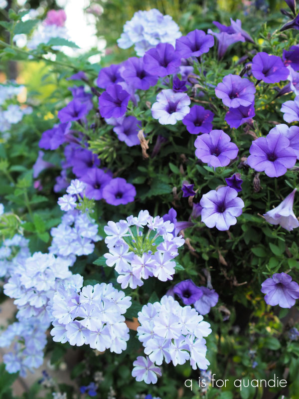
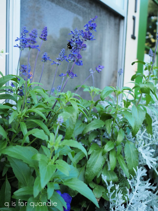
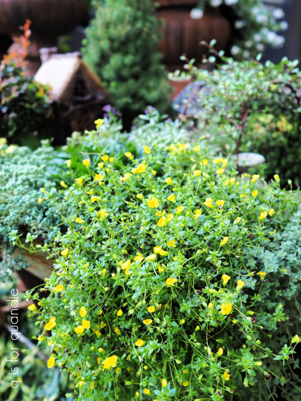
I’d planned a couple of things in Amsterdam that will make good ‘Sunday morning in the garden’ posts too including a visit to Hortus Botanicus …

the tulip museum …

and the garden at The Willet-Holthuysen House …

After our first few days in Amsterdam my neighbor nnK’s brother and another couple joined us for two more days in the city, after which we boarded a Holland America cruise around Norway.
When we initially started planning this trip, we were going to spend time in Amsterdam and then head to Bruges. But my sister has always wanted to go to Norway, so I started looking at cruise options from Amsterdam just to see what I could find. And I found a great deal on this 7 day Norway cruise. It didn’t take much to convince Debbie that we should do this instead of Bruges.
Bruges has always been on my bucket list, and one of these days I’m sure I’ll get there, but I’m really looking forward to seeing my sister and niece experience Norway.
Mr. Q and I have already been to all of the ports of call on this particular cruise, but we don’t mind going back again. We have stops in Oslo …


and Flåm.

Be sure to check back in next week when I report back on how it all went!


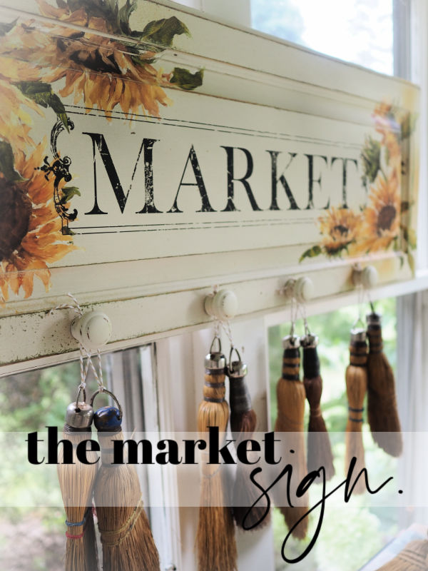
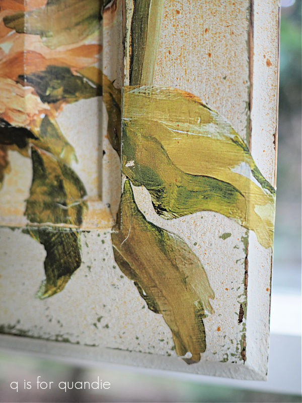
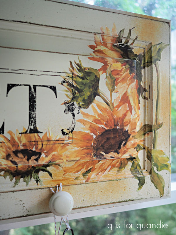
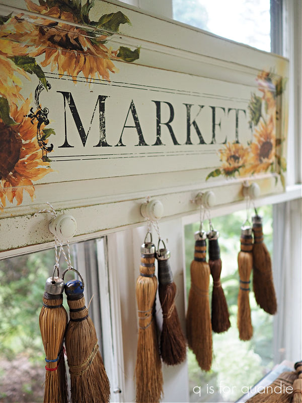

 This would be a great way to display your non-collection of whisk brooms, should you happen to have one. If not, you could hang your kitchen towels on it, or maybe some ironstone pitchers.