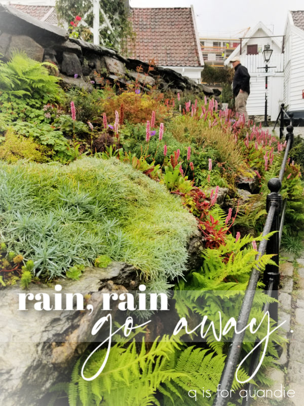
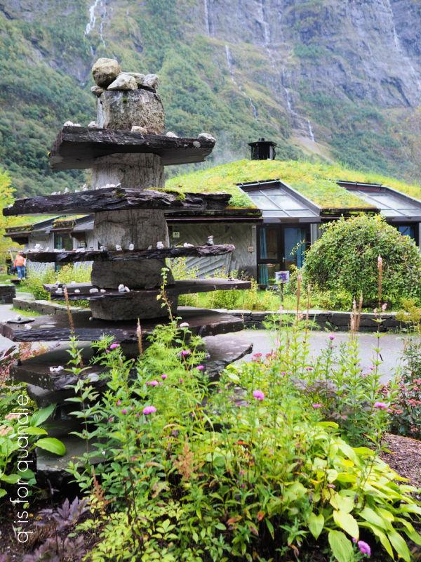
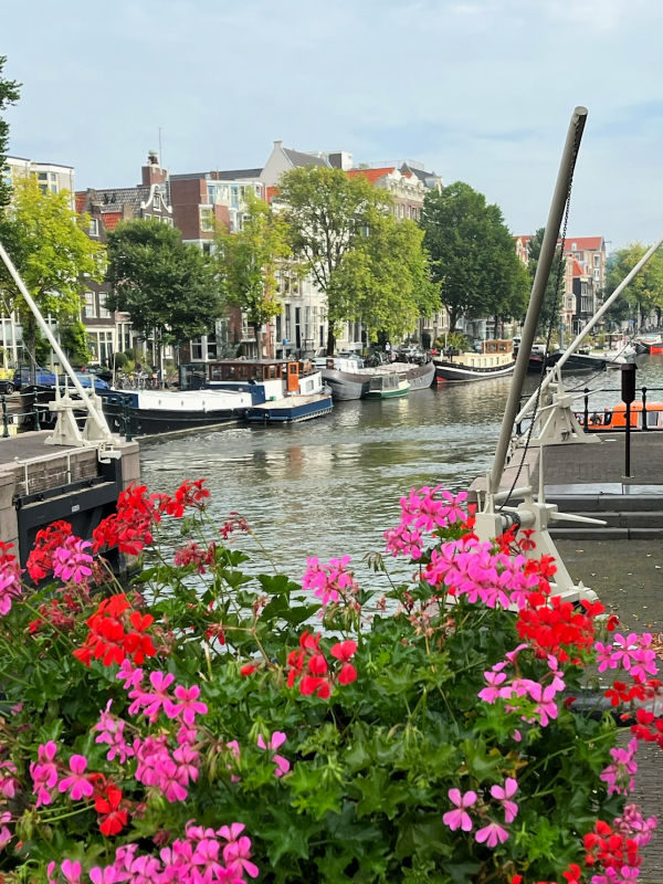
When we were in Norway last month I was determined to find a set of 5 small Norwegian flags to bring home as a souvenir. Yeah, I know, maybe not your typical souvenir. But I have this vintage flag holder and although I have U.S. flags for it, I was thinking it might be fun to fly the Norwegian flag for a while.

Especially since nnK (my neighbor across the street) flies the Swedish flag!
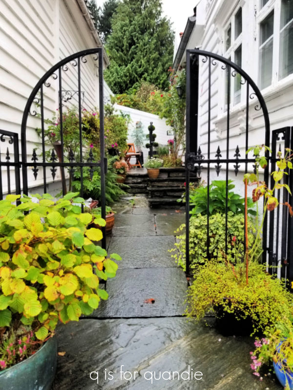
I initially thought I might have to really hunt around for those flags in Norway, but no. They were everywhere. Nearly every souvenir shop we visited had them, and they had them in various sizes too.
So now I have them hanging on the carriage house and I love them.
Fast forward to a week or so ago when I found this red toolbox at a garage sale.

I was heading out to my workshop with it, and as I passed those flags I thought … hmmmm … the Norwegian flag would be perfect on the toolbox.
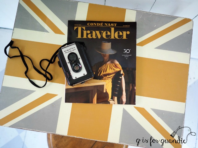
After all, I’ve done a few union jack pieces …
So why not the Norwegian flag?
So I cleaned up the toolbox and then gave it a coat of Dixie Belle’s Honky Tonk Red inside and out. You’ll note that I skipped the B.O.S.S. step this time around. This toolbox did not have any rust, and it also didn’t seem to have any greasy residue from anything. So I thought I’d be O.K. skipping the B.O.S.S.
I let the paint dry overnight, and then I taped off the white stripes and painted those with Drop Cloth. Once dry, I taped some more and then added the dark blue stripes using In the Navy.

Once I had the flag design in place I decided that it needed just a little something more.
So I decided to add a few roses.

The white roses are from the I.O.D. Brocante transfer, and the red roses are from their Redoute II transfer.
I wrapped them up and over the top …

And also around the side.

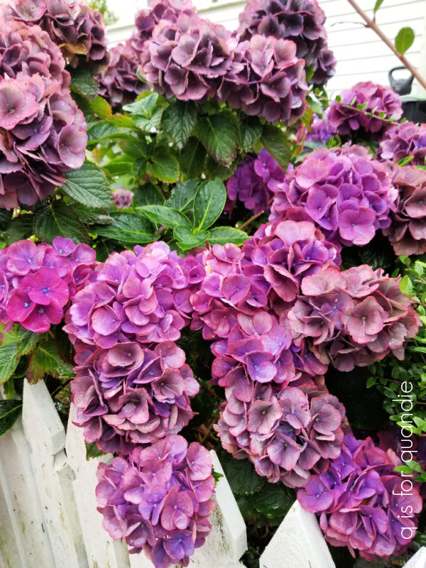
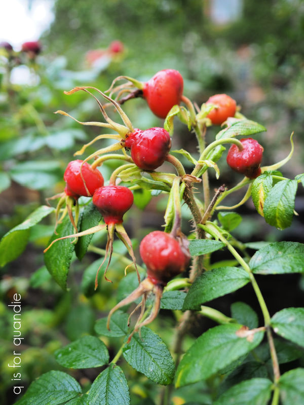
You may be wondering what roses have to do with the Norwegian flag. Well, nothing really. I just thought they looked nice together. Plus, judging by the amount of rose hips I saw while visiting Norway, I’d say they grow plenty of roses there.
So it’s not entirely odd to have added roses to their flag.

I staged the toolbox with some old photos of my Norwegian ancestors.
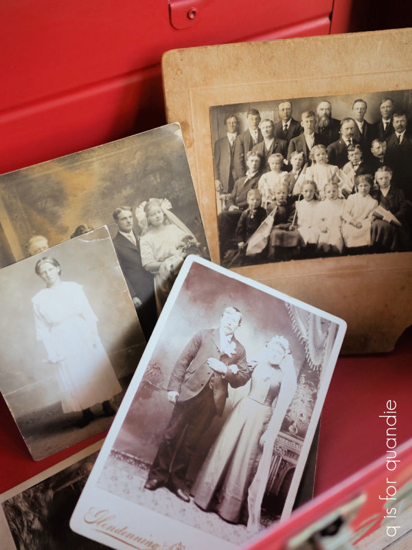
The wedding photo in the front is my great grandfather who emigrated from Norway as a young man. In the back row is my grandmother’s confirmation photo, then her wedding to my grandfather, and then there is this photo from 1909 …

My grandmother is the 2nd from the left in the front row. I thought this photo was particularly relevant because several of the kids are holding Norwegian flags. The back of the photo dates it to May 17, 1909. May 17th is Norway’s Constitution Day, so they must have been celebrating that. I have no idea why there are only men and children in the photo. Where are all the women? Probably in the kitchen making Kvæfjordkake or something.
By the way, a little sidebar, I did try Norway’s official national cake, Kvæfjordkake, while I was in Kristiansand …

And it was absolutely delicious. Have you ever had it?
Anyway, I totally love how the Norske toolbox turned out.

I am going to attempt to sell it. I’m banking on the belief that there are a lot of locals in Minnesota with Norwegian ancestry who just might want a Norwegian flag toolbox.
Maybe?
Well, I guess I’ll find out. And if it doesn’t sell, well then, maybe it was meant to be mine.
If interested, be sure to check out my ‘available for local sale‘ page for more details.