Happy New Year!
Rather than making a list of resolutions for the new year, which often leads to a sense of failure when you don’t actually accomplish most of them (hello exercising at least 5 days/week), I find that it’s much more satisfying to celebrate the things that you did accomplish over the previous year.
I don’t know about you, but I definitely tend to forget about the stuff that I’ve already done and focus too much on the stuff that I haven’t.
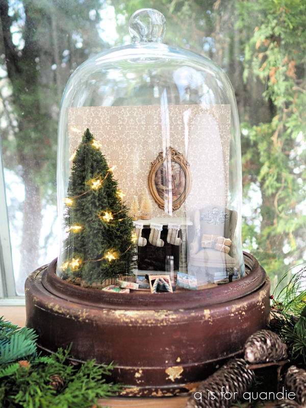
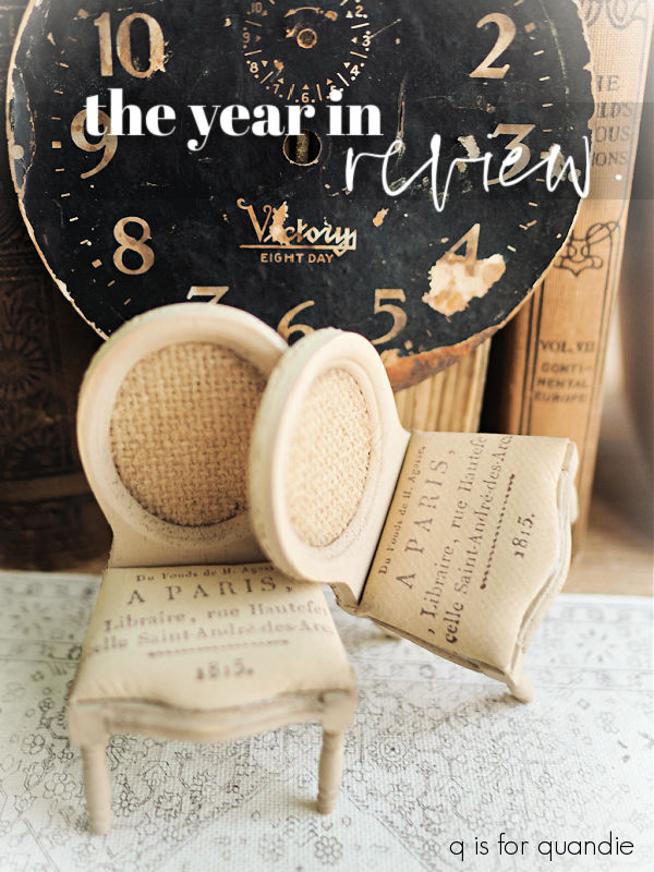
So for me New Year’s Day is a good time to look back and remind myself what I did in 2025, starting with my dollhouse reno.

I have to admit, when I originally decided to tackle this project I half expected it to get pushed to the back of workshop mostly unfinished. I definitely was not confident in my ability to get it done.
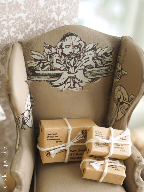
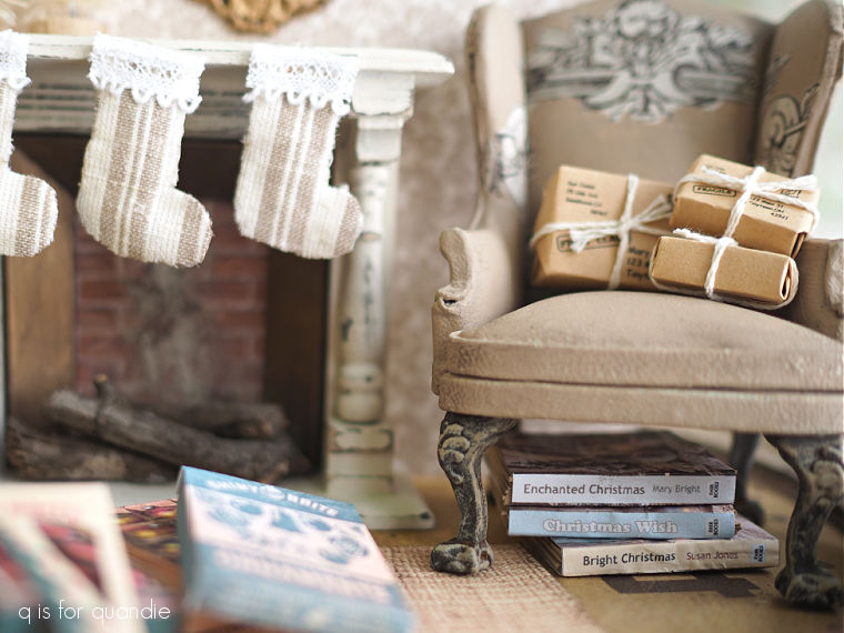
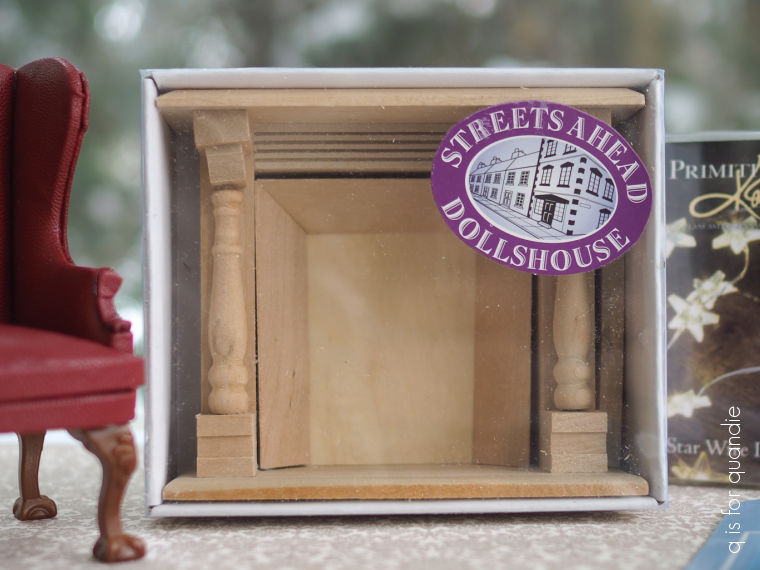
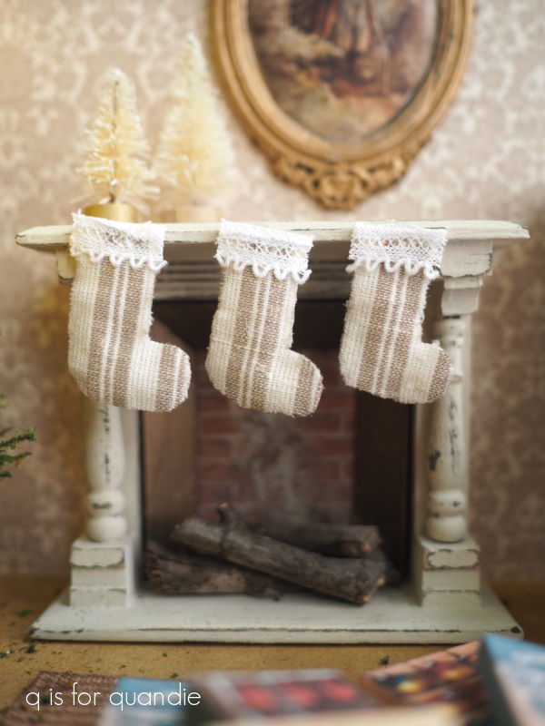
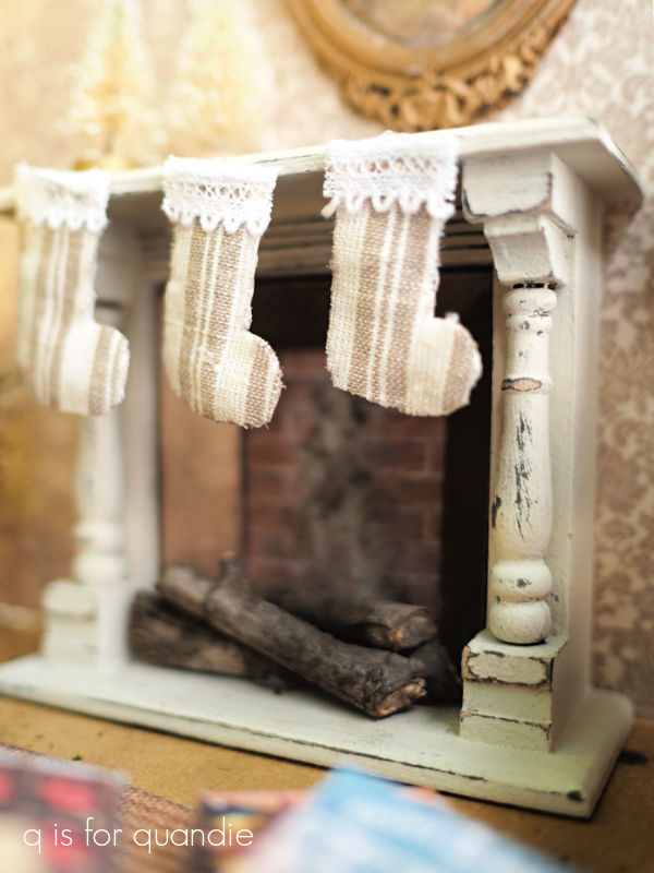
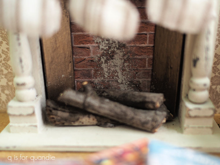
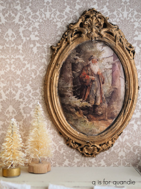
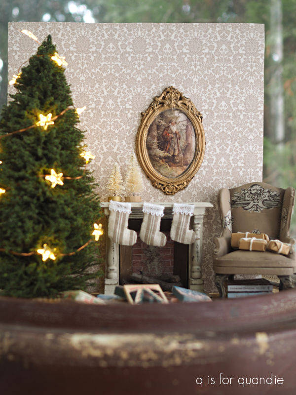
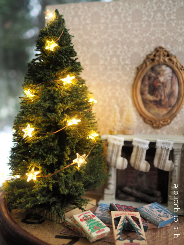
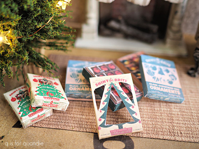
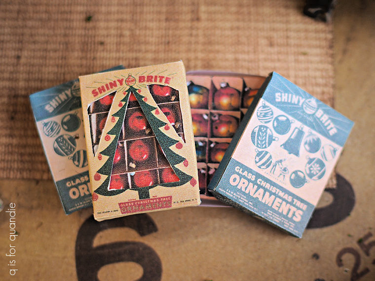
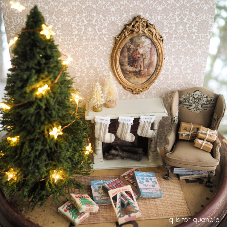
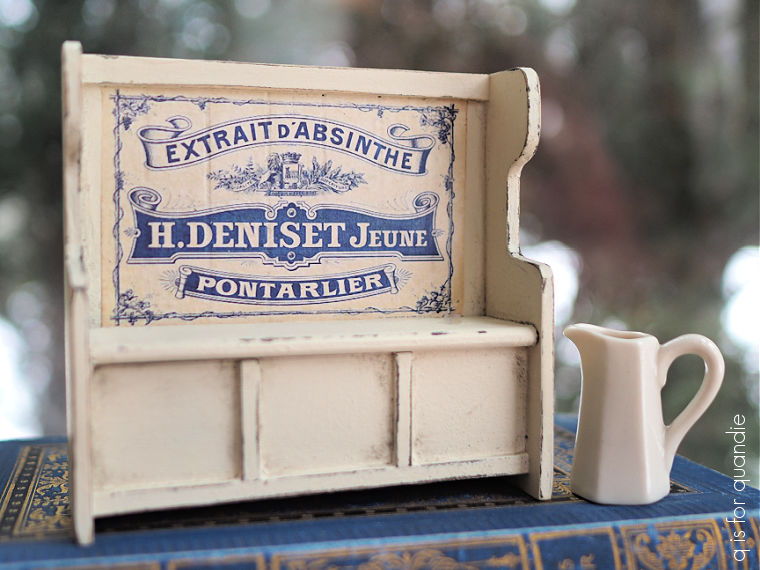
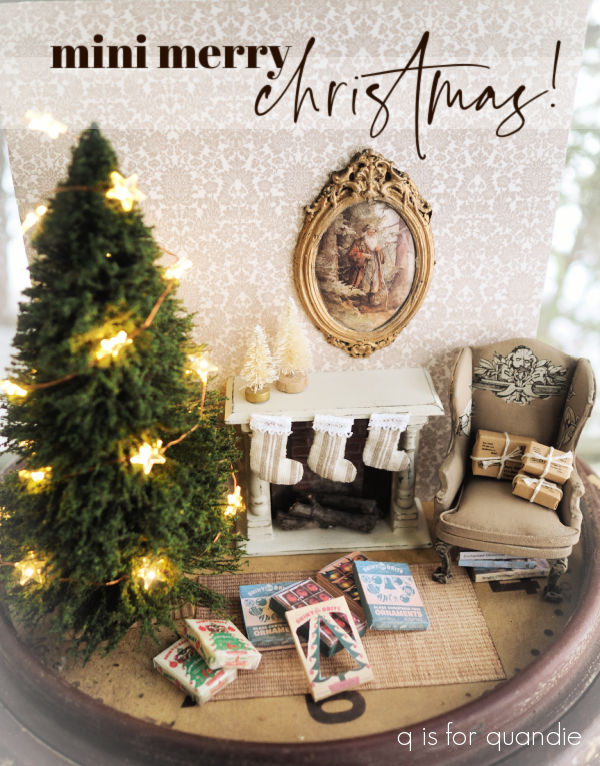
But as it turned out, I really enjoyed working on it. I finished 9 rooms, if you count the two hallways as rooms.
I do have two rooms left, the living room and the library (which is up in the tower). I’m just waiting for some inspiration to strike for the living room, I don’t have a clear idea of how I want it to look yet, and the library is just going to require a lot of books.
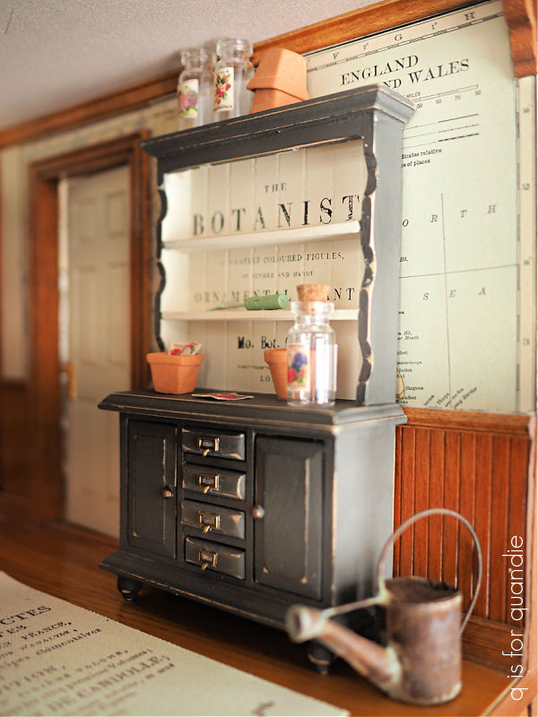
I’m sure you noticed that most of the furniture I painted in 2025 was miniature too.
I had so much fun creating miniature pieces last year.

They are so much easier to work on than full sized furniture!
But now that my dollhouse is mostly complete, I’m not sure how I’m going to justify continuing to paint more miniatures. I’m working on a plan for that though, so stay tuned.
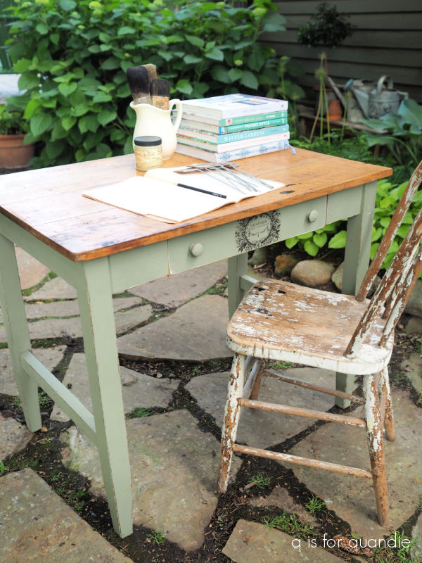
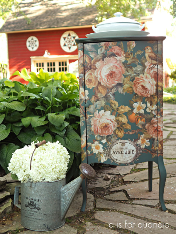
I did manage to paint a few full size furniture pieces this year including a desk that I purchased for just $4 at a garage sale.
I also painted up this small cabinet …
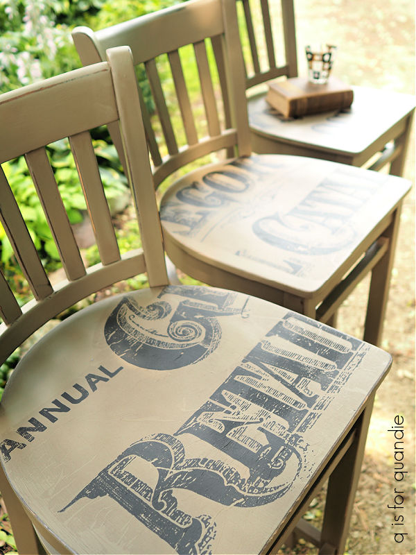
and a trio of bar stools.
I hope to do more furniture when the weather warms up enough for me to work out in my unheated carriage house workshop again in spring.
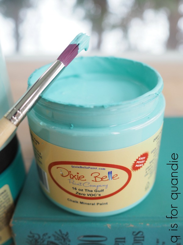
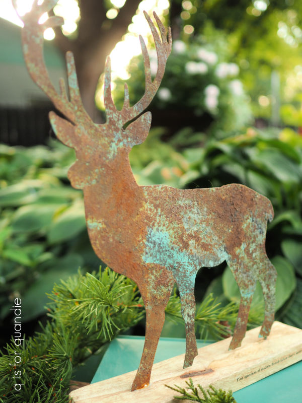
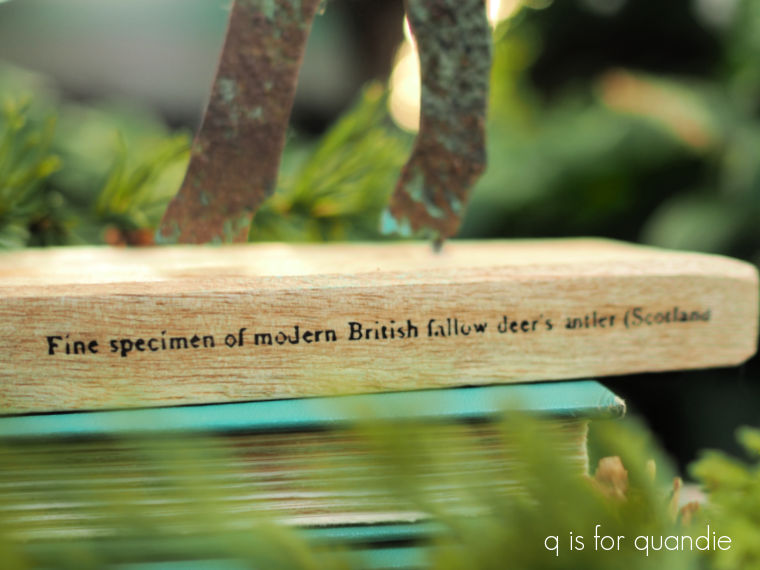
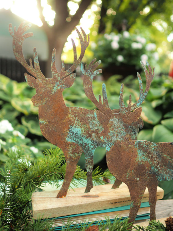
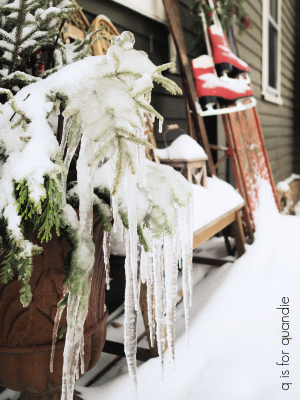
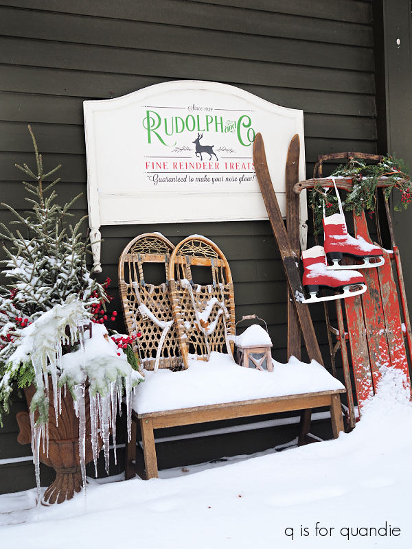
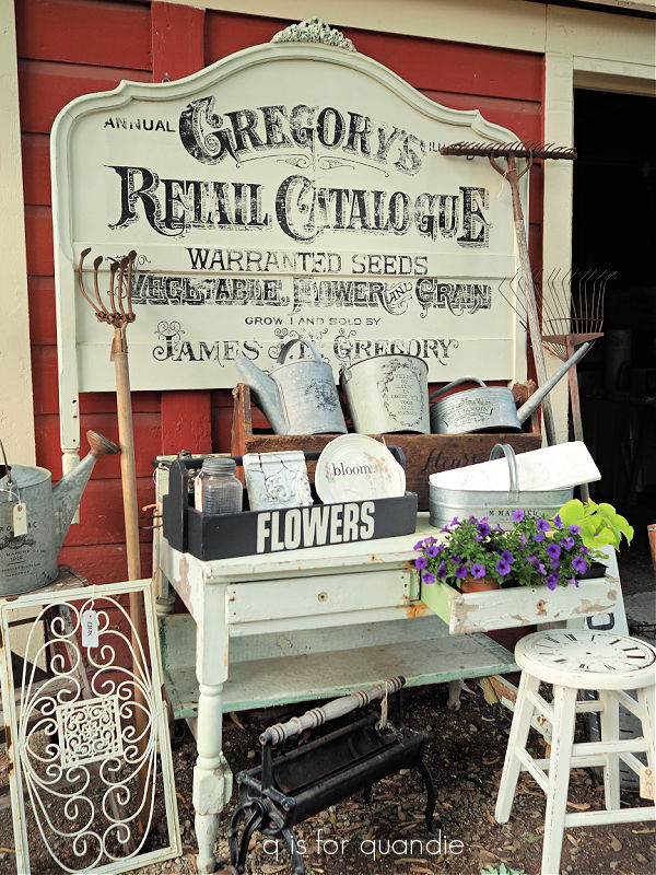
I created quite a few rusty masterpieces in 2025 using Dixie Belle’s Patina Paint as well.
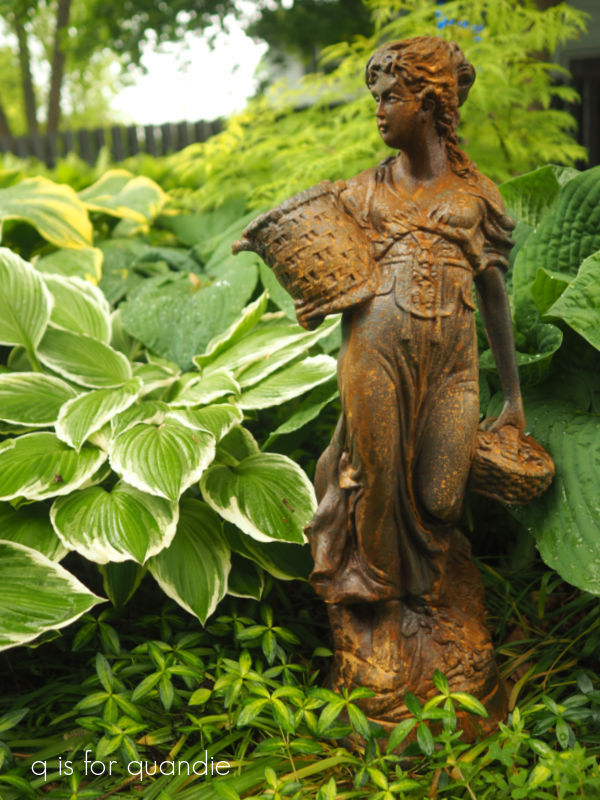
I use the Iron Paint and the Green Spray to add faux rust to otherwise somewhat boring (or dare I even say, tacky) items.
I love using it on plastic garden planters especially.
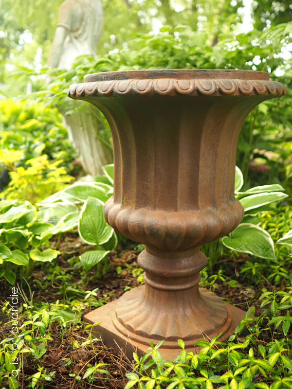
To me they look totally realistic, and since I don’t want to spend a few hundred dollars on an authentic iron garden urn they make a great alternative.
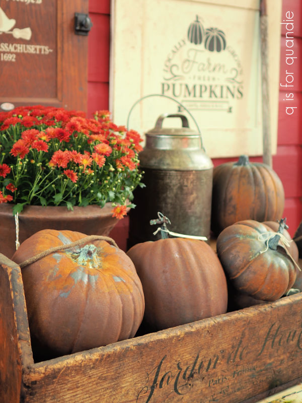
I also used Patina Paint to transform garish orange pumpkins into rusty masterpieces.

They were a big hit at my fall sale.
Speaking of which, I managed to host the Carriage House Sale twice last year. Once in May …
and again in October.
I definitely plan to do that again in 2026.
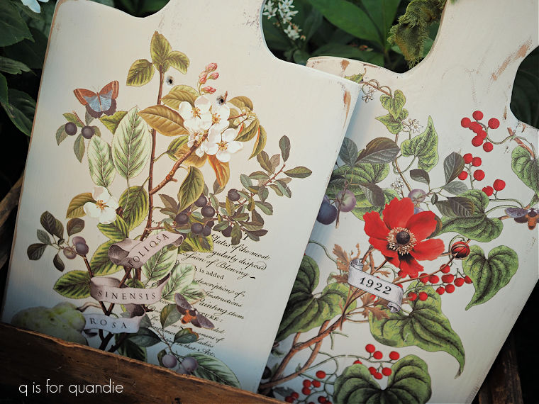
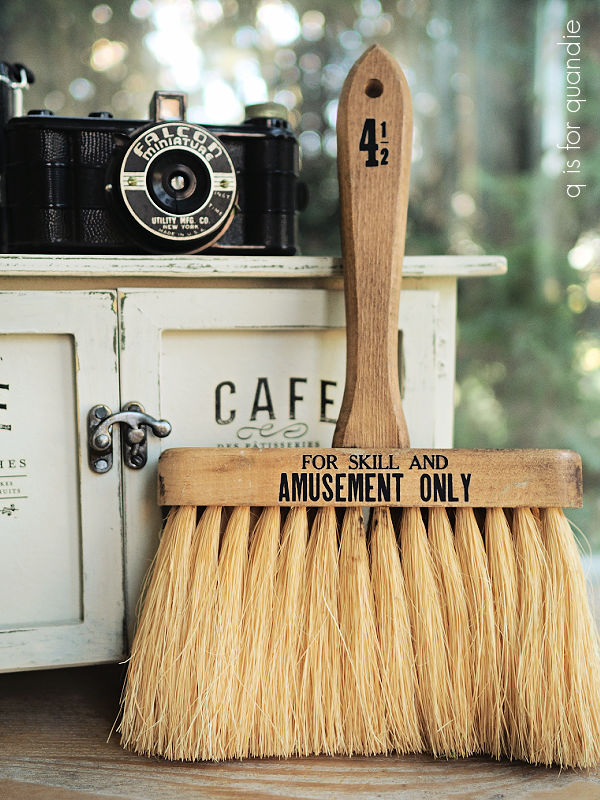
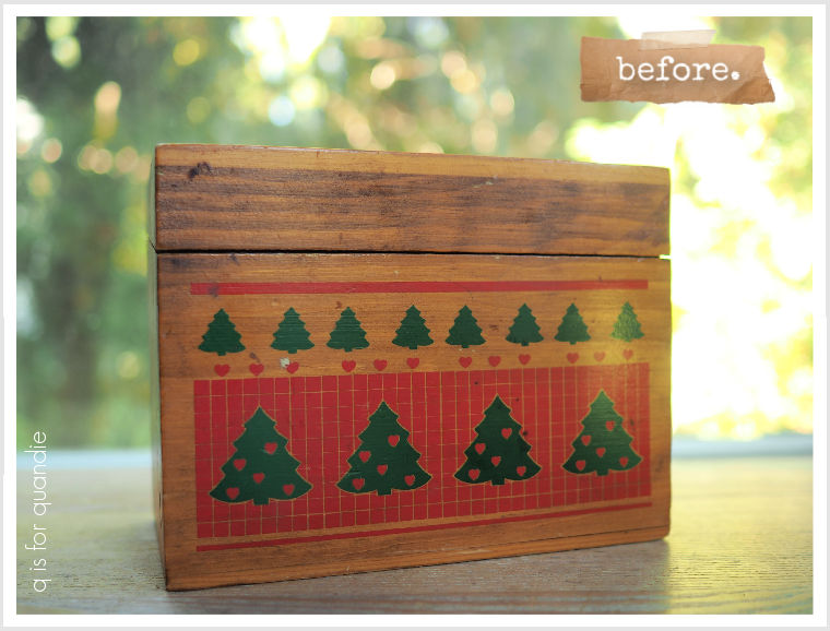
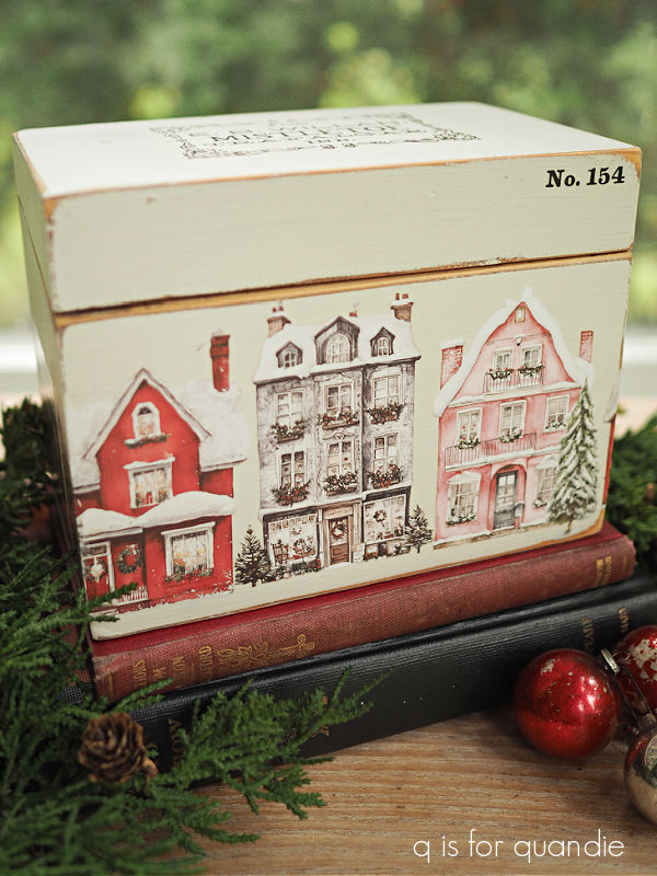
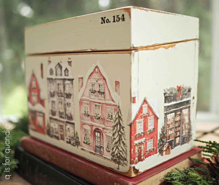
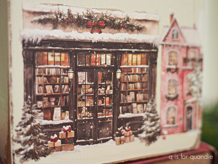
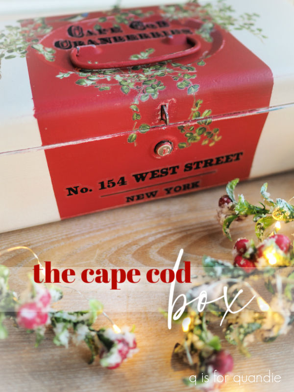
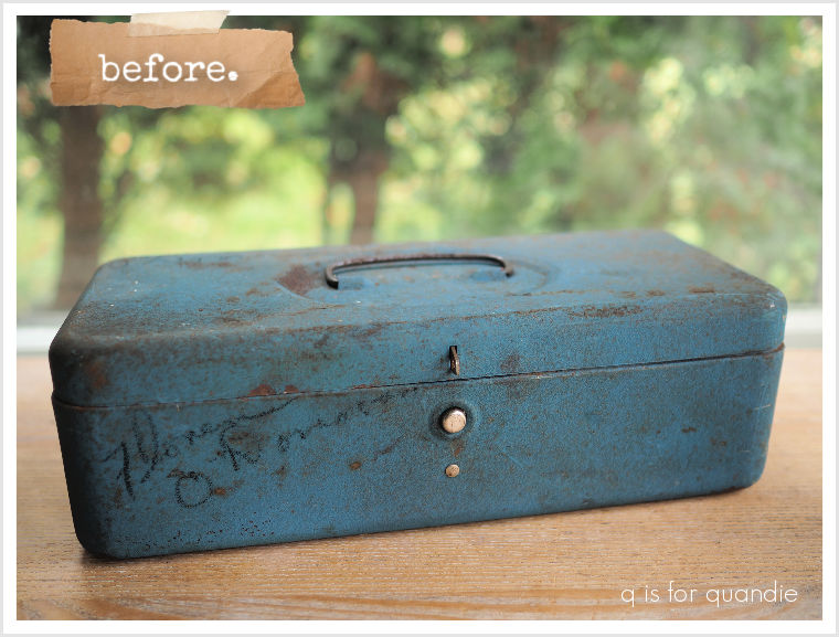
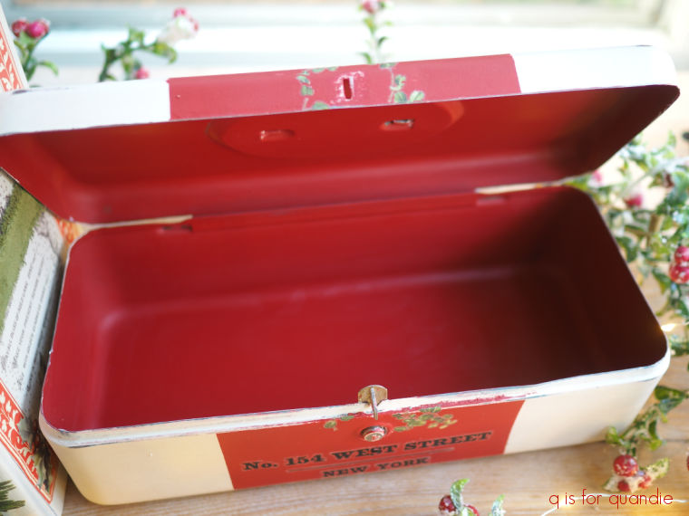
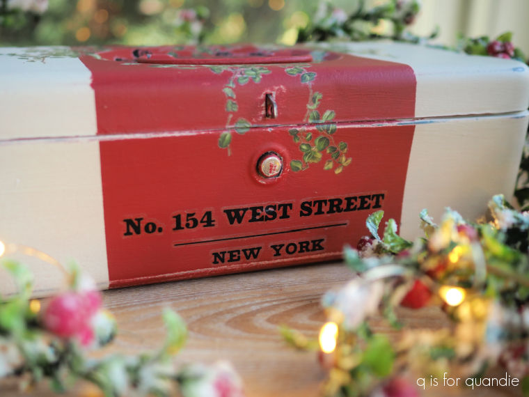
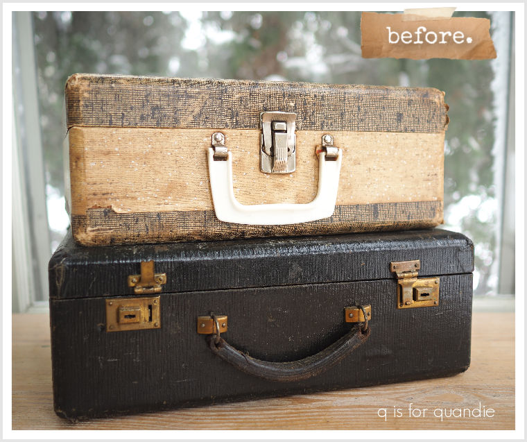
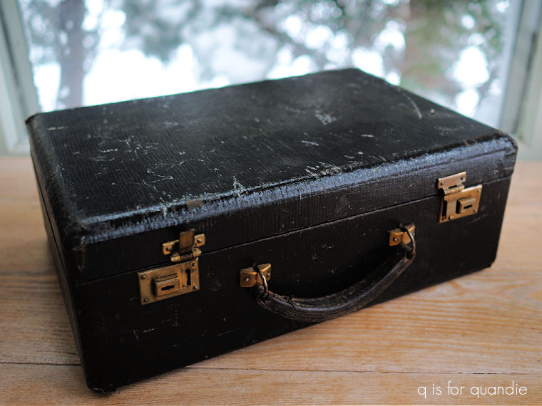
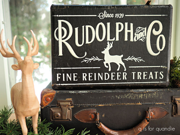
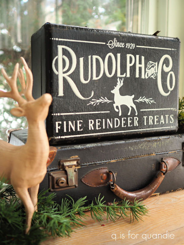
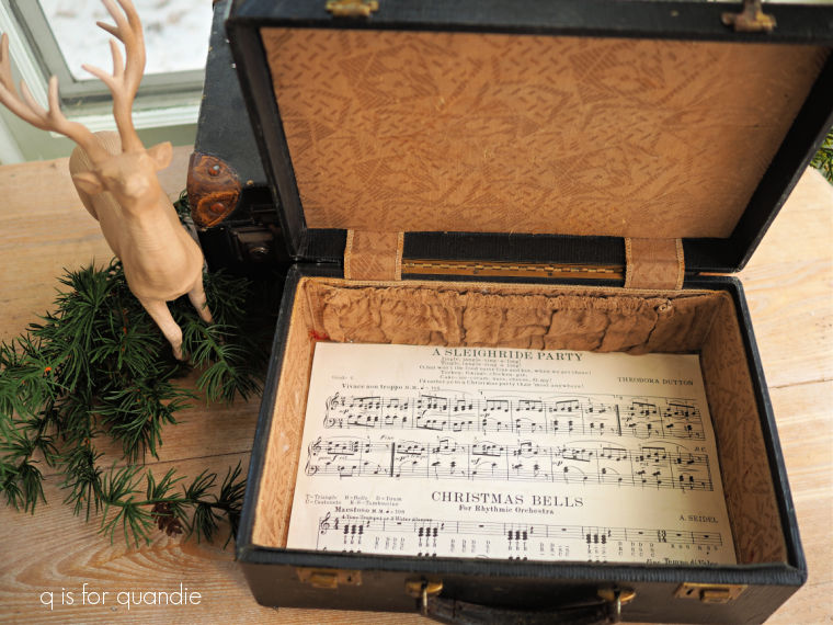
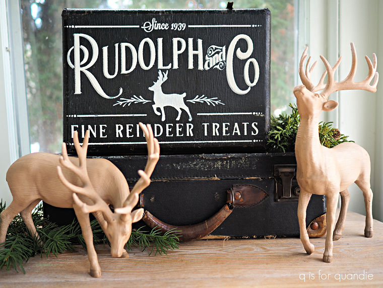
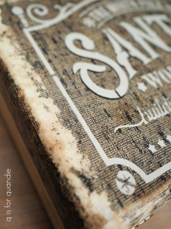
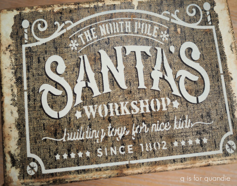
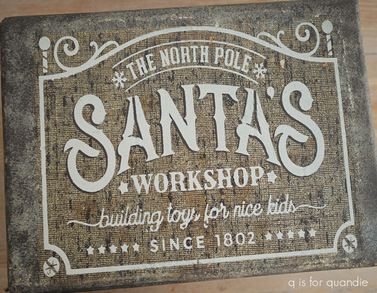
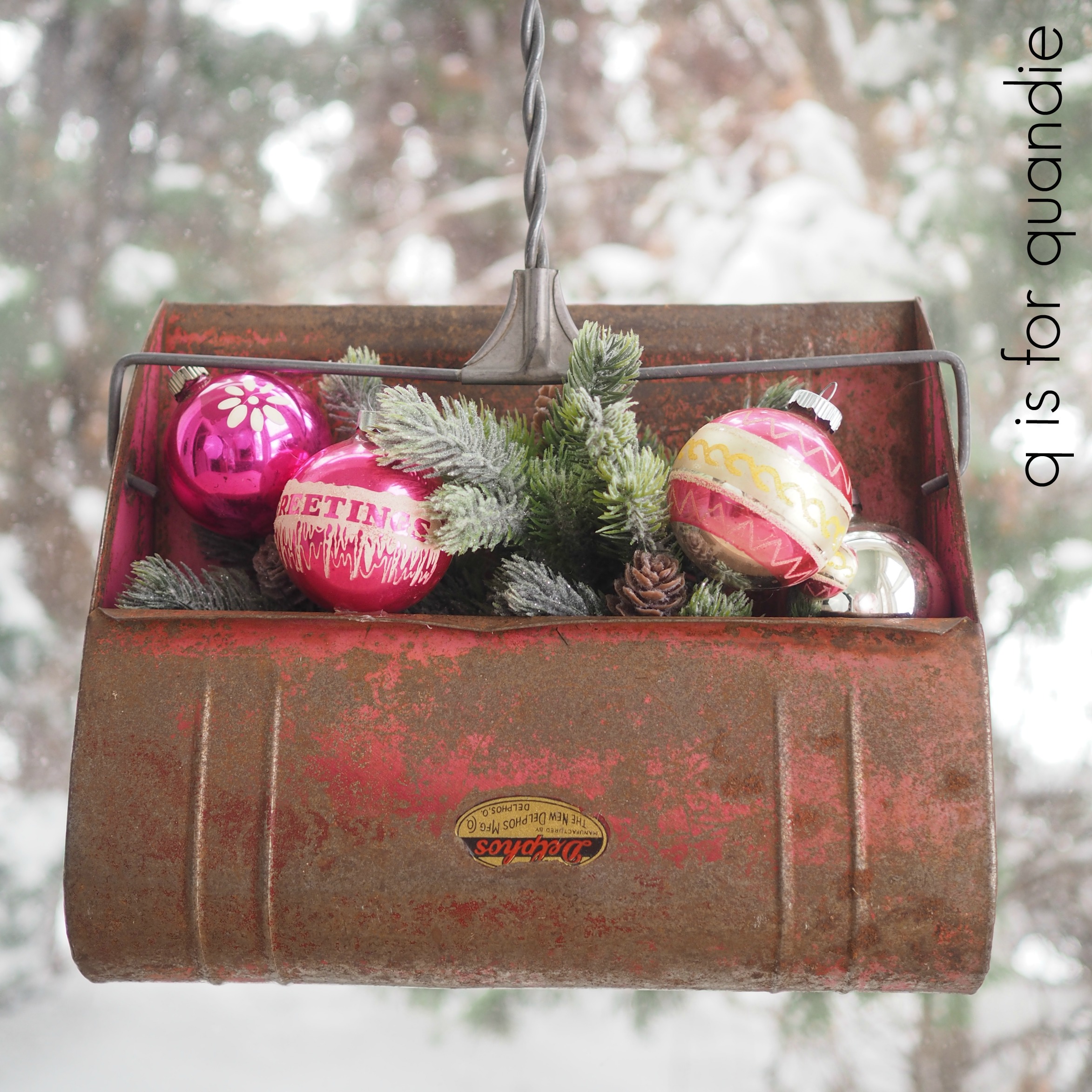
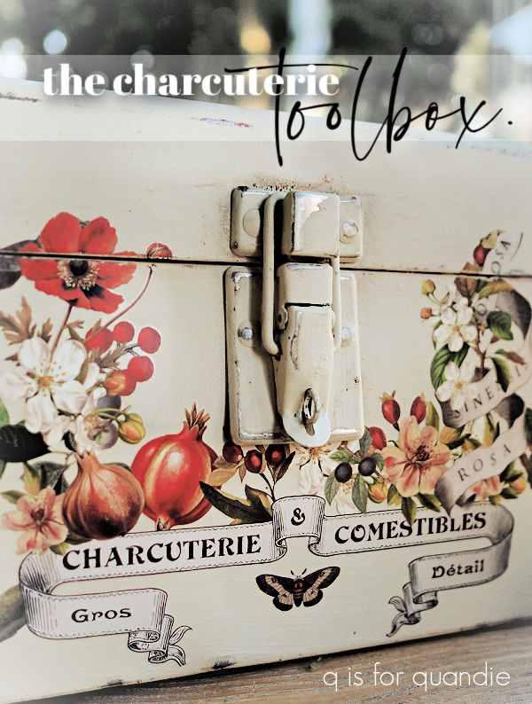
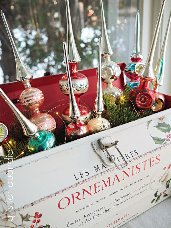
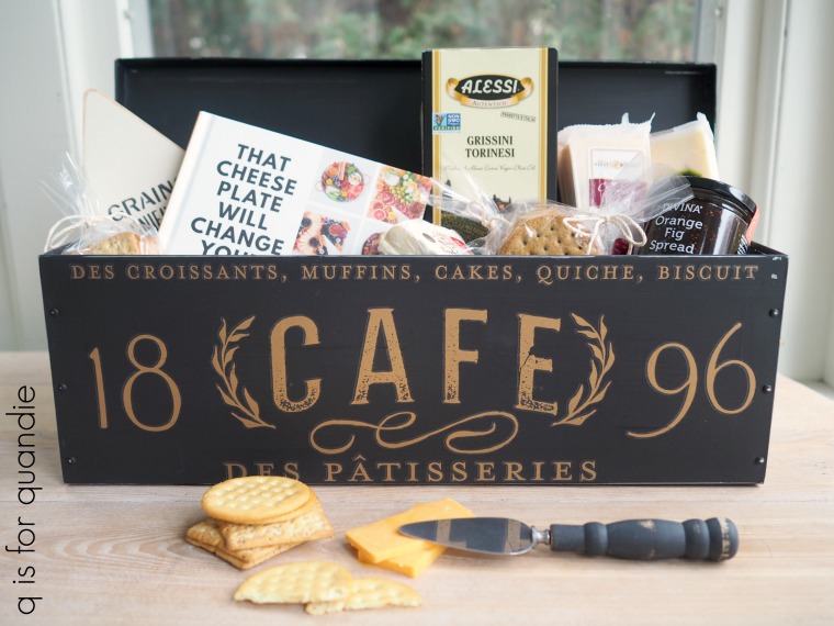
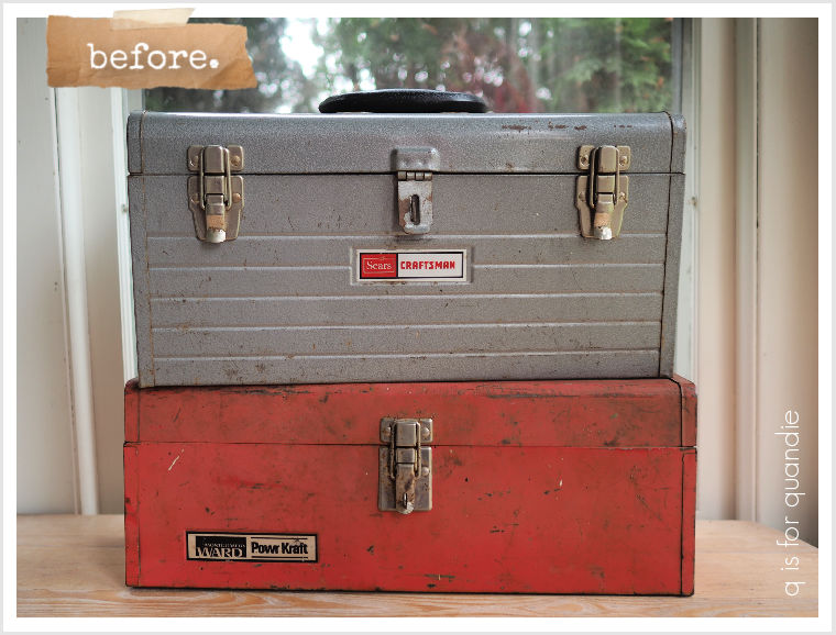
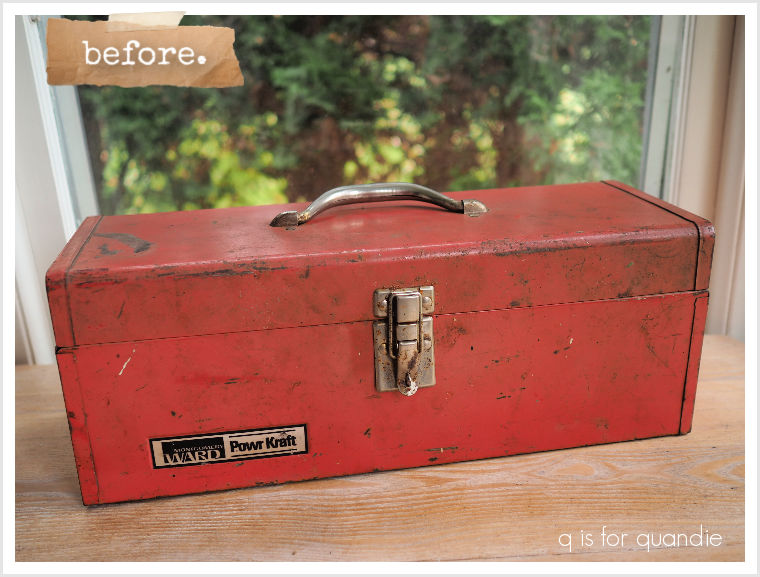
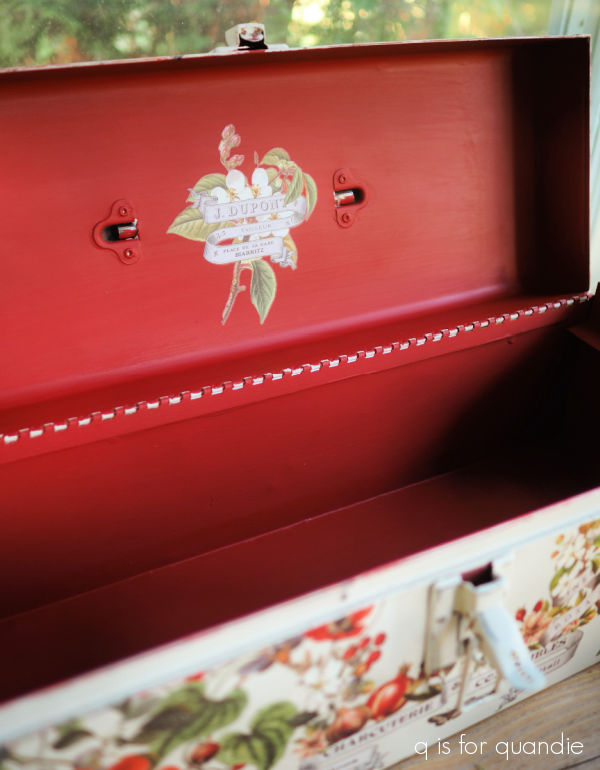
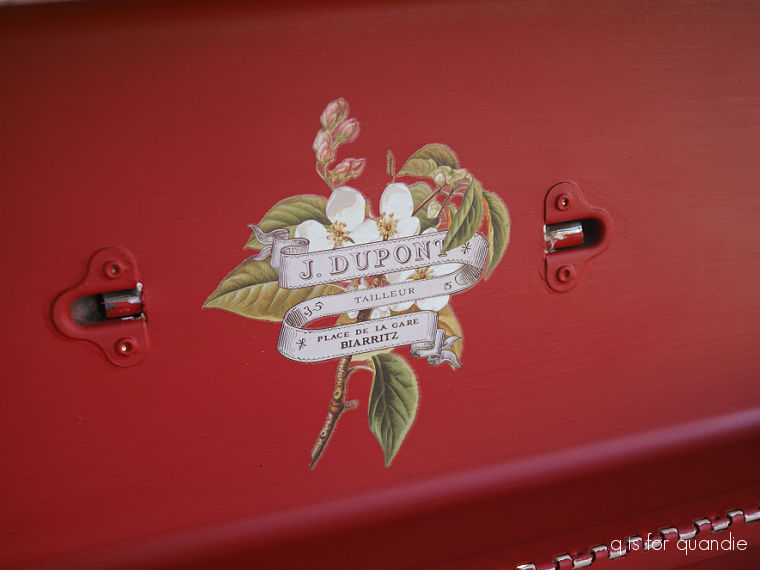
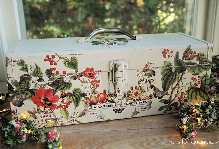
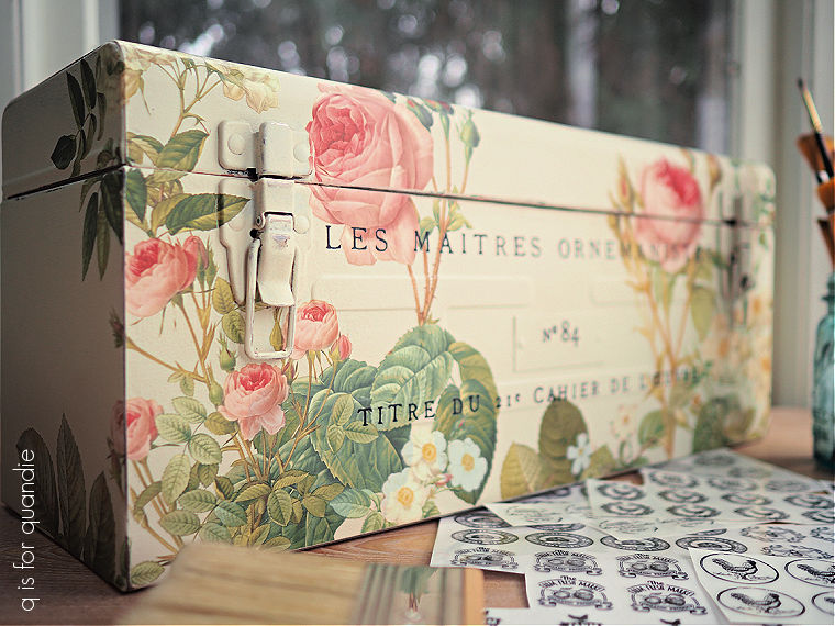
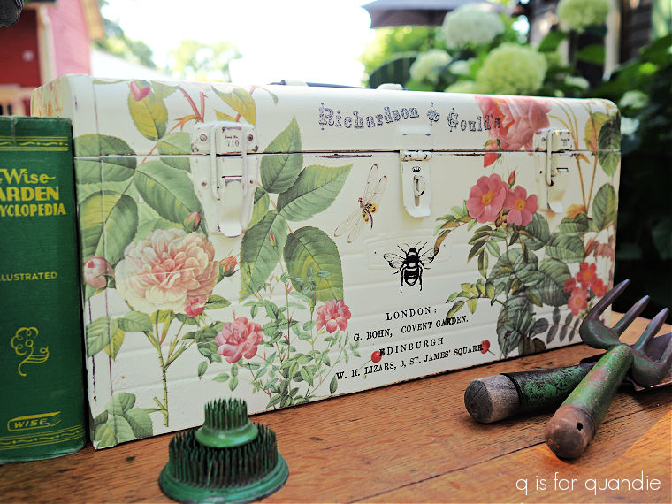
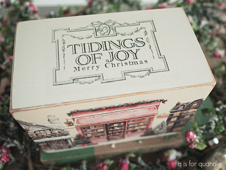
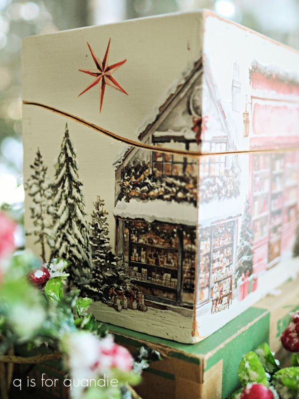
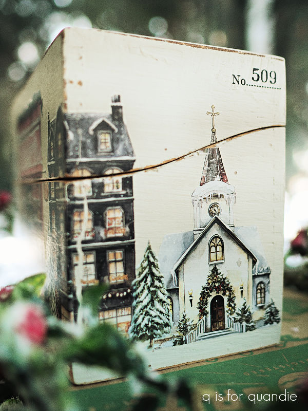
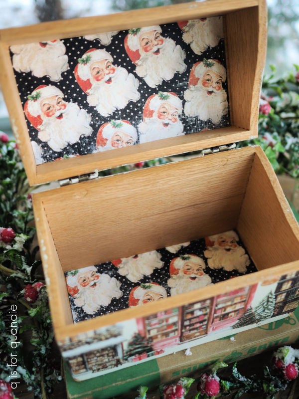
Of course, I also painted a multitude of toolboxes in 2025. I haven’t taken the time to count them all, but here are a few of my favorites starting with this pretty one from back in January.
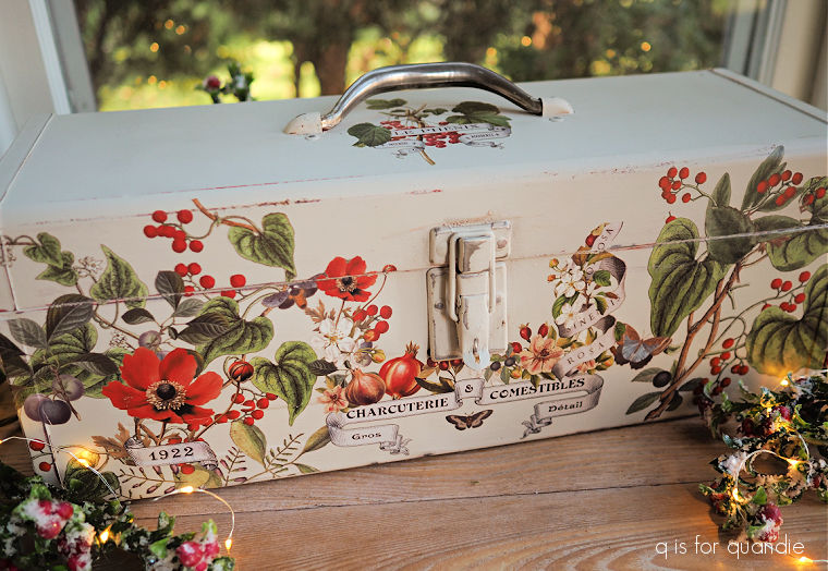
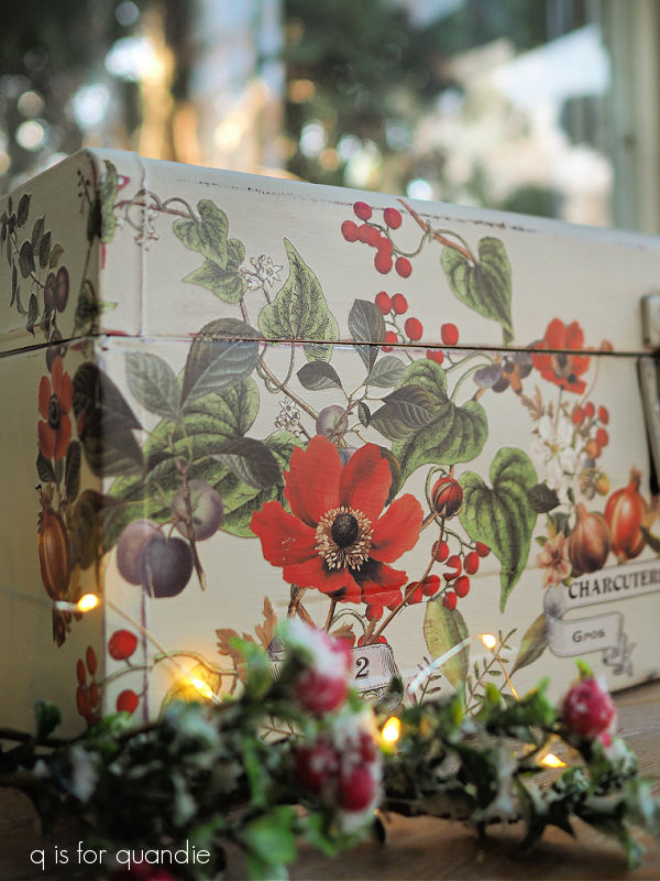
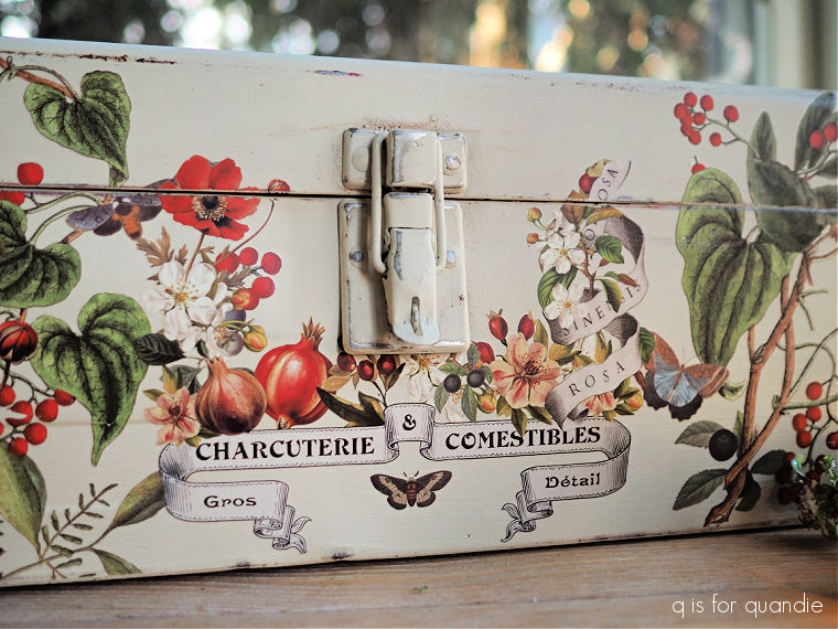
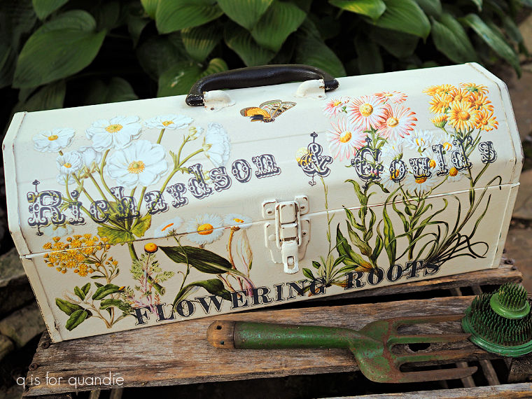
I honestly could share a favorite toolbox from every month of the year, but that might get tedious. So I’ve only gone back to May for this next favorite.

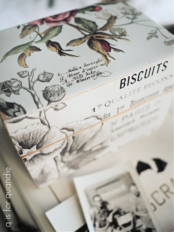
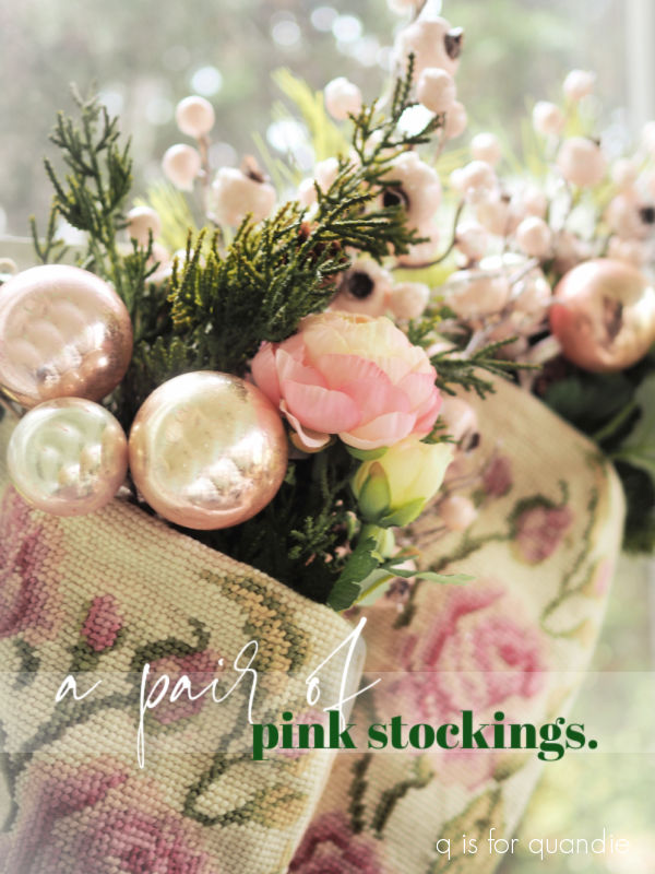
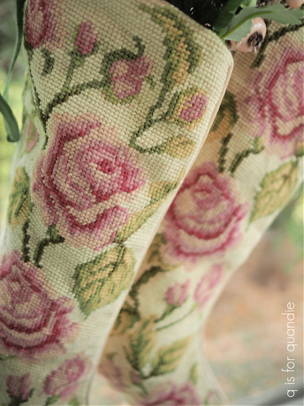
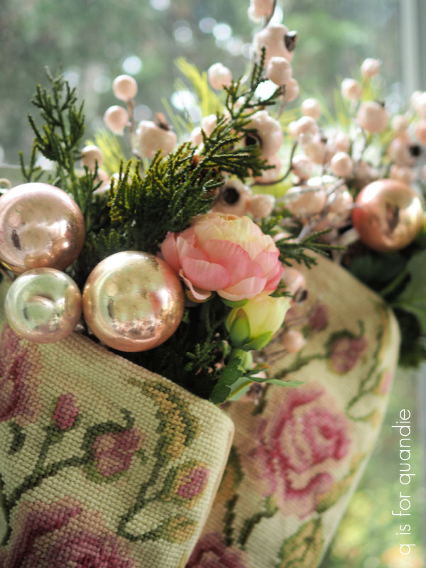
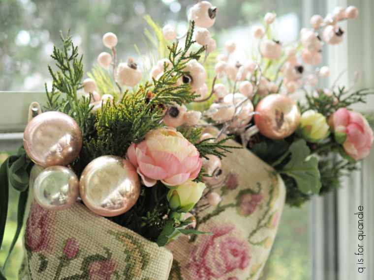
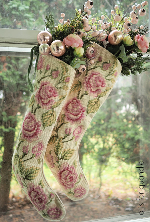
It seems that I had a recurring theme of roses last year.
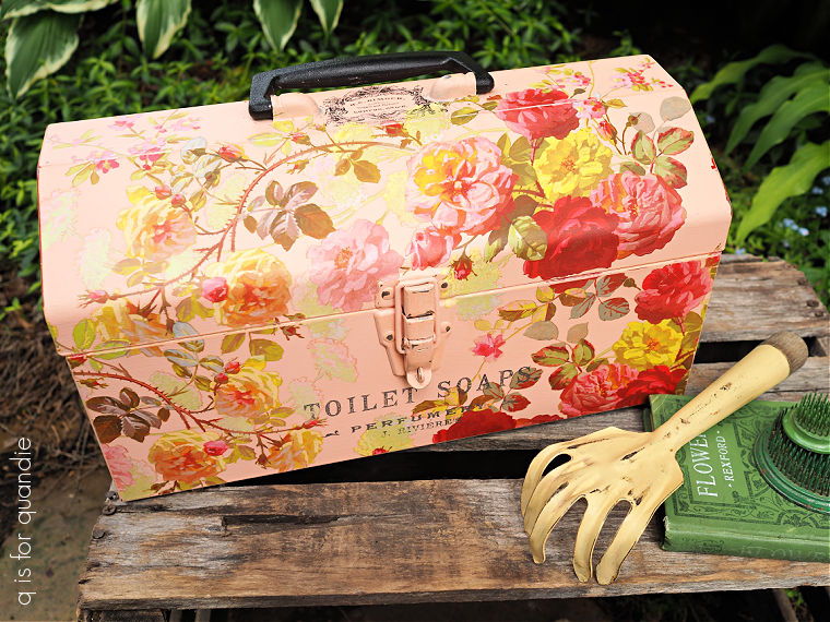
I can’t help it that I.O.D. has so many beautiful rose themed transfers.
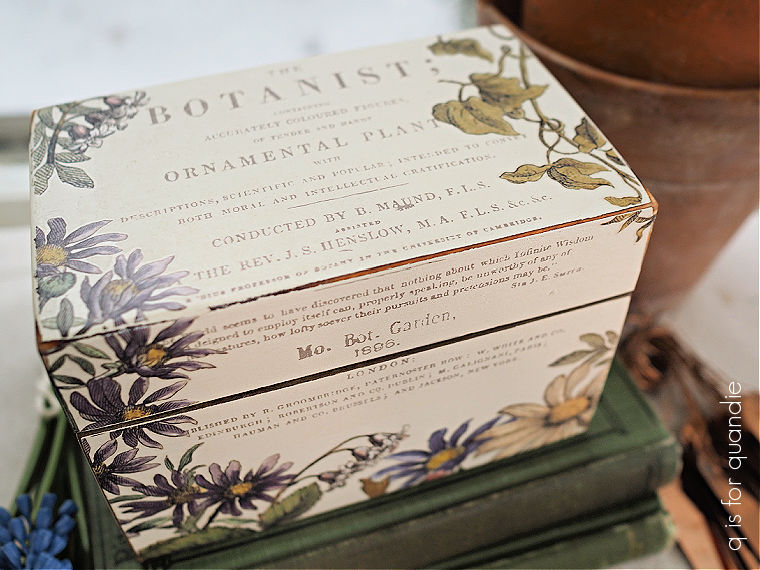
I did find some other florals to use too.
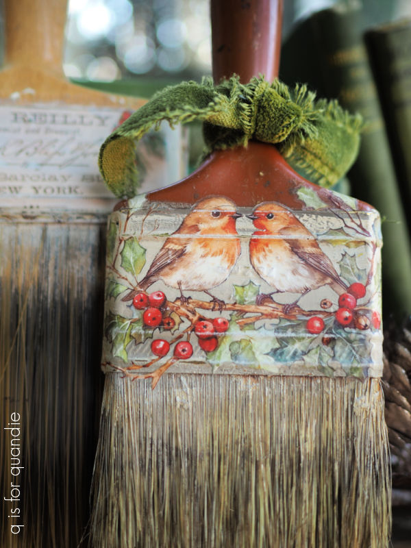
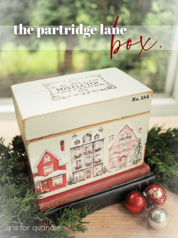
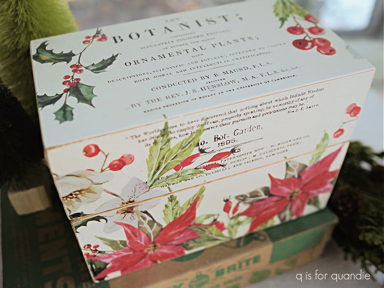
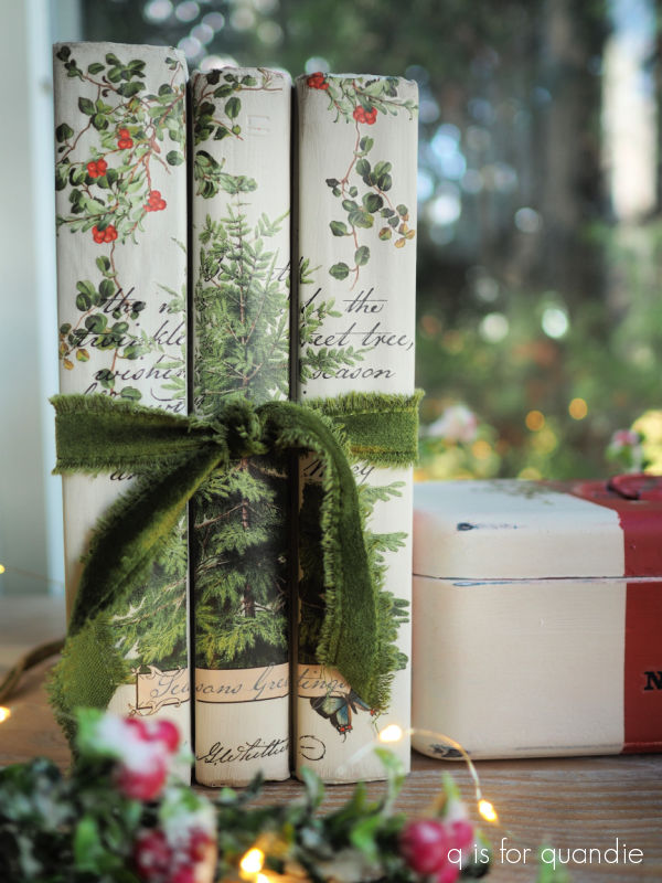
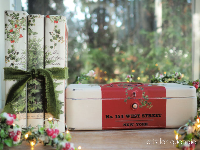
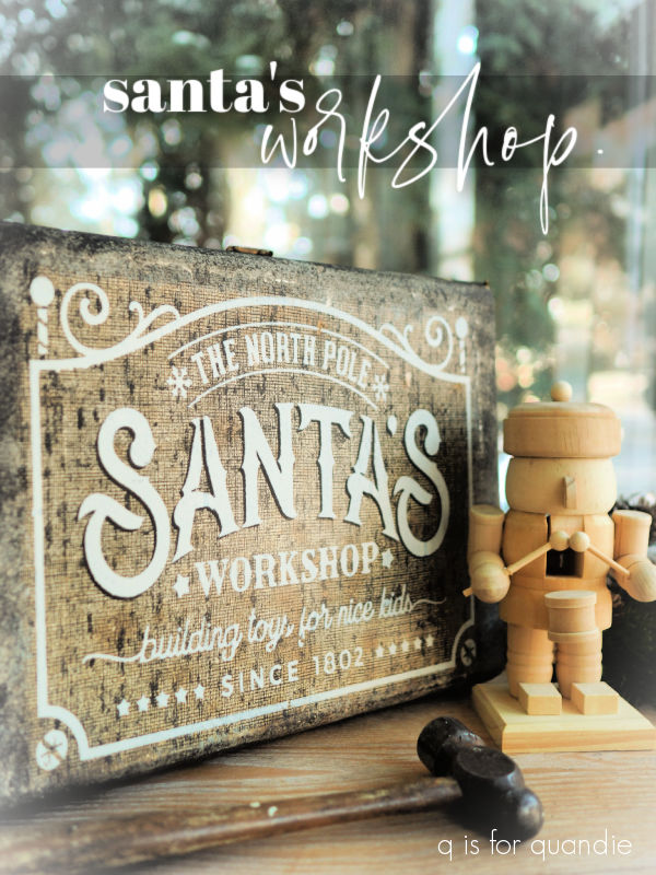
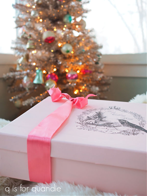
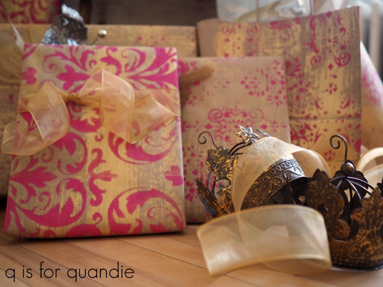
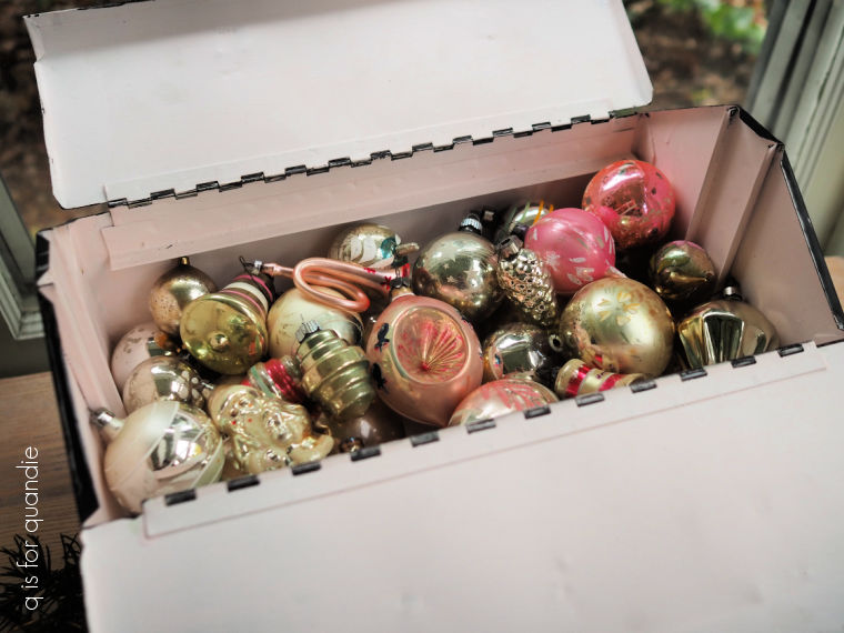
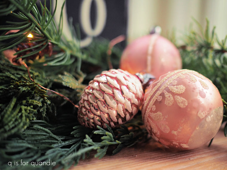
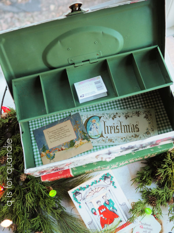
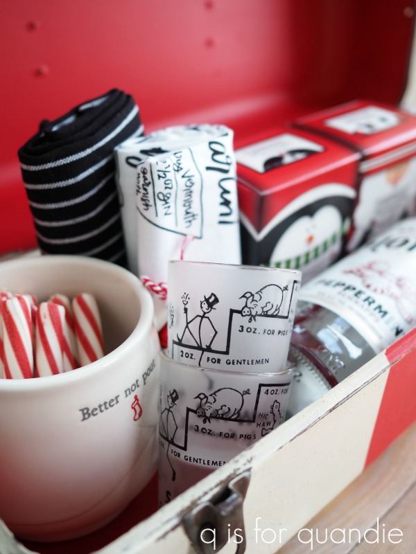
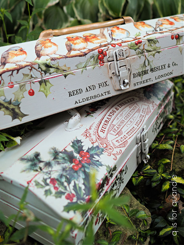
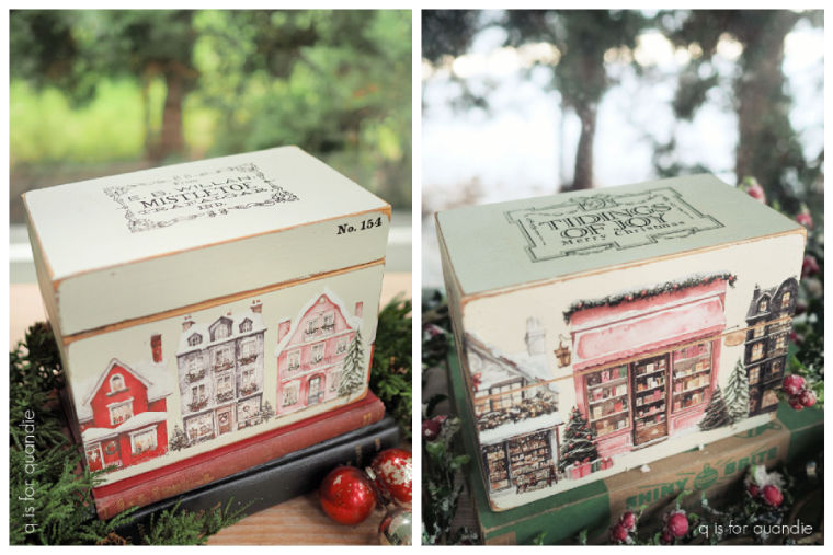
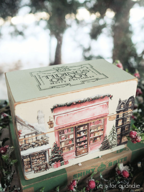
And of course I did a few holiday themed boxes as well.
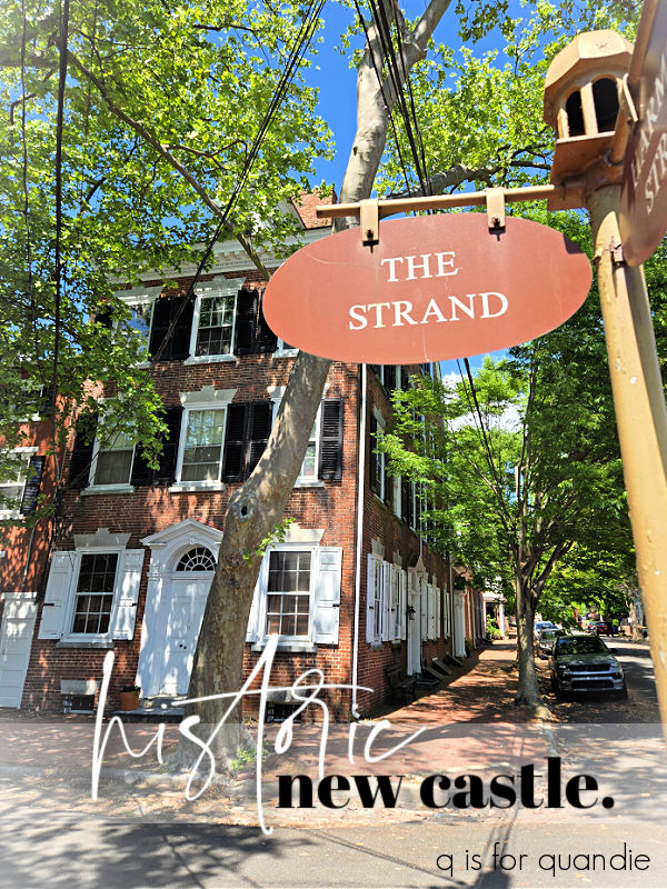
I did a lot of traveling in 2025. I took several trips to visit my mom (she lives in a suburb of Las Vegas).

I plan to head back there again in February.
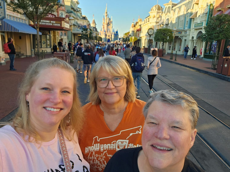
I also took two trips to Orlando to visit my favorite theme park last year, one in February with just my sister …

And one in November with both my sister and my niece.
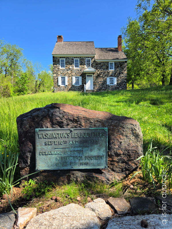
Mr. Q and I took a fantastic trip to the Brandywine Valley in May.
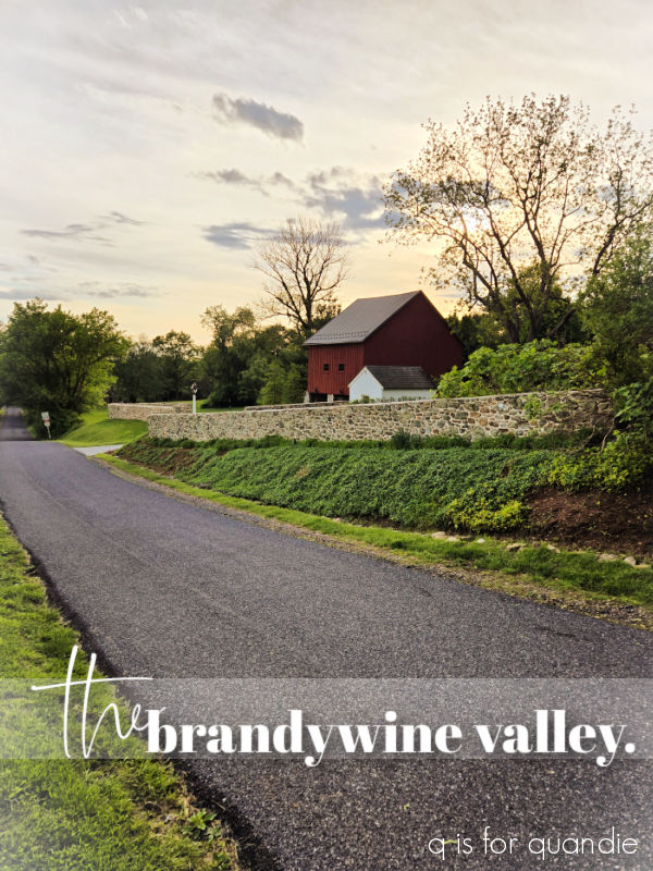
If I had to pick a favorite trip in 2025, this one was it. We enjoyed checking out gardens …


and battlefields.
We also took an Azamara cruise along the St Lawrence Seaway all the way from Montreal out to the Atlantic Ocean in September.
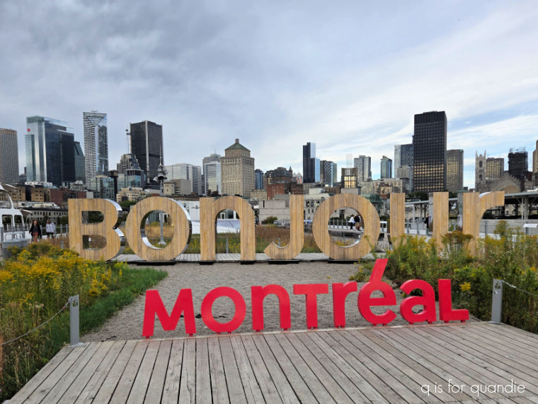
Honestly, this trip would probably have rated higher if I hadn’t come down with Covid halfway through.
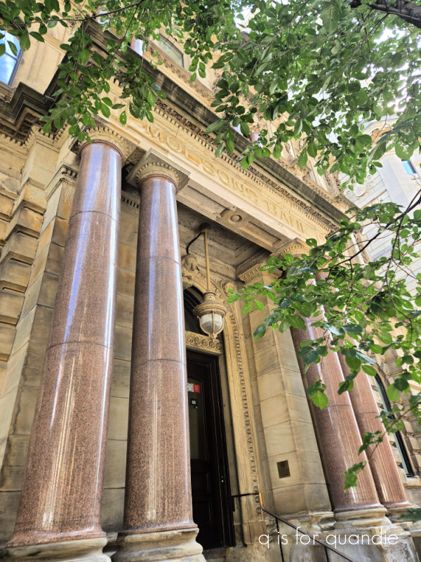
But prior to getting sick, we did do some fun sightseeing in Montreal.
and we really enjoyed the Fortress of Louisbourg.

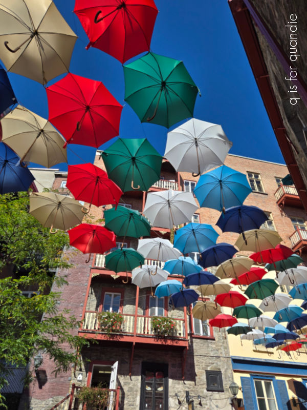
And despite being rather under the weather, I did get to see Quebec City which has always been on my bucket list.
I finished the travel year off with my annual trip to Puerto Vallarta with my neighbor’s family.

A week at the pool with a good book is the perfect way to relax a bit during the holiday season.
I spent a bit of time out in the garden in 2025 too.

Despite my jumping worm infestation, things looked pretty good for most of the year. I did have to do more watering and fertilizing than I used to do, but fortunately now that I’m retired I have time for that.

Although I was mostly focused on maintenance for 2025, I did finally choose a tree for the front yard.
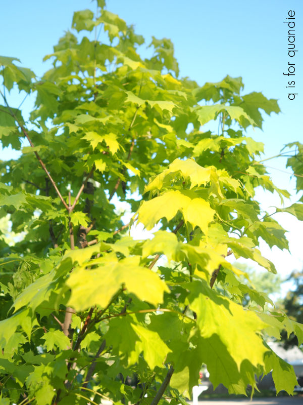
It’s a Princeton Gold Maple, fingers crossed that it thrives in 2026.
For that matter, I hope for the same for myself and for all of you. May we all thrive in 2026! But before we move on to the new year, maybe take a moment to create your own list of the things you accomplished in 2025! It’s so much more rewarding than making a list of resolutions, and I bet it will be much longer than you think. In fact, why not share some of your accomplishments with me in a comment?!
Happy New Year!


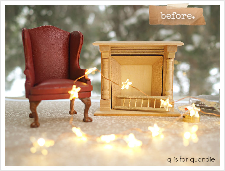
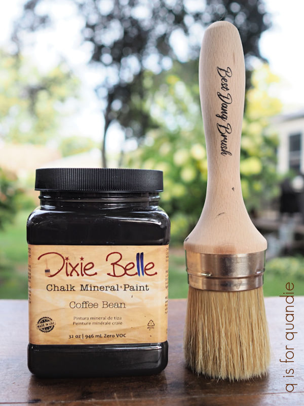
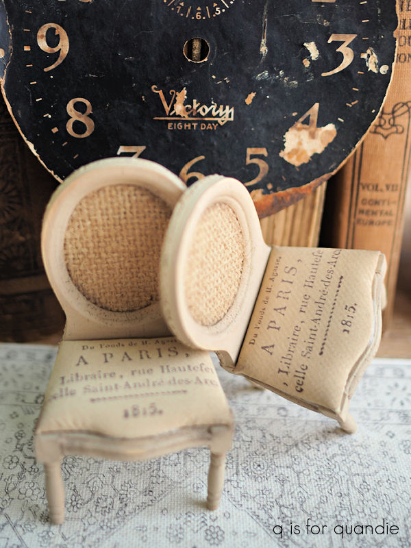
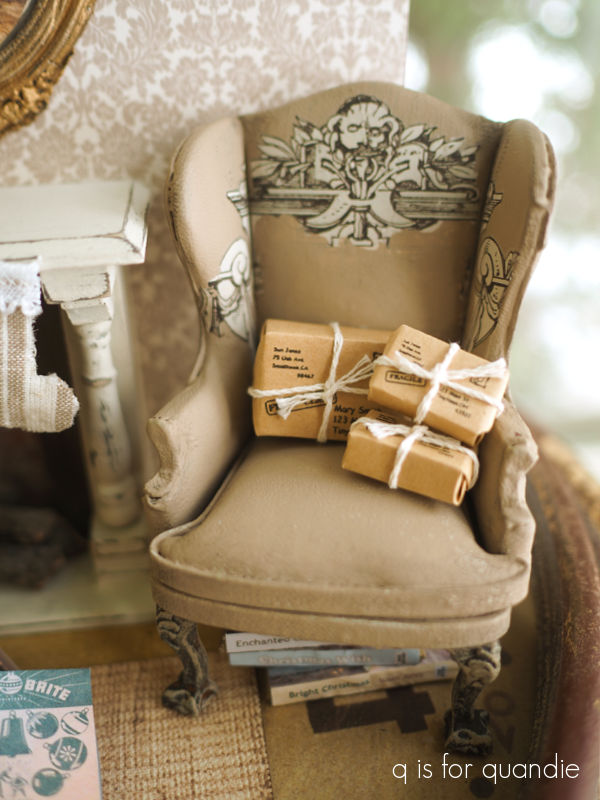 I gave the chair a base coat of Dixie Belle’s Coffee Bean, which is a dark brown/black color. I wanted to cover up the original red completely and have a dark color to distress back to.