I really, really wanted to like the new gilded transfers from I.O.D.
![]()
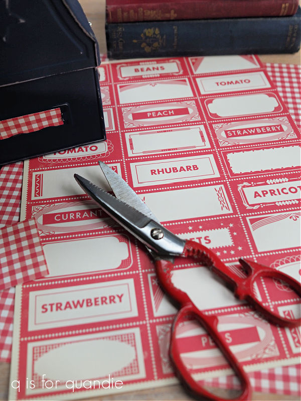
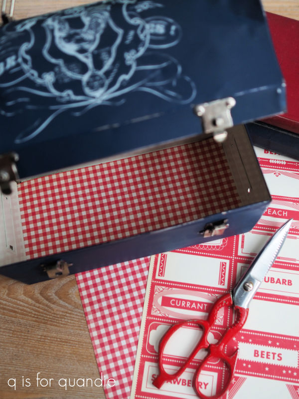
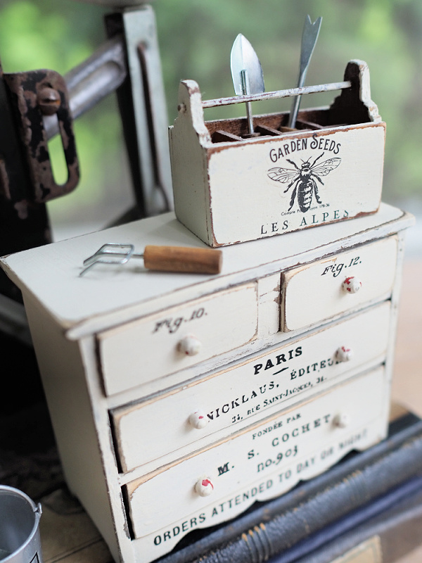
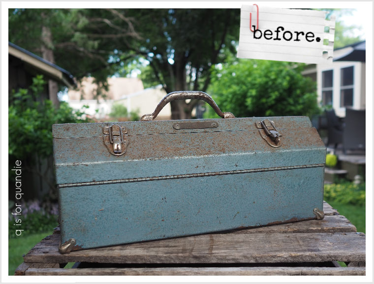
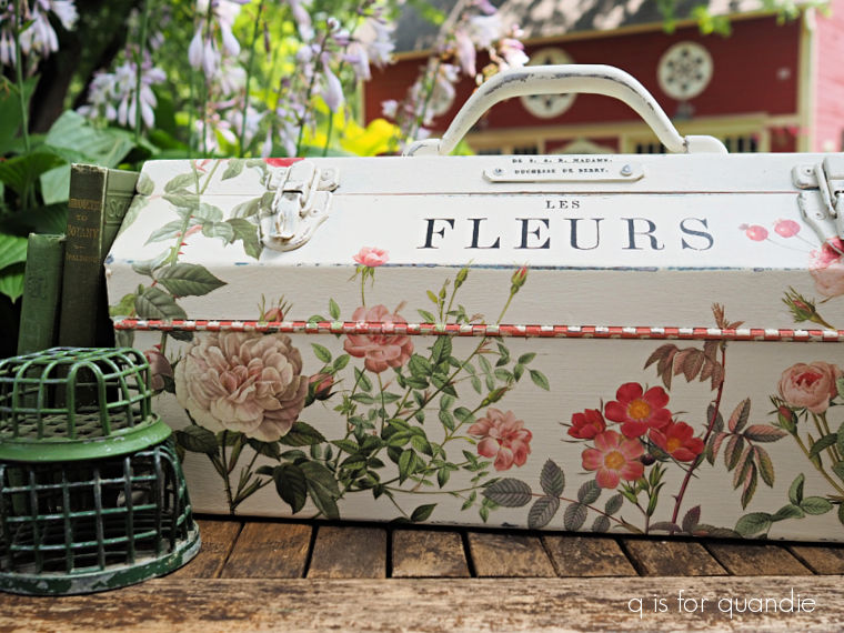
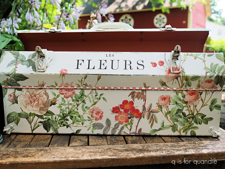
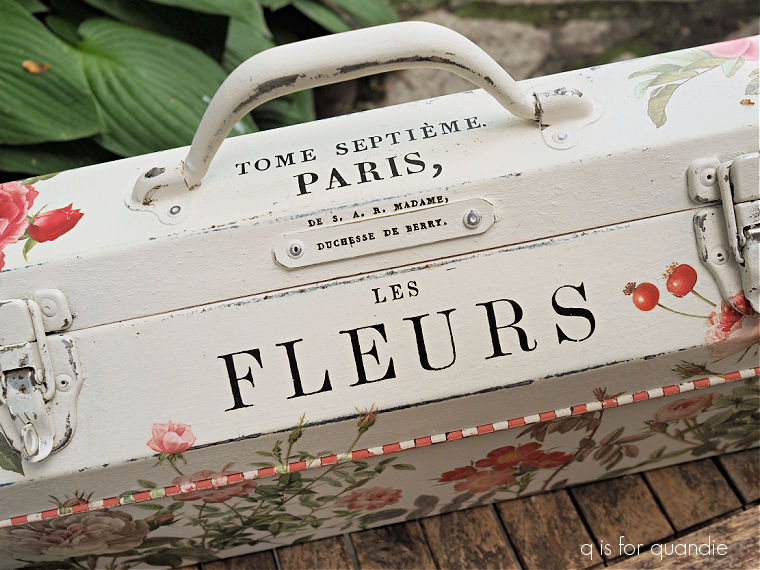
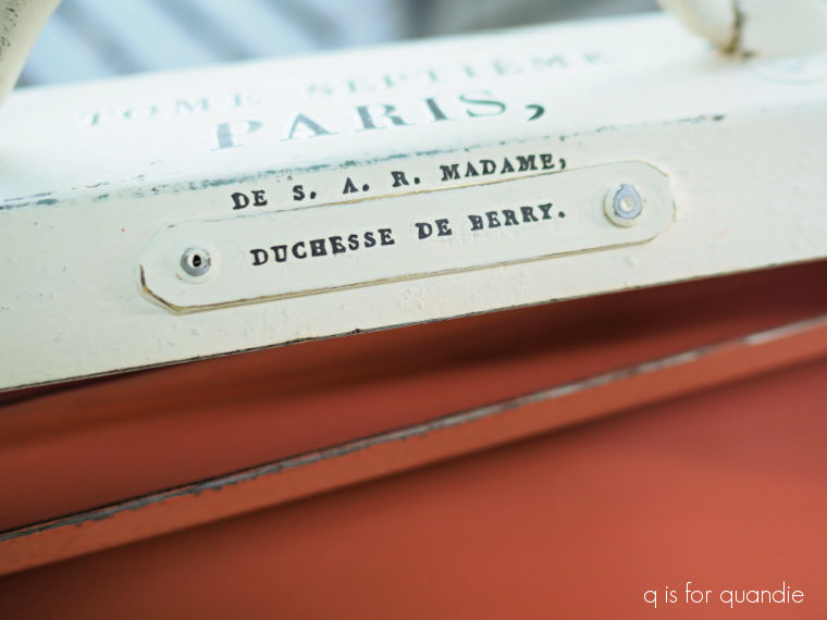
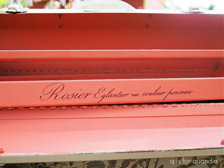
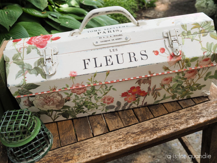
I ordered the one called Étiquettes, because it has all of that fabulous typography. I mean, just look at it. It should be right up my alley. The designs themselves are fantastic. And wouldn’t these be a great addition to some of my toolboxes?
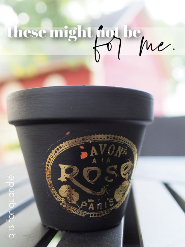
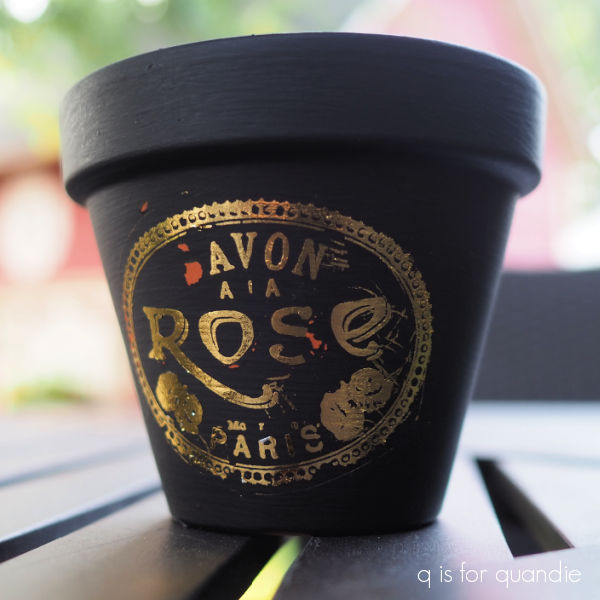
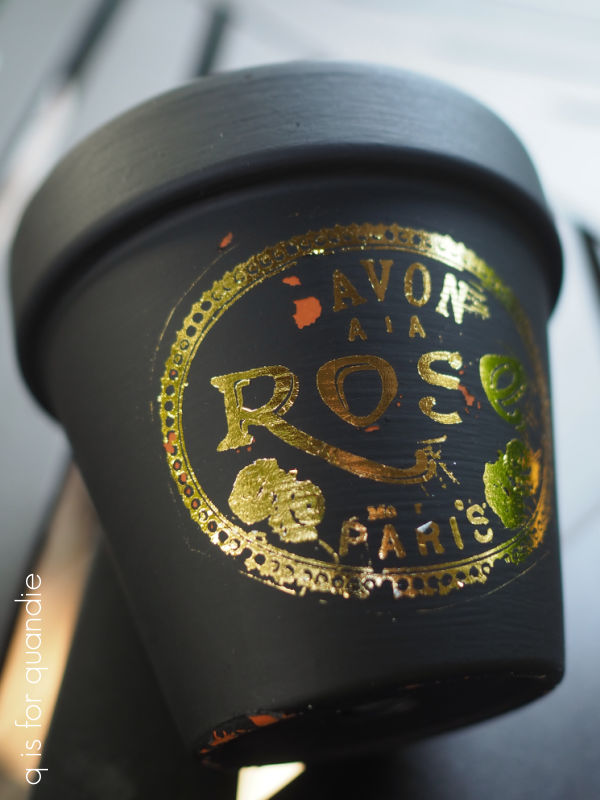
The gilded transfers are a little bit different than your typical transfer. So after watching a handful of YouTube videos on how to apply one, I pulled out a small terracotta pot and painted it black using Dixie Belle’s Anchor for a test run.
One difference with these transfers is that the entire sheet is opaque.
![]()
That makes it a little trickier to place because you can’t see what’s under it, and the usual grid lines have been eliminated. It’s also quite a bit trickier to tell whether your transfer is fully adhered without lifting it up to check behind the backing sheet. In addition, if you rub too hard on the non-transfer part of the sheet it can also rub off onto your project.
So I would say that the application process is a bit more difficult than with a non-metallic transfer.
In addition, the result with a gilded transfer is just not as crisp looking as your typical black (or blue, or white) transfer. For example, the roses on the transfer I used just look like blobs to me.
I also really struggled to get the smallest details to transfer. In this case there was some small writing above the word ‘PARIS’ that I simply couldn’t get to transfer no matter how much I rubbed. I barely even got the ‘PARIS’ to transfer.
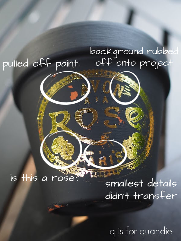
One tip from the videos I watched is to make sure that your paint is absolutely fully dry before applying these transfers. I thought mine was fully dry, but it was a humid day and I only waited a couple of hours after painting before attempting the transfer. As a result there were a couple of spots where the transfer pulled off the paint, rather than sticking to the paint.
I should have let my paint dry overnight, so that’s my fault. If you’re going to attempt these gilded transfers, be sure to give your project plenty of dry time first.
OK, so I will be the first to admit that I’m a bit of a perfectionist. I like a crisp result, and you get that with black transfers, even if they are really, really small.
So the results I got with the gilded transfer just aren’t cutting it for me.
Even without my mistake of not letting the paint dry fully, I wouldn’t be happy with this result.
Back in early 2019 re.design with prima tried to create a gold leaf look with their adhesive transfers paired with their decor foils and I have to admit I didn’t like that look either. I think I used them once and then never went back to them again.
In the end, maybe it’s just that the gold leaf look isn’t for me. It’s simply too shiny for my taste. If you’ve followed me for long, you know I’m just not a fan of super shiny things. And these are very shiny, almost mirror-like.
If a super shiny look is what you’re going for, you might really love the gilded transfers.
I was hoping for a more muted look though, similar to other more matte gold transfers that I’ve used, such as the Flower Collector transfer from re.design with prima.
![]()
Or re.design’s Somewhere in France transfer.
In the end, what I’m really hoping for in a transfer is a fabulous new collection of typography in black that I can use on small projects. Is that too much to ask for?
In the meantime, I haven’t entirely given up on the gilded transfers. I’ll go back to the drawing board and practice with them a bit more and see if they grow on me. As I often say, never say never. A year from now I may decide that I love them, you never know.
Have any of you tried these new transfers? And if so, what did you think of them. I’d love to hear from you so be sure to leave a comment.


 That was back in September 2017 (you can read all about it