aging british rockers.

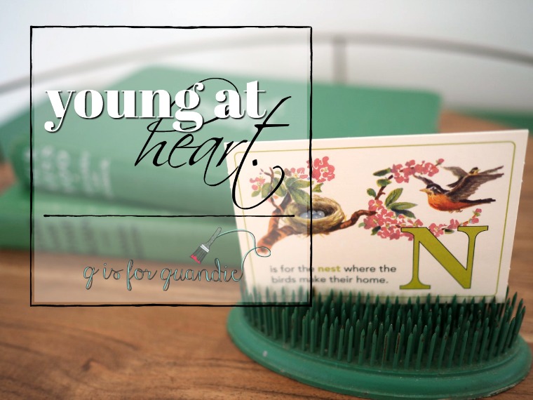
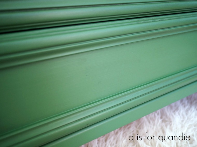
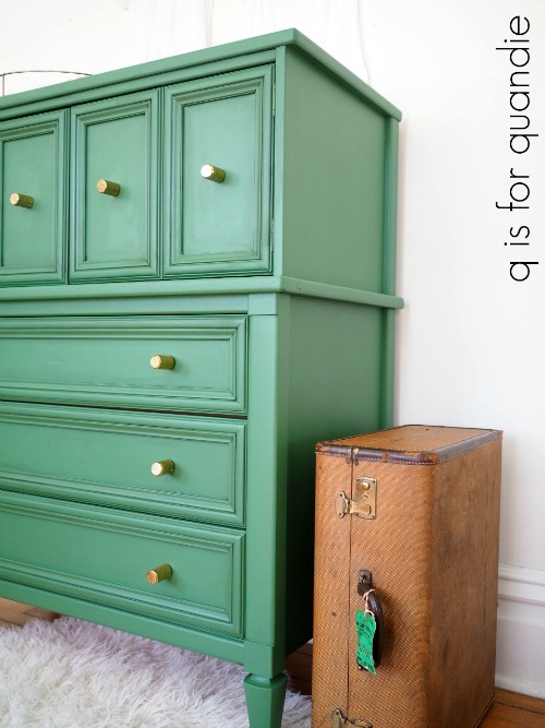
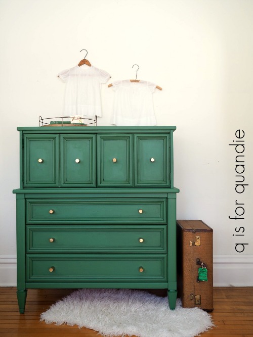
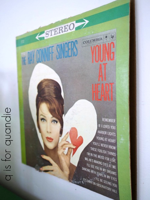
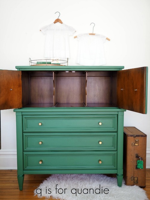
Before we get on with today’s regularly scheduled blog post, I promised to report back on how long it took the sell the ‘young at heart’ green dresser that I posted on Monday.  I was a little nervous about painting it in the vibrant green of Fusion’s Park Bench and wasn’t at all sure how easily the piece would sell in that color.  Well, I posted it on Craigslist on Tuesday morning.  By Tuesday evening I had two potential buyers expressing an interest in the dresser.  The first buyer in line showed up on Wednesday and bought it!  So if you’ve been hesitating about painting something in Park Bench (or perhaps some other more vibrant color) I say go for it.  I’m starting to think that I might just start painting everything green!

I also want to share the story of selling it.  The buyer was a young woman furnishing her new apartment.  She loved the dresser and promptly handed over the cash.  But when we went to load it into her vehicle it was just a hair too wide to fit.  Flipping it up on its side wouldn’t work either.  Mr. Q and I don’t usually deliver my pieces, but on a whim we offered to load it into our van and follow her home with it.  After all, we didn’t have plans for the rest of the evening and she had mentioned she lived in Minneapolis so I knew we wouldn’t be going all that far.  So we loaded it up and headed out.  Turned out that she lives in a huge old mansion just off Hennepin Ave that has been sectioned off into apartments.  The foyer had the most gorgeous original hex tile floor, beautiful oak wainscoting with a stunning arts and crafts style wallpaper above.  The apartment was full of old leaded glass windows, a built in china hutch in the dining room, gorgeous original wood floors.  Even the radiators were amazing.

It’s so fun to get to see where the dresser ended up and to know that it’s going to look amazing in that space.

But enough with the green dresser, let’s move on.  Today I thought we could talk about aging British rockers.

No, no, not that kind of rocker, this kind …

Although I will admit that I am a Rod Stewart fan, after all blondes do have more fun.  I especially like his more recent Great American Songbook recordings and I often listen to those while painting.

But seriously, this post is about that 2nd rocker.  You might be wondering what makes it British, but we’ll get to that in a minute.

I picked up this aging rocker at a garage sale last summer.  I have found that I really enjoy painting these little chairs.  They are perfect for an afternoon project, and also as a way to try out new paint colors, or conversely use up the little bit that’s left of some already well-loved colors.

In this case I pulled out my bin of milk paint.

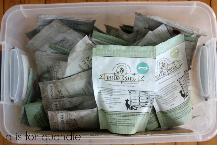
Am I the only one with a bin of milk paint?  These are all of the opened and partially used bags of milk paint that I have.  Let’s face it, those zip lock tops are really hard to get sealed back up again properly and I store my milk paint in my somewhat damp basement so I need to make sure that it is kept dry.  I used to store each individual opened bag of milk paint inside another gallon sized Ziploc storage bag but that got to be cumbersome, so now I store them all in this plastic bin with a tightly fitted lid.

I pulled out a few colors, Eulalie’s Sky, Luckett’s Green and Flow Blue (all Miss Mustard Seed) to mix together and see what I could come up with for the rocker.  The first batch I mixed ended up far more blue than I wanted.  I think it was the Flow Blue that threw it off.  So I went back to the drawing board and mixed 3 T Eulalie’s Sky with 1 T of the Luckett’s, leaving out the Flow Blue altogether.  That combo was far too green.  So I simply added in some of the previously mixed ‘too blue’ paint one teaspoon at a time until I had the color I wanted.

I’m calling this one British Rocker Mint.  Isn’t it pretty?

I once posted a piece painted in a mix of milk paint colors like this and someone commented that it was a bit much to expect people to go out and buy three bags of milk paint to paint one piece of furniture.  Yes, I totally agree.  I don’t mean to imply that you need to do that.  What I am suggesting is that you can use up your left over milk paint in a similar way.

If you don’t have enough of any one color to paint an entire piece of furniture, mix a few of your leftovers together and see what you can come up with.

Now, back to that aging British rocker.

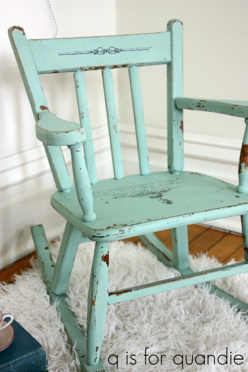
The only prep I did on this piece was to wipe it down with a damp rag.  I was feeling pretty flexible about any amount of chipping I might get.  There were spots of pre-existing shiny finish, but there were also lots of areas where the existing finish was completely dried out and I knew the milk paint would adhere well in those spots.

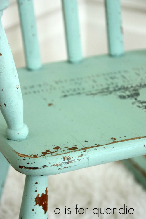
I got great coverage with British Rocker Mint.  I did use two coats, but I prefer a more opaque finish.  Once dry, I sanded lightly to remove any loose flakes of paint.  I followed that up with vacuuming away and dust and further flakes of paint.  Then I finished with a coat of Fusion clear wax (same as Miss Mustard Seed clear wax).

Oh, and I almost forgot … what is it that makes this an aging British rocker?

Well, it’s the portion of an IOD transfer that I added to the seat before I added the wax.

This section of transfer was left over from the IOD Gilded Gander transfer that I used on the handmade hutch last year.  This leftover bit fit perfectly on the seat of the rocker, and  gave it a little British style.

This was definitely a project that was good for using up some left overs!

And the end result is an aging British rocker even more adorable than Rod Stewart!


the thrift store library chairs.

Remember the thrift store library chairs?

My friend Meggan who was shopping with me when I purchased them suggested I paint them black, and several of you agreed.  Mark this day down on your calendars, because it’s not often that I follow good advice.  I ask for opinions all the time, but then usually go and do my own thing, often to my detriment (and I bet this annoys my friends to no end).  But not this time.

This time I gave it some thought and decided black would be perfect on these chairs.  I started by sanding the chairs a bit and then wiping them down with TSP Substitute.

Next I debated which paint to use.  Milk paint, chalk paint or Fusion’s acrylic paint?

I love the look of hemp oiled black milk paint.  I definitely wanted a distressed look for the chairs, so milk paint would have been perfect for that.  I even had plenty of black milk paint on hand (both Miss Mustard Seed’s Typewriter and Homestead House’s Coal Black).  But the existing finish still had a bit of shine left to it so I knew it might possibly resist the paint a little too much.  I could have solved that problem with a little extra pre-sanding  but the chairs have all of those legs, slats and stretchers.  So.  Many.  Surfaces.  I just didn’t want to sand them all.   Plus then there is the added work of applying a topcoat to the milk paint as well.  Chalk paint was out for the same reason, and also because I didn’t happen to have any black chalk paint.  So in the end I decided to go with Fusion’s Coal Black.  Two coats of paint and done (well, not exactly as it turns out, but almost).

Before I started painting I remembered some advice given by Sue at My Painted Door for making it easier to distress Fusion paint and decided to give it a try (read her post about distressing Fusion paint here for more details).  This must have been an advice-following day for me!

So, as Sue recommended, I added a little Homestead House Salad Bowl Finish (a.k.a. Miss Mustard Seed beeswax) to all of the areas of the chairs where the paint would naturally be worn away.  Then I painted them with two coats of the Coal Black.

Here is how they look before being distressed.

I imagine some of you prefer this look (especially you Betty!).  But I think distressing is what brings out the life in a piece.  So I sanded the areas that had beeswax applied to them by hand with some 220 grit sandpaper and voila!

And yes, it was much easier to distress the Fusion paint this way.

Applying beeswax first in areas that you want to distress before painting with Fusion acrylic paint will make them much easier to distress.  Even after the paint as cured for a few days.  Although I haven’t tried it, I would assume this is true of other acrylic paints as well such as General Finishes Milk Paint (which is really an acrylic paint, not a true milk paint).  Also, this is basically the same technique that I use to get perfect chipping when using milk paint.  However, the acrylic paint doesn’t chip.  It just becomes easier to sand away.

Normally I don’t add a topcoat to my Fusion paint because it has a built in top coat and is very durable and washable on its own. However, in this case the bare wood in the distressed areas looked a bit fresh.  Plus once you have sanded through to the bare wood, those areas are not protected.  So I got out my Fusion black wax and added just a bit of it to the distressed areas to darken up and protect the freshly exposed wood.

Although you are only seeing one chair in my photos, I do have a matched pair.

However I think I’ll price them separately since some people might need just one chair, for a desk for example.

If you are in need of a distressed black library chair (or two), be sure to check my ‘available for local sale’ page for more info.

young at heart.

Recently my friend Terri has been sending me messages about furniture for sale on Facebook Marketplace.  I’d never purchased something via Facebook before, but one of the pieces she forwarded really appealed to me and it was a good price so I followed up on it.

I found it a little clunky going through Facebook to make arrangements for the purchase.  I ended up wasting about 2 hours because initially the seller said he was available at 4:00, but then when 4:00 rolled around I was still waiting to get his address and not getting a response to my IM on Facebook.  So there sat Mr. Q and I with our boots on, ready to head out.  Finally around 6 p.m. the seller messaged me with his address and we headed out.  From there on out it was smooth sailing.  The seller’s home was easy to find and only about 20 minutes away.  He had the dresser out in the garage ready to go.  I looked it over, handed him the cash and then he and Mr. Q loaded it into our van.  Easy peasy.  And of course, this kind of thing can also happen with Craigslist.  I just seem to have better luck communicating via text rather than via Facebook messaging.

Anyway, here it is.

Perhaps you are wondering at this point what gotten into me.  This is not at all my typical style.  But I was in a mood and I knew that with some paint and some new hardware I could bring out some amazing mid-century mod style with this piece.

As soon as I saw it I was picturing it in a crisp fresh green.  Specifically Fusion’s Park Bench.  Perhaps it had something to do with the shortage of green things to look at this time of year in Minnesota!

But then I hesitated.

That’s a lot of COLOR.  It’s a larger piece of furniture, could it really handle it?  I definitely won’t be keeping it, so I had to wonder if I would be able to find a buyer for a large-ish, very green, mid-century dresser.

But the universe kept shouting ‘green’ at me.  Starting with that Northwest Orient luggage tag.  How many of you remember the days of Northwest Orient?

Then I was watching a colorized version of an old episode of the Dick Van Dyke show.  I have to say, I only made it about halfway through the show before I had to give up on it but that’s a whole different story.  I just had to change the channel when Dick told Laura he wouldn’t allow her to dye her hair.  Um, excuse me?  Allow?  As if.  Some mid-century things should definitely not come back in style.  But what I couldn’t help but notice was the fab green chair in the background of Dick & Laura’s living room.

Clearly this shade of green was a popular mid-century color.

Next I was thinking that this piece would work beautifully in a nursery so I checked on pinterest to see if people were doing this color in nurseries these days.  And why yes, they certainly are.

And doesn’t it work beautifully?

source for both nursery color schemes: https://www.laybabylay.com/

I’ll definitely be marketing this piece for a nursery, but it could also work well as a liquor cabinet/bar.

But I’m getting ahead of myself.  Let’s go back to the beginning.  Since I went so far off track, here’s the ‘before’ photo as a refresher.

This piece was in almost perfect condition.  The drawers glide beautifully, the piece is solid and well made.  The only problem was a missing drawer pull (see the middle drawer).  As I’m fond of saying, if you’re missing one you might as well be missing them all.  It would be very tricky to find a replacement part for that one pull.  I could have tried to find three new pulls for the drawers that worked well with the hardware on the top doors.  But I didn’t much care for the look of those anyway, so I opted to go with new hardware overall.  That meant filling the holes left by the old pulls on the drawers.

It’s not difficult at all to fill and disguise previous hardware holes if you’re planning to paint your piece.  I don’t think you’d know that there used to be holes here, would you?

Here is how I do it.  Start by placing a piece of tape over the back of the hole on the inside of the drawer.  Next, fill the hole with Elmer’s ProBond Wood Filler (or whatever brand of wood filler you like, as long as it is paintable).  Make sure the entire hole is full of filler, then smooth off the excess and let it dry.  Most fillers claim that they don’t shrink, but I have yet to work with a brand that doesn’t dry a little bit concave (maybe technically they don’t shrink, but they do settle into the hole).

So here’s today’s q-tip:  Once dry, sand your wood filler and then go back with some lightweight spackle and fill again.  I find that the spackle is smoother and does a better job of filling in that last little bit of concave space that was left after the wood filler dried.

Once dry, I sand smooth again and then I’m ready to paint.

After my usual prep (light sanding following by cleaning with TSP Substitute) I painted the piece with two coats of Fusion’s Park Bench.  I purchased two pints of the Park Bench just in case one wasn’t quite enough.  There is nothing more frustrating than running out of paint near the end of your project.  But I didn’t even use one full pint.  I probably used about 3/4 of it.  So on the plus side, I have lots of Park Bench left for another project down the road!

Since this is a mid-century piece I opted not to distress it by sanding the edges.  However, I felt like the result looked somewhat one-dimensional so I decided to add some dimension in another way.  By adding black wax.

You do not have to top coat Fusion acrylic paint for durability or water protection.  However, you definitely can wax over it for aesthetic reasons like this one.

I find that wax behaves a little bit differently over acrylic paint than it does over a more porous paint like chalk paint or milk paint.  It doesn’t soak in quite as much, which can be an especially good thing when you are working with black wax over a lighter color.  You are better able to wipe away the excess without leaving a ‘stain’ of sorts behind.  With this piece I really just wanted to add more definition to the trim around the edges of the drawers and door fronts.  I used a wax brush to apply the wax just to those areas working it into the creases.  Then I used a clean rag to wipe away the excess from the raised areas, leaving some wax behind just in the creases.

It was just enough to give the dresser a bit more dimension by accentuating that trim.

I replaced all of the original hardware with these gold knobs from Hobby Lobby.

I wish Hobby Lobby had more mid-mod style knobs.  They do have some, but not a huge selection.  This particular style also comes in silver, but I thought the gold paired with the green had more of a mid-century feel.

Are you wondering what the whole piece looks like?  I’ve been teasing you a bit with all of these glimpses.  Enough already, here it is …

This is my attempt at staging it for a nursery without having any real nursery type props other than some pretty vintage baby dresses and a fabulous vintage green kid’s book.

I also felt like most of my vintage, cottage-y, farmhouse-y style props weren’t quite right for the more mid-mod look of this piece.

I did much better staging it as a bar.

I found this old record album at the thrift store for $1.49.  Perfect for providing some mid-century art to the wall.  I’ll probably just re-donate it after using it in my photos.  Not only did it have the perfect shade of green, but the title is perfect for staging a piece of furniture meant for the very young at heart!

I found the round tray that I’m using in the photos at Target.

It’s part of the Hearth & Hand with Magnolia line.  While I was standing in that aisle of my local Target I ran into my friend Donna (also a loyal reader of my blog, thanks for that Donna!) and we had a whole conversation about how the final season of Fixer Upper has really transitioned toward more of a mid-century modern style rather than their previous farmhouse style.  Have you noticed that?  It’s definitely noticeable in their Hearth & Hand line.

As you can see, I did not paint the inside of the upper cabinet portion of the piece.  It’s in perfect shape, so I felt that leaving it alone was the right choice.  At first I wasn’t sure why this top section is divided vertically like it is.  But looking at it again I realize that each section is the perfect width for folded shirts.  Also, those dividers are removable, so if you did want the use the entire space without dividers you could.  And coincidentally this section is also the perfect height for most liquor bottles or baby clothes, or maybe diapers?

How convenient.

Now the real trick is going to be seeing if this dresser will sell.  Wish me luck on that!


a chippy washstand.

I purchased this washstand last fall at one of the last neighborhood garage sales of the season.

Aw look, things were still green!  The trees still had leaves!  Why does that feel like it was so long ago now?

It was a pretty little piece, but someone had done a number on the drawer fronts.  I think that whoever refinished it sanded a bit too heavily.  Especially on that middle drawer.

What really appealed to me about this piece were the handles.

Aren’t they pretty?

I knew that painting the wood could help those stand out more.  If you look back to the ‘before’ photo they are barely even noticeable!  This piece was calling out for a chippy milk paint finish, so after sanding it a bit and wiping it down with TSP Substitute, I painted it with three coats of Miss Mustard Seed milk paint in Linen which is a warm, creamy white (all of the white shades usually require three coats for good coverage).

It chipped perfectly which is exactly what I expected since I used my secret method for perfect chipping.

I was initially planning to use my new IOD Decor Stamps on this piece, but as I was digging through my supplies I came across this smaller version (11″ x 14″) of the IOD Richardson Seed transfer and realized it would fit perfectly on the door.

Before I applied the transfer I sanded the door front well and vacuumed off any loose chips of paint.  Be sure to do this if you are going to work with a transfer over chippy paint.  Otherwise the paint will stick to the transfer sheet, rather than the transfer sticking to the door front.

By the way, if you are shopping for the Iron Orchid Designs transfers online I have found that prices can really vary.  I have seen this one as low as $12 and as high as $26.95, so be sure to shop around.

I think I achieved my goal of making the handles more of a focal point.  They really pop next to the creamy white paint.

I added a topcoat of the Real Milk Paint Co’s Dead Flat Finishing Cream to this piece.  One coat over the entire thing, and then a second coat over just the top.

What I have been noticing lately with pieces that I have kept that are painted in milk paint is that the ones that initially chip like this will likely continue to chip over time even if they are finished with wax or hemp oil.  Especially in areas where they get a lot of wear, like the tops.  So I am planning to start using a better sealing topcoat on those pieces, either the Dead Flat or Miss Mustard Seed’s Tough Coat Sealer.  And using two coats on the top will help make sure it is more durable over time.

Although if you love chippy (as I do) and are perfectly fine with additional wear on your pieces you can certainly forgo a more durable sealer and stick with wax or hemp oil.

When I purchased this piece I mentioned that I was going to leave the harp and mirror off and try to sell them separately.  They haven’t sold, so I still have the harp and mirror but I won’t be putting them back on.  I find that it’s much harder to sell a piece that has a mirror.  It just limits the versatility too much.  People just don’t seem to go for mirrors these days.

Without the mirror, pieces this size make perfect bedside tables.

If you happen to live nearby and need a chippy washstand, this one is available.  Be sure to check my ‘available for local sale’ page for more info.

the faux tiger.

I worked on a quite a few pieces of furniture during my recent blog hiatus.  I’m afraid this is a bit of a bad news/good news situation for you guys because it reminded me of how much more I can get done when I’m not spending quite so many hours editing photos and writing blog posts!  But not to worry.  I think I can find a balance between blogging and doing the actual furniture painting and that’s going to be my goal going forward so I hope you’ll stay tuned.  And of course the good news is that I’ll have lots of furniture makeovers to share with you for the next couple of weeks.

Today we’re starting with piece no. 1.

When I saw the ad for this dresser on Craigslist, I have to admit I immediately hated it.

OK, hate is a strong word.  But let’s just say I am not a fan of tiger oak.

I actually passed over the ad for this piece several times before I decided to look past the tiger oak-iness of the dresser.  I then realized that I liked the clean lines, the height, the original wood casters and the key holes.  It was a blank canvas really.

So Mr. Q and I went and picked it up.

I was just starting to prep it for its paint job when nnK (that’s new neighbor Karen, my neighbor across the street whose house is peeking out from behind the dresser in that before photo) stopped over.  She took a look at the finish and said “you realize that’s fake, right?”

Um, no.  I hadn’t really paid much attention since I wasn’t hoping for real tiger oak and in fact was trying really hard to ignore that finish and planned on painting right over it.

Sure enough, if you look closely where the finish has chipped off you can see that this is just a faux finish and underneath is a plain wood.

I’m not even sure what kind of wood it is.  But I should also have been clued in by the fact that the piece is not heavy enough to be oak.  Oak is definitely a heavier wood.

So yes, it’s a faux tiger finish.  For those of you who cringe when people paint over ‘real wood’, you can chill.  This one’s fake.

Aside from the really dried out finish, this dresser was in pretty decent shape.  All I had to do was sand it, wipe it down with TSP Substitute and start painting.  I think it took longer for me to pick a color than it did to paint it.  I debated using a grey, or even pink.  But in the end I chose Fusion’s Inglenook.

I really love this color, but I find it hard to get photos that really show the true color.  It’s a blue green that can look more blue in some light, and more green in others.  I’ve heard people describe it as a green, but I would be more inclined to call it blue.  The look of the color also depends upon the color of other items around it.  Put it next to a blue and it will look more green, and vice versa.

It’s definitely a color you should see in person and make your own judgement.

Once painted, this dresser was completely transformed but it was still a bit plain.  I wanted to add a little bit more.  So I pulled out an Iron Orchid Designs Le Fleur transfer that Mr. Q ordered for me somewhere online (I’m sorry I didn’t keep track of where this one came from, but if you google it you’ll find it at several places for less than $20).

The details on this transfer are absolutely amazing.

I’ve heard people say that they can’t justify spending the money on an IOD transfer for just one use, and I think we’ve already established that I am usually pretty frugal about such things myself.  But for less than $20 and about 30 minutes of extra labor, this adds a ton of personality to an otherwise somewhat plain piece of furniture.  When I add one of these transfers to a piece I can usually get anywhere from $50 to $75 more for the finished piece than I would have without it.  In other words, it more than pays for itself.

As you can see, I switched out the original wooden knobs that came with the dresser for some large, sparkly, clear glass knobs from D. Lawless Hardware (these are the 1 1/2″ antique clear glass knobs).

I could have just painted the wooden knobs and I think that would have looked OK.  It certainly would have been a cheaper option, but I wanted to add a little sparkle without distracting too much from the transfer so I went with clear glass.

I was having a bit of fun hanging this pair of vintage paint rollers on the wall above the dresser.

There is a story behind these.  A couple of weeks ago when my friend Meggan, the thrift doctor, and I got together for some thrifting she brought me a gift.  One of these rollers.  I burst out laughing and said ‘you aren’t going to believe this, but I already have a paint roller just like this!’

They are an exact match.  What are the chances?

So, what do you think?  Did you prefer the faux tiger?  Or is Le Fleur more your style?

If you are local and in need of a pretty piece to store things in, this dresser is for sale.  Be sure to check my ‘available for local sale’ page for more details.

a pretty darn good year.

Happy New Year!

I’m back from my blog hiatus and I have to say, it was a little weird.  I’ve taken some breaks from blogging before, but usually I take them while I’m traveling so my time is pretty much occupied.  This time I was just at home, and although I was busy with holiday gatherings, taking down the decorations and even painting a couple of pieces of furniture, I really missed interacting with you guys!  Plus, it was frigidly cold here in Minnesota.  Yesterday we woke up to a windchill of -37.   Funny side story, Mr. Q told me that when he was a kid he thought it was the “windshield factor” and they were talking about how cold the windshield of the car would feel.  Well, either way, -37 feels cold and I was not motivated to go out much.

But that gave me a good opportunity for reflection, and thinking back I realized that 2017 was a pretty darn good year.

In March Mr. Q and I went looking for bald eagles along the Mississippi River with my sister and niece, and we found plenty of them.

I still thank my lucky stars almost daily that my sister and niece moved to Minnesota over two years ago.

Mr. Q and I took an amazing trip in May that started in Copenhagen.

Then there was Norway.

And Scotland.

And finally, England.

I inherited my travel bug from my mom who still works as a travel agent at the age of 77.  Mr. Q and I have been fortunate in being able to travel to some amazing places over the years.  Check out the ‘travel’ category under ‘stuff.’ over on the right side of the page to read some of my travel posts.

My sister bought her house and we helped her move in June.

I feel like this really made it official.  My sister will definitely not be deciding that she hates Minnesota (even though the windshield is -37) and wants to return to New Jersey.  Not that she ever was considering that, but it still feels good that she has put down permanent roots here.

In late summer we redecorated our master bedroom.

We had the floors refinished, added a faux ship lap wall, new light fixtures, a new to us headboard, and I painted all of the furniture in the room (except that bench).

We had help from Ken on the ship lap and the bed, help painting from my sister and help from nnK finding some college kids to do the floors.  I really couldn’t do these things without help from friends and family!

Although we missed a few of our favorite neighborhood sales while I was gone on my trip in May, my sister and I did score some hauls in the fall.

My sister has become the perfect garage saling companion.  She drives, she brings snacks, she’s an expert at packing stuff into the vehicle (all of that stuff fit into her SUV), and most importantly she doesn’t really compete with me for the good stuff.  We have very different styles, so that works out quite well.

I met my idol, Miss Mustard Seed, in October.

Much like many of you, I have been following the Miss Mustard Seed blog for several years.  Earlier this year when Marian announced that she was moving to Minnesota I thought that maybe, just maybe, I’d get a chance to meet her in person.  So it was super exciting to not only get the opportunity to meet her, but also to spend a day at a painting workshop she co-hosted with Carver Junk Co.

That was followed by a fun trip to Disney World with my sister and my niece over Halloween.

I was included in my first magazine just before Christmas which was pretty exciting.

I celebrated my 4th blogiversary in November.

And sprinkled in between all of that I did some painting.

A few of my faves from 2017 include the antique headboard that we used in our master bedroom makeover.

I discovered the Iron Orchid Designs transfers last year and immediately fell in love with them.  One of my favorite pieces with a transfer was this gorgeous Eastlake style dresser.

 A friend of mine suggested using Fusion’s Mustard on this union jack desk, and I loved how it turned out.

My next favorite also included an IOD transfer.  The sizing of the transfers is just about perfect for a typical piece of furniture like this linen press.

My final fave for 2017 isn’t exactly just one thing, and it isn’t exactly a piece of furniture.  It’s more of a … well … what should I call it?  It’s the idea of turning a mirror frame into a chalkboard frame with a shelf instead.  This was one of my greatest discoveries in 2017.  Well, technically I did the first one in November 2016.  I love re-purposing these beautiful frames into something that people want to have in their home.

So there you have it, 2017 was a pretty darn good year.  In fact, I’m beginning to suspect that there is no way I can top it for 2018.  Well, we’ll just have to wait and see.  I did paint some fab pieces during my blog hiatus so be sure to check back later this week to see them.

But in the meantime, did you have a favorite from among the pieces I painted in 2017.  Check out my ‘fab furniture’ page and let me know which one was your favorite!

happy solstice.

Today is the winter solstice here in the Northern Hemisphere.  This is the day of the year with the shortest period of daylight.  Did you know that the Twin Cities are located on the 45th parallel.  That’s exactly halfway between the equator and the North Pole.  This makes us further north than some parts of Canada, like Toronto for example.

I am betting that I am not alone when I say that I struggle with the dark and gloomy days of November and December here at the 45th parallel.  Typically November and December are the least sunny months of the year for us.  Even January has more sunshine.  This time of year I leave for work in the dark, and return back home in the dark, which makes blog photo taking very challenging.

I often tell people that I don’t mind the cold or the snow, but if only winter weren’t so dark.

So I greet the arrival of the winter solstice with some relief knowing that from here on in we are going to slowly start getting more daylight hours each day.  We’ll also start getting more sunshine during those daylight hours.

I am more than ready for that.

In the meantime, I’m going to take a bit of a blogging break over the holidays to regroup, spend time with friends and family, maybe even take a few naps.  But I also want to focus on painting some furniture.

As you’ve probably noticed, I’ve been posting five days a week since September.  I didn’t really mean to start posting every week day, it just sort of happened because I had a lot of smaller projects going on that I wanted to share.

Plus, a I received a few comments on how much readers were enjoying getting a post every day.  I didn’t want to disappoint people by cutting back on the frequency of my posts.

But after taking a bit of time to reflect on that, I’ve realized that daily blogging has taken too much time away from my true love which is painting furniture.  Suddenly the furniture painting is taking a back seat to the blogging instead of the other way around.  In addition, I often find myself rushing thru my projects so that I can get them done in time for another blog post.  Quality is suffering in favor of quantity, and nobody wants that, right?

But don’t worry, I promise I won’t abandon you.  I’ll be back to help you celebrate the new year (and the longer days).

I’ll share a recap of my favorite pieces from 2017 and I’ll definitely have some new furniture makeovers for you.

So be sure to stay tuned and in the meantime happy holidays to you and yours!


jodie’s house, part 4.

Welcome back to the final segment on our tour of my friend Jodie’s house.  All that we have left to see is her master suite, so let’s get started!

I have to say, there are lots of great features in Jodie & Doug’s master, but it’s very hard for any of them to compete with the view from that amazing wall of windows.

 Can you just imagine how gorgeous that view is when there is a freshly fallen snow?  Or, like the first time I visited, in the fall with brilliantly colored leaves on all of the trees?

I had to tear myself away from that view to get photos of the rest of the room.  I also had to shut the drapes because the room was drenched in sunlight and I was having trouble getting good photos!

I’m really quite envious of all of the beautiful light in this room.

You’ve already seen that Jodie has a Christmas tree in the living room, each of her boys has a tree in his room, and yes, there is one in the master bedroom too.

You see, Jodie has been collecting (or should I say non-collecting?) Precious Moments since 1984.  She received her first one from her pen pal in New Jersey!  Living in a household full of men, she thinks maybe the Precious Moment ornaments are just a tad too … well … precious for the family tree in the living room so she keeps them all on a tree in here.

Not only does she have lots of ornaments, she also has the Sugar Town.

I can see why they call it the Sugar Town because some of the pieces are just adorably sweet, like the free Christmas puppies.

Obviously the driver of this car couldn’t resist one of the free puppies!

I love the way that Jodie has displayed the nativity scene on a stack of vintage suitcases.

But then, I just have a weakness for vintage suitcases period, and these are awesome.  This is a pair that I would definitely never paint.

Jodie and Doug’s master bath is fantastic.

So much space!  Have I mentioned that I have the world’s smallest bathroom?

I always wonder, do people get cold in the winter when their bathroom is this large?  I mean, the steam from the shower just isn’t going to heat up the entire space, right?  Maybe Jodie will answer that question for me.  I’m sure those heated concrete floors help.

Isn’t the tub area fab?

I saw the idea for ‘get naked’ on pinterest and shared it with Jodie.  I love that she used it, doesn’t it add a bit of whimsy to the space?

And hey, there is the rest of that ladder!  Remember we saw a section of it hanging from the ceiling in the laundry room, and then another section leaning on the wall in Blake’s room.

Doug turned it into a bathtub caddy by adding a plexi-glass bottom and shaping it to fit the sides of the tub.

I really love this jar next to the tub, isn’t it gorgeous?

There is plenty of built in storage …

And hey, what is that I spy on top of the built in?

It’s one of my very first painted hat boxes!  Jodie has amazing taste, doesn’t she?  Wink, wink.  By the way, the dried roses in the container next to the hat box are from Jodie’s dad’s funeral.  She has kept them for all of these years.

A big thank you to Doug & Jodie for letting us take this tour of their house.  Jodie has incorporated so many clever decorating ideas, I hope some of you have been inspired by some of those ideas yourselves!

But wait, before Debbie and I head back across the border to Minnesota, no trip to Ellsworth would be complete without stopping at the Creamery to buy cheese curds.  After all, Ellsworth is the cheese curd capital of Wisconsin!

(Debbie left, Jodie right).


adding the gleam of copper.

Recently the lovely people at Fusion offered to send me some of their Copper furniture wax to try.

  And I have a confession to make, I had it all wrong in my head.

I thought this was going to be a product similar to Rub ‘n Buff.  A heavy, thick wax that you could apply just to the edges of something to highlight them in copper.

But no.  This is a light, creamy furniture wax.  Much like the clear version that I used on the cutie patootie chair, but with the added gleam of metallic copper.

I originally pulled it out thinking I could use it just around the edges of this platter that I painted in Fusion’s Little Piggy.

I applied it to just the edges, and … well … nothing.  You could barely see it.

So next I applied it all over the tray, much like one would with any other furniture wax.  It added just a hint of a copper glimmer to the surface and it also darkened up the color overall much like a clear wax would, but I couldn’t capture the effect very well with my camera.

Obviously I was entirely mistaken about how this product should be used.  It really needs to be used on something that has a bit more detail to it so that it can build up in the crevices.  My tray is relatively flat and smooth.  This was definitely not the right piece to use to show off this wax.

But this little experiment made me realize that I’m probably not the only one who doesn’t always know the difference between the various metallic products out there and what applications they are best suited for.  So I thought I’d share some insight into that with all of you using copper as an example.

If you want a solid copper, my product of choice is Fusion’s Copper paint from their Matthew Mead Studio Metallics line.

That’s what I used on these jewelry trays.  I love the shimmer of the metallic paint.

If you want your copper to have an aged, oxidized patina, the patina metal effects kit from Modern Masters works great.

I used it on some dresser knobs and they turned out perfectly.  You start out by painting your item with the copper paint from the kit.

Then you apply the aging solution and let it do it’s magic.

I think this kit gives the most authentic look if you’re going for the verdigris color of oxidized copper (the rust kit is also fantastic, you can read about that here).  The small kit is a little pricey though.  I purchased mine at Hobby Lobby with a 40% off coupon though, so that helped.  The kit doesn’t go very far either.  You will use it up entirely on a project that is 2′ square.  However, it’s definitely worth the splurge if you want an authentic looking patina.

Finally there are the heavier waxes like the Rub ‘n Buff and other similar products.  Although I’ve used the Rub ‘n Buff in gold, I’ve never tried their Copper (although they do make one).

I have tried the Little Billy Goat Goat Sticks, including their Old Penny.  You can read more details on how to use them here.

I like this product, but it can be harder to find than some of the others.  My local shop, Reclaiming Beautiful, used to carry them but I don’t think they do anymore.  It’s also a little bit more expensive, usually also priced around $20.

Here is the Prima Marketing art alchemy metallique wax in Rich Copper.

I ordered it from Amazon for under $10 with two-day shipping (you gotta love that Amazon Prime).  You can read more details on how to use this product here.

You can see that this copper is a bit brighter than the Old Penny.  Here’s a comparison to show how each one looks on some metal drawer pulls.

That’s the Rich Copper on the left and the Old Penny on the right.  The drawer pull in the background is untreated.

Aside from the difference in color, I think both of these products work equally well, as does Rub ‘n Buff, to add a little color or shimmer back to old hardware like these drawer pulls.

These are just a few of your options for adding the gleam of copper to your projects.  Do any of you have a favorite product that I haven’t mentioned?  If so, feel free to share that info in a comment.

learning things the hard way.

If there is one area in which I absolutely excel, it’s in learning things the hard way.  I also tend to give you guys lots of advice, and then not follow that good advice myself.  This past Saturday I worked on a project that was a prime example of both of these.

You see, I was so excited to start using my new IOD Decor Stamps on a piece furniture that I forgot one of my own best tips.  I didn’t test my technique on a practice board first.  Granted, I did test the stamps themselves first, but I used them over bare wood.  I should have also tested how the ink would interact with paint.  Instead I just jumped in at the deep end and then floundered a whole bunch!

But before we get there, let’s go back to the beginning.

Over a year ago my bff’s sister Laura called me and said that there was a vanity free at the curb in her neighborhood, did I want it?  She was willing to pull it into her garage until I could get there to pick it up.  Unfortunately I neglected to take a real ‘before’ picture of the vanity.  But here’s the picture that Laura texted to me.

It was in pretty rough shape and the middle section was barely holding the thing together, so I decided to dismantle it and, with Ken’s help, turn it into two nightstands instead.  I have a plan for the mirror as well, but that will be down the road.

By the way, if you are new to my blog and don’t already know this, Ken is my next door neighbor.  He can always come up with a clever way to fix stuff.  In many ways, I think he is one of a dying breed.  These days people tend to prefer to replace broken things rather than repair them.  Ken is from the generation that repaired everything.  And apparently he’s also a photo bomber!  See him back there?  And yes, that is his back yard, with my back yard in the foreground.  He was actually on his way over to take a look at the repairs needed on this pair of nightstands when I took the photo (and yes, this was last fall when the grass was still green and not covered in snow).

I had a precise vision in my head of how I wanted these nightstands to look when finished.  Imagine chippy, old, ethereal, delicate, feminine. Can’t see it?  Well, stick with me, let’s see if we can get there.

My first step was to remove the big round wooden knobs.  They weren’t terrible, but they didn’t work with my vision for the piece.  Next I sanded lightly, cleaned with TSP Substitute and then painted a base coat of Fusion’s Little Piggy which is a very pale pink.  I didn’t get a photo, but they did look really pretty in the pale pink.  If I’d had enough Little Piggy to do a second coat, I could have just gone with the pink.  Life would have been so much easier.  But I was out of Little Piggy after one coat, and hindsight is always 20/20.

Next I added a little Homestead House Salad Bowl Finish (a.k.a. Miss Mustard Seed Beeswax) along all of the edges of each nightstand to provide a resist to the two coats of milk paint that I applied next.  This is where mistake no. 2 comes into play.  I wanted a warm white and I had several mostly used bags of various whites so I mixed them all together to give me enough paint for both nightstands.  Again, this would have been OK, except for what happens later.

But for now the nightstands were painted and they looked amazing.  I sanded them to distress and that looked amazing too.  I got out my new IOD Decor Stamps (I used stamps from the Friffery set) and my Ranger Archival ink in a color called Watering Can.

I started small with a stamp on either side of the opening for the drawer.  They went on perfectly and looked gorgeous!  But 10 minutes later they looked decidedly less crisp.  My first thought was to check my glasses, didn’t I have my ‘cheaters’ on?  I did, and the stamp was definitely no longer as crisp.  So I waited another 10 minutes and looked again.

Oh boy, even worse.  That was not at all the look I was going for.  It didn’t take me long to figure out that the ink was bleeding into the milk paint.  I should have sealed my paint before applying the stamp, mistake no. 3.

Then I realized that I didn’t have enough paint left to cover up the bleeding stamps.  And since I had custom mixed the color, I knew I wouldn’t be able to recreate it perfectly.  Sigh, mistake no. 2 coming back to bite me.

That’s when I started drinking.

No, not really.  It was tempting, but it was still only about 10 a.m.

So instead I decided to back up a step and check my theory with a practice board.  If only I’d done that in the first place!

I found an old board and painted half in Fusion paint (left side) and the other half in milk paint (right side).  Once dry, I used The Real Milk Paint Co’s Dead Flat to seal the lower half of the milk paint side.  Once dry, I applied the stamp to each section.

As you can see, sealing milk paint first will make all the difference if you want to use an IOD Decor Stamp with ink on your piece.  Good to know for next time.

However, at this point I was back to square one.  I needed to repaint my pieces in their entirety because I didn’t have enough paint to just paint over the stamps.  It was time to re-think my entire plan and switch to Fusion paint.

I was able to get away with just one coat of Fusion’s Putty, a pale grey, over the white milk paint.  Once that dried, I added the smaller stamp on either side of the drawer opening.  If you look back at the ‘before’ photo, you’ll see that I pointed out that these spots must have originally had some sort of carved detail.  All that was left were the shadows showing where they used to be.  I really liked the idea of replacing those with the stamp.

Next I wanted to use a larger stamp on the doors.

As it turns out, it takes a bit of finesse to use that big 10″ x 12″ acrylic block.  You must make sure that your surface is perfectly flat and there are no other obstructions to keeping the entire 10″ x 12″ block flat.  You know, things like hinges for example!

On my first attempt at stamping the door, the door itself pushed inward as I pressed down on the block.  Ugh, mistake no. 4.  I quickly realized that I should have taken the doors off so that they could lie flat while I stamped them.  So I removed the doors, added another coat of Putty to them, and when that was dry I tried again.

This time around, when I went to press down on the acrylic block I realized that the hinges I’d left on the doors impeded the block.  Mistake no. 5.

So after repainting the door fronts for a 3rd … or was it 4th … time, I adjusted where I placed my stamp on the acrylic block so that I could avoid those hinges.  And this time, eureka!  It worked!

Phew!

So let’s recap all of the Q-tips I learned while working on these nightstands.

  • Do not use Archival Ink over unsealed milk paint, it will bleed.
  • Do use Archival Ink over Fusion paint.
  • Be sure to allow the ink to dry before rubbing over it to avoid smearing.
  • Don’t use a limited amount of a custom mixed color of milk paint when experimenting with new products.
  • When using the large acrylic block, be sure you can keep it flat and not hit any obstructions, like hinges or raised trim.  Note:  you can use these stamps without the acrylic block to avoid this problem, but I haven’t tried that yet.  Maybe next time.
  • Be sure the the item you are stamping can’t move (even the smallest amount) while being stamped, like a door or drawer that can move inwards.  Instead remove them from the piece and place them on a firm surface while stamping.
  • Have extra paint on hand just in case.  It’s going to take some practice to get the hang of stamping on furniture, so be prepared to paint over the mistakes and try again.
  • Don’t expect perfection!

After much trial and error, in the end I think my nightstands turned out lovely.  Did I achieve my vision of chippy, old, ethereal, delicate, feminine?  Well, not entirely.  Certainly not the chippy part, but maybe the rest?

What do you think?

And before I close, I wanted to point out one of the best features of the stamps.  Buy them once, use them a million times.  They can be used over and over and over.   I’m planning to get lots of use out of them, especially now that I’ve learned how the hard way.