It’s finally here! Garage sale season!
I’m so excited to get out there and see what I can find this year.
For those of you who may be new here, I live in a suburb of the Twin Cities (that’s Minnesota, in case you didn’t know). Our garage sale season probably starts a bit later than most.
And definitely quite a bit later than at my mom’s house in the Vegas area. While my sister and I were out visiting her a couple of weeks back we stopped off at a handful of garage sales. I have to say, they were pretty bad. For one thing, apparently people don’t bother to price stuff at garage sales out there (one of my pet peeves, I hate having to ask for a price on every item I look at). For another, apparently they have a lot of outdated electronics and office supplies that they think people will buy at a garage sale.
I’ll admit, sometimes the garage sales around here are just as bad, but sometimes they can be pretty fab.
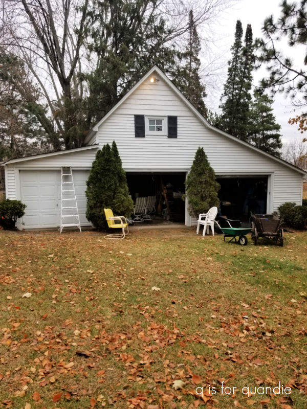
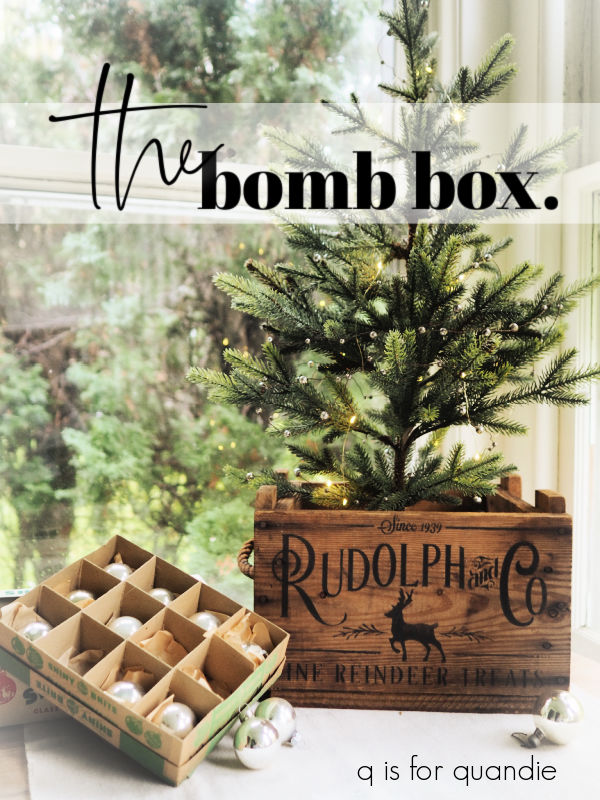
Here’s an example from last week …

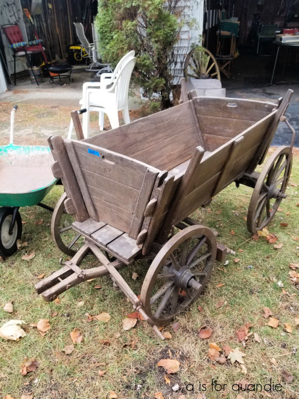
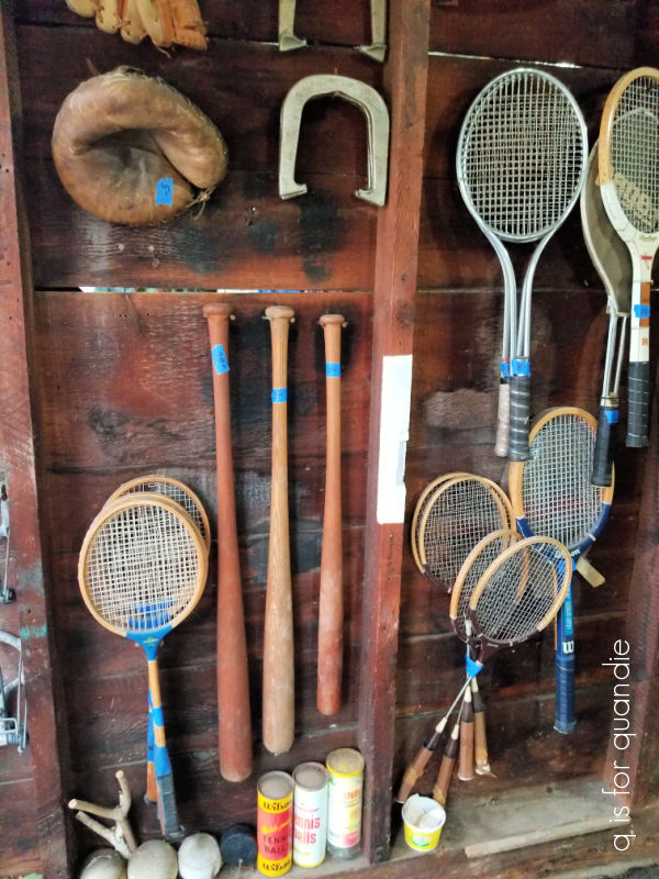
Now, I have to admit, I didn’t actually purchase any of the items shown above because they were just a little out of my re-sale price range. If I personally collected vintage thermoses or buffalo check items I would have been all over them.
My friend opK and I spotted those fun vintage camp items when we went to a handful of sales last week just across the border in Wisconsin. Although I didn’t buy any of those, I did come home with a handful of goodies.

I was initially thinking I’d leave the galvanized scoops ‘as is’ …

but in the end I decided to dress them up just a little bit.

I simply added some wording from the old I.O.D. Label Ephemera transfer.
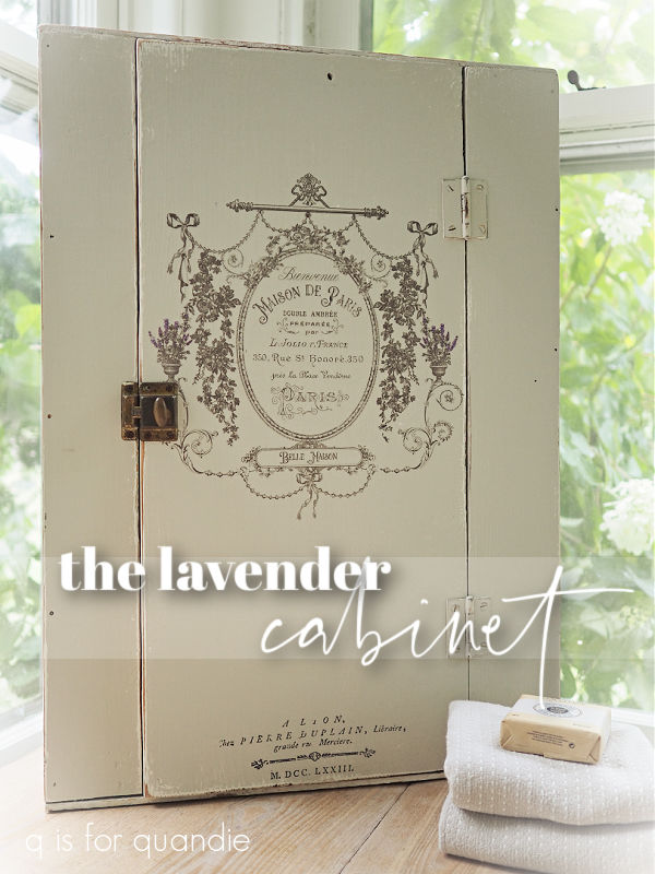
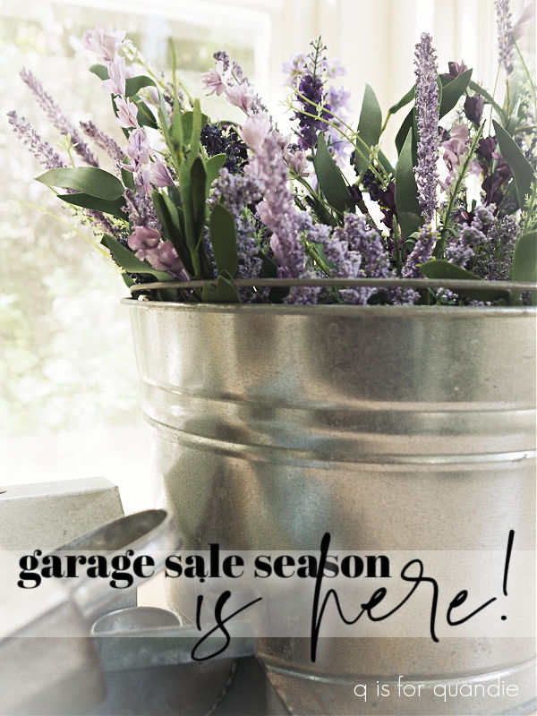
I purchased the big bouquet of faux lavender because I’m always on the hunt for good florals for staging pieces like french floral buckets, or vases.
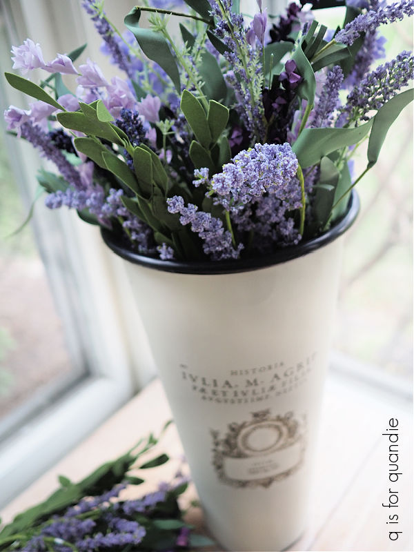
At $5 for the whole bunch, they seemed like a pretty good deal.
opK spotted the little toolbox for me.
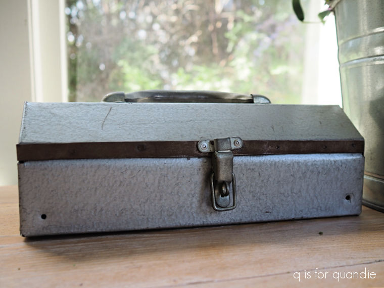
Its petite size made it perfect for the daisy transfer that I used on a lockbox a month or two ago. I liked that one so much that I wanted to do something similar again.
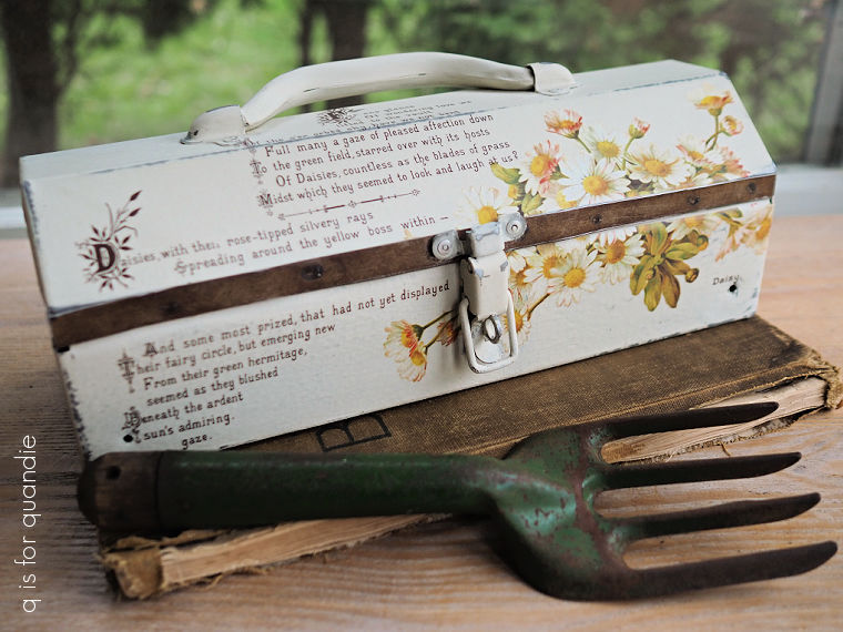
I think it turned out rather sweet.
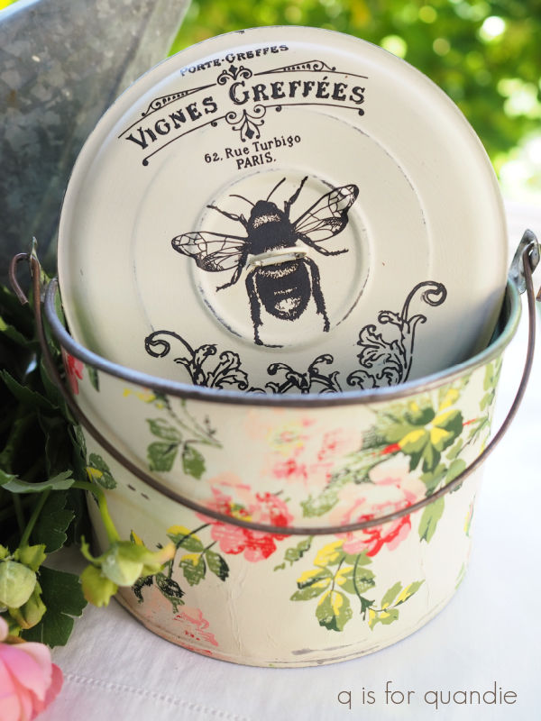
As for the shiny bucket, I gave it the same treatment as a bucket I painted a month or two ago. After giving it a good washing, I stippled on a coat of Dixie Belle’s Dried Sage paint mixed with their Sea Spray texture additive. Once dry, I sanded it back a little to take some of the peaks down then added two coats of Drop Cloth. Once that was dry, I sanded it a bit as well to allow some of the Dried Sage layer to show.
I painted the interior of the bucket in Dixie Belle’s Deep Sea just to clean it up a bit.
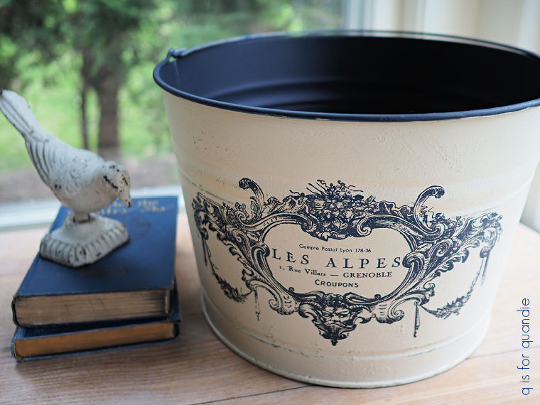
Plus, the deep dark blue worked beautifully with the dark blue of the re.design with prima transfer I then applied to the front of the bucket.
![]()
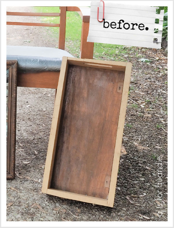
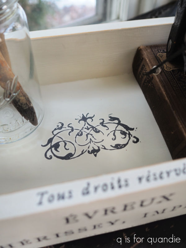
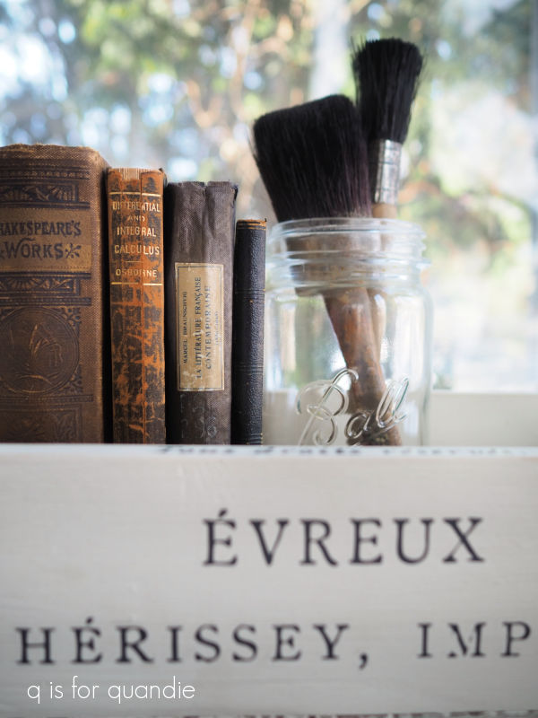
I did also pick up this small wooden box while out garage saling in North Hudson.
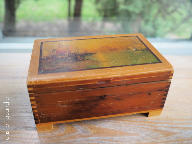
I’ll be honest, I only grabbed it because it was only $1 and I thought I could give it a quick makeover for my sale.
I gave it two coats of Bonding Boss to block any stains from that orange-y wood, then gave it two quick coats of Dixie Belle’s Drop Cloth. Once dry, I decorated it with some scraps from I.O.D.’s Redoute II transfer.
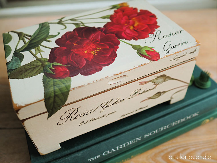
I followed it all up with some clear wax to finish. It would be perfect for a small jewelry or trinket box.
This coming weekend we are spoilt for choice as the garage sale season kicks off with a bang in my area. The cities immediately surrounding me of Oakdale, Maplewood and North St. Paul are all having their city-wide sales this weekend. In addition, a couple of my favorite neighborhood sales are this weekend; Bryn Mawr and Tangletown. Finally, there is also the 100-mile garage sale that runs along the Great River Road from Hastings to Winona.
So many options! We can’t possibly get to them all, but here’s hoping I find lots of great stuff no matter where we end up.


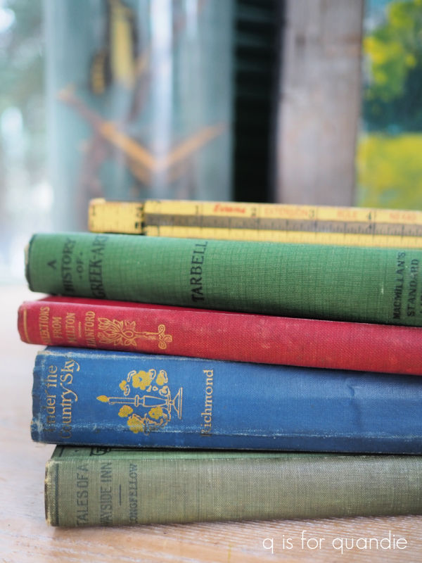

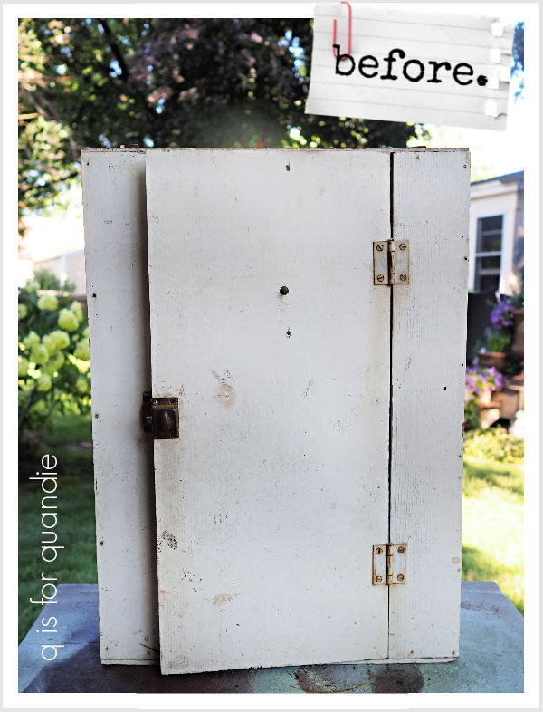
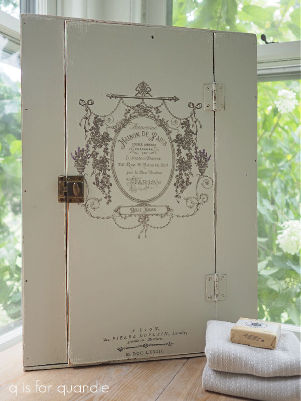
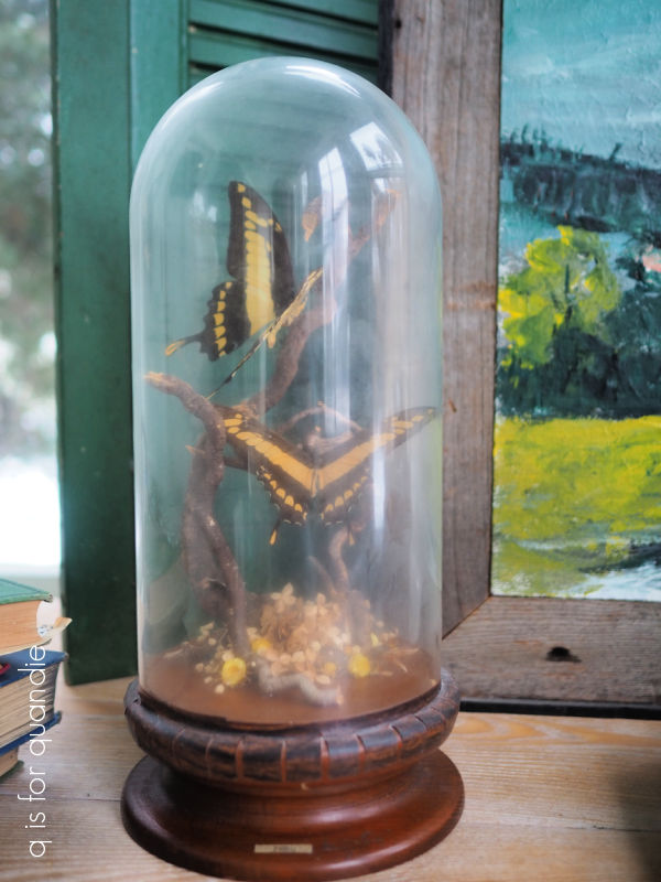
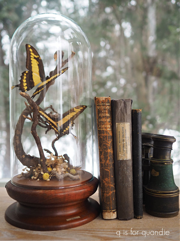
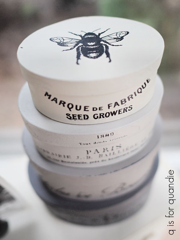
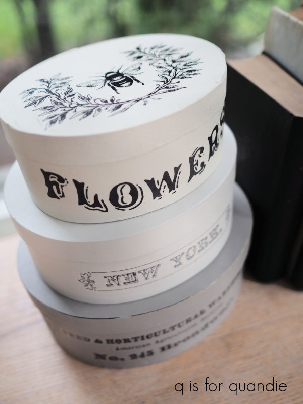
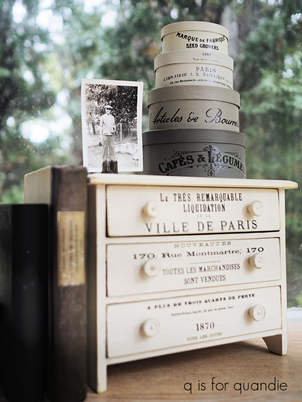
 I plan to use some of these in the q branch makeover too.


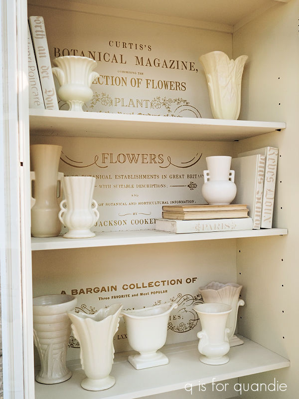
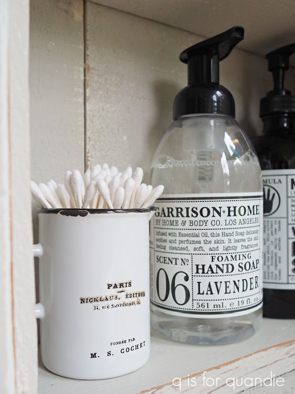
 As you may have noticed, I have a little bit of a non-collection of matte white pottery.