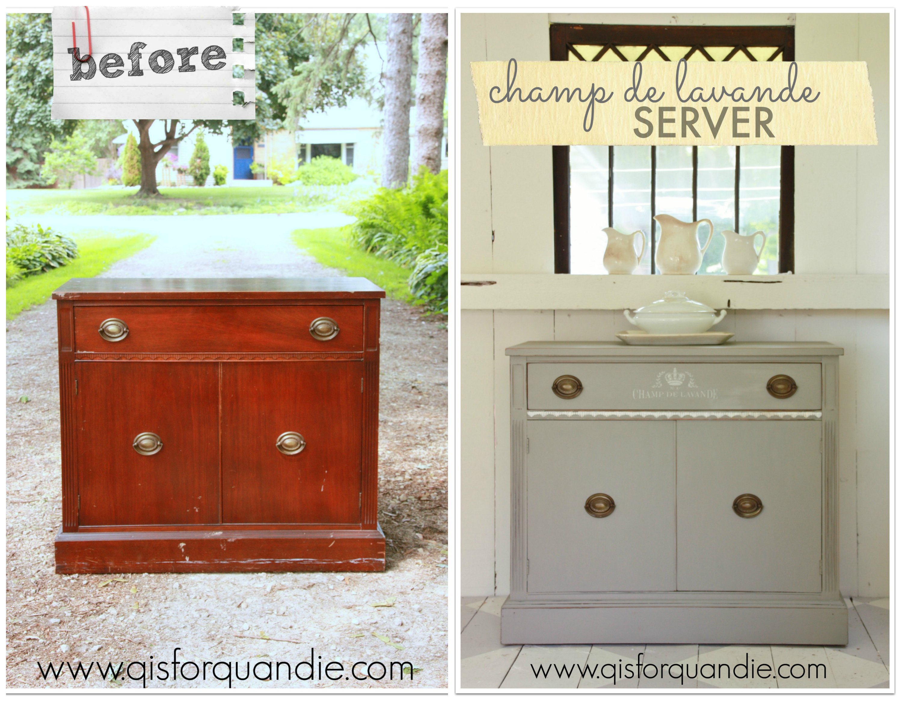
Usually when I mention to co-workers or acquaintances that I buy furniture on craigslist and fix it up, they make a pained face and mention serial killers. As if it is somehow a horrible prospect to them that I would actually go to stranger’s homes on a regular basis.
The reality (for me at least) is that 99.9% of the people I have met via craigslist have been super nice, friendly folks. Maybe it is because we’re talking vintage and antique furniture here. Probably not a lot of wackos out there selling grandma’s old dresser (knock on wood, literally).
None the less, I practice ‘safe craigslisting’. I always have someone with me when I go to purchase an item, either Mr. Q or my neighbor nnK in a pinch. I also always make sure that someone else is around when I am having a buyer over to see a piece that I have finished.
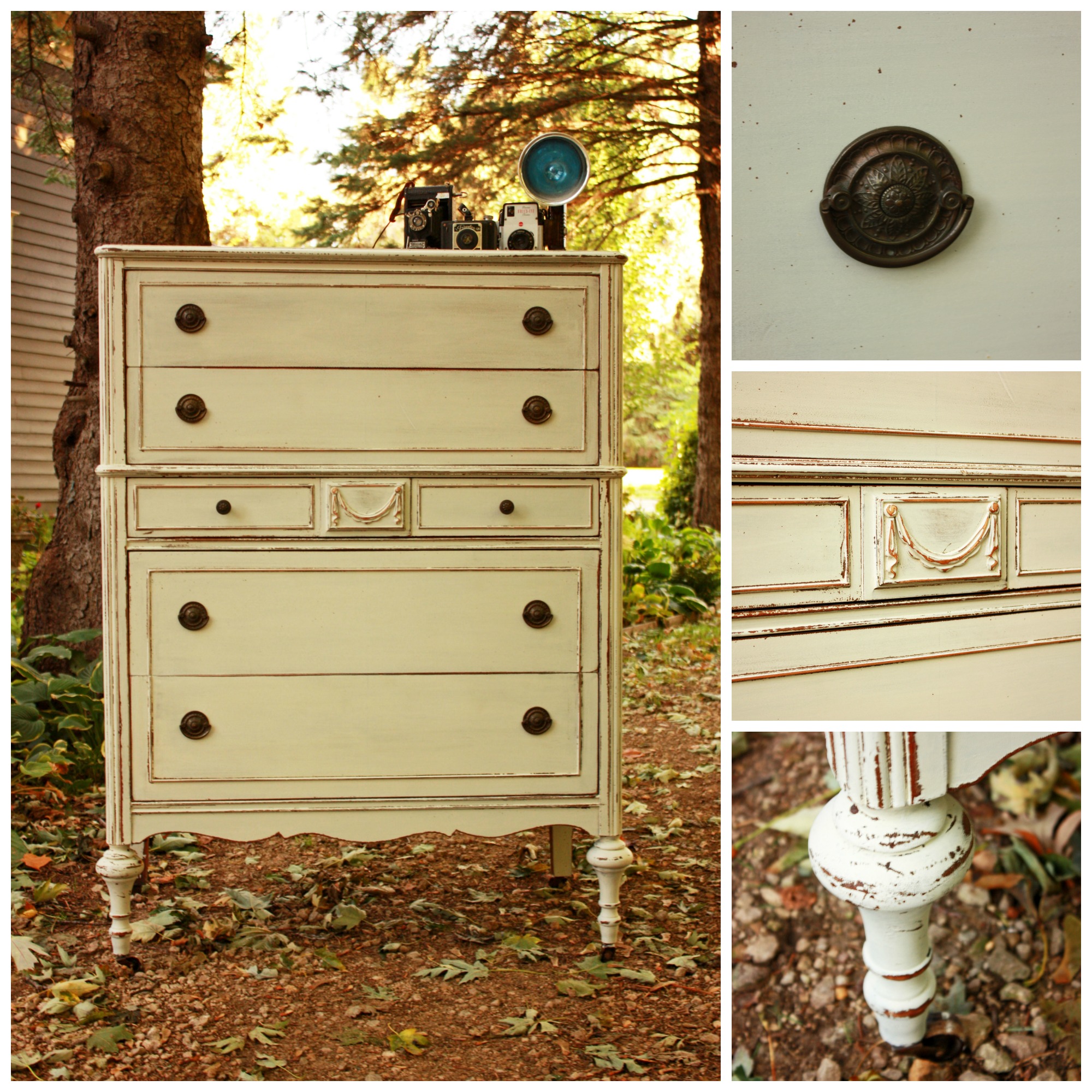
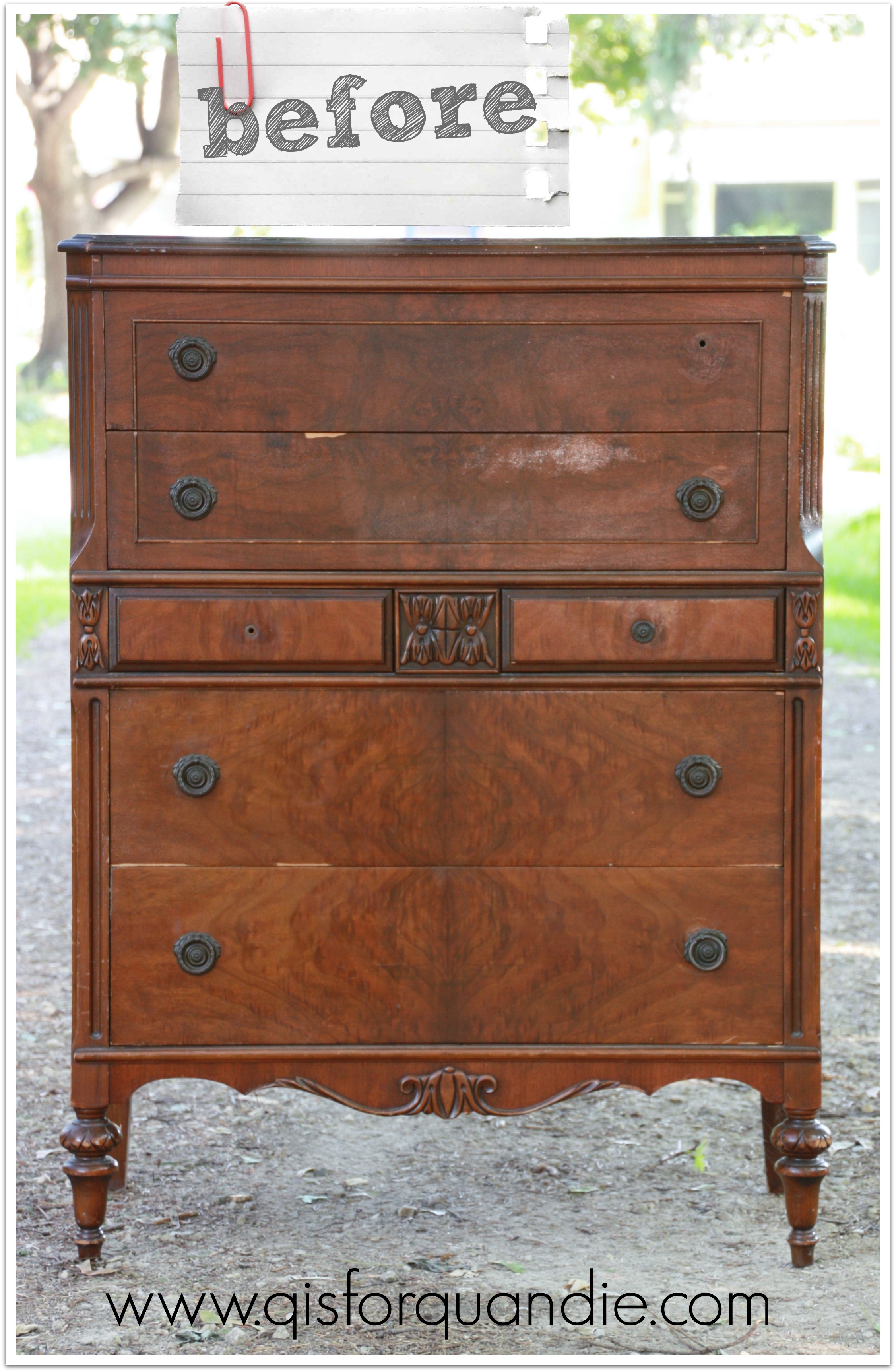
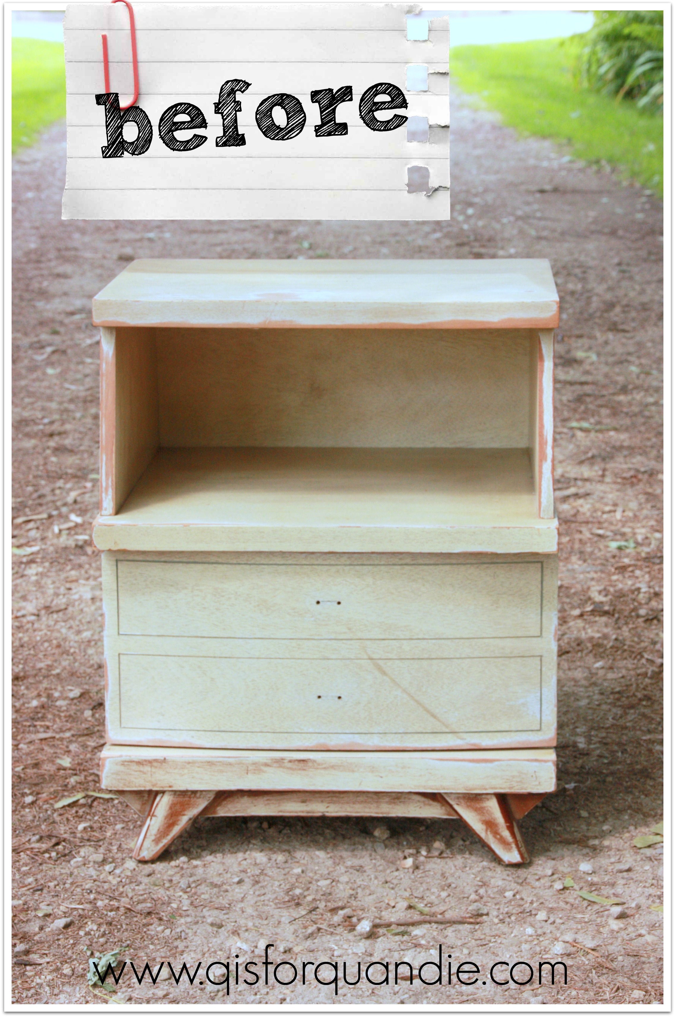
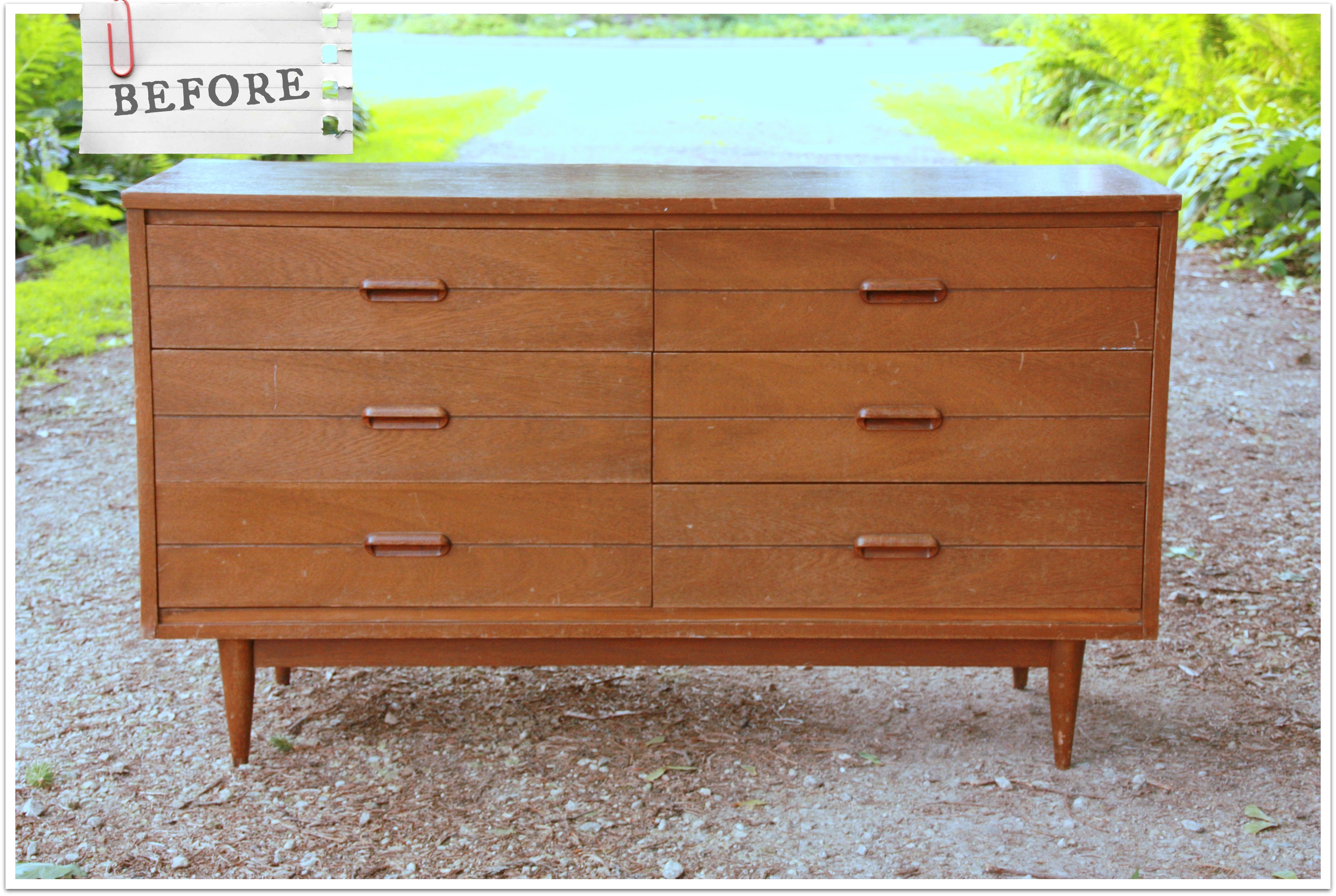
Sometimes we just really enjoy the people we meet via craigslist, and the seller of this mid-century dresser was one of those people. He was scrupulously honest about the condition of the dresser. He had the dresser pulled out of the garage and ready to go when we got to his house, which was immaculately maintained, by the way. He and Mr. Q had a great time quoting old ’80’s movies. We also learned some interesting stuff about his neighborhood off McKnight Road in St. Paul that was originally developed for employees of 3M, or as those who remember it from back in the day, ‘the mining’.
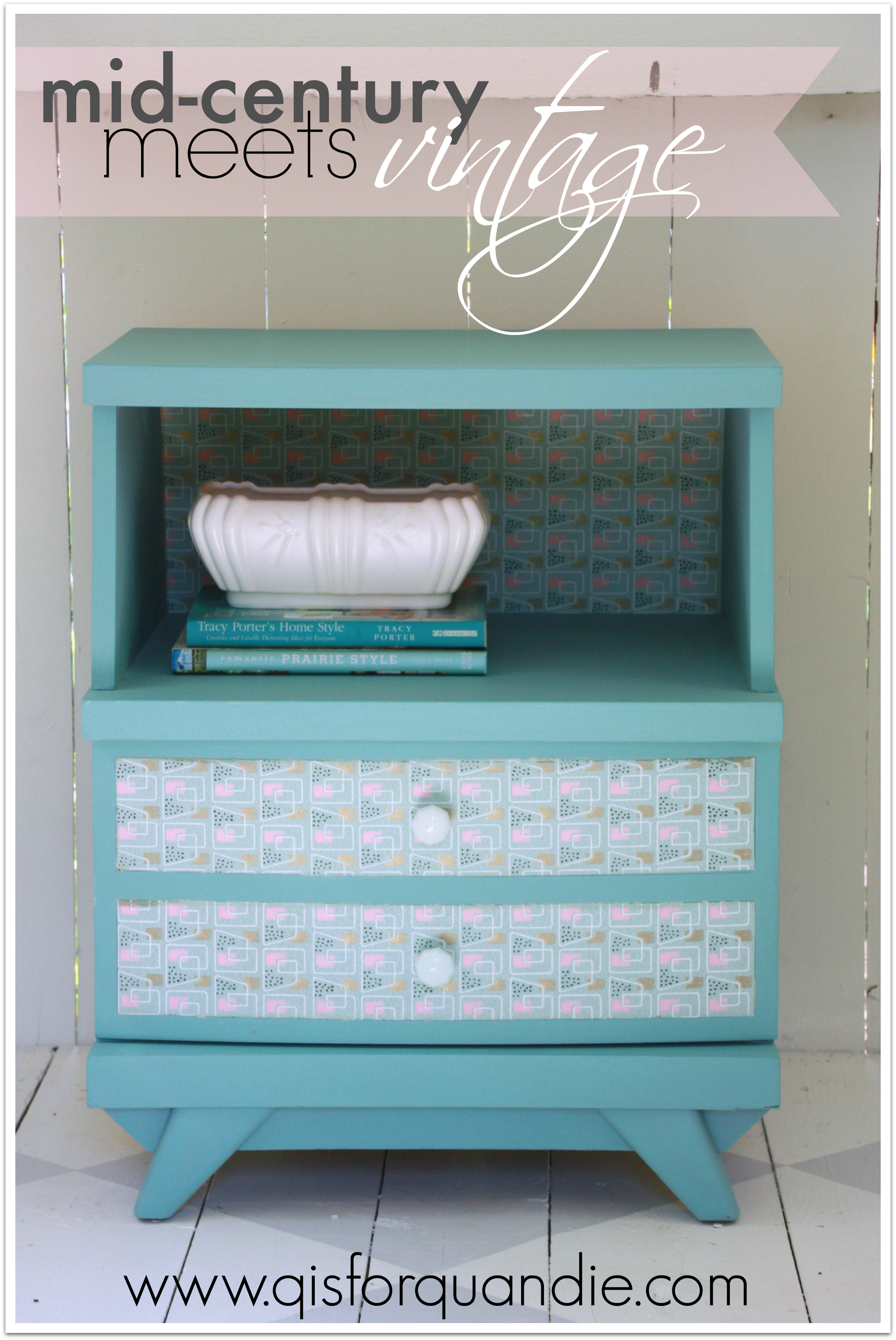
It was really just a pleasant way to spend a part of the evening, and as a bonus I got to come home with this.
 Fun, right?
How many of you out there are mid-century fans?
I’ll admit, I’m not really a fan in so far as I will probably never do mid-century in my own home. That being said, I love the look in other people’s homes.
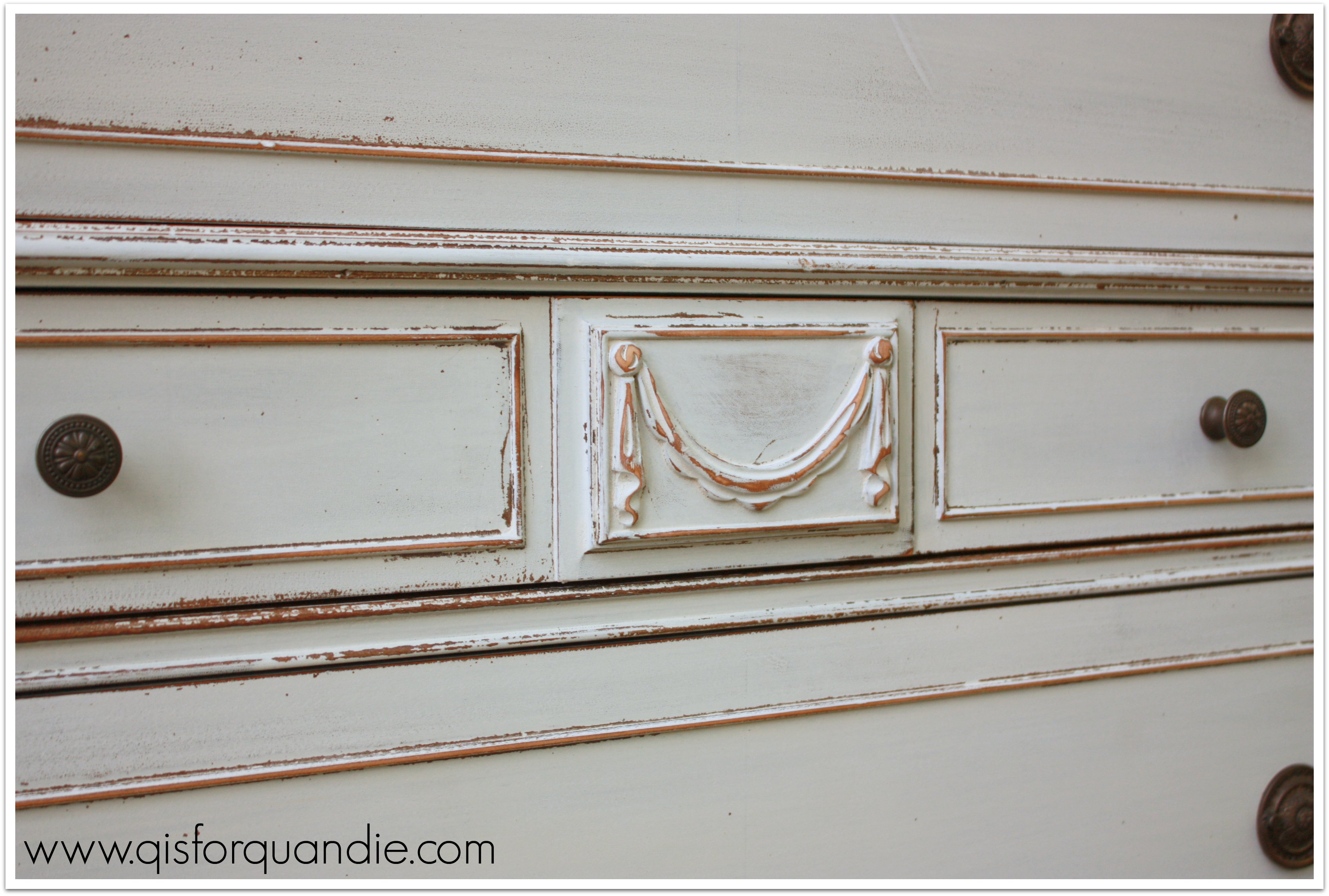
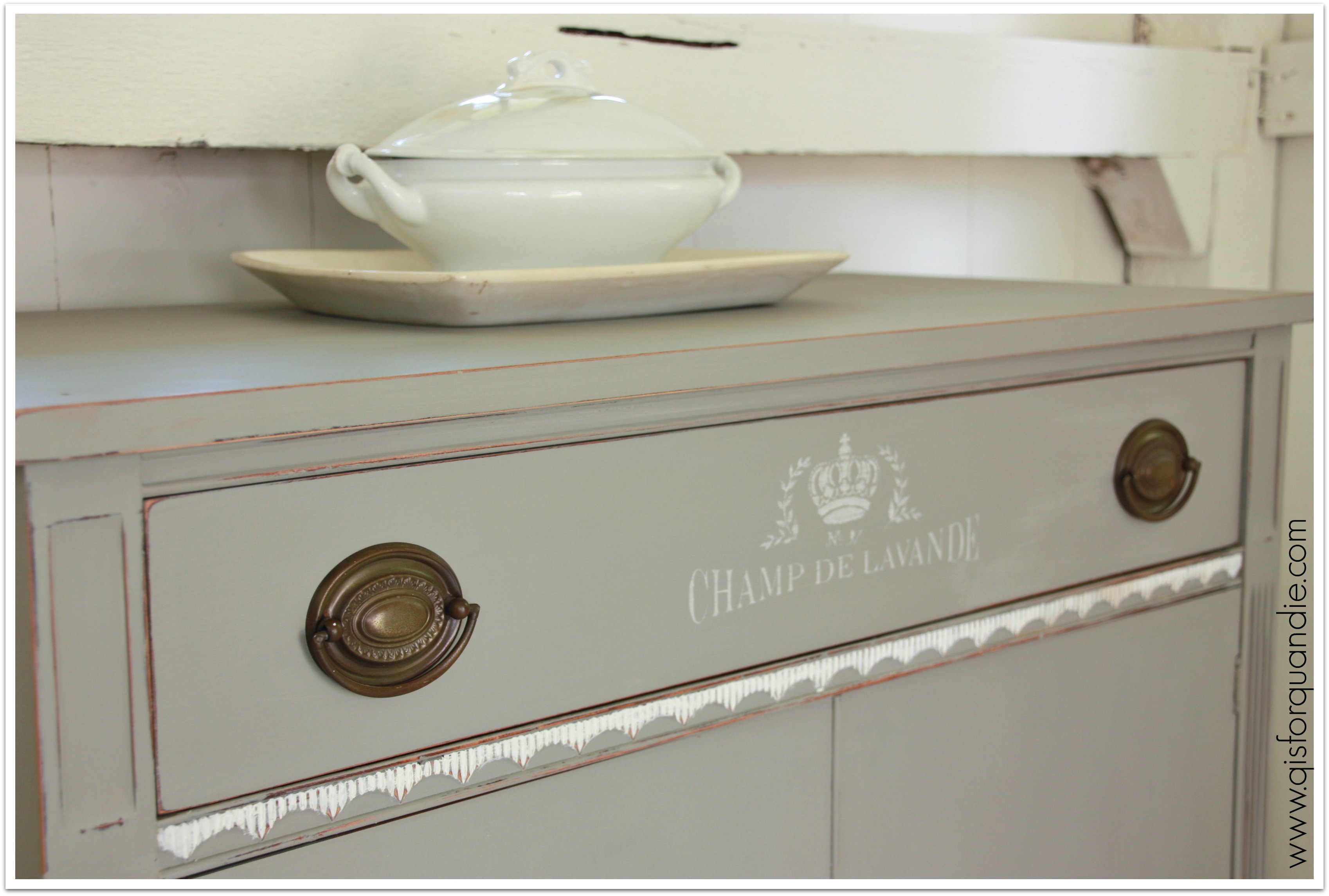
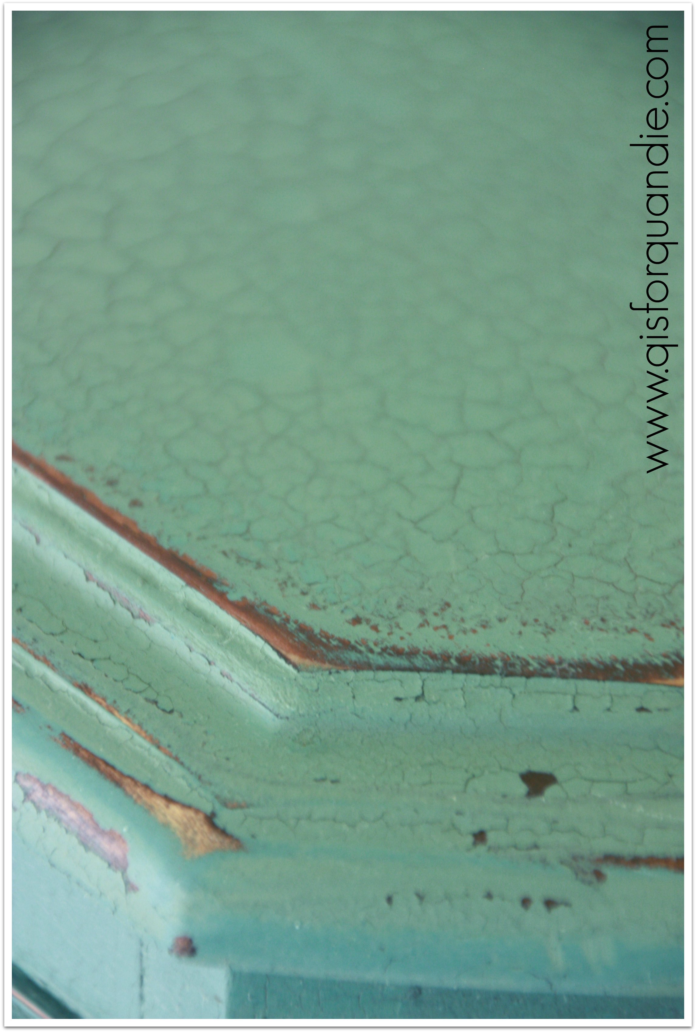
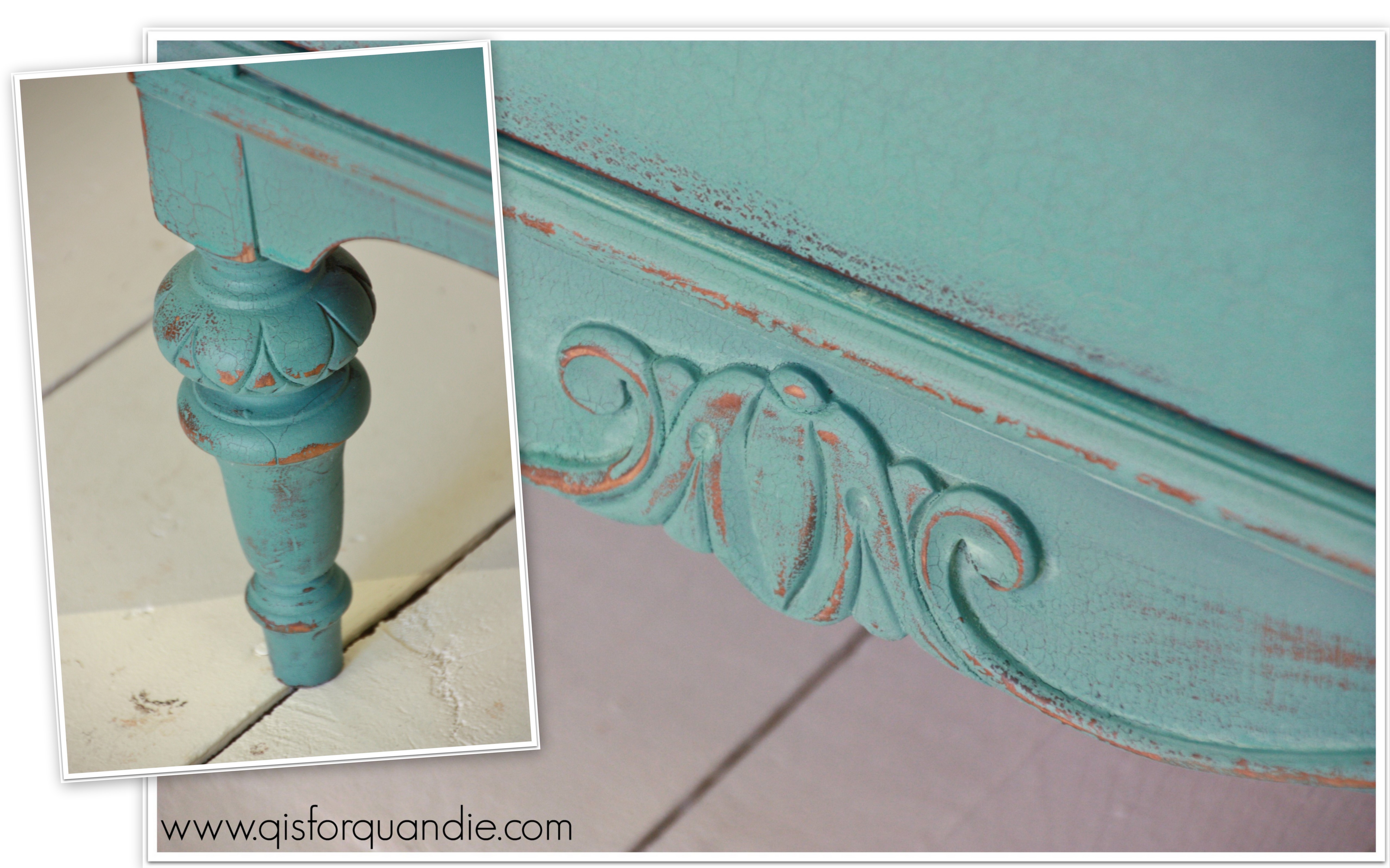
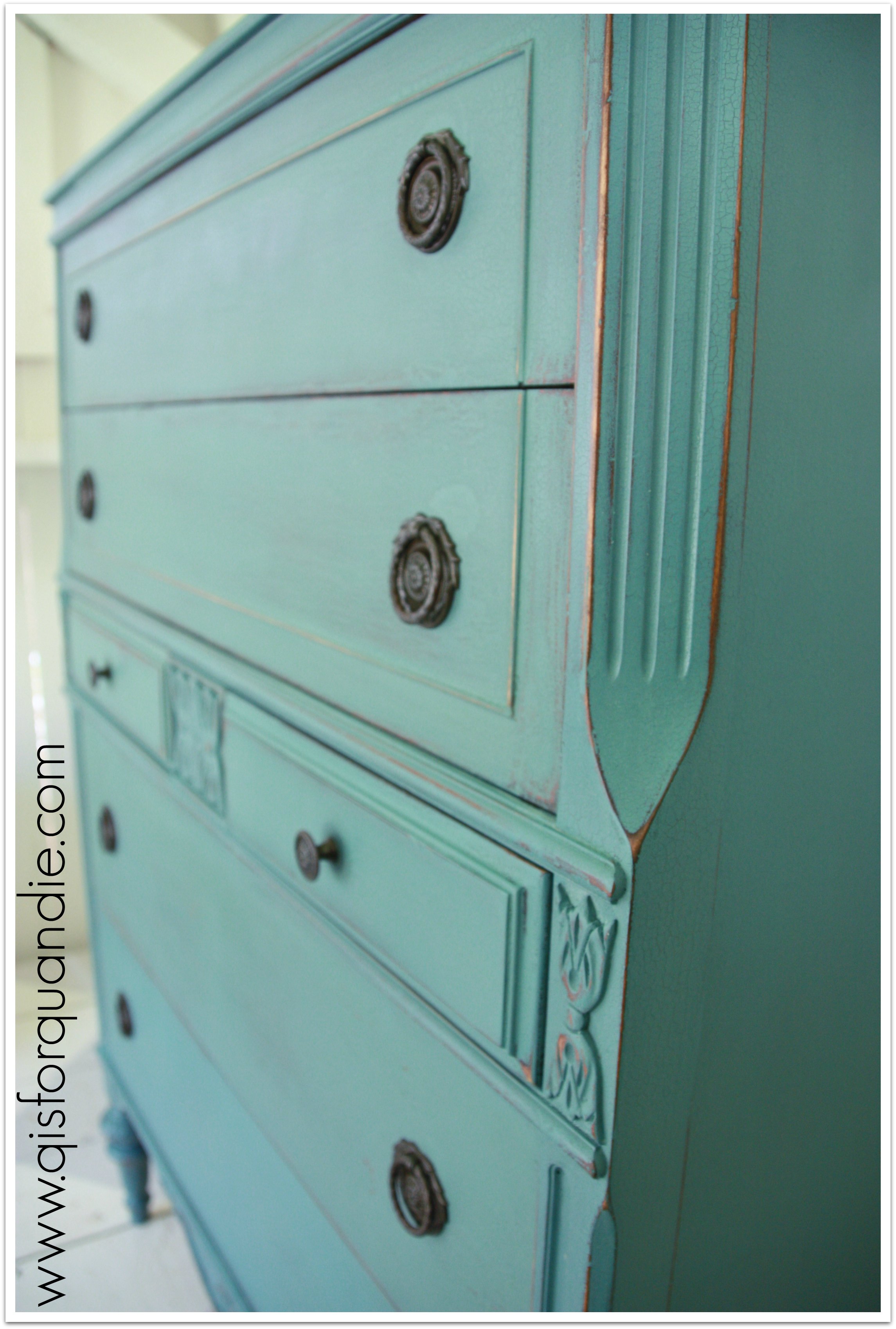
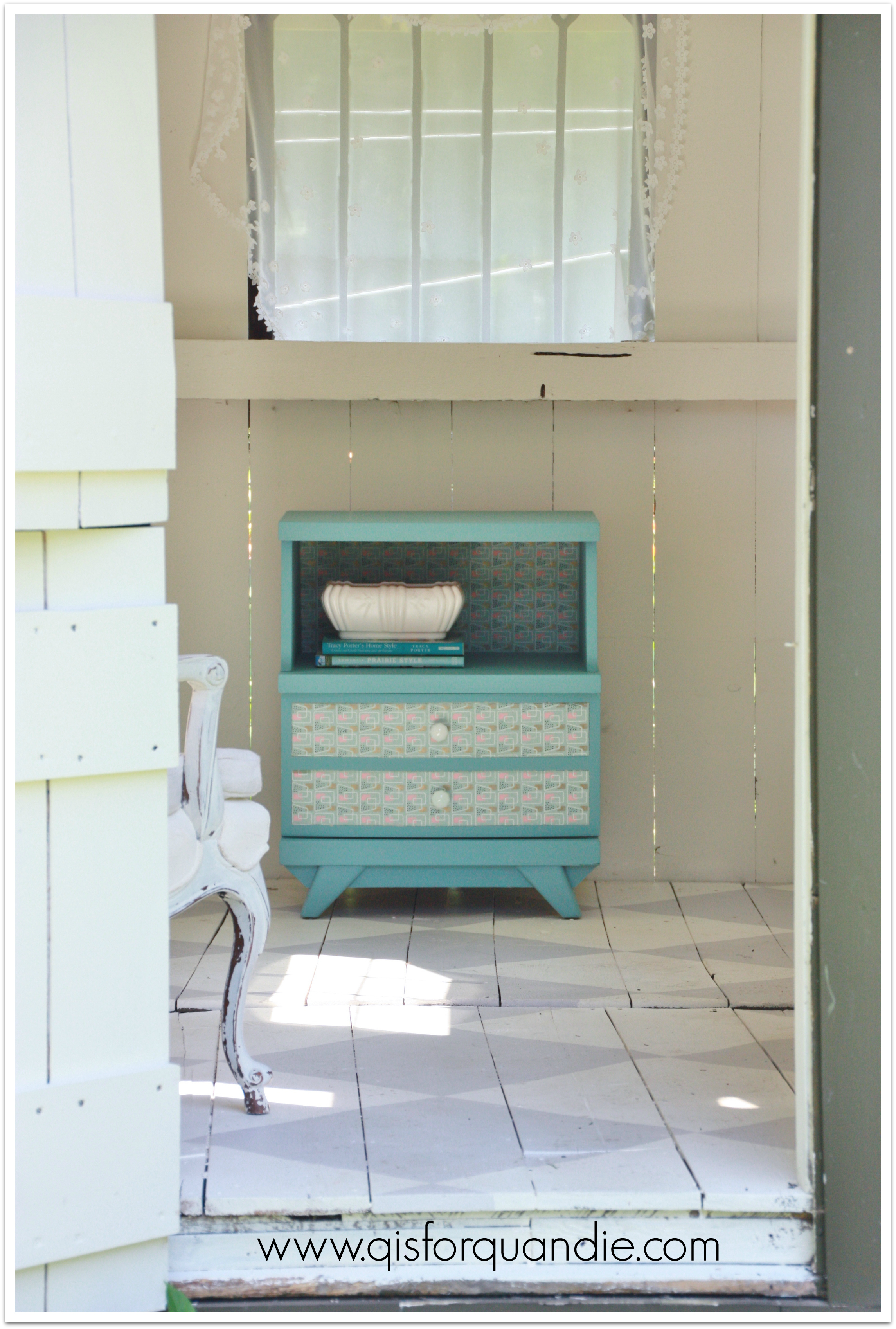
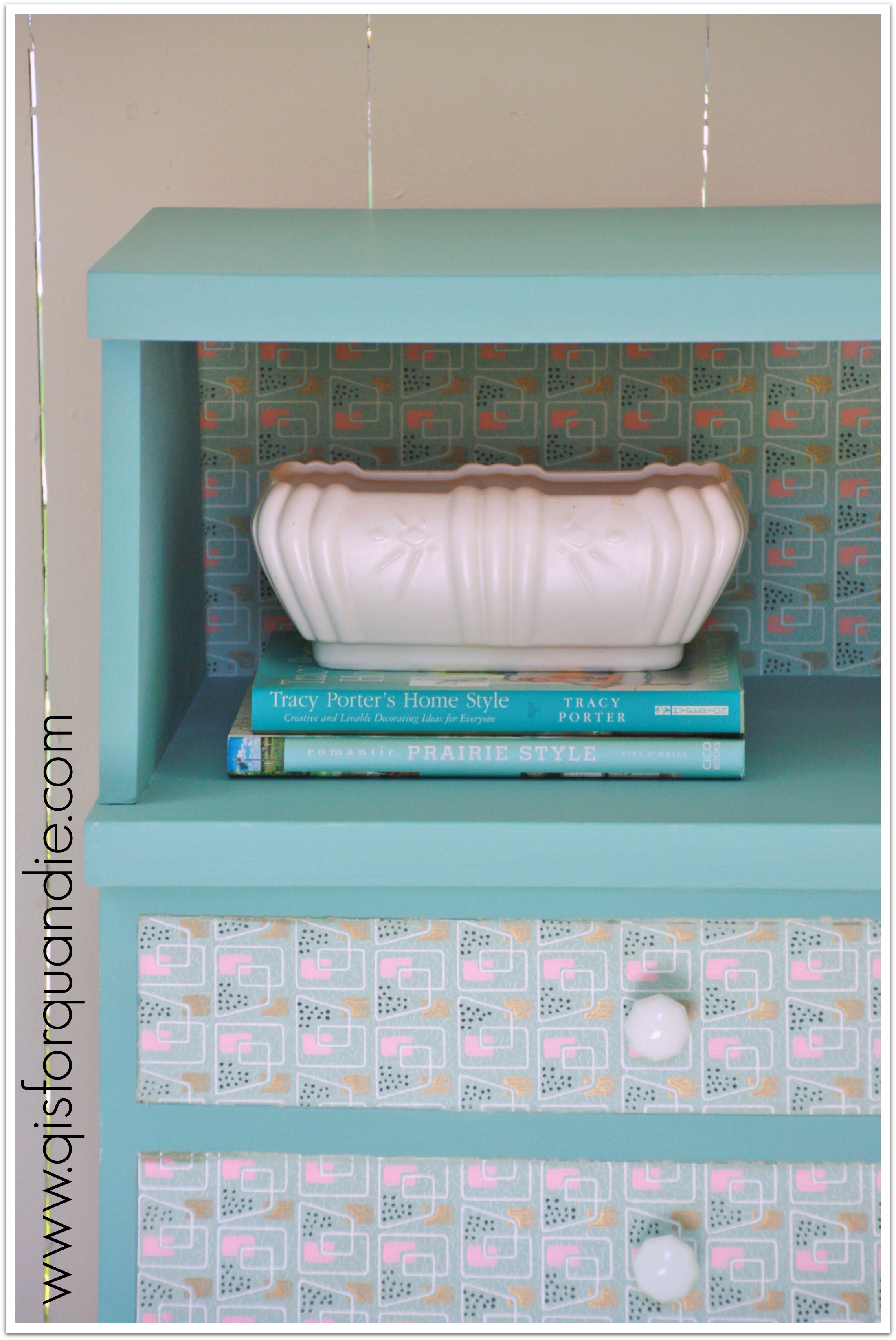
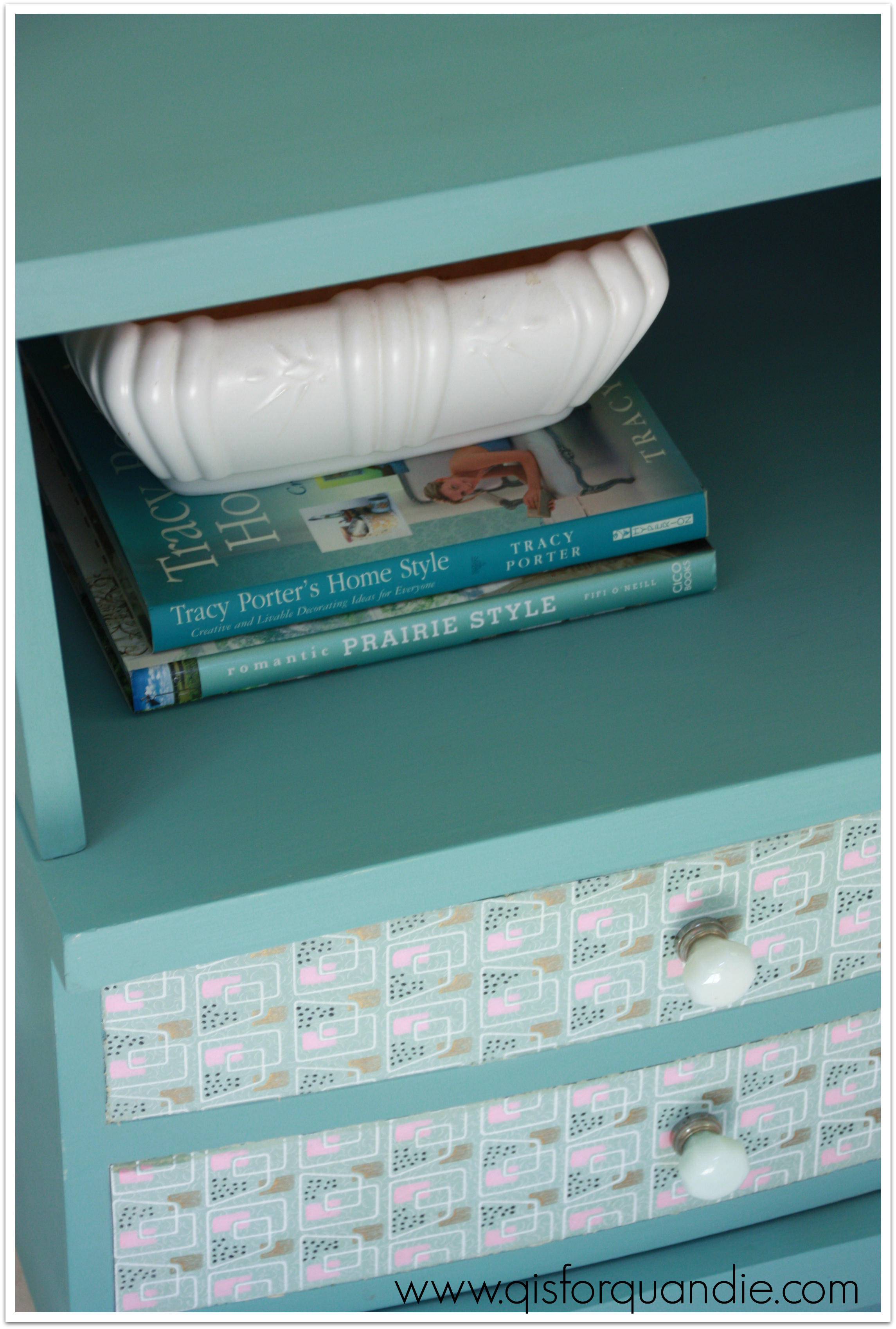
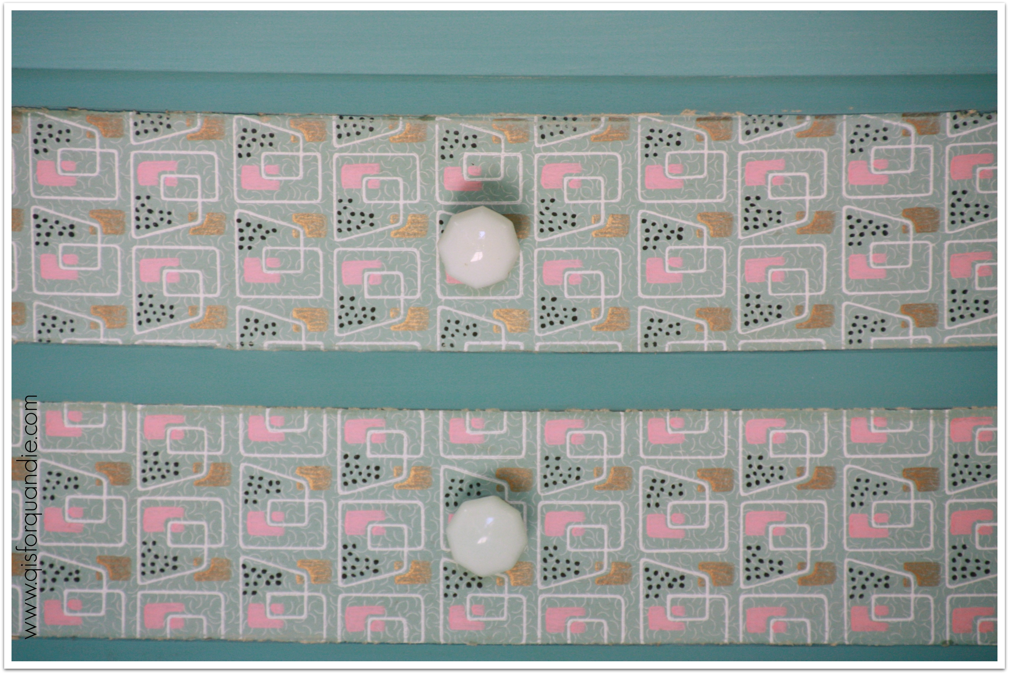
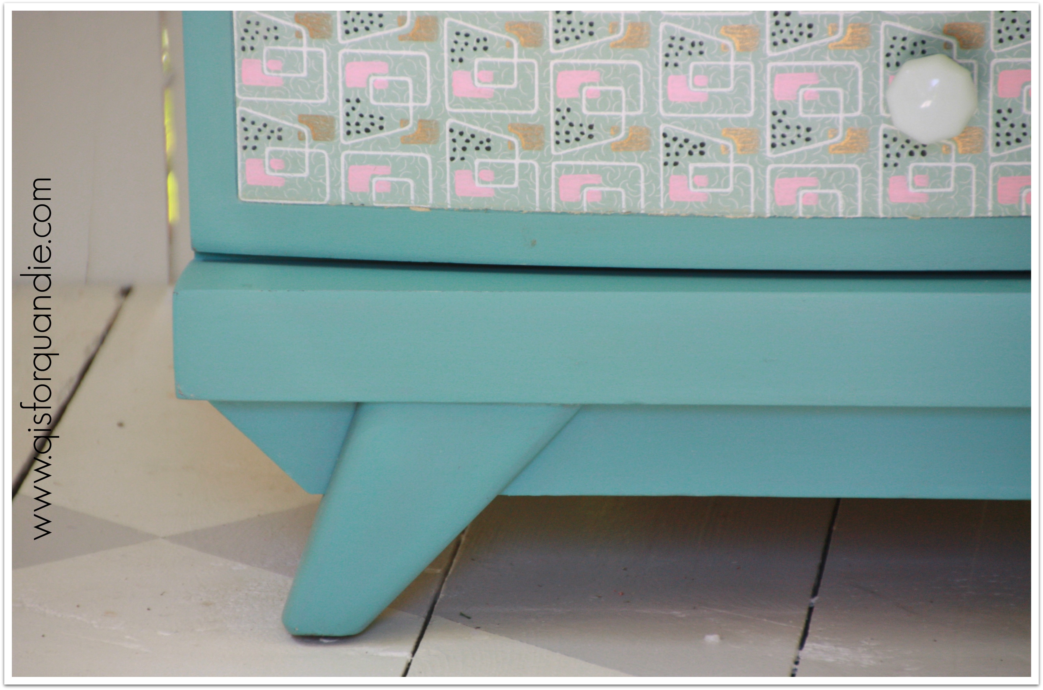
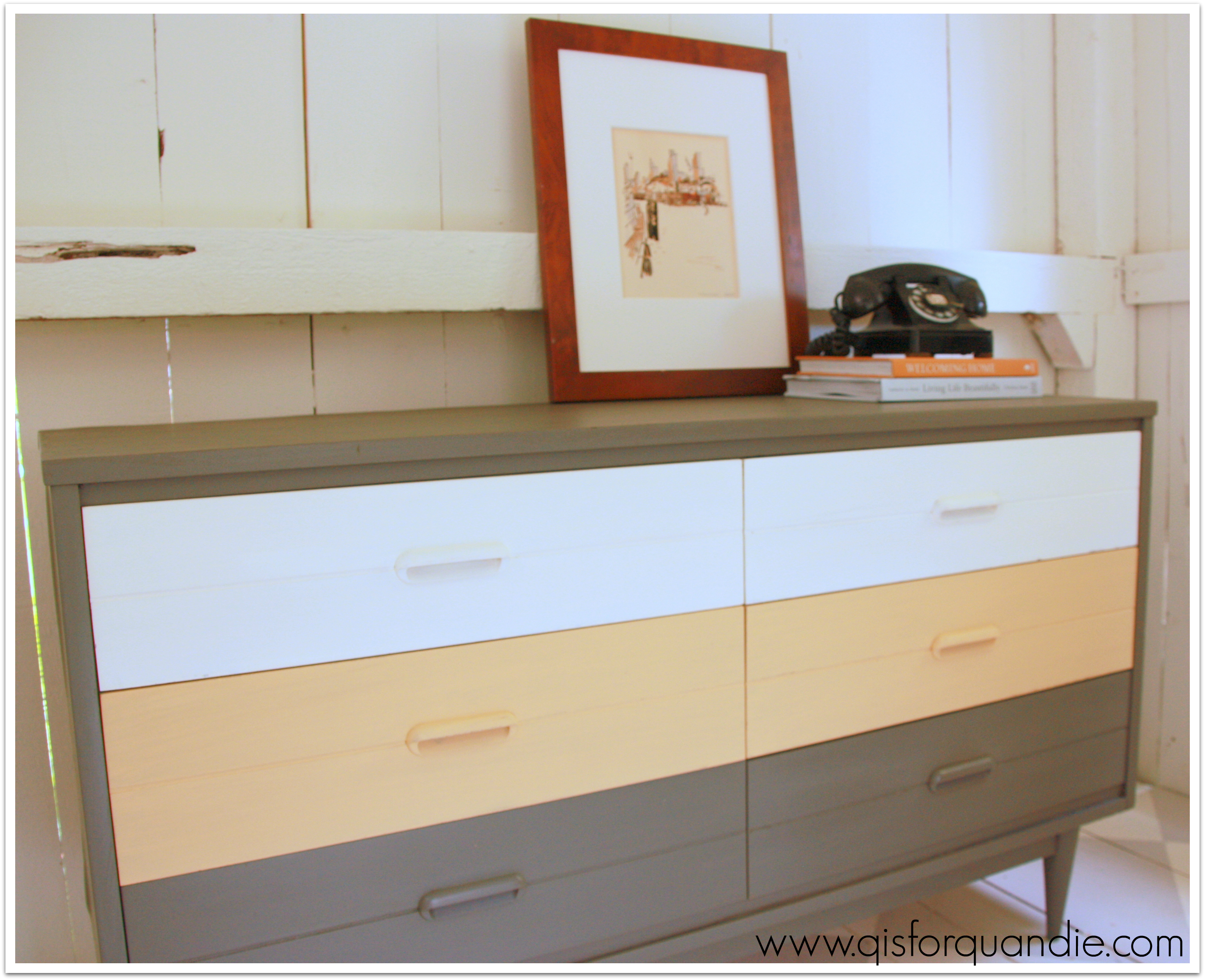
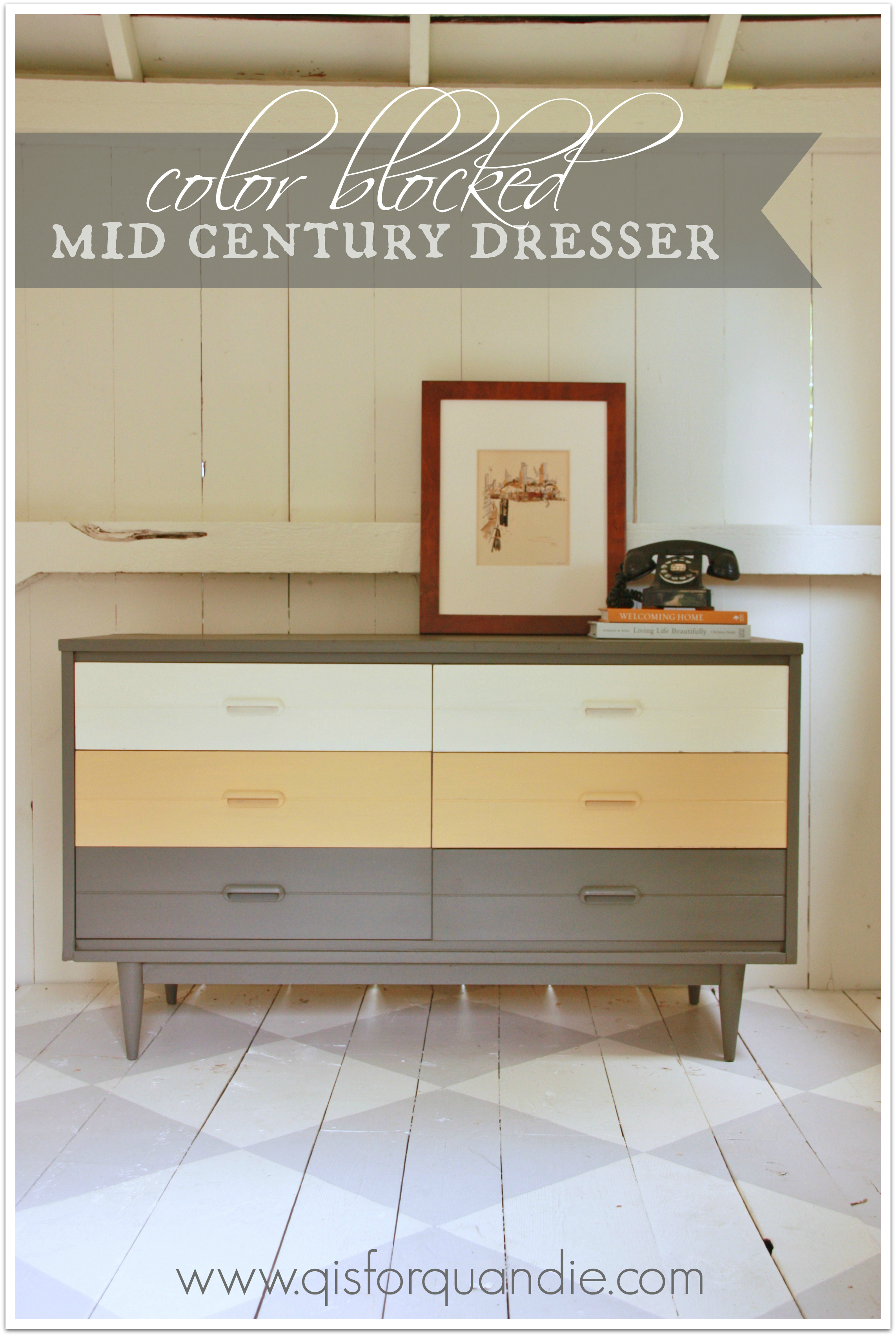
I took some inspiration from pinterest and tried some color blocking on this one. I was going to use my standby fave color, aqua, but then I saw a dresser painted in grey, yellow and white and decided to venture a bit outside my normal color comfort zone. And I LOVE it!

I revamped this with a mishmash of products. The grey is an ‘oops’ paint from Home Depot. It was $2. I mixed it with plaster of paris and water to create my own chalk paint. I wanted a deep, rich grey and this one was perfect. The yellow is a Behr sample. I could have used the MMSMP in Mustard Seed Yellow because they are very close to the same color. In fact, I could have done this entire piece in MMSMP using Trophy for the grey and Linen for the white. However, I definitely didn’t want this one to get chippy, so I opted for homemade chalk paint for the yellow as well, and Annie Sloan’s Old White for the top two drawers.

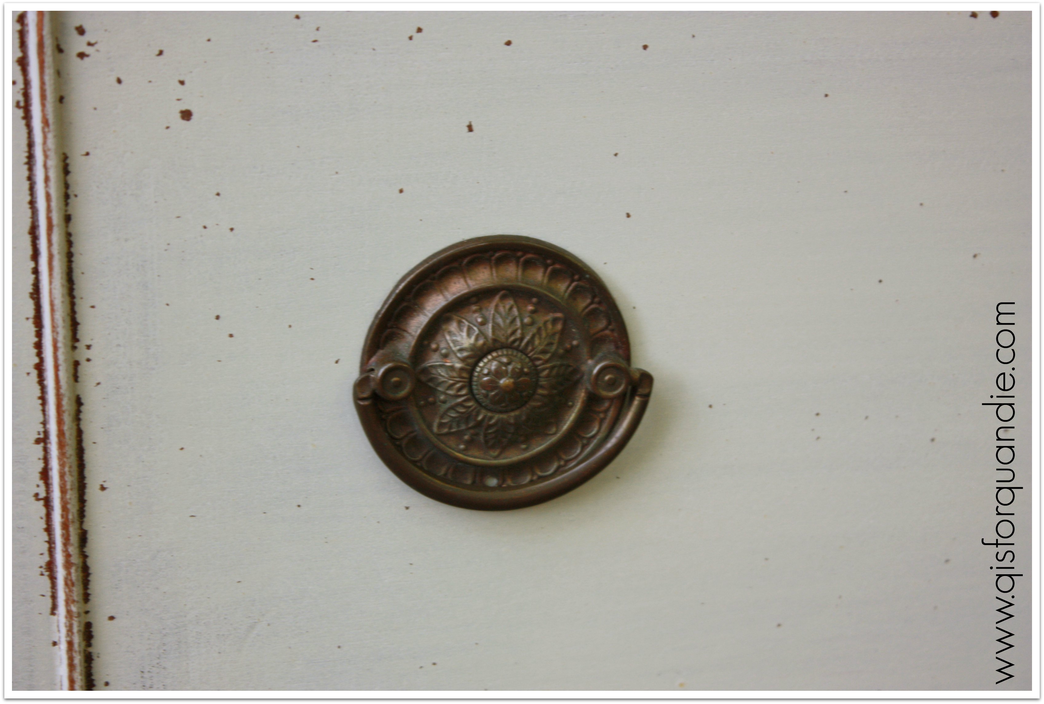
I used 3 different waxes on this one too. Never let it be said that I am not detail oriented, and possibly a bit picky about my results. The grey is waxed in a custom mix of dark Briwax and clear paste wax (the cheap stuff, SC Johnson). The dark wax gave a little more depth to the grey and reduced the blue tint a bit. The yellow is waxed in clear SC Johnson. For the white however, I have found that you have to pull out the big guns to avoid yellowing your whites, and that is Miss Mustard Seed’s clear furniture wax. Not a bit of yellowing with that one.
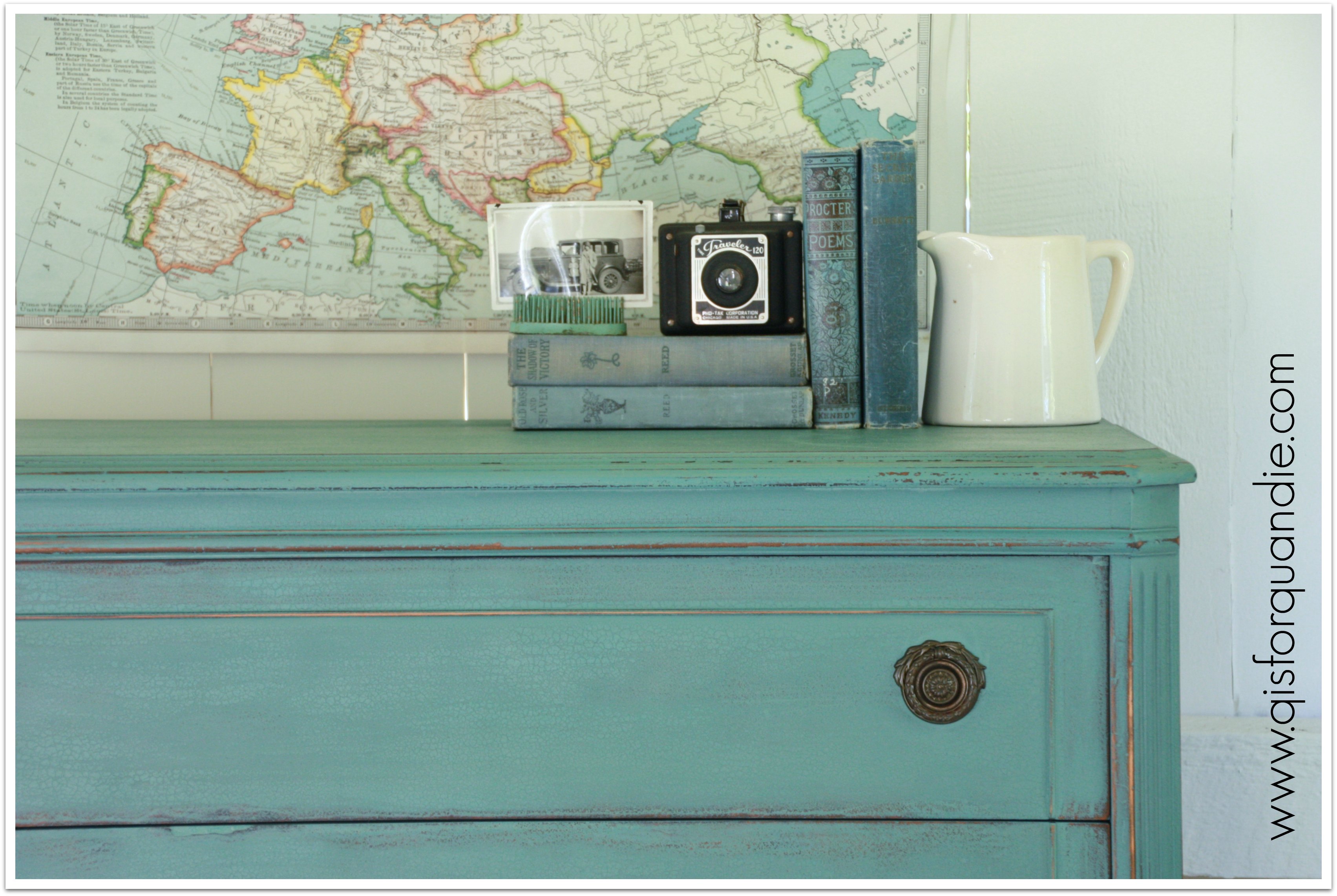
I had considered staging this one with some fab mid-century stuff borrowed from some friends, Mike and Meg. They have the most fabulous ranch home that is completely decked out in classic mid-century modern. Even all of their poolside patio furniture is collector quality mid-century. But in the end, I was too impatient. I wanted to catch the light in the photo cottage while I had it, so I staged it very simply with some of my own stuff.

The water color was drawn by my grandfather. I have a pair of his watercolors, and they are on the list of stuff I’ll never part with. The book, Welcoming Home: Creating a House that Says Hello, was written by a friend, Michaela Mahady. Her husband, John, and Mr. Q are coffee shop buddies. Michaela is an architect at SALA and does gorgeous work. She and John also do beautiful stained glass work through their Pegasus Studio.
But, I digress. The color blocked mid-century modern dresser was a fun departure from my usual style and I really enjoyed the process. And it looks great in my photo cottage, don’t you think?

So, mid-century, are you in or out? Grey, yellow and white? You love it, or it’s not your cup of tea?

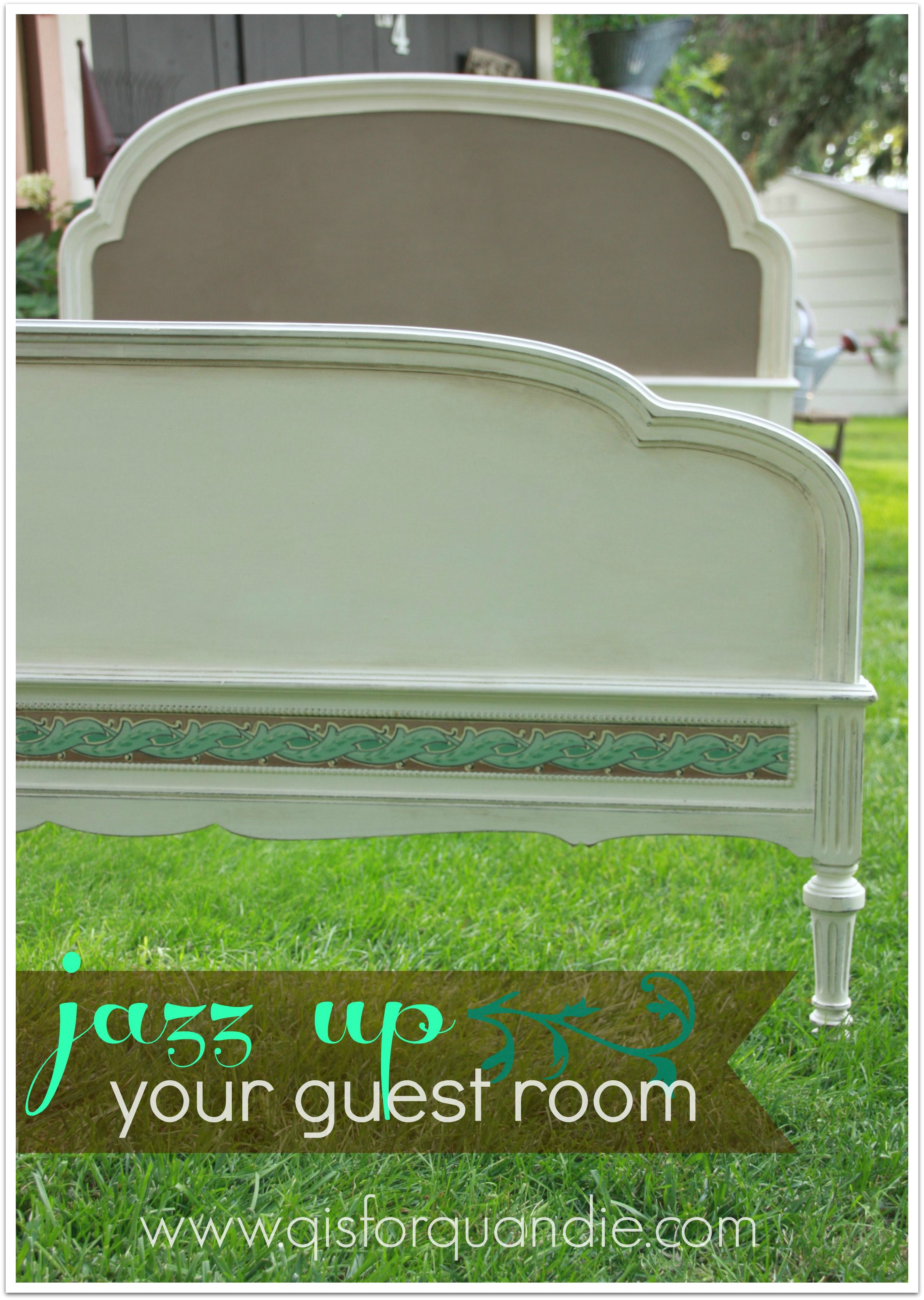
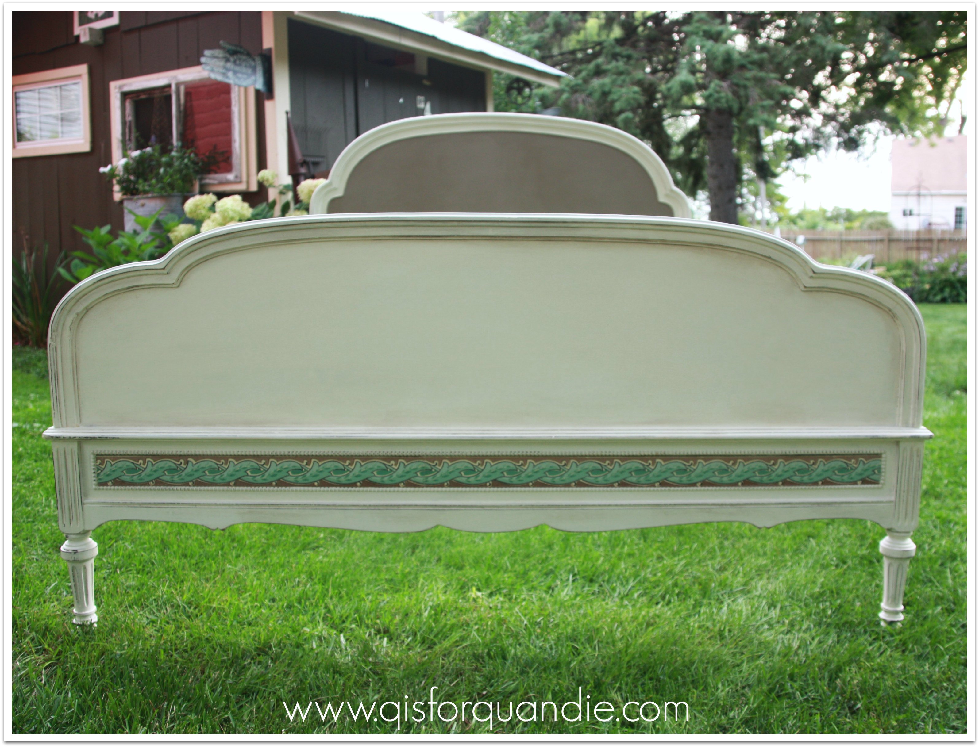


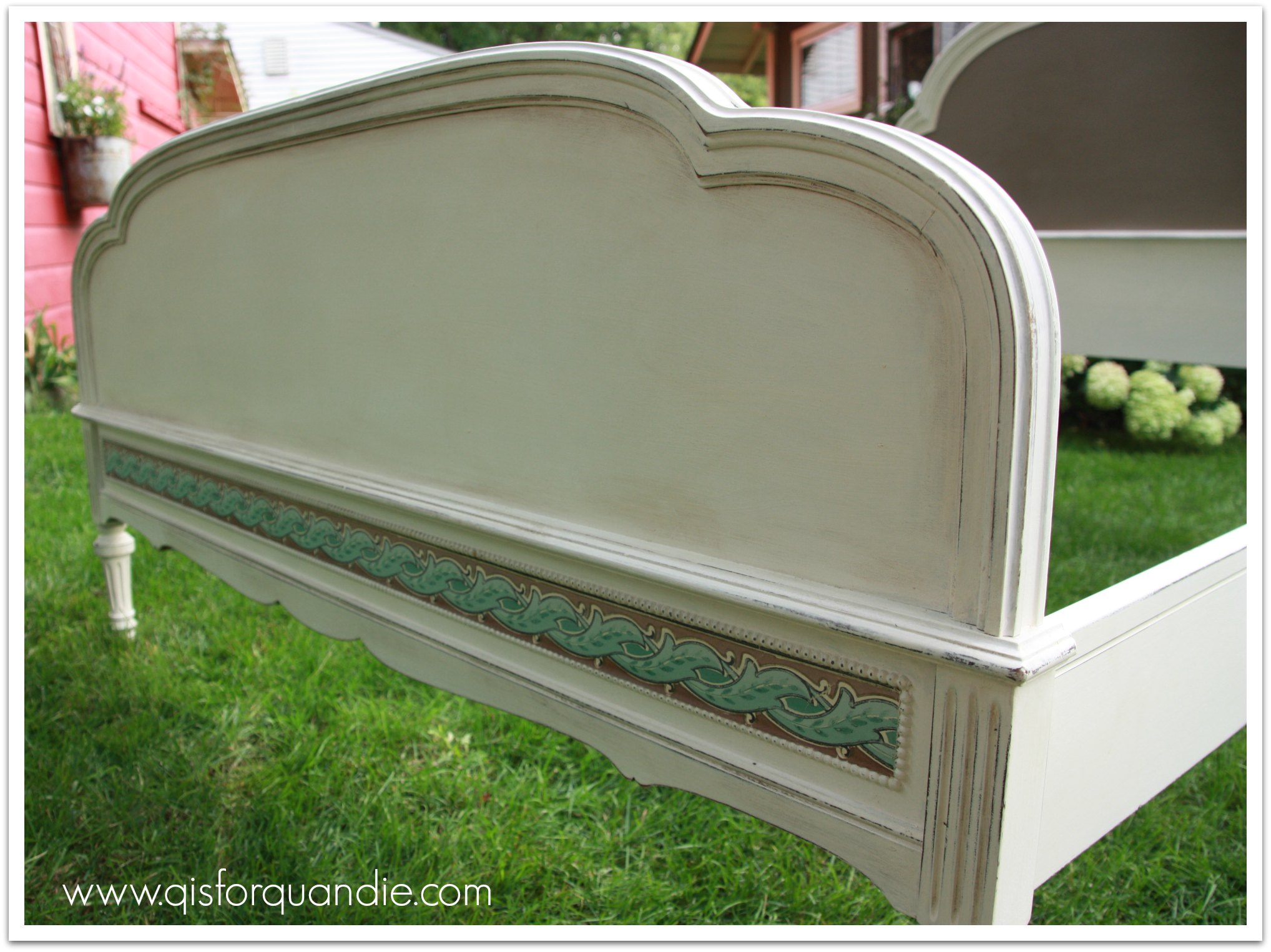 It really is somewhat challenging to get interesting photos of a bed frame without a box spring, mattress and linens. While painting this bed, I thought about how it would look fully made. With pillows in front of the headboard, a good bit of the Coco will be covered up. I think this bed would be gorgeous with crisp white vintage linens and then a pop of the Coco color with this throw from H & M.
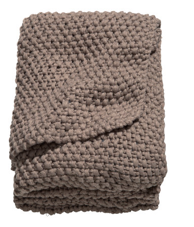


