Remember my inadvertent mid-century flip from last spring? I purchased a Lane cubist credenza for $20 and sold it in the same day for $175. Only to find out later that the guy who purchased it was a dealer and had it listed in his shop for $550.
Well, I said ‘live and learn’, and I think I got a little smarter the next time around.
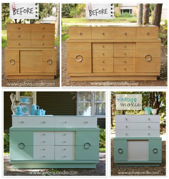
I purchased two American of Martinsville mid-century pieces (after nnK spotted them on CL) and I flipped them. I made a little nicer profit this time. Even so, the impossibly hip couple that bought the credenza told me they were going to take it to Manhattan. I have a feeling that they were going to make a tidy profit also.
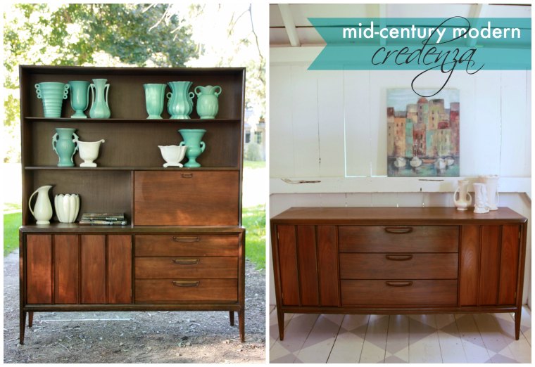
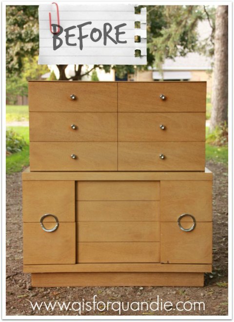
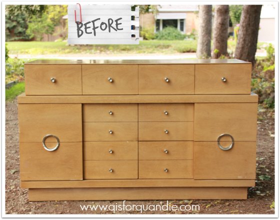
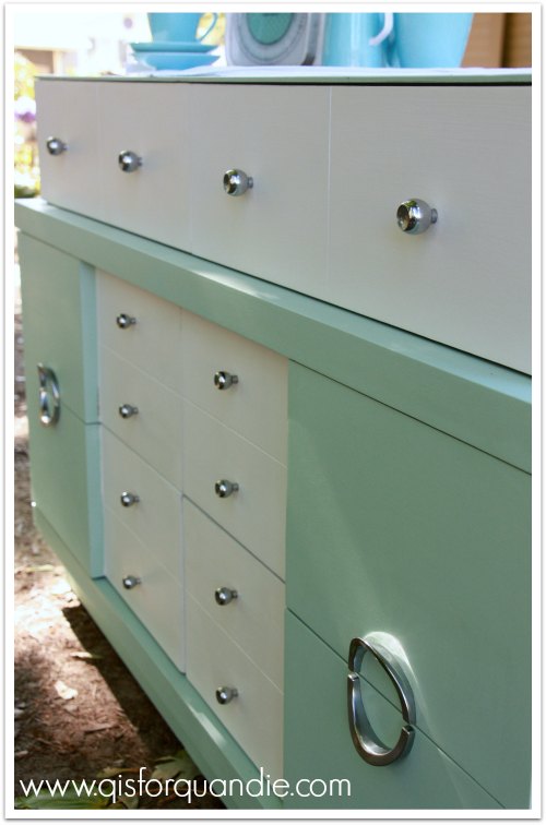
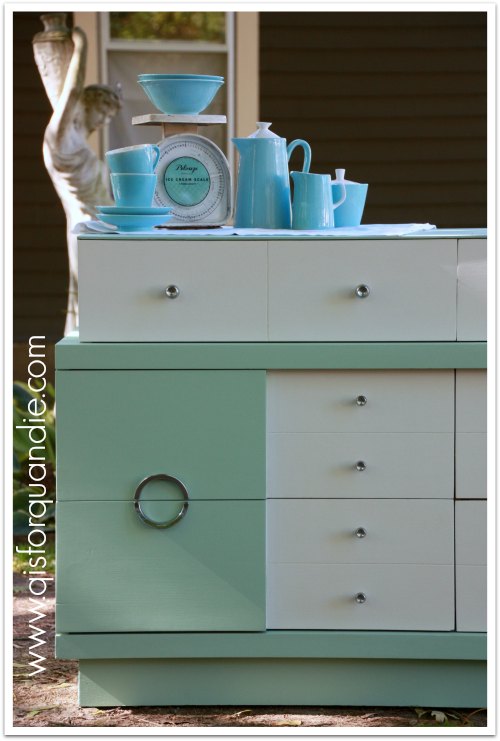
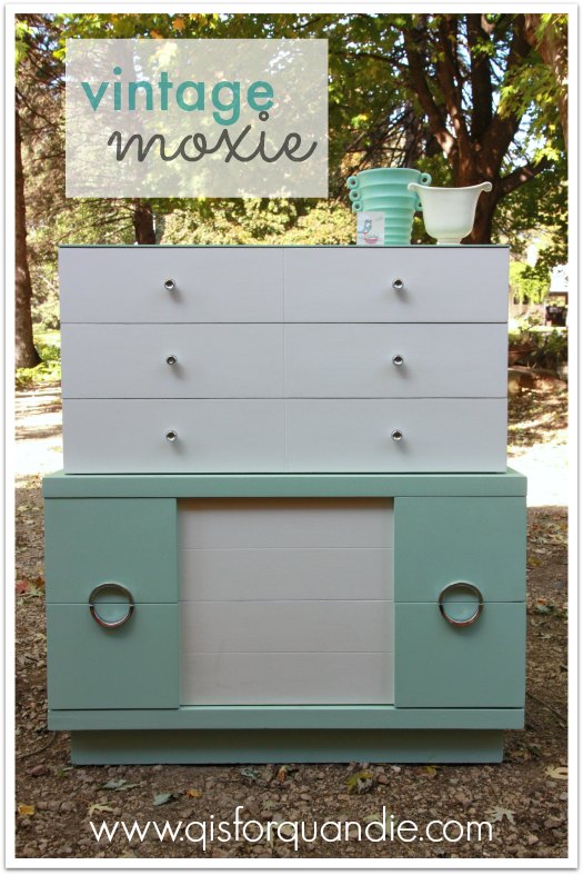
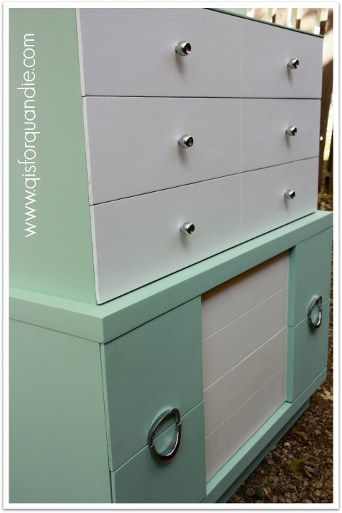
Here are the pieces:

I’m definitely not a mid-century modern expert, but I know enough to sometimes recognize a good thing when I see it. And these were gorgeous.
The other day my friend Sue stopped off at a garage sale near our work. It was one of those “diamond in the rough” sort of sales. A lot of junk, a big dumpster in the driveway, nothing marked or even really set up, just piles of stuff. Luckily Sue is an intrepid garage saler. She goes beyond the surface. She asked if they were selling any furniture, and sure enough they said almost everything inside the house was for sale too. Sue happened to notice that they had a couple of mid-century pieces, so when she got back to work she told me about them.
Actually, to be precise, she left a note on my chair that I promptly sat on without noticing, how embarrassing.
I did finally get the message though, and I popped over to the sale myself. This story is becoming long winded at this point, but let’s just say several phone calls, 2 trips, some help from Mr Q’s strong heavy lifting friend and some sneaking around grandma later and I was the proud owner of these two pieces.
But the best part of the story is still to come. You see, hanging on the wall above the credenza was a large metal pom pom wall sculpture.

Classic 1970’s. On a lark, as part of my negotiations for the furniture, I asked if they would throw that in. Absolutely! They needed to have the entire house cleared out in 3 more days, “take it”, they said!
I’m pretty sure this is where Mr. Q earned sainthood. Picture him kneeling on top of the credenza trying to unscrew this thing from the wall with metal pom poms stabbing him from every angle. But, he did it, without a single complaint.
Turned out it was ridiculously heavy and nearly impossible to grab onto without getting stabbed, but we hauled it home where I promptly tossed it on the lawn and hosed off 35 years worth of dust. This was the point where I thought “what in the world is wrong with me? I am totally going to be stuck with this thing. What was I thinking?”
Actually, I had gone into it thinking I could just use this piece to stage future mid-century pieces, but in reality it was just far too heavy to even consider hanging it in the photo cottage. I was then tempted to put it at the curb with a free sign.
Instead, I googled it. After several attempts at trying to find something similar, I ended up finding Curtis Jere. And from there, I found the exact same piece for sale at 1stdibs online for … wait for it … drum roll please … is the suspense killing you? … $5,900.
Yep. I kid you not.
I did read online that it was imperative that the piece be signed. A true Curtis Jere was always signed. You should have seeing me going over that thing with a fine tooth comb looking for a signature. I thought for sure it would be on the back (although in hindsight, what artist signs his work on the back?), but I could not find a signature anywhere on the back. Finally Mr. Q said, “too bad, it’s just a knock off.”
But I did not give up. I flipped it over, and kept looking. Sure enough, a couple of minutes later, there it was! A signature! Not just a signature, THE signature.

Yep, I have an authentic Curtis Jere mid-century metal pom pom wall sculpture worth $5,900. Are you flippin’ kidding me?
Now what?


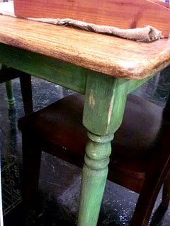
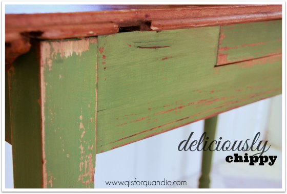
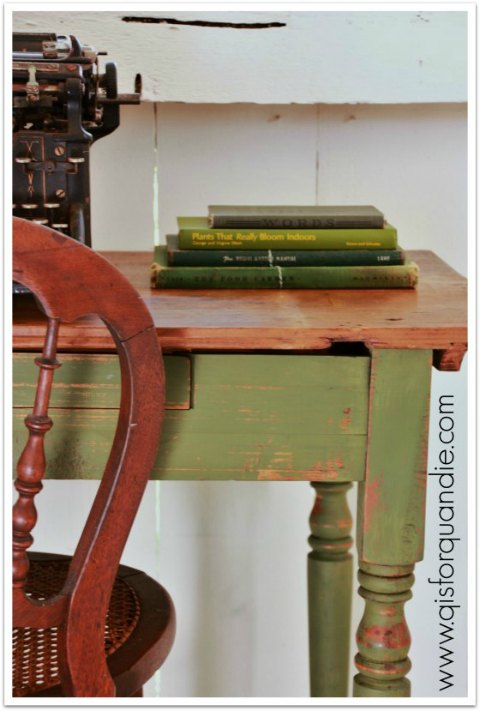
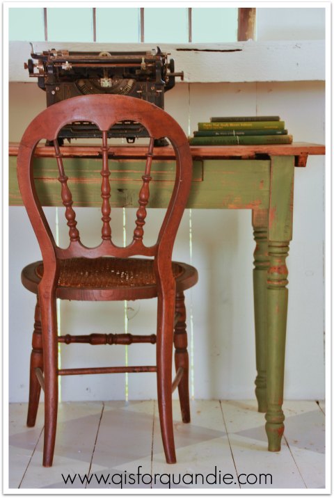
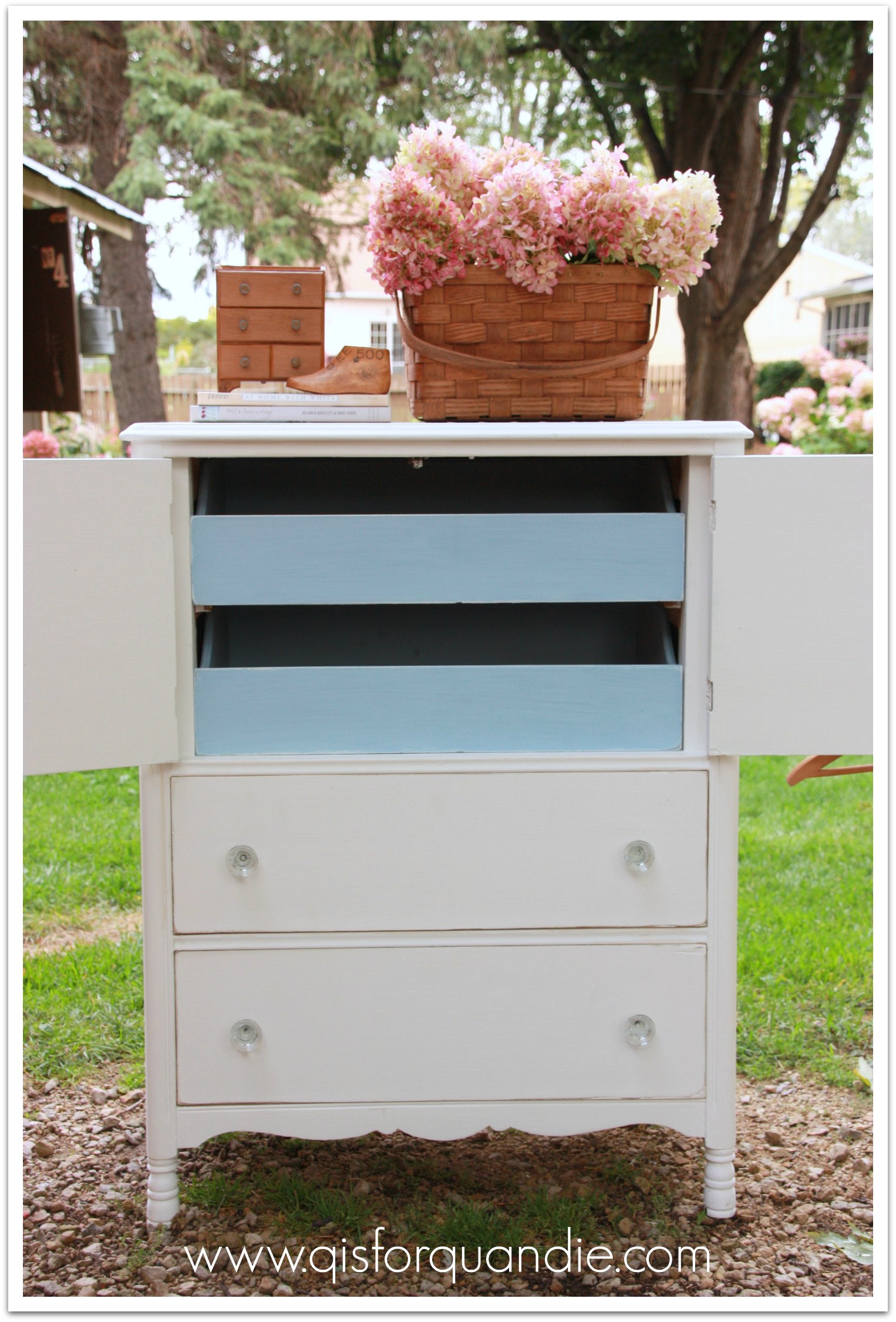
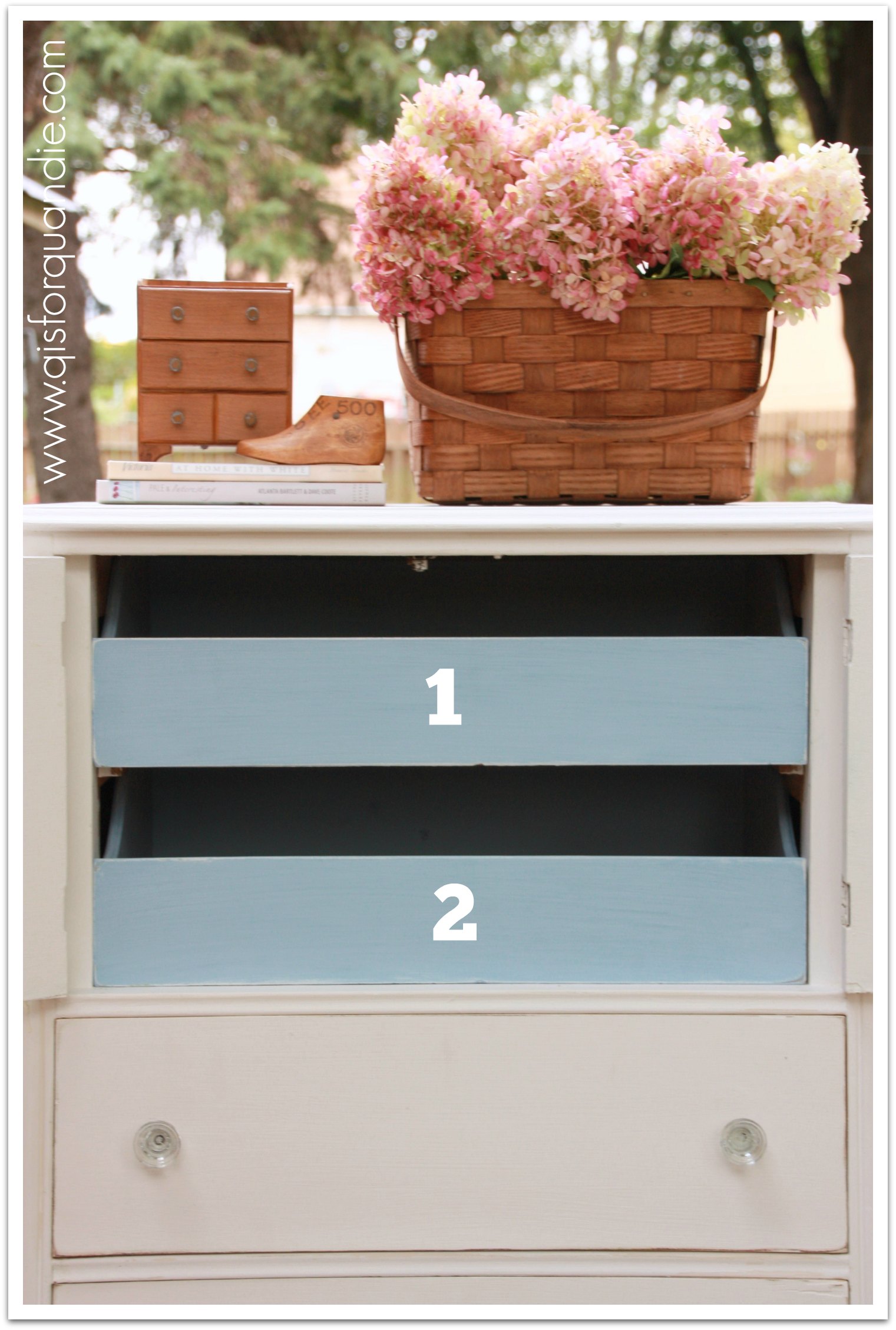
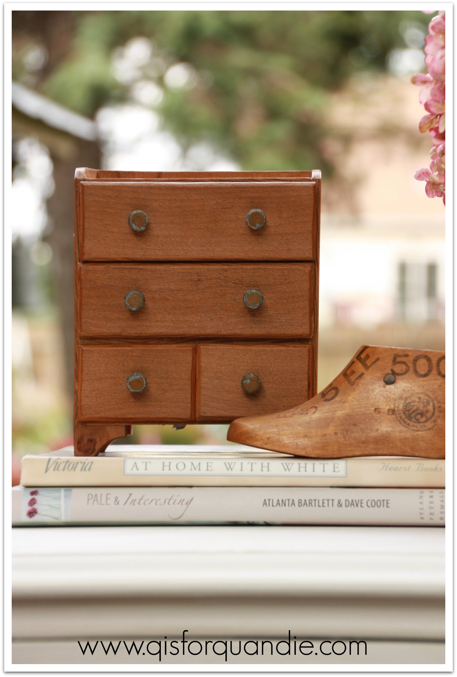
 I bought this at a lunchtime garage sale for a whopping $1. Really, who can pass that up?