two degrees of separation.

two degrees title

You’ve all heard of the concept of six degrees of separation, right?  This is the theory that absolutely everyone is connected by no more than six other people.  This led to the game “Six Degrees of Kevin Bacon”.  Any other Footloose fans out there?

Well anyway, today I am officially two degrees of separation away from one of my earliest decorating idols, Rachel Ashwell!

ashwell

Yep, I’m definitely a fan from way back …

ashwell books 2

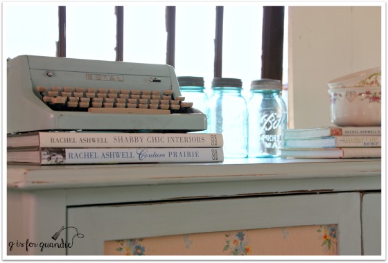
I’ve got all of her books …

ashwell books

And now we are separated by just two short degrees!

A while back I was contacted by Chantelle from Bungalow 47.  They are the distributors for Rachel Ashwell’s new line of chalk and clay paint.

ashwell paint

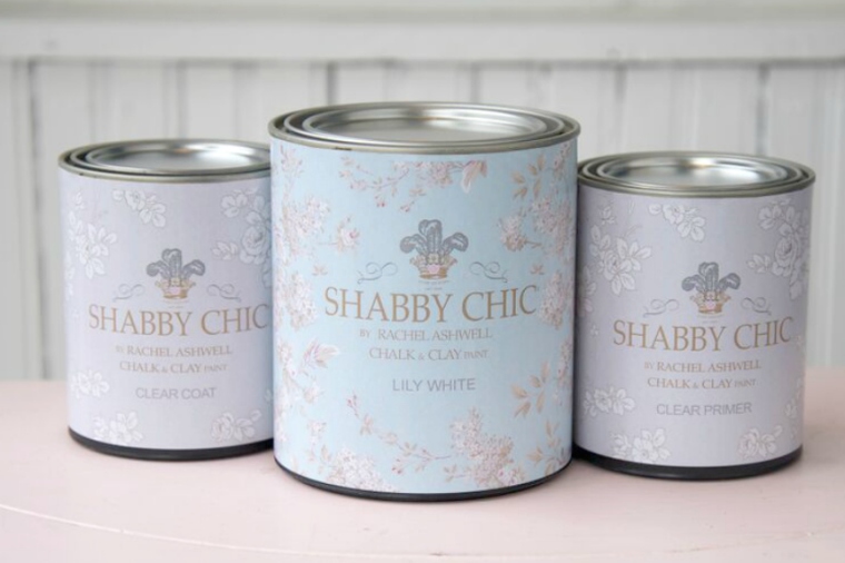
She asked if I would be interested in sampling this new line of paint products.  My answer was “Um, YES!  Where do I sign?”  After all, Rachel’s shabby chic movement was what prompted me to begin painting furniture in the first place!

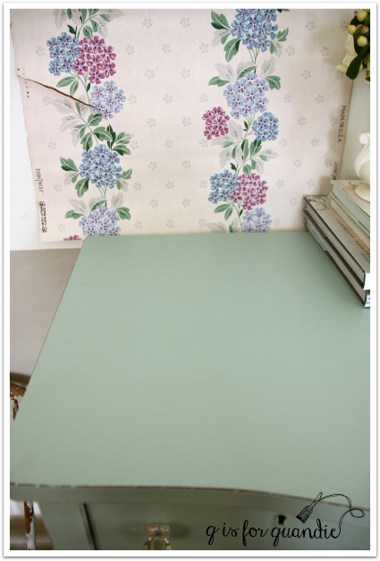
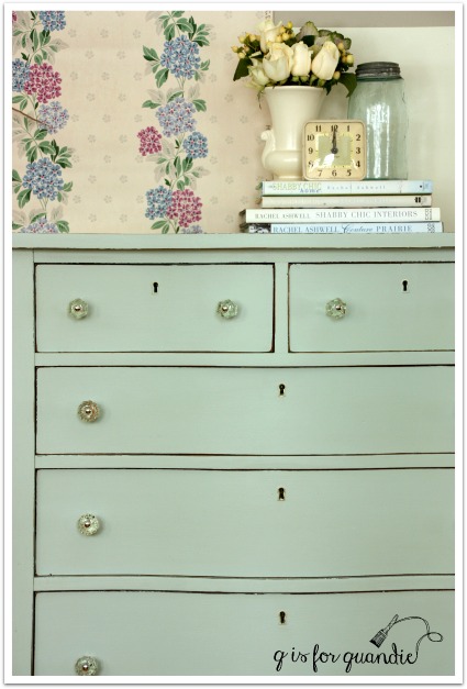
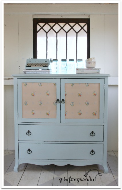
So I picked out a color, Caribbean Sea, and Bungalow 47 sent it off to me along with a can of their Clear Primer and their Clear Coat.

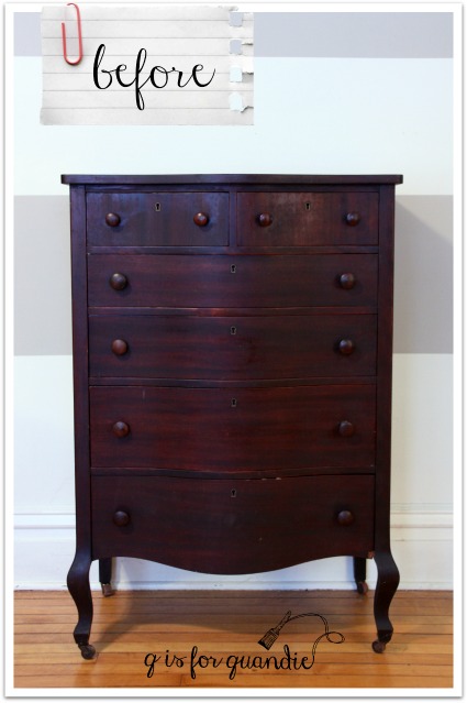
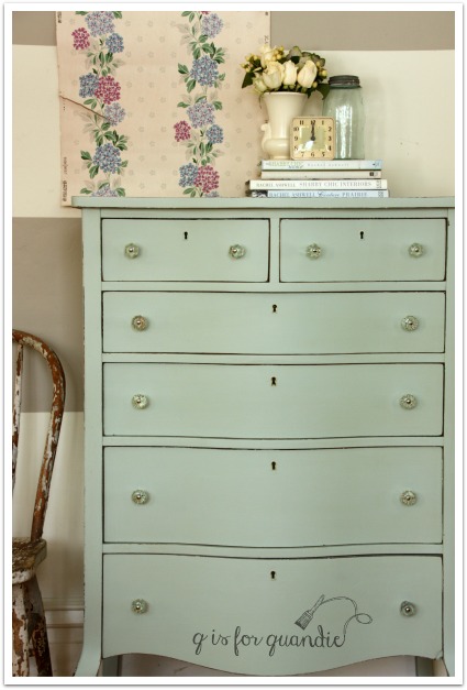
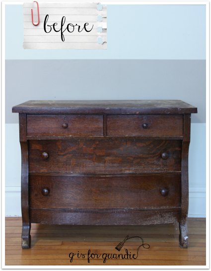
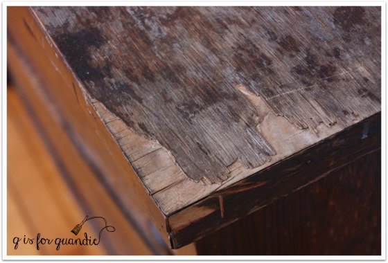
The next step was trickier.  It was finding just the right piece to paint!  I hemmed and hawed, and went round and round with myself.  I had a couple of dressers lined up to paint, including the ‘battle scar dresser’ from last week, but none of them seemed “Rachel” enough.  I also knew that I wanted to add some vintage wallpaper into the mix, so I needed a piece that had a spot for wallpaper.  I debated painting my own armoire, but decided it just wasn’t ‘vintage’ enough.  And then I came across this piece …

ashwell dresser before

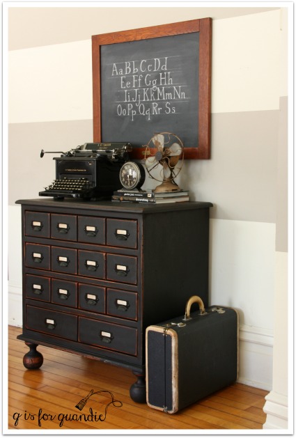
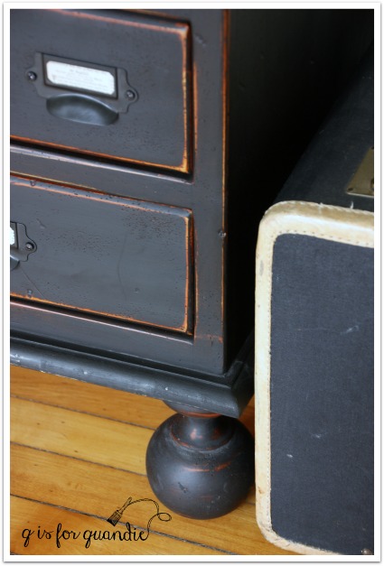
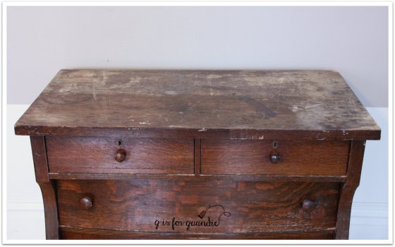
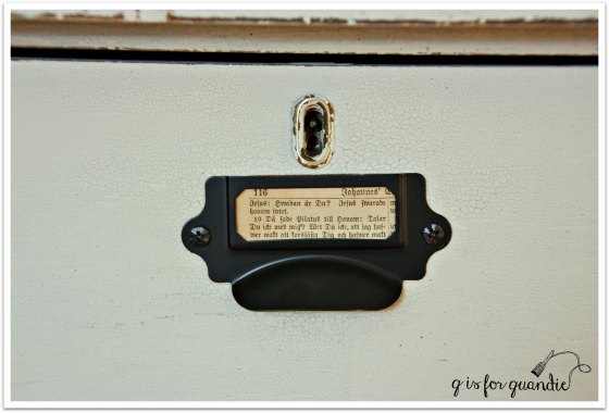
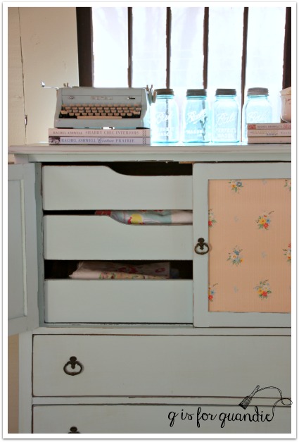
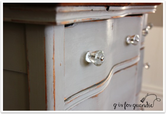
A lovely linen press with two doors in front that would provide the perfect spot for some vintage wallpaper.  It looks as though at some point these doors had embellishments of some kind on them.  You can see a ghost of them, but whatever was there is long gone.

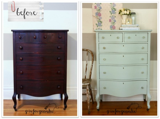
Painting the dresser was a breeze.  I followed my usual m.o. of cleaning my piece with some TSP substitute first.  Then I painted my first coat of paint straight up out of the can.  Once dried, I could see that I needed just a light second coat to get perfect coverage.  Bungalow 47 suggests dipping your brush into the paint first and then into water to get a thinner coat of paint, but I went ahead and actually poured some paint into a small container (another empty Talenti ice cream container if you must know) and thinned it out by mixing water directly with the paint.

After the second thin coat, the coverage was perfect.  Rachel Ashwell Shabby Chic paint is a chalk and clay paint, and much like other chalk paints it dries to a very matte finish.  At this point I had some options about a top coat.  According to the instructions from Bungalow 47, I could have gone without a top coat if this piece didn’t need much protection from wear.  In that case their instructions are to buff the finish with a clean dry towel.

I also could have waxed this piece.  The Rachel Ashwell line doesn’t include a wax yet (they are working on developing one), but you can use another brand of wax with it.  The Miss Mustard Seed wax is my personal favorite.  But I’m all out at the moment.

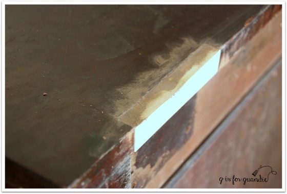
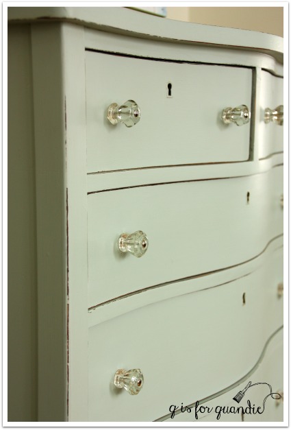
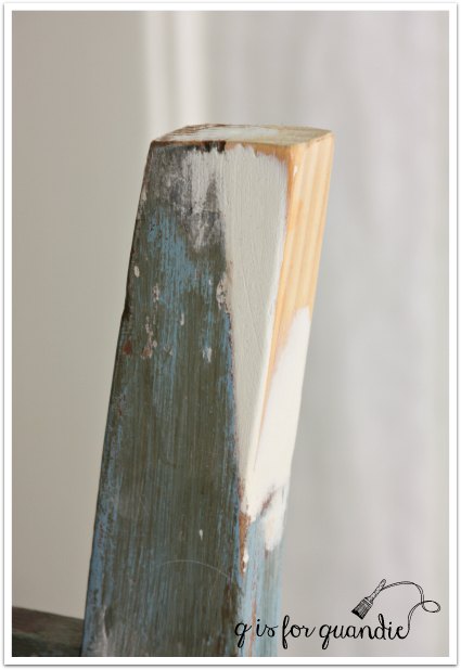
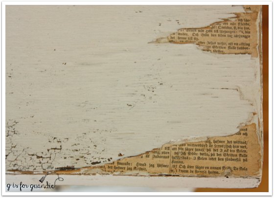
So in the end I decided I should just try the Rachel Ashwell Clear Coat since they had taken the trouble to send it to me.  I don’t normally use a clear coat, so I have very little experience with them.  Chantelle had warned me about the potential for water based clear top coats to draw stain from under paint.  Are you aware of this?  I was not.  I should have listened to her when she explained this the first time, but you know me, I always prefer to learn things the hard way!  So, I went ahead and added two coats of Clear Coat to my dresser.  The next evening I proceeded with adding the wallpaper to the doors (to read more about how to wallpaper furniture, check out this post).  As I was doing that I noticed that there was some discoloration around the edge of one of the doors.  I thought maybe I’d gotten a little messy with the wallpaper paste, but then it wouldn’t wipe off.  A closer inspection revealed that I did indeed have stain bleeding through my paint.

ashwell stain bleed

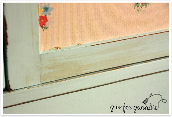
The next day I ran home on my lunch break from the day job so that I could inspect the dresser in the light of day.  Sure enough, I had stain bleed thru in a few other spots too.  Yikes!

Luckily all was not lost at this point.  You can use the Clear Primer to solve this problem.  I painted a coat of the Clear Primer over the areas where I had bleed thru.  In my case, this was just on the sides and the right door of this piece, the top and the drawer fronts were fine.  Once the Clear Primer was dry, I painted another coat of paint, and then finished with another coat of Clear Coat.  Problem solved.

ashwell linen press cornr

So here’s the thing, even though I had to learn about this the hard way, you don’t have to!  You can just pay attention now and not make this mistake yourself.  Here are your options:

Option no. 1 –  Just start out with the Clear Primer.  If you know you are going to use Clear Coat or a similar water based sealer, then seal your piece first.  In addition, if you have a piece that you are pretty sure is going to be a bleeder even without the Clear Coat, one with a very dark stain, or a very red stain, just hedge your bets and start with Clear Primer.  Yes, you can also use shellac or a stain blocking primer for this purpose.  The benefit of the Clear Primer over shellac is that it can be cleaned up with soap and water and it isn’t as stinky.  The benefit of the Clear Primer over a stain blocking primer such as Zinsser or Kilz is that it’s clear.  If you are going to distress your piece, you probably don’t want to see a white primer underneath your paint color.

Option no. 2 – Wax your piece instead of using Clear Coat.  If your piece is painted and there is no bleed thru yet, you will be fine with wax.  The wax will not draw out the stain if it hasn’t already bled through.  The downsides of wax are that it takes some elbow grease to apply and it is not as durable as a clear coat.  If you are working on a dresser or similar piece of furniture that isn’t going to be subject to a lot of wear, wax is awesome.  Personally I prefer wax over other top coat options most of the time.

So, to recap, Clear Primer and Clear Coat together, or wax.  Got it?  I know I do now!

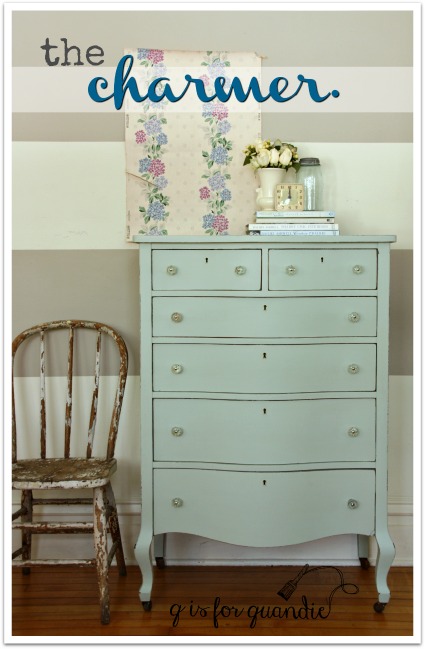
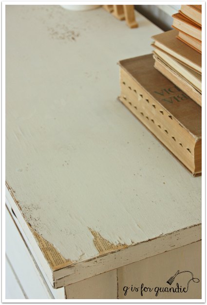
And after all of that, what do you think of the finished dresser?

ashwell linen press

Oh, and hey, did you notice?  Anybody?  I’m back in the photo cottage!  Spring has sprung here in Minnesota, for the moment anyway.  The snow has mostly melted and I can be out in the photo cottage without freezing my buns off.  It’s always a happy day for me when I get to head out there again.

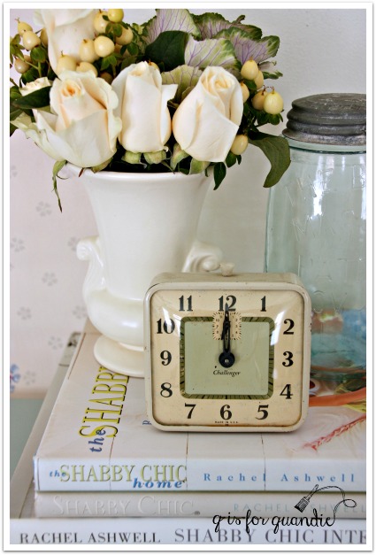
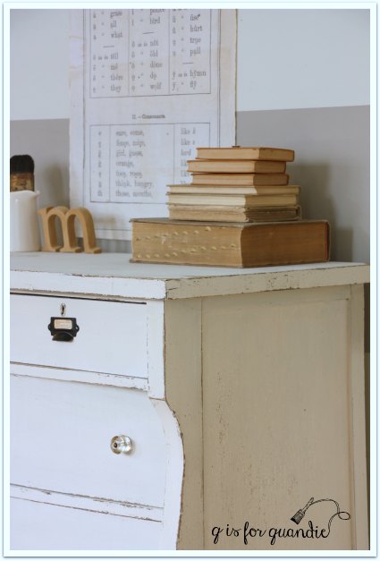
By the way, I call this piece a ‘linen press’ because of the drawers that are behind the doors.

ashwell linen press interior

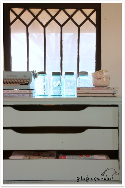
Once upon a time I read somewhere that these drawers were intended for storing linens and these pieces are called linen presses.  I kind of love that name, so I go with it.  I love the idea of storing one’s linens in a piece like this rather than in a closet in the hallway.

ashwell linen press angle

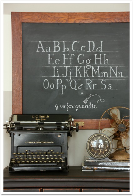
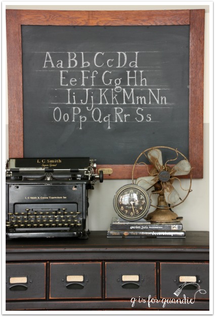
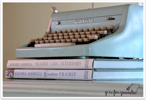
Did you notice that this color is almost exactly the same color as my new favorite vintage typewriter?

ashwell blue

There are 9 other equally lovely colors in the Rachel Ashwell line up.

ashwell wallpaper

If you are interested in learning more about the Rachel Ashwell Shabby Chic paint line, or if you’d like to order it online simply visit Bungalow 47.

If you are local and are interested in purchasing this lovely linen press, leave me a comment and I will email you with the details!

battle scars.

battle scars

Mr. Q and I drove to Apple Valley to pick up this sweet antique serpentine dresser a few weeks ago.  Unfortunately I have once again neglected to take a ‘before’ photo, drat!  But I can tell you that someone had ‘refinished’ this dresser by applying a thick, drippy and very shiny coat of polyurethane to the entire thing.

The ad clearly stated that the dresser had some additional issues (you’ve got to admire honest people!).  Both of the two lower drawers had holes in the bottoms.  They were caused over time by the drawer bottoms rubbing on the metal drawer stops.  I assumed that the drawers were rubbing because the stops weren’t pounded in far enough to clear the drawer bottoms, easy enough to fix.  In hindsight, I should have realized the problem was more significant.  But luckily I have a secret weapon in my back pocket, or should I say next door?  Ken the handyman to the rescue!

Whenever I bring home a dresser that needs repairs I call Ken to come over for a confab.  We start with trying to figure out what is causing the problem.  In this case, the drawer runners were worn down from years of use as were the bottoms of the sides of each drawer.

Those worn down parts meant that each drawer would sort of fall down about ¼” in the back.  So when the drawer was pushed in all the way, the back of the drawer was sitting about ¼” lower than the front.  That’s why it rubbed on the drawer stops.  It also meant that the drawer fronts would be a little angled and not sit in the openings properly.  I hope this description is making some sense to you.

So, not only did the drawer bottoms themselves need to be replaced, but we needed to build up the bottoms of each side of the drawer where they were worn down.  And by “we”, I really mean Ken.  Here is what he came up with.

drawer bottom

He trimmed the sides down so that they were even and level with the back.  He replaced the drawer bottom, and then he build up new “sides” for the drawer to rest on.

drawer bottom 2

Next, he added extensions onto the runners inside the body of the dresser.

drawer runner

Now the drawers remain level, they slide in and out easily and they don’t rub on the stops.  And they have fresh new bottoms!

Ken really did all of the hard work on this one!  Once he was done with the repairs, I stripped the top of the dresser and waxed it with Cece Caldwell’s aging cream.  Let’s talk about that for a minute.  I am sure there are going to be a few of you who think I should have done something about the stains, gouges and unevenness of this dresser top.  Since the top is solid wood and not a veneer, I could have sanded the life out of it to create a smooth and blemish free top.  But I happen to love those battle scars, and when I say “sanded the life out of it” I mean it literally.  I like seeing some history on my pieces.  As long as these flaws don’t compromise the functionality of the piece (like the drawer issues did), I like to keep them.  I know this philosophy isn’t shared by all.  Wouldn’t the world be a boring place if we all liked the same thing?

battle scars top

Once I’d made the decision to strip and wax the top, I decided to go with chalk paint on the body instead of milk paint.  Remember that very shiny coat of poly that I didn’t get a photo of?  Had I gone with milk paint I probably would have gotten some significant chipping.  Yes, I love a good chippy piece.  But I felt like a smoother chalk paint finish would be a nice juxtaposition with the rustic top on this one.  I also could have gone with a more feminine paint color to play up the curvy-ness, but instead I went with a masculine medium grey (this is Annie Sloans’ French Linen).

Before I move on, I should also mention that this dresser did not come with its original hardware.  I’m sure that was long gone.  Instead there were some of these Early American style drawer pulls on it …

early american drawer pulls

I am not a fan of these.  So I removed them and filled the extra holes with wood putty.  I gave this dresser some lovely glass knobs instead.

glass knobs

I staged this piece with the radio I snagged at a garage sale last summer and of course I had to include Annie Sloan’s Room Recipes for Style and Color.  This is an awesome book, if you haven’t already seen it.

battle scars radio

I also used my grandfather’s water color.  I haven’t used this in a photo shoot in quite a while, so there are probably some of you who have never seen it.

grandpa's watercolor

I have two watercolors that my grandfather painted.  They both have a fab mid-century feel, but this one is my favorite.

french linen dresser

 I love the yin and yang of this dresser.  Feminine curves with a masculine color, battle scarred top with a smoother paint finish and pretty glass knobs.  These choices all create a nice balance, don’t you think?

This dresser is currently available for sale.  If you are local and interested, leave me a comment and I will get back to you with the details.

In other news, since it appears that Ken now needs his own fan club, I decided to get going on a virtual t-shirt design.

fan club t-shirt

What do you think so far?

Linking up with Friday’s Furniture Fix!

a squarely modern chair.

squarely mod chair title

I’m beginning to think that Mr. Q has a soft spot when it comes to orphaned furniture.  People offer him something and he just can’t refuse.

Last summer he picked up some furniture for me at a garage sale.  While there, he was offered this chair for free and so it came home with him.

squarely mod before

Ugh!  Is this thing ugly or what?  Just to be clear, this is vinyl you are looking at, not leather.  And that stuff hanging down underneath, I don’t even want to think about how many years of dust mites were accumulating under there.  It was so gross!  At first I thought I’d have to put this one at the curb with a free sign on it, but then I decided maybe it could be salvaged after all.

You may remember that last fall I did a little experiment with painting vinyl.  I painted the vinyl seat on a wheeled doctor’s stool.

stool 1

It has held up remarkably well.  I sit on this stool to paint furniture, so it gets a fair amount of rough wear and so far it still looks just as good as day one.  So last weekend I decided to paint this freebie chair as well.

I cleaned it up really well using TSP substitute first and then I painted the vinyl with Annie Sloan’s chalk paint in Provence.  I taped off the square pattern in the center of the back and added some of Annie Sloan’s Old White.  By the way, I am totally aware that those are not technically ‘squares’ but rather rectangles, but “rectangularly modern” didn’t make nearly as catchy of a blog post title!

squarely mod chair back

Next I painted the legs in Fusion’s Copper (from the Studio Mettallics line).

squarely mod chairOnce all of the paint was dry, I sanded the chalk painted vinyl with a fine (320 grade) sand paper allowing the edges to get lightly distressed.  Then I finished with a top coat of Fusion’s bees wax.

squarely mod chair 2

I also knew I needed to clean up the underside of this chair.  I pulled off the really disgustingly ratty previous fabric that lined the underneath of the chair.  It was hanging half off anyway, so removing it was pretty easy.  Then I dug through my fabric stash and found some remnants of the perfect vintage barkcloth to use on this chair.

squarely mod bottom

Could those colors be any more perfect?  I kind of feel a little bit sad that this fabric is hidden away underneath the chair now.

But since the bottom of the chair kind of bulges out a bit I knew that just a hint of the fabric would show, so I wanted it to be pretty.

I totally faked it with this upholstery job using a staple gun and without any sewing.  The remnant I used had one pre-existing hemmed edge.  I started by placing that edge at the front of the chair and stapling it in place.

squarely mod chair upholstery

I just cut out around the legs and folded the excess fabric under.

squarely mod upholster around leg

By the way, the above photo shows what gives barkcloth it’s name, there is a sort of nubby, tree bark-like texture to the fabric.

The piece of fabric I had wasn’t quite large enough to do the whole chair, so I totally rigged up a fix by adding a different piece to the back of the chair and tucking it under.  I just left the raw edge as is, but I may still add a little bit of stick-on velcro there to make sure it doesn’t get saggy.  For the raw edges at the sides of the chair, I just rolled the fabric under as I stapled creating an edge that won’t fray.  So yeah, like I said, I totally faked it!

I staged the chair with some mid-century modern glassware that I snagged at the thrift store a while back.  I loved the copper metallic on gray geometric design on these glasses.  I wonder if these were originally black and faded to gray, or if they started out gray?  Either way, I love the gray now.

squarely mod glass

So, there you have it.  A little trash to treasure revamp using mainly paint and a bit of fabric.

squarely modern chair collage

On another note, I fell asleep long before midnight last night so haven’t had a chance to draw names for the hat box kits yet (check back on Wednesday for that).  However, there were six who wanted to join in the party so my plan is to just squeeze everyone in.  The more the merrier I hope.  I’ll just bring in an extra table and we’ll all get friendly.  If you left a comment indicating that you’d like to join, I’ll be sending out an email with the particulars!  So stay tuned.

Here is another bit of a sidebar for you as well.  My friend Kathy (this would be the same Kathy that came over to paint toolboxes) has now been bitten by the painting bug.  Recently she painted a wooden plant stand and she had to share it with me.  She was channeling her inner-Quandie, so she sent me ‘before’ and ‘after’ pics.

kathys plant stand

Kathy is a bit of a crack up though.  She wanted to stage her ‘after’ photo like I would, hence the vintage books, but she added a little bit of her own personality too. She added Mr. Lincoln in honor of President’s Day, so I’m sharing him with you too.  Enjoy!

lincoln bobblehead

One last bit of housekeeping news.  You may have noticed that I added a new page to my blog called “available for local sale.”  I thought it would be easier to have one place to send people to if they are looking for a piece of furniture to purchase.  I will keep that page updated (at least I’ll try my best) and it will list any pieces that are currently available as well as their price (including today’s squarely modern chair).  However, please always feel free to email me at qisforquandie@gmail.com if you are interested in purchasing any pieces you see on my blog.  I don’t ship, but if you are a local buyer I’d love to hear from you.  I will continue to maintain my ‘fab furniture’ page just as a spot to track all of the pieces I’ve done over time.

OK, that’s all the news for today.  Let me know what you think of the squarely modern chair, and those of you in the U.S., Happy President’s Day!

Sharing at the Making Broken Beautiful party at the Curator’s Collection.

jardin de fleurs desk.

jardin de fleurs desk

Mr. Q crossed state lines (to Wisconsin) a week or two ago to pick up this desk for me.

desk before

I thought the vertical trim on the corners was lovely.  I knew that a little paint would really bring out those details.

First step was having Ken work on the structural integrity.  He glued up some joints and replaced all of the screws holding the top on.  He also had to re-glue a couple of the drawers.  Once that was done, I stripped the top.  You can see in this next photo that there was a shadow on the top of this desk.  I suspect that there was a desk pad in place for a long time and as a result the desk top faded all around it, but not under it.

desk top before

After stripping, I sanded this some by hand.  Since it’s veneer, I didn’t want to sand too heavily and sand right through it.  If I had been able to completely eliminate that shadow, I would have then just waxed the top.  However, although it was diminished somewhat, I could still see it.  So I decided to stain the top to help even out the color.  I added two coats of Varathane gel stain in Dark Walnut.  Since I am far from being an expert wood stainer, I really like working with a gel stain.  They are super easy to apply, I just wear gloves to avoid staining my hands too, and then use an old t-shirt to rub the stain on.  I find that I can work the stain without it getting streaky or uneven.  I waited 24 hours and then added a couple of coats of  Minwax Wipe on Poly in clear satin using that same technique.  I don’t usually use a poly, but I do like it for desk tops that might get a fair amount of wear.

desk top

Unfortunately that shadow is still there.  Perhaps I should have tried bleaching that area a little.  Or, I cold have gone with a really dark stain like Java gel.  But although the shadow is obvious when the desk top is empty, once there are a few things on top it’s not so glaring.

black desk top filled

Another problem this desk suffered from was ‘ring around the drawer pull’.

ring around the drawer pull

See that groove worn into the wood around the drawer pull?  That is from the pull being too loose and spinning around, thus wearing that groove into the wood.  So sad.  Usually when you see this problem it’s because the escutcheon pin is missing from the drawer pull.  On many old pieces of furniture with this type of pull, there is a tiny little nail that holds the back plate stationary so that it won’t spin.  Those are often long gone on older pieces.  However, in this case there were never any pins.  The handles had just been allowed to work loose over time and no one took the time to tighten them up.

I added a little wood filler to all of those circular grooves and then sanded them smooth so that when I painted the dresser they wouldn’t be quite as obvious.  You can still see them if you look closely, but they are far less obvious …

black desk and typewriter

I sanded all of the flat surfaces lightly before painting, but I didn’t sand the detailed corners at all.  I was hoping for some chipping!  As it turns out I was hoping in vain; I didn’t get any chipping at all.  I even tried my masking tape trick (using tape to pull the paint off creating more chipping) and nada.  This is Miss Mustard Seed’s Typewriter milk paint by the way, and it’s finished with hemp oil.

black desk corner

I also painted the back of this desk.

black desk back
The desk is trimmed out all the way around so that the back is presentable and could face out, so I went ahead and painted it too.  The middle piece of that back was positively calling out for a stencil, so I couldn’t resist using my new “Jardin de Fleurs” stencil there.black desk stencil close up

I used Martha Stewart acrylic craft paint in Grey Wolf.  I’ve mentioned this before, but when I stencil on black I don’t like to use white paint because the contrast is too heavy.  The Grey Wolf is actually a medium grey, but on the black it reads as ‘white’ without being too harsh.

black desk back close up

One final fix that I thought I would share with you is replacing the doodads that keep the drawers from pushing in too far.  You  know, these things …

doodad 
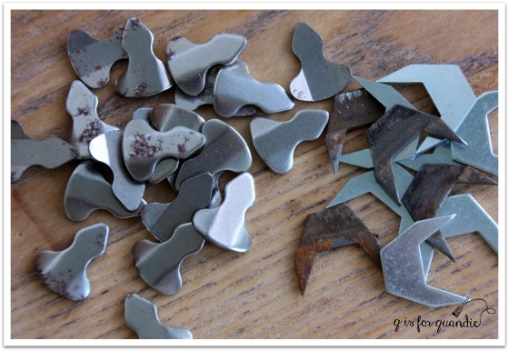
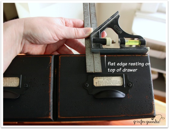
I think I’ve established that I often don’t know the proper names of tools and other hardware.  I get a lot of funny looks at my local Menards store when I ask the employees if they have those ‘metal thingamajigs that keep the drawers from getting pushed in too far’ or ‘that tool with the slide-y thing on the ruler’.  I was never able to find these at any of my local hardware stores, but I did ultimately find them online at VanDyke’s Restorers.  And by the way, they are called ‘drawer stops’ (duh) and there are two different styles that I see fairly regularly in vintage furniture.

do dads

This desk has the type that are on the right.  You are better off replacing like with like because the grooves they go in are different sizes.

And here’s what it looks like when one is missing.

doodad space

It’s quite simple to just pound another one into that groove.

I had a lot of the props from my photos of the faux card catalogue handy including my chalk board, so I used them again.

black desk angle

Don’t you love that sweet little chair?  Some of you might recognize it from previous posts (here, here or here).

desk chair

It works perfectly with this desk, but unfortunately the cane seat is in very bad shape.  It would be cute with a little skirted seat cover, but I am sadly lacking in sewing skills!  I just keep the chair around to use as a prop with desks.

The jardin de fleurs desk is available for local sale.  If interested leave a comment and I’ll get back to you with the particulars.

Linking up with Making Broken Beautiful at The Curator’s Collection and Friday’s Furniture Fix at Patina Paradise.


a faux card catalogue.

chalkboard 2

On what proved to be the coldest day of the winter so far (windchills of more than 30 degrees below zero), my friend Meggan and I decided to do some thrifting.  I believe we officially qualify for ‘die hard’ status now, don’t you?  But our local thrift store was having a 50% off preview day for members only (we are members), so we had to check it out.  This piece proved to be the ‘find of the day’.

apothecary before

Can you see the giant flaw?  Lower right corner? A huge chunk of trim was ripped off.

But the price on this was really right at a mere $15.  And I could just picture using the same label cup pulls that I used on the book page dresser on it.  Most of all, I knew that my handyman neighbor Ken was up for the challenge of repairing that trim.

Sure enough, I sent it home with Ken and a few days later he sent it back over with this patch job …

apothecary fix

Super impressive, right?  Honestly, this kind of repair just boggles my mind.  I don’t know how he does it, and I can’t even begin to explain it.  Let’s just reiterate how very lucky I am to have Ken living next door and leave it at that.

Once that repair was done, next I removed all of the knobs and filled the holes with wood filler.  The fill didn’t have to be perfect because the holes are behind the new label holder cup pulls.  With a ‘label’ in place, you can’t even see them, but if you take the book page paper labels out you can.  So I filled them.  I then sanded the whole piece.  The existing finish was a little shiny and I wasn’t sure how milk paint would react with it, so when in doubt I tend to sand.

Next came a simple paint job using two coats of Miss Mustard Seed’s Typewriter.  I sanded to distress and added a top coat of hemp oil.

faux card catalog angle

Here is how that front repaired section looks after the paint job.

faux catalog front corner

If you didn’t know it was there, I don’t think you would really notice it.  But it does stand out a little in so far as it isn’t as distressed as the rest of the piece.  Had I been really meticulous I should have stained the new wood first, then painted over it.

Once the paint job was finished it was time to attach the new label holder cup pulls.

Ken taught me a little trick to making sure they all lined up properly using a combination square.  Do you have one of these?  I bought mine at a garage sale for a couple of bucks, of course.  It looks like this …

combo square

Basically you loosen up the tightening thingie which allows the slide-y part to move along the ruler part (I’m so technical!).  In my case, I then decided exactly how far down from the top of the drawer I wanted to place the pulls.  Once you have that measurement, you tighten it back up.  Now it’s easy to measure for the placement of each pull …

combo square demo

Just rest the flat edge of the slide-y part along the top of your drawer, then butt your label pull up to the bottom of the ruler part.  You can slide the square along making sure that the pull is straight all the way across.  Does that make sense?  I then used a pencil to mark the holes for the screws, pre-drilled small holes, and then screwed the pulls on.

This worked great for the top to bottom placement, as for the side to side placement, I just eye-balled it.  That could probably have backfired for me, but I did it carefully and was able to keep each pull centered on it’s faux drawer.  I think I did a pretty good job keeping them all lined up.  When I mentioned this to Ken, he asked me if my arm hurt.  I thought he meant from having to attach so many pulls, which wasn’t really that hard, so I said “no, not really” and he said, “oh, I thought it might hurt from all that patting yourself on the back!”  Ha!  Yes, it’s true, I was overly proud of myself for getting these all on straight.

faux catalog pulls

I used more Swedish bible book pages to fill the slots for labels.

faux catalog label pulls

Are you wondering what makes this a ‘faux’ card catalogue?  It’s because those aren’t really small drawers.  Each set of 4 across is really just one drawer.

faux catalog drawer

So much more functional than lots of small drawers!  Although I did once see a real card catalogue turned into a wine cabinet.  Each drawer held one bottle of wine.  That was pretty cool.  But this piece is really just a small dresser.  I think it’s the perfect size to use as a bedside table.  It would also work great in a foyer or as a TV stand.  I also like the idea of using it in your home office with your printer on top and various office supplies inside.  There are so many possibilities for a small chest of this size.

How do you like my chalkboard?  This was a fun little project of its own!  The frame actually belonged to a mirror that came attached to the book page dresser.  I took it off the dresser.  The size wasn’t the right scale for it.  Plus it was poorly attached.  I had to wonder if it was even original to the dresser.  So, it never went back on.  Later I removed the mirror from the frame and replaced it with some hardboard painted with chalkboard paint.  Then I added a little brass number plate to the frame (at the bottom).  Next I got out the Complete Book of Chalk Lettering that my sister gave me for my birthday and did some more practicing.  I love how it turned out!

chalkboard 1

My chalkboard skills are slowly improving.

chalkboard angle

These make a great pair, don’t you think?

faux card catalogue

Both the chalkboard and the little chest of drawers are available for sale (chest of drawers is SOLD).  If interested, leave a comment and I’ll email you with details.

DIYFM-featured1-250x250

sit.

I painted this little chair last summer and then took it to Eye Candy ReFind.

sit before

Since it didn’t seem to be selling, I decided to bring it home and add a little more pizzazz to it.

But first, I managed to dig up the original ‘before’ photo from May of 2014.

Linden Hills 8

Yep, this chair and its companion were pretty ratty looking when I first brought them home.

Initially I painted this chair with an undercoat of Miss Mustard Seed’s Flow Blue and MMS Linen over that.  The second chair was painted in MMS Luckett’s Green, but that one is long gone.

I decided to jazz up the white chair with some grain sack stripes on the seat, and a stenciled ‘sit’ on the back.  I have to give credit for the ‘sit’ idea to my friend Sue.  She brought the most darling little chair to one of our occasional sales that was painted with ‘sit.’  I am totally copying her.

I used my Cricut machine to cut a vinyl stencil for the ‘sit’.  My sister gave me some of the stencil vinyl for Christmas.  It worked perfectly for this project.

sit chair stencil

sit chair 1

I just used tape for the grain sack stripes.  I sanded them down a bit to make them look good and worn.

sit seat

I think the chair has a little more pizzazz now.

sit chair 2

Don’t you?

sit 2

the charmer.

charmer title

Remember I told you that I sent Mr. Q after two dressers recently?  The first was the ‘how chippy is too chippy’ dresser from last week, and this is the second.

charmer before

Before getting started on the paint job, there was a small fix on this one that Ken helped me out with.  This dresser must have originally had a mirror.  It would have been mounted onto the back and the mounting would have fit into two notches cut into the top of the dresser at the back.  I did a crappy job taking photos of the fix, so you’ll have to excuse the poor picture.

charmer repair

The lighter piece is an insert that Ken cut to fit the notch.  He used glue to hold it in place, along with a few nails driven in from the back.  I then patched the edges with another new wood filler I’m trying, Elmer’s ProBond in Walnut.

These are the kinds of flaws that make pieces good candidates for painting.  If one wanted to strip and stain this piece, you’d have those two big notches at the back of the top.  Do you try to match the wood?  Do you leave the notches?  Either way you’d probably end up with a so-so end result.  But with paint, the repair is barely even noticeable.  In fact, you might roll your eyes in disbelief, but I totally forgot about this repair by the time I had this painted.  It wasn’t until I started editing the photos for this post that I remembered, ‘oh yeah, Ken fixed this one.’

charmer fixed top

See, you can’t even tell there is a patch back there can you?

As you can see in the ‘before’ photo, the existing stain on this dresser was dark, dark, dark and had a slightly reddish tinge.  I was fully prepared for it to be one of the dreaded ‘bleeders’.  You know, where the stain bleeds through the paint?  I was pleasantly surprised to find that it was not.  My course of action when I have a piece that might bleed is to paint the first coat and then watch for bleeding.  If I see stain coming through the first coat of paint, then I seal it before moving on to coat number two.  In this case, my plan payed off.  No bleeding after the first coat meant I didn’t have to seal this one, thus saving myself the cost of sealer and the time spent to apply it.

If you’ve been following me for a while, you might know that my usual philosophy is to not fight against the existing color of pieces.  In other words, with a finish this dark to begin with I would usually paint it in a dark color.  Originally I was leaning towards Miss Mustard Seed’s Typewriter (black).  Or possibly the Little Billy Goat Prizewinner (dark blue).  But in the end, this dresser was crying out for light (or maybe that was just me projecting my own feelings onto an inanimate object on a dreary winter day).

After reviewing my paint inventory, I pulled out Fusion’s Inglenook.  Good grief I love this color!  It’s just so pretty.

charmer 2

In addition to being pretty, I am once again impressed with Fusion’s coverage.  It did take two coats to cover this piece, but look again at how dark it started out!  Going this light in two coats is pretty impressive.

charmer angled view

And of course, the second real benefit of the Fusion, I didn’t have to use a top coat!  I sanded the edges for a distressed look and I was done.  I accomplished this makeover (not including Kens’ repair) in two evenings after work.  The first evening I removed hardware, lightly sanded, wiped it down with TSP substitute and painted the first coat.  The second evening I painted a 2nd coat of paint before dinner, watched an episode of The Blacklist (James Spader, who remembers when he had hair?) while it dried, sanded the edges and replaced the hardware.  Bam!  Done!

the charmer title

Isn’t this dresser just a little charmer?  I love that curved bottom on the lowest drawer, and the curve of the front two legs.  This piece is just full of subtle curves.  I purposely left the paint job simple so that the design of the dresser could speak for itself.

You’ll notice that I replaced the hardware with glass knobs.  The wood knobs were still in good shape.  I could have opted to just paint them and put them back on.  In fact, I most likely would have done that had I chosen a dark color for this one.  But this color was calling out for pretty glass knobs.  Right?

charmer glass knobs

Like adding sparkly jewelry to a pretty outfit.

This vintage alarm clock was the perfect color to use for staging.

charmer staging

It’s still set to midnight from New Year’s Eve!

charmer collage

So what do you think?  It’s hard not to be charmed by this pretty little dresser isn’t it?

Linked up with:  the FAB Friday link party.

how chippy is too chippy?

Thanks so much to everyone who took the time to leave a comment regarding the question of drawer pulls last week.  Pressed brass drawer pulls, should they stay or should they go now?  If they go there will be trouble, if they stay it will be double … is anyone else singing along?  For those of you not old enough, that song is by The Clash and was written in 1981.  I’m pretty sure it wasn’t about drawer pulls though.

Well, to clear up any mystery, here are the actual drawer pulls in question.

chippy title

And I’m guessing that some of you might be tempted to think that was a ‘before’ picture, but no, it’s not.  Thus leading to today’s question.  How chippy is too chippy?

Let’s start at the beginning though, shall we?

chippy before

A week or two ago I found three dressers in one day on craigslist.  Two were even right here in my own hometown, which was pretty awesome.  It was also Mr. Q’s day off, so he was free to run around picking them up.  In the end, we only purchased two of them.  The third was a little overpriced and the seller wasn’t budging on the asking price, so Mr. Q passed on it.  This dresser is the first one he purchased that day.

As you can see, it had that ugly orange-y/reddish stain.  I am not a fan.  Job no. 1 was to strip the top and then wax it.  Easy enough.

chippy top

Turned out beautifully.

Next step was to paint the body in Miss Mustard Seed milk paint.  Those of you who follow Miss Mustard Seed have probably been reading about the new color she has coming out, Farmhouse White.  I was so wishing I had that color for this dresser!  But no, I am just impatiently waiting for it like most everyone else.  Meanwhile, since I’d had such good luck with the Marzipan and leaving it unwaxed (on the book page dresser), I chose to go with that color again.  I was aiming for a chippy, vintage farmhouse look, so I opted not to pre-sand.  I did wipe the dresser down with some TSP substitute though.

I have to say, even after having painted, let’s see, maybe close to 100 pieces of furniture in milk paint, I still often can’t predict the end result.  I suspected I would get some chipping.  I wanted plenty of chipping.  What I got was A LOT of chipping.

chippy dresser 1

Personally, my heart still skips a little beat whenever I see an awesomely chippy piece of furniture.  One of my own favorite pieces is this chippy cupboard that resides out in my photo cottage.

studio cabinet inside lower

Recently I saw a very similar cupboard (much taller, but the doors were missing) for sale at my local Bachman’s and the price tag said $1,000 (Maplewood location in case any of you locals want to rush out and buy it).  No lie.

So when I saw how chippy this dresser turned out, I thought it was pretty fab.  My sister wasn’t so sure.

chippy corner

I could have opted to sand this all down to the wood and start over.  I have done that before and in general once you do the sanding necessary to take all of the paint off, the next coats of paint tend to adhere pretty well (not always, but generally).

But I was kind of loving the chippy.

chippy angle

When my friend Meggan dropped by to pick me up for some thrifting, she voted a resounding yes on the chippy as well!  So how about you?  Chippy yes or chippy no?

Lots of ironstone seemed like the right choice for staging this dresser.

chippy staging 3

chippy staging 1

Along with some old books and wooden utensils.

chippy staging 2

As for the drawer pulls, there were a couple of comments left on my last post about them that really made sense to me.  Kim made a comment about creating the look I want with the dresser and then deciding on the hardware.  And Nikkii’s comment about choosing a style really clicked with me.  I realized that this dresser was going to be vintage farmhouse all the way!

chippy drawer pulls

I think the existing pressed brass drawer pulls totally work with the chippy, vintage farmhouse vibe of this dresser.  I hope you agree!

chippy farmhouse dresser

This dresser is available for sale by the way.  If you are local and interested, feel free to leave a comment and I will be happy to email you with the details.

feeling blue?

Feeling blue?  I know I am.  Color-wise anyway!

feeling blue title

Who remembers these little chairs that I picked up at a lunch time garage sale last summer?

lunchtime finds

I’ll admit I wasn’t too keen on purchasing them, but my co-workers Sue & Cathy were with me and they talked me into them.

They were in pretty rough shape.  I painted the one that didn’t need any repairs right away in Miss Mustard Seed’s Artissimo, maybe you remember it?

blue chair on the wall 2

Then I hit a bit of a wall because the other two chairs were pretty wobbly.  One of my good customers has expressed an interest in having these and she has a passle of darling little children.  I didn’t want the chairs to fall apart underneath them!  I knew I had to shore them up, but I kept putting it off.  Then the other day I pulled them out thinking they would make the perfect winter project.  Easy enough to work on in the house.  As it turned out, they needed more repairs than I realized.  One was even missing a crossbar at the bottom.  These kind of repairs are ‘Ken territory’.  So I called him up and asked if he had time to work on them.

Here’s what I love about Ken.  I sent these home with him and he didn’t just do a band-aid kind of repair job.  Oh no.  He completely took them apart and then glued them back together bit by bit.  He also replaced the missing cross bar …

feeling blue repairs 1

And he repaired a leg that had a chunk broken off at the bottom.

feeling blue repairs 2

I really hadn’t even noticed this problem, but Ken saw it and fixed it because when he does a job he does it right.  Do you think that is beginning to be a lost art?

Thank to Ken, the chairs are now structurally sound.  All I had to do was add the ‘pretty’.

feeling blue 1

My plan from the start was to paint each one in a different shade of blue from Miss Mustard Seed’s milk paint line.  In addition to the Artissimo, I also painted one in Flow Blue

feeling blue flow blue

and one in French Enamel

feeling blue french enamel

 I knew that I was going to see bits of the original blue of these chairs peeking through my new paint, so I thought varying shades of blue would work well.

feeling blue flow blue seat

feeling blue phone

Seeing these chairs all together gives you a good idea of the differences between these Miss Mustard blues.

from left:  French Enamel, Artissimo, Flow Blue

So Nikkii, if you’re reading, the chairs are ready!  And if Nikkii has changed her mind, I’ll let the rest of you know if these are then available.  But I’m betting she’s going to want them because they are just so darn cute.

feeling blue truck

the book page dresser.

I sent Mr. Q off to pick up another dresser from craigslist a while back.  Sometimes Mr. Q isn’t quite as particular about condition as I am.  He gets all chatty with the seller and he doesn’t really scrutinize the furniture.  He also has a tendency to overestimate my abilities to save a piece of furniture … or maybe he doesn’t.  Here is the dresser in question.  It doesn’t look too bad in this photo unless you’re really looking closely.

book page before full

Here’s a photo of the top …

book page top before

Now you’re starting to get the picture.  Check out this close up though …

book page veneer damage close up

Yikes, right?!

Originally I had been hoping to strip and stain the top and paint the body, but obviously that wasn’t going to work.  My next plan was to patch the veneer using wood filler and then paint, but then I remembered a really cool idea I saw on pinterest of using old book pages to fill in missing veneer.  This piece was perfect for that!

I sanded the piece lightly, wiped it down and then painted it with three coats of Miss Mustard Seed’s Marzipan.  Covering a dark stain with a white tends to require at least three coats.

book page from side

Once it was dry I mixed a little water with some Elmer’s glue (homemade Mod Podge) and I used a small brush to paint the glue in all of the spots of chipped veneer.  Then I pressed my book pages onto those spots and painted another layer of the glue mixture over the top.  I used my finger to really press the paper into the areas where the veneer was gone.  I didn’t worry about trimming the paper yet.  Once the glue was dry, I used a very light touch to sand around the edges of the area which removed the paper just where I wanted it to.  Lastly I used a small brush to add some Miss Mustard Seed Tough Coat Sealer over the paper for durability.

book page close up

I found it a little hard to capture the look of this in photos, but it really is a cool effect.

book page from top

Once the book pages were in place I sanded the rest of the dresser and then vacuumed off the dust.

I got some awesome chipping/distressing on this piece, which I was hoping for.  Rather than fight the ‘beat up’ nature of this piece, I wanted to play it up.

book page top 2

For those of you who follow Miss Mustard Seed herself, you may have noticed that lately she has been forgoing a top coat on a lot of her pieces.  If you’ve ever painted with MMS milk paint, you know that the top coat deepens the color.  With wax added the color darkens it a bit, with the hemp oil it darkens even more.  So I know exactly where Marian is coming from when you have a piece all painted up and you love the color just as it is.  You don’t want to change it.

book page corner 2

Well, I was kind of loving the Marzipan as is.  I added a little bit of wax to a corner on the side and saw that it really brought out more of an almond color and I didn’t love that.  I debated.  Not adding a top coat means this piece is not water proof or washable.  But since the book pages aren’t really ‘washable’ either, I felt like I could get away without a top coat on this piece.  Also, since this dresser is very distressed anyway, adding a little more distressing over time isn’t going to take away from the look of the piece.  So in the end I just wiped the dresser down with a damp paper towel and didn’t add any sort of top coat.

You might have noticed that this dresser came with wood knobs.  I could have just painted them and put them back on, but I came up with another idea that played off my book page theme.  I purchased these label holder cup pulls from D. Lawless Hardware.  They are dirt cheap at 60 cents each.  Yep, you read that right, 60 cents (the screws have to be purchased separately).

book page pulls

They aren’t super functional.  I wouldn’t use them on a bigger/heavier drawer, but for the two smaller top drawers on this dresser they will be sufficient.  And don’t they look fab with the same vintage book pages inserted?

book page pulls 2

So, there you have it.  From uber shabby to rather chic.

book page dresser title

I think this piece would work really nicely as a sideboard in a smaller dining room, or as a perch for your widescreen TV.  It would also be perfect in a larger foyer for storing hats, scarves and gloves.  Or of course, you could always use it in a bedroom.  And it just so happens that this dresser is available!  Feel free to leave a comment if you are interested!

book page dresser collage

Sharing at the Making Broken Beautiful party.