the people have spoken.

Thank you all so much for the great response to my camera obsession post!  I’ve given people until Friday to get a comment in to be eligible for the giveaway, so I’ll be announcing the winner next Monday.

In the meantime, remember the little folding chair that I recovered a while back?

blue chair seat close up

When I posted about that chair {here} I mentioned that I had two more green chairs, and  I asked for your opinion.  Vintage fabric seat, or chalkboard?  I have to admit I was a little surprised that so many who weighed in preferred the vintage fabric seat over a chalkboard.

I really thought it would go the other way.

But the people have spoken!

Let’s start with the ‘before’, just like the aqua chair only in a spring green.

green chairs before

I’d been watching for some sweet vintage fabric to use on these, so when I found these pillow cases at the Linden Hills garage sales for $3 per set, I snatched them up.

vintage pillowcases

I thought that pair on the top would be perfect for these chairs, and I just couldn’t pass up that pair on the bottom.

vintage daisy pillowcases

I’d guess these are from the 60’s or 70’s, wouldn’t you?  I love the colors and the daisies.  I may just hang on to this pair for my own bed.

pillows

Yep, I’m gonna keep them.

Anyway, I was all set to cover the seats with that other pair, but I also had this set of ‘his & hers’ pillowcases from Linden Hills.

linden hills 6

Since they happened to be in the same pile as the others, I couldn’t help but notice that the green of the cross stitch was very close to the green on my chairs.  But I also thought it might be silly to have ‘his & hers’ folding chairs.  Who’s going to want ‘his & hers’ chairs?

Still, I just couldn’t help folding them up and placing them on the chairs, just to see how they would look.

his & hers test

Well dang, they looked so cute!

But did I really want to cut up these vintage pillowcases?  Well, I didn’t love the green and white tatted edges on the pillow cases, maybe it wouldn’t be so bad to cut that off.  Plus, they had a couple of stains.  Nobody wants stained pillowcases, am I right?

Then I put the originally intended pillow case on the chair, just to see how it would look.

green chair with floral

Not bad I guess.  But definitely not as fab and the ‘his & hers’.  That clinched it.  “His & hers” was the winner.

his & hers close up

I don’t know if anyone out there is going to want a pair of ‘his & hers’ folding chairs, but I just couldn’t help myself.  I took these to Reclaiming Beautiful, so hopefully they will find a new home.  I think they would be darling hanging on the wall on either side of the bed.  Or maybe if you are lucky enough to have ‘his & hers’ closets, you could hang one on each door.

his & hers after

Aren’t they sweet?

this little piggy went to market.

Last week I shared the Little Speckled Frog dresser, as well as the new line of nursery colors from Fusion.  I mentioned that they sent me a few jars of different colors to play around with.  One of the colors they sent is called Little Piggy.

little piggy paint

Now don’t tell them I said this, but I have to admit that when I first saw this color I thought “hmmm … maybe this one isn’t really for me.”  But then another one of Fusion’s bloggers, Mary from Orphans with Makeup posted an absolutely gorgeous dresser painted in this color and I realized that I had it all wrong.  She had way more vision than I.  She could see that it was going to be the most lovely pale champagne pink, and she was right.

Once I’d seen the color actually on something, I knew I had to crack open that jar of paint and try it out myself.

I pulled out this little child sized chair that I purchased at the Linden Hills garage sales …

little piggy before

and I painted it up with two coats of Little Piggy.

little piggy 2

To add a little pop of interest to the chair, I stenciled the seat with my french ‘sweet dreams’ stencil.

little piggy seat

Isn’t this the most lovely subtle pink?  It’s not over-the-top bubblegum pink, or sickly sweet cotton candy pink, it’s a sophisticated pink.

little piggy 3

I staged it at the bend in my staircase.  I get the most gorgeous light in that spot towards evening and I wanted to capture that.

little piggy 4

And the chair fit perfectly into that corner.

It’s probably not the safest spot for little ones to sit and sip their pretend tea while reading fairy tales from Shakespeare, but it sure looks pretty for pictures.

little piggy tea cup

Since I don’t have any little ones to place in precarious positions, this little piggy chair is going to market.  I’m taking this and a few other pieces to Reclaiming Beautiful tonight.

What do you think of this lovely pale pink?

embracing the chippy.

Recently my friend Donna emailed me and asked if I’d like some furniture.  She had a few random small pieces that she was going to take to Goodwill unless I wanted them.  It’s always nice when people think of me!  She and her husband (a former co-worker of mine) even delivered them to me.  It doesn’t get any better than that.

Included in the mix was a pair of small tables.

small tables before

They have removable glass tops, which is kind of cool (the glass top isn’t pictured on the smaller table).  Their only flaw was that they were missing the little finials that go here …

missing finials

There was a little hole that they fit into, so I could have opted to just fill the hole and go without.  I thought that would look just a little off though.  So I dug through my stash and came up with two finials that were originally used to hold a dresser mirror onto its harp.  They were the perfect size.  I just had to glue them into place.

finial before

After painting the washstand that I posted yesterday, I had just enough of that custom mixed color left over to use on the smaller table.

french table chippy

And it got gorgeously chippy!

The chippy-ness works on this table because it is so ornate and has such a vintage feel.  You can almost believe this is an 80 year old paint job.

chippy finial

People often ask me if chippy milk paint will continue to chip over time.  My answer is: it depends.  If you seal it with the Tough Coat Sealer, it shouldn’t continue to chip.  But if you just use wax or hemp oil, it will.  Go check out {this post} to see an example.  But personally I am fine with continued chipping.  It just adds more personality to the piece over time.  That’s why I chose to just use wax as the top coat on this table.  I am embracing the chippy!

When Donna gave me this table she mentioned that she pictured a stencil on the top, under the glass.  She was right, it was the perfect spot for a stencil and I just happened to have a new one that was just the right size.

french table stencil

I staged this little table on my front porch which is finally open for the season.  I don’t know what took me so long to get out there this year!  Usually I am out there setting it up for summer in April, and here it is almost June.

french table on porch

I took most of my photos with the glass top removed to cut down on glare and reflections, but the beauty of the glass top is that it will protect that chippy paint job.

french table with glass top

But obviously you could choose to use it either way.

french table on porch 2

This little table is the perfect size for between my wicker chaise lounge and my adirondak chair on the porch, but it would also work as a small coffee table.  If I didn’t already have a fab old trunk that I use in that spot I’d be tempted to keep this there.

porch trunk 2

But I’m fond of that old trunk, so I’m planning to take this one into Reclaiming Beautiful to sell, unless someone nabs it here first!

copy cat.

Sometimes I am merely a copy cat.  I see something that I love on pinterest, or on another blog, and I want to do that too!  I’d like to say that I put my own spin on it, and sometimes I do, but not always.  I know that some people are quite furious when people ‘steal’ their ideas, whereas others put stuff out there for precisely that reason.  They want to inspire people, plus they realize that imitation is the sincerest form of flattery.

I fall in that latter category, and I’m pretty sure that Miss Mustard Seed does too and she won’t mind that I copied her.  At least I hope so.

You may have seen the sweet little washstand that Miss Mustard Seed painted to bring to Lucketts.  She painted it in a custom mix of her milk paint and she thoughtfully provided the recipe (that’s kinda why I’m pretty sure she won’t mind that I copied).  I loved this color instantly and I knew I wanted to try it on something.  I was thinking more about a full sized dresser, but then while garage saling in Linden Hills I found this fab washstand …

Linden Hills wash stand

Well, duh, it was a no-brainer.  I hadn’t really intended to completely copy MMS right down to the washstand, but this just felt like it was meant to be.

So I mixed up my paint according to Marian’s recipe; equal parts Shutter Grey, Eulalie’s Sky and Layla’s Mint.  I like to let my milk paint settle a bit before I start to brush it on.  Especially when I’m mixing colors like this.  It’s sort of like making homemade salad dressing, you want to give the flavors some time to blend together.  So while I was waiting I removed the hardware and lightly sanded the washstand.  It’s difficult to see in the photo, but this washstand had been poorly ‘re-finished’ with a coat of shiny polyurethane.  I knew that the impervious poly would give me some serious chipping.  I wanted some chipping, but not serious chipping ;-), so I sanded.

wash stand 3

That did the trick perfectly.

I love the scalloped edge on the back trim piece.  Isn’t it sweet?  Those are the last of my lilacs, by the way.

wash stand close up

Washstands tend to be the perfect size to use as a bedside table.  Mr. Q has a washstand on his side of the bed, while I have a small table.

mb nightstand collage

They are painted in the same color and are about the same height which helps unify them.

So, if you are on the hunt for a nightstand with some chippy, vintage farmhouse style this might be the one for you.

wash stand 4

As always, check out my ‘available for local sale’ tab for details.

do-overs.

It’s not often that I need to have a do-over.  At least when it comes to pieces that I am selling.  But sometimes things just don’t sell.  And unfortunately I am one of those people (maybe we all are) who like to second guess myself.  When something doesn’t sell quickly I immediately question my own choices.  Is the color wrong?  Are the details not quite right?  Is it too chippy?  Is it not chippy enough? Should I re-paint it?

Mr. Q is always quick to jump in and remind me that I just need to wait for the right buyer.  There isn’t anything wrong with my piece of furniture, it’s just waiting for the right home.  And he is usually right (yes, I put that in writing Mr. Q)!

But sometimes I want to just tweak my design a little bit to hopefully make it more marketable.

Such is the case with my big blue hutch.  I’ve been trying to sell this guy for about 8 months now.  When I finished it last summer, it looked like this.

farmhouse hydrangea cupboard title

I’d tacked vintage wallpaper behind the glass doors.  It was gorgeous paper, but somewhat fragile as vintage wallpaper tends to be.  When I took this piece into Eye Candy ReFind to sell, the wallpaper got damaged and eventually was removed.

It stayed at Eye Candy until January, and then I moved it to Reclaiming Beautiful.  At which point it looked like this.

 blue hutch q
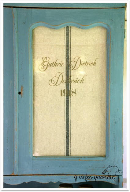
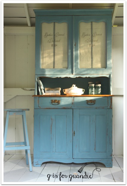
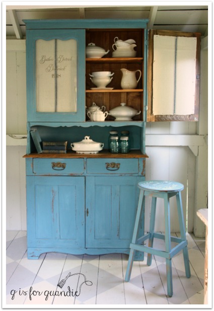
Nothing behind the glass.  Which is great if someone wants to display things inside.

But it still didn’t sell.  So finally I brought it home from Reclaiming Beautiful and decided to tweak it just a bit.

Since I’m so fond of my own blue hutch with the rooster feed sack behind the doors, I decided to create some faux grain sacks for this cabinet.

I started with some grain sack striped fabric that I purchased from Decor Steals.  I cut panels so that I had one stripe down the middle of each piece.  Then I stenciled each one to mimic the look of German grain sacks.

blue hutch 4

And now the cupboard looks like this.

blue hutch

It has such an awesome chippy vintage farmhouse look now.

blue hutch 1

Just yesterday morning Mr. Q and I moved this piece from the photo cottage into my dining room, which is where I store finished pieces until they are either sold or taken to a shop.  After we got it in place, I just stood there and admired it for a few minutes.  It really is gorgeous.  And it looks pretty amazing next to my barnwood walls.  If I didn’t already have the rooster cupboard, I would so want to keep this one.  Mr. Q calls it a ‘statement piece’ and he says that’s why it’s taking so long to sell.  You can’t just work this into your existing decor, you have to design a whole room around it.  Maybe so.  But I’m hoping this little tweak will be the magic change that helps this one sell.

If you are local and in need of a farmhouse style hutch, check my ‘available for local sale’ tab for details.

While I was on a roll with the do-overs, I also decided to revamp this little stool.

fruity bench

I painted this two years ago.  It has made an appearance at a couple of my own occasional sales, but no takers.  While Mr. Q is usually right about waiting for the right buyer, in this case I knew it needed to be re-painted.  The red just wasn’t working, nor was the fabric.  I had already been thinking I’d reupholster it using the same grain sack fabric I used on the blue hutch, but was debating a paint color for the base.  Then I saw {this post} by Kristin at Hazel Mae Home.  That was all the inspiration I needed to get going on my own little stool.

I loved the dark blue paint she chose for her stool, so I used my Little Billy Goat paint in Prizewinner because I knew it would be similar.

stool side view

I finished the paint with a coat of Miss Mustard Seed’s Antiquing Wax because I wanted to keep the color nice and dark.

Then I reupholstered the seat with my fabric, but first I added a stencil to it using a dark blue acrylic craft paint.

stool stencil

And just to give you an idea of the size of this little stool …

stool with chair

It’s the perfect size for tucking just under a chair and using as a foot rest.

What do you think of my do-overs?  Definitely an improvement in both cases?

little speckled frog week.

little speckled frog week

Welcome to Little Speckled Frog week!  “Huh, what?” you say?

Let’s start at the beginning.  You may know that I belong to a Fusion blogger group.  Many moons ago Janice from Fred & Bessie’s recommended me to Fusion (thanks again Janice!).  They sent me some of their new paint to try out, and the rest is history.  Now I occasionally participate in blog hops with some of the other Fusion bloggers.  Sometimes I ask Fusion to sponsor hat box painting parties, like I did last winter.  And sometimes they send me colors from their new color collections to try out, like the Seaside from their Michael Penney collection.  So back in February when they sent me the supplies for the hat box party, they also sent me several jars of paint from their not-yet-released new color collection, Tones for Tots.  In case you are wondering, no, they do not pay me.  However, they do supply me with free samples of their products.  Obviously I need a t-shirt that says “Will work for paint.”

tones for tots

The seven new designer colors are inspired by favorite nursery rhymes.

I had some fun taking photos of the paint before I ever cracked one open.

little piggy

tones for tots 1

While out shopping one day with friends, I found this adorable vintage baby shirt that had the perfect colors to match the paint.

tots 2

And how funny is it that this is the tag inside?

tiny tots

I was under strict instructions not to post anything until the new colors had been officially launched.  That gave me some time to search for the perfect piece for a nursery.  Hmmmm.  That was harder than I thought it would be.  I found one particular piece on craigslist that would have been perfect for this project, but someone got there ahead of me and it slipped through my fingers.  Finally I decided that maybe I could just work with a small dresser, not necessarily a nursery piece, but something that could be used in a nursery or a young child’s bedroom and that’s when I found this dresser.

The before photo is not terribly exciting.

frog dresser before

It’s not hideously awful, just kind of blah.

What you can’t see in the photo is that it needed some shoring up.  I’m going to share those details in another post this week, so stay tuned for that!

Once it was repaired, I knew it needed something to add just a little more interest.  I couldn’t just paint it one solid color and call it good.  I debated just adding a french stencil I have that says “reves doux mon enfant” which would have been appropriate for a nursery piece.  I also debated adding a damask stencil to the drawer fronts.  But in the ended I opted for a stripe and I’m so glad I did.

frog dresser 2

It was the perfect solution for adding a little extra something to this dresser and also keeping it playful for a nursery.

frog dresser angle

Later this week I’ll share a tutorial on painting stripes, but in the meantime I used the new pale green color from the Tones for Tots line called Little Speckled Frog (are you starting to get why I’m calling this Little Speckled Frog week?) as the base color and I added stripes in Fusion’s Picket Fence.

little speckled frog dresser

I replaced the original wooden knobs with pretty glass knobs.  I like to use a clear knob on pieces like this because it lets the stripes be the focus.

frog glass knobs

One of the reasons for the delay in releasing this new color line was that Fusion wanted to have it fully tested for safety around your little ones!  Their Tones for Tots collection meets both the Toy Safety Standards of North America and the EN71-3 Certification for Europe, so you can feel good about using these paints on pieces that are intended for a nursery.  Like all Fusion paints, Tones for Tots is zero VOC, requires little prep work and has a built-in topcoat.  Let’s face it, most new moms out there don’t have a lot of time to be fussing around with a painting project.

The Tones for Tots line will be available in stores beginning May 28, 2016.  Check out Fusion’s “where to buy” page to find a retailer near you.

I had fun finding props to use for the photos of my Speckled Frog dresser, but I suspect most of them would definitely not meet those safety standards!  I used some vintage wooden blocks and this rusty old toy truck that came from my friend Terri’s uncle.

toy truck

frog dresser 3

frog chair

If you are local and interested in purchasing this sweet striped dresser, please check my ‘available for local sale’ tab for details.

Otherwise, please check back later this week for more details on how Ken repaired this dresser and a tutorial on painting stripes!

she likes ’em french.

You’ve all probably seen me mention that I don’t do custom work.  For the most part.  As a general rule.  Most of the time.

But I do make exceptions.  After all, rules are meant to be broken.

When I blogged about the chair that I purchased at the Bryn Mawr neighborhood sales, one of my good customers sent me an email and asked if she could have dibs on it (always worth a shot if you are so inclined).

Bryn Mawr chair

It is totally her style, so I shouldn’t be surprised that it jumped out at her.  She likes ’em if they look a little french.  After all, she is the proud owner of this dresser …

french dresser title

And this bed …

Bed painted white.

So I asked her if she had a ‘look’ in mind for the chair.  She responded with some ideas and some photos of chairs she liked, and since her thoughts pretty much meshed with exactly what I wanted to do with the chair anyway … voila!  A custom job was born 😉

I had visions in my head of using milk paint on this chair and getting a deliciously chippy finish.  That being said, I should have known better based on experience.  Here’s why.  I was painting over existing paint.  Since I wanted to see some wood where the chair was distressed (and not that weird mustard yellow that came on parts of the chair), I sanded the existing paint job pretty heavily.  Down to the bare wood along most of the edges in fact.  That heavy sanding helped the milk paint to stick and not chip.

So, it was a trade-off, no chipping in exchange for not seeing mustard yellow.  I can live with that.

frenchie chair 1

I painted the chair in Miss Mustard Seed’s Linen milk paint.  Then I sanded to distress and added a protective layer of MMS furniture wax.

The details on the back of the chair look amazing.

frenchie chair back detail

Ken cut a new seat for me and I upholstered it in some faux grain sack material that I purchased via Decor Steals.

I added a French stencil in black.

frenchie chair seat

All this chair needed was just a little time and attention to bring it back to its full glory.

french chair back

french chair 2

I think this chair is going to be right at home with Jen’s other fabulous french pieces, don’t you?

french chair 3

Sharing at Friday’s Furniture Fix and Making Broken Beautiful.

another prize winner.

I have a small confession to make, I might have gotten a little drool on this one.  Yep, I kinda love it.

Let’s start with the ‘before’.

prize winner before

Not hideous, but let’s face it, that shiny, cherry finish is extremely tired.  Right?

The problem with painting over this finish is that it often bleeds through your paint, or is just plain tough to cover.  But I have the best solution for that, Little Billy Goat’s Prize Winner.

little billy goat paint 2

This is the most gorgeous shade of deep, rich blue.  I can’t guarantee that it always works to cover a dark stain, but I am two for two so far on this color (check out the post on the last piece I painted with Prize Winner {here}).

So, technically even though I didn’t win any prizes with this makeover, I feel like it’s a winner!

prizewinner 3

I used two coats of paint this time, and finished with Miss Mustard Seed furniture wax.

One of the saddest things about this dresser was that it came with only five of the 10 handles, and the handles are pretty fab.

prizewinner drawer pulls

They have a sort of ‘craftsman’ style vibe, don’t you think?  I love the geometric-ness of them, the circle inside ovals, with that horizontal line.  But there wasn’t much I could do with only five out of the necessary 10.  So I took them off, filled one of the holes and used some glass knobs from D Lawless Hardware instead.

prizewinner detail

I couldn’t resist using some of my lilacs in the photos of this one.

prizewinner 5

As well as my new Touring game.

prizewinner touring

If you are local and in the market for a gorgeous blue dresser, check out my ‘available for local sale’ tab to see if it is still available!

prizewinner collage


in the mood for a little mid-mod.

mid mod title

A while back my craigslist spotter, nnK, spotted this little mid-century dresser for me.  It wasn’t far away, and I was in the mood for a little mid-mod so Mr. Q and I went and picked it up.

mcm before

I wanted to paint the body of the dresser, but leave the drawer fronts unpainted.  However, in addition to being a bit worn, I wasn’t particularly fond of the ‘pieced together strips of wood’ look on the drawer fronts.  So I decided to try using gel stain to solve both of these problems.  First of all, gel stain can be used over an existing finish, so it wouldn’t require a lot of work to spruce these up and make them look new again.  Second of all, gel stain is not quite as transparent as traditional stain, so it helps blend different grains of wood.

  Before applying the stain, I sanded the drawers fairly well with my palm sander.  Then, after wiping them down with TSP substitute, I applied Varathane’s Dark Walnut gel stain with an old t-shirt.  I let that dry overnight and the next day I added two coats of a matte poly finish.

mcm drawer fronts

I definitely achieved my first goal of sprucing them up, but not so sure I minimized the appearance of those strips.  Nonetheless, the drawers are definitely much improved!

I painted the rest of the dresser in Fusion’s Sterling, which is a pale silvery grey.

mid mod corner

Once I had the Sterling painted, I realized that the original gold brass on the drawer pulls wasn’t going to work.  I solved that by adding some Silver Leaf rub ‘n buff to them.  I also gave the wooden centers a swipe with the gel stain and another swipe with the poly.  I didn’t sand them, and I wasn’t terribly particular about the application of the products, but it was just enough to give them a fresh look and to blend their color with the drawer fronts.

mid mod hardware

These were all really simple techniques that gave this dresser a fresh new look in no time at all.

mid mod 2

What do you think?

 Anyone else in the mood for a little mid-mod?

fusion blues giveaway.

Fusion blues

Recently Melanie from Lost & Found Decor asked if I wanted to participate in a Fusion blog party.  For this particular event each participating blogger was asked to choose one of Fusion’s shades of blue and use it in a project of some kind.  Melanie wanted each of us to choose a different blue, and it was first come, first served.  I was hoping to get Homestead Blue, which I was going to use on a typewriter stand (was going to add a Union Jack top), but that color was taken.  I also would have been happy to get Laurentien, since I used it on that pair of vintage school desks and it’s one of my favorite colors, but that was taken.  Another great choice would have been Seaside; it was taken too!  Now I’m not saying that there is anything wrong with the remaining color choices, but I tend to be a little bit particular about pairing just the right color with just the right project and I don’t have that many unfinished projects waiting in the wings.

Fortunately, another of my favorite Fusion colors wasn’t spoken for yet, Inglenook.  And I had just the right piece for it, this lovely french provincial sideboard.  I’ve done a few french provincial pieces in this color and each one has turned out gorgeous.

buffet before

I must start out by saying that this is probably one of the prettier ‘before’ pics I’ve ever shown.  This piece was very lovely to begin with, and structurally it’s in perfect condition.  The original finish was a bit worn out and yellowed though.  It was also shinier than I like.  Who am I kidding, this piece could easily have been left alone.  But that’s not what I do.  I paint stuff and give it a new look, so that’s what I wanted to do here.

First I stripped the top.  I was told that this piece is made out of walnut.  I always thought that walnut was a dark wood, but I did a little google research and discovered that walnut is one of the few woods that can range from very pale to a dark chocolate brown.  I really loved the pale color of this walnut.  To me it feels fresh and clean.  So I just added some clear furniture wax to protect it rather than adding any color using stain or a tinted wax.

blues 3

Next, after sanding lightly, I painted the rest of the piece in two coats of Inglenook.  Once the paint was dry, I distressed lightly to bring out the details.  Before I put the hardware back on, I refreshed it with some gold rub ‘n buff.

blues 2

And that was it.

Inglenook sideboard

blues 5

I used some old gold frames in my photos to bring out the gold hardware.

blues 1

I just haven’t been able to bring myself to part with these two frames.  I love the detail, and the fact that they are both just a little bit shabby.

gold frames

The frames are joined by a gilded cage full of vintage salt and pepper shakers.

gilded cage

What I really wanted to do was hang some sort of gorgeous landscape oil painting on the wall above this sideboard, but oh, wait, I don’t have one of those!  I’m still regretting the one I passed up at a garage sale last summer because it was $35 and that seemed high to me (kick, kick).

blues 4

But what I do have is a really gorgeous french provincial sideboard in the most lovely shade of blue.  In the end, it’s probably a good thing that many of the other blues were already spoken for!

If you have a space in your home for this gorgeous sideboard, be sure to check out my “available for local sale” tab to see if it’s still available.

Now for the fun part.  You have the opportunity to win a prize package from Fusion that includes 2 pints of any shade of blue, a brush and some Fusion Antique Glaze.  The giveaway is open to residents of the U.S. and Canada who are 18 years old and up.  You have until midnight on May 1, 2016 to get your name included in the drawing on Rafflecopter using this link:

a Rafflecopter giveaway

Please be sure to visit the other five bloggers that are participating in today’s blog party as well!

Melanie at Lost & Found Decor

Tara at Suburble

Crystal at Team Sutton Designs

Susan at Homeroad

Becky at Beyond the Picket Fence

And best of luck to you in the drawing!