

My friend Sue popped by the other day with some thrift finds for me. I’d told her all about the dark academia themed window we were putting together at the shop (fyi, if you want to see how it turned out, check out the Reclaiming Beautiful Facebook page), so when she saw these amber Kombucha bottles she thought they would be a fun addition.
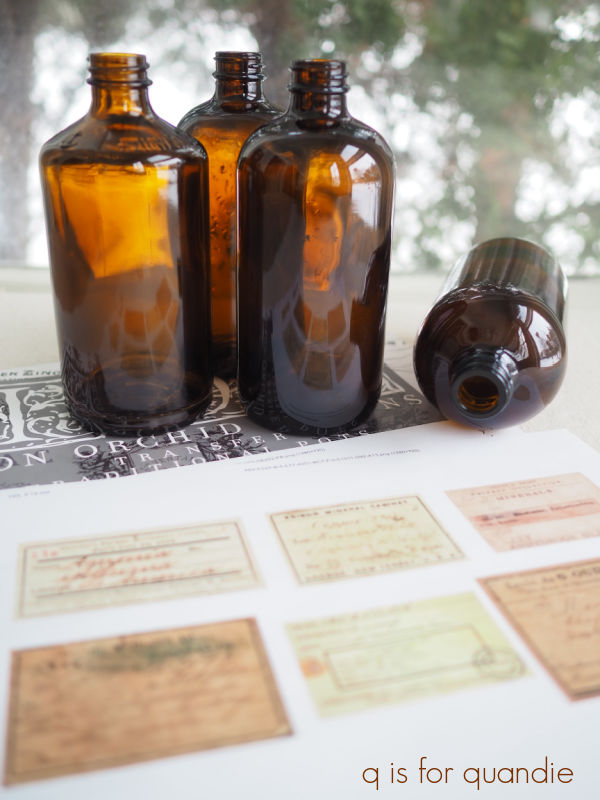
She suggested that I use some of the white I.O.D. Traditional Pots transfers on them.
But I was reminded of a video I’d watched from Canterbury Cottage (that Sue had also sent to me) where she printed out apothecary jar labels and applied them to bottles. The video even has convenient links to the .pdf for printing out the labels (find that here).
So I thought I’d go half and half. There were 8 bottles total, so four got white transfers and four got labels.
First up I washed all of them in hot, soapy water and let them dry. Then it was super simple to apply the white transfers to four of them.

The white transfers have definitely improved over time. When they first came out, I wasn’t a fan. They had more of that filmy halo around them. But I think these look really good.

There certainly is still some halo, and you can see it in that close up photo. But to the naked eye it’s pretty insignificant.
People always ask if I seal transfers when applying them to glass, and I do not. They stick like gangbusters to glass. In fact, I usually warn people to make sure you’ve got your placement just right before allowing the transfer to touch the glass because it will get sucked down onto the glass like a magnet.
As for wear, they will be fine if handled gently. You can hand wash them with soapy water, but don’t scrub on the transfer. For that matter, when you get sick of them you can scrape the transfer off using a razor blade.
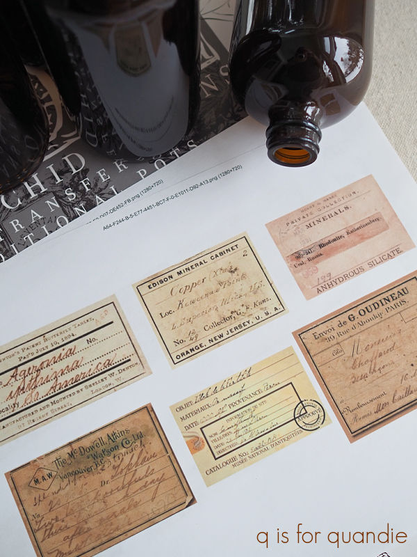
For the next four bottles, I added those apothecary labels using Mod Podge.

Personally, I prefer working with the matte version. You all know I’m not a big fan of shine. I also think that in this case it gives those paper labels a more authentic look.
I had printed the labels out on your basic printer paper. Once I had them cut out, I brushed a thin layer of Mod Podge on the back of the label and applied it to the jar. In contrast to those white transfers, you can easily slide the label around on the glass until you have it on there straight. Once I had it in place, I smoothed it down with my finger to remove any air bubbles and then added another layer of Mod Podge over the top of the label.

I then carefully wiped away any excess Mod Podge around the edge of the label using a damp paper towel.
And that’s it. Super simple. I just had to let them dry.

Unlike the bottles with the transfers, these labels would not hold up well if you got them wet. So I would not advise washing these other than possibly wiping them down with a dust rag now and then.
That being said, they really did turn out kind of fabulous, don’t you think?

Once I was done adding labels to all of my bottles, I thought it might be fun to update this little wooden crate to hold them.

This was a super simple project. I scuff sanded the wood, wiped it down with a damp cloth and then stained it using DIY Liquid Patina in Dark & Decrepit.
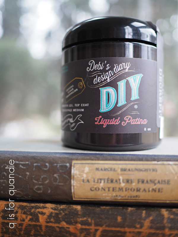
I have to admit, I haven’t found a lot of uses for this product. I experimented with it over paint and didn’t really like that look. However, it worked perfectly for this. I just applied it with a rag, and then wiped away the excess with the same rag. I did have to use a q tip to get into some of the corners, but that wasn’t difficult.
It dried quite quickly, and once dry I added some more decoupaged apothecary labels to the sides.
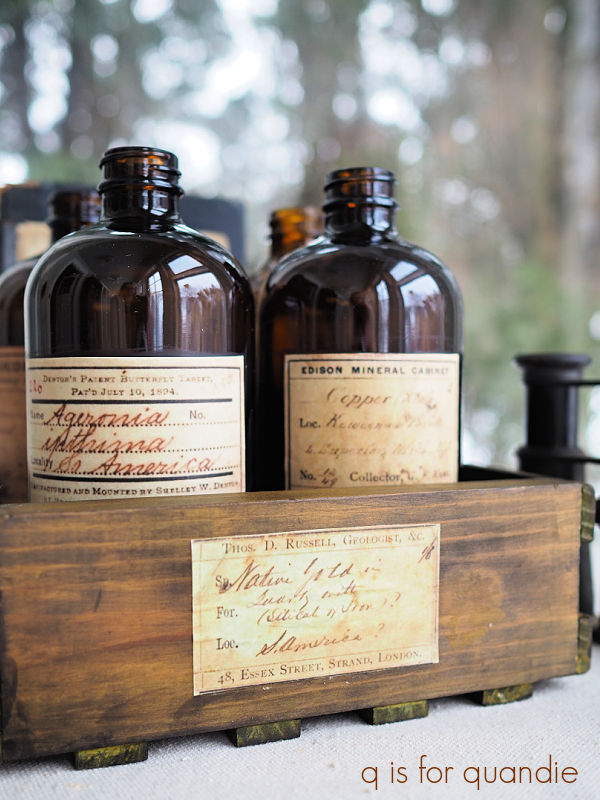
Easy peasy.

Unfortunately, I did not get these finished in time to take them in to the shop this week. And in other news, my sister and I are flying out to visit our mom on Saturday, so I won’t be around to take them in for a couple of weeks. But eventually they will make their way into Reclaiming Beautiful.
In the meantime, which style is your favorite? The white transfer, or the labels? Personally I’m digging those labels. They look so authentic to me.
Posts will be hit or miss over the next two weeks while I’m off at mom’s, but I’ll be back before you know it so be sure to stay tuned.

Oh wow! I love these. The labels you printed are definitely my fave although the white are great too. They would make awesome soap dispensers with a pump lid. The shop display looks amazing. There’s just something so classic about black furniture and all the other accessories really pop against it. I’ve gotta dig out the old clarinet we had around here somewhere!
LikeLike
Great idea to add a pump lid!
LikeLiked by 1 person
I am a transfer fan on the bottles ♡ Enjoy your visit with your Mom ♡
LikeLike
I’m glad that both kinds of bottle will appeal to people! Thanks Diane 🙂
LikeLike
I am a huge fan of the labels on the bottles. And I especially love how you paired them with the old books in the crate that you updated to hold them. Totally love it!
LikeLike
Thanks Deb!
LikeLike
Your bottles turned out great! I recycle my kids kambucha bottles too 🙂 Have a great time with your mom.
LikeLike
It’s not going to be as warm out there as I would like (highs only in the 50’s), but I suppose it still beats our 2′ of snow on the ground.
LikeLike
Those turned out great! The labels I are my favorite. I would use the white labels in my dressing area.
I’m happy for you being able to be with your Mother. Have a wonderful time!
I will miss your daily inspirations!
Smiles, alice
Ps something to look forward ❣️
LikeLike
Thanks Alice, I’m looking forward to spending some time with my mom. And she seems to be excited to cook for us, which is always nice. She’s been planning menus for weeks now 🙂
LikeLike
I really love the look of those labels. Wondering if you printed them with aan unmet or laser printer?
LikeLike
Um … not sure if you meant ‘unmet’, maybe you meant laser jet? or ink jet? Are there other kinds of printers? I don’t know. Ours is an ink jet printer.
LikeLike
Love the label look and the wooden box is so perfect with them!!
LikeLike
Thanks Amanda!
LikeLike
I love the way the labels came out-I like the transfers too-just like the labels a bit more and they look so authentic! I just watched the Canterbury Cottage video on Dark Academia a few days ago-had never heard of it. Now it’s popping up everywhere-I am always behind the trends!
LikeLike
I’m usually behind on the trends too, but this one caught my eye right away. And I’m with you totally, I just like the labels a little bit more, and was also impressed that they look so realistic for simply being printed on regular ol’ copy paper.
LikeLike
Definitely the ones with the paper labels! They look wonderful–especially placed in the crate!
LikeLike
Thanks so much Sandy!
LikeLike
Love the paper label ones and super easy to do too!
LikeLike
Yep, super simple!
LikeLike
Totally loving this look. I just did a post on crawling out of the gray/white cave with the new color projections for year. I’m not a teal lover, but the newer deep dark teal and greens they are saying will be in, are intriguing. I took a peek the FB page—and you must ecstatic and maybe not having to use white constantly. Always informative and inspiring, though I don’t comment that often! Hugs, Sandi
LikeLiked by 1 person
To be honest, I’m not really ecstatic. I still love the Drop Cloth! And I still love the look of a creamy off-white color scheme. But, that being said, I also love green. So here’s hoping the green pieces start selling!
LikeLiked by 1 person
Of course if whites are your best sellers…I guess I come from ‘way back when’ I closed my shop in 2007–and I had then been painting furniture/accesories in whites, crackled, and distressed, as well as pure white for 8 years prior to 2007, I think maybe it might swing sometime, soon…LOL. Paint ON!
LikeLike
I keep thinking that too, I’m certainly seeing far less white in decorating magazines!
LikeLike
I have to say I love them both. That label ones sure do look authentic. I love the white transfers too. They wood be perfect for some flowers. Nice job! Have fun with your mom and sister. Safe travels 😊
LikeLike
Thanks Monica!
LikeLike
Love the bottles with labels (authentic looking) and thanks for the idea I could use with the white transfers that came with the black and blue transfer labels! That look works too. and you have the touch with displaying your creations – that is a talent by itself!
LikeLike
Thanks so much Karen, and yes, the white transfers look great on amber glass! Give it a try 🙂
LikeLike
I like them both a lot, not sure I could pick one over the other.
LikeLike
Thanks sis!
LikeLike
What a great transformation! But, push comes to shove…the labels win me over! I use old amber bottles with labels for decorating in Fall/Halloween! You did a fantastic job, and have a wonderful vacation! Bring back warm weather!!
LikeLike
I’d have to find some warm weather first. The forecast calls for highs in the 50’s, lows in the 30’s while I’m out there. Not terribly warm!
LikeLike
I love the labels!
LikeLike
Thanks Freida!
LikeLike
Living those labels!! Did you put mod podge over them or just on the back? They look like genuinely old bottles.
LikeLiked by 1 person
I put mod podge over them, and then wiped away any that got onto the glass.
LikeLiked by 2 people