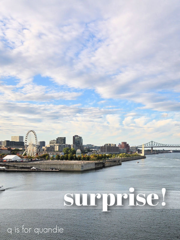
You may have noticed that there hasn’t been much activity from me over the last two weeks.
Well … surprise! Mr. Q and I were in Canada.
We took a 10-night Quebec ‘intensive’ cruise with Azamara.
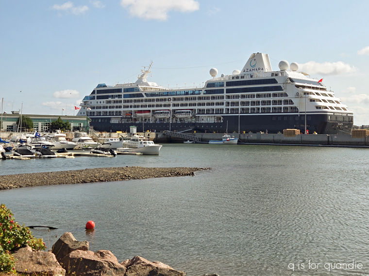
I’m sure most of you haven’t heard of Azamara. It’s a small boutique cruise line with only 4 ships. Their ships hold around 700 passengers as opposed to the giant mega cruise ships that hold anywhere from 3,000 to 7,000 people.
That being said, they are an ocean going cruise line, not a river cruise line. That seems to confuse people when I mention that we sailed out of Montreal, which obviously is not on the coast. But we did eventually end up in the North Atlantic Ocean after traveling down the St. Lawrence River and through the Gulf of St. Lawrence.
Basically, if a river cruise and an ocean cruise had a baby, this cruise would be it.
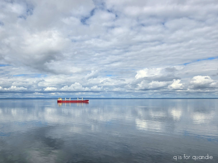
It was very cool to be sailing down the St. Lawrence while sitting out on our balcony …
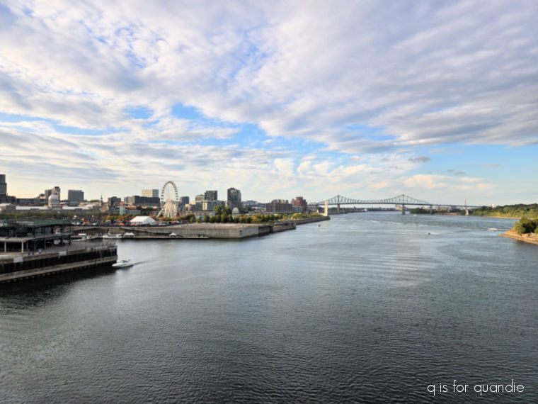
and while also being on a ship that had a few more amenities than your typical river cruise boat.
I thought it was pretty interesting to see some of the vessels that were going in the opposite direction fairly close up as they passed by, they definitely don’t pass this close out at sea.

It was also fun to be able to see the opposite shore much of the time.
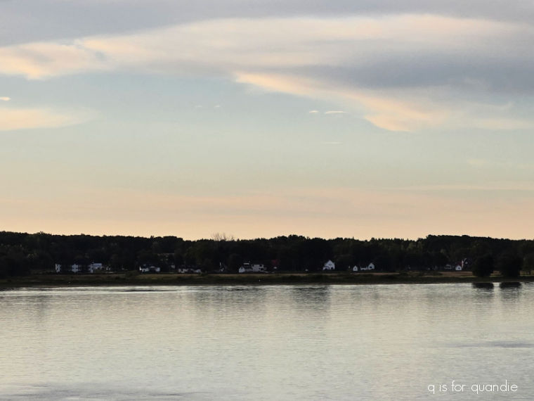
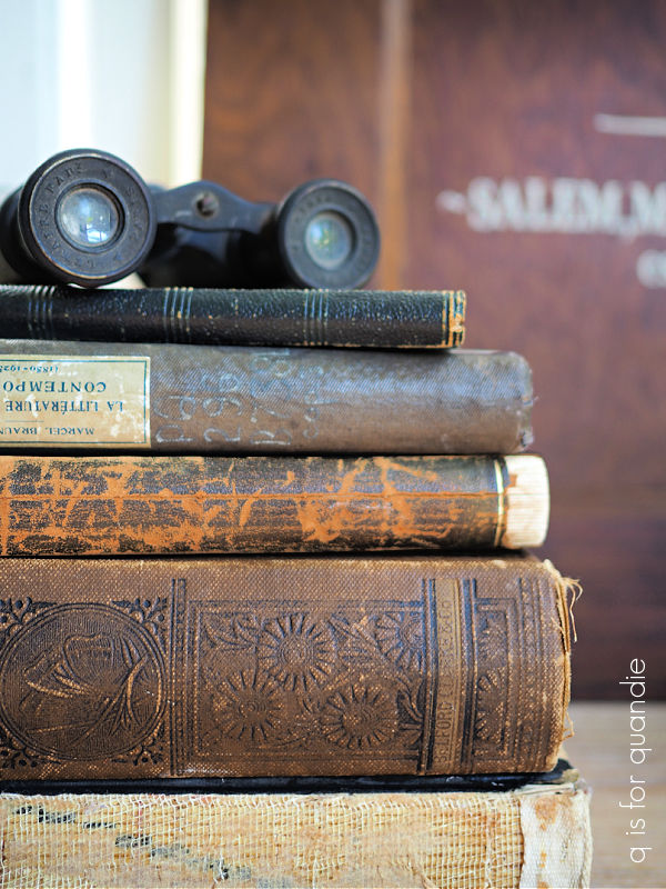
That would have been better yet had we thought to bring binoculars with us!
And for those of you who may not appreciate the motion of the ocean, for the most part we barely felt any movement at all on this cruise.
Our weather was very nearly perfect with the exception of one rough night on the Atlantic, and one afternoon of rain on our very last day.
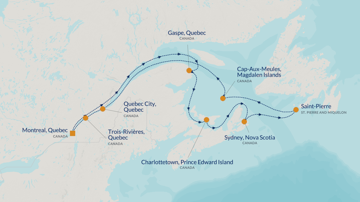
Azamara specializes in what they call ‘destination-intensive’ itineraries that focus on a single country or region. Because they are a smaller ship, they can visit smaller, lesser know ports that can’t accommodate the mega-ships.
Although this cruise was called ‘Quebec intensive’, only half of our ports of call were in the Canadian province of Quebec. The others were further east in Nova Scotia, Prince Edward Island and the Magdalen Islands. We even technically visited France. St. Pierre and Miquelon is an archipelago of 8 islands just off the coast of Newfoundland and it is a French overseas collectivity. In other words, its residents are French citizens.
I’ll share more about that and the rest of the itinerary in future blog posts, I plan to post separately about each of our ports of call.
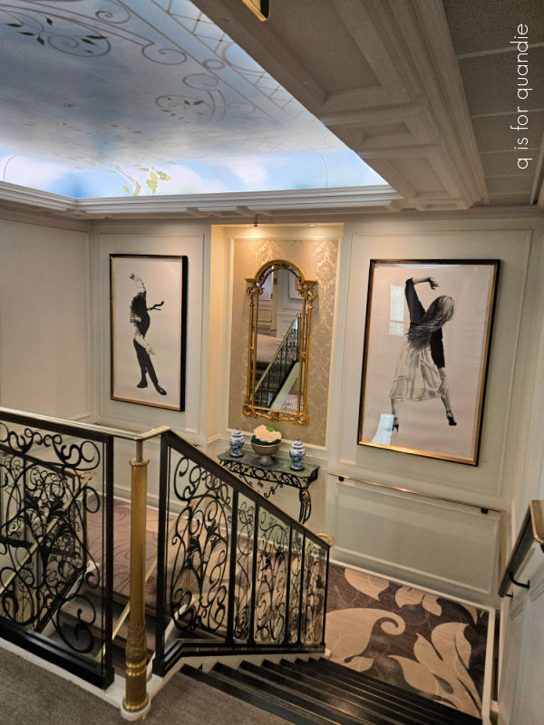
Azamara considers itself a ‘luxurious boutique hotel at sea’, and I have to say that whether or not they qualify probably depends upon your definition of ’boutique hotel’. The Oxford dictionary defines it as ‘a small stylish hotel’. Well … it was small, and while some of the public areas could be called stylish …
The cabins themselves definitely were not.
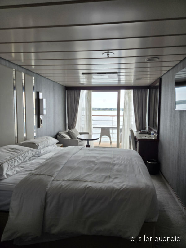
In fact, our balcony cabin was quite bland. Zero artwork, zero color, horrible lighting, and one of the worst bathrooms on a cruise ship ever. The shower was miniscule, I had to stand sideways in it, and the water temperature randomly fluctuated from scalding to tepid as you were showering.
That being said, the cabin itself was decent sized for a cruise ship and we were comfortable enough.
Another definition of boutique hotel however is ‘an independently owned property that emphasizes authentic experiences and personalized service’, and that does aptly describe Azamara. The cruise line was originally owned by Royal Caribbean, but they sold it off to a private equity firm in 2021. So yes, it is independently owned. And Azamara definitely offers personalized service. Every single Azamara employee that we encountered went out of their way to provide exceptional service. Furthermore, Azamara’s focus on destination immersion definitely ’emphasizes authentic experiences.’
Before I continue on with the rest of this blog post about our overall experience, I should now mention that I ended up with Covid about halfway through our voyage. And yep, that pretty much sucked. I ended up mostly in bed for about 48 hours. I hadn’t thought to bring Covid tests along with us, but some other travelers that Mr. Q befriended were kind enough to offer us some. Sure enough, I tested positive while Mr. Q was thankfully negative.
Being a rule-following sort of person, I reported my illness to the ship’s doctor. He then came to my cabin and gave me another covid test to be sure, and yep, it definitely was covid. The ship’s policy was to quarantine me to my cabin for the next 24 hours based on the fact that I did not have a fever. If I remained fever-free at the end of that time period, I could leave my cabin wearing a mask. I had to wear a mask in public areas for the next five days, which was basically the duration of the cruise.
In other words, I spent WAY more time in our cabin than in any public areas of the ship on this cruise. I also ate a lot more room service than I ever have before on a cruise. Once I knew that I had covid, I felt like it would be wrong to take my germs to the ship’s buffet (masked or not), and I didn’t really relish spending a lot of time wearing a mask elsewhere either.
So … room service on the balcony was my only real option from that point forward.

And most of the time it was room service for one. Mr. Q was still allowed to go about the ship at will, so I didn’t want to deny him the chance to find something better to eat.
Which brings me to the food. In my experience, the food on the Azamara Quest was not great. Now of course, once I had covid I couldn’t be a good judge, but even before that I was pretty disappointed in the food. Everything on the buffet was lukewarm at best, and more often cold, by the time you got to your table to eat it. The menu in the main dining room usually didn’t offer many choices that appealed to me either.
They had a couple of dining events that I did make it to starting with the brunch buffet on our first full day.
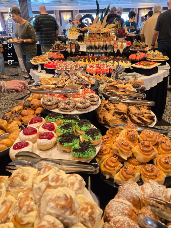
The spread was certainly spectacular looking, but like a lot of buffet spreads it mostly all looked way better than it tasted. The baked goods tended to be somewhat dry, the hot foods didn’t stay hot, and everything was just a bit bland in flavor.
Mr. Q and I also made it to one of Azamara’s signature events before I became sick, their White Night Party.

This was basically another extravagant buffet, this time on the pool deck.
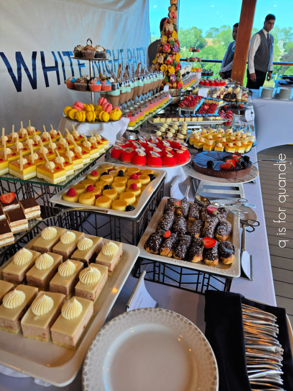
Everyone is encouraged to wear white, there is live music, they were grilling lobster tails, and the staff puts on a bit of a show.
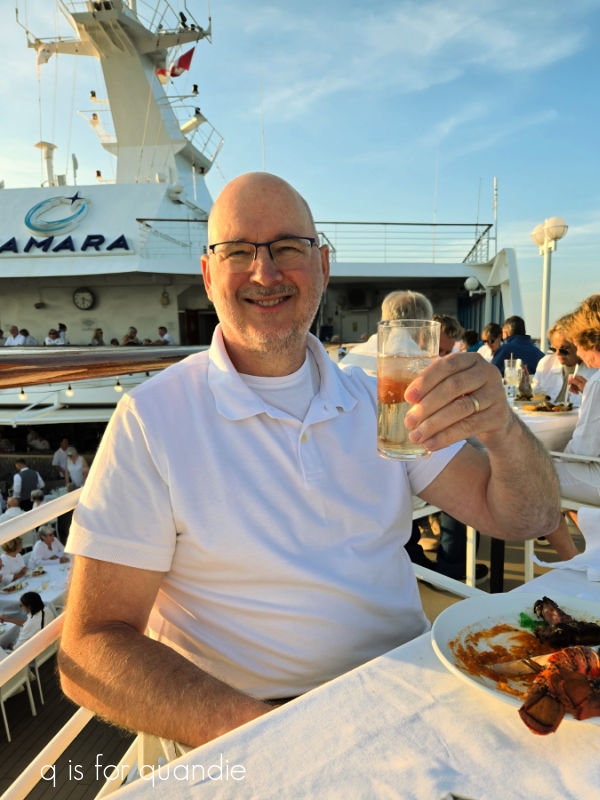
It was a beautiful evening, once again the weather was perfect. But also once again, it was a buffet, and there was limited seating so after wandering around for 15 minutes looking for two free seats, we ended up with cold food when we finally found a place to sit down.
I also have to point out that it was when we were on our way back to our cabin at the end of the White Night Party that I started sneezing, and over the course of that night I knew I had caught something. I hoped it wasn’t covid, but of course, as it turned out, it was. Having covid for half of the cruise meant that I missed out on a lot of shipboard activities. It also meant that I didn’t really feel well enough to truly explore the last four of our eight ports, and in fact I missed out on one of them altogether. So you can take my review with a grain of salt. I’m sure I would have had a much different experience had I not been ill.
But I’m home now, I’m starting to feel a bit better, and I’m still hosting an occasional sale at my house coming up in a week and a half.
So I’m going to start gearing up, while also taking some time to rest up and fully recover.
I hope you’ll stay tuned for more posts about some of the lovely spots we visited in Canada, as well as some posts about the upcoming sale and what sort of merch I’m pulling together for it.
In the meantime, have any of you been on an Azamara cruise? Or how about cruises in general? Leave a comment and let me know.