You may remember that I purchased a dollhouse while out garage saling this summer.

It was a bargain at just $5. It needed a few repairs, but nothing major. I asked my handyman Ken to create a replacement shutter for the window next to the door, and he made quick work of that.

Ken also created a new window sash for the upper right window, and re-installed the glass in that lower window, which involved adding new stops to keep it in place.
I also needed to replace some of the ‘roof tiles’. Conveniently enough, I found a pack of popsicle sticks that were the exact size I needed for $1.50 at another garage sale.
I cut them to size and glued them in place.

Easy peasy.
As I was working on those repairs, I noticed that there was a signature on the bottom of the dollhouse.

Looks like Al made this dollhouse back in 1978. It’s held up pretty good for 45 years old, don’t you think?
Initially I decided to use the Dixie Belle Patina Paint to create an aged faux metal look to the roof. I first gave it a base coat of black with their Caviar paint, and then painted the shingles with their Bronze patina paint. Then while the 2nd coat of the Bronze was still wet, I spritzed on the green spray.

But that’s where things kind of fell apart. I started painting the body of the dollhouse with Dixie Belle’s Drop Cloth, but that warm white just wasn’t working with the bronze roof.
So then I decided to paint the body of the house with DB’s Sea Glass. And I sort of hated it. Sea Glass is a very pretty color, and it worked nicely with that verdigris patina on the roof, but the whole combo just wasn’t what I was envisioning for this makeover.
Then I reminded myself that my original idea for this house was to paint it white. All white. So that’s what I did next. I painted over everything with DB’s Drop Cloth.
But I wanted the shutters and front door to stand out just a bit more, so I mixed up a custom paint color using 50% Drop Cloth and 50% French Linen to create a nice, pale grey.

It’s just enough to let those features pop, without taking away from the monochromatic look I was going for.
I felt like the trim over the door was the ideal spot for typography of some kind, so I cobbled together an ‘address’ from the I.O.D. Label Ephemera transfer.

Perfect. I love it!
Once everything was painted, I distressed the edges a bit to make it look a little bit worn. I feel like distressing adds so much character to a piece, even a dollhouse.
I finished off the painted areas with some clear wax, then I used hot glue to affix some wreaths to the windows and door. I attached the lights around the roofline with some Stick-Um candle adhesive, which is basically a super sticky wax.

All of that Christmas frippery could be easily removed after the holidays. The Stick-Um residue can be removed with a hot soapy rag.
I didn’t do anything to the interior of the dollhouse except use a Magic Eraser to remove some pencil marks on one of the floors.

This way the future owner can dress it up with their own style.
To be honest, this ended up being one of those ‘what was I thinking?’ projects. I don’t need a dollhouse. I don’t have a spot for a dollhouse. In fact, I got rid of my own pretty spectacular dollhouse six years ago (more about that here).
But this dollhouse was a mere $5 investment, so really, what do I have to lose other than the time it took to paint … and then re-paint … it?
And it ended up being a rather fun project to work on.

I had actually planned on doing this well ahead of Christmas, because I thought it might be the perfect time to sell it. Wouldn’t it be adorable to find under the tree? While it would make a fantastic gift for a child, it would also just be fun to have as Christmas decor.

But once again, time got away from me and here we are with just one week to spare.
I went on Facebook Marketplace and Craigslist to see what kind of competition there will be for selling it and there were tons of dollhouses for sale there! I didn’t even take the time to count them all there were so many. So clearly trying to sell a dollhouse around Christmas is not a unique idea.
The prices for those similar to this one ranged from around $150 to $250. I’m going to price mine well below that though. I really just want it to go to a good home. If any of you locals are interested, be sure to check my ‘available for local sale‘ page for more details.
Meanwhile, I think I did right by this 1978 dollhouse.

What do you think?


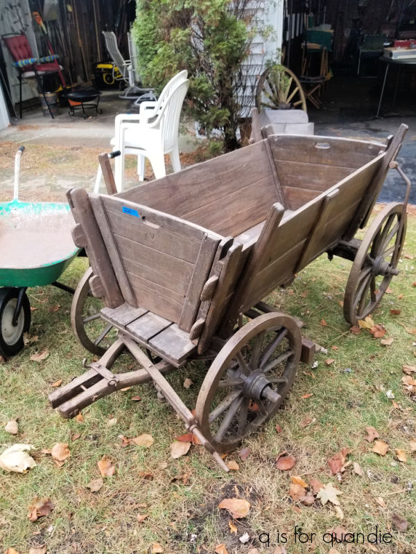


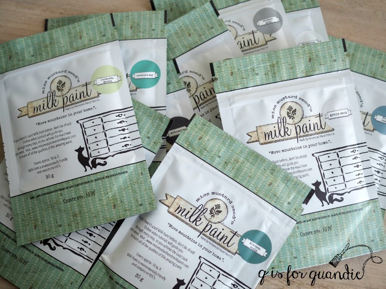
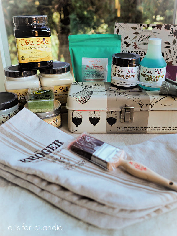
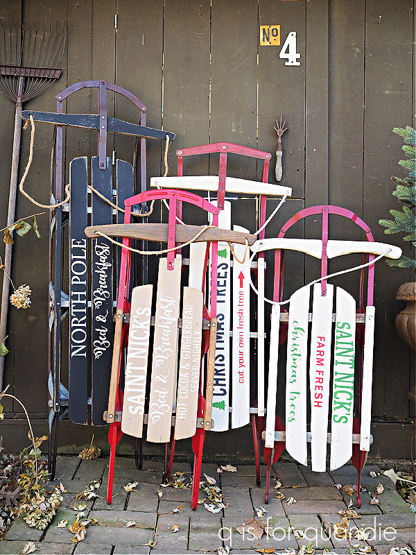
 I plan to use some of these in the q branch makeover too.