Today I’m sharing a ‘how-to’ post on creating your own rugs for a dollhouse or other miniature display.
I’ve already shared my mini rugs eureka moment, when I figured out that you can purchase printable canvas and create your own rugs using downloaded .pdf files.

I found my canvas sheets on Amazon, but I’m sure you can find them in other places as well.
I’ve purchased several different downloadable .pdf files for printing rugs via Etsy.
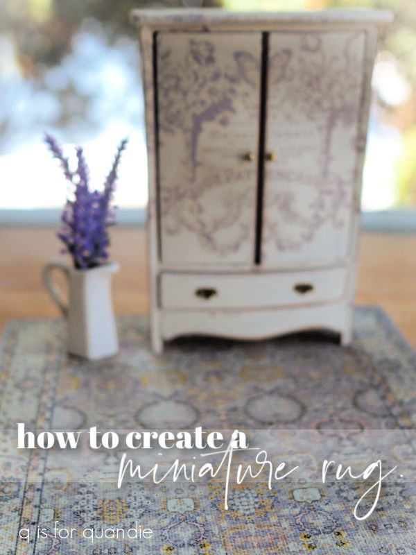
So far this one in shades of lavender remains my favorite.

I purchased that from MinatureMoo. The rug in shades of blue in this next photo is also a .pdf purchase from Miniature Moo. Unfortunately, apparently this shop is no longer selling on Etsy. I guess I’m glad I got these .pdf’s when I did.
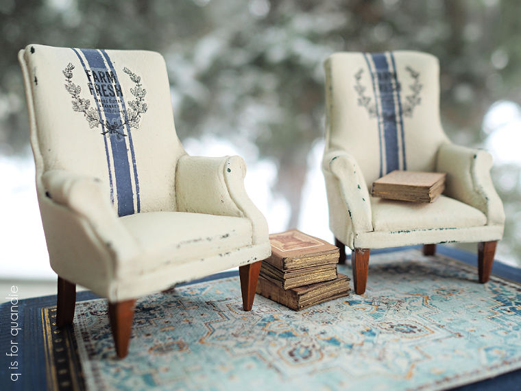
I think downloading printable rugs is the easiest option, and purchasing the file is generally fairly cheap. I paid $5.37 for each of those files.
Another option would be to find a good quality image of a rug online, re-size the image to suit your needs, and then print it out. I haven’t actually tried this approach, so I can’t really give you any advice on how to go about it.
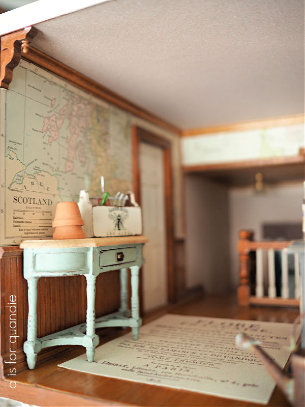
Once I realized that these canvas sheets worked really well for printing rugs, I thought that perhaps I could also use some stamps to create a unique rug as well. You saw my version of that in the dollhouse kitchen reveal.

To create that rug I used an I.O.D. Ephemeral Type stamp with some VersaFine Clair ink in a color called Morning Mist to stamp the canvas. Then I glued some cotton twine around the edge to finish it off.
I had created another rug using that same stamp set for my U.K. hallway.
You can’t see it terribly well in that photo, but in case you didn’t notice, the writing is in French. And somehow, it just seemed wrong for my U.K. hallway to have a French rug. Right?
Then at about 3 a.m. one night, a light bulb went off in my head. I have a small Union Jack stencil that I got ages ago from Maison de Stencils (no longer in business as far as I know). Perhaps I could stencil my own Union Jack rug!
I started by cutting a piece of that printable canvas to the size I wanted. Then I taped off a narrow border around the edges and gave it a base coat of Dixie Belle’s Drop Cloth. Once dry I centered my stencil and painted it in a mix of Drop Cloth and Dried Sage.
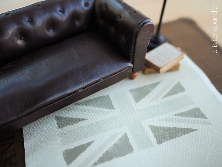 Once that dried, I went back over just the triangles with straight up Dried Sage.
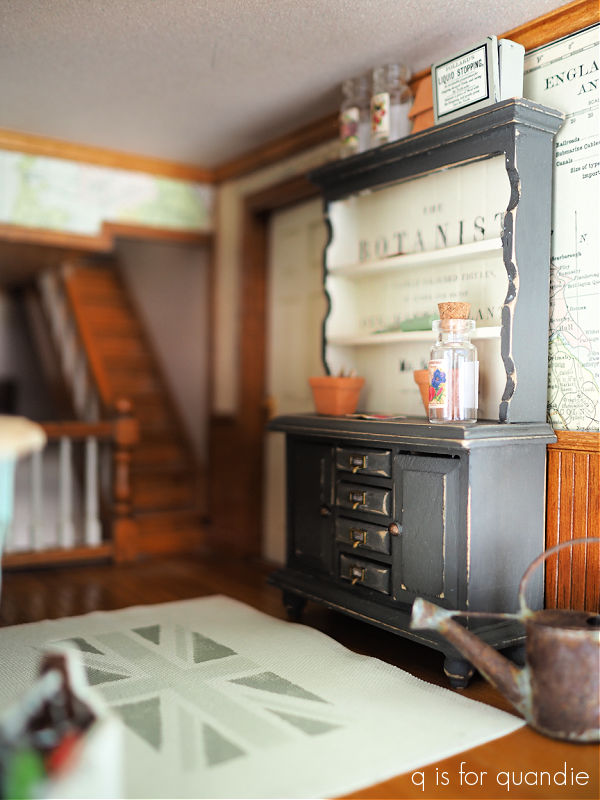
Although I liked the way the stencil worked on the rug, I felt like the Union Jack needed to be bigger for this size of rug … and this is the size of rug that I needed in the U.K. hallway.
So it was back to the drawing board.
For my 2nd attempt, I decided to just draw the design on the rug using a ruler, lots of measuring and a pencil and then paint it in free-hand.
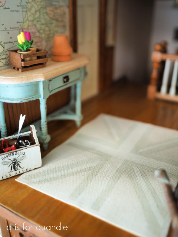
This time I went with an even more subtle selection of colors using just Drop Cloth, and that custom mix of Drop Cloth and Dried Sage. Rather than painting the full background, I just painted the stripes. So those triangles are unpainted.
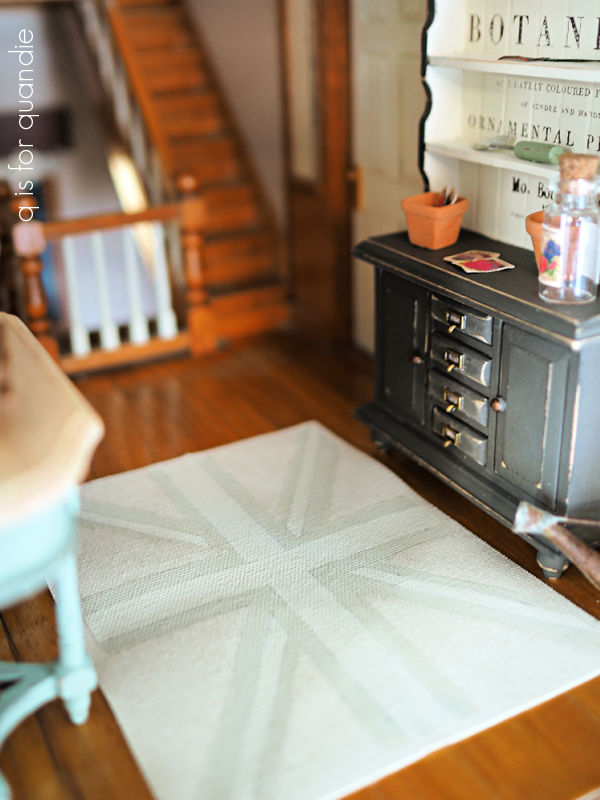
One important note if you are going to paint on the printable canvas, the paint will cause the canvas to curl up a bit. I solved that problem by ironing the ‘rug’ flat again once the paint had dried. I also anchor the four corners of the rug to the floor using some double sided tape.
I hope this post has given some of you some ideas for creating your own miniature rugs. Be sure to leave a comment if you have any other methods that you like to use.


 It certainly is a beautiful display, but it was fairly obvious that not all of the ‘flowers’ are real. Certainly that purple vine was artificial.