all that glitters.

The holiday season is the perfect time of year to add the glimmer of metallic’s to your home, but I bet there are a few of us who love to see the glint of gold year round.

Along with the IOD Decor Stamps that Prima Marketing sent my way last week, they also sent a few of their Art Alchemy Metallique waxes.

Aren’t they pretty?  The Vintage Gold looks like gold leaf in wax form.  It’s not too shiny or bright, but the perfect aged gold.

As soon as I opened these up I wanted to try them out on something.

Then I remembered this pair of frames that I found at a garage sale last summer.

They are fairly beat up, which is part of what I love about them, and they also have a hint of green to them.  I thought it might be pretty to add just a bit of metallic shimmer to the high points on the frames.

I used the Vintage Gold on one frame …

And for a more subtle look, I used the Bronze Age on the second frame.

I used q-tips to apply the wax.  I dipped the q-tip in the wax, swirled it around a bit to coat it well and then lightly rubbed the q-tip over the frame just hitting the high points.  Then I buffed very lightly with an old rag.

It couldn’t have been any easier.

These frames are so gorgeous that they can stand on their own as art without needing anything in them.

They are perfect just propped on a shelf with some old book pages adhered to the wall behind them.

All that glitters may not be gold, it might be Bronze Age instead, but either way it sure is pretty!

These waxes would work really well for touching up the finish on vintage hardware or for highlighting details on furniture as well.  I plan to do some more experimenting with them along those lines, so I’ll be sure to keep you posted.

By the way, if you want to try one of these just google the name.  They are readily available online.  I found them for less than $10 each on Amazon including shipping.

IOD decor stamps.

If you’ve been following my blog over the past year, you’ve probably noticed that I have succumbed to an addiction.  Yes, it’s true.  I’m addicted to Iron Orchid Designs Decor Transfers.

I discovered them back in March when I saw one on a Facebook group I belong to, How to Paint Like a Pro.  I promptly ordered two of them online.  My first project with a Decor Transfer was the cupboard where I store my painting supplies (well, to be honest, just some of my supplies fit in this cupboard, there are two more cupboards full of supplies in other rooms of my house, who’s with me on that one?).

I love these Decor Transfers so much that I went on to do countless projects with them over the last 8 months (some of my faves can be found here, here, here and here).

So you can just about imagine my delight when I found out that Fusion and Iron Orchid Designs/Prima Marketing were teaming up.  Now Fusion retailers have the option of also stocking the IOD Decor Transfers.  And as an official Fusion Mineral Paint Blogger, I was offered the opportunity to receive some IOD products to try free of charge!

I believe I did a little happy dance when that message came across my computer.

But then I was stopped in my tracks by that word, ‘try’.  Hmmmm.  I have to admit, I felt like I would be a bit of a fraud if I sent back a big list of Decor Transfers that I wanted to ‘try’.  After all, technically I’d already tried almost all of them, many of them more than once!  And some of the ones that I hadn’t tried yet, I already had in my cupboard (yes, that same one shown above) waiting to be used on something.  I’ve had poor Mr. Q ordering IOD transfers for me via Amazon for months (he himself is an Amazon addict).

So it felt a bit greedy to ask for more!

But guess what?  Prima Marketing and IOD have some other cool products too, like their Decor Stamps.

These are stamps that are designed and sized appropriately for use on furniture or for other home decor applications, like walls for example.

So, ding, ding, ding, we have a winner!  I asked them to send me some of their Decor Stamps to try, as well as their 10″ x 12″ acrylic stamp block.

If you are not familiar with changes that have been made in rubber stamps over the past number of years, you may not be aware that many of them no longer come adhered to a wood block.  Now they make them out of a sticky rubber-like stuff that sticks well to a clear acrylic block, but also peels right back off again.  It’s so much easier to store lots of flat sheets of stamps and just one acrylic block (or several of differing sizes).

When my box arrived from Prima Marketing it was like Christmas came early for me.  I immediately opened it up and started fondling the supplies.  I decided to try a quick little project just to test them out.

I purchased this wooden sock stretcher at a garage sale last summer.

Back in the olden days when socks were made with wool, after you washed them you then put them on a sock stretcher while they dried.  That would ensure that the sock didn’t shrink up and no longer fit.  But when I see these old sock stretchers, I always immediately think ‘Christmas decoration’.

So I thought I would use the IOD stamps to give them a little more Christmas style.

I started by laying out my design right on the sock stretcher.

This way I could move the stamps around and make sure they fit where I wanted them.  These stamps are from the Alpha II set, by the way.

Once I had them where I wanted them, I simply placed my acrylic block (this is a block I already had, I didn’t need the big 10″ x 12″ IOD block for this small design) over them and pressed down to attach them to the block.

Next I lifted them off the sock stretcher and inked them up.

Although Prima Marketing/IOD does currently carry some inks, and they did send me a couple, they are not going to continue to carry ink in their line up.  So I went to my local Michaels and purchased some Ranger Archival Ink in a color called Watering Can.  You can use any kind of ink with the stamps, but be sure to choose one that is suitable for your project (especially if you are stamping fabric, which I hope to try soon).  In this case, I went with a permanent, waterproof ink.

You should absolutely test out your stamp on paper a couple of times before finally stamping your project.  That way you can get a feel for it, and work out any kinks.  You can see if you are getting enough ink on your stamp as well.  Always be sure to have your project on a hard, flat surface when stamping.  Of course, if you’re stamping furniture or walls, they will be their own hard, flat surface.

Finally, ink up your stamp again, place it where you want it and press down firmly.  I usually avoid rocking the stamp back and forth because that can blur your design.  Just press firmly straight down.

I added this sweet little crown to the top of my sock stretcher.

The crown is from the Grain Wreath set.  What I love about this is that the crown doesn’t look ‘new’ or recently added.  It looks like it could be an original detail.

Next I attached a pretty ribbon and hung my ‘sock’ up on the aforementioned cupboard.

This was a pretty simple, basic project using the stamps.  As you can imagine, the sky is the limit design-wise, but I wanted to start out with something easy to get my feet wet (or get my wool sock wet?).  I’ll be sharing a slightly more advanced stamping project soon.

But in the meantime, I’m almost entirely happy with my sock stretcher except for one thing.  I think she looks kind of lonely hanging there all by herself.  She needs a mate, don’t you agree?

I’ll definitely be keeping an eye out for more sock stretchers during next year’s garage sale season!

In the meantime, have any of you tried the IOD Decor Stamps?  If so, I’d love to hear about your project, so be sure to leave a comment.

a chalkboard tutorial.

On Monday I shared a photo of the holiday stuff I was bringing to Reclaiming Beautiful …

And Laura suggested I share a tutorial on how I lettered those chalkboards.

Great idea Laura!

Actually, I’m sure I’ve shared this method before, but I couldn’t find that post and if I can’t find it, it stands to reason that you guys probably can’t find it either.  So that means it’s high time for another post about it, right?

It was perfect timing anyway, because obviously I needed to freshen up the message on the chair chalkboard that hangs in my kitchen …

Hmmmm.

Time flies doesn’t it?  It feels like I was just changing this up for summer, and here we are looking winter square in the eye.

So let’s get started.

The previous design on my chalkboard chair was drawn with regular chalk, so I just used a damp rag to wipe it clean again.

Sometimes I use a chalk pencil or even a chalk pen on my chalkboards, both of which can be harder to remove.  A Mr. Clean Magic Eraser (or generic equivalent) will work well to remove those.  But in this case the damp rag was all I needed.

Once the board was dry, I re-seasoned it.  To ‘season’ a chalkboard you simple rub chalk all over it …

And then wipe it off again with a dry cloth.

Next I print my design on paper.  I often find chalkboard designs on pinterest, but the design I’m using today was a free download from yellowblissroad.com.  Don’t confuse this with printing a design for a transfer, you do not want a mirror image for this method.

Next rub chalk all over the back of the piece of paper that has your design on it.

Place your paper design side up, chalk side down, over your chalkboard.  You can tape it down if you are worried about it shifting while you work.  Now just trace the design with a pencil, pressing down with a little firmness (not so much that you tear through your paper though).

When you lift the paper back off your chalkboard, you’ll see a faint outline of your design.

This is your guideline for going back in and filling in the design with chalk.

This will be easier if you sharpen your chalk.  An old lip pencil sharpener will work well to sharpen regular sized chalk.

I use a piece of notebook paper to rest my hand on while I’m filling in the design.  It serves two purposes, first to keep me from leaving hand prints on my seasoned chalk board and second to keep my hand from smearing that faint outline of my design.

Today’s q-tip: use a q-tip to clean up any messy areas or touch up mistakes (sorry, I couldn’t resist)!

I wasn’t too happy with that last ‘e’ in ‘here’ so I erased it with the q-tip and tried again.

And now my chalkboard chair is all set for winter.

This really is my favorite method for a chalkboard.  I’ve tried teaching myself to do free-hand designs, but in the end I’m never really happy with how they turn out.  I sometimes use stencils to create an outline for a chalkboard, but then you are limited by whatever stencils you happen to own.  I once tried the Martha Stewart Erasable Liquid Chalk with a stencil and that was a total fail.  So ultimately this seems to be the method that I fall back on the most.

I think it works pretty well, and if you are like me and you just aren’t satisfied with the results you get trying to draw free-hand, give this method a try on your next chalkboard!

a rusty toolbox.

Back when I sent a welcome email to Miss Mustard Seed, a.k.a. Marian Parsons, she offered to send me some of her products to try.  How totally awesome of her, right?  But I had to admit, I’d pretty much worked with most of them already.

However, I thought I vaguely remembered reading somewhere that her Tough Coat Sealer had been re-formulated to have more of a matte finish since the last time I’d used it.  So I asked her to please send me some of that.

So the other day when I was contemplating what product to use to seal the rusty toolbox I brought home from that garage sale I wondered if I could use the Tough Coat Sealer.

The toolbox isn’t terribly bad on the outside, but the inside was quite rusty.  It was rather greasy and dirty as well.

So I did a little google research.  I googled “using Miss Mustard Seed Tough Coat Sealer to seal rusty metal” and that search took me directly to this post from Miss Mustard herself where she conveniently addresses that question in the comment section.  She also mentions the reformulation of the Tough Coat Sealer in the post itself.

So, full steam ahead.

I first scrubbed the toolbox well with Dawn dishwashing soap and one of those 3M Scotch Brite scrubbies.  I tend to use dishwashing soap when I’m trying to cut grease.  I suppose that TSP substitute would work just as well, if not even better, but I haven’t tried that.

I wasn’t aiming for perfection here, just an easy clean up and coat of sealer that would allow me to store stuff in the toolbox without it getting all gross.

Once the toolbox was dry, I simply brushed on the Tough Coat Sealer.  I gave the inside bottom of the toolbox a 2nd coat just to be sure I was taking care of that rust, while every other surface only received one coat.  Here’s how the inside looks after …

Much improved, wouldn’t you say?

Although it’s cleaned up and the rust is sealed, I also added a paper liner just to make it a little prettier.  I used one of my favorite October Afternoon papers, and just laid it in place with no adhesive.  If it gets grungy over time I can easily replace it.

Here is how the toolbox looks on the outside with its coat of Tough Coat Sealer.

I did save the label.

I think I might use the toolbox to store my ribbons.

I don’t really know why I have such a fascination for rusty old toolboxes.

Something about them just appeals to me, especially when they are used for something unexpected, like vintage ribbon.

Looking at the ‘before’ and ‘after’ pics side by side you might be thinking that they don’t look all that different, but that actually was my goal.  I wanted to seal the rusty metal so it wouldn’t rub off on things or continue to deteriorate, but I also wanted to retain the rusty aged patina.

The Tough Coat Sealer did that perfectly.  It added a tiny amount of shine and it darkened up the color just slightly as well, but for the most part it didn’t change the look by much.

So the next time you need to seal some rusty old metal, consider reaching for the Tough Coat Sealer.

And speaking of Miss Mustard Seed, tomorrow is her workshop with Carver Junk Co.  I think they may still have some spaces left and tomorrow is supposed to be cool and stormy, so a perfect day for hanging out indoors and learning about milk paint.

I’ll be there and I’d love to see you there too!

yardstick shelves.

I’m sure some of you locals have heard of the Bachman’s Ideas House.  Bachman’s is a local floral, gift and garden chain of shops.  They have been in business since 1885, and their first retail location was opened in the 1920’s on Lyndale Avenue in Minneapolis, which is also where the family home was located.

Quite a few years ago (I think it was 2010, but I’m not totally sure) they began the Ideas House.  Basically they decorated the family’s historic home (which is no longer occupied) on their property on Lyndale for the season and then the public was welcome to tour it for a donation of $5 which went to charity.  In addition, everything in the home was for sale.  You just had to come back after the season to pick it up.

At that time, the mastermind behind the decor was none other than Ki Nassauer, now of Junk Bonanza fame.  Her upcycled junk style was evident in every room and I loved all of it.  In those first couple of years the house was full of one-of-a-kind authentic vintage items re-purposed in really clever ways.  The Ideas House is still around, and in fact Linda over at Itsy Bits and Pieces has just blogged about the 2017 Fall version.  Linda has blogged about the Ideas House since the beginning, and you can find all of her Ideas House tours {here}.  But, I have to say that I miss the good ol’ days when they had more vintage pieces and less mass-produced items.  Since Ki moved away to California, I feel like they don’t have quite the same re-purposed vintage edge that they did in the beginning.

Today’s idea came from those early days of the Ideas House.  One year they had narrow shelves made with old yardsticks on the front to hold wine glasses above a bar cart and I loved them.  So the next time I saw some old yardsticks at a garage sale I snatched them up, and Ken (my handyman neighbor) made them into shelves for me.

They are perfect for displaying a non-collection of vintage alarm clocks if you don’t happen to need them for wine glasses.

I still grab awesome yardsticks whenever I see them at garage sales and every once in a while Ken helps me make up some more shelves.  So today I thought I’d show you guys how we do it.  It’s a super simple project that you could handle in an afternoon.

step 1.  cut a narrow board to the same length as your yardstick (um, that would usually be a yard, but the ruler I used this time is not technically a ‘yard stick’).  I use old sections of bead board that I salvaged from the bead board ceiling that my neighbor nnK tore out a few years ago.

step 2.  attach the yardstick to the board.  I’m not gonna lie, my handyman neighbor Ken did this part not me.  He drilled little pilot holes and then used small headless nails to adhere the yardstick.

Today’s Qtip:  If you don’t already know this, a pilot hole is a small hole drilled as a guide for the insertion of a nail or screw.  A pilot hole will help prevent the wood from splitting as you drive in the nail.  It will also help make sure that you get the nail in the right spot.  Your pilot hole should be just a tad smaller than the nail, if it’s too large then your nail won’t grab hold.  Ken taught me the secret of pilot holes and I use them all the time now.  I know this might seem like a simple tip for some of you, but I’m sure there are more people like me out there who didn’t know about this nifty trick.

step 3.  add L brackets to mount your yardstick shelf to the wall.

Seriously, it doesn’t get any easier than this!

I bet you have some awesome non-collection that would look great displayed on some yardstick shelves!


hello fall book page banner.

Fall officially arrives today, and I don’t know about you but I love this time of year.  As much as I enjoy summer, I don’t enjoy frizzy hair on humid days, the way my upper arms jiggle in sleeveless shirts or how the weeds take over my garden in what feels like a day!

Ironically it’s going to be 90 and humid today in the Twin Cities, so frizzy hair and jiggly arms it is for at least one more day.  But I’m looking forward to long sleeves, good hair days and not feeling guilty about reading a book on the sofa instead of weeding the garden.  Oh, and a trip to Disney World.  Yep, my sister, niece and I are going to Disney World for Halloween.  Mr. Q will stay home and man the fort.  I think he’d rather poke his eye out with a sharp stick than go to Disney World.  Anyway …

Last year I made some petite book page banners to say hello to fall for my occasional sale.

I thought they were pretty adorable.  At least a couple of other people must have thought so as well because the items I added them to sold really quickly.

So I made some more to sell at Reclaiming Beautiful this year, and while I was at it I thought I would do a tutorial for you guys.  Be sure to read all the way to the end of this post even if you don’t want to know how I made them because I’m giving a couple away.

step 1.  Print your message on vintage book paper.

I use pages from some old atlases for my banners.

The pages are a little bit bigger than 8” x 10”, so I trim them down to size.  Then I use the manual feed option on my printer and print directly onto the book page.  Click this link to open the word document that I used to make my banners:  hello fall

Q-tip:  you can play around with fonts and sizes as much as you want to, but be sure to leave enough spacing to cut your letters into flag shapes.  I recommend practicing on plain paper until you have the spacing just right so you don’t waste any of your book pages.

My doc will fit on an 8” x 10” page, and the end result will be 2” x 3” ‘flags’ for each letter.

step 2.  Cut out your flags.

For a uniform look to your banner, remember that you want your flags to all be the same size and you want the letter centered on each one.  I use my larger paper cutter at first to cut each strip of letters to 3″ tall ….

Then I switch over to my smaller Creative Memories paper cutter to cut them down into 2” wide pieces.

Finally I just free-hand the notch out of the bottom to give them a flag shape.

step 3.  Add string.

Use a hole punch to add holes to the top of each flag, string them on some pretty striped baker’s twine and you’re done!

Now all you have to do is find the perfect spot for your banner.  I have mine draped across an old window screen that is just hanging on the wall .

But it also looked great on my chalkboard door.

So many options.

And speaking of options, you have some options for getting your own ‘hello fall’ book page banner.

Option 1, make your own.

Option 2, if you’re local, go buy one of mine at Reclaiming Beautiful ($12 each, while supplies last).

Option 3, win one!  I have a couple of extras, so I’ll be drawing the names of two winners from comments left on this blog post by Saturday (September 23, 2017) at midnight (central time).  So leave a comment to be in the running to win, best of luck!

ewwww, what’s that smell?

As a furniture makeover artist, one issue that I have to deal with regularly is furniture with bad odors.  Nobody wants a piece of furniture that stinks, right?  In fact, I’d say “does it smell OK?” is the most frequent question I am asked by potential buyers.

Bad smells can run the gamut from cigarette smoke, to mouse pee, to just plain old age.  The fact is, furniture that is over 75 years old (which is mostly what I work with) is going to have some smells.

Eliminating bad odors is especially important in pieces that are going to be used to store clothing.  You don’t want your clean clothes coming out of the drawers smelling like someone’s old cigarette smoke.

There are all kinds of tips out there on how to get rid of bad smells, so when I brought home a dresser that previously belonged to a heavy smoker a while back I decided to do some serious experimentation and figure out what really works and what doesn’t.

Baking soda:  I placed open bowls of baking soda inside the drawers for about 10 days.  Initially I used an older box of baking soda, so when that didn’t work I went out and bought fresh baking soda, just in case that was the issue.  Nope, after another 10 days the drawers still smelled smoky to me.  Cross this one off your list.

Fresh Wave:  This is a product that claims to remove odors with all natural ingredients.  I’ve tried the spray as well as the odor removing packs in the past and not had much luck with either.  With this smoky dresser I tried spraying the drawers both inside and out with the Fresh Wave, as well as the interior of the dresser while the drawers were removed.  I sprayed heavily directly onto the wood.  It made no difference at all, don’t waste your money.

AtmosKlear:  Another product that claims to eliminate odors rather than just masking them, and another product that did not work on cigarette smoke.

Water and Vinegar:  This is something I’ve been using recently for cleaning furniture before I paint it.  However, I recently read that vinegar is not a good de-greaser, so I’m going to go back to my TSP substitute again.  And the vinegar/water mixture was powerless against the smoky dresser.  I even tried the vinegar/sunny day combo by wiping each drawer inside and out with a mixture of vinegar and water (about 1/2 cup vinegar to a gallon of water).  Then I spread the drawers out on the lawn on a sunny day and left them out for about 8 hours.  Like I said, powerless against the smoky smell.

Dryer sheets:  I like using dryer sheets to add a pleasant scent to a drawer that just has that sort of ‘old’ smell.  But dryer sheets are really just masking a smell and are not helpful for something like cigarette smoke or the dreaded mouse pee.  I’ve also had some potential furniture purchasers say that they hate the smell of dryer sheets, so they can definitely backfire on you.

Vodka:  Although I didn’t try vodka on this smoky dresser, I did try it a couple of years ago on another smelly piece.  I’d read somewhere that Martha Stewart recommended it, but I’m beginning to think that might be an urban myth.  I basically wiped the drawers down inside and out with straight up vodka.  I didn’t even dilute it with water (or cranberry juice, ha!).  It did nothing except waste some really good vodka.  I suppose you could just drink the vodka, and then you won’t really care whether or not the dresser still stinks.  That’s one way to solve the problem.

Newspaper:  After trying numerous solutions that really didn’t work for my smoky dresser I was starting to despair and think that I was going to have to go to my last resort solution (more on what that is in a minute).  But my friend Terri suggested I try newspaper.  And guess what?  It did a pretty good job!  Here’s the trick, you have to give it time, and you have to keep changing out the paper as it absorbs the smells.  This is not a quick fix, but it is a cheap fix.  Just crumple up sheets of newspaper and place them in each drawer.  Then change them out every couple of days until the smell is gone.

But if you don’t have several weeks set aside for the newspaper method, I’ve found that the one technique that eliminates bad smells every single time is … drum roll please …

Paint:  Paint works every. single. time.

Do you remember the fabulous cupboard I bought last year?

It wasn’t until I was unloading it from the truck at home that I noticed it had a bad smell.  I don’t know what to attribute the smell to, other than just old age, although it may have been stored in a barn for too long.  I cleaned it thoroughly and sprayed it heavily with Fresh Wave inside and out.  I brought the piece up to my bedroom and put all of my clothing in it, along with a few dryer sheets for good measure.  A few days later I pulled out a t-shirt and put it on.  As the t-shirt started to warm up with my body heat I noticed that it had taken on the smell of the cupboard.  Do you know that feeling?  You think ‘ewwww, what’s that smell?’ and then you realize it’s you (or your t-shirt anyway)!  The Fresh Wave definitely had not worked, and the combination of old barn smell mixed with dryer sheet was positively nauseating.  I immediately had to take the shirt off.  I re-washed all of the stuff I’d put in the cupboard, and then I spent the next six months piling my clothes on top of the cupboard instead of inside it (I’m not proud of it, but it’s the truth)!

Clearly I had to come up with a better solution.

So I decided to just go with what I know works for this one.  Paint.

I emptied everything out, and then I painted all of the surfaces inside the cupboard with Fusion’s Inglenook.  And when I say all of the surfaces, I mean all of them including the undersides of the shelves and the back sides of the doors.  This is the secret to successfully blocking the odors.  If you’re working with drawers you have to paint them inside and out as well.

This might sound like a drastic measure, but it really didn’t take that long.  Maybe 20 minutes or so per coat (and I did two coats).  The nice thing about using Fusion paint for this is that I didn’t also have to add a topcoat, plus once the paint is cured it will be fully washable.  Once painted, I left the doors open for about a week so that the paint could cure a bit before I put anything back in.  Then I gave it the sniff test.  Ahhhh.  The stink was gone!

My clothes have been back inside the cupboard for over a month now and they still smell fresh and clean when I pull them out to wear.

By the way, I really like using a cupboard like this for my clothes rather than a dresser with drawers.  I can open those doors and grab everything at once.  I use locker baskets to hold scarves, underwear and socks.  It works great.

And now it smells great too!

So the next time you have a serious odor problem consider reaching for either the newspaper or the paint.

copper patina.

In Monday’s post I mentioned that I used a new (to me) technique on the hardware for the blue alligator dresser.

The original drawer pulls on the two bottom drawers of the dresser (which I kept) were a very well aged brass, but my 4 replacement knobs for the top drawers were a kind of tacky new ‘brassy’ color.

I realized this would be the perfect opportunity to pull out the Modern Masters Metal Effects patina kit that I purchased last year at Hobby Lobby and use it to unify my old and new hardware.

(By the way, I used the rust kit on my rusty bull last year)

The copper patina kit comes with a small jar of primer (which I ignored), a small jar of copper paint and the activator.

I started by painting my knobs and the original drawer pulls with the copper paint.

Before the second coat of paint was dry, I sprayed on the “green patina aging solution” that came with the kit.

As it dried, I could see the patina beginning to form.

Which made these knobs just about perfect for the blue alligator dresser.

They blend quite nicely with my custom Blue Alligator milk paint color, thus allowing that gorgeous transfer to be the star of the show.

The only thing I’m not sure about is how well the finish will hold up to use over time, and whether or not I should be sealing it with something.  Here is what the Modern Masters website has to say about it:

Applying Sealer Effect, a protective sealer and top coat is highly recommended over the Iron/Rust Finish. Particularly on interior surfaces where there may be contact or exterior surfaces to prevent runoff of the rust finish caused by rain or sprinklers onto surrounding areas. It is not necessary to seal/topcoat the Copper/Green Patina or Bronze/Blue Patina finishes, except if the patina surface is subject to repeated hand contact, such as hand rails.

So … yes?  no?  maybe?  Do any of you have experience with how these finishes hold up over time?  If so, please share your knowledge in a comment!

methods for transferring graphics.

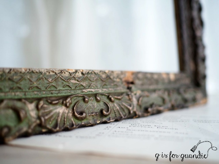
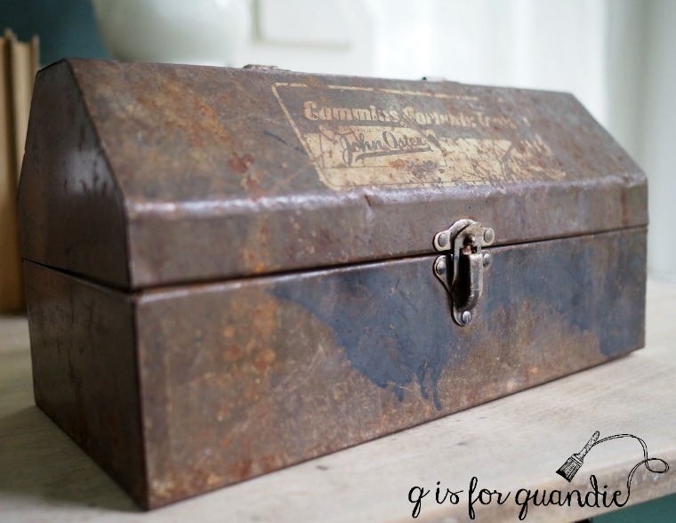
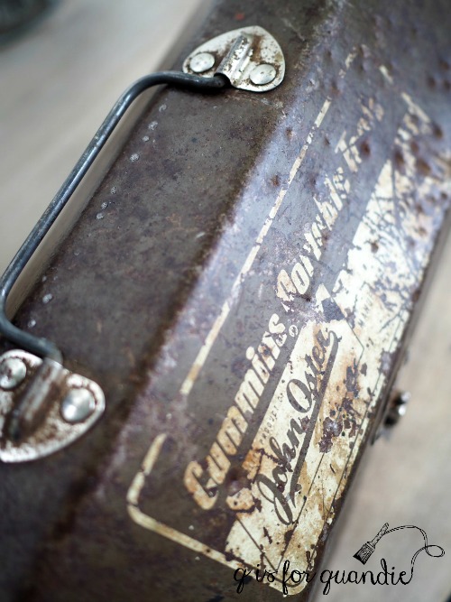
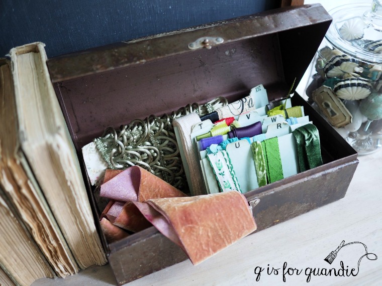
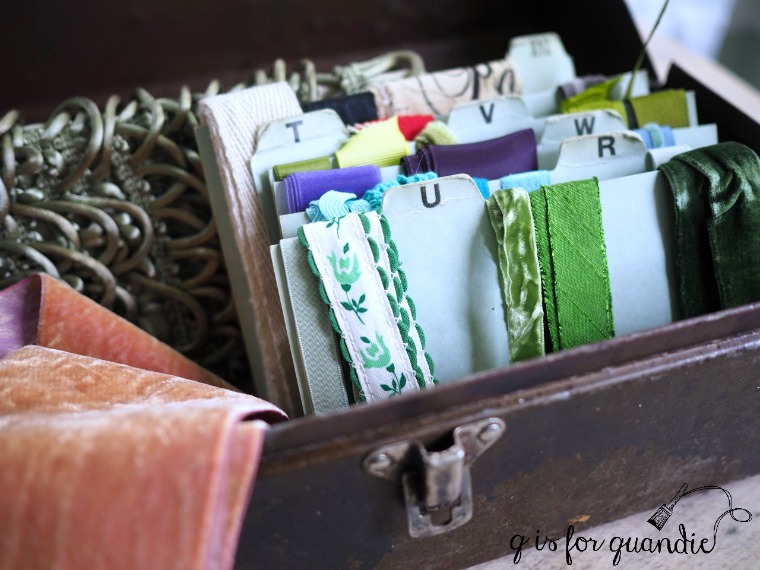
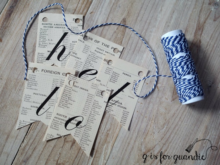
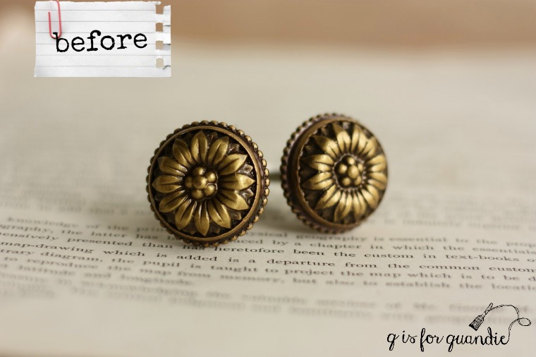
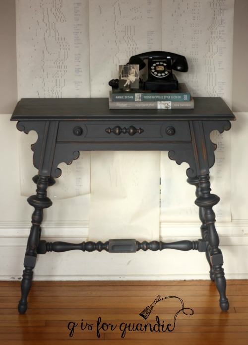
After reading some of the comments on Monday’s post about my ‘specimens de la decoration’ cabinet, I realized that a post comparing rub-on transfers, gel transfers, stencils and hand-painting might be worthwhile.

Are you a fan of adding words or other graphics to furniture?  Or even perhaps to your walls or other items of décor around your home?

I’m sure I’ve already established that I am definitely a fan, and I think I’ve tried just about every method there is to get them on there.  There are pros and cons to each.

Are you familiar with the project management triangle?

The theory behind it is that you can’t have all three things on the triangle at once;  fast, good and cheap.  You can only achieve two out of the three on any one project.  You can have cheap and fast, at the expense of quality.  You can have quick and high quality at the expense of low cost.  Get the concept?  It applies well here.  The cheapest options are also the most time consuming.  The most expensive are the easiest and produce the highest quality result.  But let’s go ahead and evaluate each one, shall we?
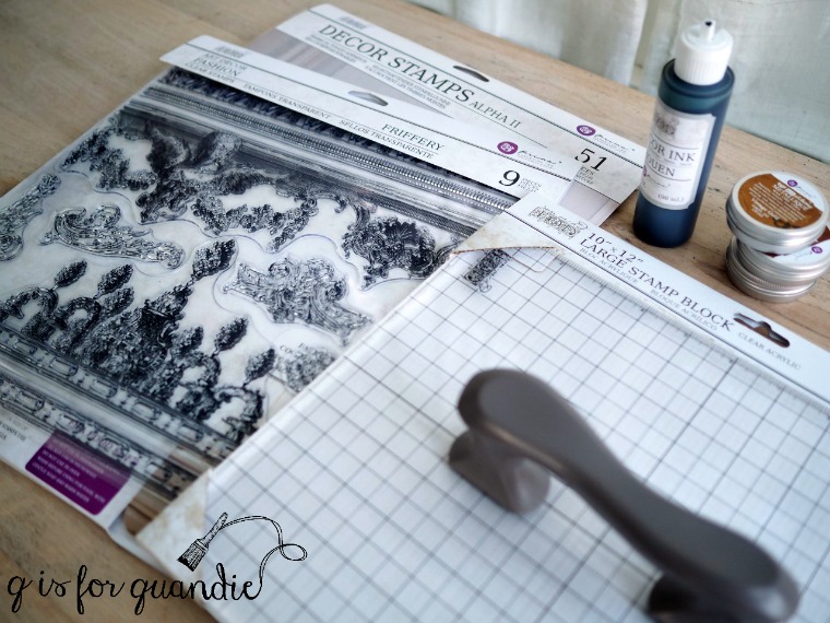
Rub-on transfers.

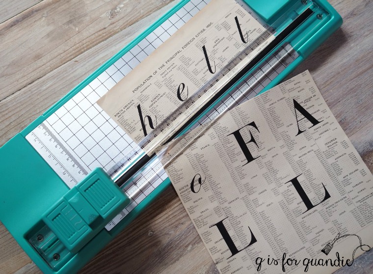
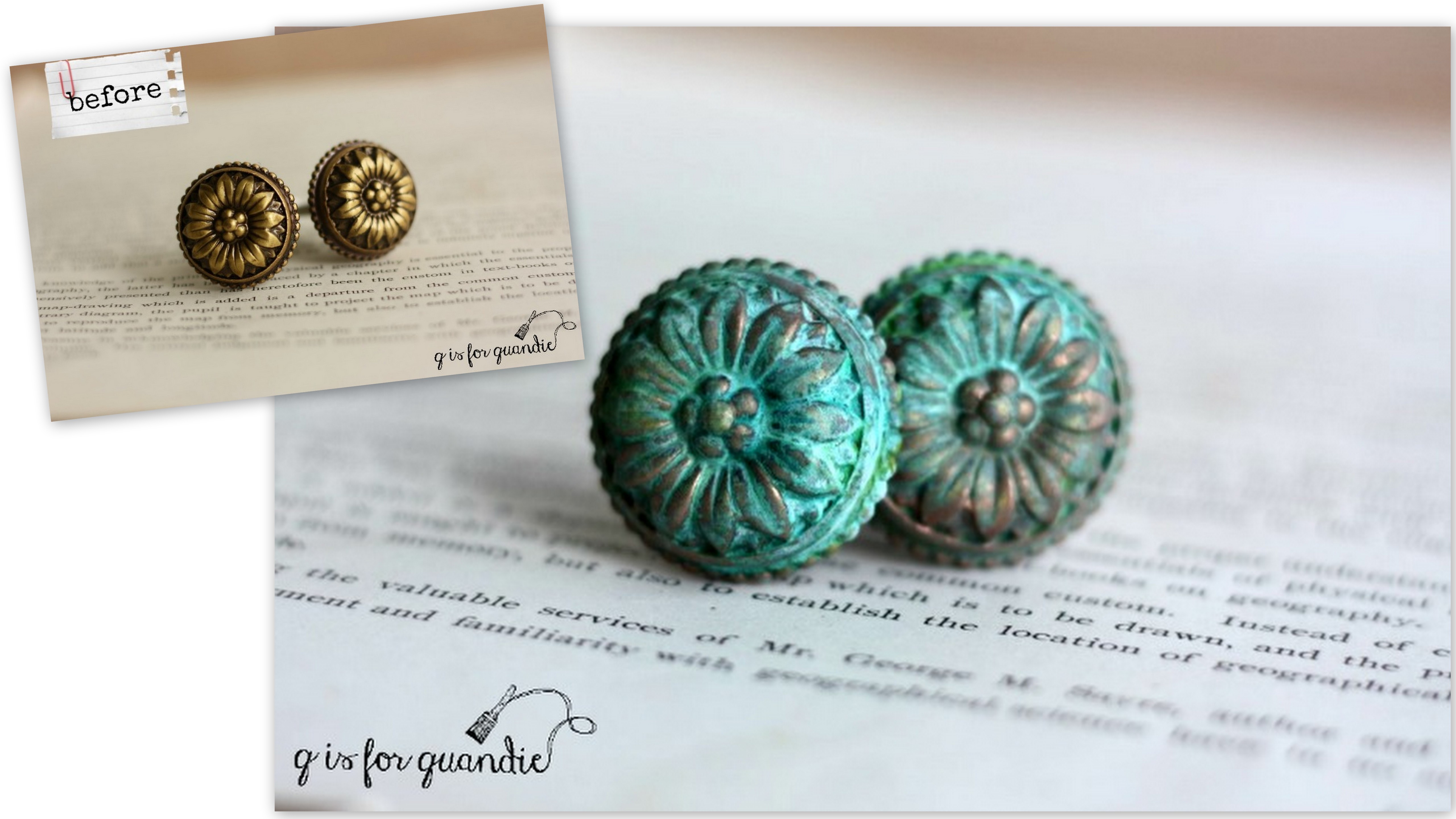
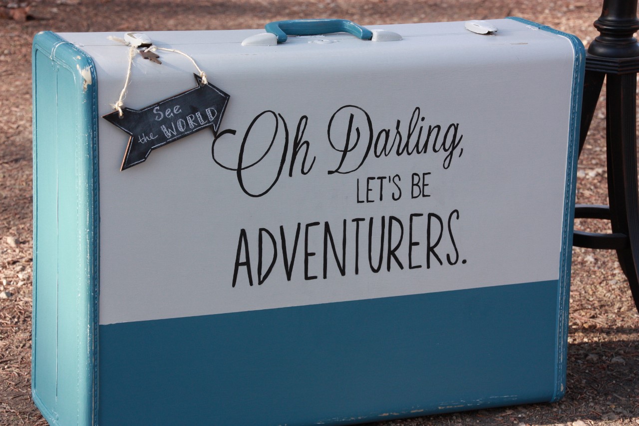
Not to be confused with gel medium transfers, which I’ll discuss in a minute, a rub-on transfer is a ‘dry transfer’ that is on a ‘backing material such as paper or plastic sheeting much like a transparency’ (Wikipedia).  They are applied by placing the sheet with the transfer down over your intended surface and rubbing the sheet with a tool of some kind until the transfer is adhered to your surface.  Rub-on’s will give you a high quality appearance and are fast to apply, but they cost more than other options.

Pros:  I think rub-on’s have the most professional look.  The designs can be much more highly detailed than stencils; in fact they are absolutely gorgeous.  They are easy to apply.  You can use them on painted surfaces, wood, metal, glass, plastic, paper … have I missed anything?  Until now I was only aware of rub-on’s for small craft projects, but I’m thrilled to have found large transfers for furniture!

Cons:  They are expensive and can only be used once each.  There is a little bit of a learning curve if you’ve never used them before because you have to get used to making sure the entire design is properly adhered before you remove the backing.  I wouldn’t use a rub-on transfer on a surface that will get a lot of wear such as on the seat of a chair or a table top.  I don’t think it would hold up well under that kind of use.
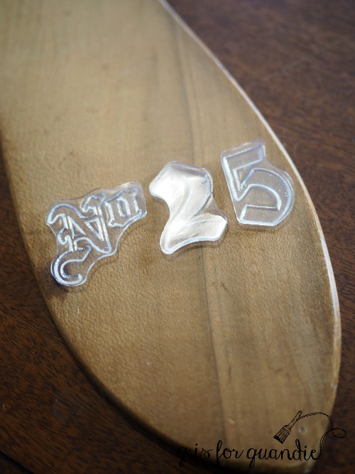
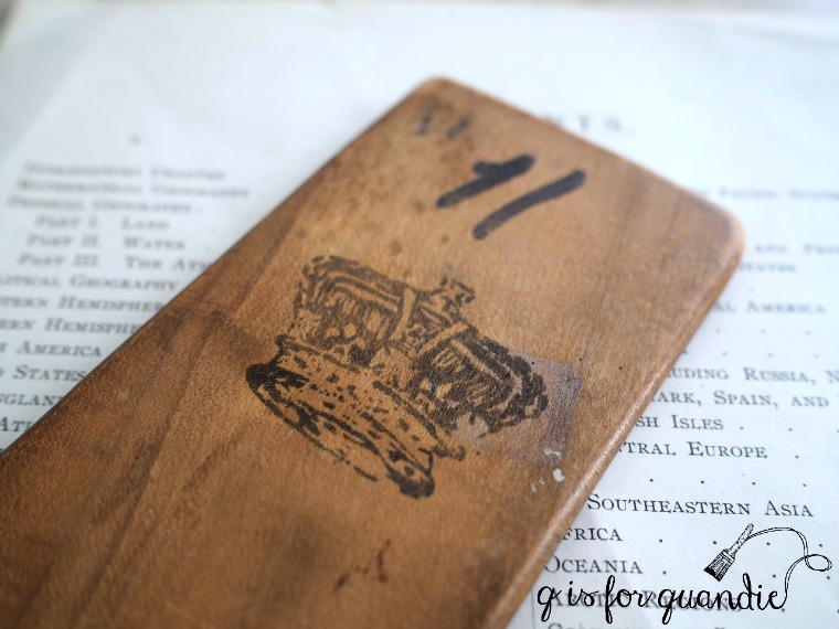
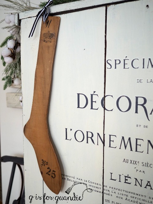
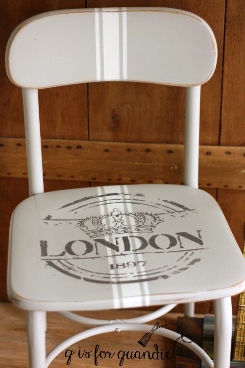
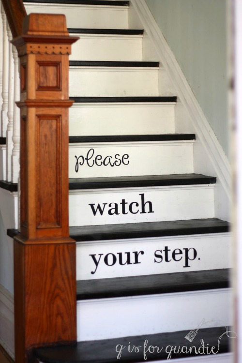
Stencils.

Stencils are usually made out of a piece of Mylar with the design cut out of it, although sometimes they are made with heavy paper or even metal.  They are applied by placing the stencil over your intended surface and using a stencil brush and paint with a pouncing motion to fill in the design.  Stencils will also give you high quality and fast, but not cheap.

Pros:  Stencils also have a very professional look when done well.  They are very quick and easy to apply.  You can re-use them over and over and over, thus lowering the cost per use.  You can easily use a painted stencil design on a chair seat or table top as it will wear the same as any other paint treatment.

You can get creative with stencils using just a portion of the design, or pairing up multiple stencils to create a larger design.  Another big plus to stencils is that you can use them on fabric, one of my favorite techniques.

Cons:  Stencils are also rather expensive.  Especially if you are only going to use it once on a specific project.  In addition to the cost of the stencil itself, you’ll also need to purchase a stencil brush and paint.  The price of stencils really only makes sense if you are going to be able to use them multiple times.  In addition, there is a bit of a learning curve with stencils.  Some people I’ve talked to claim they have never been able to develop the knack for getting a clean line with a stencil.  It does take some practice.  A sloppily done stencil is not a good look.  Also, stencil designs aren’t quite as delicate or detailed as a rub-on can be.
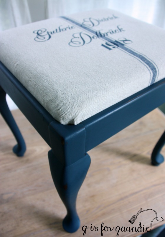
Gel transfers.

A gel transfer is made by printing a mirror image of your intended design onto paper with a LaserJet printer, then applying transfer gel to it and placing it face down on your surface being careful to eliminate any bubbles or creases in the paper.  You wait 12 hours, then use water to gently remove the paper leaving the design behind.  This method is cheap and creates a good quality transfer, but it isn’t fast since you have to basically wait overnight before removing the paper.

Pros:  This is a very cost effective way to add transfers.  A container of the transfer gel is under $20 and will last quite some time.  I haven’t even gotten halfway through my jar of Fusion Transfer Gel and I’ve done countless projects with it.  I’ve had the best success using transfer gel on freshly painted surfaces such as wood, cardboard, or metal.  I’ve read that you can use this method to transfer images onto fabric as well, but I’ve never tried it.

Cons:  I’ve also had some failures trying to use transfer gel on metal.  It always works over freshly painted metal, but I’ve had the gel peel right off both unpainted metal and metal with an old paint job taking the design with it.  It would also not work on unpainted cardboard or paper, or anything else that can’t get wet.  I’ve read that people use it on glass, but I’ve never tried it (do any of you have experience with this?), I wonder whether the gel can peel off the glass in the same way it did for me on unpainted metal.  Transferring a design larger than the letter or legal size available on your home printer will require having it printed at a Kinko’s or other print shop, adding a little bit to the cost and a bit of extra time to the process.

Tracing and hand-painting.

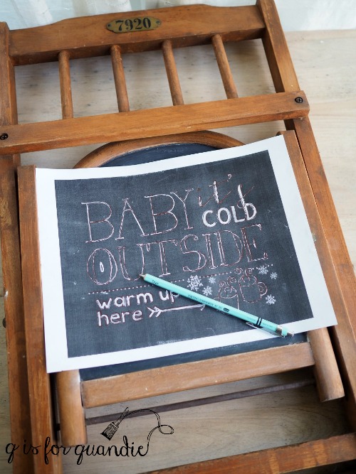
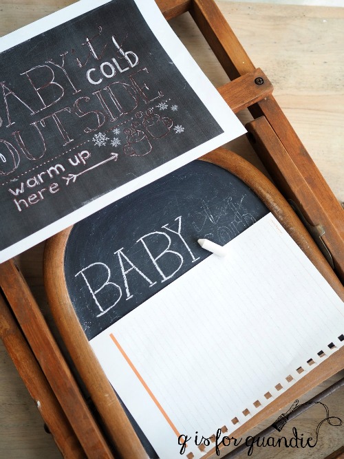
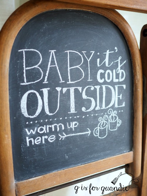
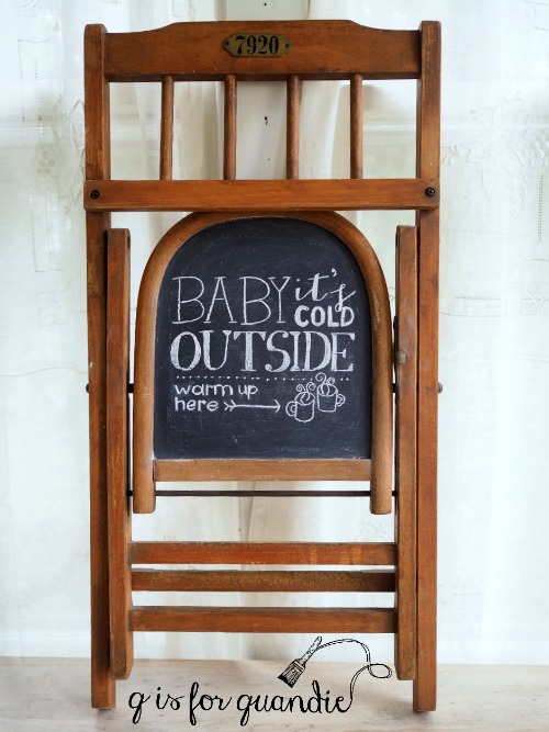
There are two ways to trace a design onto your surface and then hand paint it.  The first is to print your design on paper, then use tracing paper (in either white or black depending on the color of your intended surface) to trace the entire design onto your surface.  Then go back with a small artist’s brush with paint and fill in the design.  The second option is to print your design on a letter sized piece of paper, then use an overhead projector to project the image onto your intended surface.  Trace the design using a pencil, then go back and fill in with paint by hand.

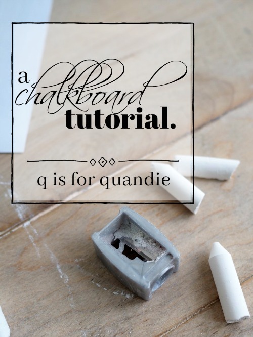
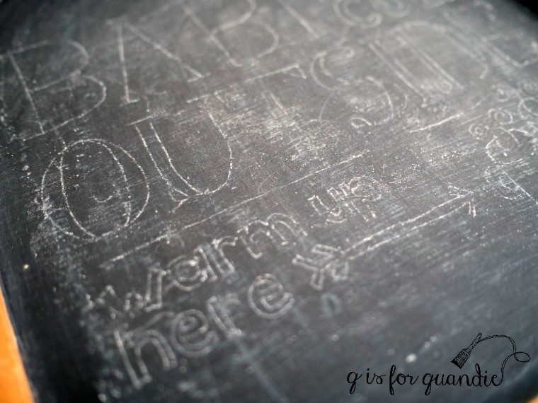
Pros:  If you happen to already own a projector and you have excellent painting skills, this is a cost effective way to add a graphic.  Using a projector is also a good way to add a really large graphic to a piece of furniture and be able to size it correctly.  The alternative tracing paper method is very cost effective.  I still use this method for chalkboard designs, to be filled in with chalk, but I almost never use it for painting a design anymore.

Cons:   Back in the day though, this was the way I did all of my graphics.  Can you imagine?  Looking back I am astounded at how time consuming it was, and I was never entirely happy with the end result.  If you don’t have a steady hand and a couple of spare hours, this option is definitely not for you.

Cutting vinyl.

I almost didn’t include this option because it’s not exactly a ‘transfer’, but since I tend to use it fairly frequently I decided I should throw it in.  I use a Cricut machine to cut adhesive backed vinyl, but there are other types of machines out there as well like a Silhouette.

Pros:  Once you’ve made the initial investment in a machine, it’s relatively inexpensive to buy the adhesive vinyl and then the sky is the limit for the quantity of stuff you cut out.  Once you’ve learned how to use your machine, it’s relatively easy and quick to do.  The vinyl will adhere to painted surfaces, glass, metal and plastic.  It is flexible as well, so it works well on surfaces that aren’t flat.  Also, you can print out any word or saying that you can think of.

Cons:  You have to invest in a die-cutting machine like a Cricut or Silhouette, and they aren’t cheap.  You also have to spend some time learning how to use it.  The investment is not worthwhile unless you are going to do a fair amount of cutting.  In my case, with a Cricut that is not attached to my computer, I am limited to designs on font cartridges that I have purchased.  The cartridges themselves can be rather expensive.  If I was starting from scratch I’m not sure I would invest in a Cricut and multiple cartridges, but since I already had them for scrapbooking I’m now finding that I get a lot of use out of them for home décor projects.

That wraps up my synopsis of the various options available to you for adding graphics to your projects.  I don’t have an overall favorite, different projects are better suited to different techniques and aside from tracing and hand-painting I’m sure I’ll continue to use all of them.  How about you?  Do you have a favorite?  Or maybe you have another method that you like to use.  If so, please share with a comment.

general finishes milk paint.

There are several furniture refurbishers out there whose work I really admire and they extol the virtues of General Finishes Milk Paint.  So when I ended up in a shop that sold this product while out shopping with some friends recently I decided to pick some up and give it a try.

The first thing you need to know about General Finishes Milk Paint is that it isn’t really milk paint.  I know, confusing right?

Here is what they say about the paint on their website:  GF’s Milk Paint is not a true Milk Paint – it is premixed and does not contain any casein based ingredients. We named our product Milk Paint with the intention of putting a clear, bright, contemporary spin on an old fashioned furniture paint tradition. It is designed to mimic the low luster finish of old world paints.

So if you are buying this paint and expecting to find a powder you’ll mix with water inside the can, guess again.  And if you are used to using this ‘milk paint’ and then you buy some Miss Mustard Seed or other true milk paint, don’t be surprised to find that it’s totally different.  Also, just know that you won’t get the chippy look that milk paint is known for with this paint.

The fine print on the can says that this is an acrylic paint, and for that reason it didn’t surprise me to find that it is very similar to Fusion paint.  Much like Fusion, it does not require a top coat (whereas chalk paint and milk paint require a top coat to be water resistant).  It also has the same self-leveling properties as Fusion.  It also distresses in a similar fashion, and by that I mean that neither of these paints distresses as easily as a chalk or milk paint.  These paints are meant to be very durable, so the longer you wait between painting and distressing, the harder it will be to sand off the edges for a distressed look.  Just be sure to distress promptly, if you plan to distress at all.  For those who prefer a non-distressed finish, both of these paints are perfect for that.

OK, so now that we have all of that info out of the way, let’s see how it looks.

I started with this petite desk that a friend gave me a while back.

I have to admit, I thought this desk was kind of hideous but it was either me or the Goodwill so I took it.  If nothing else, it provided a great canvas for testing out a different brand of paint.

You got a little sneak peek at this one in my post about my painting chair

Yep, this is where I paint in the winter.  Smack in the middle of my house.  And that chair was the perfect height for painting all of those spindly legs.

And now that it has a couple of coats of General Finishes Milk Paint in Queenstown Gray, well …

it’s kinda cute now, don’t you think?

As you can see, I did distress this piece and I did it about a week after I painted it.  So it can definitely still be done, it just takes a little more effort.

I lined the drawer with some pretty map paper.

Although I’ve called this piece a ‘petite desk’, it’s definitely too small for me to use as a desk.  It would be perfect for a youngster’s desk, but I think it would also work really well as a console table in a foyer or behind a sofa.  It also is the perfect height to be used as a nightstand.

Back in the day, it would have made a great telephone table, but nobody needs those anymore, right?

In the end I think this paint is very comparable to Fusion paint.  It’s just a bit more expensive (at least at the shops where I buy my paint), but not a lot.  If you love working with the General Finishes Milk Paint, you will also love Fusion paint and vice versa.  But obviously, if you’re looking for a true milk paint you aren’t going to find it here.

If you noticed in my first photo, I also bought a can of General Finishes Flat Out Flat topcoat.  I did not use that on this desk.  I have heard really good things about it as well, and I hope to test it out on something soon so stay tuned.

In the meantime, this little desk/nightstand/telephone table is for sale.  Be sure to check my ‘available for local sale’ page for more details.