going green.

I mentioned that I bought a little matching table at the same estate sale as the Lily Pond dresser.  I’m not a fan of using ‘matching’ furniture pieces, so often when I buy pieces that came from a ‘set’, I split them up.

green before

I’m still going green, but this time with Miss Mustard Seed instead of Fusion.

green books

There are lots of shades of green out there.  Avocado, mint, grass, pea, pear, forest, moss, the lily pond I used on the dresser …

I have to say, some times with the MMS milk paint greens, I feel like there are a lot of shades in the same bag of paint!  One of the quirks of milk paint is that you can never be entirely sure precisely what shade you will get.  You really need to be OK with that if you’re going to use it.  I knew that going in when I decided to paint my little estate sale table in Boxwood.

I’ve used Boxwood before, and loved it.  But this time it just wasn’t working for me.

boxwood

Now don’t get me wrong, I don’t think it’s bad.  It’s just not quite what I was going for.  I got some great chipping, which I loved, but the color just felt a little flat to me.  A little too 80’s country maybe?  Maybe the problem was the orange finish showing through the chips.  I don’t know, but something about it wasn’t speaking my language.

So I came home from work one night and decided to add a layer of Luckett’s green over the Boxwood.

green chippy 2

Ahhhh, so much better.  I love the little peeks of Boxwood showing through.

green chippy close up

I tucked some toile scrapbook paper inside the drawer.

green drawer interior

Is it possible to not love this color? or the chippyness of milk paint?

green table in Lucketts

Or maybe it’s just simply the layering of colors that appeals to me so much.

chippy green table

It works great next to a chippy chair.  Wouldn’t this be a great combo in your potting shed?  Or maybe on a covered porch?

And on a more personal note, today is my sister’s birthday.  Happy Birthday Deb!

Debbie

Are you digging that mid-century bookcase?  Debbie was this size when mid-century was just called ‘new’.

Last night my mom flew from Las Vegas to New Jersey to help her celebrate, and then to keep her company on the drive to Minnesota.  They will be hitting the road bright and early tomorrow morning, and my sister will be an official Minnesotan by Sunday!  Woo hoo!  How lucky am I?

big blue.

As part of my ongoing attempt to clear out a back log of furniture in my carriage house, last weekend I painted this guy.

big blue title

I don’t even have a ‘before’ shot of this one, I was so anxious to just get it done.  I sent Mr. Q out to pick it up last fall.  From the picture on craigslist, I thought it had more of a mid-century vibe.  I was going to paint the body white, and then do an ombre effect on the drawers.  However, when I saw it in person it wasn’t at all what I expected.  It is big, and sort of ‘heavy’ looking.

Honestly, I was so uninspired by this piece in person that I was just going to turn around and re-post it on craigslist as is.  However, the finish was in such bad shape I simply couldn’t do it.  I decided it would be better to just give it a quick chalk paint makeover with some Annie Sloan in Aubusson.  I then realized that I needed to go with a wood top to balance out all of that blue, so I stripped the top.  Unfortunately, that only made it more obvious that someone had used the top of the dresser as an ashtray.  Jeesh.  Have you ever seen that?  Burns about the length of half a cigarette all the way around the perimeter of the top.  Clearly someone had rested their lit cigarettes on the edge of the dresser and left them to burn there.  Why do people treat furniture with such disrespect?

I tried bleaching the burn spots, then sanding them down, then bleaching again, then sanding again.  They lightened up a little, but were still pretty apparent.  So in the end I decided to try and cover them with General Finishes Java gel stain.  I think it did a decent job of covering the marks.

big blue top

If you look closely you can see that the Java gel went on darker in the areas around the edges where I sanded heavily.  But this is such a great improvement over how it looked before that I am happy to call it good.

big blue closeup

By the way, in case you are wondering, I topped the Aubusson with some of my custom mixed dark wax.  I’ve mentioned this before, but for those of you who missed that, I mix 1 part dark brown Briwax with 4 to 5 parts cheap Johnson’s Paste Wax to create my own dark wax.  The Briwax on its own is very dark, but mixed with the Johnson’s it is just the right color.  I would never use it indoors, because it’s quite smelly.  It’s also probably bad for the environment and one’s health.  But when it’s nice enough to work outside, I sometimes pull it out because I really like the end result I get with it, and let’s face it, it’s cheap.  I bought the Briwax for $1 at a garage sale, and the Johnsons is about $6 per can.

I’ll be the first to admit that this piece isn’t my usual style, but I like to think that I saved this dresser from an uncertain future.

big blue angle

And now it is done, and hopefully will go to a good home and I can move on to some of the pieces I have waiting that are more ‘me’.

I was continuing my British theme from last week’s Union Jack desk while staging the photos of this dresser.  I used some London map paper on the wall and my Perfect English Farmhouse book.

big blue staging

And on the other side, look kids, Big Ben!

big ben

So, do any of you need a big blue dresser?  Ooops, sorry you missed it, this one is sold.

the lily pond dresser.

The other day I was running some errands over my lunch hour when I spied an ‘estate sale’ sign on the side of the road.  Fortunately, there was no one behind me, because I slammed on the brakes to make the turn.  I quickly purchased a sweet little nightstand (you’ll see that later) and some German redwork …

red work

I also noticed a charming maple dresser that was marked $90.  In general, I find that estate sale prices on furniture are a little too high for me.  It was a cute dresser, but not worth $90 to me.  However, there were signs posted throughout explaining the ‘bid’ policy for this sale.  Basically, I could leave a bid, and if the dresser didn’t sell for full price, the sellers would give me a call if they wanted to accept my bid.  I placed a bid for $65 and dashed back to work.  There was some strategy involved in coming up with this amount.  On Day 2 of the sale, the dresser would be reduced to $60 if it was still there.  However, they would hold it for me at the $65 until I could get back to pick it up.  Nice.

On Saturday morning, I got the call.  My bid was accepted and the dresser was mine.  I just had to go back and pick it up.

estate sale dresser before

A little sidebar story for you.  Why, oh why do I ever leave the house in paint splattered sweatpants and without makeup?  I usually make a rule to never, ever do such a thing.  However, on this particular Saturday I had painted all morning, and was going to do yardwork all afternoon.  It seemed silly to change clothes and add makeup just to quickly pick up this dresser.  After all, who could I possibly run into at an estate sale?  Sure enough, the moment I walked in the door I heard “hey, need some help loading that dresser?”  Oh boy.  One of our local fire fighters, whom I happen to work with at the day job.  So embarrassing!  From now on, it’s makeup and real clothes, even for an estate sale!

Back to the dresser.  Once I got it home and scrutinized it more closely, I found that it had a … hmmm, what should I call it?  Sort of a crack in the wood that left a pointed jagged edge sticking out.  I wish I had thought to take a picture of it before we fixed it, but once again, I forgot.  I thought I could just use some glue and a clamp to hold the jagged edge in place, but I wasn’t able to even budge it.  So, I called in my handyman neighbor Ken.  He always has some little trick up his sleeve for stuff like this.

Basically, he used a chisel to add some ‘give’ to the jagged piece of wood.  The chiseled line will ultimately be hidden behind that pretty braided trim.

estate sale dresser repair

We glued and clamped, and voila, the pointy bit is back in place.  I’ll fill in the crack with some wood filler, sand it down, nail the braided trim back down and paint will hide this repair quite nicely.

I had originally consider both red and yellow for this dresser.  I have found that when I paint things in those colors they take about 3 times as long to sell.  They do sell eventually, but they don’t fly out the door like the aqua/blue/mint green tones do.  Still, sometimes I ignore that and go with my gut, and this one said red.

But then Fusion offered to send me some paint from their new Michael Penney collection.  I saw Lily Pond and decided to go for it.

lily pond title

I sanded the entire dresser, wiped it down with a damp cloth, and then painted one coat of paint.  I added a second coat to the top of the dresser, but believe it or not, the rest was just fine with one coat.  Talk about easy. I waited about an hour or so, until the paint was dry to the touch, and then I used 220 grit sandpaper to lightly distress.

I found that it distressed quite easily at this point.  In the past, I have waited longer to distress and with the Fusion that isn’t a good idea.  As this stuff cures, it gets harder and harder to sand off.  So distress promptly.  Unless of course you don’t want any distressing.  But aside from that little tip, using Fusion really couldn’t get any easier.  There is no need to wax, unless you just prefer that look.  Waxing has never been my favorite thing, so it’s nice to do without it now and then.

Isn’t this a sweet shade of green?  While pulling out stuff to stage the dresser, I realized it’s just a tad more subtle than the green on the vintage clock I picked up while shopping in Las Vegas last year.

lily pond clock

It also works beautifully with some of my vintage wallpaper.

Lily pond corner

It’s that sort of 50’s vintage green that I love so much.  I have a bread box in this color in my pantry.

bread box

What do you think of Lily Pond?  I think it would be utterly charming in a nursery.  It’s got a little bit of a beach cottage vibe too.  Ahhhh, if only I had a beach cottage!  And don’t you just love those fat cinnamon bun knobs?

lily pond

I’ll probably post this one on craigslist soon, although with my sale coming up in June pretty soon I’ll have to start hanging onto pieces for the sale.  But for now, this one is available.  Ooops, sorry, this one is sold.

who doesn’t love jack?

My neighbor, nnK, has been busy dumpster diving for me again.  This time she came home with a old school desk and an industrial stainless steel cart.  You’ll have to wait to see the cart, but I finished up the desk this week.  Here is what it looked like when she brought it over.

trash talk before

I had to laugh when I saw that it was literally labeled as “trash.”

trash

The desk has a metal base with a formica top and is the perfect job for Fusion paint.  I knew it would stick to both of these surfaces.  Initially I was going to paint all of it, the base and the top.  But as I started working on it, I decided I liked the patina on the base, and if I could find the right color scheme for the top, it could work as is.  I hate to cover up a good genuine aged patina.

The inside of the base was another story though.  It was kind of disgusting, so I opted to paint that with one of Fusion’s new colors from their Michael Penney collection, Seaside.  These colors will be available for a limited time, so if you love it, you’d better get it now.  The Seaside is very similar to Annie Sloan’s Aubusson.  As a matter of fact, I was painting a dresser in Aubusson at the same time I was working on this piece and they were practically indistinguishable (you’ll see that dresser next week).

Now that the inside is painted, you can feel comfortable tucking your favorite books inside without them getting grungy.

uj inside

As for the top, I knew right away that I wanted to do another Union Jack.  I could have done it in the traditional red, white and blue (and Fusion does have an awesome navy and red), but I wanted to change it up a bit.  I started with a base of Seaside.  Then I taped off the lines for my Union Jack and painted the next layer in Fusion’s Champlain, which is a shade of white with a tiny hint of grey in it.

trash tape

You may be noticing at this point that I forgot the diagonal lines.  Ooops.  Drat.  I had to wait for this to dry and then go back and add them.  I’ll note here that I let each layer of color dry for about 24 hours before moving on to taping the next one.  As a result, my tape came off very cleanly and didn’t remove any paint with it.

The final layer of my Union Jack was painted in Fusion’s Bedford, which is a nice warm greige.  And voila!

uj desk top

Once the top was dry I sanded it with a fine sanding block.  That removed some ridges of paint that had developed around the tape lines and left a nice smooth finish.

us smooth top

One could use this desk as a desk, although it is rather small if you like to spread out. I think it would be more fun to re-purpose it as a bedside table.  Or use it next to your sofa, or in your foyer as a place to drop your keys and mail as you walk in the door.

uj on angle

I am rather in love with this desk now.  After all, who doesn’t love Jack?

vintage desk painted with Union Jack

 Please note that I have not been compensated by Fusion for this post, but they did send me some free samples of their paint to try out with no obligation which was awfully nice of them.

a glutton for punishment.

Eureka!  I finished the chairs!

completed chair

Took me long enough.

But in my defense there were two.

chair pair completed

I am relieved to have them done.  Turns out that upholstery might not be my favorite thing.

I managed to replace the arm patches, but don’t look too closely at my work.

chair arm

It will not hold up to intense scrutiny.

I’d give you all of the details on how I did them, but you probably don’t really want to copy my work.  Look to Miss Mustard Seed for legit tutorials on upholstery.

The nice thing about these chairs is that they are totally neutral and could be dressed up with throw pillows in any color.  I’ve shown you three different options in my photos.

chair with green table

Despite my whining and complaining about how much work these were, I went out and purchased a claw foot antique settee on Wednesday and I’ll be jumping right back in for more upholstery work.

settee before

I know, you’re now thinking to yourself ‘what is wrong with her?’  Or perhaps it’s just me wondering about that.  Am I a glutton for punishment or what?

Well, here’s the thing.  Every year I set myself the goal of trying something new.  Last year it was stripping and waxing wood.  I had been afraid of this process for a long time, so I decided I needed to tackle it.  And as it turned out, it’s pretty easy.  Now I often strip and wax the tops of my pieces.

wintergreen stripped top

This year’s goal is to get a handle on upholstery.  I don’t sew, so I’ll never do any serious upholstery work, but I want to be able to tackle the basics.  I think that like anything, more practice will help me get more comfortable with it.

The beauty of this particular settee is that it won’t require any sewing.

Also, I should note that this is all the fault of my friend and Carriage House Sale co-conspirator Sue.  She just finished a fab settee herself and it inspired me to tackle one too.  I’m going to share her’s with you next week, so stay tuned!

a tropical island.

This poor dresser has been wasting away out in the carriage house all winter.

island before

 Somehow its plain straight lines just weren’t inspiring me.

But I have made a commitment to get to all of the pieces that are waiting for me out there, and this one was next up on the list.  It is a great example of how my plans change as I begin working on a piece.  My original plan was to paint it grey with white horizontal stripes on the drawers, much like this inspiration photo from pinterest.

sophiasdecor dresser

I was going to use Fusion paint, because I knew that would handle the taping of the lines quite well.

I even ran to Hobby Lobby and bought some really pretty crystal knobs that I thought would work well with this rather more formal look.  However, while picking up those knobs, I also grabbed some glass pulls just to see how I liked them on this piece.  Since it already had two holes for each pull, I thought maybe, just maybe, the glass pulls would work.

Sure enough, they were exactly the right size.  To me, glass drawer pulls give a very ‘vintage farmhouse’ feel to a piece, which meant I had to change gears and go with milk paint.  Also, after taking a closer look at the dresser, I decided it would be the perfect piece for stripping the top and refinishing it with my favorite wax for that, the Cece Caldwell Aging Cream.

All that remained was to pick a color.  I debated several Miss Mustard Seed colors, but in the end I realized I was kind of bored with the “out of the bag” colors.  I needed something custom mixed.  I went to my favorite place for inspiration, pinterest.  I keep a pin board for MMS colors and I try to pin custom color examples whenever I see them.  I considered using a color that Dear Emmeline created called Eucalyptus.  It is a mix of Boxwood and Ironstone.  But I wanted more blue in my color.  Then I saw a dresser painted by Abbe Doll and decided it was perfect!  A mix of 3 parts Luckett’s Green to 2 parts French Enamel, and I just happened to have plenty of both colors.  I don’t think that she named her color, so I’m calling it Tropical Island.  It’s a beautiful shade of blue green, like the waters surrounding a tropical island.

tropical island dresser title

And since I was on a roll with the whole ‘island’ thing, I decided to turn the dresser into a kitchen island!

Ken and I worked together to add new casters.  Why new?  I wanted them to be functional.  The vintage casters tend to look pretty, but you wouldn’t really want to roll your pieces around on them too much.  These larger casters also added the perfect amount of height to bring the top up to counter top height.

I staged the piece in my own kitchen first to see how it would look.  I thought it would be perfect to take photos in the early morning when the light is flooding in.  I forgot to factor in that the light would be flooding in behind the island.

kitchen island

Hmmm.  Not the best plan.  Although I like that you can now easily picture this piece as an island.  And since it is intended to ‘float’ in the room like this, I did paint the back.

kitchen island back

You can see that I added a little hook to the side for hanging a towel.

kitchen island hook

In the end I hauled the tropical kitchen island out to the photo cottage to take advantage of better lighting.  I staged it with a lovely French ironstone bowl and some other pretty vintage kitchen items.

kitchen island stagingkitchen island staging 2

As is typical with MMS milk paint, there is some slight color variation in the paint.  You can really see it more clearly in this close up.  The drawers are a little more green than the body of the dresser.  But in this case, the drawers are all the same, and I think this look works on this piece.

kitchen island close up

After having the island in place in our own kitchen, Mr. Q and I have decided we really don’t have room for a kitchen island.  So, this one is for sale?  How about you, do you have space to fill in your kitchen?

kitchen island collage

progress.

Remember the cane back chairs I picked up a while back?

chair before

Well, they are promised to one of my favorite customers, Nikkii.  We once added up all of the pieces she has purchased from me, and it was in the double digits.

I think the very first piece she purchased from me was this bed, back in my pre-blog days.

French bed

 She also has the Duncan Phyfe sideboard …

french linen sideboard

and this sweet white dresser …

le petit gateau

Not to mention the footboard chalkboard.

foot board turned chalkboard

Plus a bunch more!

So I am happy to be working on these chairs for her.  I know they will be right at home along with the other pieces she has!

However, they are turning into one of those projects.  The ones where you just keep running into snag after snag.  And they still aren’t done, but I thought I would give you an update (mainly because I don’t have anything else to share today!).

My original plan was to start with removing those arm rest patches so that I could just paint the arms.

chair arm covers

Easier said than done.  The Velcro slipcover thingie came right off, but the upholstered arm cover had about 400 million staples holding it in place.  I spent over an hour on the first one, and still had about 20 firmly embedded staples left in the arm that I simply could not get out.  It was time to consider a plan B.  I am going to attempt to re-upholster them.  Miss Mustard makes it look so easy, I hope it is.

Once I made this decision, I decided to go ahead with the painting.  I painted one coat of chalk paint on the first chair, and quickly realized that it was going to be a challenge to cover all of that cane with a brush.  Time for another plan B.

spray paint

I decided to spray paint the cane first, then cover it with a final coat of chalk paint.  I generally avoid spray painting indoors though, so I had to wait until the weather cooperated so I could haul them outside for this step.  I am not a big fan of spray painted furniture, but when it comes to both cane and wicker, it can often be the best option.

While manhandling the chairs for spray painting, I realized that one of the arms was really wobbly.  I thought I could shore it up by just tightening the screw that holds it in place.  No dice.  I called my handy man/neighbor/furniture miracle worker, Ken, for a consultation.  He decided he could work some magic with glue and by adding an additional screw where the arm meets the chair back.  Since I’m going to paint these, he knew I could patch and paint over the screw head.  Thank goodness for Ken, but of course this was another delay in getting the chairs painted.

Meanwhile, I was working out a plan for the cushions.  Luckily my friend and Carriage House Sale partner, Sue, is a fabulous seamstress who doesn’t mind tackling the occasional sewing job for me.  I sent the cushions home with her along with some drop cloth fabric.  She whipped up some slip-covers for me in no time!

chair cushions

She made them with an unstructured pillow sham-like design, so they could be slipped off and washed.  Since Nikkii has some little ones at home, I know she will appreciate this feature.  Here is the underside, with two ends that overlap so the cushion can be slipped out.

chair cushion slipcover

And here is how one looks on a partially finished chair.

chair with cushion

Nice, right?

So … progress is being made … but I’m not quite done.

chair progress

I still need to add another coat of white, distress and wax, then re-cover the arm patches.  I’m hoping to get all of that done this coming weekend.  Wish me luck!

On a related note, for you Fixer Upper fans, remember when I first posted about these chairs and I mentioned that Joanna had used similar chairs in one of her fixer uppers?  Well, she did it again.  In the most recent episode, Asian Ranch, she used them again …

fixer upper chairs

Does she re-use furniture for staging the homes for the show, and then take them back and use them again?

Or does she have a supplier of these chairs that she just goes back to for more?

Does anyone else wonder about this?

And while we’re on the subject of Fixer Upper, did anyone else notice the piano in the Asian Ranch episode?  It came with the house and looked like this …

fixer upper piano before

And they kept it in the house …

fixer upper piano

See it tucked away back there behind the table?  It’s a little difficult to see in this photo, you can see it a little bit better in the episode, but I think they painted it black.

And I love it.

So now I’m tempted …

piano room

What do you think?  Black piano?  I could use MMS Typewriter milk paint.  Do I dare?

a chippy blue chair.

I purchased this chippy blue chair many years ago at a garage sale.  I no longer remember what the seat looked like at the time, but I’m sure it was gross.  I’m also sure that the seller thought this thing was ready for the dumpster.  But you know me, I love that chippy factor.  And this one is authentically chippy.

chippy blue chair close up

 I recovered the seat with some pretty vintage pink and white fabric and for many years the chair lived in the ‘potting shed’, which became the ‘summer house’, which became the ‘photo cottage’ last year.  At that point, the chippy blue chair became homeless.  I’ve shuffled it around, but it hasn’t really found a spot.  I used it in the photo shoot for this dresser I painted a few months ago.

pale yellow and white dresser

But it ultimately ended up stashed on the front porch, so during last weekend’s clean up I pulled it out of there.  Taking a close look at it, I realized it was really dirty from all of those years in the cottage out back.  It deserved some attention.  I pulled off the seat, removed the fabric covering and sent it to the washing machine.  Then, I vacuumed off the surface dirt.  Finally I pulled out the magic eraser, and that made all the difference.

Look how much dirt came off, ewwwww …

chair dirt

That was a brand new magic eraser when I started!  Are you now wondering how it is possible that 90% of the time I neglect to take photos of my process, but somehow I managed to get a photo of dirty water for you?  Yeah, I don’t know what’s wrong with me either.

After cleaning the chair, I re-glued some of the cross pieces at the bottom that had come loose.  Finally, I wanted to add a little protection to the finish so I pulled out the sample of Fusion Beeswax Finish that Homestead House was kind enough to send to me.

chippy blue chair beeswax

I used some torn up flannel sheeting and rubbed the beeswax over the whole chair.  It added a little more sheen to the painted areas, and some much needed moisture to the chipped areas giving the chair a fresher look. I don’t know if you’ve used a magic eraser before, but it does tend to remove the shine from things.  So the beeswax added a really nice lustre back to the chair. This stuff is made with pure natural beeswax and hemp oil.  You could quite literally eat it because it is food safe quality, but honestly, it doesn’t look that appealing as a snack.  I did feel quite comfortable using it indoors with no ventilation though, and now my chippy chair has a little more protection from all that dirt.

Next came deciding what fabric to use on the seat.  I had a couple of options in my stash.  The first was this H & M tea towel.  I liked that it had a blue border, but once I fitted it to the seat, I realized that not much of the blue border would show.

 chair seat option 1

Next I tried a dyed grain sack.

chippy blue chair grain sack seat

I liked this idea in theory, but when I put these together I felt like the richer color of the grain sack overpowered the pretty blue of the chair.  It’s not a bad combination, just not the one I wanted.

Finally I tried an H & M pillow cover that I had on hand.

chippy blue chair seat 1

Ding, ding, ding.  We have a winner folks!

I like how the blue pops with the white fabric on the seat.  And a bunch of french writing?  What’s not to love?

So, a tip for you here.  These 20″ x 20″ pillow covers from H & M are the perfect size for the average chair seat like this one.  They are a mere $5.95 each (plus shipping though).  The problem with H & M is that their inventory seems to go fast.  They still have this style, but only in pink and pale green.  Another style they have that would look great on some chairs is this one:

H and M cushion

So, my chippy chair is cleaned up and re-covered and now I just need to decide what to do with it!

chippy blue chair title

 I’m sure I will find a home for it somewhere, and it will probably make its way into future furniture photo shoots.  Wouldn’t it look great paired with a chippy desk?  Maybe I’ll keep it on the front porch for now, it certainly looks nice next to the white hutch.

chippy chair

picking pieces.

Recently someone asked me how I pick the pieces I paint.  I didn’t come up with a very good answer on the spot because I really haven’t given much thought to my process.  I just pick what I like.  But I do realize that choosing the right piece to paint is nearly as important as the painting itself.  So I decided to try and pin down my process a little for all of you.

In winter, most of my pieces come from my local craigslist.  We have a thriving craigslist community here in the Twin Cities.  So a while back I headed out to craigslist and picked out a few examples of what was out there to share with you.

First let’s talk price.  I generally set a maximum of $100 for a dresser.  I use the craigslist search tool to limit my search, otherwise I will be distracted all day by gorgeous pieces of furniture that are listed at $400, which is a total waste of my time.  Although $100 is my max, I will only pay that much for a piece that has all of its hardware, is in great shape, doesn’t need repairs and has something unique or special about it.  Otherwise I like to stick to a price range from $40 to $75 for a dresser.

Let’s start with a dresser that I would not pick.

dresser, 100, pass

The first problem with this dresser is the hardware.  Gack!  It is just plain ugly and would have to be replaced, and there are 8 handles.  That is going to add up.  Not to mention, these handles have two holes each, so I’d either be filling holes, or trying to find replacements that fit these existing holes.  But the real problem with this dresser is that it just doesn’t have any personality at all.  If this dresser were dirt cheap, let’s say around $25, and I didn’t have to go far to pick it up, I might consider it.  It could be dressed up with some number stencils on the drawers.  But it was listed at $100.  No way.

Here is another “no” for me.

dresser, olive green

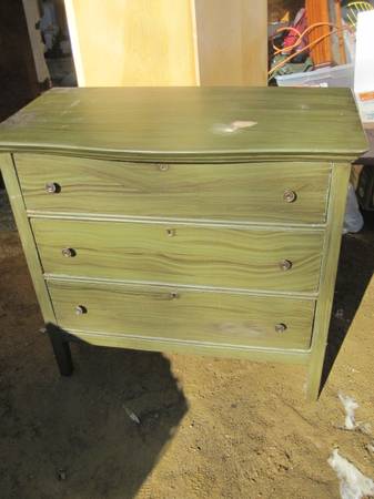
This dresser was listed for $50.  Great price.  It has something I always look for, key holes.  To me key holes usually indicate a well made, antique piece of furniture.  The ad claims this piece is solid wood, another plus.  So, why don’t I want it?  It’s painted a weird olive green.  I hate stripping paint.  It’s time consuming and messy.  So my choice on this piece would be to either paint it something that works with the green and allow the green to show as an undercoat, paint it a solid coat of chalk paint (or even Fusion!) and not distress it at all.  But the fact of the matter is, I’m a distressing sort of girl.  I reserve the non-distressed look for mid-century pieces.  But that’s just me.  Maybe you’d be OK with any of these options, in which case this dresser is a great deal!  I generally steer clear of previously painted pieces though.

Let’s move on to a distinct ‘maybe’.

dresser, apple valley, 75

These are often called a “chest on chest” dresser because they have a wider lower section of drawers with a slightly narrower section on top.  I find this look really appealing.  The Seven Seas dresser that I painted recently was a chest on chest. The trim around each drawer on this one adds a lot of detail.  The legs in front are pretty sweet.  They aren’t turned, but they still have some personality.  This dresser was listed for $75, which is a decent price but not great.  One glaring problem is the missing drawer pull.  As I’m fond of mentioning, one missing drawer pull is the equivalent of not having any hardware at all.  You’re never going to match that.  You’d have to replace all of the hardware on this piece.  But, it still might be worth it.  Honestly, if I didn’t already have a bunch of unfinished pieces lined up in my garage, I’d follow up on this one.

Here is another dresser that I would seriously consider:

dresser, otsego, 75

This dresser was also listed at $75.  Look at that charming detail on the top two drawers, and the lovely turned legs in front.  It has a mirror (it was shown in a separate photo), but I often leave these mirrors off.  Especially when they are mounted on two turned supports like this one is.  I just don’t like that look very much, and I find the turned supports annoying to paint.  This is a style of dresser that can work really well for a wide screen TV when there isn’t a mirror.

I do have one concern about this one though.  It could be a ‘bleeder’.  Are you familiar with that term?  Basically some of the orange to reddish colored stains will bleed through paint.  No matter how many coats of paint you use to cover them up, that orange/pink color will just keep coming through.  There are methods you can use to deal with the dreaded bleed thru, which usually involve sealing the piece somehow, but that adds another step to your process and can really be frustrating.  So, I usually avoid those pieces.  They can be hard to spot though.  This one looks like it has the potential to be a ‘bleeder’ although it may not be.  I would have to see this dresser up close and in person before making a decision on it.

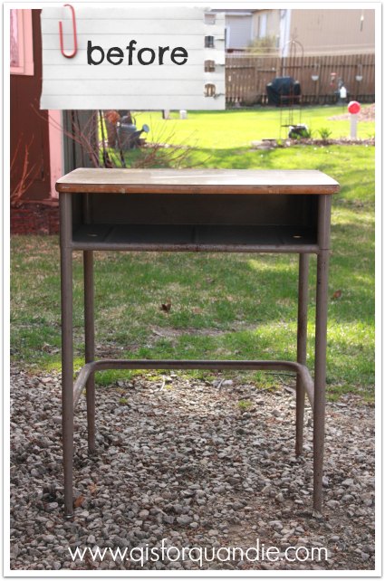
This last example is right up my alley.

dresser, minnetonka, 75

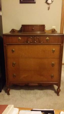
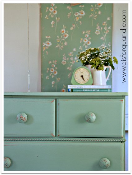
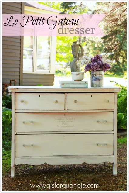
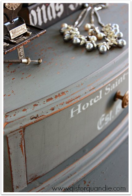
It was listed at $75.  What do I love about it?  The turned legs, the beaded trim below the first pair of drawers, the fabulous hankie drawer at the top.  I can picture in my mind how this piece will look painted.  I know that I can play up those details with some distressing, or contrasting colors.  I can’t really see what the hardware looks like in this picture, but I can see that it is all there.  But even if I have to replace it, I think this piece is worth it because of that charming hankie drawer.

In fact, I liked this one so much that I did send Mr. Q out to pick it up.  Here is the ‘before’ photo I took when we got it home.

hotel dresser before

And here it is after its make-over.

Dresser painted in MMS milk paint in Trophy

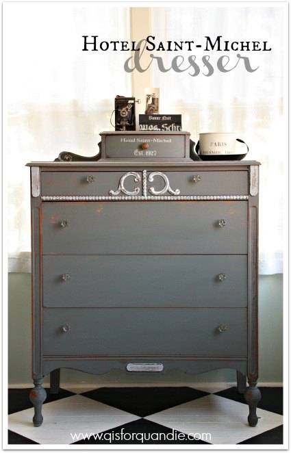
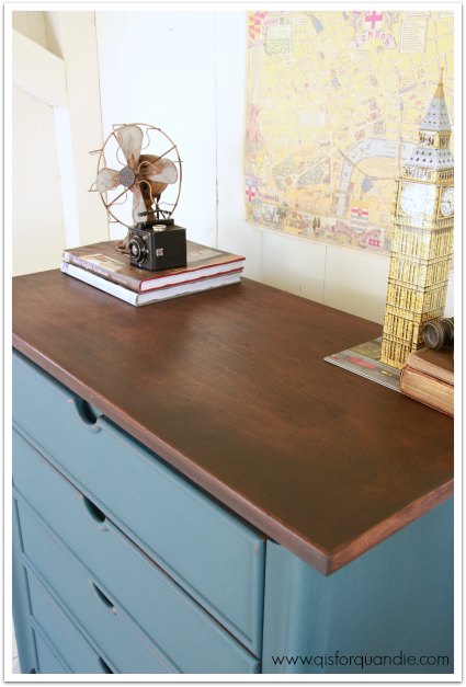
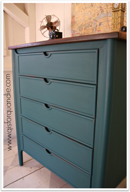
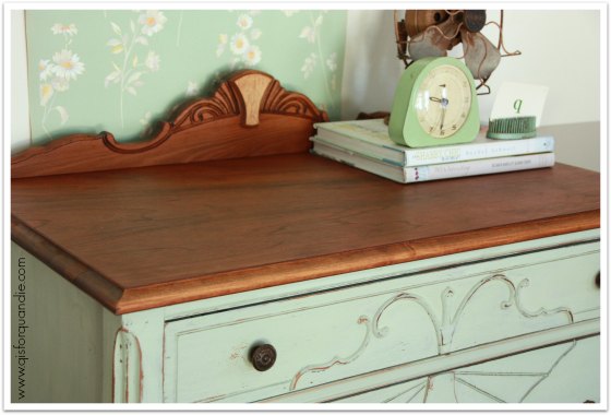
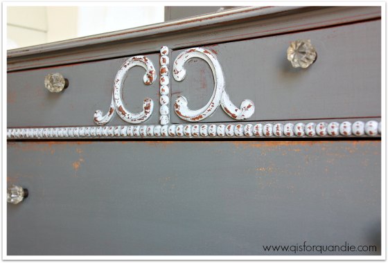
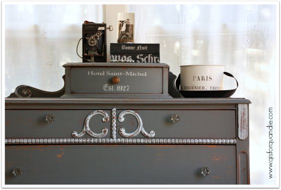
I painted it in Miss Mustard Seed milk paint in Trophy.  I used MMS Ironstone on the trim details, and I finished with hemp oil.

I added a little stenciling on the hankie drawer just to give it a little extra personality.

hotel dresser stencil

I got some really fantastic chipping on this piece.

Chippy milk paint close up

hotel dresser details

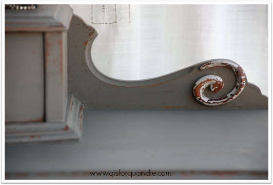
I really wanted the details on the dresser to pop, so I painted them in Ironstone for contrast.

hotel dresser front

As you can see, I did end up changing out the hardware on this one.  The original hardware was pretty, and it was all there, but it was a very yellow brass and I didn’t like the way it looked with the grey of the Trophy.  I just left the original knob on the hankie drawer.  I’m not really sure why, but I tried that one both ways, and just liked the original better (the other drawer pulls are bigger and brassier than this little knob).

hotel dresser staging

I hope this post gives you some ideas of your own about re-fabbing a dresser or two.  Head to your local craigslist and see what you can spot for yourself!

hotel dresser collage

And meanwhile, yes, this lovely dresser is for sale.  Let me know if you are interested.

Linking up with:  Finding Silver Pennies.

whistling dixie.

During the recent miraculous spring warm-up here in the Twin Cities, my co-workers Sue and Cathy and I headed out to our first lunch time garage sale of the season.  Woo hoo!  Mid-March, and sales are already popping up.  So exciting!

We didn’t find much, but I did come home with a Dixie blonde mid-century nightstand and a really fab old wire ‘in-box’ (which now lives in the Q Branch).

2015 spring blog

The nightstand was bargain priced, and I knew it would be the perfect candidate for another Fusion makeover.  Why?  Well, when I paint MCM pieces I always feel like they shouldn’t be distressed.  Normally I am all about the distressing, but not with these pieces.  Obviously, milk paint is out of the running when you don’t want to distress.  True, you could add the bonding agent and get a non-distressed look, but seriously, why bother?  That’s going to get expensive, and putzy, and unnecessary.  In the past chalk paint was always my go-to for MCM pieces.  And, don’t get me wrong, they did turn out lovely.

2014 summer blog2

vintage blonde dresser painted in Aloe

But now that I have tried Fusion, I am pretty sure it’s going to be my paint of choice for MCM pieces and I’m not just whistling dixie!

I painted the body of the nightstand in Fusion’s Champlain and the drawer in my new favorite color, Laurentien.  The color reminds me of my favorite shade of McCoy pottery.

MCM tulips

I let the paint dry overnight, and then I added some of my fav MCM vintage wallpaper to the inside of the cubby hole.  As I was working with the wallpaper, it was nice to not have to worry that I was taking off any paint while wiping off excess paste.

MCM wallpaper

The wallpaper has little touches of gold in it, so I decided to add some gold Rub ‘n Buff to the knobs to bring that out.  When I purchased this piece, Cathy assumed I was going to replace those knobs.  Nope.  The knobs are perfect for this piece and are part of its personality.  What do you think of them now Cathy?

MCM knobs

I love how the gold works with the turquoise.

MCM nightstand painted in Fusion's Laurentien

Since I felt like the little nightstand would be lonely in a photo shoot all by itself, I also decided to paint up a chair that was waiting for a makeover.

MCM chair before

I used the same colors on the chair, and then added some vintage barkcloth to the seat.  The aqua in the barkcloth was a perfect match for the Laurentien.

MCM chair upholstered in barkcloth

Didn’t it turn out sweet?

MCM nightstand and chair

Almost makes me want to add a few mid-century pieces to my own home.  How about you?