feeling international.

This past Saturday I went to the Pink Martini concert at Orchestra Hall in Minneapolis (if you’re reading Kim, thanks for the heads up on that!).  If you’re not familiar with Pink Martini, they once said that if the United Nations had a house band it would be Pink Martini.  I love this quote from their bio:  “We’re very much an American band, but we spend a lot of time abroad and therefore have the incredible diplomatic opportunity to represent a broader, more inclusive America… the America which remains the most heterogeneously populated country in the world… composed of people of every country, every language, every religion.”  Saturday night they sang songs in Turkish, Armenian, Italian, French, Japanese and more.

Not sure that Japanese music would appeal to you?  Check out Zundoko Bushi.  Or perhaps an Italian ballad is more your style, if so check out Ninna Nanna.  They do sing songs in English too, and I always dedicate Eugene to my sister (because her ex is named Eugene and I enjoy teasing her about it).

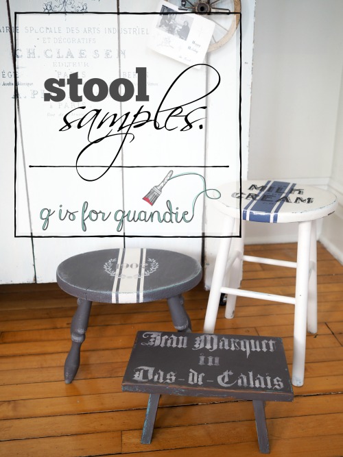
Anyway, seeing Pink Martini perform is like taking a trip around the world without leaving Minneapolis.  I let that idea inspire the staging for the piece I’m sharing here today.

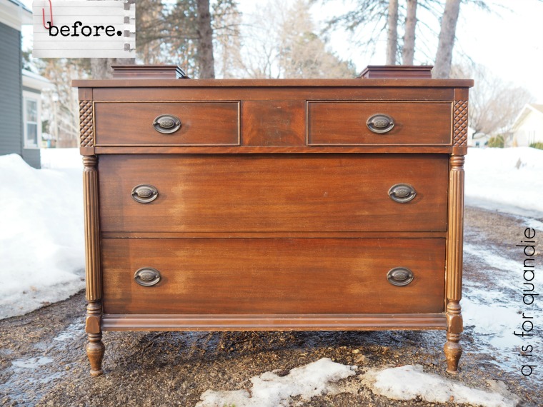
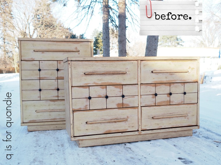
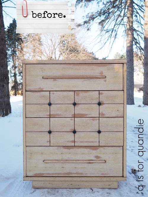
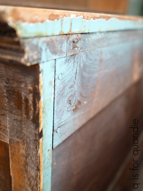
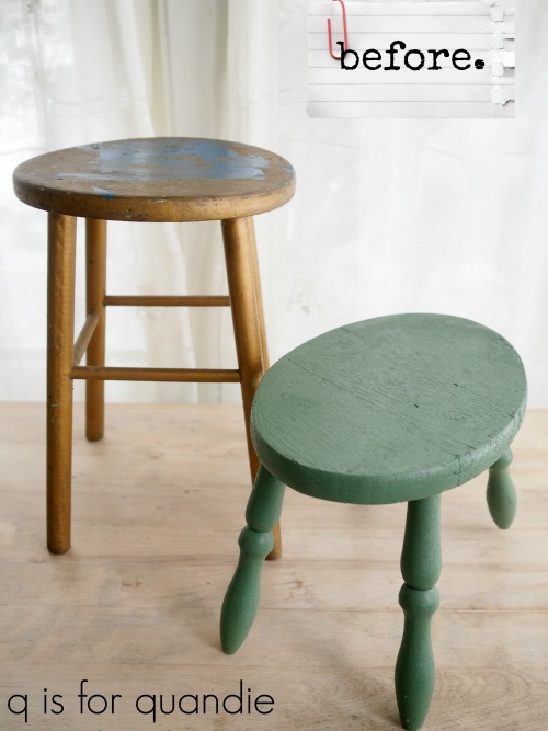
But let’s start with the ‘before’ pic …

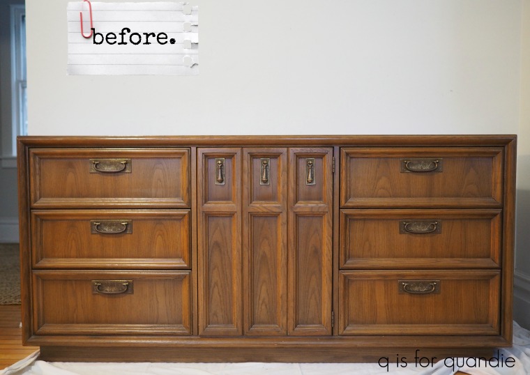
Mr. Q and I risked life and limb to pick this up one cold evening last week.  It was being stored in the seller’s walk out basement so it required backing our vehicle halfway down an icy hill in the pitch dark, and then carrying the piece itself halfway up that same icy hill in the pitch dark to load it into the van.  And yes, in case you are wondering, it is as heavy as it looks!  Once it was all loaded up it took a couple of tries to get the van back up that icy hill.

But we survived to tell the tale and got this piece safely unloaded back at our house.

By the way, this dresser also came with two tall, skinny, side by side mirrors attached at the back.  You may be familiar with that style from the 70’s.  I took them off and will not be putting them back on.

I bet you can guess what I did with it next!  If not, you haven’t been paying attention lately.

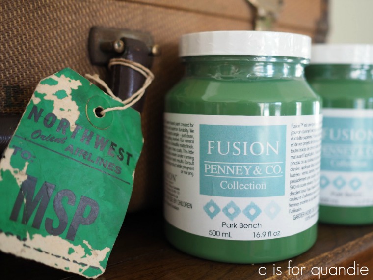
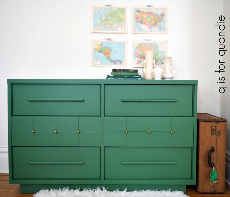
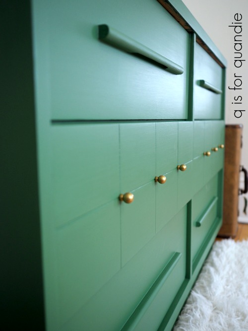
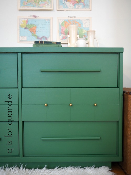
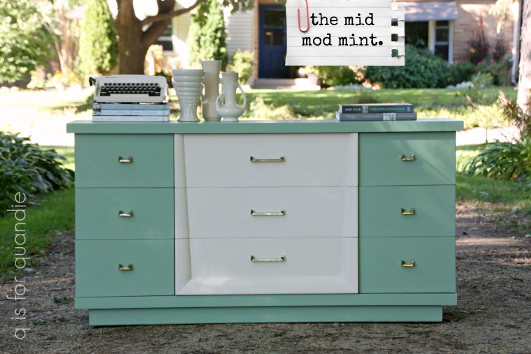
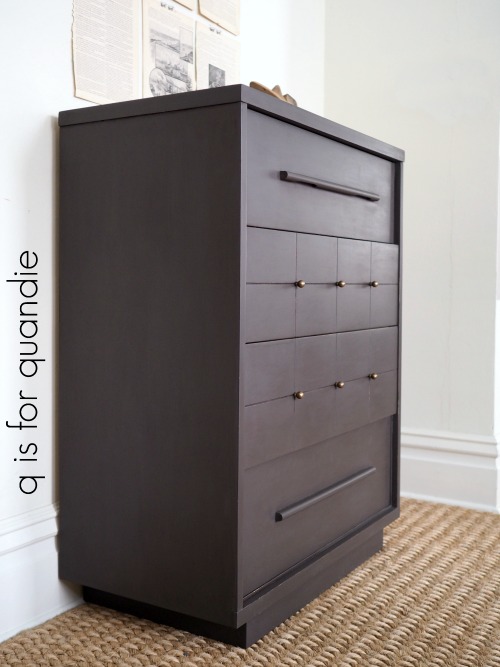
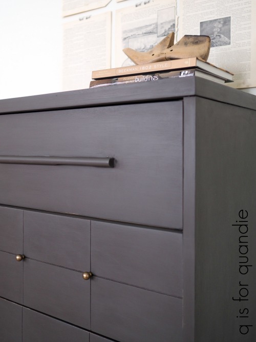
Of course I painted it in Fusion’s Park Bench!  I warned you guys that I was going to bore you with repeats of this color.  The last two pieces I did in this gorgeous shade of green flew off the shelf, each one selling within 48 hours of being posted on Craigslist.  So when you have a winning combination you just gotta go with it, right?

I would say the design of this piece is somewhere between the sleek, modern, clean lines of earlier mid-century pieces and the chunky, Spanish Rivival stuff of the 60’s & 70’s.  Perhaps it was designed by someone who couldn’t quite embrace either style so they stuck with somewhere in the middle.

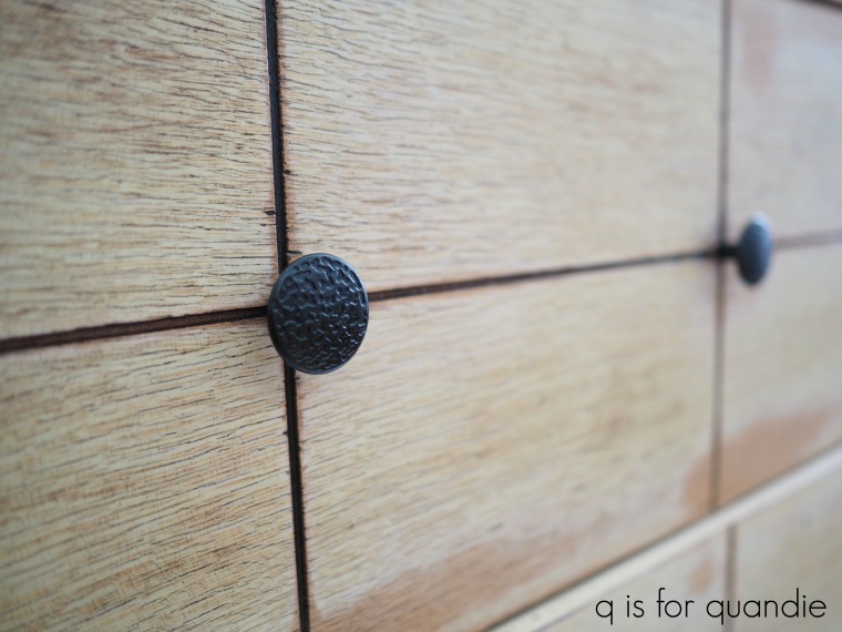
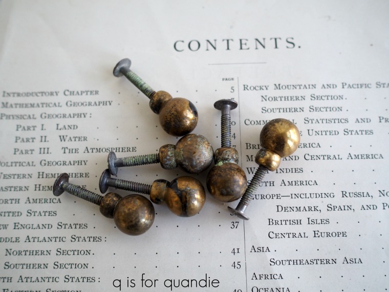
I really debated the fate of the hardware.  The original stuff wasn’t horribly bad.  There might even have been some who really liked it.  If the back plate had been plain instead of fussily engraved, I might have tried shining up the brass and keeping it.  Also, if the back plate had been a separate piece that I could remove and still use the pulls, I may have done that as well.  But they are one solid piece.

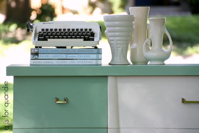
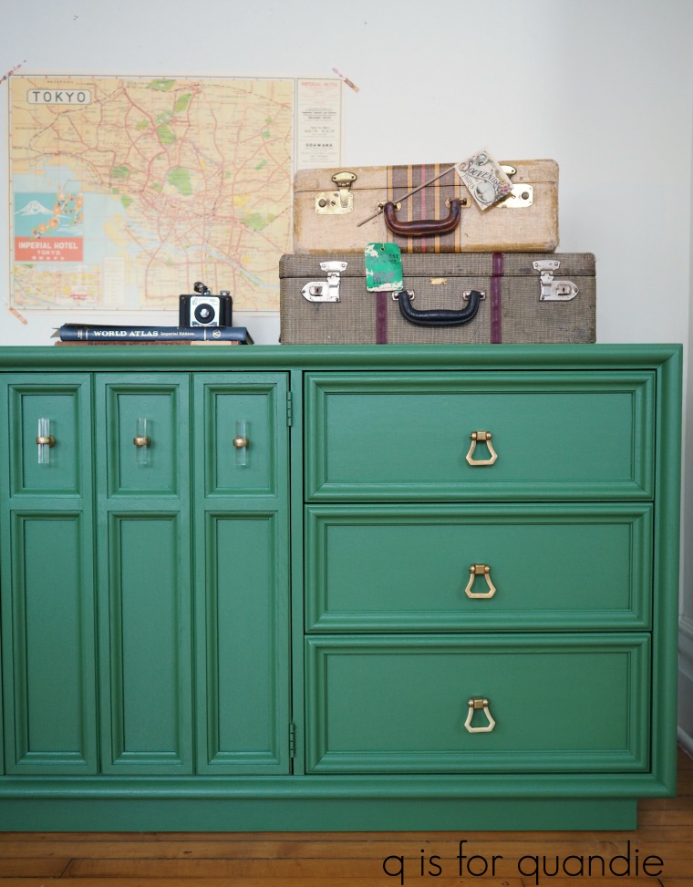
 So I really felt like the piece would be better served with new hardware, and since I’d gotten an excellent price on it I felt like I could spend a little bit more on new hardware.  Luckily Hobby Lobby is really stepping up their game on more modern looking drawer pulls.  There were several different styles that caught my eye, but I ended up going with some matte gold drawer pulls for the six drawers and some matte gold and clear acrylic knobs for the center door.

Also, I was in luck because last week knobs were 50% off at Hobby Lobby.  Great timing!

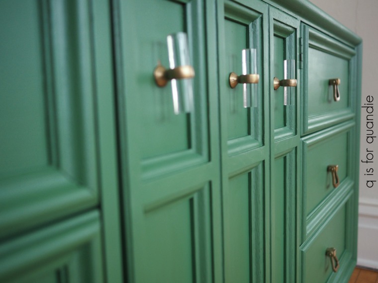
Seeing the new hardware in place, I know I made the right decision.  These pulls and knobs lend a bit more of a modern edge to the dresser.

If any of you are wondering about the details on this piece, I started by filling the old drawer pull holes with Dixie Belle’s brown mud.  Next I sanded lightly, vacuumed away the dust and wiped it down with TSP substitute.  I painted it with two coats of Fusion’s Park Bench.  As you know Fusion paint has a built in top coat, so I didn’t need to add one.  Finally, I drilled new holes for the hardware, and voila!

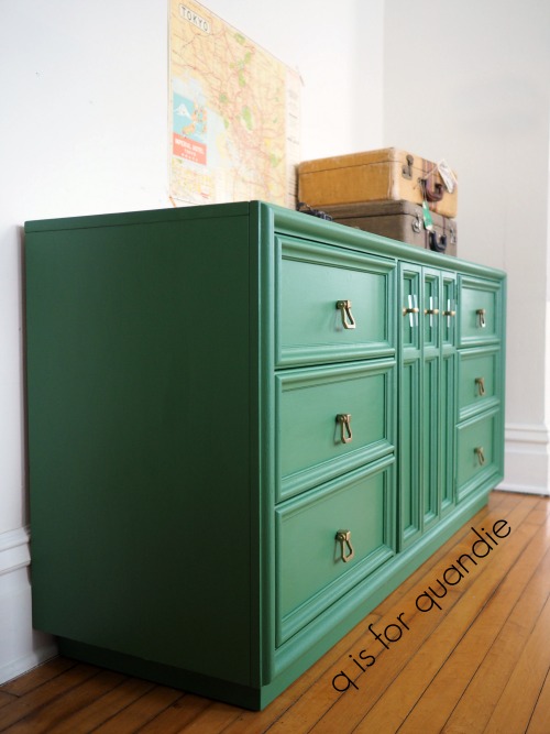
There are three more drawers behind that door in the middle of the dresser.

And as it turns out, I’m kind of a dork because I neglected to paint the inside of the door.  It wasn’t until I opened it to take photos that I realized it looked rather awful unpainted.  I had to slap a quick coat of paint on it for the photos while I still had some light, so the paint isn’t actually even dry in that photo.

And in case you are wondering, I’m also going to have to cut down the screws for the knobs  on the door so that they don’t hit those interior drawers.  I did some measuring and I will just be able to trim them down enough to fit.

So technically this piece wasn’t quite finished when I took the photos for the post, but I had to make hay while the sun shined (shone?) and get my pictures done during daylight hours.  I won’t be listing this piece on my ‘available for local sale page’ until it’s totally finished and ready to go.

But in the meantime, I thought I’d still share it with you guys.  What do you think?

Will this third piece in my Park Bench series do just as well as the other two?

Fingers crossed.  I need to add a little more cash to the travel fund so Mr. Q and I can plan our next real international adventure.

the pickle chair.

Recently I shared the pair of chairs with the stamped fabric seats that I purchased on the day of chairs …

I also bought two little kid sized chairs that day, see them there on the left?

Here they are again …

At the time I stashed many of these smaller projects away for the winter so I would have things that were easy to work on inside the house.

I painted the first little chair back in November in a pretty Homestead House milk paint color called Maritime.

I just finished up the second one, and this time I chose Sweet Pickins’ milk paint in a color called In A Pickle.

I’ve had such luck with green pieces lately so I figured I’d try it in milk paint.  I’ve painted a few pieces in this color in the past and the little bit of paint powder left in the bag was just enough for this chair.

Just look at the gorgeous chippy-ness …

I opted to just leave this chair unadorned, so no stencils or transfers.

It’s perfect for providing a pop of vibrant color.

The milk paint has been top coated with hemp oil, which really brings out that rich color.  Here is how it looked before the hemp oil was added.

The little bowl with the strawberries on it is something I picked up at a garage sale many years ago.  It’s just one of those sweet little things that I couldn’t resist.

I’m sure at one time it had a lid, but now it’s lidless.  I store paper clips in it.  It never fails to bring a smile to my face when I see it.  I love the little lines of green around the base and handles.

I’ve hung the chair on the wall for the photos, I think it would be fun to use a chair like this as an alternative to a traditional shelf, don’t you?

I’m slowly but surely making my way through all of the smaller projects that I had stashed away for the winter.  Luckily spring is just around the corner (shhh, don’t tell me differently, this is what I keep telling myself) and along with spring comes garage sale season!  It can’t get here soon enough.


the boutique de vin dresser.

I sent Mr. Q off to pick up this lovely dresser one afternoon last week.  It wasn’t far away so it was easy for him to pop over and buy it while I was still at work at the day job (well, technically I was getting my hair cut on my lunch hour at the time, hi Tamara!).

It has a rather classic traditional style, wouldn’t you say?

You can barely see them, but it has a pair of hankie drawers attached to the top.  I’m not a fan of the hankie drawer.  I’ve removed them from many dressers over the years.  Having those two boxes permanently adhered at either end of the top makes it difficult to put anything else on top of this piece, like a TV for instance.  And in the case of this dresser, I think it could easily be used as a buffet in the dining room, but not with hankie drawers. Usually there are a couple of screws holding the drawers in place, and that was the case with this dresser too.  So, I unscrewed the screws, removed the boxes, filled the holes with Dixie Belle’s brown mud and you’d never know they were once there.

Other than the finish being a bit worn, and the holes left by those hankie drawers, this piece was in perfect condition.  I paid a little bit more for it that I normally would, but not having to make repairs meant that I could restyle this one quickly.

To prep the dresser for painting I sanded it lightly and cleaned it with TSP substitute.  Then I pulled out my Fusion paint in a color called Little Lamb.  In the jar Little Lamb looks like a nice medium grey.  What I forgot about Little Lamb is that once painted and dry it has a purplish undertone.  In some lighting (such as mine) it almost looks lavender.  It’s a pretty color, but not what I wanted for this piece.  Here is how it looked on a bookcase I painted last year.

But no worries.  I just pulled out another jar of Fusion paint in Putty and was able to get away with just one coat of Putty over the Little Lamb, so I really didn’t waste any time or paint.  I would have needed two coats of the Putty had I not already had that coat of Little Lamb in place.  In fact, sometimes I even do this on purpose when transitioning a piece from a very dark original finish to a pale paint color.  Start with a first coat in a medium shade and then move to a paler color.

Once painted, I hand sanded with 220 grit sandpaper to distress and bring out some of the details on this piece.

Remember, Fusion paint can be more difficult to distress than milk or chalk paints because it has a built in top coat and once cured it is incredibly durable.  So if you’re going to distress Fusion I recommend either distressing right away as soon as the paint is dry to the touch (which is what I did here), or using some beeswax or hemp oil under your paint to create a resist in the areas you want to distress.

After I distressed this dresser I stood back and took a look. It was pretty, but it wasn’t very exciting.  The next decision was whether to add some more detail that would really make it pop, or leave it more neutral to appeal to a wider range of potential buyers.  I always struggle with this decision.

After all, we all need multiple pieces in our homes and they can’t all be showstoppers.  Sometimes we just need a piece that is pretty, but doesn’t steal all of the attention.  Sometimes buyers are looking for a piece that they can work into their existing decor, not a piece that will require redecorating the entire room.

But there was something about the top row of drawers on this dresser that was just bugging me.

See it now?  Why such a big gap in between the drawers, with the drawers flush up against the outside edges?  It just feels weirdly off balance to me.  Those two top drawers should be more centered.  I felt the need to correct that visually if not literally.

I thought one possible solution would be to add some sort of decorative detail to just that wide middle space.  Maybe a small IOD rub on transfer, a stencil, or even an IOD decor stamp.

But as I was digging through my IOD transfers I came across this one.

At 36.25″ x 25″ it was the perfect size to fill the entire front of this dresser.  And the detail of the rub-on would do a good job of drawing your attention away from the odd placement of those upper drawers.

Unfortunately I had a little trouble with the transfer.  When I tried to pull the backing paper off, parts of the transfer stuck to it.  No matter how I tried, I couldn’t get those bits of the transfer to detach from the backing.  And one of the bits in question was the face of one of the lions.  I really couldn’t apply the transfer with one faceless lion.

So I contemplated my options and decided to just remove the lions completely.  I cut away those sections of the transfer and kept going.

As it turned out, I think I might prefer this transfer without the lions.  Maybe lions just aren’t my thing.

I reached out to my contact at Prima Marketing and asked if there was a solution to this problem (aside from cutting away portions of the transfer) that I should try next time.  And yes, there is!  If this happens to you try popping the entire thing intact into the freezer for a little bit.  That should solve the problem.  But I also learned that there were some issues with this in previous shipments of the transfers, but they have made some changes to correct for it.  The transfers going out now shouldn’t do this (I purchased my transfer over six months ago).   So if you tried an IOD transfer a while back and ran into problems with the transfer sticking to the backing paper and decided they weren’t for you, give them another try.  I’ve done quite a few pieces with them (I counted, I’ve done 17 pieces with IOD transfers!) and normally I don’t have any issues.  Although, spoiler alert, I have learned not to wax before applying an IOD transfer (you can wax after).  But that’s a post for another day.  For now, just trust me on that one.

In addition, if you do have a transfer that fails, go back to your retailer and ask them to replace it.  Prima Marketing will send the retailer a replacement for you.

Did you notice my new lamp shade from Light Reading?  I mentioned a couple of weeks ago that I was in the market for another of their gorgeous lampshades and I did find one at Piccadilly Prairie in Southdale Center.  It looks amazing on the very Grecian looking lamp that I purchased at a garage sale.

I’m so glad I switched to the Putty for this dresser.  I love it in this pale shade.  Wouldn’t this piece make a lovely sideboard in a dining room?

As usual, this piece is for sale locally.  Check out my ‘available for local sale‘ page for more details on this piece or other pieces I currently have listed.


here’s a hint, it’s not quite mint.

After painting the tall mid-century modern piece in a neutral dark grey last week, I promised myself that I would go for a more daring color on its companion piece.

I have to confess, I almost backed out of that promise when I saw how amazing the taller piece looked in the dark grey.

But I stuck to my guns and went for a brighter color on the low piece.

Can you guess what color I went with?  And no, it’s not mint!

But it is green.

Yep, I just had to choose Fusion’s Park Bench.  It worked so beautifully on the last mid-century piece I painted and that piece sold in just over 24 hours, so I decided to see if I could repeat that experience.

The prep work on this piece was exactly the same as for the taller one.  I had to re-position the drawers so that they were inset once again, but other than that it was ready to paint thanks to the sanding and repair work that the previous owner had already done.

I really love painting a large piece like this with the Fusion paint mainly because it cuts out one major step in the makeover process, having to add a top coat.  Fusion paint has a built in top coat.  After curing for about 3 weeks or so, this paint is fully washable and water resistant as is.  You’ll often see people adding a top coat, and you can add one if you want to, but you don’t need one for durability.

I love this gorgeous shade of green!

On the taller dark grey dresser I used Prima Marketing’s Metallique wax in Bronze Age on the knobs, but for this piece I wanted to go with a brighter gold so I went with their Vintage Gold Metallique wax.


Now it just remains to be seen if this green appeals to a buyer too.  Fingers crossed.

If you are local and would like more details, be sure to check out my ‘available for local sale‘ page.

blondes have more fun.

As I was working on two mid-century pieces recently, I was thinking about how many blonde dressers I’ve done in the past.

I took the time to look back and realized I’ve done more than I thought.

My very first mid-mod blonde was a dresser that my friend Cathy gave me.  This was waaaay back, before I had a blog and before I realized that these pieces from the 60’s were coming back in style.  At the time I was just trying to make this piece more palatable somehow.

It was also before I realized that bright reflecting sunlight maybe wasn’t the greatest lighting choice for furniture photos.  And back when I was painting with plain ol’ latex paint and doing things like spraying the hardware white.

The blonde bombshell came along a bit later.  It’s painted in Annie Sloan’s Provence.

It had the most awesome drawer pulls.  They look like something that came off an airplane.

I think the vintage moxie pieces were my favorite blonde pieces to work on.

I painted them in Sherwin Williams’ Aloe (6464), which was the 2013 color of the year from their Vintage Moxie collection.  Seriously!  Vintage Moxie!  I had to use that name.

Aren’t those circular drawer pulls to die for?

On many of these mid-century pieces, the hardware is what makes the piece.

This mid-century nightstand is the first one I used vintage wallpaper on.

This was a case where I didn’t have the original mid-century hardware, so I gave it more of a vintage makeover with the wallpaper drawer fronts and the old milk glass knobs.

In March of 2015 I worked on another cute little blonde nightstand, this one made by Dixie.

It’s painted in Fusion’s Champlain and Laurentien, and I used the same vintage wallpaper inside the cubby hole area.  The flecks of gold in the wallpaper tie perfectly with the gold knobs.

Fast forward to September 2016.  Another friend gave me a blonde mid-century piece and surprise, surprise, I decided to paint it mint green.

The mid mod mint is painted in Dixie Belle’s Mint Julep with Annie Sloan’s Old White in the center.

Once again the piece has some distinctive mid-century drawer pulls.

Boy, it wasn’t until I saw all of these pieces in one place that I noticed how much I love painting the blondes with aqua/mint and white.

I’m glad I stepped out of that comfort zone when I painted my latest mid-century blondes.

You’ve seen the one painted in Dixie Belle’s Gravel Road, but you’ll just have to come back on Wednesday to see what color I chose for the 2nd one.  Here’s a hint, it’s not mint.

salvaging some mid mod style.

Unlike some lucky furniture painters, I don’t have a pole barn full of furniture waiting to be painted.  Although on occasion I’ve been known to have as many as 10 or so pieces out in the carriage house waiting for their moment in the sun, for the most part I don’t have room to store a lot of inventory.

I try to stock up a bit in the fall because typically by now there are slim pickings on Craigslist.  In February people in Minnesota are hibernating, they aren’t cleaning out the attic or getting ready to move.  Plus in the winter I’m obviously not finding pieces at garage sales either.

But I’ve pretty much worked through most of what I had stocked up and now I’m scouring Craigslist on a regular basis looking for candidates for a makeover and not finding a whole lot.  The occasional piece that attracts my eye ends up either too far away, too expensive, or else it has already sold to someone else but the ad wasn’t deleted yet.

When I initially came across the ad for this pair of mid-century dressers I gave them a pass.  I didn’t hate them, but I didn’t love them either.  I do enjoy working on the occasional mid-century piece, but I usually prefer older stuff.

But week after week I kept seeing this ad.  I suspect they weren’t selling because the seller wasn’t ‘working his ad’ very aggressively.  By that I mean that he wasn’t renewing the ad periodically to keep it towards the top of the list.  Over a month had gone by since the ad was originally posted and he’d never renewed it once.

Or perhaps the problem was that no one could see the potential in these pieces.

The price was certainly right, and after seeing the ad pass by a couple of times I stopped to take a closer look.  You know what I saw?  I saw two pieces where someone else had already done half of the work for me.  They’d already been sanded and were pretty much ready to paint (and when Mr. Q and I picked them up the seller told me that he’d also already replaced all of the runners inside).  So I realized that these two pieces could be a pretty quick turnaround.

Unfortunately, in addition to the sanding and repairing, the seller had also replaced the original knobs with these awful cheap knobs from the hardware store that are all wrong and have zero mid-century style.

But imagine my glee when I opened one of the drawers and found a Ziploc baggie filled with the original knobs inside.  Jackpot!

If you are thinking they look a bit grungy in that photo, just sit tight.  You’ll see what I did to spruce them up in a few minutes.

As we got talking with him, the seller happened to mention that he’d also made a couple of … well … let’s call them adjustments to the style of the pieces.  He said that originally the drawers with the long handles has been inset.  He thought that looked weird, so he added stops inside the dresser to keep the drawers from pushing all the way back.  Plus he moved the shims on either side of those drawers forward to bring all of the drawers flush with the front.

Now that you are aware of this, go back and look at the ‘before’ picture again.  Yep, now your eye immediately goes to those shims and you realize they look kind of odd, right?

I realized that I had to un-do those changes before I could start painting.  So much for the quick turn around.  But that being said, thank goodness the seller mentioned this.  I’m honestly not sure that I would have figured this out on my own.  I know I would have been puzzled about those shims, but would I have realized that two of the four drawers were meant to be inset?  Probably not.

I tried to remove the shims intact so that I could just simply move them back to their original location, but I ended up breaking two of them.  That’s when I called my handyman Ken for a consultation.  He came over and helped me get the rest of the shims off without breaking them (they were glued and stapled with heavy duty staples), and he took the broken ones home and cut replacements for me.  What would I do without Ken?

While Ken was working on that I had to take care of one last problem before I could start painting.

It wasn’t until I was wiping the drawers down to paint them that I noticed there was a hole on either side of the long wooden drawer pulls.  I’m guessing that there used to be a metal cap of sorts on either end of that pull.  I wish I’d found those inside a drawer in a Ziploc baggie, but no such luck.  So I needed to fill those holes.  I used my usual trick of placing a piece of tape on the back side of the hole, but then this time I filled them using Dixie Belle’s brown Mud.  It cracks me up that the label says ‘straight from the swamps of Dixie’.

Fortunately it does not smell like it’s straight from the swamps of Dixie 😉

I used a putty knife to press the mud into the holes and then I let it dry.  Once the first pass was dry I went over the holes a second time with the mud to make sure they were level with the drawer front.  Once dry again, I sanded them smooth and cleaned the drawer fronts with a damp rag.

Now came the fun part, the paint!  I always struggle with deciding between choosing a more neutral color that I think will sell more easily and choosing a more vibrant color that will be fun to paint with but may not appeal to as many buyers.  So I made a deal with myself to paint one piece in a neutral and one in a brighter color.  Today I’m starting with the taller piece, and it’s going more neutral.

Dixie Belle’s Gravel Road, to be precise, which is a warm, dark grey.  Once again I used Dixie Belle’s recommended method of painting.  I dipped my brush in water periodically to thin down the paint.  The paint goes on so smoothly using this technique.  It does also thin it down a fair bit, so two coats were required.  Also, in case you are wondering I used about half of the 16 oz jar for this dresser, so less than $10 worth of paint.

I use Dixie Belle’s Best Dang Wax! in brown as a top coat.  I like how the brown wax warms up and deepens the color a bit.

Before putting those original brass knobs back on, I washed them with soap and warm water and then once dry I added some Prima Marketing Metallique wax.  I debated using the Old Silver and although I think that would have looked gorgeous, I went with the warmer tone of the Bronze Age instead.

I like to apply it with a q-tip (although some people just use a fingertip).  The trick is to apply even coverage and then leave the knobs alone to ‘dry’ for a couple of hours.  Once dry you can buff lightly to add some shine.

They look amazing on the dresser.  It was so lucky that I was able to put the original knobs back on this piece.

I have to admit that I did not have high expectations for this dresser.  I really expected to improve it somewhat with a paint job and call it good.

But in the end, after salvaging a bit of the original mid-century modern style, I am amazed by the transformation.

How about you?


the blanchisserie dresser.

As you can probably tell by the ‘before’ photo below, I purchased this dresser back at the end of summer when I was trying to stock up some projects for the winter.

I think we can all agree that the previous owner had made some rather unfortunate hardware decisions, but otherwise this piece didn’t look all that bad at first.

I wanted to strip the top and then wax it with a dark wax, but after stripping the top of the dresser it looked like this.

I’ve run into these black streaks before.  I’m not 100% sure, but after doing some quick google research I think they might be iron oxide stains (if any of you have any insight, please share in a comment).  Iron oxide stains can occur when the tannins in the wood interact with moisture and turn black over time.  There are methods for removing these stains, but I didn’t think it was worth it to spend that much time and effort on this dresser.  The wood just wasn’t that pretty.  So, in the end I opted to just paint the whole thing.

I also found some clues to tell me this dresser was probably originally intended to be painted.  In fact, it had been painted at least twice and possibly three times.  Clue no. 1 is on the back side.

Isn’t that a gorgeous aqua?  I know I would have loved that color!

Clue no. 2 was inside the openings for the drawers …

So it was probably also pink at one time, and maybe even white.

Whoever bought the dresser, then stripped off all of those colors and refinished it, was probably pretty disappointed in the lackluster results.  But I was happy to take it back to its roots.  Except I didn’t choose aqua, pink or white.  At least not on the outside.  Instead I chose black.  More of Dixie Belle’s Caviar to be precise.

Once the paint was dry I added bits and pieces of my french laundry stencil to the drawer fronts.  Once again, I’d love to share a source for this stencil but the company I purchased it from via Etsy seems to no longer be in business.

To keep the stencil subtle I used a warm, dark grey acrylic craft paint rather than a white.

Once the stencil paint was dry, I sanded lightly by hand over the entire dresser with a fine grit paper and then waxed it using Dixie Belle’s Best Dang Wax! in brown.  I think the amount of sheen I got from this wax is just about perfect.

I ended up using clear glass knobs and drawer pulls on this dresser because I happened to have them on hand.  My friend Sue gave them to me and I had just the right amount for this dresser, plus they were just the right size for the existing holes.  It seemed like it was meant to be.

 As a nod to the remnants of pink paint that I found inside the dresser, I painted the interiors of the drawers in Fusion’s English Rose.

I like to use Fusion paint in spots like this because it doesn’t need a topcoat, yet is still fully washable once cured.  A great quality for the insides of drawers.  It only took me about 20 minutes for each coat of paint (I used two) and that fabulous pop of pink when you open the drawer is a lot of bang for your buck, time wise.  I generally only resort to painting the inside of drawers when they are really stained up and scary looking.  These drawers had a few ink stains that needed to be covered up.  In order to prevent the ink stains from bleeding through my paint I tried out the new clear sealer that Dixie Belle provided me with last month, B.O.S.S.

B.O.S.S. stands for Blocks Odors, Stains, Stops bleed-thru.

Had I wanted to block odors, or stop a reddish stain from bleeding thru I would have painted the B.O.S.S. over the entire surface.  However in my case I just had a couple of stain spots that needed blocking, so I just painted two quick coats of B.O.S.S. over the stains themselves.  It worked perfectly.

You might be wondering why I didn’t paint that edge of the drawer.  That is because the drawer fits fairly tightly as it is.  If I added paint, it would not open and close freely.  Always beware of adding too much paint to the edges of your drawers when they are a tight fit.  Nobody wants sticky drawers!

I staged the dresser with some of my favorites from my non-collection of vintage alarm clocks, plus one of my favorite old photos.

That photo was taken on the stoop of my grandparent’s home in South Minneapolis, but no one in the family seems to know who the people are.  They look like such a fun couple though, don’t they?  I imagine that it was a sunny spring day and they were on their way to a picnic at Minnehaha Falls when the photo was taken.

This was back in the day when ladies wore dresses and men wore ties on picnics in the park.

They probably had fabulous painted dressers with glass knobs too, but maybe not with french stencils on them.  Their loss, right?

I gotta tell you guys, I’m kind of in love with this Dixie Belle Caviar.  Lucky they sent me the big jar, because I’m going to be using a lot of this color.

The blanchisserie dresser is available while it lasts, be sure to check my ‘available for local sale’ page for more details!


the windsors.

You might think I’m about to talk about England’s royal family, but no.  I’m talking about the chair kind of Windsors, not the royal kind of Windsors.

I picked up these Windsor chairs at one of the neighborhood garage sales last summer .

Structurally they are in great shape, they just have a bit of an outdated finish on them.  As soon as I saw them, I pictured them painted black.  Black is a classic color for a Windsor.  So when Dixie Belle sent me some of their chalk style paint in a color called Caviar I dug these chairs out of the carriage house to give them a makeover.

I did not sand the chairs before painting them, I just gave them a good cleaning with some TSP Substitute and started painting.  I used the same damp brush technique that I mentioned in my post on Monday, simply dipping my brush in a cup of water occasionally while painting.  It took two coats to fully cover mainly because the paint thins out using this technique, but it also goes on ultra smooth.  So for those of you who prefer to see a brush-stroke free finish, this is definitely the way to go.

Once dry I wet distressed the edges of the chairs using a damp rag and then used a 320 grit sandpaper on the seats, flat arms and flat top at the back.

I did not sand any of the spindles because that would likely have pushed me over the edge.  Painting them was putzy enough, just look at all of those spindles!

Can we just stop here a minute though and talk about this color?

The Caviar is a gorgeous deep, rich, saturated black.  It looked deep and dark even before I waxed it.

In fact, here’s a secret.  I didn’t wax the legs yet.  Obviously I have to get to that before I sell the chairs, but I was trying to take advantage of a sunny day to get my photos done so I saved the legs for later.

Before waxing I stenciled the seats with a fab french design.  I’m fairly sure I ordered this stencil via Etsy, but once again the shop I ordered from is no longer there.  I seem to have bad luck in this way with stencils.  So I’m sorry that I can’t give you a source for this one.

The stencil was just the pop of something special that took these chairs from ho-hum to fab.

Once I had the stencils done, I sanded lightly over them with 320 grit sandpaper and then waxed the chairs (and I will get to those legs!) with Dixie Belle’s Best Dang Wax in clear.

If you’re used to using Miss Mustard Seed, Homestead House or Fusion wax (like I am), don’t be freaked out when you open up the Dixie Belle clear wax and it looks really white.  I thought for sure I had gotten a white wax by mistake.  But no, ultimately it dries clear.

Also, you really won’t need a dark wax (like brown or black) to deepen the black color of this paint.  It looks gorgeous even with the clear wax.

I love how the chairs turned out.  If I had a spot for them I’d definitely keep them.  But there is no room at the inn, so they have to go.  If you are local and need a pair of Windsors, be sure to check my ‘available for local sale’ page for more details.


stool samples.

Back in the beginning of January I was pondering my blog content and thinking about potential ways to grow in the new year.   I felt like it was time to try some new products.  Don’t get me wrong, I absolutely love Fusion, Homestead House and Miss Mustard Seed products and I’ll definitely continue to use them on a regular basis.  I’m also still officially addicted to the IOD Décor Transfers.  But I felt like I needed to add a good chalk style paint to my line up and also just take a look around at what other sorts of products are out there and what they can do.

After all, variety is the spice of life, right?

My painting philosophy is that there is no one perfect paint that is best no matter what the project.  Some projects are better suited for milk paint, some are better suited for an acrylic paint and some are better suited for a chalk style paint.

I decided to do a little research by looking at what other furniture painters that I admire are doing these days.  One of those painters is Denise at Salvaged Inspirations (be sure to check out her blog post today about painting with black).  She recently painted this gorgeous dresser in Dixie Belle chalk paint in a color called Caviar

and this stunning blue buffet painted in Dixie Belle’s Bunker Hill Blue

So I went to the Dixie Belle website and just browsed around a bit.

And guess what?  They had some really cool stuff, like their Patina Collection for creating an aged metal look and a stain-blocking, smell-blocking clear primer called BOSS.  I was also intrigued by their Easy Peasy Spray Wax and Dixie Belle Mud.

That was when fate intervened in an amazing way.  I received an email from Teri at Dixie Belle out of the blue.  She had seen my blog and wondered if I’d be interested in trying any of their products.

Seriously!  What a wild coincidence right?  The timing could not have been any more perfect.

Of course I said yes!  I’d definitely be interested in trying a whole bunch of their products.  Like all the ones I listed above, and certainly some paint too!

So last week I received a big heavy box in the mail from Dixie Belle!  I’d asked them to ship it to my day job.  The Dixie Belle paint should not be allowed to freeze.  Since it’s January in Minnesota, having the box shipped to my office meant it wouldn’t be left sitting outside on my porch for any length of time.

Now I was fully stocked with some gorgeous paint colors and some fun, unique products that I couldn’t wait to experiment with.

Having made my share of mistakes with new products over the years, I’m learning to start out slowly; test them out on something small to get a feel for how they work before jumping right in to the deep end and painting a big piece of furniture.  So this time I pulled out a pair of stools that my friend Sue recently passed on to me to sample some of the paint colors and top coats.

And hence, the title of this blog post was born.  Stool samples.  Seriously, how could I resist?

The ‘how-to’ guide for Dixie Belle chalk paint says that you don’t have to sand your piece, just clean it and then start painting.  I would have followed that advice to the letter except the seat of the taller stool had a big glob of spilled blue paint on it.  Although I could have painted right over that and the paint would have adhered, you still would have been able to see the texture from it.  In other words, it would have looked like I painted over a glob of something.

Q-tip of the day: if you don’t want to see texture (including drip marks and brush strokes) from a previous paint job (or spill), you will need to sand it down before painting with any kind of paint.

So I sanded the top of the taller stool pretty vigorously, but left the rest alone.  It really was a relief to not have to sand all of those legs!

I didn’t want to see either of the existing colors on each stool when I distressed them after the final coat of paint, so I gave them an undercoat of a color that I wouldn’t mind seeing, Savannah Mist.  Dixie Belle recommends using a damp paint brush and painting in thin coats.  I’d never tried the damp paint brush technique before so I thought I would give it a try.  You simply dip your brush into a bit of water, just a quick dip, not a big, swooshy, saturate your brush sort of dip, then dip your brush into the paint.  You don’t have to re-dip your brush into the water with every fresh dip of paint, maybe just with every 4 or 5.  I just kept a plastic cup of water handy.

Turns out I really like this technique which basically just waters down your paint as you use it.  It makes the paint easier to apply and it definitely goes further.  It also helps prevent brush strokes.  Despite the watering down, I still got great coverage with just one coat of the fairly light base color.

I used the same technique to paint each stool with a top layer of a different color.  The smaller stool got one coat of Gravel Road and the taller stool got two coats of Drop Cloth (white tends to require more coats for good coverage no matter what kind of paint you are using).  Then, while I had the paint out anyway I also painted a third even smaller stool in the Gravel Road.

Since I was going to add some grain sack style stripes using tape next, I flipped over to the underside of one of the stools (which I had also painted) to test whether or not the tape would pull off any paint.

Nope.  I was good to go.  By the way, this is the color called Gravel Road.

I taped off some stripes on the two larger stools.  One got striped with Drop Cloth, the other got Yankee Blue.

Next I decided to try wet distressing them.  I think a chalk style paint is easier to wet distress than other types of paint.  The trick is to do it right away as soon as the paint is dry, but before it hardens too much.  In case you’ve never heard of it, to wet distress a piece you just use a damp cloth and wipe the paint off wherever you would normally distress the piece.  I like to use a nubby terrycloth fabric for this and I have a bunch of old towels that I’ve cut down into rag sized pieces for jobs like these.

Here’s how the wet distressed edge looks up close …

 There are a couple of benefits to wet distressing.  First of all, you don’t create any dust.  This is a big plus when you are working indoors in the middle of winter.  Second, you can more easily control how far down you distress.  I didn’t want to see much of that original green color of this stool.  As soon as I could see the coat of Savannah Mist coming through I stopped rubbing.

To add a little something extra, I stenciled the two smaller stools.  After the painted stencil designs dried, I sanded the top of each stool with a fine 320 grit sand paper to smooth them out.

Next I sampled two of the Dixie Belle top coat options, the Easy Peasy spray wax and their Best Dang Wax! in Brown.  The ‘1902’ stool was finished with the spray, the smaller stool with the brown wax.

The Easy Peasy spray definitely lives up to its name.  You simple spray it on in a fine mist, wait 5 seconds and then wipe.  Done.

The Best Dang Wax! is very creamy, soft and workable and it has no smell (which translates to no petroleum distillates and you know I like that).  I also like the rich, dark color of the brown.  I’m planning to test it out on some bare wood soon.

After sealing the tall stool with the Real Milk Paint Co’s Dead Flat, I used Fusion Transfer Gel to add a graphic (click here to read more about that technique).

Remember, if perfection is your goal then graphics added with transfer gel might not be right for you.  If you want to compare various methods for adding a graphic to something check out my post on that {here}.  Using transfer gel is definitely one of the most cost effective ways.

I had fun playing around with the various Dixie Belle paint colors and top coats while creating my three stool samples.

To recap …

stool sample no. 1 – painted with a base coat of Dixie Belle’s Savannah Mist, then painted with Dixie Belle’s Drop Cloth, striped with Dixie Belle’s Yankee Blue, sealed with Real Milk Paint Co’s Dead Flat, graphic added using Fusion’s Transfer Gel.

stool sample no. 2 – painted with a base coat of Dixie Belle’s Savannah Mist, then painted with Dixie Belle’s Gravel Road, striped with Dixie Belle’s Drop Cloth, stenciled with Martha Stewart acrylic craft paint, sealed with Dixie Belle’s Easy Peasy Spray On Wax.

stool sample no. 3 – painted with Dixie Belle’s Gravel Road, stenciled with Martha Stewart acrylic craft paint, waxed with Dixie Belle’s Best Dang Wax! in brown.  You’ll notice that the Gravel Road looks darker on this stool as a result of adding the dark brown wax v. the Spray On wax.

I’ve already started my next project using the Dixie Belle products, so be sure to stay tuned!


the rest of the desk.

Today I’m sharing the rest of the desk makeover.

As a refresher, here is the ‘before’.

And here is the ‘before’ and ‘after’ of the desk top.

If you’ll remember, my initial plan was to paint the entire desk green.  But then I decided to try and save that wood top.  I still could have painted the rest of the desk green, but I decided to go with black milk paint instead.

I used Homestead House milk paint in Coal Black, and this seemed like a good opportunity to try the Homestead House Stain & Finishing Oil in Cappucino as a topcoat over the milk paint.

The technique for this is fairly simple.  Once your milk paint is dry, sand it with a fine grit sandpaper to smooth it out, distress the edges as desired and loosen any flaking milk paint.  Vacuum away the dust, and then wipe your piece down.  I like to use a dry microfiber cloth for that.

Next, apply a coat of the SFO.  You can wipe it on with a lint free cloth or you can apply it with a stain applicator pad, but I chose to apply it with one of those cheap sponge brush thingies.

The angled tip of the sponge worked really well for getting the SFO into corners and grooves.

After allowing the SFO to absorb into the surface for a few minutes, wipe away the excess with a lint free cloth.  I used an old black t-shirt.

One coat of SFO will give you a matte finish.  Subsequent coats will increase the shine, deepen the color and increase the durability.  I had this crazy idea that I wanted a little more shine, so I added a second coat (after waiting 24 hours for the first coat to dry).  As it turns out, I had a little trouble keeping the gloss consistent with the second coat.  You don’t notice that on the front of the desk at all, but it’s more apparent on the sides when they catch the light just right.

I’m sure this was the result of ‘user error’, this is the first time I’ve used the SFO over milk paint on a larger piece.  Perhaps I wiped too much off in some areas and not others, or perhaps I didn’t wait long enough for the SFO to absorb before wiping.  I’m not sure.  Either way, I definitely prefer more of a matte look over my milk paint so next time I will stop after one coat of SFO.

Regardless, I absolutely love how the Cappucino SFO darkened up the black milk paint and really brought out the richness of the color.

As for the hardware, I kept the original drawer pulls that came on the desk but I dressed them up a bit with some of the Prima Marketing art alchemy Metallique wax in Bronze Age.

If you remember back, Prima Marketing provided me with several different colors of this wax a month or two ago.

I really love how subtle the Bronze Age is.  Not too bright or too shiny.

To apply the wax simply dip a q-tip into the wax, swirl it around and then use the q-tip to apply the wax to your piece.  Allow it to dry and harden for a couple of hours and then buff to bring out some shine.

Since I loved the look of the Bronze Age wax against the black milk paint so much, I added some of it to the raised detail on the middle drawer.

I applied this in the same way, using a q-tip and rubbing it over the surface.  Be careful to not get the wax anywhere you don’t want it, it is hard to remove again.  So be sure to use a steady hand while doing this.

By the way, the chalkboard hanging on the wall is an old mirror frame taken off a dresser with a piece of hardboard cut to fit the opening which was then painted with two coats of Miss Mustard Seed milk paint in Typewriter.  Once the last coat of milk paint is dry, I sand it smooth and then ‘season’ the chalkboard by rubbing chalk all over it and wiping it away with a microfiber cloth.  I wiped the wood frame down with a little Miss Mustard Seed hemp oil just to freshen it up a bit.

If you’re wondering why I suddenly switched from the Homestead House Coal Black that’s on the desk to Miss Mustard Seed Typewriter for the chalkboard, it’s simply because I used up all of my Coal Black on the desk and I had the Typewriter on hand.  I’ve painted with both of these colors side by side and I don’t think there is any difference.  Of course they look different here because one has the SFO topcoat and one just had white chalk smeared all over it.

We’ve come to the part of my blog post where I normally share a side by side collage of the ‘before’ and ‘after’ of the desk, but earlier this week Mr. Q gifted me with a new computer!  It has a huge display screen, which is amazing, and it’s so much faster than my old computer.  However, I don’t have Picasa on it which is the software I used to make those side by side collages.  Picasa was retired back in March 2016 so I can’t load it on this computer.  And as it turns out, Windows Live Photo Gallery was discontinued back in January 2017, so I couldn’t load that either.  I’m going to have to learn all new software for organizing my photos, and I’m going to have to find new photo editing software that will let me make those collages.  But I still have my old standby, PicMonkey so all is not lost there (but I’m not impressed with PicMonkey’s collage options).

In the meantime, you’ll have to excuse me while I take some time to learn some new tricks and just be content with seeing the ‘after’ all by itself.

This desk is for sale, so be sure to check my ‘available for local sale’ page for more details.