Our recent Azamara Quebec intensive cruise sailed from Montreal, Canada so Mr. Q and I decided to fly in to Montreal a couple of days early so that we could see some of that city.

Let’s start with a couple of quick travel q tips in case any of my American readers are planning a trip to Montreal anytime soon.
First up, I highly recommend using the ArriveCAN app in advance to make your customs declaration. You can then use the express lanes in the customs area in the Montreal airport. We avoided some crazy long lines by doing this.
Next, although the taxi line at the airport was pretty long, it moved quickly. Now, you are probably thinking ‘wouldn’t an Uber be cheaper, or quicker?’, but no. There was an even bigger crowd waiting for Ubers. Plus, as our taxi driver told us, a taxi from the airport to the historical city center in Montreal has a fixed flat price of $50 (that’s Canadian, so currently about $36 USD). Since we arrived right around 5 pm, or rush hour, with surge pricing an Uber would have cost closer to $100.
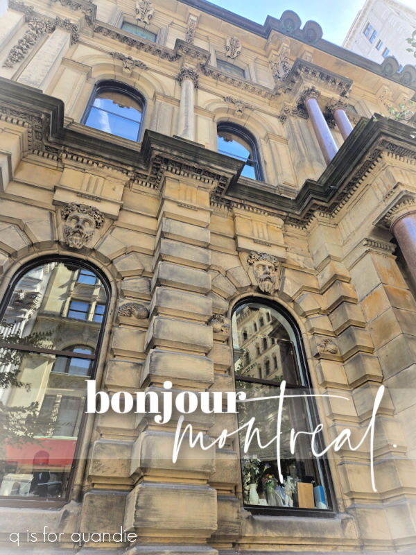
My next tip is to take all of those tips you see on travel vlogger videos on YouTube with a grain of salt. Many of the YouTubers I watched said it was considered rude to not at least try to greet people in French before assuming they spoke English. So when we arrived at our hotel, we walked up to the front desk and promptly said “Bonjour!”, at which point the desk clerk rattled off a bunch of French back to me. We then had to explain that we didn’t really speak French, and the clerk said “Well, why did you say bonjour?” and I had to explain the whole thing. She said that was nonsense, just speak English. Most people in Montreal, especially in the tourism industry, are bilingual and will respond back to you in the language you greet them in.
After checking in, we found a nearby restaurant for dinner and then called it an early night. I have to admit, Mr. Q and I are definitely not night owls.
After fortifying ourselves with some coffee and pastries the next morning, we headed to the Château Ramezay.
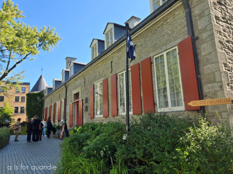
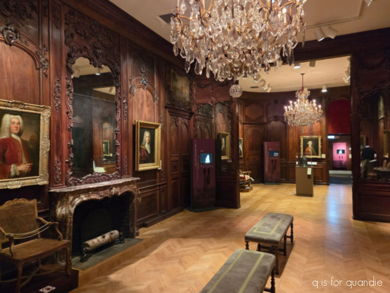
This residence was built in 1705 for Claude de Ramezay, the governor of Montreal. Now it’s a small museum with a mix of interesting exhibits showing 500 years of history.
I have to be honest and admit that I specifically chose it because it was the only tourist site I could find nearby that included a garden.
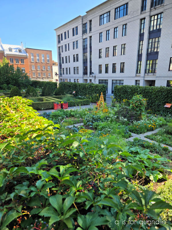
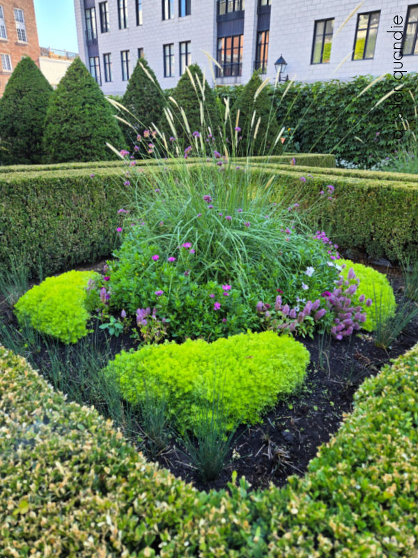
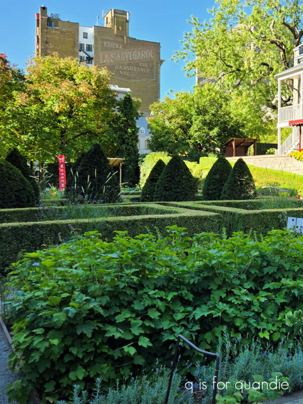
The chateau’s original garden was 4,200 square meters, but today only 750 square meters remain. Nonetheless, the museum has done a lovely job of recreating a smaller version of the original, complete with a vegetable garden …
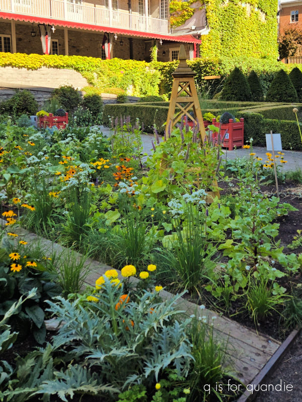
an ornamental garden (including some of my favorite verbena bonariensis) …
and an orchard (those trees behind the those trimmed arborvitae are fruit trees).
It was lovely to spend a little time in such a pretty setting.
After a quick lunch of some really delicious croque monsieur, we headed to the meeting point for a small group walking tour with MTL Detours. We had decided to book a walking tour at the last minute the night before, and I’m so glad we did.
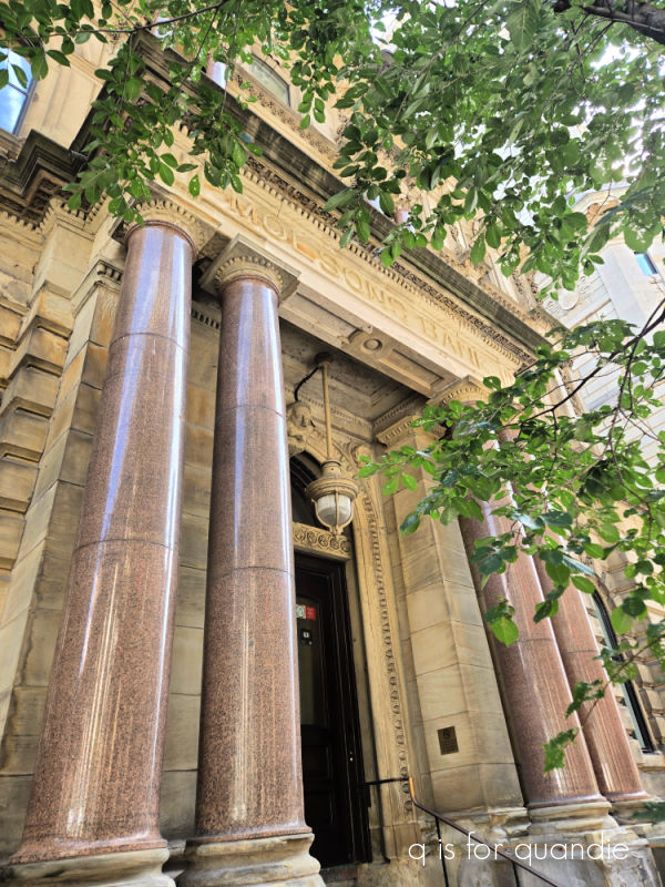
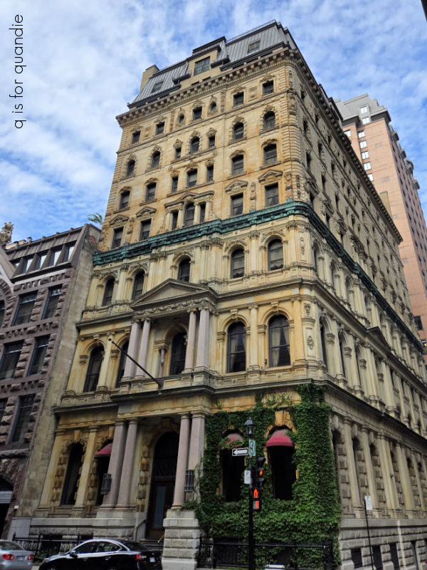
Our guide, Caroline, was full of information and also quite funny and entertaining. She shared some of the history of Montreal, and how you could see that history in the architecture.
Some of the historic buildings are very French in style, like this one with its mansard roof.
And then there are places like Habitat 67 which was built for Expo 67, a World’s Fair held in Montreal in 1967.
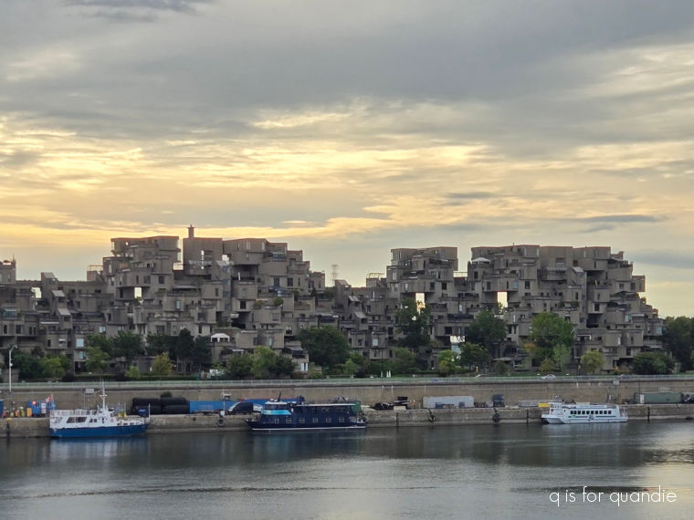
The unique design consists of modular concrete boxes arranged in such a way that each individual living space has it’s own private rooftop terrace that isn’t visible from any other unit.
Caroline also pointed out the geodesic dome that was built for Expo 67.

See it over there on the other side of the river? It was the United States pavilion and was designed by R. Buckminster Fuller. It also was the inspiration for Spaceship Earth in EPCOT …
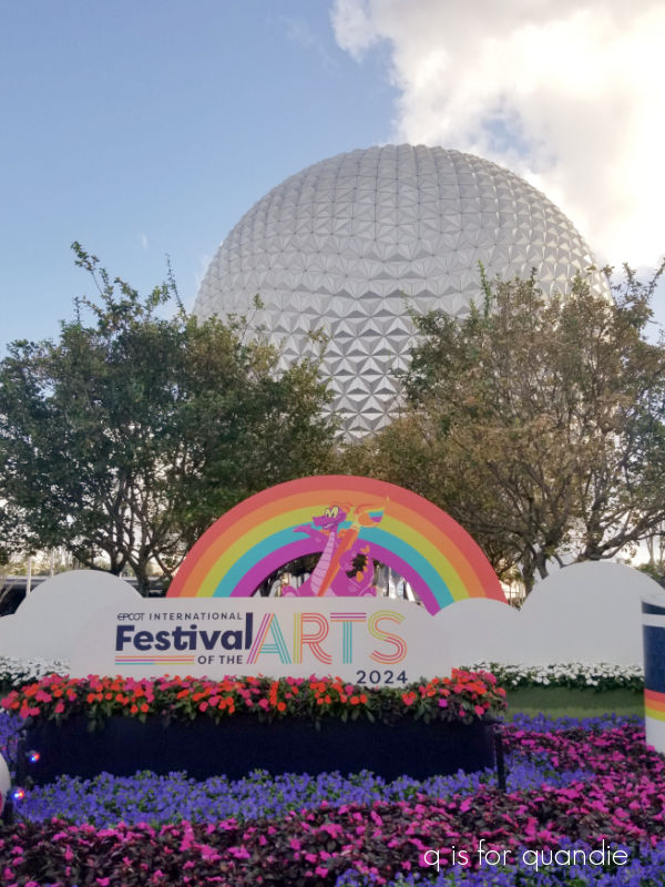
As a Disney park fan, I thought that was an interesting little bit of trivia.
We ended our tour at the Bonsecours Market.
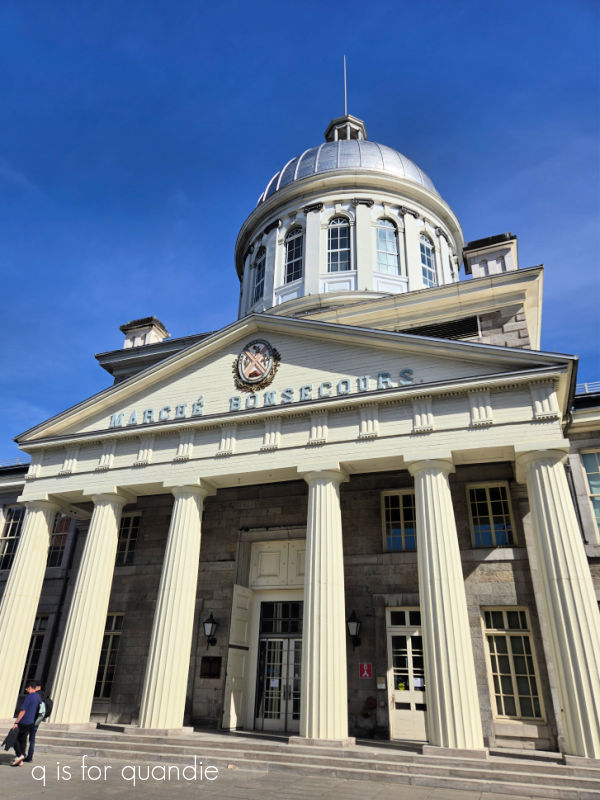
The building was finished in 1847 and was originally home to city hall, but now it’s filled with restaurants and shops.
In hindsight, I’m now kicking myself for not going inside. I wish we had at least taken the time to check it out a bit, but it was such a lovely afternoon that we decided to explore a bit more outside instead.
For dinner I decided I had to try poutine. If you’ve been to Quebec and not tried the poutine, have you really been to Quebec?
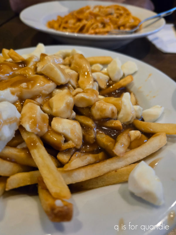
If you aren’t familiar, poutine was invented (if that’s the right word) in rural Quebec in the 1950’s. Traditional poutine consists of french fries topped with cheese curds and then smothered in brown gravy. Poutine has gotten so trendy these days, and now you can get all kind of variations on the theme like lobster poutine, or buffalo chicken poutine.
I have to admit, I didn’t like it. I had a feeling I wouldn’t. I’m not a fan of soggy french fries, and really not a big fan of cheese curds either (unless they are battered and deep fried). And brown gravy? I like it on mashed potatoes, but on fries? No thanks. But now I can say I’ve tried it.
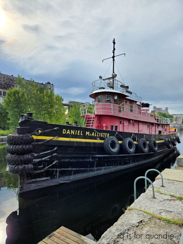
On our last morning in Montreal we decided to take a walk to the port to decide whether or not we needed a taxi to get there later with our luggage (we did not).
It was a lovely morning for a walk along the river.
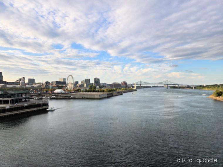
And there were some nice views of the Montreal skyline from the quay.
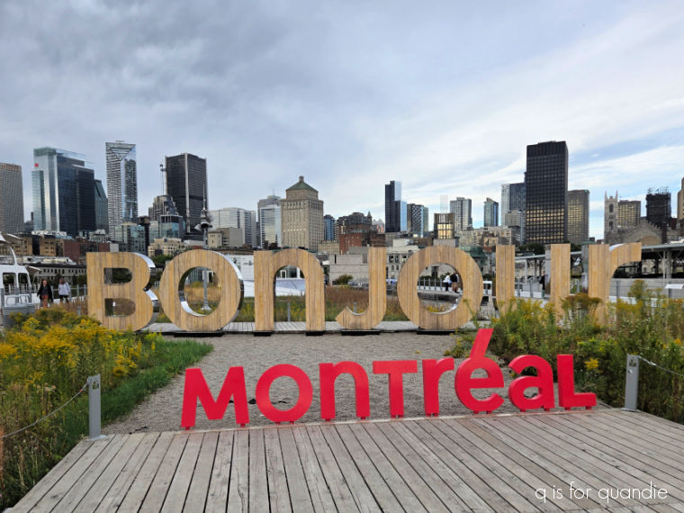
It was the perfect way to say goodbye to Montreal before boarding our ship and sailing away.
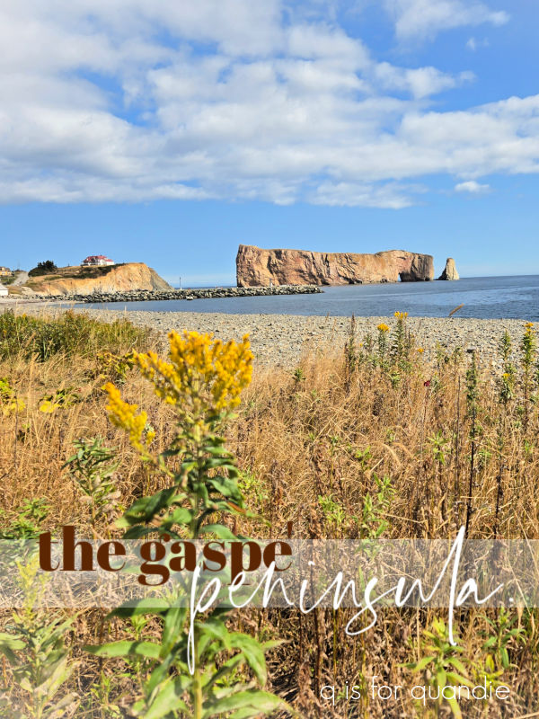
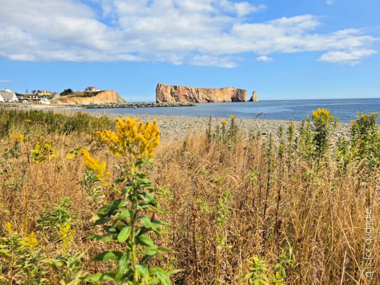
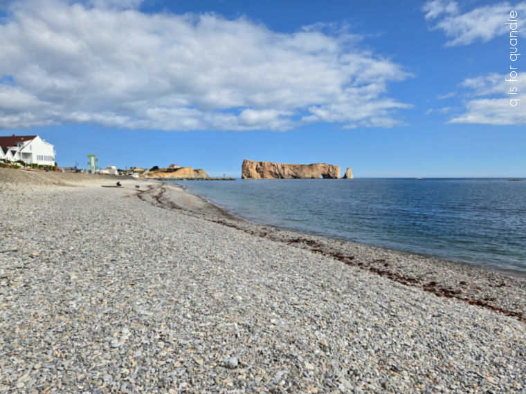
If you’re interested in reading more about my travels, be sure to check back next week when I post about our first port of call, Gaspe.
In the meantime, have any of you tried poutine? If so, what did you think? Are you a fan, or do you also prefer your fries crispy? Leave a comment and let me know.