Good morning from the garden!
It has been awhile since I’ve sent out a Sunday morning in the garden post. In fact, the last one was on December 14 of last year!

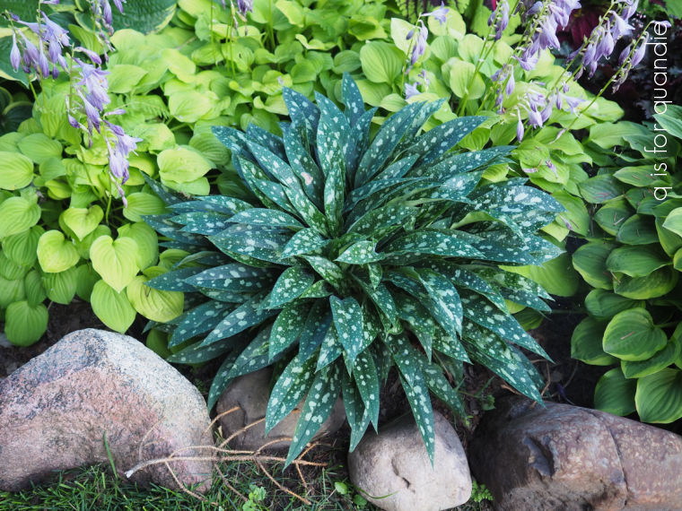
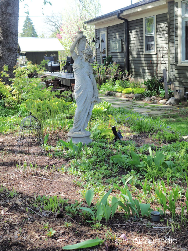
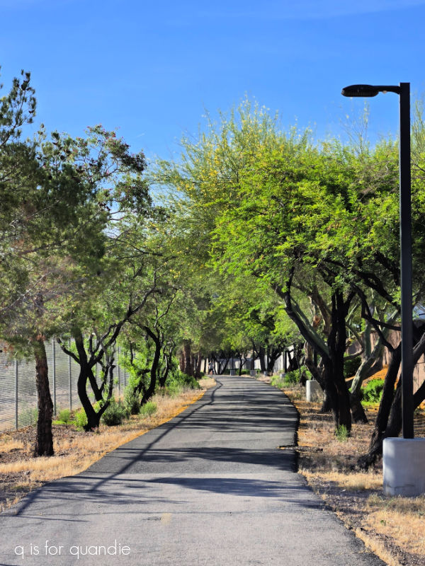
Things are definitely looking a bit different now.
Once again, I am out in the garden. I’ve been super busy getting things cleaned up, mulched and weeded. I’ve also been shopping for plants!
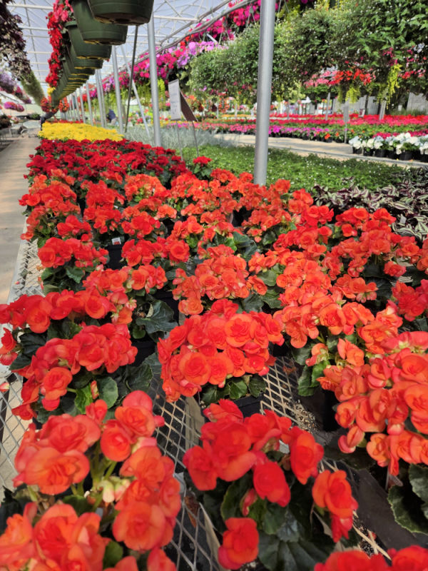
I know I’ve said it here before, but just as a reminder to my local readers, Country Sun Farm in Lake Elmo has far and away the best annuals around.
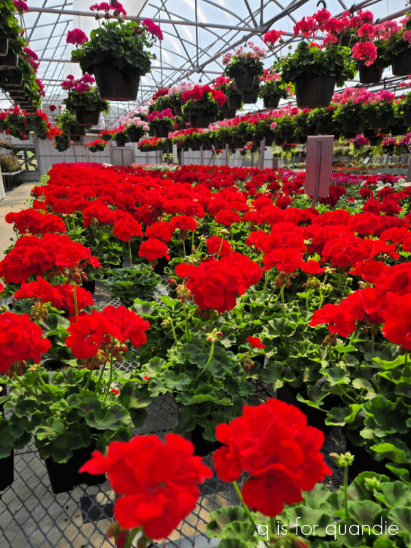
I’ve been to nearly every garden center in my area over the last week or so, and they outshine all of them.
And no, this is not a sponsored post in any way.
As for prices, at $6.99 for a 4.5″ pot they are no more expensive than the same size from Fleet Farm or Bachman’s.
They do only sell annuals, no perennials, and they get picked over fast. I purchased a couple of gorgeous caladium on my first visit, and then the rest were already gone when I went back a few days later.
I also visited Dragonfly Gardens in Amery, Wisconsin last week. It’s a garden center that focuses on native plants. I have to admit, I’m not a big fan of native plants. I know they are good for wildlife, low maintenance once established and are less prone to pests. But honestly, not too many of them appeal to me.
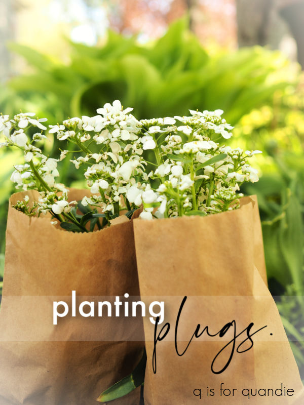
However, what I discovered last week is that Dragonfly also sells plugs.
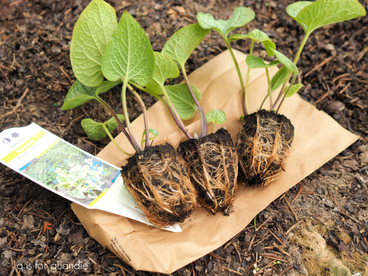
If you aren’t familiar, plugs are young plants cultivated in individual cells, typically in seed trays, that are ready for transplanting into larger containers or directly into the soil. They are much more cost effective than perennials that are already potted up. For example, a one gallon perennial at Dragonfly is $14.99 and a plug is only $7.99. So that’s almost a 50% savings.
If you are planning to plant some perennials en masse … or even just in a grouping of 3 or 5, this is a much more affordable way to do that.
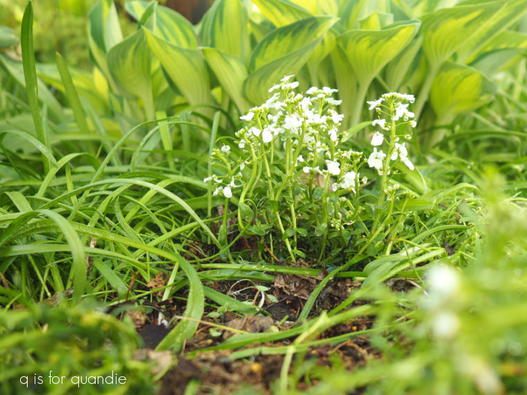
You might be thinking that planting something this tiny must mean that it takes forever for them to turn into a full sized plant, but from everything I’ve read online, theoretically they catch up in just one growing season.
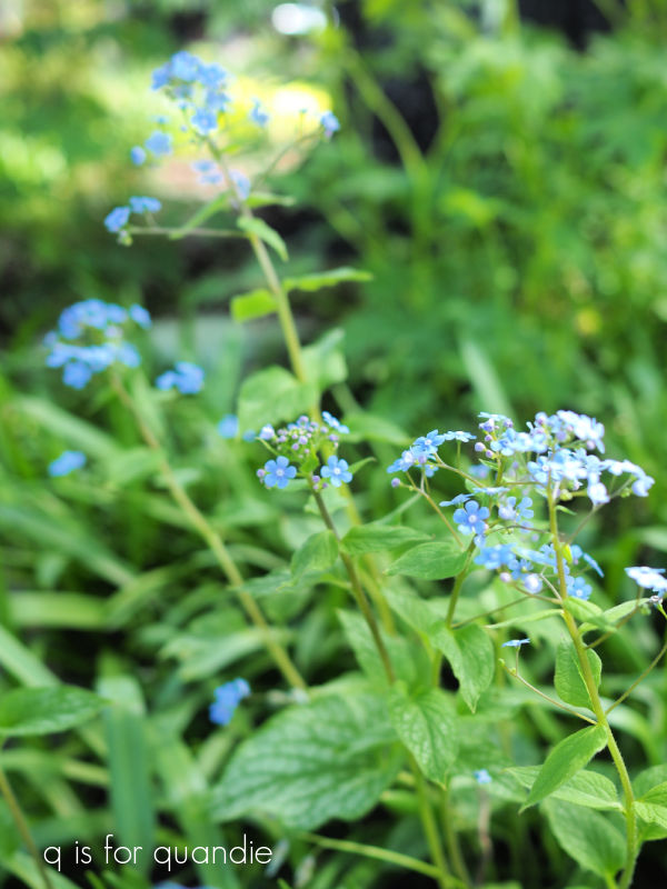
I’ve never planted plugs before, mainly because I’ve never seen them sold in a garden center. I know you can order them online, but it just never has occurred to me to do that. So I’ve decided to give it a go. I purchased three Candytuft plugs and three Brunnera plugs.
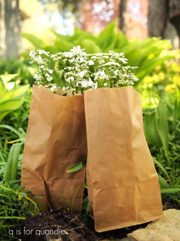
At Dragonfly, you simply pop the plug into a small paper sack to take it away. Just keep in mind that you have to plant them fairly quickly … or otherwise keep them from drying out until you can. I planted mine right away the next day.
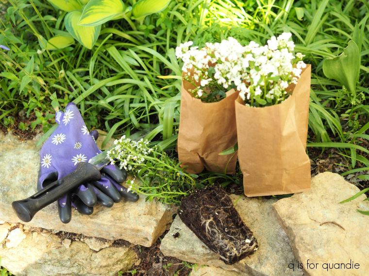
Another big benefit to planting plugs is that it’s easier to get them in the ground. You just need a small hole. That works especially well if you’re planting around tree roots, or, as in my case, you don’t want to disturb too many of your scilla bulbs.
Another reason to purchase plugs is if you don’t have the space or the inclination to start things from seed yourself. You can purchase all kinds of annuals as plugs too, including many vegetable plants.
I plan to update you all near the end of the growing season to let you know how the plugs worked out for me. So be sure to stay tuned!
In the meantime, have you ever planted plugs? Leave a comment and let me know.
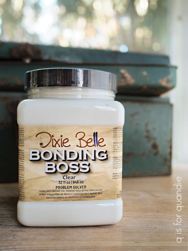


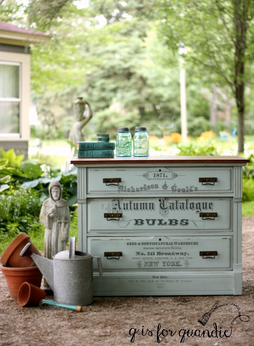
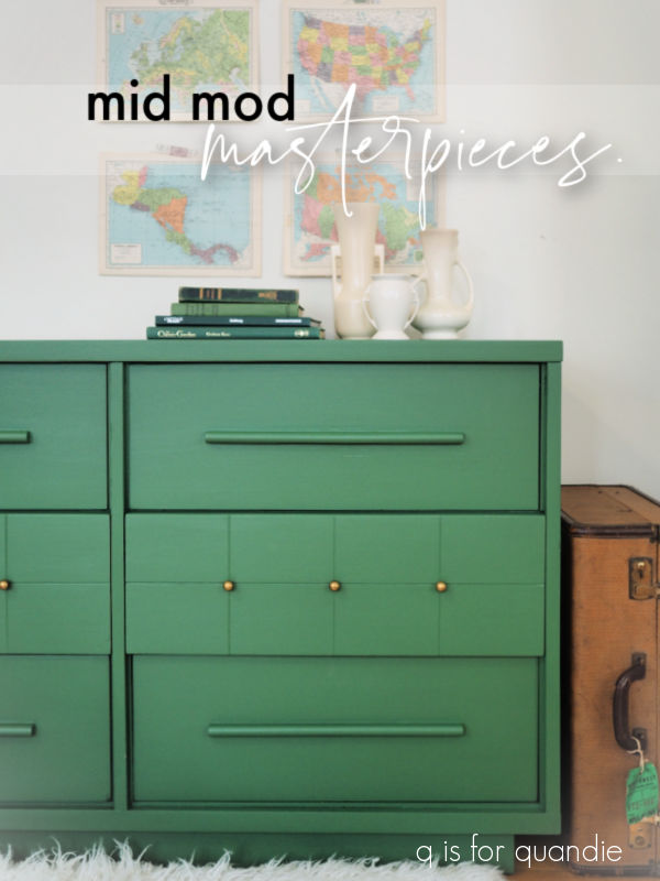
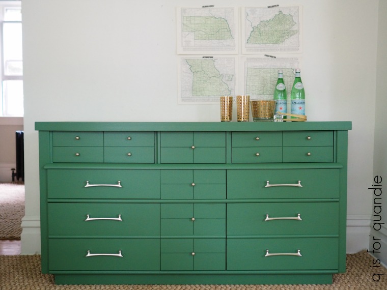
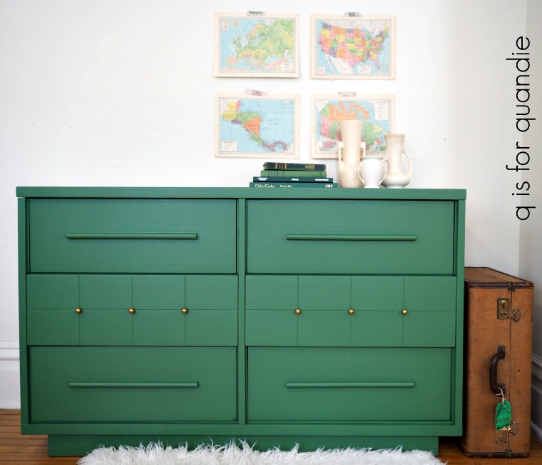
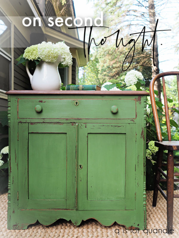
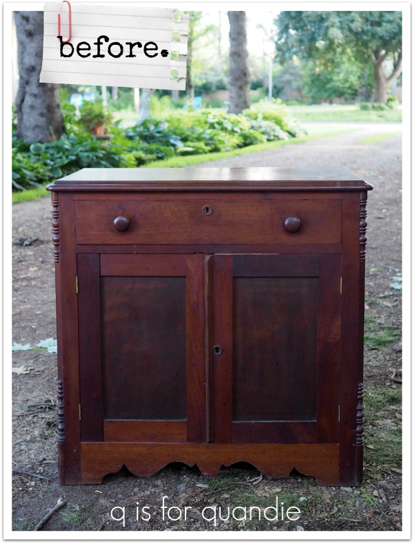
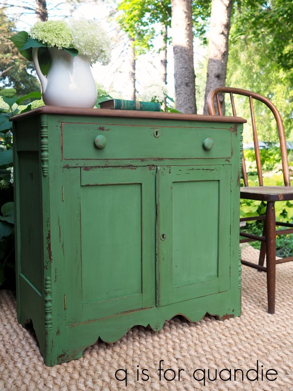
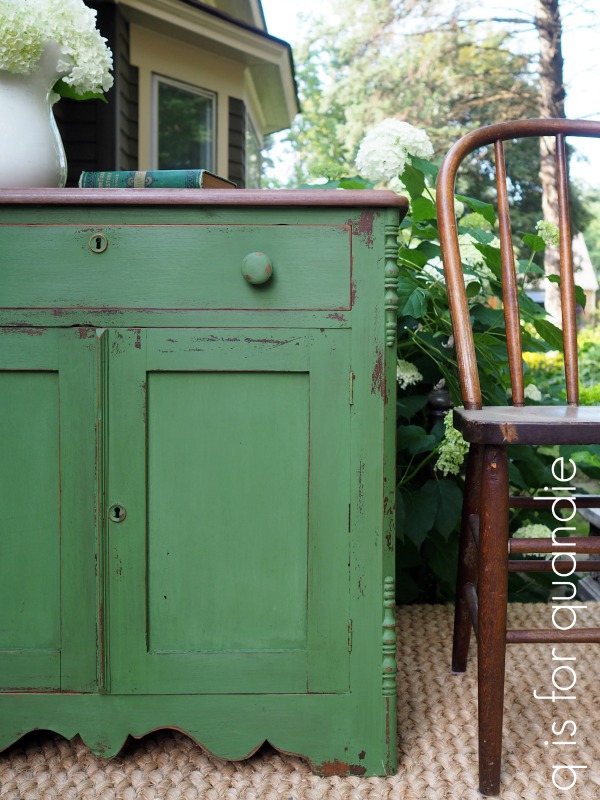
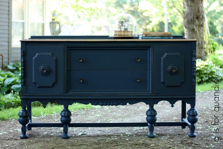
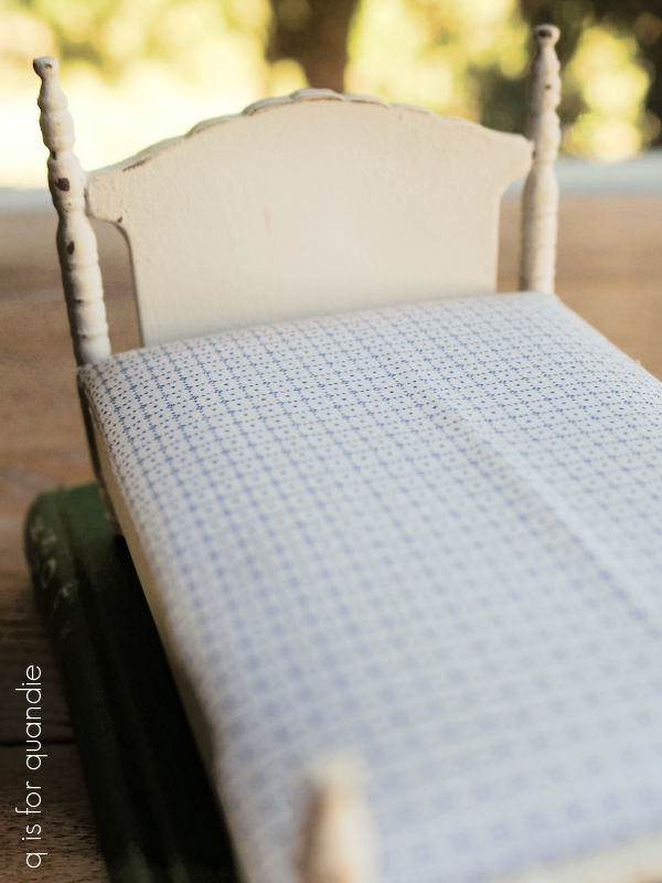
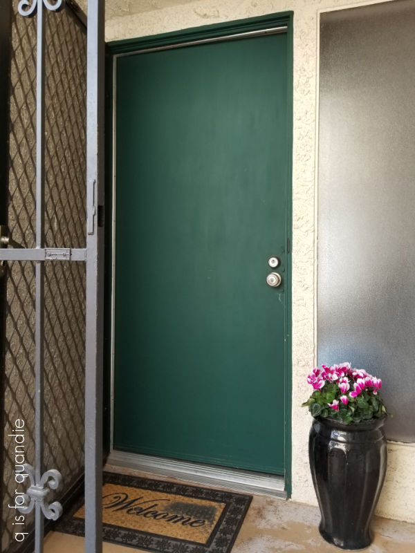 I painted that in Dixie Belle’s Midnight Green Silk Paint back in March 2022 and it still looks great.
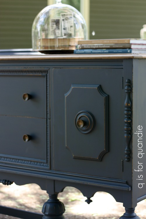