Remember that time I went to Charleston in April to see the azaleas in bloom? And then there was a huge storm the night we arrived that knocked the blooms off most of them?
Well, who would have expected that a trip to Delaware in May would make up for it?

I have to admit, it never even occurred to me that Delaware would be full of azaleas, but welcome to Winterthur.
Winterthur is the creation of Henry Francis du Pont. It includes a massive 175 room house that he built to house his ginormous collection of American decorative arts (over 90,000 items). There’s no way this guy could pretend to be a non-collector 😉
Not only did he collect American decorative arts, he also collected plants including azaleas.

And as you can see, they were in their full glory while we were there.

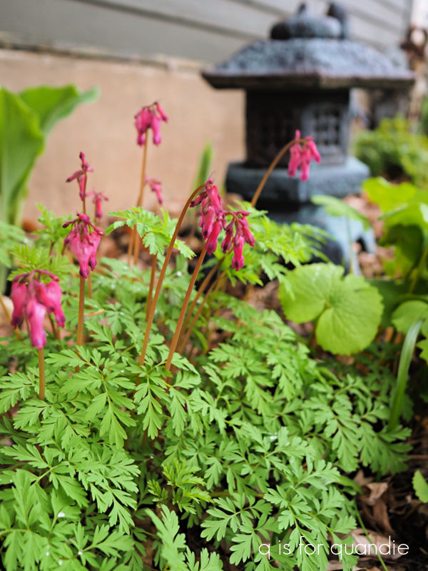
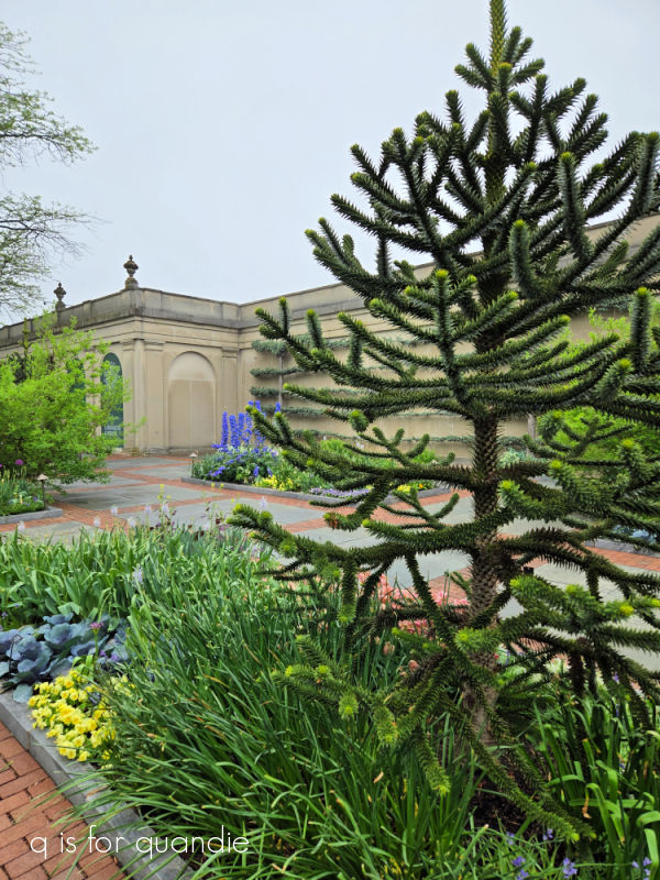
The ticket for Winterthur includes a 30 minute tram tour of the gardens, so we took advantage of that to get the lay of the land. Afterwards we headed back to explore a few of the areas that I wanted to see up close starting with the Azalea Woods.
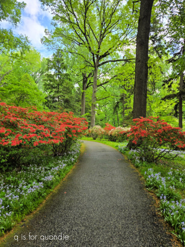
They were beautiful and definitely made up for the lack of blooms in Charleston.
The Peony Garden was our next stop. The flowers were just beginning to open, but this single variety was in full glory.

The Quarry Garden was filled with blooming primroses.
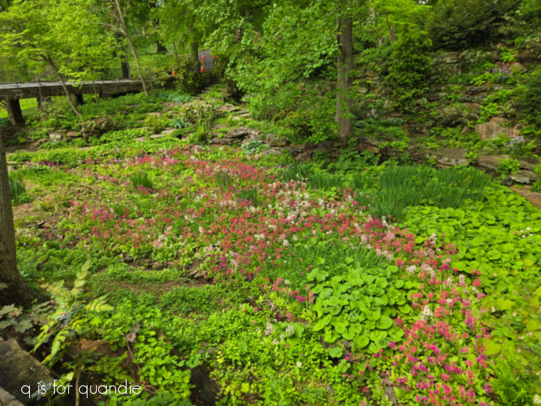
It makes me want to add more of these to my own garden, currently I have just one small plant.
Unfortunately they were doing some restoration work in this garden while we were there so we couldn’t get any closer. We had to settle for looking down on it from above.

The Enchanted Woods were a later addition to Winterthur.

This area was added about 20 years ago to encourage more families with children to visit.
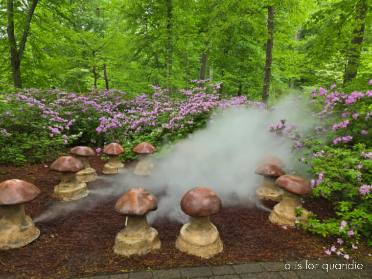
I think I preferred the authenticity of the reflecting pool.

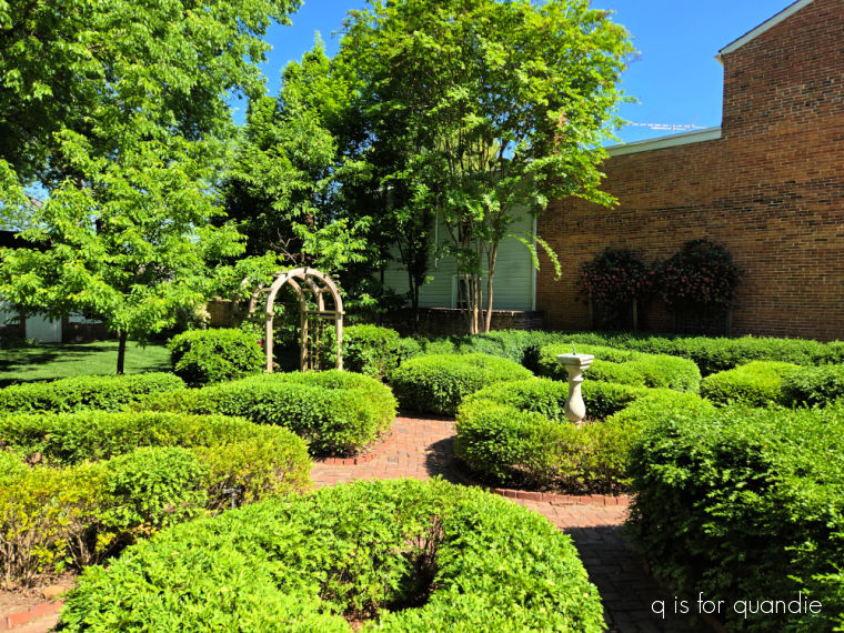
Next up was exploring the rest of the area around the house, if you can call a 175-room building ‘a house’.
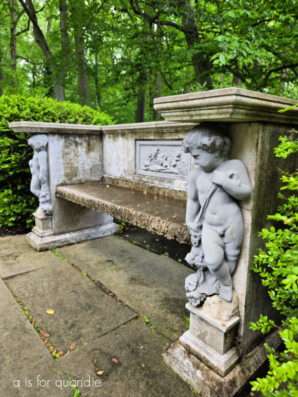
I was fascinated by this rain water tank, at least I’m guessing that’s what this is.

As you can see, the downspout goes directly into that box so I assume it’s meant for storing rain water. And just check out the concrete lions that are holding up the box. No decorative detail was spared on this functional item.
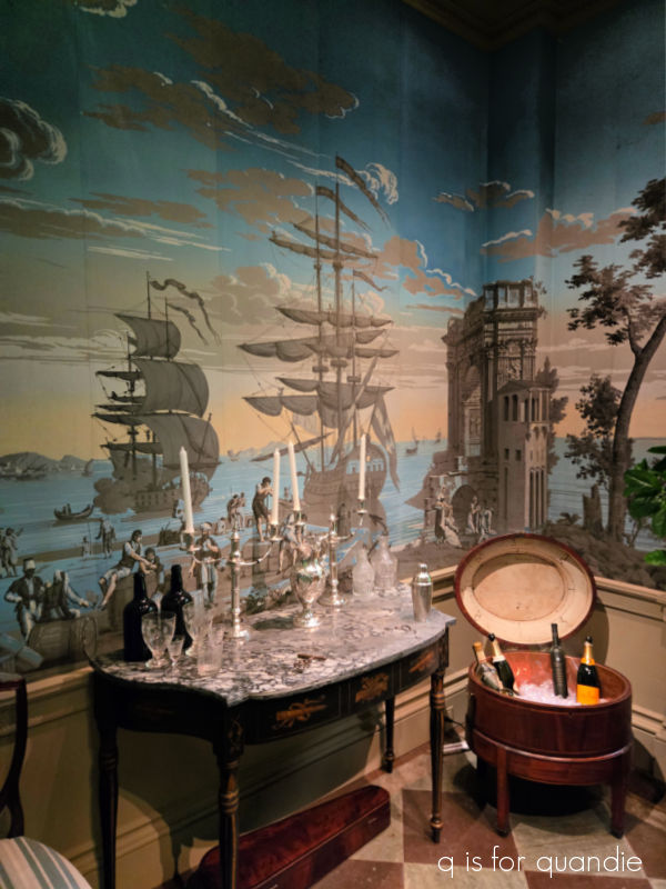
We also took a self-guided tour inside the house where you can see just a handful of the 175 rooms.
Several of the rooms were decorated with hand-painted wallpaper.
And there were lots of spaces that were simply designed to display collections (because let’s face it, we can’t really call these non-collections can we?).
This room was just for candlesticks.
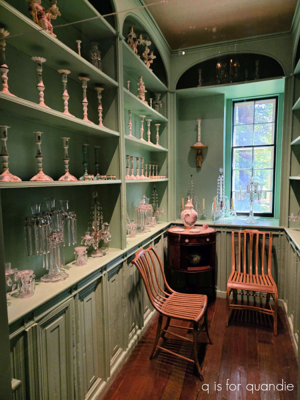
To be fair, I guess one could say that my own pantry is also mainly just a space for displaying collections 😉
As if the house and gardens weren’t enough, there is also a museum at Winterthur. It’s a small museum, but by the time we got there we were getting pretty worn out so it was lucky there weren’t too many exhibits to see.
I really enjoyed the one called “On Tour: Lafayette, America’s Revolutionary Rock Star“.

I have to admit that I didn’t really know much about Lafayette prior to this trip. Of course, I’d heard the name, and I knew he fought in the Revolutionary War, but that was about it. Check out the link above to learn just a little bit about him and his ‘farewell tour’.
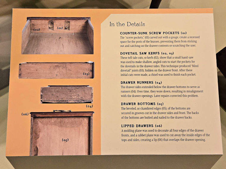
There were also a couple of exhibits in the museum that I found very relatable such as the exhibit about the Dominy’s, a family of skilled woodworkers that made furniture among other things.
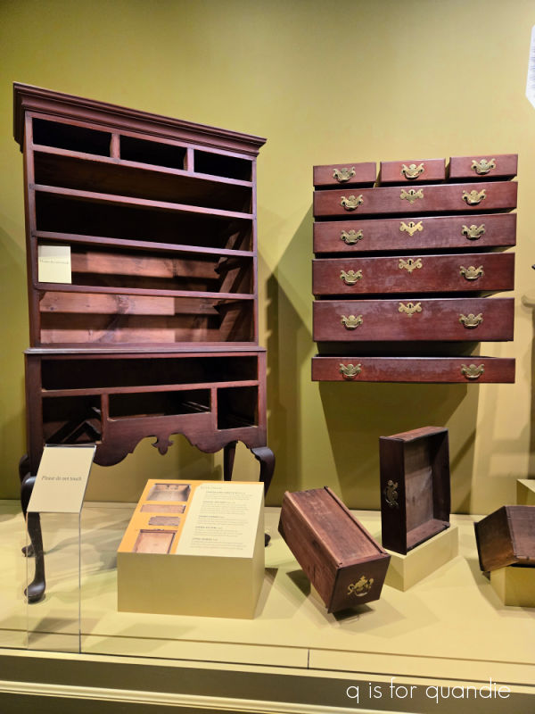
This display pointed out all of the details that went into creating this piece of furniture.
There was also an interesting exhibit about furniture restoration. This 17th century cupboard had been significantly altered over time.
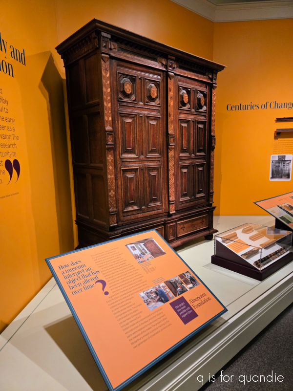
The bottom section had been removed to reduce its height so that it would fit in a smaller room. It has now been restored to its original design.
This next piece was once thought to be two separate pieces that had been ‘married’ together, so the two pieces had been separated.
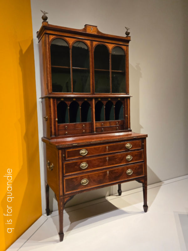
It was only later that the conservators determined that no, these two pieces did belong together.
Another exhibit explored the use of toxic pigments in decorative items such as books, wallpaper and fabrics.
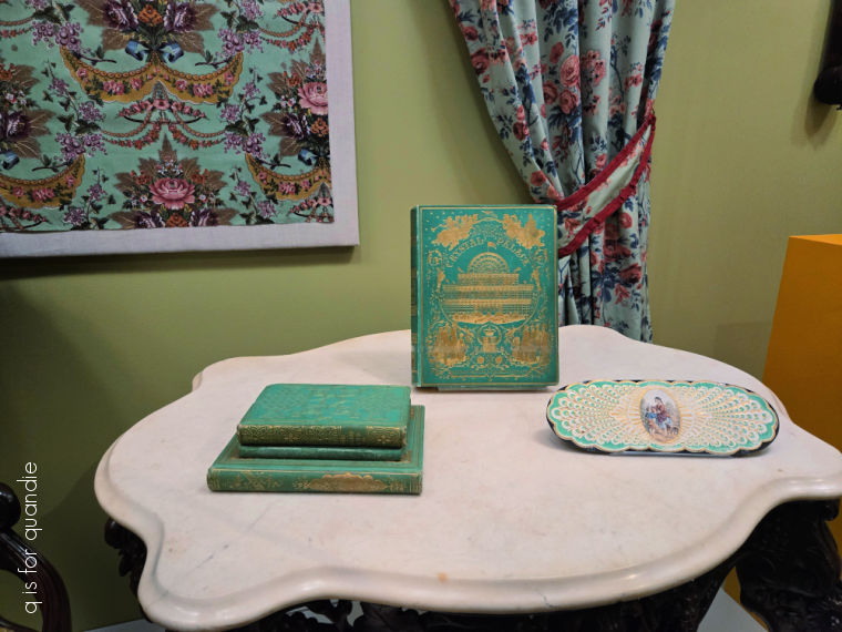
Arsenic was used to create the vibrant green on the items shown above.
In case you haven’t already figured it out, I will warn you that it takes the better part of an entire day to visit Winterthur and see everything there is to see. We never did find the collection of soup tureens that I wanted to see, but in the end we were too worn out to look for them. Luckily there is a cafe with grab-and-go sandwiches and salads, so we were able to get some sustenance before tackling the museum exhibits.
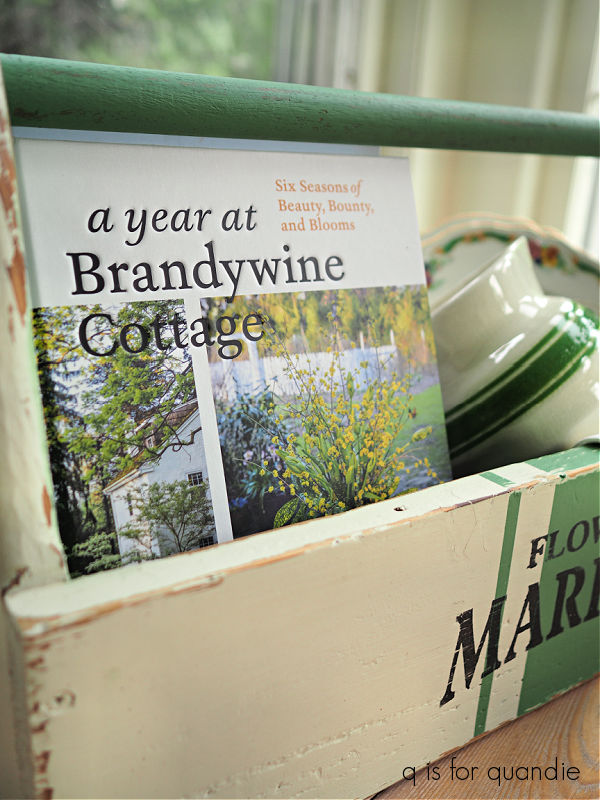
I highly recommend a visit though, I think Winterthur gives Longwood Gardens a run for their money as my favorite place we visited during our recent trip. If you ever are in the Brandywine Valley area be sure to visit both of these!