the pickle chair.

Recently I shared the pair of chairs with the stamped fabric seats that I purchased on the day of chairs …

I also bought two little kid sized chairs that day, see them there on the left?

Here they are again …

At the time I stashed many of these smaller projects away for the winter so I would have things that were easy to work on inside the house.

I painted the first little chair back in November in a pretty Homestead House milk paint color called Maritime.

I just finished up the second one, and this time I chose Sweet Pickins’ milk paint in a color called In A Pickle.

I’ve had such luck with green pieces lately so I figured I’d try it in milk paint.  I’ve painted a few pieces in this color in the past and the little bit of paint powder left in the bag was just enough for this chair.

Just look at the gorgeous chippy-ness …

I opted to just leave this chair unadorned, so no stencils or transfers.

It’s perfect for providing a pop of vibrant color.

The milk paint has been top coated with hemp oil, which really brings out that rich color.  Here is how it looked before the hemp oil was added.

The little bowl with the strawberries on it is something I picked up at a garage sale many years ago.  It’s just one of those sweet little things that I couldn’t resist.

I’m sure at one time it had a lid, but now it’s lidless.  I store paper clips in it.  It never fails to bring a smile to my face when I see it.  I love the little lines of green around the base and handles.

I’ve hung the chair on the wall for the photos, I think it would be fun to use a chair like this as an alternative to a traditional shelf, don’t you?

I’m slowly but surely making my way through all of the smaller projects that I had stashed away for the winter.  Luckily spring is just around the corner (shhh, don’t tell me differently, this is what I keep telling myself) and along with spring comes garage sale season!  It can’t get here soon enough.


the boutique de vin dresser.

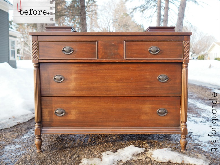
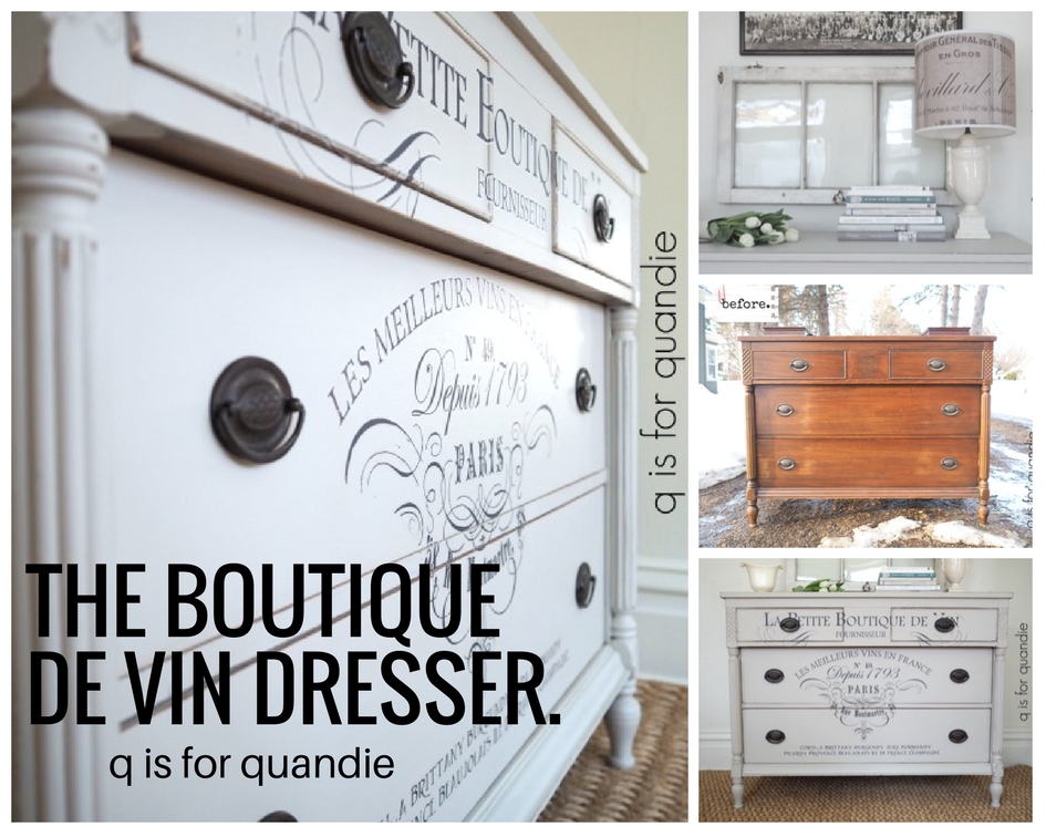
I sent Mr. Q off to pick up this lovely dresser one afternoon last week.  It wasn’t far away so it was easy for him to pop over and buy it while I was still at work at the day job (well, technically I was getting my hair cut on my lunch hour at the time, hi Tamara!).

It has a rather classic traditional style, wouldn’t you say?

You can barely see them, but it has a pair of hankie drawers attached to the top.  I’m not a fan of the hankie drawer.  I’ve removed them from many dressers over the years.  Having those two boxes permanently adhered at either end of the top makes it difficult to put anything else on top of this piece, like a TV for instance.  And in the case of this dresser, I think it could easily be used as a buffet in the dining room, but not with hankie drawers. Usually there are a couple of screws holding the drawers in place, and that was the case with this dresser too.  So, I unscrewed the screws, removed the boxes, filled the holes with Dixie Belle’s brown mud and you’d never know they were once there.

Other than the finish being a bit worn, and the holes left by those hankie drawers, this piece was in perfect condition.  I paid a little bit more for it that I normally would, but not having to make repairs meant that I could restyle this one quickly.

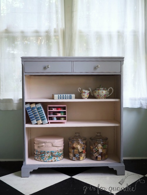
To prep the dresser for painting I sanded it lightly and cleaned it with TSP substitute.  Then I pulled out my Fusion paint in a color called Little Lamb.  In the jar Little Lamb looks like a nice medium grey.  What I forgot about Little Lamb is that once painted and dry it has a purplish undertone.  In some lighting (such as mine) it almost looks lavender.  It’s a pretty color, but not what I wanted for this piece.  Here is how it looked on a bookcase I painted last year.

But no worries.  I just pulled out another jar of Fusion paint in Putty and was able to get away with just one coat of Putty over the Little Lamb, so I really didn’t waste any time or paint.  I would have needed two coats of the Putty had I not already had that coat of Little Lamb in place.  In fact, sometimes I even do this on purpose when transitioning a piece from a very dark original finish to a pale paint color.  Start with a first coat in a medium shade and then move to a paler color.

Once painted, I hand sanded with 220 grit sandpaper to distress and bring out some of the details on this piece.

Remember, Fusion paint can be more difficult to distress than milk or chalk paints because it has a built in top coat and once cured it is incredibly durable.  So if you’re going to distress Fusion I recommend either distressing right away as soon as the paint is dry to the touch (which is what I did here), or using some beeswax or hemp oil under your paint to create a resist in the areas you want to distress.

After I distressed this dresser I stood back and took a look. It was pretty, but it wasn’t very exciting.  The next decision was whether to add some more detail that would really make it pop, or leave it more neutral to appeal to a wider range of potential buyers.  I always struggle with this decision.

After all, we all need multiple pieces in our homes and they can’t all be showstoppers.  Sometimes we just need a piece that is pretty, but doesn’t steal all of the attention.  Sometimes buyers are looking for a piece that they can work into their existing decor, not a piece that will require redecorating the entire room.

But there was something about the top row of drawers on this dresser that was just bugging me.

See it now?  Why such a big gap in between the drawers, with the drawers flush up against the outside edges?  It just feels weirdly off balance to me.  Those two top drawers should be more centered.  I felt the need to correct that visually if not literally.

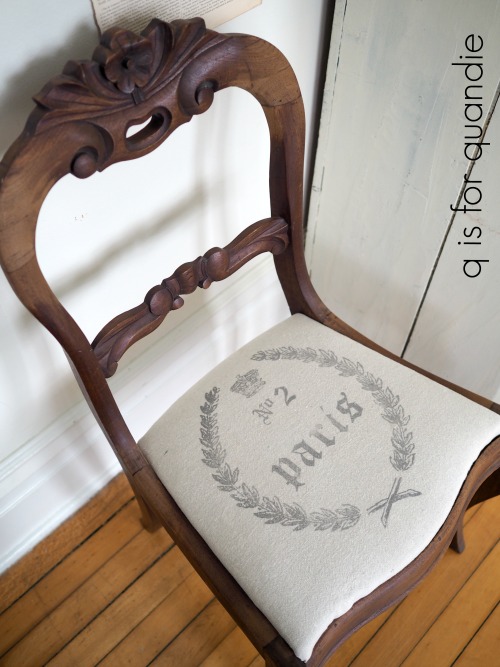
I thought one possible solution would be to add some sort of decorative detail to just that wide middle space.  Maybe a small IOD rub on transfer, a stencil, or even an IOD decor stamp.

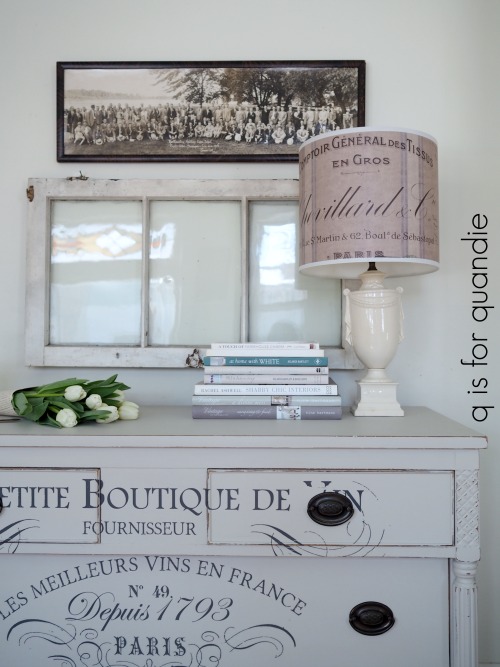
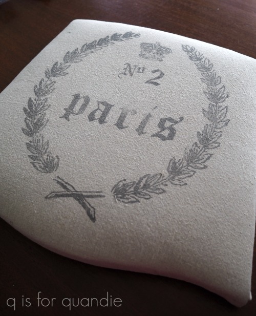
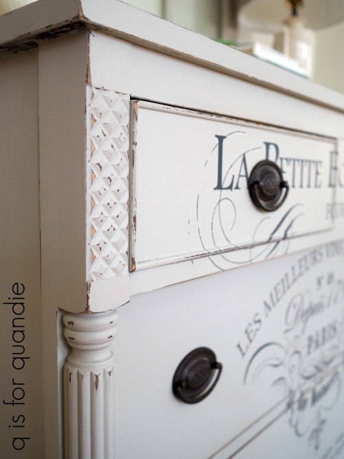
But as I was digging through my IOD transfers I came across this one.

At 36.25″ x 25″ it was the perfect size to fill the entire front of this dresser.  And the detail of the rub-on would do a good job of drawing your attention away from the odd placement of those upper drawers.

Unfortunately I had a little trouble with the transfer.  When I tried to pull the backing paper off, parts of the transfer stuck to it.  No matter how I tried, I couldn’t get those bits of the transfer to detach from the backing.  And one of the bits in question was the face of one of the lions.  I really couldn’t apply the transfer with one faceless lion.

So I contemplated my options and decided to just remove the lions completely.  I cut away those sections of the transfer and kept going.

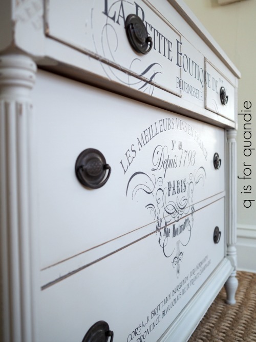
As it turned out, I think I might prefer this transfer without the lions.  Maybe lions just aren’t my thing.

I reached out to my contact at Prima Marketing and asked if there was a solution to this problem (aside from cutting away portions of the transfer) that I should try next time.  And yes, there is!  If this happens to you try popping the entire thing intact into the freezer for a little bit.  That should solve the problem.  But I also learned that there were some issues with this in previous shipments of the transfers, but they have made some changes to correct for it.  The transfers going out now shouldn’t do this (I purchased my transfer over six months ago).   So if you tried an IOD transfer a while back and ran into problems with the transfer sticking to the backing paper and decided they weren’t for you, give them another try.  I’ve done quite a few pieces with them (I counted, I’ve done 17 pieces with IOD transfers!) and normally I don’t have any issues.  Although, spoiler alert, I have learned not to wax before applying an IOD transfer (you can wax after).  But that’s a post for another day.  For now, just trust me on that one.

In addition, if you do have a transfer that fails, go back to your retailer and ask them to replace it.  Prima Marketing will send the retailer a replacement for you.

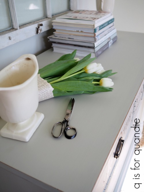
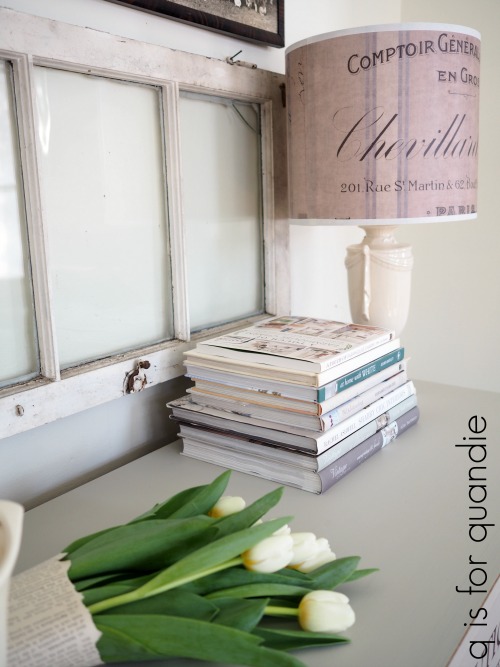
Did you notice my new lamp shade from Light Reading?  I mentioned a couple of weeks ago that I was in the market for another of their gorgeous lampshades and I did find one at Piccadilly Prairie in Southdale Center.  It looks amazing on the very Grecian looking lamp that I purchased at a garage sale.

I’m so glad I switched to the Putty for this dresser.  I love it in this pale shade.  Wouldn’t this piece make a lovely sideboard in a dining room?

As usual, this piece is for sale locally.  Check out my ‘available for local sale‘ page for more details on this piece or other pieces I currently have listed.


a pair of french chairs.

Before I get into today’s post, I have to mention … Fusion’s Park Bench green on mid-century pieces seems to be a magical combination.  The dresser I posted on Wednesday is already sold.  Once again, less than 48 hours from posting on Craigslist to being sold.  I’m going to have to start painting everything green!  How boring would that get for you guys?

Well, not to worry, today’s pieces aren’t green, and in fact they aren’t even painted … yet.

Do you guys remember the day for chairs last September?  I ended up bringing home 8 chairs from a neighborhood garage sale.

I love the carved detail and the pretty curvy legs on this trio of chairs.

Shortly after bringing them home I decided to save two of the chairs to deal with later, but paint the third chair for my guest room.

I used Miss Mustard Seed’s Apron Strings milk paint and the milk paint did its fabulously chippy thing.

My plan all along was to paint and reupholster the remaining pair, using the Iron Orchid Designs Decor Stamps on some basic muslin fabric for the upholstery.

Here’s the Decor Stamps how-to.

Step no. 1 – pull out your fabric, ink and stamps and do some test runs to be sure that the ink you are using will work well on fabric, and that you like the color combo.

Not all stamp inks are appropriate for use on fabric, so it’s always a good idea to test your ink first (or read this great article comparing various ink brands for use on fabric).  It’s also a good idea to see exactly how your ink color will look on your fabric before committing fully as well.  I was totally expecting that I would use the Sepia colored ink for this project, but after trying both that and the Watering Can I realized that I much preferred the latter.

Also, I have to note here that I like to use ink rather than paint for any stamping project (whether it’s on fabric, wood or paper).  Paint can be sloppy and harder to control than ink.  I get a much crisper image with ink.  That might just be my personal experience, but if you’re going to use paint be sure to fully test it on some scrap material first and make sure you like how it looks.

Step no. 2 – lay out your stamped design on the chair seats, making sure it fits properly.

I used stamps from two different sets of IOD Decor Stamps; the letters and no 2 are from the Alpha II set and the wreath and the crown are from the Grain Wreath set (by the way, the smaller wreath and rooster I used for my test are also from the Grain Wreath set).

Be sure that you have placed the pieces stamp side down with the smooth flat side up.  If you have any letters or numbers in your design you should be able to read them as shown in my photo above.

Once your design is laid out just place your IOD 10″ x 12″ acrylic stamp block over them and press down lightly.  It picks up the stamps almost like a magnet.  That smooth side of the rubber stamp will easily cling to the acrylic block.  At this point you could still change the placement of any of the stamps if you want to by pulling the individual stamp off and re-positioning it.

Now it’s time to ink up your stamp by pressing it into the stamp pad making sure it is evenly covered with ink  (hold it up to the light and you can easily see if it’s well inked).  Place your fabric on a flat, hard surface.  The surface under your fabric is going to determine how well your stamp works so make sure it is flat and doesn’t have any concave spots.  Place your stamp where you want it on your fabric (I tried to keep mine centered on a piece of fabric that was about 3″ bigger than my seat all the way around).  Then press firmly on the block over all of your design trying not to rock the stamp, just press straight down.  Use your hand to press down on the acrylic block above anywhere there is a stamp.

Step no. 3 – place the fabric over the chair seat, centering the design appropriately.  Staple your fabric in place, and voila! you are done.

Once I had the seat reupholstered I decided to just pop it on the as-yet-unpainted chair quick to see how it looked.  That’s when something really unexpected happened.  I kind of liked it as is.

I totally did not see that coming.  The finish is worn away in some spots and I think that is part of what I like about it.

So now I have to make a decision.  Do I leave these chairs unpainted?  In which case I would clean them up and maybe add a coat of hemp oil or wax for some added protection.

Or do I paint them?  Most likely in a chippy look using milk paint in white, or maybe pale grey (check out my pinterest board full of chippy chairs for inspiration)?

Any thoughts?  What would you do?  Let me know with a comment.

And in the meantime, be sure to pin this post for future reference!