the christmas curiosities box.

It’s time for another Christmas themed lockbox, and this time I managed to get a ‘before’ shot!

This one wasn’t in terrible shape, with just a few rusty spots here and there.  Nonetheless, I followed my usual prep process of sanding lightly, cleaning, and then priming inside and out with Dixie Belle’s B.O.S.S.

Then I painted the inside with Dixie Belle’s Collard Greens.

Next I painted the outside in DB’s Sawmill Gravy.  Both of these colors have a greyish undertone and they make perfect companions.

Once again I applied bits and pieces from various transfers to the outside.

The holly and poinsettias are from Dixie Belle’s Evergreen and Holly.  The cursive wording on the top of the box is from a re.design with prima transfer.

The cherubs are taken from Dixie Belle’s Vintage Post transfer.

This is a great example of how something not meant to be Christmas-y at all can be mingled with the holly and given an instant holiday vibe.

There was a little spot on the handle that must have been originally meant for a label of some kind, so I painted it in and then added a Tim Holtz ‘curiosities’ transfer.

I finished everything off with a coat of Dixie Belle’s flat clear coat.

Now this lockbox is perfect for storing your Christmas curiosities.  Or maybe just your Christmas cards as one of my readers suggested for the last Christmas themed lockbox.

What would you keep in it?

The lockbox is for sale locally while it lasts.  Be sure to check my ‘available for local sale‘ page for all of the details.

Thank you to Dixie Belle for providing all of their products used on this lockbox.

classic blue & white.

I’ve got another toolbox to share with you guys today.

Once again I neglected to get a good ‘before’ photo of it, but it’s the one on the very bottom of the photo above.

I followed my usual steps to prep it for paint.  I sanded the peeling paint and rust, I cleaned it with a grease cutting cleaner, and then coated it inside and out with Dixie Belle’s B.O.S.S. to block stains and odors.

I decided to go with a classic blue and white theme on this one, even though that doesn’t feel very seasonal right now.  But I wanted to use up some leftover sections of re.design with prima’s French Ceramics transfer.

I’ve always really loved this one.

I painted the tray, and the inside of the toolbox, first using Dixie Belle’s Bunker Hill Blue.

Next I painted the outside in Dixie Belle’s Drop Cloth.  After that dried, I applied the French Ceramics transfer to the front and sides.

I also added some wording from the I.O.D. Label Ephemera transfer to the lid of the toolbox.

I gave everything a couple of coats of Dixie Belle’s flat clear coat to seal it.

This would be the perfect container for storing all of your stamping supplies, wouldn’t it?

This toolbox is available until someone local snatches it up.   Be sure to check out my ‘available for local sale‘ page for more details.

Thank you to Dixie Belle Paint Co for supplying their products used in this makeover.

a simple wood tote.

Whenever my friend Sue sees these simple wood totes, she always grabs them for me.

I had two of them in my stash recently so I decided to hang onto one of them to give it a Christmas look, but I went ahead and painted up the other one.

I started by simply painting it inside and out with Dixie Belle’s Sawmill Gravy.  Then I pulled out all of my I.O.D. transfer scraps and started layering them onto the tote starting with some florals from the Floral Anthology transfer.  I then layered some wording from the I.O.D. Label Ephemera transfer over them on the front of the tote.

I added florals to the ‘back’ of the tote as well.  I think these make awesome centerpieces on a dining table, in which case they need to be decorated on both sides.

I had the perfect spot left to add a bee from the I.O.D. Brocante transfer on the back.

I also wrapped the florals around the sides a little bit.

After adding a quick coat of clear wax, I filled the tote up with some of my dried hydrangeas.

I brought this one into the shop where I sell on consignment last week, and I don’t know whether or not it has sold.  I usually try to post things here on the blog first, but I was in a hurry with this one since I flew off to Orlando at the crack of dawn this morning (technically it was prior to the crack of dawn).

My sister and I are spending the coming week at DisneyWorld.  But not to worry, I have a few blog posts already lined up to keep you guys company while I’m gone.  I may not find the time to respond to comments until I’m back though.

So I hope you all have a great week, and I’m sure I’ll be back before you know it!

it’s beginning to look a lot like Christmas.

As I mentioned yesterday, we had our first snow here on Friday.  Go figure, we went from 80 degrees on Tuesday, to snow on Friday.  Lucky I finished getting my windows washed and the storm windows in place on Thursday!

There’s always something magical about that first snow of the season.  And what better way to celebrate than with a little Christmas project?

I’ve been plugging away at my pile of toolboxes, tackle boxes, and lock boxes.  As I was working on them, I decided it might be fun to give one a holiday look.  I have to admit, I chose one of the very simple lock boxes for this because I wasn’t sure I would like the results.  I figured if it didn’t turn out well, it was a small one and I could easily do it over.

Silly me!  How did I not realize how lovely a Christmas lock box would be?

OK, let’s start at the beginning.  Well, not precisely because I’ve gotten really bad at taking ‘before’ pictures lately.  But you can just picture your average putty colored lock box here.  Nothing special.

This one wasn’t really rusty or gross at all (that’s generally reserved for the toolboxes), so after washing it, I skipped over the B.O.S.S. step and went right to paint.  In hindsight, I won’t do that again.  Somehow that coat of B.O.S.S. just makes them easier to paint, although I can’t really explain why.

I went with Dixie Belle’s Silk paint in Fiery Sky on the inside.

It took three coats to get really good coverage, but red is just like that.

Next I painted the outside in two coats of Dixie Belle’s Sawmill Gravy.  Then it was time to get creative.  I first pulled out Dixie Belle’s Evergreen and Holly transfer and added the pretty poinsettias and holly to the box.

But then I felt like it needed just a little something more.  You know how I love to use typography.  So I pulled out another new Dixie Belle transfer called Vintage Post.

I trimmed out a section here and a section there and added them to my box.

It was precisely what the box needed.

The typography doesn’t have anything at all to do with Christmas, but those fonts have a holiday look to me.  What do you think?

I finished off the outside of the box with a couple of coats of Dixie Belle’s flat clear coat.  I didn’t need to clear coat the inside because the Silk paint has a built in topcoat.

Wouldn’t this lock box be perfect for storing your most treasured vintage glass ornaments?

It would also make an amazing gift box!  If you have someone special you’re exchanging gifts with this Christmas, why not package it in a fabulous lock box?  Or simply fill it up with homemade baked goods, or Christmas candy.

I’m definitely going to do some more of these holiday themed boxes.  I just can’t get enough of ’em.  Well, I say that now, but by mid-December I’m sure I’ll be sick of anything that’s red and green.  But for now, staging these photos sure was a fun way to welcome the first snowfall of the year.

So tell me, is it looking a little like Christmas where you are?

This Christmas lockbox is for sale, so be sure to check my ‘available for local sale‘ page if you are local (sorry, I still don’t ship my creations) and in need of a fabulous lock box.

Thank you to Dixie Belle Paint Co for providing the paint and the transfers used on this project.

an indiscriminate painter.

Despite what may seem like evidence to the contrary, I’m not an entirely indiscriminate painter.  I don’t think that absolutely everything can be improved by slapping some paint on it.  There have been times when I’ve passed up purchasing an item because I don’t think it should be painted, and yet it’s also something that won’t appeal to my market ‘as is’.  Sure, I realize that someone else is going to come along and buy that item, and they may even paint it, but it won’t be me.

Some of the things that I think shouldn’t be painted include mid-century pieces that are in good condition, antique pieces with a nice patina and no damage, and pieces with authentic original chippy paint.

I really had no idea that today’s project would fall into that last category.

But let me go back and start at the beginning.  First a little history for some of my newer followers.  My picker, Sue, and I have been friends for a long time.  We met at our day job, where we worked together for 34 years.  Last year both Sue and I retired.  The situation at our day job had really gone south and we both wanted out.  Sue was my original garage sale mentor.  She introduced me to the fine art of shopping garage sales and thrift stores.  For many years Sue and I hosted an occasional sale together out of my carriage house too.  These days Sue picks up items for me that she knows I’ll like.  Quite honestly, she often has more confidence in my ability to breathe new life into something than I do.

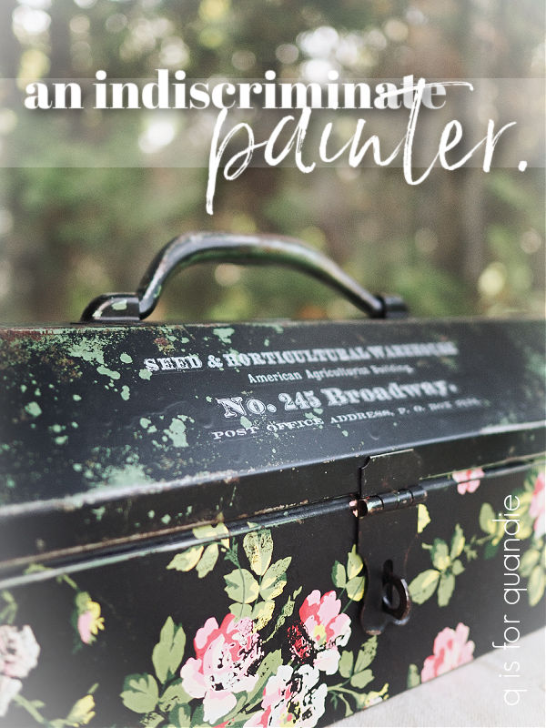
Today’s project is a case in point.  Sue bought this very rusty, crusty toolbox for me over a year ago, before either of us were retired.  I remember this because she brought it to me at work, and I put it in the trunk of my car.  And then it stayed there for all of last winter!  I dug it out this summer and stashed it in my workshop knowing that I needed to get to it when I could work on it outside.

Now, sadly, I totally forgot to take a ‘before’ picture of this one.  Drat!  It would have made an amazing ‘before’ and ‘after’ collage.  So just try to imagine a toolbox that was almost completely rusted shut.  The bottom was solid rust inside and out.  Although I didn’t get a true ‘before’ photo, I did take some pictures after I sanded, cleaned and gave it a coat of matte spray sealer (and apparently set it down on some wet blobs of Dixie Belle’s Drop Cloth).

My initial plan was to sand the heck out of it to get as much rust off as possible, then paint it up.

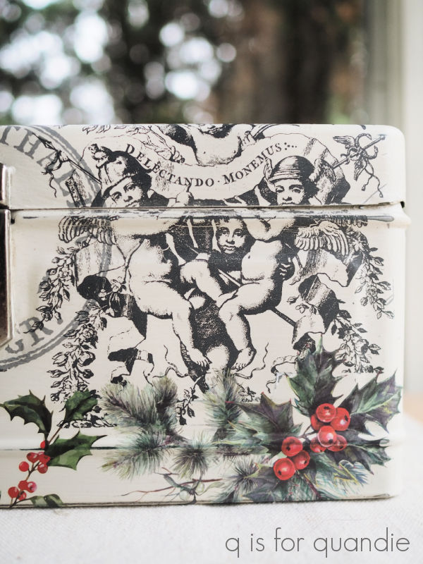
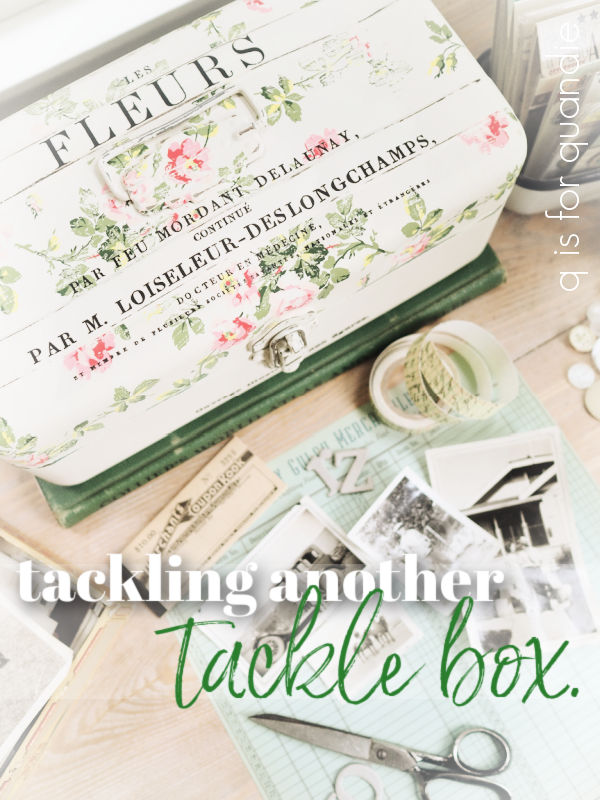
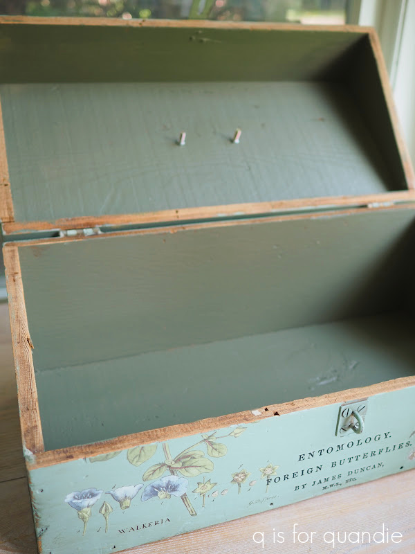
As I started sanding though, I began to reveal a lovely minty green color underneath the coat of black that someone must have added at some point.

I really liked how the lid of the toolbox looked with the chippy black over that mint green, but I wasn’t so fond of that rusty bottom.

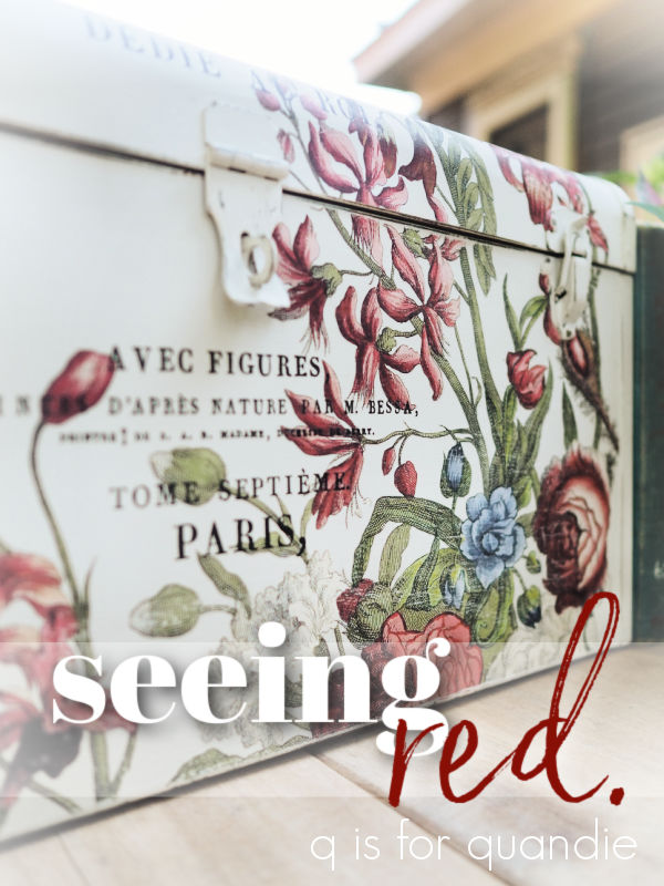
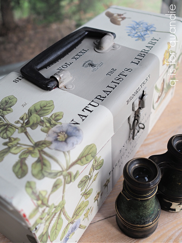
So I started to think about possible ways to keep the lid ‘as is’, but cover up that rust at the bottom.  My first thought was that I could paint the bottom in a matching black and then just add some gold wording … along the lines of this toolbox …

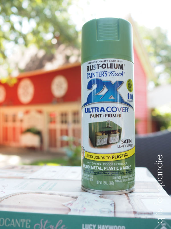
And I did pull out Dixie Belle’s Silk paint in Anchor, and I painted the bottom.

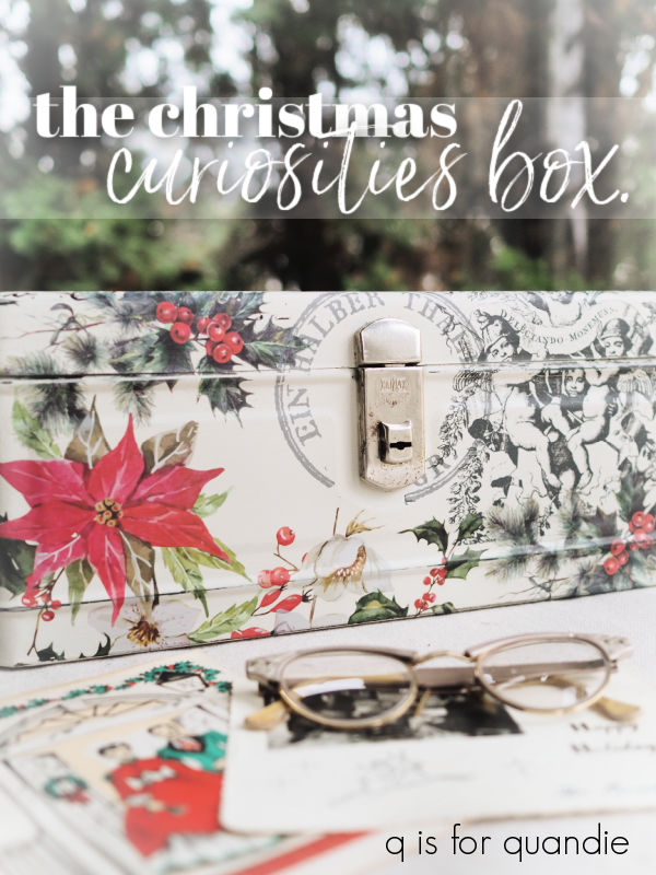
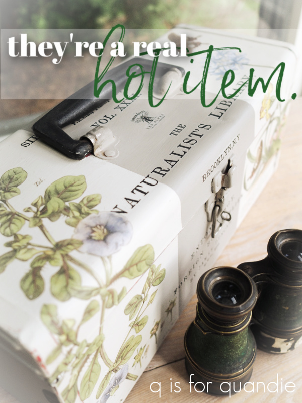
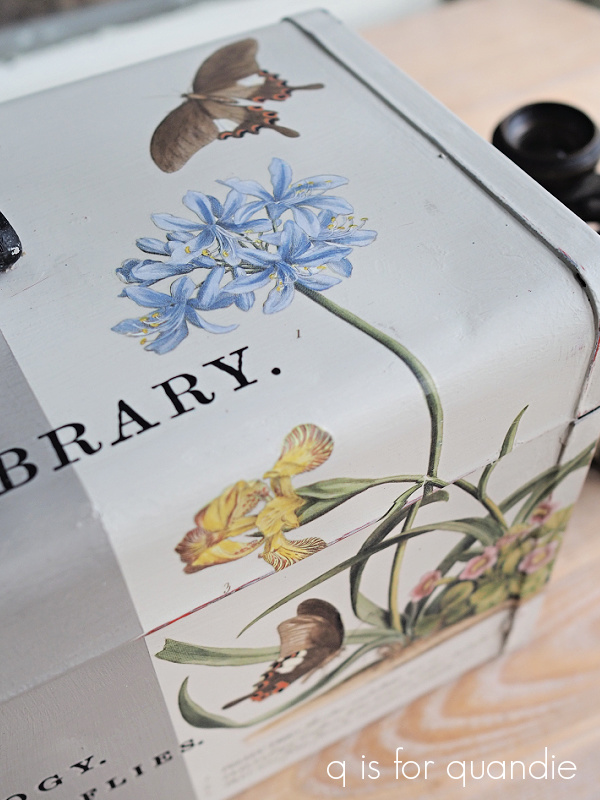
The Anchor was perfect for this use.  But then I started thinking about the Rose Chintz paint inlay from I.O.D.  I’d seen it used over black and I thought it might just be perfect for the sides of this toolbox.  The paint inlays work best with a chalk style paint rather than an acrylic style paint like the Dixie Belle Silk paint.  So I made the switch to Dixie Belle’s Caviar for the sides of the toolbox and I applied the paint inlay all the way around the four sides of the box.

Eureka!  I love it!

The distressed look of the paint inlay was perfect to go with the chippy lid.  And isn’t that Rose Chintz floral gorgeous over black?

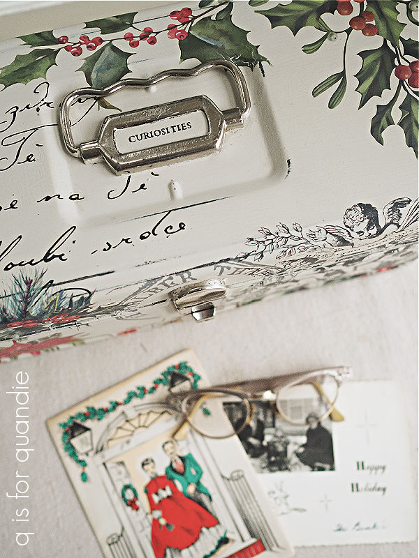
I wanted to add just a little something more to that lid though, so I pulled out an old small Seeds transfer in white and chose a portion of the wording to add to the lid.

Then I also cut out a little white crown from the I.O.D. Traditional Pots transfer and added that under the handle.

Next up I added a couple more coats of Rust-Oleum clear matte spray sealer to both the lid with the transfers and the paint inlay.

Today’s q tip: always remember that the paint from the inlays can be reactivated with water.  To avoid smearing it, it’s best to seal it with a spray sealer.

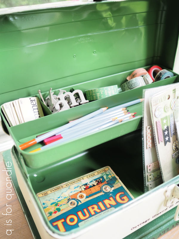
Next up was dealing with the interior of the toolbox.  As I mentioned, it had a solid layer of rust inside the bottom.  I had sanded that down a bit and cleaned away the dust.  Then I gave it two coats of Dixie Belle’s B.O.S.S. in clear.  I find that the B.O.S.S. does a good job of blocking any bleed thru from rust.  I can’t vouch for its long term effectiveness since I’ve only been using this product for a couple of years, but so far it seems to do the trick when I’ve used it on rusty pieces.

Once the B.O.S.S. was dry, I added a couple of coats of Dixie Belle’s Mint Julep.  I knew this color would be a good match for that mint color I’d revealed on the lid.

I wanted to also add a pop of something special inside the toolbox so I pulled out this leftover scrap from the I.O.D. Petit Rosier transfer and applied it inside the lid.

It was a perfect fit.  Well, almost.  I had to trim a little off the edges.

I also sealed the inside of the toolbox with the matte spray sealer.

People occasionally ask me what my buyers do with these re-fabbed toolboxes.  Some have told me they use them to store art supplies, or sewing supplies.  I think this one would also be perfect for housing all of one’s ribbons.

But regardless of what is inside, I just love how this one turned out.  What do you think of it?  Would you have kept the chippy lid, or would you have painted over it?

As hard as it may be to part with this one, I won’t be hanging onto it.  It is for sale locally.  If any of you locals are interested, be sure to check my ‘available for local sale‘ page for more details.

Thank you to Dixie Belle Paint Co for supplying the paint used for this project.

the roller skate case.

My friend/picker Sue found this metal case for me.

She was told it was a roller skate case.  Or at least someone kept their roller skates in it, even if that wasn’t its original intention.

Either way, Sue knew I could breathe new life into it and maybe also give it a new purpose.

I started with my usual prep; cleaning, sanding, etc, followed by a coat of Dixie Belle’s B.O.S.S.  Then I made the decision to stick with the original black color, so I gave it a quick coat of Dixie Belle’s Midnight Sky.  I avoided painting over the brass fittings because they have an amazing patina to them.

Just a side note here about the B.O.S.S.  This is definitely one of those occasions when I really appreciate the clear B.O.S.S.  I wouldn’t have wanted to use a colored or white primer (other than black I suppose) on this piece because you would have seen that when I distressed the edges.

Once the Midnight Sky was dry, I followed up with one of the stencils from the set of 4 German Grain Sack stencils from ellen j goods.

Isn’t that a fun one?  I used Dixie Belle’s Drop Cloth for the stenciling.

I finished off the outside of the case with some clear wax.

I briefly considered doing something to the inside of the case, but ultimately I thought the original vintage paper lining was pretty fab.

Obviously it’s not in pristine condition, but I cleaned it up a bit and I rather like its shabby appeal.

Not many of us need a case for our roller skates these days.

So how about using this case to store your old photos?

OK, maybe you don’t have photos quite as old as these (I have a stash of the most amazing photos from my mom’s side of the family in South Dakota), but you must have some sort of photos or other mementos that need a cool case to live in.

Now, if only I could think of a way to repurpose those old skates.

Any ideas?

The roller skate case is for sale so be sure to check my ‘available for local sale‘ page for more details if interested.

Thank you to Dixie Belle Paint Co for providing the B.O.S.S. and paint used on this project.  Thank you to ellen j goods for providing the stencil.

tackling another tackle box.

Well dang, somehow I managed to forget to take a ‘before’ photo of today’s makeover candidate.  Shoot!

You’ll just have to use your imagination to picture this tackle box looking rusty and crusty as per usual.  I followed my standard procedure of cleaning, sanding, and priming with Dixie Belle’s B.O.S.S. on the outside, but for the inside I opted for spray paint.  I find that to be the easiest way of dealing with these hinged, pop up tackle box trays.

I used some of the leftover Rust-oleum Leafy Green spray paint from my wicker garden chair.

After the inside dried, I painted the outside in Dixie Belle’s Drop Cloth.  Then I applied some of the I.O.D. Rose Chintz paint inlay to the top.

For more detailed instructions on using the paint inlay, you can check out my step by step how-to post.

Once the paint inlay was dry, I sealed it with a clear matte finish spray to prevent it from smearing when I next applied some wording from the I.O.D. Label Ephemera transfer.

At this point you might be noticing that I got some mixed results with the paint inlay.

Some areas are crystal clear …

while others are rather faint.

I think this is a result of two things.  First, the surface itself is bumpy and uneven, and second, I probably didn’t press the inlay into the paint firmly enough in those bumpy areas.

Normally I use a brayer to press the inlay down into the paint and I didn’t do that this time.  Instead I just used my fingertips and a damp rag.

Personally, I rather like this faded sort of look, but if that isn’t your thing you may want to be sure to use a brayer with the paint inlays.

I opted to paint over the latch and handle on this one, then I just roughed them up a bit with sandpaper to make them appear worn.

I love the idea of using an old tackle box for jewelry, but they also are perfect for containing craft or art supplies.

I have to admit I don’t do much scrapbooking anymore, but staging a photo shoot like this makes me realize how much I miss it.

Maybe I’ll find more time to get back to it now that I’m retired (note: I’m saying that 9 months in and I haven’t seemed to find the time yet).

Normally I would share a ‘before & after’ collage here, but since I neglected to get that ‘before’ shot … well … all I have is the ‘after’.

But it’s a pretty good after I think.  What do you think?

This tackle box is for sale so be sure to check my ‘available for local sale‘ page for more details if interested.

Thank you to Dixie Belle Paint Co for providing the B.O.S.S. and paint used on this project.

seeing red.

I’d been suffering from a little toolbox withdrawal recently, so I decided to take a break from the bigger stuff and paint a couple of them starting with this one.

I have pretty much developed a technique for dealing with these old, dirty, greasy, crusty, rusty toolboxes after having painted so many.

I start out with scraping away as much gunk as possible and then vacuuming out any loose dirt.  Next I clean the toolbox inside and out with a grease cutting cleaner (I’ve used Dawn dish soap, TSP, Mean Green Cleaner & Degreaser) and the garden hose.  I try to take advantage of hot sunny afternoons for that step.  It’s fun to play in the water in the backyard, and then I can leave the toolbox to dry in the sun.

Next I sand the surface to remove any remaining loose paint and to smooth out areas of rust.  Then I vacuum again and wipe everything down again with a damp cloth.

Today’s q tip:  are you wondering why the sanding step comes after the cleaning step, and then I have to basically clean again?  Well, that’s to avoid embedding the oily dirt in the tiny cracks and crevices by sanding on it.  It’s better to remove that oily dirt first.

After all of that, I paint inside and out with a coat of Dixie Belle’s B.O.S.S.  This product may not totally prevent the rust from eventually coming through the paint, but it will definitely slow it down.  It also gives me a fantastic surface for painting over.

I usually paint the inside first, and this time around I decided to go red.

This is Dixie Belle’s Silk Paint in Fiery Sky from their Desert Collection.  Isn’t that a gorgeous shade of red?  It definitely has a cool/blue undertone.  I ended up doing three coats to get good coverage (which is often the case with red paint).  In hindsight, I should have used the grey B.O.S.S. rather than the clear version.  A grey primer will always improve the coverage with red paint.  The next time I use Fiery Sky I’ll try to remember the grey B.O.S.S.!

Next up I painted the outside of the toolbox in two coats of Dixie Belle’s Sawmill Gravy.  Once that was dry I pulled out a few different I.O.D. transfers and started getting creative.

I used sections from their June, Ode to Henry Fletcher (florals on the front), Floral Anthology (floral on the top left) and Label Ephemera (wording) transfers.

I specifically chose floral sections with lots of red to go with the Fiery Sky on the interior.

And I used some of my favorite French wording from the Label Ephemera transfer.

I’m starting to run low on my stash of this particular I.O.D. transfer, and it has been retired.  I’ve been hunting for it, and I even found a shop to mail order it from last week.  I placed my order, only to get a call from the proprietor a few hours later telling me that she didn’t actually have it in stock.  Bummer.  I’ve found another source though and I’m hoping this one comes through.  Fingers crossed.

Once the transfers were all applied, I added a couple of coats of Dixie Belle’s flat clear coat to seal them.

I didn’t do much staging for this toolbox, it was hot outside so I wanted to snap these pics quickly.

But I did fill one of my vintage vases with some like-colored foliage from caladiums and coleus, as well as an Annabelle hydrangea blossom.

I love how that deep purple coleus has just the slightest dusting of chartreuse in the newest leaves.  Isn’t that pretty?  You have to look closely to really see it, but it’s a fun detail.

Although florals typically make us think of summer, I think the colors on this one are leaning into fall … or dare I say it … even winter.  With all of those reds and greens, this would be pretty for Christmas filled with an arrangement of evergreens.

So, what do you think?  Do you prefer the ‘before’ or the ‘after’?

This toolbox is for sale so be sure to check my ‘available for local sale‘ page for more details if interested.

Thank you to Dixie Belle Paint Co for providing the B.O.S.S., paint and clear coat used on this project.

the upholsterer’s toolbox.

I picked up this wooden box while out at garage sales a few weeks back.

I knew it would be a fun painting project, and swapping out that blue plastic handle would be super easy.

As I was paying for it, the seller told me that her dad was an upholsterer and this was his toolbox.  Inside the lid was this contraption, which consisted of some steel wool covered by some felt and held in place with upholstery tacks, and then filled with big pins with round loops on the end.

Apparently those are upholstery pins or skewers.

Of course, I’m not keeping any of that.  I think it might seriously limit my ability to sell this piece if my target market only includes upholsterers.

So I removed all of that, and pulled off the ugly handle.  Then I gave the box a base coat of paint in Dixie Belle’s Dried Sage.  That was just to build on though.  I decided to try my hand at paint blending once again.  Some of you may remember that I tried this once before and wasn’t happy with the results (on this bed).  I ended up painting back over that attempt with a solid color.

But you know what they say, if at first you don’t succeed …

So I pulled out a couple of colors that I thought would blend nicely for the outside of the box, Dixie Belle’s chalk mineral paint in Sea Glass and Juniper, and their Silk paint in Cactus for the interior of the box.

I have to confess that I did cheat a little, or maybe it would be fair to say that my technique was a little different than that of the experts.  I started by mixing my two colors together in a plastic cup to create a third mid-range color.  I then painted the centers of each surface in Sea Glass, the outer edges in Juniper, and used the mixed paint to blend in between.  I used the Dixie Belle Continuous Mister Bottle to keep my paint wet thus allowing me to blend the colors together as I worked.

I kept my blending a little on the more subtle side, and I love the results.

Once I had the paint blended on the outside, I painted the inside in two coats of Dixie Belle’s Silk Paint in Cactus.

You might be wondering why I didn’t just use the Juniper again on the inside, and that’s because I wanted to use a Silk paint for the interior.  It has a built in stain blocker, and a built in top coat.  There were some stains that I thought might bleed through, and I wanted the inside to be durable without having to add several coats of sealer.  Two coats of Silk paint and I was done.

Next came the fun part, adding some transfers.

The wording is from the I.O.D. Label Ephemera transfer, the florals and that adorable row of birds is from the I.O.D. Brocante transfer, with a couple of florals from their Floral Anthology thrown in as well.

And as you can see, I swapped out the original handle for a drawer pull from Hobby Lobby.  In fact, it was the drawer pull that inspired the color scheme.

The little moth on the latch is a Tim Holtz transfer (the 1858. is from Label Ephemera).

Once I had all of the transfers in place, I sanded over everything lightly with 220 grit sandpaper and then added a coat of clear wax.

This box would be perfect for storing art supplies.

Or maybe your bird watching materials.

I really enjoy working on these sorts of projects.  When I’m working on furniture I feel much more limited in what I can do.  I’m always trying to walk that line between creating art and creating furniture that is marketable.  Maybe that’s where I’m going wrong with the furniture?  I might have to give that some thought.

But in the meantime, it doesn’t even feel fair to make a before and after comparison on this one.

I can’t imagine that anyone would prefer the ‘before’ version.  Except possibly an upholsterer.  What do you think?

This former upholsterer’s toolbox is for sale locally, be sure to check my ‘available for local sale‘ page for more details.

Thank you to Dixie Belle Paint Co for providing the paint and mister I used on this project.

they’re a real hot item.

“Give shy persons the strength they need to get up and do what needs to be done. Made from whole wheat raised by Norwegian bachelor farmers, so you know they’re not only good for you, they’re pure, mostly.”

Were any of you fans of A Prairie Home Companion?  The radio show on public radio?  OK, this one makes me sound older than I am because I was a fan of a radio show (as if I was around before TV).  But it was on the air from 1974 through 2016.  It originally started at a local college here, Macalester.  If that name sounds familiar to some of you non-locals, maybe it’s because I regularly go to a neighborhood garage sale in that area, MacGrove.

Anyway, one of the fictional sponsors of the show was Powdermilk Biscuits.  When I mentioned how fast Monday’s toolbox sold, Mr. Q started singing the Powdermilk Biscuit jingle.

Has your family tried them, Powdermilk?
Has your family tried them, Powdermilk!
Well, if your family’s tried ’em,
You know you’ve satisfied ’em,
They’re a real hot item, Powdermilk!

Which brings me to the 2nd toolbox that I transformed last week.  If you’ll remember, here is the ‘before’ photo.

This is one that my friend Sue found for me.

I started out with my usual prep; a good cleaning with a grease cutting cleanser (Dawn dish soap in this case), a light sanding to remove any flaking paint and to scuff up the surface, then two coats of Dixie Belle’s B.O.S.S. to show this toolbox who’s boss.

Next I painted the inside and the tray in Dixie Belle’s Bunker Hill Blue.  I chose that color because I thought it would be gorgeous with the Cobalt Flourish decoupage paper from re.design with prima.

Before decoupaging this paper to the bottom of the tray, I had to paint just the part I was covering up in DB’s Drop Cloth in order to provide a white background for the tissue paper design.

Once I had the inside finished, I painted the outside in Dixie Belle’s Sawmill Gravy.  I then used this toolbox to experiment with my new I.O.D. stamps, and you’ll see those details in a later post.  Suffice to say, spoiler alert, I didn’t love the results.  So I ended up painting over them with a stripe of Dixie Belle’s French Linen down the center of the toolbox.

Next I pulled out some wording from I.O.D.’s Label Ephemera transfer and added that to the toolbox.

Then I took a step back and thought it was still just a little bare looking.  It needed something more.

So I pulled out the I.O.D. Brocante transfer.  As I was looking through the various designs in that transfer, this botanical one with a blue flower caught my eye …

I realized it would wrap around from the front of the toolbox to the top of it perfectly, plus the blue flower would tie in with the Bunker Hill Blue on the inside.  Not to mention, the butterflies would tie in perfectly as well.

Then I saw a 2nd botanical design with a blue flower in that set.

It was also nearly the perfect size to wrap up and over, it just covered up a tiny bit of the “N” in Naturalist’s.  Of course, it would have been better to put the florals on first, then layer the wording over them.  Had I planned this out, I would have done that.

But this design was continuously evolving as I went along.

In fact, when I then put the tray with the Cobalt Flourish paper lining back inside it was all wrong.  I meant to take a photo so that I could show you what I mean, but completely forgot.  You’ll just have to imagine it.  It just didn’t mesh with the botanicals on the outside of the toolbox.

So I made the decision to remove the decoupage tissue and just leave the inside plain.

If you’re wondering how hard it is to remove the prima decoupage paper that was applied with DB’s clear coat, it’s not that hard.  I misted it with water, let it sit for a minute, and then it scraped right off with a paint scraper.  Of course, it hadn’t had a chance to cure, I think it had been about 24 hours since I put it on.  I’m sure it would become more difficult to remove over time.  But once I had it off, I sanded the tray down a bit and added a fresh coat of the Bunker Hill Blue.

I love the rich, pop of navy blue inside …

but the outside is the real star of the show.

This toolbox is for sale locally, and they’re a real hot item, so if any of you locals (I don’t ship my items) are interested, be sure to check out my ‘available for local sale‘ page for more details.

As always, thank you to Dixie Belle Paint Co for supplying the B.O.S.S., paint and sealer I used for this project.